Psst- Sorry about yesterday’s truncated post, Reader users. There was some bad code in a video we embedded (we like to feed full posts, so if you ever see a shortened one, something wonky’s going on).
We’re painting something again today! Who’s surprised? Anybody? Nobody? We’ll be back with the goods tomorrow, but in the meantime we thought this house tour was so charming and creative that we had to share it. It’s a great example of a someone buying a house and just going for it, without being even a little afraid to make it theirs. And if there’s one thing that we’ve learned in this whole home-making journey of ours, it’s that the more personal you make a space the less it might appeal to someone else (like your mother-in-law, the mailman, or your handsome pool boy) but the more it can feel like “you” – and really, that’s what matters most. So stamp your house up baby. Leave your fingerprints all over that thing.
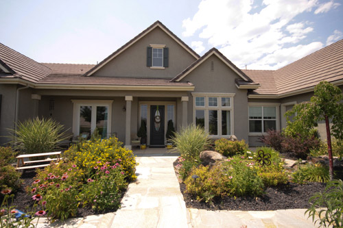
But on with the tour! First of all, how sweet is the exterior of Laura’s house in Reno?
Here’s Laura now, with her dog Emma. She’s also the mother of three kids, so you know, she’s not busy at all.

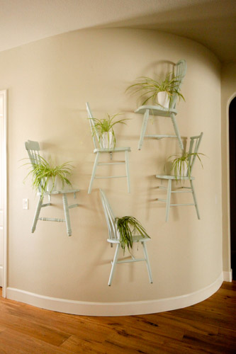
When you enter her home she has a wide foyer area with a curved wall, which is where Laura and her husband Dan got creative. Yup, she made shelves from old secondhand chairs that she painted a soft seafoam green color (Seacliff Heights by Benjamin Moore) and hung right onto the wall (after chopping them in half). I love the little potted plants that are resting on each chair-shelf. Here’s more on how she did that project.
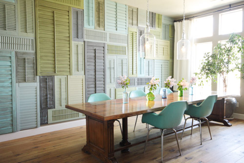
Speaking of creativity, check out her dining room. Yup, the entire wall is filled with shutters that Laura painted in a bunch of soft beachy tones. Isn’t it amazing? As for where she got them all, many came from the Habitat For Humanity ReStore, thrift shops, and Craigslist. I’m also a HUGE fan of both the light fixtures and the chairs (which she found on ebay). It’s such a cool personality-filled room that she made all her own. And that table is actually an old conference table from a nearby university.
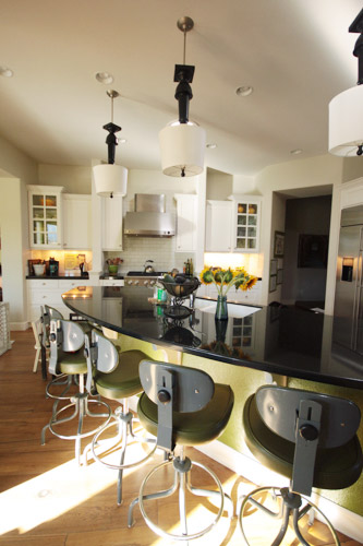
The kitchen is another classic-meets-creativity example, thanks to traditional white cabinetry and subway tile mixed with playful hanging pendants that Laura and Dan made from Home Depot lamps. I love that they don’t take themselves – or their home – too seriously. And the industrial bar stools (which were once science stools at the same university as her dining table) are another fun touch.
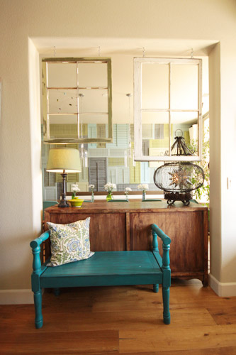
Laura decided that closing off this doorway made for better flow so she casually hung some secondhand window panes to subtly divide the space while keeping things airy. I love that colorful bench too. She picked it up at a thrift store and spray painted it Lagoon by Rustoleum and then glazed it for a less-new look.
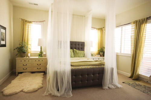
Laura also added height and a breezy and cozy vibe to their bedroom, thanks to sheer curtains from Ikea that she hung from the ceiling for a makeshift canopy affect.
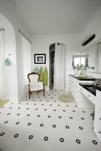
Their bathroom has awesome tile that mimic’s Laura’s childhood 1920’s home. I love it with the extra thick black counters and the white cabinetry.
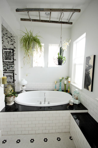
Laura would love to take the subway tile all the way up the wall behind the tub to the ceiling, but in the meantime she added a really cool old ladder that she found at a thrift store for a couple of bucks and a few hanging plants.
Thanks so much to Laura and her husband Dan for sharing their gorgeous home! I hope you guys were as inspired by their fearless approach. And of course you can check out more about every project and room here on her blog. But before I get back to painting, let’s play the favorite part game. Mine’s the shutter wall in the dining room. Especially with those gorgeous glass pendants hanging down in front of it. Me-ow.
************************************


Melinda West says
Love! Love! Love!, your selection & use of the sheer curtains, on the bed frame & over your arched doorway! Way to Go!
meganleiann says
STUNNING! She made me go into caps lock! I have never seen a house that’s so fearless and artistic! I love that I feel like I KNOW her after just a few pictures!
Chenell says
I don’t comment often, but wow! I love what they’ve done here! We sometimes worry about what a taste-specific reno would mean for resale with our house (and then do it anyway). These are cool projects that won’t effect resale at all, because as substantial as they feel, these are completely cosmetic. What a way to turn a newer “builder’s special” into a gorgeous and unique home. Awesome house crash!
EngineerMom says
I am LOVING the pendant lamps in the kitchen. The rest of the house is a little too off the beaten path for my personal taste (though I do like the chair shelves, and the shutter wall would work for me if it was all one neutral tone, like crisp white or a soft grey), but I laughed out loud when I finally figured out what the pendant lamps actually were.
If we ever get a kitchen with tall enough ceilings, I might have to go find some table lamps of my own. :-)
Joanna Banana says
Wow! I think this is my favorite house crash! The use of repurposed materials is amazing, especially the chairs, I’ve never seen that before. Great ideas!
Bailey says
I don’t even know where to start. Everything here is so inspirationally creative!!!!! I’m obsessed. The hanging chairs. The upside down lamps hanging from the ceiling. The shutter wall. The ladder as a ceiling hanger. HOW did they even think of all these things?!?!?!
xox
Bailey
http://akabailey.blogspot.com
Michelle says
LOVE the shutter wall. The chairs are an amazing choice too. Wish I could see more of her outdoor walkway. Will check out her site, maybe there is more of it on there. Great house crash!
marthastewart says
A wall of chairs??? Really??? At some point don’t you stand back and take a look and say to yourself “this is absolutely stupid”. Keep drinking the Kool-Aid people.
Missi says
HOLY SH*T. I never comment on house tours. Ever. But this house blows my mind grapes. I want to go to there!!!!!
Briel K. says
I love her bathroom! And that shutter wall is neat!
maria at inredningsvis says
I LOVE your posts:) and I always leave your blog with a big smile.
Check out my new summer post and have a great day dear:)
LOVE Maria from inredningsvis.se
(sweden)
YoungHouseLove says
Aw thanks Maria!
xo
s
Stefanie says
Favorite crash! Loooove her ideas!
Eric Prado says
Is the chair-shelf cut in half? What do your friends say when seeing the chair-shelf? I am planning to make ones at the left side of our house in front of our small garden. It really look so creative and very unique.
Andrea B says
Ah! She’s pretty much famous in my world. I’ve been dying over her shutter wall for a year now! Such a great textural element. And so creative!
Hollie @ I'm Busy Procrastinating says
We built our home to resemble a 1920s bungalow, so I’m definitely loving the bathroom tiles. Black and white, and that pattern, will always be classic and classy!
Devin says
Innovative and refreshing! Such unique but comforting ideas. I love it!