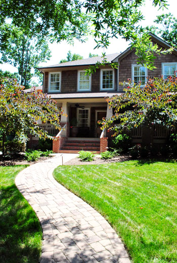
We do our best to crash a variety of homes, both old and new, big and small, traditional and modern, expensivo and super cheap, etc. This one falls into the glamorous high-end realm, but its cup runneth over with adaptable ideas – even if you’re on a tight budget. So we’re happy to bask in the inspirational eye candy (and pass it along to you guys of course). As we mentioned in yesterdays post, this gorgeous home is located in Charlotte, NC. So on with the tour. Here’s the charming exterior:
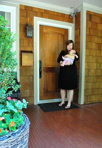
And here are Jennifer and her sweet six week old daughter Eleanor to let us in:
Here’s the gorgeous view that greets you when you step in the front door, which you might recognize from yesterday’s surprise-we-were-road-tripping post. Seriously, I pretty much walked into this house and went crazy with delight and excitement. So sorry for jabbering mindlessly and running around screaming, Jennifer. Your house is just too much goodness for my brain to handle.
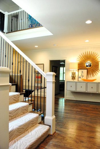
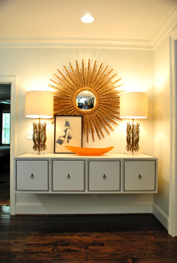
When it comes to that gorgeous tonal zebra carpeting on the stairs, it’s by Stark. And that gigantic mouthwatering mirror is from Circa (well, I’m 90% sure that’s what she said – remember my brain was exploding). I think the lights on the floating console are also from Circa, but I’ve seen dead ringers at HomeGoods along with other starburst mirrors. So checking there (or at their sister stores: TJ Maxx or Marshall’s) can help you get the look for less. And speaking of that floating console, how cool is that? Finding a four-drawered piece like that at a thrift store or garage sale and adding nail heads around the edge of each drawer along with ring hooks could mimic the look. You could even remove the legs and mount it on the wall like Jennifer did. The girl is creative to the nth degree.
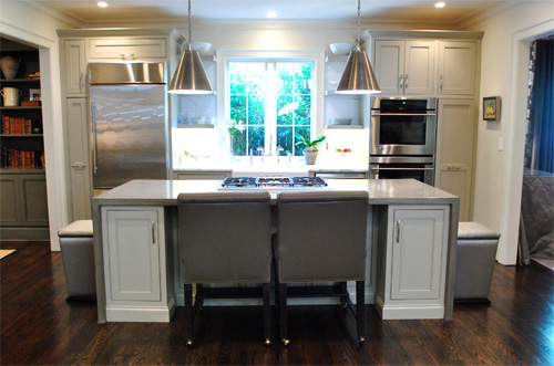
Behold, the kitchen. The cool thing is that it wasn’t a massive space but Jennifer made the most out of it by adding as much function (along with a heaping portion of form) as she could. The steel pendants (by Visual Comfort) provide task lighting for the island, which is packed with useful range space as well as food prep area on either side and a spot to sit and eat in front of the cooktop. And instead of using pricey granite or marble, Jennifer actually chose poured concrete for the top of the island, which was molded to wrap around the base of the cabinets on each side like a parsons desk. I was in lurve (she also said it held up really well for those considering DIYing concrete counters like this previous House Crashing homeowner did here).
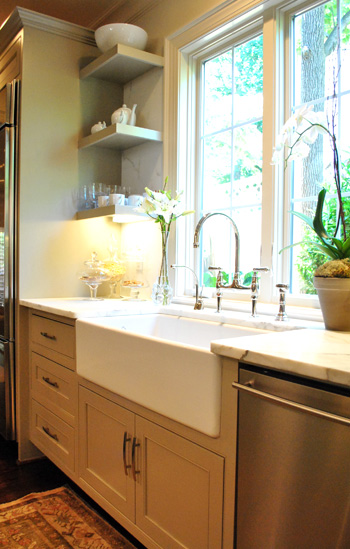
There were two small areas next to the sink with marble, but it was actually scored as a remnant to save loot (using concrete for the majority of the kitchen was definitely a money saving choice). And how great are those simple clean-lined shelves on either side of the window? So simple and sweet. The faucet is Rohl (I love the raised neck) but overstock.com often has similar looking versions for those on a budget (you might have to check back a few times since they seem to go fast).
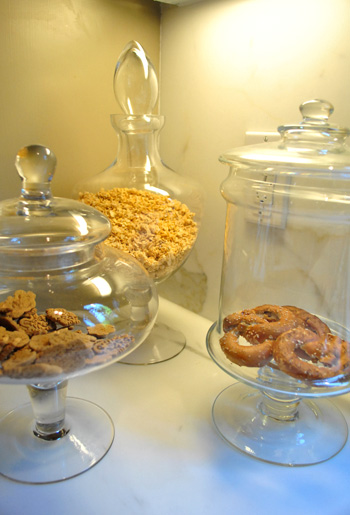
Oh and did you notice that cluster of items under the shelves in the photo above? I loved this idea. Jennifer got a few glass apothecary jars (HomeGoods, Marshall’s, and TJ Maxx sell these for under $15) and filled them with kitchen stuff like granola, pretzels, and cookies. Such a chic way to dress up any counter.
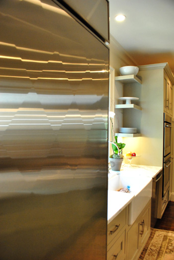
And file this under never-seen-it-before-but-I-went-crazy. The fridge is “quilted” with a cool diamond pattern that actually bumps out ever so slightly to create a faceted textured look. Jennifer went with standard GE appliances, but she sent the door of her fridge to a guy in Atlanta who added the special detailing for a completely customized look.
Beyond the kitchen was the dining room, which was a gorgeous contrast to the light and lovely space.
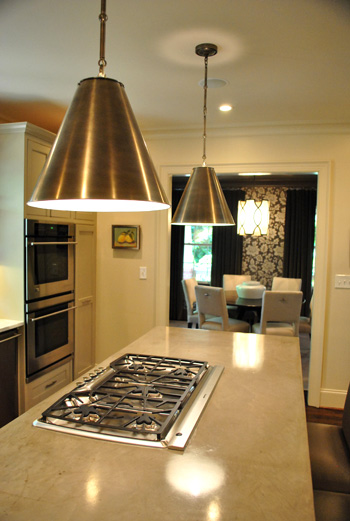
It felt moody and luxe thanks to darker tones (in that stunning wallpaper and those great gray velvet drapes). If you’re looking to recreate this look on the cheap you could always experiment with a light gray stencil on a dark gray wall. You could even dye some $7 Ikea curtains (we like the Vivan ones) in a deep gray tone. It won’t be completely the same (the sheen of the wallpaper and the texture of the velvet curtains is amazing) but it would definitely swank things up and add that moody vibe.
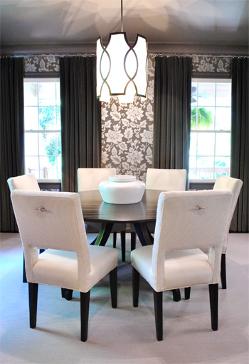
And how amazing is the light fixture? This picture doesn’t even do it justice (it’s by Baker). You can kind of see the shadows that it casts on the ceiling but it was ten times cooler in person. Oh and look closely at the chairs above. See those cool hardware handles on the back of each one? Those are also the brainchild of Jennifer, who added them because she thought it would be easier to pull them out (and they might save the upholstery a bit more since grubby hands won’t constantly be gripping the sides). Is she a thinker or what? I love that no detail was left unaddressed. Especially since I know firsthand how hard it is to have focus like that when you’re furnishing a house (it’s so easy to get caught up in the big stuff and forget about all the cool little finishing touches that make a room feel personal and functional).
Here we have the cozy living room with a gorgeous ottoman that I wanted to strap on top of our Altima and take home. It was covered with this amazing painted fabric. That’s right, I said painted fabric. It was a velour/velvet type upholstery that was stenciled with paint and then weathered/distressed/worn down so it looked irregular and tonal and amazing. The weathering process (sanding it down) made it soft, so it didn’t feel crunchy or hard. Just textured and special. I’ve never seen anything like it.
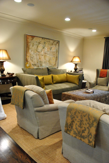
So for anyone brave enough to try stenciling velvet our velour with watered down paint and then sanding it with high grit sandpaper for a weathered and worn in look, I can tell you firsthand that it might just be the coolest thing you ever do. In your life. Ok that might be an exaggeration (creating a human or graduating college might be up there too).
Oh and see those pieces of fabric folded over the top of each arm chair? Once again Jennifer used her brainpower to creatively solve a problem. Her cat loves to jump up from the floor to the back of her chairs, so draping some pretty fabric over the back of each chair was her solution to keep the chair’s upholstery from being clawed (it’s much easier to switch out the draped fabric if it gets ruined than redo the chair). Smart right? And that’s something you can make with a fabric remnant and some Heat N Bond (or a sewing machine if you’re getting braver every day like I am).
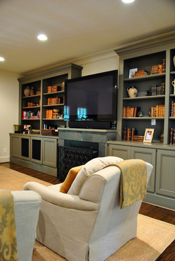
Aren’t those built-ins gorgeous? I loved the elegant greeny-gray color (try Benjamin Moore’s Senora Gray for a similar look), and the hidden storage underneath will definitely come in handy when it comes to stashing Eleanor’s toys.
Since Jennifer loves to add unexpected pattern and texture from room to room (like her light kitchen next to her ornate wallpapered dining room), she thought the small powder room was the perfect place for a little more wallpapered drama. It was a very small room so we were really impressed with her bravery (bold pattern, dark trim, dark sink) but it looked like a bling-y little jewel box instead of a tiny and bland little builder bathroom, so it was such a great call.
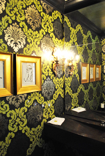
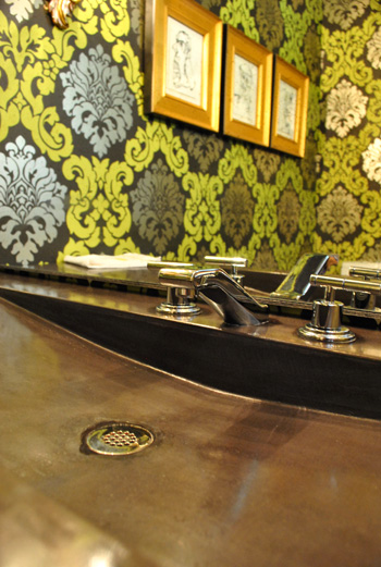
I also loved the dark modern sink, which was poured concrete just like the kitchen island. And the faucet is by Kohler (so sexy, right?) which often ends up on overstock.com or a place like plumbersurplus.com for those in a deal-hunting mood.
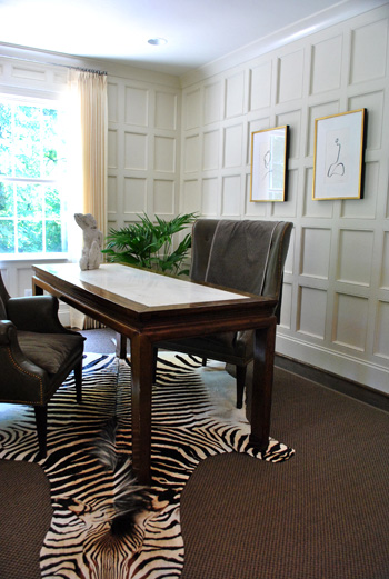
This room is a little office/bill paying area that was another modestly sized space that Jennifer maximized with a skinny floating desk and two comfy chairs (so much more inviting than traditional office chairs and still just as functional). And those amazing paneled walls make you notice the luxe architecture of the room instead of how small it is. As for how they attained that paneled look, it’s just cheap wood from the home improvement store that they used to create a rectangular grid pattern with molding around the edges to finish each one off. Then they just painted it all for a seamless effect.
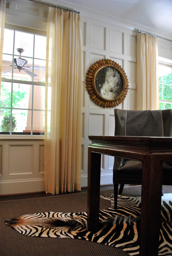
Oh yeah and this mirror is another thing I wanted to sneak out with. How pretty is that patina-riddled glass? It’s an antique from Circa, but there are tutorials online for antiquing your own mirror (like this one), so finding something new and then glazing the frame and patina-ing the glass could yield something similar on a budget.
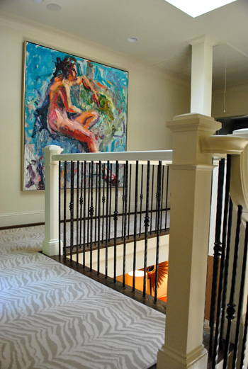
Jennifer and her husband are hardcore art collectors, and one of their favorite pieces is this giant figure by Carl Plansky. It’s such an amazing focal point in a hallway without much else going on (except for that cool zebra runner which snaked upstairs). A giant abstractly painted canvas (made by you) or even a large wooden frame with colorful fabric stretched around it could add similar color and boldness.
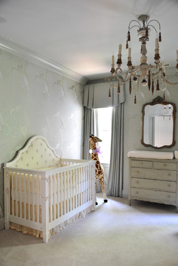
And of course little Eleanor needed a nursery to call her own, and Jennifer didn’t spare a single detail. The gorgeous chandelier is from Circa and the dresser is actually her own childhood dresser that she painted to work with the wallpaper.
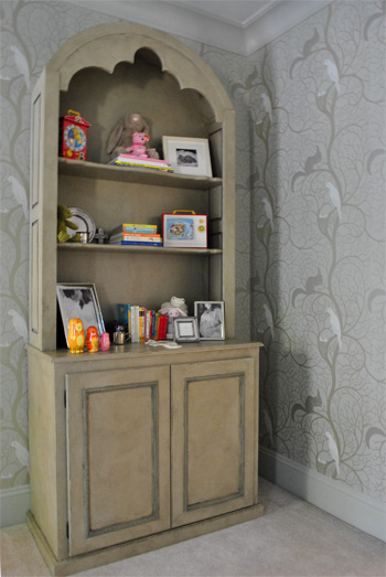
Speaking of the wallpaper, here’s a shot that might be easier to make out. It was actually these tone on tone vines that snaked up the wall with squirrels and birds on some of the branches. So sweet yet sophisticated. I felt like I was in an enchanted forest.
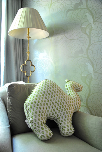
And you know I love a good quatrefoil worked in there, so of course this lamp was yet another thing I wanted to grab while screaming “what’s that over there?” and running out to the car with it while Jennifer looked the other way. But I didn’t. It looked perfect right where it was. And how cool is the camel pillow (by Rikshaw Design)? I love how it layers in with the tones of the room while adding more of that “enchanted animals” vibe from the wallpaper and the giant giraffe near the crib. Clara was in love with this room (and that camel pillow in particular).
So there you have one of three house crashing adventures (well one was actually an office crashing) of which we partook during our weekend road trip. We’ll be back to share the other two in a little while (we don’t want them to be jammed on top of each other and we’re still waiting on some source info for those, but they’re definitely coming within the next week or two). Oh but we can’t sign off without sending a huge thank you to Jennifer and her sweet family for so graciously letting us in to snap photos for you guys (even with such a fresh little newborn around)! They were amazing and we’re so happy that we were able to stop by. Now let’s play the what’s-your-favorite-part game. Mine is the floating nailhead console with the sunburst mirror over it. And the poured concrete counter that runs up and down the side of the island. Le sigh.
Psst- Wanna check out other house crashing adventures? We have them all right here.
More random pssst- Is anyone else watching The Voice? I’m in love with Dia and Xenia. Who are your picks?

Jane says
absolutely breathtaking! I wish she could come to my house. :) I do have two questions though…was that a real zebra pelt on the floor or a faux one? Also did she tell you how her cats were with the jute rug? I’ve been wanting one forever but I dont want it to become a huge scratching post. :)
YoungHouseLove says
I’m not sure about either one of those questions (although the jute looked to be in good shape so there weren’t any obvious snags). Here’s hoping Jennifer stops in with more info for ya!
xo,
s
Jennifer says
Our cat was a foster/rescue cat and came to us without his front claws…. It hasn’t been an issue at all. We have really loved the rug – it’s very durable and easy to care for.
Erin says
This is by far my favorite house crash of all time now. What an amazing job they did. I’d be hard pressed to pick a favorite thing of what you’ve shown us, but I will say that I am not a fan of carpet in any way, shape or form. And I especially detest carpet on stairs. Have I mentioned that I’m also not a huge fan of animal prints? And yet I took one look at that zebra print carpeting on the stairs and I was so head over heels in love I thought “would that work in my house?”
And the quilted fridge door. I. Want. That. Now.
Awesome crash! Maybe Jennifer wants to come up to Wisconsin and redecorate my house for me.
Ana Silva says
Can you say Pinterest?! Wow her house is gorgeous. I am in love. Can I move in please? How much fun it must be to house crash and on the other hand to show it off. Can’t wait to see the other two. Have a great day Sherry, John, Clara and Burger!
laura says
I love dia and xenia too!!! Love their unique voices and style!
Stephanie says
Super fancy house! If anyone noticed the cute stacking animals in the baby’s room, I have a source (one of my favorite stores):
http://www.poshchicago.com/product.asp?lt=d&deptid=3076&pfid=PSH01651
This mommy and her toddler love them!
YoungHouseLove says
Love it! Thanks for the link!
xo,
s
Jenny says
Thank you so much for sharing! I really look forward to the day I get to truly decorate for me instead of for a future buyer. I would be all over the bolder choices like the zebra carpet and the wallpaper! Fabulous find!!
Tina says
Her house is beautiful! And I have to say, I’ve bought all of my faucets on overstock. They are so much cheaper & I usually have a coupon & free shipping!
Manda says
OMG, love love love the paneling in the office. Definitely putting that on my dream to do list. I was also thinking it could be really cool in your office off the dining room, especially if you end up with french doors there. Just a thought!
Kristin says
Wow! She did an amazing job! I hope she is in the design world because she certainly did a fantastic job on her home! You did a fantastic job capturing this perfect house. Keep the crashes coming!
Lynette says
The Voice….Dia is my favorite so far. She is so sweet and shy, but when she sings…..WOW!
Ashley says
I am definitely in head-over-heels LOVE with the zebra runner. Now if I can convince my fiance to let me do that in our next place…hmmm…
Jessica says
I love the floating console. Another less expensive way to get that look could be to hack an Ikea expedit bookcase.
YoungHouseLove says
Oh yeah I love that idea!
xo,
s
Leslie Ann says
That is one SEXY sink… Dark, sleek, subtle curves…
I’m sad we only get an angle view of the bathroom sink though. Do you have any photos that capture the full view of the sink?
YoungHouseLove says
So sorry- it was such a small room that was the best we could do!
xo,
s
Nancy says
How beautiful…thanks for sharing!
Seeing the mirror reminded me of the DIY one I read about yesterday. Have you seen this? http://blog.addicted2decorating.com/2011/06/diy-decorative-mirror-made-with-wood.html
I could totally seeing you making one. It would look very cool with your DIY sofa table!
YoungHouseLove says
Woah- amazing! It looks like the flooring in our living room. Love it!
xo,
s
CandiL says
I love everything about this house…but for some weird reason I want the sink in the bathroom!! That was pretty neat looking!!
Katy D. says
I love Xenia, Dia, and Javier Calon! I’m addicted to the Voice. I am not however, addicted to Xtinas clothes! She’s falling out every way she can!! Haha
YoungHouseLove says
The “girls” were definitely out when it came to that Lady Marmelade number!
xo,
s
Kacie says
Wow! That is a very cool home. We’re getting ready to redo our kitchen and I love the open shelving.
Kacie
http://www.acollectionofpassions.blogspot.com
stephanie says
forget stealing the lamp and mirror-i want to just steal the house! I really think i’m having heart palpitations!
I’m all for Dia and Beverly!
Jessica says
I love the paneling in the office….that could totally make a simple room so much more interesting!!
Megan says
Very nice. I love to look, even if I’ll never be able to afford it, I think borrowing ideas from high end homes makes us budget minded folks that much more creative! I am going to borrow the grid walls for my living room that will be soon transformed into an office and I will be googling around for some concrete counters! Love it.
Victoria says
My heart started beating faster as I read this post. I could actually feel your excitement through the words. And the images from her house back it up. Great house crashing post, guys!
Cherie says
LOVE the zebra carpet, the textured fridge and the apron front sink in the kitchen. I’ve recently become obsessed with those!
Erica says
This looks like it came straight out of House Beautiful. LOVE the zebra rug on the stairs and the floating shelf, the entire kitchen, and the dining room. Drool.
Amy says
I hope while you were in Charlotte you checked out Post & Gray Home (a 7,000 sf warehouse were individuals and designers sell their wares), the Sleepy Poet (55,000 sf antique mall) and the Clearing House (a great home consignment shop) for fantastic treasures for the home. Then for the for the most amazing lux (and uber expensive) eye candy and inspiration ever you have to visit Mrs. Howard (to die for!). We have family in Charlotte and my visits there are never complete without visits to all those places.
YoungHouseLove says
We actually went to Post & Gray and Sleepy Poet the last time we came though (last year). So much fun!
xo,
s
Amber says
Gorgeous! Jennifer’s house has so many amazing details. I’m so in love with the paneled walls that I’m already trying to figure out where I could do that in my house.
As for The Voice, I’ve only seen one episode, but I’ve been listening to Meg & Dia for years. I love their music.
Julie B. says
I am smack in the middle of a kitchen re-do (though not as brave as the DIY’ers of the world; a wonderful contractor is the one getting sweaty at my crib!:) and I am totally wondering –is her faucet mounted on the windowsill?? I love my new Delta faucet (yours from your previous home with the touch to turn on feature) and it curves like the one here, but this one looks mounted to the windowsill…?
YoungHouseLove says
It’s mounted to the slab of marble counter behind the sink, but it looks like a windowsill since the window is so low and it appears to be right in front of it! Hope it helps.
xo,
s
Jenn M. says
love the dining room! been looking forever for a dark table and light upholstered chairs. do you or anyone know where she got the table and chairs? gorge!!!
YoungHouseLove says
Here’s hoping Jennifer stops by with that info for ya.
xo,
s
JayGirl says
I love the zebra carpeting. The neutral colors in it are fun, yet the print is edgy. The house is amazing!
Michelle @ Ten June says
Ho. Ly. Cow. That home is incredible! Seriously did you just hyperventilate when you walked in? The textured fridge. The zebra carpet. The nursery. The floating console. THE FLOATING CONSOLE! I am so in love with it! I need one!!!
YoungHouseLove says
Yes, I was a crazy person. I’m not ashamed. Gorgeous houses do that to me. Haha.
xo,
s
Nan says
Handles on the backs of chairs — genius! Love, love, love the poured-concrete-wrapping counters too. Can’t wait to see your other crashed houses.
Bob says
I wish I had this much money. Ah, to be rich!
Julie says
I’m glad I wasn’t the only one wondering if:
a. This family is incredibly rich to be able to decorate like this while so young & with a baby on the way (when she was doing the decor, duh).
or
b. About to declare bankruptcy.
I love the house, but 9/10 of the ideas just aren’t doable for the average young family on a budget. Perhaps you could do a little DIY for these projects to demo to the rest of us how to make this happen in our own homes?
Suzanne from the RVA says
LOVE the faux paneling in the office. I have to recreate that!!
Lindsay says
I really need to find me a sunburst mirror. like yesterday. love them.
Rachel says
Wow – this beautiful home is so inspirational. I can definitely see myself replicating some of her high end ideas on my budget which is more Home Goods/DIY. I also like that this appears to be a newish house, and there is no boring builder vibe anywhere.
I also love that carpet on the stairs and her use of BIG pieces of art…they totally make the rooms. The dining room is also totally stunning.
ashley dailey says
Can you give us more info on the crib. I love the style of it! haven’t seen anything quite like it, modern but also the top of it was amazing for a little girl!
YoungHouseLove says
Here’s hoping Jennifer drops in with more info for ya.
xo,
s
Jennifer says
The crib is Restoration Hardware. We had the back part upholstered. It’s a convertible crib so the back ‘headboard’ part can be used when the crib is outgrown.
Emily@GoHausGo says
Somewhat related question – how do you house crash? Are these people you know or those you’ve stumbled across? Or do you literally start knocking on doors? Ha! Love the house crashing feature.
YoungHouseLove says
Almost every house that we crash is brought to us by someone who emails us and says we just have to see it (thanks so much to everyone who “knows someone with a killer house that we have to feature!”). This one (and the other two places that we crashed in Charlotte) were brought to us by Kristin, the sweet friend of ours that we stayed with for that leg of the trip. We’re soooooo thankful for Kristin for hooking us up with not one, and not two, but three amazing places to photograph while we were in town!
xo,
s
Rebecca Foxworth says
The Voice makes me want to say “What’s American Idol, again?”. Awesome show. Xenia is a fave, as is Adam’s whole team (Javier and Casey blog me away!).
Genevieve says
I’m new to the Young House Love train, but I’ve squealed with delight over a number of your posts in the last few days!
Do you think you could give a tutorial on how to accomplish the look of the office (the wood paneling) in this House Crash? I’m pretty inept with DIY projects and always appreciate a step-by-step explanation.
Many thanks! So happy to now be a Young House Love follower!
P.S. Thanks to Ashley above for the heads up on that Living Social deal…SCORE!
YoungHouseLove says
Aw thanks so much! We haven’t actually tackled that project ourselves yet, so I think your best bet would be to goolge around for a “wall paneling how to” post and just see what you find. My best guess would be that you would have to carefully measure out the placement so it all looks even and then just nail boards in to create the criss-cross effect. Then cut small molding (miter cut the corners) to frame out each box. It would be tedious and probably would look shady while you were mid-project. But once you’re done and it’s all painted the same color it should look amazing!
xo,
s
Stephanie Phillips says
Hope over to ourhumbleabowed.wordpress.com. She and her hubby have done the paneling themselves.
YoungHouseLove says
Oh yeah they did an amazing job!
xo,
s
Jessica C. says
Gorgeous!! Any full shot of the outside of the house?
YoungHouseLove says
Darn, yes! I meant to put that in but somehow it got away. Off to add it. Just refresh in a bit for that update.
xo,
s
JR says
Love! It’s hard to narrow it down but I think my favourites are the wallpapers, the floating console and the art collection.
I’m curious… did she work with a designer/decorator? Or perhaps was she just hiding her superwoman costume under her little black dress?
YoungHouseLove says
She did virtually all of the designing herself. Isn’t that amazing? I kept telling her she could have a thriving decorating business if she wanted one!
xo,
s
JR says
Amazing. And good for her! Such attention to detail and everything seems so thought out (in a non-stuffy way). She certainly could have a decorating/styling business if she wanted!
(I hope I posted this in the right place…!)
Sarah says
That nursery wallpaper is lovely. What a great idea!
Kristen says
She totally nailed the colors in the kitchen – can you (or Jennifer) PLEASE share the cabinet paint colors???
YoungHouseLove says
Here’s hoping she stops by with that for ya!
xo,
s
Kristin says
That was my question too. :) We’re picking cabinets for our kitchen remodel, and I want to paint them (or, I should say, have them painted) a similar color. Very pretty!
Brien says
My favorite crashed house so far!!!! I live in Charlotte and I kind of want to move in : ) I can’t believe a baby lives there! I can’t pick a favorite room, but I am in awe of the DIY paneling effect in the office.
Kristen says
Jennifer’s home is gorgeous!! I think my favorite room is the entryway. The console is awesome but it’s that zebra runner than really made me swoon. I’m a sucker for animal print.
Tabitha says
O-to-the-M-to-the-G!!!! I can only imagine your reaction to her home in person, because I am only pausing momentarily from running around my house screaming, to post this comment. It’s BEAUTIFUL! I wanna live like this when I grow up :)
I’ll be fantasizing about that carpet for the rest of the week!
Kim at Yellow Brick Home says
That floating console has officially been “pinned”! Thank you for the inspiration!
Elisa says
This post just got the crap pinned out of it. Hehehe (that would be the immature giggle).
Rachel says
Wow, gorgeous! I don’t blame you, Sherry, for running around in delight!
Did Jennifer design herself or work with a decorator?
YoungHouseLove says
She did virtually everything herself! Isn’t she fantastic? I kept telling her she needed to start a design firm stat.
xo,
s
C.E.R. says
A-mazing crash. Can’t wait to see the others!
Oh, and I heart Xenia too (would TOTALLY buy her CD), but I miss my Tim Mahoney. :( My girls and I used to go see him pretty religiously at a small bar in our college town, and then after college, some of us went to see him whenever he came to Chicago. He even put one girlie in our group into labor! I’m totally serious. :)
Jennifer says
Just stunning. I would really love a home that is this well put together in the future.
It’s a really great example, though, that even if you DIY 80% of your home decorating, it will not look stellar unless you drop some $$$ on SOME swanky/designer pieces. Sigh.
Maybe by the time I’m 40. :)
Tannis says
Hi,
Can you find out the color of her white main floor walls/ceiling/crown moulding? We are going to paint our whole house white, and I’m looking for the perfect shade. Also, can you find out the color of her main wall kitchen cabinets, they seem in the pic to be a nice soft shade of grey?
Thanks!
Tannis
YoungHouseLove says
Here’s hoping Jennifer drops in with that info for ya!
xo,
s
Jennifer says
The walls and trim are a Farrow and Ball color – Clunch (although we didn’t use Farrow and Ball, just had the color matched at Sherwin Williams). We did 50% Clunch on the ceiling. The cabinets are a Farrow and Ball color as well (our bedroom is actually the same color!) but I can’t remember the name of the color! I will get back to you… ; )