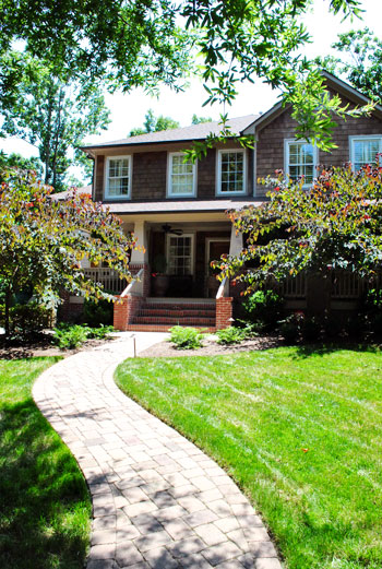
We do our best to crash a variety of homes, both old and new, big and small, traditional and modern, expensivo and super cheap, etc. This one falls into the glamorous high-end realm, but its cup runneth over with adaptable ideas – even if you’re on a tight budget. So we’re happy to bask in the inspirational eye candy (and pass it along to you guys of course). As we mentioned in yesterdays post, this gorgeous home is located in Charlotte, NC. So on with the tour. Here’s the charming exterior:
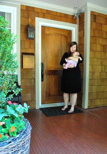
And here are Jennifer and her sweet six week old daughter Eleanor to let us in:
Here’s the gorgeous view that greets you when you step in the front door, which you might recognize from yesterday’s surprise-we-were-road-tripping post. Seriously, I pretty much walked into this house and went crazy with delight and excitement. So sorry for jabbering mindlessly and running around screaming, Jennifer. Your house is just too much goodness for my brain to handle.
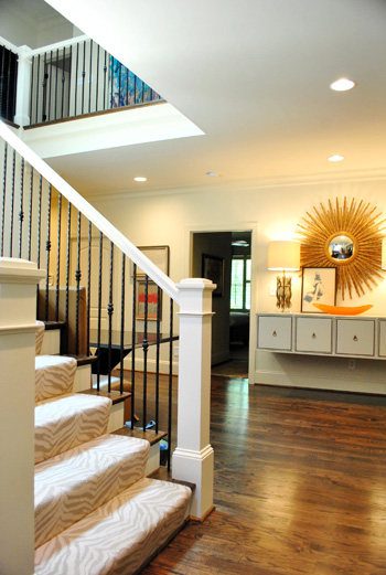
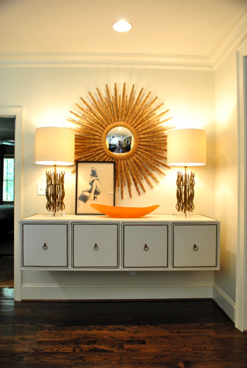
When it comes to that gorgeous tonal zebra carpeting on the stairs, it’s by Stark. And that gigantic mouthwatering mirror is from Circa (well, I’m 90% sure that’s what she said – remember my brain was exploding). I think the lights on the floating console are also from Circa, but I’ve seen dead ringers at HomeGoods along with other starburst mirrors. So checking there (or at their sister stores: TJ Maxx or Marshall’s) can help you get the look for less. And speaking of that floating console, how cool is that? Finding a four-drawered piece like that at a thrift store or garage sale and adding nail heads around the edge of each drawer along with ring hooks could mimic the look. You could even remove the legs and mount it on the wall like Jennifer did. The girl is creative to the nth degree.
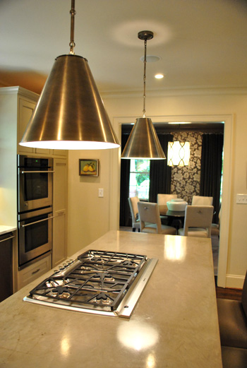
Behold, the kitchen. The cool thing is that it wasn’t a massive space but Jennifer made the most out of it by adding as much function (along with a heaping portion of form) as she could. The steel pendants (by Visual Comfort) provide task lighting for the island, which is packed with useful range space as well as food prep area on either side and a spot to sit and eat in front of the cooktop. And instead of using pricey granite or marble, Jennifer actually chose poured concrete for the top of the island, which was molded to wrap around the base of the cabinets on each side like a parsons desk. I was in lurve (she also said it held up really well for those considering DIYing concrete counters like this previous House Crashing homeowner did here).
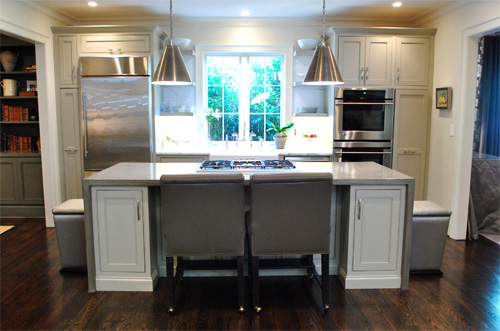
There were two small areas next to the sink with marble, but it was actually scored as a remnant to save loot (using concrete for the majority of the kitchen was definitely a money saving choice). And how great are those simple clean-lined shelves on either side of the window? So simple and sweet. The faucet is Rohl (I love the raised neck) but overstock.com often has similar looking versions for those on a budget (you might have to check back a few times since they seem to go fast).
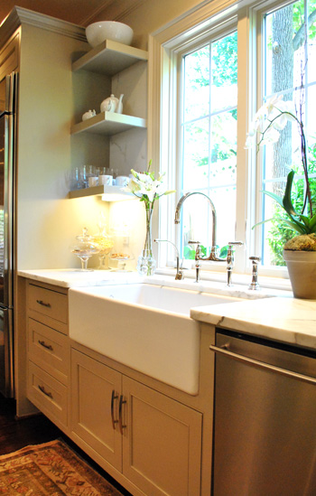
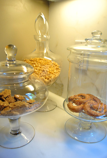
Oh and did you notice that cluster of items under the shelves in the photo above? I loved this idea. Jennifer got a few glass apothecary jars (HomeGoods, Marshall’s, and TJ Maxx sell these for under $15) and filled them with kitchen stuff like granola, pretzels, and cookies. Such a chic way to dress up any counter.
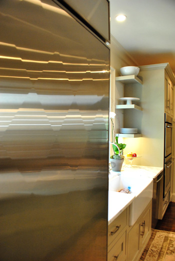
And file this under never-seen-it-before-but-I-went-crazy. The fridge is “quilted” with a cool diamond pattern that actually bumps out ever so slightly to create a faceted textured look. Jennifer went with standard GE appliances, but she sent the door of her fridge to a guy in Atlanta who added the special detailing for a completely customized look.
Beyond the kitchen was the dining room, which was a gorgeous contrast to the light and lovely space.
It felt moody and luxe thanks to darker tones (in that stunning wallpaper and those great gray velvet drapes). If you’re looking to recreate this look on the cheap you could always experiment with a light gray stencil on a dark gray wall. You could even dye some $7 Ikea curtains (we like the Vivan ones) in a deep gray tone. It won’t be completely the same (the sheen of the wallpaper and the texture of the velvet curtains is amazing) but it would definitely swank things up and add that moody vibe.
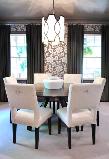
And how amazing is the light fixture? This picture doesn’t even do it justice (it’s by Baker). You can kind of see the shadows that it casts on the ceiling but it was ten times cooler in person. Oh and look closely at the chairs above. See those cool hardware handles on the back of each one? Those are also the brainchild of Jennifer, who added them because she thought it would be easier to pull them out (and they might save the upholstery a bit more since grubby hands won’t constantly be gripping the sides). Is she a thinker or what? I love that no detail was left unaddressed. Especially since I know firsthand how hard it is to have focus like that when you’re furnishing a house (it’s so easy to get caught up in the big stuff and forget about all the cool little finishing touches that make a room feel personal and functional).
Here we have the cozy living room with a gorgeous ottoman that I wanted to strap on top of our Altima and take home. It was covered with this amazing painted fabric. That’s right, I said painted fabric. It was a velour/velvet type upholstery that was stenciled with paint and then weathered/distressed/worn down so it looked irregular and tonal and amazing. The weathering process (sanding it down) made it soft, so it didn’t feel crunchy or hard. Just textured and special. I’ve never seen anything like it.
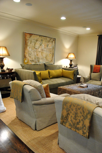
So for anyone brave enough to try stenciling velvet our velour with watered down paint and then sanding it with high grit sandpaper for a weathered and worn in look, I can tell you firsthand that it might just be the coolest thing you ever do. In your life. Ok that might be an exaggeration (creating a human or graduating college might be up there too).
Oh and see those pieces of fabric folded over the top of each arm chair? Once again Jennifer used her brainpower to creatively solve a problem. Her cat loves to jump up from the floor to the back of her chairs, so draping some pretty fabric over the back of each chair was her solution to keep the chair’s upholstery from being clawed (it’s much easier to switch out the draped fabric if it gets ruined than redo the chair). Smart right? And that’s something you can make with a fabric remnant and some Heat N Bond (or a sewing machine if you’re getting braver every day like I am).
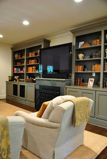
Aren’t those built-ins gorgeous? I loved the elegant greeny-gray color (try Benjamin Moore’s Senora Gray for a similar look), and the hidden storage underneath will definitely come in handy when it comes to stashing Eleanor’s toys.
Since Jennifer loves to add unexpected pattern and texture from room to room (like her light kitchen next to her ornate wallpapered dining room), she thought the small powder room was the perfect place for a little more wallpapered drama. It was a very small room so we were really impressed with her bravery (bold pattern, dark trim, dark sink) but it looked like a bling-y little jewel box instead of a tiny and bland little builder bathroom, so it was such a great call.
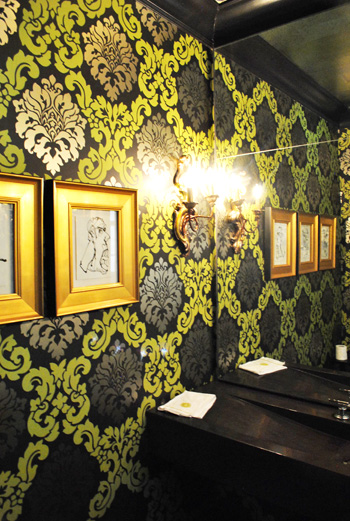
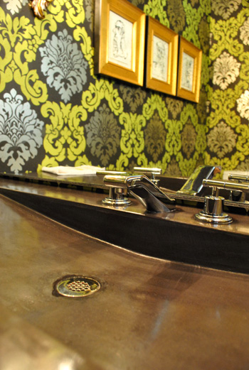
I also loved the dark modern sink, which was poured concrete just like the kitchen island. And the faucet is by Kohler (so sexy, right?) which often ends up on overstock.com or a place like plumbersurplus.com for those in a deal-hunting mood.
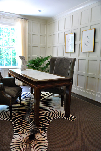
This room is a little office/bill paying area that was another modestly sized space that Jennifer maximized with a skinny floating desk and two comfy chairs (so much more inviting than traditional office chairs and still just as functional). And those amazing paneled walls make you notice the luxe architecture of the room instead of how small it is. As for how they attained that paneled look, it’s just cheap wood from the home improvement store that they used to create a rectangular grid pattern with molding around the edges to finish each one off. Then they just painted it all for a seamless effect.
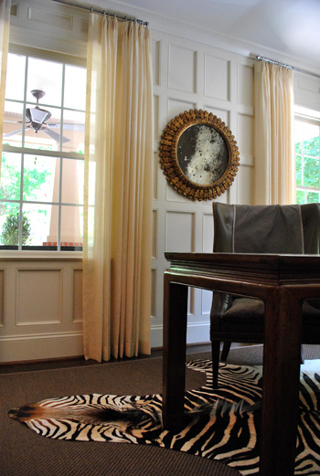
Oh yeah and this mirror is another thing I wanted to sneak out with. How pretty is that patina-riddled glass? It’s an antique from Circa, but there are tutorials online for antiquing your own mirror (like this one), so finding something new and then glazing the frame and patina-ing the glass could yield something similar on a budget.
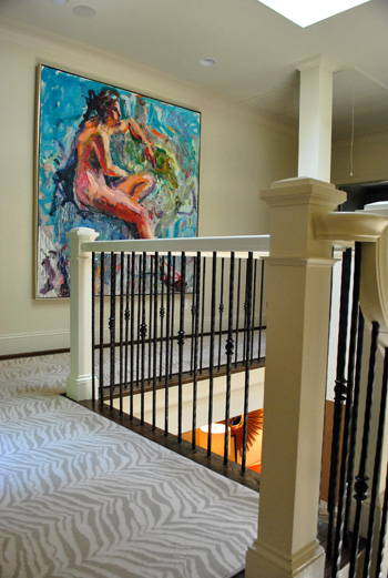
Jennifer and her husband are hardcore art collectors, and one of their favorite pieces is this giant figure by Carl Plansky. It’s such an amazing focal point in a hallway without much else going on (except for that cool zebra runner which snaked upstairs). A giant abstractly painted canvas (made by you) or even a large wooden frame with colorful fabric stretched around it could add similar color and boldness.
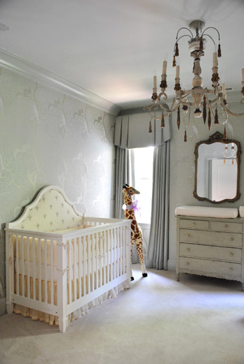
And of course little Eleanor needed a nursery to call her own, and Jennifer didn’t spare a single detail. The gorgeous chandelier is from Circa and the dresser is actually her own childhood dresser that she painted to work with the wallpaper.
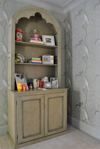
Speaking of the wallpaper, here’s a shot that might be easier to make out. It was actually these tone on tone vines that snaked up the wall with squirrels and birds on some of the branches. So sweet yet sophisticated. I felt like I was in an enchanted forest.
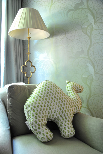
And you know I love a good quatrefoil worked in there, so of course this lamp was yet another thing I wanted to grab while screaming “what’s that over there?” and running out to the car with it while Jennifer looked the other way. But I didn’t. It looked perfect right where it was. And how cool is the camel pillow (by Rikshaw Design)? I love how it layers in with the tones of the room while adding more of that “enchanted animals” vibe from the wallpaper and the giant giraffe near the crib. Clara was in love with this room (and that camel pillow in particular).
So there you have one of three house crashing adventures (well one was actually an office crashing) of which we partook during our weekend road trip. We’ll be back to share the other two in a little while (we don’t want them to be jammed on top of each other and we’re still waiting on some source info for those, but they’re definitely coming within the next week or two). Oh but we can’t sign off without sending a huge thank you to Jennifer and her sweet family for so graciously letting us in to snap photos for you guys (even with such a fresh little newborn around)! They were amazing and we’re so happy that we were able to stop by. Now let’s play the what’s-your-favorite-part game. Mine is the floating nailhead console with the sunburst mirror over it. And the poured concrete counter that runs up and down the side of the island. Le sigh.
Psst- Wanna check out other house crashing adventures? We have them all right here.
More random pssst- Is anyone else watching The Voice? I’m in love with Dia and Xenia. Who are your picks?

Sara says
Really enjoyed this crash – thanks for sharing! Off topic – but wondered if you gus had seen this cool post about modifying Ikea Maskros into a sputnik-style chandelier. http://littlegreennotebook.blogspot.com/2011/05/diy-sputnik-chandelier.html
YoungHouseLove says
Yes, isn’t that project amazing?! Love it.
xo,
s
sistakt says
zebra hide freaks me out a bit…. otherwise nice!
jess says
Goodness. I LURVE the zebra carpet, nursery wallpaper, fridge, concrete countertop, and the whole dining room. Great job, Jennifer! The home was beautiful and props to her for having it so tidy and neat with a newbie baby, too! Great tour, guys!
Laura B says
Eye candy galore! Keeping my fingers crossed that Jennifer starts a blog because there are so many “how to” and “where to find” questions swirling around my head! Thanks for the fun (although envy inducing) post!
Andrea says
YES! Dia and Xenia are amazing. In fact, Team Blake over all is pretty darn good. Outside of Beverly, I’m over Team Christina.
And yes, this house is so amazing. Thanks for sharing a little more inspiration. I have so much to do! :)
heather says
My husband’s (hah – husband, still getting used to it) boss and wife invited us over for dinner one night at their house with a couple other people. She was in styling/production for magazines for a long time – so her style and eye for color/detail is to die for. I walked in and almost fell to the floor in a fit of giggles. It was STUNNING. I swear if you ever come to Maine you *need* to house crash them. Or maybe I’ll just do it for you (with their permission) since we owe them some babysitting.
I can’t even explain it, but it’s pretty much the nicest house I’ve ever seen. It made ours look like a cardboard box.
YoungHouseLove says
Ooh we’d love to see pics if you snap them!
xo,
s
Vicky T says
Wow, simple yet beautiful & elegant!!!
Fiona says
Wow– what a gorgeous house! I loved every room except the nursery (too grown-up and not much fun).
Krystal Lee says
omg omg omg! i love this house! i love the little quirky details she has added, the floating shelf, chairs, wallpaper, kitchen sink! we are currently undecided about how our small kitchen can be renovated and i think hers looks lovely and very usable and i want it! so beautiful, she is a very creative talented being x thank you x
krystal
http://krystalleeart.blogspot.com/
Melody says
There is no way I can choose a favorite part of this house! It is stunning!
Danielle D. says
Guh-orgeous! omg, I could bask in the glory of those photos all day long. She did such an amazing job, i love how effortless the whole house appears.
Stacey says
Hey! Beautiful home! Do you have any idea where she got the lamp in the nursery. I, too, LOVE it!
YoungHouseLove says
No idea, but I’d guess Circa! Here’s hoping she drops in with that info.
xo,
s
Amy says
I just saw that lamp in Trad Home, and it was Circa!
YoungHouseLove says
Thanks for the confirmation Amy!
xo,
s
Emily says
If you like Dia look up Meg&Dia. Her and her sister came out with an album several years ago and I was overly obsessed with them. Monster is probably their most popular song but they are very good! I was actually surprised to see her on the show since they have already had an album but you should look them up! They are wonderful.
And while you’re looking them up you should also look up Tegan and Sarah they are also sisters who are awesome!!
YoungHouseLove says
Thanks so much! Off to check them out.
xo,
s
Christine says
My fav is the chandelier in the dining room. So posh! I also love the subtle-but-rich color palette throughout the house. She has a great eye!
Tina says
I only found you guys a couple of months ago… but your site is certainly my favorite. If you ever find yourself in Chicago and in need of a house to crash, just let me know.
Noelle says
I love this house … but, um, what’s up with the font in your blog post titles? Not that I don’t like it, it’s just quite the change!
YoungHouseLove says
Something changed??? We can’t see it. Anyone else see a font change? If so what browser are you using (Internet Explorer? Firefox?). We’d love to know what’s going on so we can fix it!
xo,
s
Emily says
Yeah, it looks smaller than it used to. I use Firefox, but it looks like it is supposed to in Internet Explorer.
YoungHouseLove says
Hmm, it looks smaller in Firefox? We use Firefox and it looks the same. Man, what is up?
xo,
s
Robin @ our semi organic life says
looks fine to me. reg old office IE.
YoungHouseLove says
Thanks Robin! Anyone else?
xo,
s
Noelle says
On mine (Safari, same as I always use), it’s all curvy and handwritten-y. I just installed some new fonts on my machine yesterday, so possibly that’s why I’m having problems? Maybe it’s just me, then.
Noelle says
I just saw the same font on another website I’m familiar with, so it’s a problem on my end. Sorry for the false alarm!
YoungHouseLove says
Whew- thanks so much for letting us know Noelle!
xo,
s
Adriane (aka the greenhorn) says
WOW! Kudos to Jennifer–I am having trouble picking a color to spray paint a lamp! She had the vision and then pulled it off–amazing. She defintely deserves tons o'(Internet stranger) oogling and praise :) But, my favorite is the dining room light.
ps-that darn show got the best of me and I love Dia. I could just put her in my pocket and carry her around, so adorable and talented.
Elizabeth says
Wow. AMAZING home. I don’t know if I’ve ever seen a style I liked more. I’m curious about the stovetop in the island that does not have an exhaust hood over it. How does that work? Do you know if there is some sort of exhaust system below the cooktop? We are considering putting in one of these in our island, but I’m reluctant to put a great big hood in the middle of our kitchen.
Also, do you know who makes the wallpaper in the nursery? It’s my dream come true for wallpaper. :)
YoungHouseLove says
There are these awesome things called downdraft hoods or pop up hoods (I think hers was a downdraft) that basically suck the smoke down into them. Katie B has one too- so neat!
As for the wallpaper, here’s hoping Jennifer will stop in to answer that for ya.
xo,
s
Liz says
I LOVE the tonal zebra carpeting and the pattern on the wall in the small powder room– it reminds me of a Vera Bradley pattern!
What a gorgeous home!
Kate says
Do you all have any idea where that quatrefoil lamp in the nursery is from?!? I have been scouring the net/local stores for something similar! Any info on its whereabouts or a similar model would be beyond appreciated!!! Thanks for sharing!
YoungHouseLove says
No idea but I’d guess Circa. Hopefully Jennifer will drop in to confirm (or correct me).
xo,
s
Ashley says
Very glamorous, but I would be so afraid to raise a toddler in that house!
Elizabeth says
I couldn’t wait to know who made the wallpaper.:) It’s by Sanderson.
YoungHouseLove says
Thanks so much for that info Elizabeth!
xo,
s
leah says
I looooove the wood panelled wall… that looks amazing! I bet that took a long time to finish. wow.
I also really love the soft tones of the nursery and the wall paper, oooo ahhhh.
thanks for sharing.
Callie says
Gorgeous house!! We did a raised brushed-bronze faucet for our kitchen remodel, and I looove it. Paid only about a hundred for it – much less than the $400+ similar ones at Lowes/Home Depot.
Was that white carpet in the dining room? I don’t think I could do that – too much risk for getting upset with messy kids! :|
But otherwise, gorgeous!
Lori @ Richmond, BABY! says
Such a beautiful home. I never would have expected all the neat touches!
amymargaretc says
LOVE IT!
I think my fave part is the countertops… I’ve been thinking about poured concrete countertops for awhile now, and I love that she said they hold up really well!
Always a pleasure to read :)
Liz says
Oh my Lordy, total design overload! I think my favorite is the floating entry console! I neeeeeed to do that somewhere. After seeing that house my mind is swimming with ideas.
BTW, we have concrete countertops in part of our kitchen (we looooooove them), but if you don’t DIY them, they are EXPENSIVE! They cost almost as much as our carrara marble, and that was with our contractor doing them on the cheap end. They’re gorgeous though; totally worth it!
Julia says
Hands down, my favorite last night was Beverly!! So original and entertaining! I was a big fan of Xenia, but her performance last night was a leeeetle uncomfortable to watch with the awkward hand gestures and pointing… :)
Kevin M says
Love the poured concrete sink, did they DIY that or have a tutorial how it was done?
Also, I can appreciate how much work the paneled wall were, having done a 5 foot wainscoting/paneling in our breakfast area.
YoungHouseLove says
They didn’t actually pour the concrete themselves (they left that to the pros) but we linked to another House Crashing “victim” of ours who DIYed theirs- so hopefully that helps!
xo,
s
Barbie @ urban-barbie says
Wow, that just blew my mind. With each new picture I kept getting more and more excited. I love most everything she did, especially the zebra carpet, floating console, waterfall counters on the island, dining room, nursery, office. Fabulous! My favorite house crashing to date. Thanks for the inspiration.
Kate says
Dream house!
Tash says
I swoon over that Zebra runner on the stairs/upstairs hall. I’m also a fan of the poured concrete island in the kitchen and the dining room chairs and table.
Steph H. says
I absolutely L-O-V-E the concrete counters on the kitchen island as well as the diamond print on the screen! My dad (a construction/concrete business owner) would be so proud of me if I put concrete in my kitchen! haha!
Jorja says
My cheap-o idea for a floating console in the entry area: a 4×1 Expedit from IKEA, mounted with brackets sideways. I recently did this in my dining room to create a floating buffet. I mounted it to studs, but the shelf is a bit heavy so I use it more for decor (photos, wine glasses, seasonal decor, etc.) than for heavy lifting (Thanksgiving turkeys, crates of wine, etc.). IKEA has tons of fixtures for the cubby holes, or you can keep them open (I did and use it for display). The best part: Expedit comes in a ton of colors, so you can totally customize to match your room.
YoungHouseLove says
Love it! Such a smart idea.
xo,
s
Rachel K. says
This house is just yummy! I am in love!
Casey says
WOW! I think this is my favorite house crash ever. I loved every room!!! This girl definitely has her own style and isn’t afraid to do her own thing. Love it. That artwork at the top of the stairs, the carpet, and the console are all my faves :)
Leah says
Love the kitchen! So crispy and clean. On the topic of The Voice, I just wanted to let you know that Dia was in a band called “Meg & Dia” but they were dropped by their record label, so she decided to try out for the show. If youre craving more Dia in your life though, you can listen to some of their songs here http://www.purevolume.com/megdia. She’s my favorite too :)
YoungHouseLove says
Thanks so much Leah! Off to listen!
xo,
s
brianne says
ohh I LOVE The Voice! and I am in love with Blake’s whole team!
Am I the only one who was totally thrown off with Cee Lo without sunglasses?! He looked like a totally different person with eyebrows!
YoungHouseLove says
Yes! John and I felt the same way about the no-sunglasses-Cee-Lo thing!
xo,
s
Jessie says
I think the perv mustache was more off-putting than the no-sunglasses. He seriously needs to shave that thing.
bryn alexandra interiors says
oh my gosh I know her! She’s a customer of ours at Isabella (the shop I work at 2x a week.) Hi Jennifer your house is awesome!
Terisia says
This home is beautiful and welcoming! What is the finish on the tall shelf-cabinet unit in the baby’s room?
YoungHouseLove says
It looks like a soft gray paint that has been weathered a bit with some gentle sanding. Maybe Jennifer can confirm if she drops in?
xo,
s
Jennifer G. says
This house is amazing!!!!!
Rebekah C says
It was gorgeously decorated, but it seems like she made an awful lot of high-end decor choices, and I can’t help but wonder how much she’s gone into debt to do that—especially during this economically-challenging time. I find myself actually disappointed because it seems a bit fake and not really applicable to rest of us, although the design choices are dreamy and gorgeous. The Petersik approach–DIY’ing, finding lower-priced alternatives, getting creative—-is definitely more my preference, and I appreciate that you included lower-priced alternatives to each of her choices. Not trying to be snarky here, but I felt really disappointed when I read where all the design/decor items came from.
tarynkay says
Maybe she’s quite wealthy, in which case isn’t it nice that she’s using her wealth to support artists, designers and purveyors of antique mirrors? Or maybe she works at Circa and gets a nice discount, who can say? I mean, it’s a beautiful house. Be inspired, not discouraged- good taste is free! I also liked the lower-priced/DIY alternatives given in the post.
Kimberly says
I love the powder room. The colors remind me of my “Baroque” Vera Bradley tote bag. The lighting ideas and floating console were amazing too, though. Great house!
gina says
Love the concrete sink…did they do that themselves?
Also, the oversized clock from yesterday..how big was it?
YoungHouseLove says
That clock was about 2.5-3 feet wide. It was awesomely massive! As for the sink, they left that (and the counters in the kitch) to the pros. But we did link to a concrete countertop tutorial in the post when we mentioned the kitchen counters. Hope it helps!
xo,
s
Dawn says
Just wondering if there is a source for the nursery wallpaper? It is lovely for sure!
YoungHouseLove says
Here’s hoping Jennifer drops in with that info for ya.
xo,
s
LoquaciousLaura says
I live in Charlotte, and I don’t mean to be a creepy stalker, but what area of Charlotte do they live in? I’m curious because the outside of the house seems much older with the shakes, but you note in a bathroom that they subbed out a “builder basic” bathroom. If this is a recent build house, I am extra specially amazed by the amount of personality!!!
Another “heck yeah!” to Sleepy Poet and thanks to the earlier poster for the Charlotte resources, I hadn’t heard of the other two!
YoungHouseLove says
Yup, it’s a new house! It’s an old neighborhood but the house on the lot before it was a teardown so they rebuilt (through a builder) and then got to work making it feel like home. Isn’t it amazing how much personality it has?
xo,
s
Claire says
I’d love to know the color used for the kitchen wall cabinets.
YoungHouseLove says
Hopefully Jennifer will stop by with that info!
xo,
s
Lianna says
MUST. HAVE. THAT. DINING. ROOM.
Oh my goodness I am so in love with the look of that dining room!!
LURVE!
Debra says
House is GORG-EOUS!! As for the Voice…Xtina made some awful wardrobe, hair and makeup choices (apparently left over fro Cher and the Burlesque filming) and as for favorites – I like Dia and Jared Blake. I like Xenia’s voice but I have to listen with my eyes closed because she is so awkward to watch is HURTS!!! (Glad that for her solo they made her stand basically still)
Wom-mom Ethne says
This is crazy. I agree with Christine on the zebra carpet on the stairs. Also, the squirrel/bird/vine walls in Eleanor’s room.