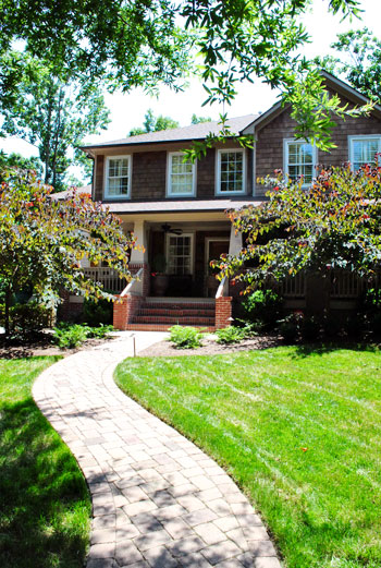
We do our best to crash a variety of homes, both old and new, big and small, traditional and modern, expensivo and super cheap, etc. This one falls into the glamorous high-end realm, but its cup runneth over with adaptable ideas – even if you’re on a tight budget. So we’re happy to bask in the inspirational eye candy (and pass it along to you guys of course). As we mentioned in yesterdays post, this gorgeous home is located in Charlotte, NC. So on with the tour. Here’s the charming exterior:
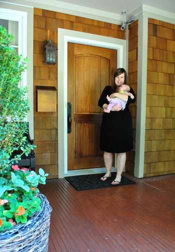
And here are Jennifer and her sweet six week old daughter Eleanor to let us in:
Here’s the gorgeous view that greets you when you step in the front door, which you might recognize from yesterday’s surprise-we-were-road-tripping post. Seriously, I pretty much walked into this house and went crazy with delight and excitement. So sorry for jabbering mindlessly and running around screaming, Jennifer. Your house is just too much goodness for my brain to handle.
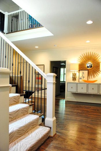
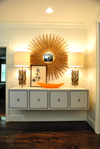
When it comes to that gorgeous tonal zebra carpeting on the stairs, it’s by Stark. And that gigantic mouthwatering mirror is from Circa (well, I’m 90% sure that’s what she said – remember my brain was exploding). I think the lights on the floating console are also from Circa, but I’ve seen dead ringers at HomeGoods along with other starburst mirrors. So checking there (or at their sister stores: TJ Maxx or Marshall’s) can help you get the look for less. And speaking of that floating console, how cool is that? Finding a four-drawered piece like that at a thrift store or garage sale and adding nail heads around the edge of each drawer along with ring hooks could mimic the look. You could even remove the legs and mount it on the wall like Jennifer did. The girl is creative to the nth degree.
Behold, the kitchen. The cool thing is that it wasn’t a massive space but Jennifer made the most out of it by adding as much function (along with a heaping portion of form) as she could. The steel pendants (by Visual Comfort) provide task lighting for the island, which is packed with useful range space as well as food prep area on either side and a spot to sit and eat in front of the cooktop. And instead of using pricey granite or marble, Jennifer actually chose poured concrete for the top of the island, which was molded to wrap around the base of the cabinets on each side like a parsons desk. I was in lurve (she also said it held up really well for those considering DIYing concrete counters like this previous House Crashing homeowner did here).
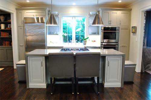
There were two small areas next to the sink with marble, but it was actually scored as a remnant to save loot (using concrete for the majority of the kitchen was definitely a money saving choice). And how great are those simple clean-lined shelves on either side of the window? So simple and sweet. The faucet is Rohl (I love the raised neck) but overstock.com often has similar looking versions for those on a budget (you might have to check back a few times since they seem to go fast).
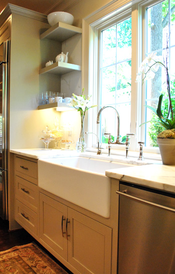
Oh and did you notice that cluster of items under the shelves in the photo above? I loved this idea. Jennifer got a few glass apothecary jars (HomeGoods, Marshall’s, and TJ Maxx sell these for under $15) and filled them with kitchen stuff like granola, pretzels, and cookies. Such a chic way to dress up any counter.
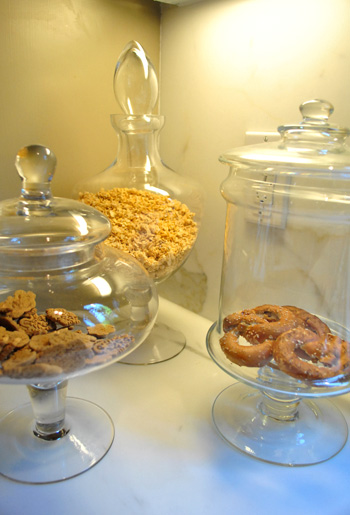
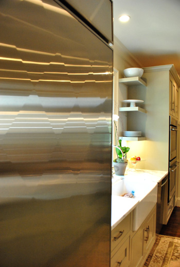
And file this under never-seen-it-before-but-I-went-crazy. The fridge is “quilted” with a cool diamond pattern that actually bumps out ever so slightly to create a faceted textured look. Jennifer went with standard GE appliances, but she sent the door of her fridge to a guy in Atlanta who added the special detailing for a completely customized look.
Beyond the kitchen was the dining room, which was a gorgeous contrast to the light and lovely space.
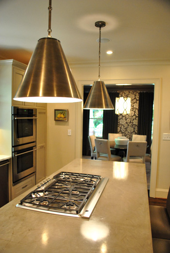
It felt moody and luxe thanks to darker tones (in that stunning wallpaper and those great gray velvet drapes). If you’re looking to recreate this look on the cheap you could always experiment with a light gray stencil on a dark gray wall. You could even dye some $7 Ikea curtains (we like the Vivan ones) in a deep gray tone. It won’t be completely the same (the sheen of the wallpaper and the texture of the velvet curtains is amazing) but it would definitely swank things up and add that moody vibe.
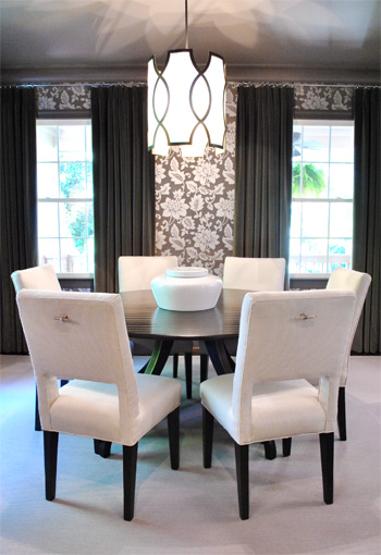
And how amazing is the light fixture? This picture doesn’t even do it justice (it’s by Baker). You can kind of see the shadows that it casts on the ceiling but it was ten times cooler in person. Oh and look closely at the chairs above. See those cool hardware handles on the back of each one? Those are also the brainchild of Jennifer, who added them because she thought it would be easier to pull them out (and they might save the upholstery a bit more since grubby hands won’t constantly be gripping the sides). Is she a thinker or what? I love that no detail was left unaddressed. Especially since I know firsthand how hard it is to have focus like that when you’re furnishing a house (it’s so easy to get caught up in the big stuff and forget about all the cool little finishing touches that make a room feel personal and functional).
Here we have the cozy living room with a gorgeous ottoman that I wanted to strap on top of our Altima and take home. It was covered with this amazing painted fabric. That’s right, I said painted fabric. It was a velour/velvet type upholstery that was stenciled with paint and then weathered/distressed/worn down so it looked irregular and tonal and amazing. The weathering process (sanding it down) made it soft, so it didn’t feel crunchy or hard. Just textured and special. I’ve never seen anything like it.
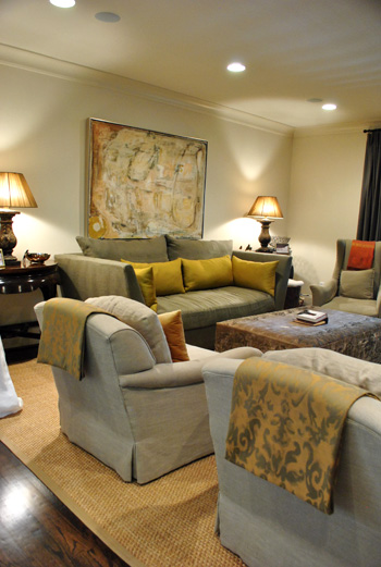
So for anyone brave enough to try stenciling velvet our velour with watered down paint and then sanding it with high grit sandpaper for a weathered and worn in look, I can tell you firsthand that it might just be the coolest thing you ever do. In your life. Ok that might be an exaggeration (creating a human or graduating college might be up there too).
Oh and see those pieces of fabric folded over the top of each arm chair? Once again Jennifer used her brainpower to creatively solve a problem. Her cat loves to jump up from the floor to the back of her chairs, so draping some pretty fabric over the back of each chair was her solution to keep the chair’s upholstery from being clawed (it’s much easier to switch out the draped fabric if it gets ruined than redo the chair). Smart right? And that’s something you can make with a fabric remnant and some Heat N Bond (or a sewing machine if you’re getting braver every day like I am).
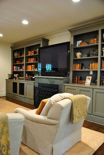
Aren’t those built-ins gorgeous? I loved the elegant greeny-gray color (try Benjamin Moore’s Senora Gray for a similar look), and the hidden storage underneath will definitely come in handy when it comes to stashing Eleanor’s toys.
Since Jennifer loves to add unexpected pattern and texture from room to room (like her light kitchen next to her ornate wallpapered dining room), she thought the small powder room was the perfect place for a little more wallpapered drama. It was a very small room so we were really impressed with her bravery (bold pattern, dark trim, dark sink) but it looked like a bling-y little jewel box instead of a tiny and bland little builder bathroom, so it was such a great call.
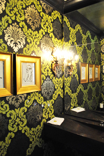
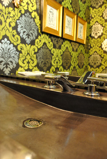
I also loved the dark modern sink, which was poured concrete just like the kitchen island. And the faucet is by Kohler (so sexy, right?) which often ends up on overstock.com or a place like plumbersurplus.com for those in a deal-hunting mood.
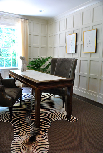
This room is a little office/bill paying area that was another modestly sized space that Jennifer maximized with a skinny floating desk and two comfy chairs (so much more inviting than traditional office chairs and still just as functional). And those amazing paneled walls make you notice the luxe architecture of the room instead of how small it is. As for how they attained that paneled look, it’s just cheap wood from the home improvement store that they used to create a rectangular grid pattern with molding around the edges to finish each one off. Then they just painted it all for a seamless effect.
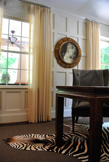
Oh yeah and this mirror is another thing I wanted to sneak out with. How pretty is that patina-riddled glass? It’s an antique from Circa, but there are tutorials online for antiquing your own mirror (like this one), so finding something new and then glazing the frame and patina-ing the glass could yield something similar on a budget.
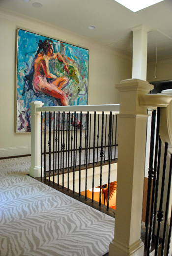
Jennifer and her husband are hardcore art collectors, and one of their favorite pieces is this giant figure by Carl Plansky. It’s such an amazing focal point in a hallway without much else going on (except for that cool zebra runner which snaked upstairs). A giant abstractly painted canvas (made by you) or even a large wooden frame with colorful fabric stretched around it could add similar color and boldness.
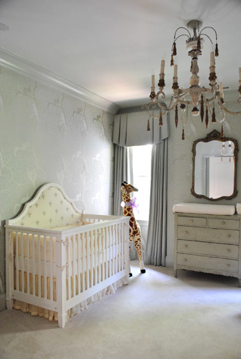
And of course little Eleanor needed a nursery to call her own, and Jennifer didn’t spare a single detail. The gorgeous chandelier is from Circa and the dresser is actually her own childhood dresser that she painted to work with the wallpaper.
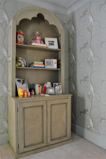
Speaking of the wallpaper, here’s a shot that might be easier to make out. It was actually these tone on tone vines that snaked up the wall with squirrels and birds on some of the branches. So sweet yet sophisticated. I felt like I was in an enchanted forest.
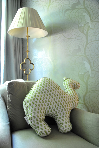
And you know I love a good quatrefoil worked in there, so of course this lamp was yet another thing I wanted to grab while screaming “what’s that over there?” and running out to the car with it while Jennifer looked the other way. But I didn’t. It looked perfect right where it was. And how cool is the camel pillow (by Rikshaw Design)? I love how it layers in with the tones of the room while adding more of that “enchanted animals” vibe from the wallpaper and the giant giraffe near the crib. Clara was in love with this room (and that camel pillow in particular).
So there you have one of three house crashing adventures (well one was actually an office crashing) of which we partook during our weekend road trip. We’ll be back to share the other two in a little while (we don’t want them to be jammed on top of each other and we’re still waiting on some source info for those, but they’re definitely coming within the next week or two). Oh but we can’t sign off without sending a huge thank you to Jennifer and her sweet family for so graciously letting us in to snap photos for you guys (even with such a fresh little newborn around)! They were amazing and we’re so happy that we were able to stop by. Now let’s play the what’s-your-favorite-part game. Mine is the floating nailhead console with the sunburst mirror over it. And the poured concrete counter that runs up and down the side of the island. Le sigh.
Psst- Wanna check out other house crashing adventures? We have them all right here.
More random pssst- Is anyone else watching The Voice? I’m in love with Dia and Xenia. Who are your picks?

Lisa in Seattle says
I am making grabby hands at the quatrefoil lamp and the squirrel/bird wallpaper! I love the scale of her furnishings and decor items. I end up with a lot of little things that just look kind of rubbishy because I’m too scared to GO BIG and go fewer – which in this house was clearly the right thing to do. I think this is one of those houses where as beautiful as the pictures are, the actual 3D space would be stunning and would feel so good to move around in. ::flails incoherently::
Cindy says
Loved Jennifer’s house! It’s beautiful and she has some great ideas. Sherry, I love your commentary, you are a gifted writer and so witty too! You make viewing the pictures so much more fun and interesting (I felt like I was running around with you oohhing and aahhing).
Keep up the great posts!
Cindy
Jennifer says
I don’t know what Jennifer does for a living, but I think she SHOULD be a decorator. WOW! GORGEOUS, GORGEOUS HOME!!
bonniek says
Wow. Just wow! Jennifer has an amazing sense of style and her contrast of calm with bold is fantastic. I am truly in love with the zebra-print runner (brilliant and fearless), the dining room (I didn’t love the shape of the chairs, but her idea to put handles on them is fantastic and I much prefer a round table), and the art! And the nursery, so swanky. Oh to have a house that I own, why DC…why must you be the only still-unaffordable housing market in the country?!
Caitlin @ Desert Domicile says
I’m DYING over that zebra runner/carpeting on the stairs! That starburst mirror and floating console table are also pretty fantastic and I love the little handle details on the back of her dining chairs!
AMAZING!!!
LIsa P says
AMAZING!! I was wondering if you have any suggestions on attaching the hardware handles on the back of dining room chairs as Jennifer did? I have very similar chairs and that is so clever, but I would be frightened to start making holes!
One more thing – love the giraffe in Eleanor’s room! Do you know if that is Melissa and Doug?
YoungHouseLove says
Here’s hoping Jennifer can get back to you about the giraffe. As for the hardware, I agree that it would be really scary to make holes. I think the key is to make sure where you’re adding them is solid wood inside (and not just batting or stretched fabric) so you can drill a little pilot hole into the wood and just screw in the hardware (you might want to use a small anchor and sink the screw into that to hold it nice and securely). Still sounds scary though! Maybe practice on a cheap thrift store or garage sale chair first?
xo,
s
Kamantha says
Would this be a good thing to do when you are getting a chair reupholstered? I figure the batting/stuffing has been removed and you can see where to attach the hardware… Cool idea!
YoungHouseLove says
Oh yes – if you’re getting something upholstered the ideal time to add the hardware would be when the chair is stripped down I would think (or at least to use that opportunity to prep the chair to “receive” the hardware and then recover it and then screw it in).
xo,
s
Amanda says
Aubrey & Lindsay (http://aubreyandlindsay.blogspot.com/) has that Giraffe and they bought it from Mastermind Toys (http://www.mastermindtoys.com/)
Ann-Marie says
So funny how different people and their tastes are. The only thing that excited me in this whole house was the farmhouse sink in the kitchen, and you didn’t even mention it. To each their own! :)
r8chel says
Wow – that’s quite a house!! It’s not my style at all, but it’s certainly impressive. Just looking at the front of the house from the curb, I’d never guess that the interior looked so posh!
Patti says
I’m in love with this entire house! The first impression as you walk in the door photo is like POW! I love the zebra stairs and the console with those great lamps and mirror. But my favorite part is the dining room, it’s absolutely sexy.
Mackenzie says
Any idea of the source for her crib? It may be the cutest one I’ve ever seen. I would LOVE to snag something similar (or identical!) when we start the little ones phase in a couple of years..
YoungHouseLove says
Here’s hoping she stops by to answer that question for ya.
xo
s
Lindsay says
OMG I have to have that Zebra carpet! I love love love this house to death. If you need an assistant house crasher, I think I would qualify :)
Crystal says
My favorite was definitely the concrete sink in the small bathroom! But the fridge design was a super close second!! I’m feeling some pinning coming on :)
Kendra says
Sorry if this has already been answered, but where did she send her fridge panel to get the design? That is amazing!
YoungHouseLove says
She just mentioned that it was a guy in Atlanta. Maybe she’ll drop in with more info for ya?
xo,
s
kristen f davis says
that was awesome. i stole pretty much all of the photos for inspiration. i looooove her kitchen! and nursery! and that floating console is pretty genius.
Kathleen says
Wow! Such a beautiful house!
By the way, I’m in love with The Voice! Patrick is my favorite. He’s cute and I love his voice :)
Jeannine says
In awes, thank you for this post. I love seeing how to make a house fun yet sophisticated and pulled together without being stuffy. Gorgeous!
christyl says
Ugh! I love this house. How is one person so creative? Honestly love your ideas, tips, house crashing. Maybe one day I’ll have my own house (renting, boo!)to experiment with. Maybe, by then, my casa will be crash-worthy. lol.
Kate says
That home is AMAZING!!! I loved every room… jaw dropping gorgeous. I also have a six week old at home… I kept looking for her laundry piles and dirty diapers laying around?? :)
I’m addicted to the voice… definitely cheering for Xenia! So cute and humble.
Sherry, did you notice tension between the judges? It seemed like men vs. Christina.
Glad you had a nice time on your vacation. : )
YoungHouseLove says
Yes! It’s so funny because I never used to like Adam Levine (he seemed like a womanizer, I don’t know) and now I think he’s awesome and I love him and Blake. And of course Cee Lo is so funny and sweet. I think Christina is the one I thought I’d love but maybe it’s her wardrobe and her arguing that’s throwing me off. I think they encourage them to banter and tease each other, but it’s definitely weird sometimes!
xo,
s
carolinaheartstrings says
Beautiful home outside and in. Tons of good ideas you passed along too. Thanks.
Jessica says
Quick question…what is your posting schedule? Just curious which days you only post once? Like today for example? haha! I’m dying to hear more about your trip so I keep refreshing the YHL page, and no luck! I’ve been following for a few months and I know you’re pretty consistent, but I just can’t seem to get the flow of things together in my mind.
Jessica says
maybe it’s because i read at work and every day feels like a monday….haha
YoungHouseLove says
We’re not always very regular when it comes to posts (that’s one of the perks of blogging- hah) but we’re sure to share at least eight posts every week. Most of the time it’s two posts a day on Monday, Tuesday, and Thursday and one post on Wednesday and Friday but it definitely changes to include a second one on Wed and Fri sometimes. We even have a random weekend one from time to time. Hope it helps!
xo,
s
erica says
This is my FAVORITE house crashing BY FAR. I absolutely love love love everything.
Elisa says
My fav part is definitely the upholstery on the baby’s crib. Such a luxurious little detail :)
Danielle says
WOW! That house is amazing! Beautiful from top to bottom. Thanks so much for sharing!
Karen says
The exterior makes my heart swoon. Big time. I am a sucker for shaker shingles.
JR says
Love it (esp. the kitchen), but the zebra skin grosses me out!
Kamantha says
Where did she get the round chocolate dining room table that seats six????
YoungHouseLove says
Here’s hoping Jennifer drops in with that info!
xo,
s
Kelsey Noble says
I think the wallpaper in the nursery is amazing! It took a little getting used to at first for a kid’s room, but I’m loving the thought of it for a study/library/writing room. Any chance you know the name of the wallpaper or where she got it?
YoungHouseLove says
So sorry not sure. Hopefully Jennifer will drop in to answer all these questions! With a little baby I’m sure she doesn’t have much free time, but here’s hoping!
xo,
s
Alyssa says
Amazeballs!!!!!!! I love her house and my fav was the zebra carpet runner! I was so happy to see it continued up to the hallway/top of stairs area since I’m sure just on the stairs wouldn’t have been enough:) Thanks for the crash guys and beautiful house Jennifer:)
Kamantha says
Are those cedar shingles on the outside? And is that a video camera overhead at the front door?
Just too many things to love and lurv!
YoungHouseLove says
Yes and yes. I think. Maybe Jennifer will confirm for ya!
xo,
s
Jen @ The Decor Scene says
OMG what a gorgeous home. Thanks for sharing the tour with us. I’m lovin’ that zebra runner and her kitchen is gorgeous!!!
Dacia says
Those concrete counter-tops are to die for! I’ll definitely be keeping those in mind for future kitchen renovations. Also, Dia is amaaazing, her rendition of ‘Heartless’ was seriously so perfect.
Samantha says
Too fancy for me but I like the apothecary jar idea.
K says
Wow, I stinkin’ love this house. I feel like it is the epitome of the bold-yet-traditional approach you see so many people trying for these days. I think the floating console is my favorite piece!
I also thought I should chime in to say that I, too, am obsessed with The Voice. I have never watched shows like this before … not sure what made me get hooked on this one. Dia and Xenia are my for-sure favorites, too!
GHL says
Love that floating console, but I also love this: http://www1.bloomingdales.com/catalog/product/index.ognc?ID=456679
I wonder if I can paint an Ikea Lack shelf and get a decent hybrid of the two. Probably not?!
YoungHouseLove says
You can! Go for it! And post pics on our Facebook page! We’d love to see how it all turns out!
xo,
s
GHL says
Okay — I’ll do it! If it stinks I’m not too invested. The main goal is to have some place pretty for these:
http://www.bobointriguingobjects.com/bobo_web/Decorative_Items/Entries/2008/8/12_mounted_star_halo___3_sizes.html
I just got them the other day!
YoungHouseLove says
So pretty! Can’t wait to see how it turns out!
xo,
s
QS says
I think I’m going to take my console out to the garage and cut off its legs!
Sorry if this has already been mentioned, but I always wonder this about your house crashing posts: I would love to know the square footages of the homes you crash just to get some type of perspective and to see if I could recreate some of the room ideas (I have a small house). Just an idea. ;)
YoungHouseLove says
Love it! We’ll have to try to remember to ask! We generally don’t share all of the rooms (don’t want to crowd people, haha- especially since people like Jennifer have all sorts of baby stuff in the bedroom so we steered clear) but square footage would definitely give people an idea of the space.
xo,
s
Ashley @ DesignBuildLove.co says
what an absolutely GORGEOUS house! I literally read every.single.word because I wanted to know every detail! That zebra carpet is amazing! All the light fixtures and mirrors from Circa are amazing too. Overall, my favorite rooms are hands-down, the kitchen, dining room, and living rooms!!!
Renee says
Hey guys, I’m a daily follower of your blog for almost 3 years, and I want to share an observation of a change in the way this type of post is being presented – maybe your intention in sharing this type of post has changed – I don’t know. For what it’s worth, it seems like your House Crashing feature has shifted from showcasing interesting and beautiful homes of different styles and budgets (like a nicely narrated series of inspiration photos) to a shopping list for how little you can spend to replicate a home’s style at *insert name of less expensive home store here*. This home is beautiful, and I can certainly appreciate that some, if not all, of these looks can be easily/inexpensively replicated – in fact, I am bookmarking it as inspiration for counters and color.
I just wanted to share that the content of this post (which is excellent) feels watered down by so many parenthetical suggestions for less expensive replicas. I looked back at a few of my favorite House Crashing posts that have been hugely inspiring to me, and this appears to be a new convention in your writing style while sharing this type of content. I expect and appreciate this kind of thing in most of your posts, but felt distracted from the house in this post by all the suggestions. Love this house, love this blog, and want to offer feedback as a committed follower.
YoungHouseLove says
Thanks Renee! Since this house wasn’t full of links to a blog with instructions or DIY details (like many of the other homes that we crash) I just wanted to toss in some ideas for folks who might otherwise think this house was out of reach! Hope that makes sense. I think we’re just used to being kind of instructional (as opposed to just sharing pretty pictures, which we love but just can’t seem to do without jabbering on). I’m also just a fool for parenthesis. Seriously, I think I average ten per post. Just can’t help myself.
xo,
s
Jessie says
I actually like the “less expensive alternative” suggestions. A person like me would NEVER be able to afford the things in that house, but it’s nice to get suggestions of how I can achieve the same effect without breaking the bank.
Renee says
Ah ha! I hadn’t thought about the lack of blog, and that makes a whole heck of a lot of sense. I definitely prefer the narrated-inspiration-photo style of former House Crashing features (complete with parenthetical this is from here that is from there info), but not having any other place to get info about this house, I dig where you’re coming from (not to mention it IS your blog). I’m also a parenthesis fool, and I think a big draw for me is that you guys DO jabber on and on about things – brevity is not my thing, either!
Kamantha says
Can she also give us some information about the flooring color? Is that walnut?
YoungHouseLove says
That would definitely be my guess! Here’s hoping she drops in soon with that info for you guys.
xo,
s
Andrea says
IN LOVE! I live in Charlotte, wish I had found a house so amazing but am guessing where it is and would be a BIT out of our price range, but am LOVING it! Definite inspiration for ideas and for our next place! :-) Thanks for sharing!
Oh and where is that fabric store you mentioned?
YoungHouseLove says
We’re not sure of the exact address but it’s off of 85 (I think it’s exit 21 just south of Charlotte). Maybe try google to be sure?
xo,
s
threadbndr says
Lovely home – I like the built=ins in the living room. Such a pretty colors in that room and I like the ‘cat proof’ chairs LOL.
The wall paper in the nursery is so sophisticated that it can go all the way to the teen years. I made the mistake of a bright ‘cartoon’ nursery and ended up re-wall papering four times between birth and high school (Bears, dinos, NASCAR and Goth) – LOL. Needless to say, that room is now ready for a NEW incarnation – as a proper guest room and I’m so thinking “PAINT” not wallpaper LOL.
Robyn @ Imperfect Nest says
I could not help myself. I had to do a post on the entry as soon as I saw your crash. Of course, proper credit was given. It’s the polite thing to do. Plus, this is just a beautiful home. I would totally have been running from room to room snapping pics, too.
http://imperfectnest.com/i-love-this-entry/
Noelle says
I am definitely in love with this house. I do have one question was the zebra print carpet a runner over hardwood floors or was it just carpet? If that makes sense. Anyway that is one stylish woman. That house should absolutely be featured all over the place :)
P.s. I totally pinned some of these pics. Thank you petersiks family and your friends for having such amazing taste.
YoungHouseLove says
It was definitely adhered in place like a stair runner that continued down the hallway upstairs. Hope it helps!
xo,
s
Michelle Lynne says
This has to be one of my favorite crashes. Definitely. Possibly THE favorite.
Karla says
Thank you for another great House Crashing.
I was pinnin’
New verb?!
As for the Voice, I think this show might have cured my allergy to singing competition shows! I am glad to hear that you are rooting for my two fave signers. Dia’s creative is amazing. Hello, she sang Kanye. As for Xenia, her voice has an awesome raspy maturity to it. Can’t wait to hear Javier next week. Oh, I also love Beverly. I adore someone so comfrtable in their own skin. Speaking of being comfortable in her own skin – Christina needs to embrace her new body shape. Seems like the clothes have been the once embracing her…a little too tightly.
YoungHouseLove says
Comment of the day for the embracing pun. Hilarious.
xo,
s
Julia says
Not to be psycho, but what area of Charlotte is this in? I’m hoping to convince my die hard west coaster of a husband we need to move to Charlotte (from CA). I’m originally from the south and would love to move back someday. This home is just beautiful. Maybe just suggestions for nice neighborhoods with good schools – doesn’t have to be this particular neighborhood if you’re worried about privacy :)
YoungHouseLove says
I’m not really sure about the area but I think it was near a spot called Chantilly? That general area is so pretty!
xo,
s
AT says
This is so off-topic, but Sherry – you are officially a “tastemaker” on Pinterest. Stunning rise to fame!
YoungHouseLove says
That’s so crazy. Don’t tell them I’m not fancy enough for the title. Haha.
xo,
s
Kristina says
Yes, I definitely pinned a few times. Her house was amazing. I pinned the Cedar Shakes, the Zebra rug, and the paneling. Beautiful!
Erin says
This might have already been asked and answered… Sorry if so, but where is the lamp from? I just LOVE it!
YoungHouseLove says
The one in the nursery is from Circa. Hope it helps!
xo,
s
Jordan G @ The Happy Homebodies says
What a beautiful home! I love the cedar shingles on the house exterior and the gorgeous runner on the stairs. She did a fabulous job!
priscilla says
Lovely home! That paneling can be done by anyone with a little carpentry experience. We did it 30 years ago on a two story stairway wall. We measuered the width of the wall, divided it by the size of the wood pieces (including trim) and worked out the exact placement for each strip of wood. Then we bought cheap 1×4 lumber and nailed them up. Next we used the miter box to cut the interior molding for each square. It took a lot of time, but we worked on it gradually for several weeks so that we did not burn out. We then stained it a beautiful mahogany.
People would walk in and go crazy over that wall, even though it really didn’t cost much to do. I will say, it was very labor intensive, but oh so worth it!
YoungHouseLove says
Love it! Thanks so much for sharing those steps! It sounds gorgeous!
xo,
s