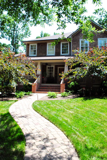
We do our best to crash a variety of homes, both old and new, big and small, traditional and modern, expensivo and super cheap, etc. This one falls into the glamorous high-end realm, but its cup runneth over with adaptable ideas – even if you’re on a tight budget. So we’re happy to bask in the inspirational eye candy (and pass it along to you guys of course). As we mentioned in yesterdays post, this gorgeous home is located in Charlotte, NC. So on with the tour. Here’s the charming exterior:
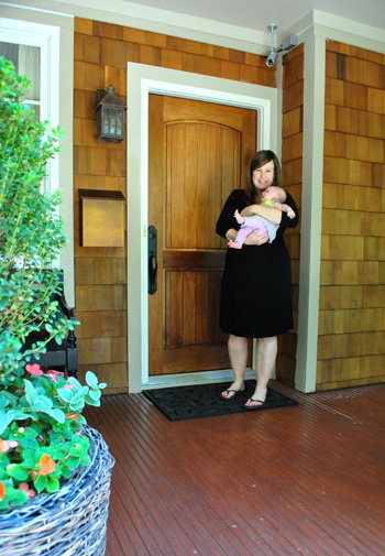
And here are Jennifer and her sweet six week old daughter Eleanor to let us in:
Here’s the gorgeous view that greets you when you step in the front door, which you might recognize from yesterday’s surprise-we-were-road-tripping post. Seriously, I pretty much walked into this house and went crazy with delight and excitement. So sorry for jabbering mindlessly and running around screaming, Jennifer. Your house is just too much goodness for my brain to handle.
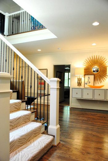
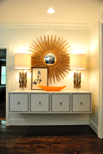
When it comes to that gorgeous tonal zebra carpeting on the stairs, it’s by Stark. And that gigantic mouthwatering mirror is from Circa (well, I’m 90% sure that’s what she said – remember my brain was exploding). I think the lights on the floating console are also from Circa, but I’ve seen dead ringers at HomeGoods along with other starburst mirrors. So checking there (or at their sister stores: TJ Maxx or Marshall’s) can help you get the look for less. And speaking of that floating console, how cool is that? Finding a four-drawered piece like that at a thrift store or garage sale and adding nail heads around the edge of each drawer along with ring hooks could mimic the look. You could even remove the legs and mount it on the wall like Jennifer did. The girl is creative to the nth degree.
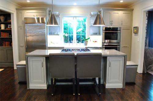
Behold, the kitchen. The cool thing is that it wasn’t a massive space but Jennifer made the most out of it by adding as much function (along with a heaping portion of form) as she could. The steel pendants (by Visual Comfort) provide task lighting for the island, which is packed with useful range space as well as food prep area on either side and a spot to sit and eat in front of the cooktop. And instead of using pricey granite or marble, Jennifer actually chose poured concrete for the top of the island, which was molded to wrap around the base of the cabinets on each side like a parsons desk. I was in lurve (she also said it held up really well for those considering DIYing concrete counters like this previous House Crashing homeowner did here).
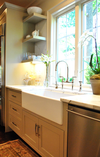
There were two small areas next to the sink with marble, but it was actually scored as a remnant to save loot (using concrete for the majority of the kitchen was definitely a money saving choice). And how great are those simple clean-lined shelves on either side of the window? So simple and sweet. The faucet is Rohl (I love the raised neck) but overstock.com often has similar looking versions for those on a budget (you might have to check back a few times since they seem to go fast).
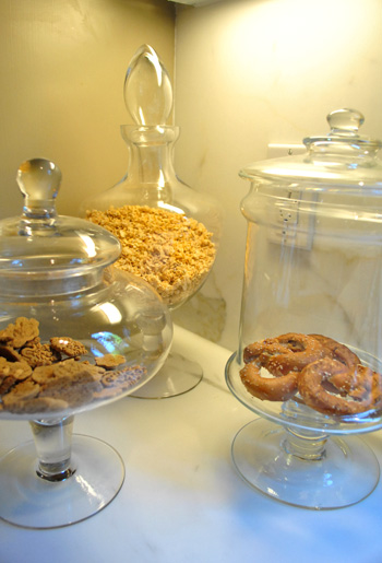
Oh and did you notice that cluster of items under the shelves in the photo above? I loved this idea. Jennifer got a few glass apothecary jars (HomeGoods, Marshall’s, and TJ Maxx sell these for under $15) and filled them with kitchen stuff like granola, pretzels, and cookies. Such a chic way to dress up any counter.
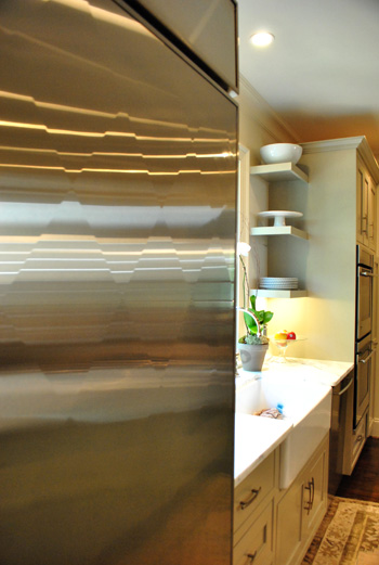
And file this under never-seen-it-before-but-I-went-crazy. The fridge is “quilted” with a cool diamond pattern that actually bumps out ever so slightly to create a faceted textured look. Jennifer went with standard GE appliances, but she sent the door of her fridge to a guy in Atlanta who added the special detailing for a completely customized look.
Beyond the kitchen was the dining room, which was a gorgeous contrast to the light and lovely space.
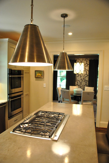
It felt moody and luxe thanks to darker tones (in that stunning wallpaper and those great gray velvet drapes). If you’re looking to recreate this look on the cheap you could always experiment with a light gray stencil on a dark gray wall. You could even dye some $7 Ikea curtains (we like the Vivan ones) in a deep gray tone. It won’t be completely the same (the sheen of the wallpaper and the texture of the velvet curtains is amazing) but it would definitely swank things up and add that moody vibe.
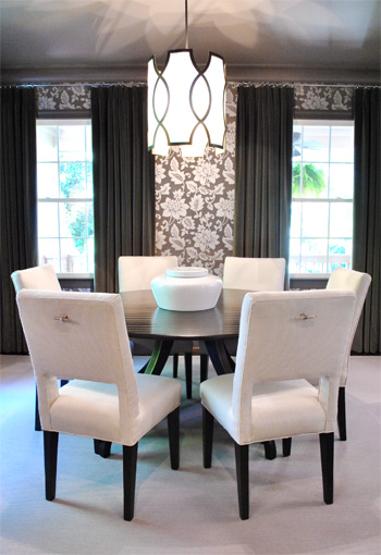
And how amazing is the light fixture? This picture doesn’t even do it justice (it’s by Baker). You can kind of see the shadows that it casts on the ceiling but it was ten times cooler in person. Oh and look closely at the chairs above. See those cool hardware handles on the back of each one? Those are also the brainchild of Jennifer, who added them because she thought it would be easier to pull them out (and they might save the upholstery a bit more since grubby hands won’t constantly be gripping the sides). Is she a thinker or what? I love that no detail was left unaddressed. Especially since I know firsthand how hard it is to have focus like that when you’re furnishing a house (it’s so easy to get caught up in the big stuff and forget about all the cool little finishing touches that make a room feel personal and functional).
Here we have the cozy living room with a gorgeous ottoman that I wanted to strap on top of our Altima and take home. It was covered with this amazing painted fabric. That’s right, I said painted fabric. It was a velour/velvet type upholstery that was stenciled with paint and then weathered/distressed/worn down so it looked irregular and tonal and amazing. The weathering process (sanding it down) made it soft, so it didn’t feel crunchy or hard. Just textured and special. I’ve never seen anything like it.
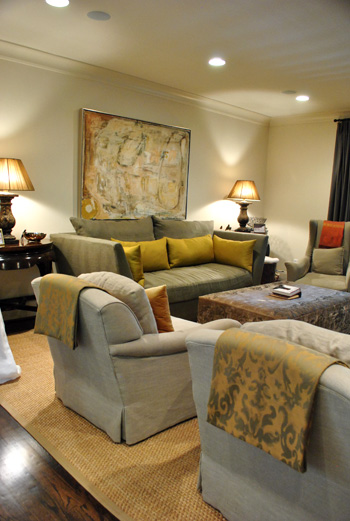
So for anyone brave enough to try stenciling velvet our velour with watered down paint and then sanding it with high grit sandpaper for a weathered and worn in look, I can tell you firsthand that it might just be the coolest thing you ever do. In your life. Ok that might be an exaggeration (creating a human or graduating college might be up there too).
Oh and see those pieces of fabric folded over the top of each arm chair? Once again Jennifer used her brainpower to creatively solve a problem. Her cat loves to jump up from the floor to the back of her chairs, so draping some pretty fabric over the back of each chair was her solution to keep the chair’s upholstery from being clawed (it’s much easier to switch out the draped fabric if it gets ruined than redo the chair). Smart right? And that’s something you can make with a fabric remnant and some Heat N Bond (or a sewing machine if you’re getting braver every day like I am).
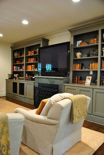
Aren’t those built-ins gorgeous? I loved the elegant greeny-gray color (try Benjamin Moore’s Senora Gray for a similar look), and the hidden storage underneath will definitely come in handy when it comes to stashing Eleanor’s toys.
Since Jennifer loves to add unexpected pattern and texture from room to room (like her light kitchen next to her ornate wallpapered dining room), she thought the small powder room was the perfect place for a little more wallpapered drama. It was a very small room so we were really impressed with her bravery (bold pattern, dark trim, dark sink) but it looked like a bling-y little jewel box instead of a tiny and bland little builder bathroom, so it was such a great call.
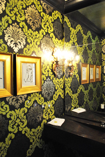
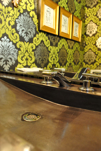
I also loved the dark modern sink, which was poured concrete just like the kitchen island. And the faucet is by Kohler (so sexy, right?) which often ends up on overstock.com or a place like plumbersurplus.com for those in a deal-hunting mood.
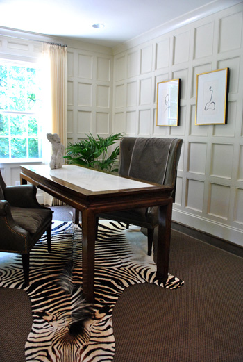
This room is a little office/bill paying area that was another modestly sized space that Jennifer maximized with a skinny floating desk and two comfy chairs (so much more inviting than traditional office chairs and still just as functional). And those amazing paneled walls make you notice the luxe architecture of the room instead of how small it is. As for how they attained that paneled look, it’s just cheap wood from the home improvement store that they used to create a rectangular grid pattern with molding around the edges to finish each one off. Then they just painted it all for a seamless effect.
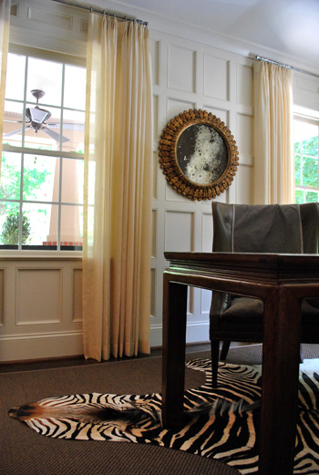
Oh yeah and this mirror is another thing I wanted to sneak out with. How pretty is that patina-riddled glass? It’s an antique from Circa, but there are tutorials online for antiquing your own mirror (like this one), so finding something new and then glazing the frame and patina-ing the glass could yield something similar on a budget.
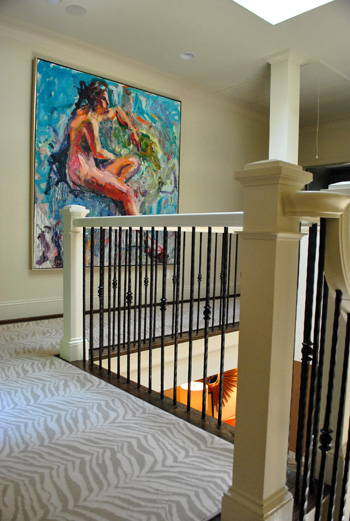
Jennifer and her husband are hardcore art collectors, and one of their favorite pieces is this giant figure by Carl Plansky. It’s such an amazing focal point in a hallway without much else going on (except for that cool zebra runner which snaked upstairs). A giant abstractly painted canvas (made by you) or even a large wooden frame with colorful fabric stretched around it could add similar color and boldness.
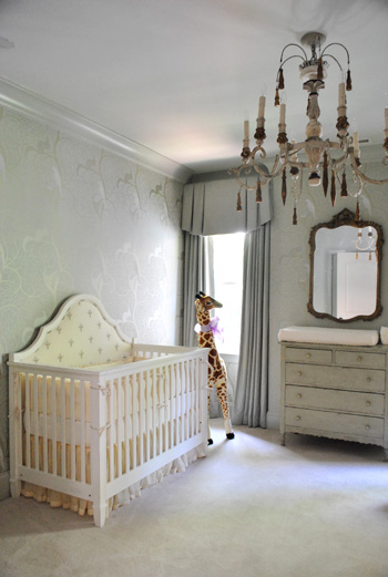
And of course little Eleanor needed a nursery to call her own, and Jennifer didn’t spare a single detail. The gorgeous chandelier is from Circa and the dresser is actually her own childhood dresser that she painted to work with the wallpaper.
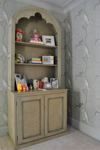
Speaking of the wallpaper, here’s a shot that might be easier to make out. It was actually these tone on tone vines that snaked up the wall with squirrels and birds on some of the branches. So sweet yet sophisticated. I felt like I was in an enchanted forest.
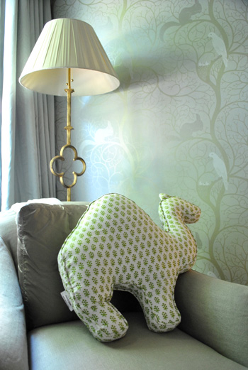
And you know I love a good quatrefoil worked in there, so of course this lamp was yet another thing I wanted to grab while screaming “what’s that over there?” and running out to the car with it while Jennifer looked the other way. But I didn’t. It looked perfect right where it was. And how cool is the camel pillow (by Rikshaw Design)? I love how it layers in with the tones of the room while adding more of that “enchanted animals” vibe from the wallpaper and the giant giraffe near the crib. Clara was in love with this room (and that camel pillow in particular).
So there you have one of three house crashing adventures (well one was actually an office crashing) of which we partook during our weekend road trip. We’ll be back to share the other two in a little while (we don’t want them to be jammed on top of each other and we’re still waiting on some source info for those, but they’re definitely coming within the next week or two). Oh but we can’t sign off without sending a huge thank you to Jennifer and her sweet family for so graciously letting us in to snap photos for you guys (even with such a fresh little newborn around)! They were amazing and we’re so happy that we were able to stop by. Now let’s play the what’s-your-favorite-part game. Mine is the floating nailhead console with the sunburst mirror over it. And the poured concrete counter that runs up and down the side of the island. Le sigh.
Psst- Wanna check out other house crashing adventures? We have them all right here.
More random pssst- Is anyone else watching The Voice? I’m in love with Dia and Xenia. Who are your picks?

Steph @ BirdHouse Family says
Gorgeous house! There are some great design features but it doesn’t look too busy. I love the colors.
On a totally different note, Sherry – you need to check out this link:
http://www.gusandlula.com/2010/08/beaded-chandelier-tutorial.html
I remembered you saying that you wanted to DIY a similar chandelier on Pinterest. They did a great job!
YoungHouseLove says
Love it so much! Thanks for the link! Pinned. Hah.
xo,
s
Aron says
I love the houses in Charlotte and I adore this one!
Nancy says
A suggestion for Jennifer if she’s not ready to start a full fledged “design firm” yet…how about some design advice (aka mood boards) via email like Sherry used to do? Pretty please?
YoungHouseLove says
That’s so funny you say that! I told her all about mood boards and she seemed interested. Here’s hoping after the early baby days haze wears off that she gets into it if she’s still interested!
xo,
s
Anna says
This is by far my favourite house crashing so far! The fridge, the panelling, the dining room, oh my!! The zebra rug makes me queazy though, I hope it isn’t real.
Anna
Christine B says
My husband and I are richmonders but we did have a chance to live in charlotte for awhile. I dont know why we ever left! I love that arts and crafts style homes are so common down there! Maybe one day Richmond will catch up.
Natalie says
Any idea where she got the camel pillow? (sorry if someone already asked this)
YoungHouseLove says
That’s from Rikshaw Design (I think you can google them for more info). But someone else said there’s a tutorial for DIYing something similar floating around Pinterest!
xo,
s
Ally says
Hi Sherry and John,
I’ve read your blog for a while and really love it. (I also grew up in NoVa and knew a few guys in John’s class at TJ, so there’s the “home” factor too). I was shopping for throw pillows today and came across this and immediately thought of the fabric you bought over the weekend. http://www.target.com/DwellStudio-Target-Sevilla-Decorative-Pillow/dp/B002YLJ7CK/ref=sr_1_32?ie=UTF8&id=DwellStudio%20Target%20Sevilla%20Decorative%20Pillow&node=1038576|1287991011&searchView=list&searchSize=90&keywords=throw%20pillows&searchPage=2&searchNodeID=1038576|1287991011&sr=1-32&rh=subjectbin%3A3151061&searchBinNameList=subjectbin%2Cprice%2Ctarget_com_primary_color-bin%2Ctarget_com_size-bin%2Ctarget_com_brand-bin&searchRank=target104545&frombrowse=0&qid=1307575547
Thanks again for such a great blog.
And of course, wahoowa!
YoungHouseLove says
Fun! Love the link! There’s definitely something reminiscent of the fabric we snagged for sure!
xo,
s
Sarah says
Gorgeous home! I have a suggestion for you Sherry, that next time you write about a luxurious home like this, maybe you could refrain from so much of the “but you can get it cheaper (here)”.
I realize it must be a difficult line to walk, to make things accessible to everyone while still respecting the quality things this family has invested in.
It just felt through the whole post like you were belittling the home’s high quality finishes. I stopped reading when you suggested we could DIY an amazing piece of art like the Carl Plansky.
YoungHouseLove says
Thanks for the feedback! It’s definitely a delicate line to walk!
xo,
s
Jill says
Everything is beautiful, but I’m really coveting the tonal zebra carpeting. I wish I had that in my livingroom. She also has some amazing lighting.
Would you be able to tell us how to hang a table like that from the wall in the foyer? I’d love to try that, but we’re not really handy around here…
YoungHouseLove says
I would just get long wood screws and find a stud and go right through the back of the cabinet and into the stud with the screw. Should hold like crazy. You can also use heavy duty anchors in a few other spots to reinforce it. Just ask around at your hardware store and the pros there should show you what you need.
xo,
s
Sara says
Only one blog post today?! :(
YoungHouseLove says
Wednesdays are usually one-post-a-day days (the last ten or so have been). Although not always, we like to switch it up sometimes. In general we do two posts a day every Mon, Tues, and Thurs, and Wed and Fri are usually one post days. Well, sometimes we do two Friday ones too, just cause we’re giddy for the weekend. Haha.
xo,
s
Tannis says
Hi – I’m sitting trying to scroll through each post to see if Jen stops in to answer “that” (this was a comment back to a lot of us). Quick suggestion, if this post (and any others) result in a lot of questions about the home, and home owner chooses to answer them – maybe you can do a new post with “all questions answered” from X post? I’d love to see answers to everyone’s specific questions about this house, not just mine! Great house.
YoungHouseLove says
Thanks for the suggestion! We’re still waiting for Jennifer to drop in with those answers (having a newborn can be hairy) but when she does, all of her answers will be nested right below the questions. They’ll hopefully be nice and easy to spot since they’ll be indented under the original questions (and my possible response to that) and italicized. Just scrolling back to look for nested comments by Jennifer should hopefully work pretty smoothly once she stops in (we figure a whole new post about a few questions might be boring for readers who want new pics and info). Hope it helps!
xo,
s
Kimberly says
I could type everything I do like, or I could just make it easy and say the ONLY thing I don’t like is the Zebra rug in the office area. The sink in the bathroom is A-M-A-Z-I-N-G. I also love what she did with the door on the refrigerator. The whole house just blows me away.
Kendra says
So great…please please please what is the source of that natural rug in the living room??? I need to have it!!
YoungHouseLove says
I’ve seen dead ringers at Pottery Barn and Overstock, so here’s hoping that helps in the meantime (and Jennifer drops in sometime to answer questions whenever she has a moment)!
xo,
s
Laura Brand says
love love love this! everything about it makes me happy!
Elle says
Wow! That is such a beautiful home!
I love the dining chairs and the zebra carpet- its amazing, all of it :)
Momma Maggpie says
Such a lovely home, Rikshaw Design has so many wonderful things, here is the link to the pillow http://www.rikshawdesign.com/booti/camel_pillow.html
Lisa H. (bountifulchaosmom) says
Oh wow, thanks for this. It’s my style (but not my skill-set or bank-balance!) so I really enjoyed it. I may have to bookmark this one for future drooling.
And I HAVE to talk the hub, John, into the Zebra runner. Would your John be down with it? Or is it too girlie for most men, you think?
YoungHouseLove says
John is opposed to any and all animal print (even my beloved leopard shoes, of which I have two pairs). That said he loved the subtlety of the runner so I wonder if he could have bee convinced…
xo,
s
Shawn says
Now I have just spent way too long drooling over all of the beautiful lighting at the Circa website. Great house and great post – thanks!
valerie J. says
Wow! That is one amazing house. So many great ideas…I love that you guys do this! It’s way better than stalking real estate sites to see inside people’s houses. :)
Mia says
What an inspiring house crash! These pictures are going to be ALL OVER Pinterest. My favorite parts were the panelling in the office, the dining room chairs and the nursery; I know some people didn’t like nursery, but I find it refreshingly chic and sophisticated! Lucky little girl.
kalibrooke says
holy amazing. now that’s a grown-ups’ house!
Carrie says
I love the paneled walls in the office! This is being added to my infinitely growing home improvement list.
btw – I recently refound your blog and I love it! You have inspired me to get moving on the things I’ve been meaning to do for a long time. I look forward to reading your posts each day. Thank you!
Christine says
Great crash!
Also loving Dia and Xenia – favorites from the beginning!
Sherri says
Jennifer’s house is beautiful and she has an amazing sense of style. The living room and the ottoman are my favorite! How long did it take to complete her home re-do?
BTW, I just discovered your blog a few days ago and I’m hooked! You two are ingenious and I love your ideas. You should pitch your DIY projects to HGTV. You’d make perfect “design stars.” I’ve become tired of House Hunters, etc. They need more creative design shows. Just an idea.
YoungHouseLove says
Aw thanks Sherri! We’ve actually had some design show opportunities but are happy to avoid the whole tv thing (don’t wanna Jon & Kate ourselves, haha). Besides, we couldn’t blog and have a show at the same time and we just have to choose the blog! I guess we’re shy and happy to stay behind the safety of our computer screens. Haha. We’re dorks.
As for the timeline for this house makeover, here’s hoping Jennifer drops in with that info for ya.
xo,
s
megan beth says
I need this house. Fo real.
B @B Getting Hot says
Beautiful home. That entry way made me gasp! Loved it. Zebra print stair runner so fun. Zebra rug in office ugh! Gave me chills. Might be because I was just at the zoo with my niece and she was oohing and ahhing over the zebras. So to see one under the desk was grody (sp?) and a shame.
Robin @ 3 Acres & 3000 sf says
Wow I think this is the most glamorous house crash you’ve ever done! What awesome inspiration. Loved multiple things in each picture you posted.
I know you were trying to relate the design to your readers but sometimes inspiration needs to be just that. You can fill your home with all of the knockoff overstock lighting and DIY artwork you want but you aren’t going to get anywhere near that result. All I could see was $$$ reading this post far beyond the reach of the vast majority of your readers. I’m very familiar with Circa Lighting and the Visual Comfort brand they carry as I’ve been saving up to buy a pendant from them for a while and looked everywhere to find it for a lower price. Since deciding on this fixture Overstock has started to carry a knockoff of it. It’s a better price but it looks so cheap and crappy even in their betterthanwhatitprobablylookslike photos. Somethings are just worth saving for especially if they make the room.
Somebody has some great taste though! Did Jenifer design it all herself or did she hire someone? I would hope you’d give a professional credit if it’s the later of the two.
YoungHouseLove says
Yes! She designed virtually every detail herself. We kept telling her that she could set up a design firm tomorrow and people would come in droves! She is so talented- but of course she has her hands full with a newborn too!
xo,
s
Carmel @ our fifth house says
Gorgeous house! I’m in love with the paneled walls in her office! And yes – I’m obsessed with The Voice! I’m in love with Blake’s team!
Dawn says
I’m in love with the walls! So fun!
Erin says
Did she really say the poured concrete counter tops helped her save money? My understanding is that they are pretty expensive — more so than natural stone. A great look, though.
YoungHouseLove says
She just mentioned that using the remnant of marble in the smallest area and choosing concrete over other more expensive options was a way that she kept her kitchen from getting too pricey (there are definitely some natural stone choices that can cost more than poured concrete). I think it’s probably one of those sliding scale things (some materials are more and some are less, so she went with something in the middle). Hope it helps!
xo,
s
RebeccaK says
Erin, I am under the same impression, or at least the impression that the cost is quite comparable to granite when you account for all the fabricating and installation costs.
I’ve long, long been obsessed with concrete counters. So cool and stunning! I’ve seen the concrete mixed with color, too.
Jessie says
What a gorgeous house. I’m in loooove with the kitchen (double oven! DROOL!!) and the dining room. So sophisticated, but not stuffy. Ohhh, and that Kohler faucet. It’s my dream to have a Kohler Sok tub in my master bath one day. A girl can dream, right!??! I’m so obsessed with that tub, I even have a picture of me at the Kohler Design Center in Kohler, Wisconsin (used to live there) sitting in the tub and stroking it like it’s gold. LOL, DON’T JUDGE ME!
As far as The Voice, I’m loving Dia and Xenia, too. Poor Xenia needs to get over her nerves, though. It was so sad watching her perform last night. Her voice is so amazing, though. And Adam Lavine is my new boyfrand. When did he get so hot?!?! And when did Christina get so rude? Anyone else think her constant interrupting and calling Adam and Blake gay totally inappropriate? I cracked up when Adam told her to shut up.
Janke says
Oh I love the zebra carpet on the stairs! I’m not sure about using it in an entire hallway but it looks awesome on the stairs!
And this dining room…. Perfection! Off to pin it. ;o)
Sophia says
Such a wonderful house, thank you for sharing!
Does anyone happen to know where the baby crib/cot was from? Thanks!! xx
YoungHouseLove says
Here’s hoping Jennifer drops in with that info.
xo,
s
Lelanie Slater says
Wow, it’s a stunner!! I wish my house looked like that. She has such great taste. I especially love the floating console. That collection is amazing. x
Ashley @ sunnysideshlee.com says
I loooove front doors and this house has a front door to die for! Nice house crash! :)
Eilene says
Not exactly my style, but the details are brilliant. I don’t even like animal prints, but WOW on the muted zebra print rug. Made me feel like a decorating chicken!
Kara says
Is she a designer? Or did she work with one? If she did that house on her own and isn’t a designer she should become one! I would want to hire her to work on my house! That house is stunning!! And Eleanor is my very favorite girls name. :)
YoungHouseLove says
She designed virtually every detail herself- isn’t that amazing?! The whole time I was there I was telling her that she could start a design firm tomorrow and have people beating down her door!
xo,
s
Julia H. says
Definitely love the entire thing – its absolutely gorgeous. They must have quite a budget though as a lot of those fixtures and such wouldn’t pass for my spending standards. But I think I am just jealous ;) Nice work Jennifer!
Kara says
Please, oh please, lady whose house this is- where did you get that amaaaaaaaaaazing couch?!?! :)
DONNA says
OMG!!! Your last two posts were absolutely MARVELOUS!!! What a road trip can do for CREATIVITY!!! Does PB Outlet deliver?!! I totally need some of those gorgeous mercury glass pendants! Can’t wait to see what the two of you have up your sleeves in the kitchen department!!!
Ellen says
This house is amazing!!! Totally my dream house in everyway. There is nothing I would change. Can I just pick it up and move it to chicago!!
Melanie Scott says
I don’t leave comments that often but I wanted you guys to know that I check your blog daily – in fact, I look forwarding to it! I want you to know how much I appreciate the fact that you work so hard at this wonderful blog. Everytime I check there is something new and it is all just wonderful! And you also always reply to people and answer questions – that is seriously cool. I loved this house and I love your descriptions! Keep up the great work! :)
Melanie Scott says
I was so excited typing I forgot to check spelling! forward (not forwarding).
YoungHouseLove says
Aw thanks Melanie. You’re sweet.
xo,
s
Dayna says
So in love with this home. I am a nut for traditional modern and this hits the nail on the head!
Julie says
Wow…thank you for sharing! I am blown away that Jennifer isn’t a professional decorator! My favorites are the quilted refrigerator door and the paneled walls. I love so many other things, too. So incredibly inspirational! Hopefully she will let us know where to have the quilted stainless done in Atlanta! And, thank you for interjecting on where you’ve seen cheaper versions of Jennifer’s style…I like that and appreciate it since I am on a budget like most.
Lindsay says
Thank you for sharing. I must know more about the technique used on the velvet ottoman in the living room. I currently have 4 velvet cushions I have tried painting and just can’t get right. Any tips she may have to share would be OOOHHH so appreciated. Please save my antique French chairs from being ruined by my failed DIY!
YoungHouseLove says
She actually purchased the ottoman with that technique already done (so she didn’t witness the process) but maybe googling “painted velvet” or “stenciled velvet” might yield a tutorial? You could also just try getting a remnant and experimenting with a few methods (more watered down, less watered down, more sanded, etc). Good luck!
xo,
s
shari says
What a breathtaking home, beautiful beyond words. BUT, PLEASE tell me the zebra runner is fake, it must be, right?
YoungHouseLove says
We saw it in person and assumed it was faux so we never thought to ask directly, although someone stopped in yesterday who seemed to have some knowledge and said that it was (possibly a cow hide that was dyed or something?). Hope it helps!
xo,
s
Megan M. says
So excited to see the gray in her house!! We just painted our kitchen cabinets “Dolphin Fin” and love the color but needed some help with the extras in the room- what’s currently there doesn’t go well with the cabinet color, but the gray in her kitchen and in the living room gave me some GREAT ideas!! Love the house!
Heather @ REOlisticRenovation says
THAT KITCHEN! THAT BABY ROOM! AMAZING! So in love with this house. Would they mind if I move in?
Jeanette says
Her house is beautiful! I love it all! My two favorites are the zebra stripe carpet going up the stairs and the powder room. Thank you for posting these pictures. They definitely give me inspiration.
Leah says
I’m a new YHL follower and this house crash was a bit of a mixed bag for me – I adored some rooms (entry, kitchen, dining room) and not so much on other rooms (nursery, living room).
Highlights definitely the fridge, console, wallpaper choices