When Kara from Made 2 Create invited us to crash her Tulsa, Oklahoma house we decided that even though we couldn’t make the trek over there in person we needed to virtually cover her casa. Because it’s just that good. And to preface this amazing house tour we should mention that almost everything you’ll see in Kara’s gorgeous home came from a garage sale, Craigslist or she and her hubby Tim made it with their own four hands. Now let’s meet Kara the handy homeowner herself:

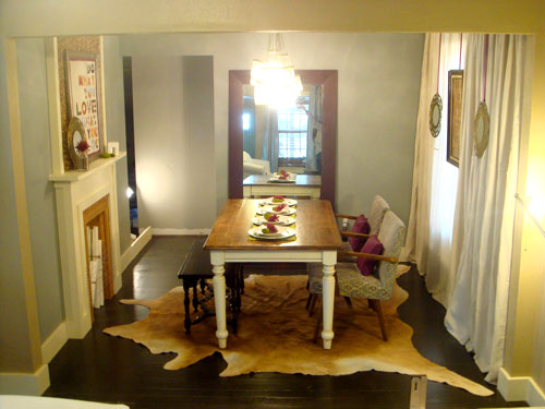
And now that we have the formalities out of the way, let’s poke around inside. Kara built a faux fireplace to create a focal point and put her favorite saying on the mantle (do what you love) along with bringing in a lot of spendy looking pieces that she hunted down on the cheap. She even made those billowy and dramatic curtains from affordable Lowe’s drop cloths.
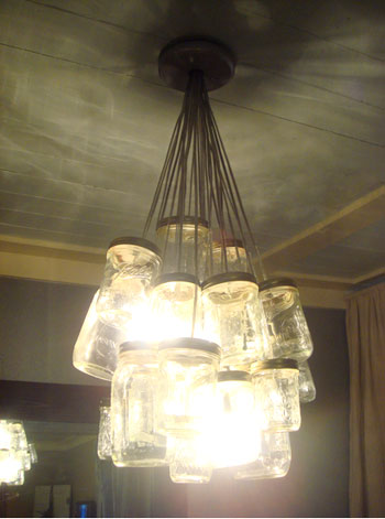
But our hands down favorite part of the dining room is Kara’s homemade mason jar chandelier. Stunning, no?
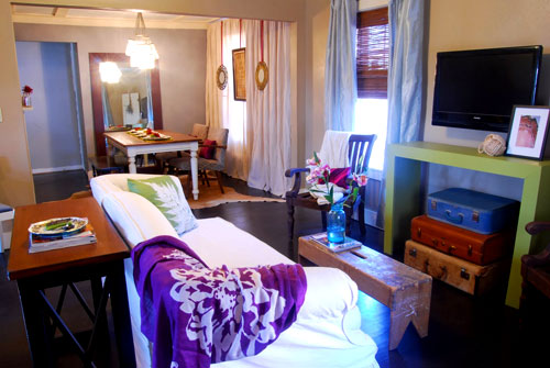
There used to be two walls cutting the kitchen and the dining room off from the living room so Kara decided to get rid of both of them to open up the space and make for easy entertaining. She even built the media console from the old kitchen cabinets that were torn out during the big expansion. Gotta love that use-whatcha-got spirit.
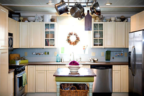
Sadly Kara’s kitchen cabinets weren’t salvageable (although we love that some of them got a second life as the green media console), so she opted for assemble-it-yourself cabinetry to save money. You’d never guess that it’s not custom though, right? We love everything from the glass fronted cabinets that flank the window above the sink to the concrete countertops that she and Tim poured themselves. Kara even made the pot rack from her home’s own reclaimed copper plumbing. And she turned a garage sale table into an island.
Bear in mind when you look at this stunning guest bathroom that this space actually had wallpaper in the shower! Insane. But it was nothing that Kara couldn’t handle. She brought in beautiful hardwood floors (and put marine grade poly on them, so water won’t be a problem), added custom built-ins, and even turned an old desk into a vanity (again topping it with a chic DIY concrete counter). And of course we love that she and her hubby did all the work themselves to keep down the cost.
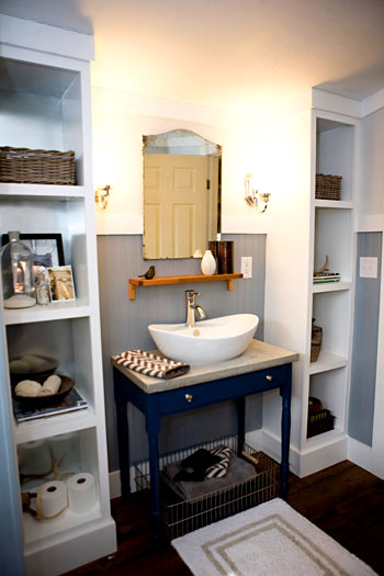
Again, in the interest of saving money (we love this girl), Kara repainted her original bedroom dresser with a flower motif that mimics the flower pattern in her curtains. She also gussied up her old headboard by tufting and upholstering it.
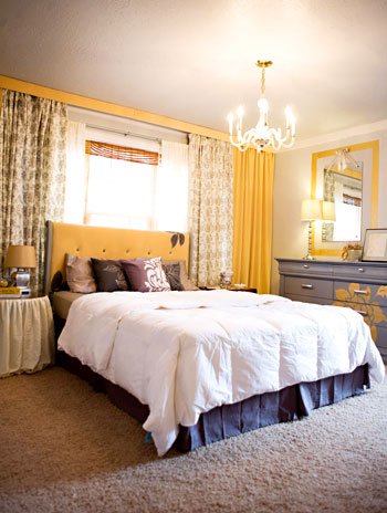
And one of the most major changes in the space was adding this gorgeous glass door in the place of an old window, which now leads to a lovely private outdoor area. Life is good when you’re Kara.
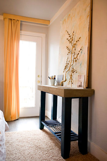
We also love that she was able to increase the square footage of her bathroom by about 25 feet, but she visually expanded it by a lot more when she got rid of an old bulky vanity, brought in reflective white tile and added a glass shower screen for that open and airy feeling.
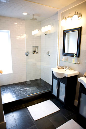
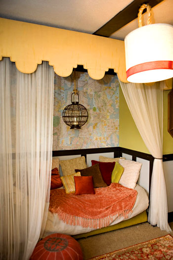
Here’s Kara’s “reading room” where she went for an exotic and worldly feeling with a bed nook for enjoying a book (or a nap) and a formerly black dresser that she amped up with colorful paint (love that Moroccan feel).
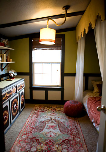
Everything from the padded pouf to the map on the wall of the reading nook adds to the worldly and well traveled feel. Which is perfectly appropriate for Kara since she actually lived in Lithuania for a while. Yes, yet another reason to be green with envy.
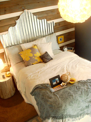
Kara wanted the guest room to have a rustic-yet-glamorous effect. And the corrugated tin headboard is the perfect combo of those two elements (she was inspired to whip it up herself after a trip to Lowe’s!). Touches of metallics, pops of yellow, and tons of texture really add to the space. And Kara figured why stop at making that amazing headboard when you can make the overhead light as well? So she did. We love the giant glowing orb, especially when it’s paired with those warm pops of yellow and the rustic wood wall.
And because we know you guys love a source list, here you go:
Dining Room- paint: Earl Gray (Lowe’s), chandelier: DIYed, table & bench & reupholstered chairs: garage sale, cowhide rug: side of the road stand, curtains: Lowe’s drop cloths, faux fireplace: built by Tim, mirror: DIYed frame + old bathroom mirror, purple pillows: Target, artwork: DIYed (she sells the Eye Charts). Living Room- paint: custom mix from leftover paint, roman shades: Home Depot, curtains: Target, armchairs: Target, media console: DIYed from old kitchen cabinets, sofa table: suitcases, coffee table/bench & sofa with slipcover: garage sale. Kitchen- cabinets: Home Depot’s self-assembled, beadboard color: Contemplation (Behr), kitchen island: garage sale, pot rack: made from copper plumbing (she also sells these), desk by the fridge: estate sale. Guest Bathroom- sconces: Habitat for Humanity ReStore, rug: Target, vanity: Craigslist desk, vessel sink: Craigslist, chevron towels: Ross, vanity shelf & bathtub caddy: IKEA. Reading Room- repainted dresser: Craigslist, rug & valance: garage sale, round pendant: Sam’s Club, red pouf: Pier 1. Main Bedroom- paint: Moonlite “something” (Glidden), flowery curtains: Target, yellow fabric: Walmart, chandelier: Habitat for Humanity Restore, nightstands: garage sales, concrete table: built by Tim. En-suite Bathroom- paint: “custom mix”, vanities: Lowe’s (painted & added glass inserts), glass shelves: Walmart, mirrors: Ross, vanity lights: Lowe’s. Guest Bedroom- paint: Prusian Cadet (Valspar), headboard: DIYed, bedding: Target, blanket: Walmart, stumps/side tables: mother nature.
So there you have Kara’s DIY palace. Doesn’t it look posh and expensive, even though it was anything but? We love that it’s full of doable DIY ideas that never look the least bit tacky or crafty. Thanks so much for inviting us into your lovely home Kara! And don’t forget to drop in on her blog for a lot more delectable DIY ideas. Now let’s play a little game we like to call what’s-your-favorite-thing? We’re totally torn between that amazing mason jar chandelier, the poured concrete counters or that brilliant tin headboard.
Psst- We’re always on the hunt for a mouthwatering house (or ten) to crash, so if you or anyone you know has a casa that’s feature-ready just shoot us an email along with some photos of the space and if we’re ever in the neighborhood we’ll be sure to drop in.

TG says
I am loving that bathroom. What kind of floor tiles are those in the area and in the shower?
Cara @ Live the Home Life says
Oh boy! What a treat! Thanks for crashing and the mason jar light fixture is phenomenal. I am currently staring at my dining room ceiling thinking about how we can make this one work.
-Cara
sarah p says
I love the black and white master bathroom! Any idea what kind of tile is on the floor (and shower floor)? It looks almost like a slate but I am so curious… Gorgeous!
Amy B. says
I love that mason jar chandelier, as well. Now that I have 3-day weekends since going back only part-time after baby, I am looking for ways to get creative with the bit of down time I have (minimal as it is). I just might try my hand at that chandelier. thanks for posting this, guys.
Amy B. says
p.s. just checked out her blog and the latest post features a table her husband did for someone. While that it very cool, I noticed the light feature above, and it’s pretty sweet as well.
Emily says
BY FAR MY FAVORITE HOUSE CRASH YET…That is exactly how I would have done it. Looooks GREAT!
Kati says
Wanted to add my 2 cents…
I think* Kara meant that the bedroom color is Glidden “Silvery Moonlight”… we have that color in our home and it looks just like that. Maybe she can confirm?
Love the way they reused so many things for such unique purposes!
Paula M. says
Holy cow! this is fantastic work! Love the ideas, the workmanship, the recycling, the cost savings, the whole kit n kaboodle.
Does Kara have “before” shots as well? (I’m a glutton for information, aren’t I?) I must scurry over to her blog in a bit and see.
Thanks for posting such amazing photos — and kudos to Kara and hubby for the fabulous work!
YoungHouseLove says
Yup, she has lots of before photos. Head over to her blog for the scoop!
xo,
s
Katie G says
I’m very impressed! Her house makes me feel lazy!
jbhat says
Wow, good for them! I love the corrugated headboard. Very clever.
jbhat
Cat Alford says
Geez – finding the cowhide rug at a side of the road stand?! would love to know where that is…
anna see says
Kara, Kara, Kara! Your home is lively, creative and chic! I just love what you have done. You and your husband are a talented pair!
Val says
I heart this house! I love how it’s second-hand without being overly country. And her blog seems super cute, too, so far. Thanks for featuring new awesomeness for us to enjoy!
I just did a quick search on her blog and didn’t find anything about that tin headboard (but you said it had just moved and had some kinks to work out). Any thoughts on making sure that the edges are not sharp?
YoungHouseLove says
Val and Tara,
Here’s hoping Kara drops back in with more info for ya. Stay tuned…
xo,
s
Renee Smith says
FAVORITE HOUSE CRASH TO DATE! (ok, top three… you guys crash some awesome casas).
I am so tickled by all the do it yourself touches; it looks like a million bucks!! Excellent use of color, too! I am amazed that so many unique and exciting rooms all connect to the same hallways!! I would LOVE info on making concrete counter tops…
I think I have a new blog to add to my list of daily reads!! And I think that meets my daily exclamation point quota! (one more for good measure)
kathy t says
I love the entire home -Wow –
The dresser with the painted flower is really pretty -the reading room is just so inviting .
A lot of hard work and love went into their home
Tara says
What a great house to crash! Love the free-spirited creativity that Kara has unleashed on this house.We are in the process of making over our master bathroom for not a lot of dough, so I was very interested in the shower screen idea. I was wondering though if the screen contains all the spray from the shower or if water finds its way outside the shower enclosure? Kara, can you please confirm??
krstn says
I am so jealous of her house and her creativity!
Hannah @ The Nanner Republic says
Wow–it looks so great! I LOVE the kitchen and bathroom the most!
Natalie says
What a creative {and gorgeous} space!
I love that she incorporate used an inexpensive items to create a space that is truly unique. Great job, Kara! :)
k & b adventures in renovating says
i want to make that mason jar chandelier REEEALLY bad!
KARA @ karapaslaydesigns/made2create says
Hey Ladies, let me see if I can answer your questions!
Tara- Our shower screen does a GREAT job at containing the water. It is about 3 1/2 feet long and that seems to be plenty to keep the water where it belongs. :)
Val- Here is a link to the guest bedroom post
http://karapaslaydesigns.blogspot.com/2010/01/rustic-glamour-retreat-portfolio-page.html
There is no tutorial on the headboard. We just used jigsaw (with a metal blade) to cut out the shape we wanted. And though you could probably cut yourself on the metal if you tried to, it is not sharp enough to do any real damage otherwise. Plus it sits right up against the wall which also cuts down on possible problems.
Hope that helps! :) THANK YOU YOUNGSTERS for featuring my house!
Molly says
I’ve seen parts of this home before, but I still love it! The kitchen and master bedroom are my favorites.
Question for Kara: Your dropcloth curtains –did they come “pieced” or as one whole piece of fabric each? I’m using a dropcloth as a slipcover for my couch, but it is actually made up of three pieces of fabric stitched together. I think this would look odd for curtains (it’s not too odd on our couch b/c the seams generally line up with the space between the cushions).
Ashlee says
What does the frame above the mantel say?
YoungHouseLove says
It says one of Kara’s favorite phrases: Do What You Love, Love What You Do. Hope it helps!
xo,
s
Jessica Y says
Can you get a full picture of the table/island from the kitchen? It looks like there is storage under it? How did they do it or re-do it? Thanks. It all looks beautiful.
YoungHouseLove says
Hey Jessica,
Just follow the links in this post over to Kara’s blog to see more!
xo,
s
KARA @ karapaslaydesigns/made2create says
Hey Molly,
When you are buying drop cloths for curtains you will want to open the packages (in the store) because some of the drop cloths have been pieced together while others are a full piece of fabric.
Hey Jessica,
Here is the link to the kitchen island makeover:
http://karapaslaydesigns.blogspot.com/2009/04/kitchen-island-total-transformation.html
blydesign says
This is a lovely home! Looks so warm and inviting :)
Stephanie says
O, MG. This might be one of my favorite houses ever. I thought I was crafty, but this girl’s house is a total inspiration. Ever single room is amazing. Thank you so, so much for sharing it! I bookmarked it and will refer back to it forever and ever.
Liz Marie Blog says
Wow! Simply amazing! I love all the brave use of colors. They are very talented people!!! Thanks for sharing this with all of us!!
Katie says
LOVE the color of the gray bathroom. Can someone please tell what brand/color name it is? I have been debating gray in my bathroom all day, and now I’m set on it after seeing this pic!
YoungHouseLove says
Here’s hoping she drops in with that info for ya (it might already be here in the comments if you have a moment to scroll back through ’em)!
xo,
s
Sarah says
Good Lord…. This house causes so. much. envy!!!!
Beautiful, So inspired by the fact that everything was “recycled” through Craigslist and Yard Sales…..
Erica says
I love this house crash! i fell in love with the mason jar chandelier and made one for myself! it looks great in my dining room. I get so much inspiration from your blog. keep up the great work!
Audrey says
This was on Nate Berkus House Proud today!
YoungHouseLove says
Oooh, go Kara! Well deserved!
-John
Jenn says
I love this it’s all gorgeous, I want to make a faux fireplace, any tips??
YoungHouseLove says
Maybe just google to find a tutorial or check out ana-white.com?
xo,
s
Janel@Hating Martha says
I just wanted to say thanks for the inspiration! The master bedroom featured here helped me solve my window dilemma in my master bedroom. How to make that darn boring room and window look spacious and charming. Here is a link to the new redo thanks so much!…http://www.hatingmartha.com/master-bedroom-fabric-wall-reveal/
YoungHouseLove says
Love it! Congrats!
xo,
s
John @ Antique Dining Tables says
That shower is a work of art. Killer colour combination between the dark slate coloured tiles and the light wall tiles. Such great taste.
Chris says
Hi!
You have a great place out there! I enjoyed reading your blog. The pictures are amazing! I love the dining area. Though my type is antique dining tables, I can’t hide my admiration of what you have there.
Keep it up!
Kierstin says
I am absolutely blown away. I’ve seen my fair share of house crashing, but this one really takes the cake. And she clearly loves yellow as much as I do. That metal headboard is so creative and industrial meets modern feminine chic. I might have to try that one at home…