Some of the same folks behind Richmond’s Homearama (who are working with us on our Habitat For Humanity Showhouse – which we’re planning to update you guys on ASAP) invited us to similar-but-new show called the Massey Street of Dreams. Like Homearama, it features custom built homes that are decked out inside by designers & decorators who collaborate with each builder and their team. But this show’s the brainchild of cancer survivor George Emerson, so it’s got a charitable slant in that all proceeds benefit our local VCU Massey Cancer Center. So just like we had fun sharing these eight homes with you guys, we’re psyched to share the four pretty places that make up the Massey Street of Dreams.
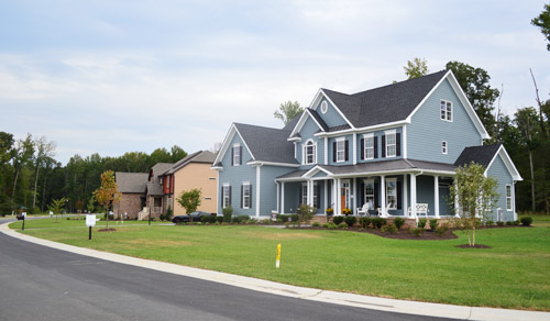
The homes are located side-by-side in a new community and (here’s the part where I’m jealous) they’re basically right across the street from water views of the James River. Each house is done by a different builder and a different design team, so they’re all pretty distinct. We love these types of tours because we always find ourselves saying “I liked the kitchen in that one the most” or “I’d take the bath from this one, but the patio from that one.”
Let’s start with the blue one first. It was probably our favorite kitchen of the group, since it was hitting lots of the trends that we’ve fallen for like gray cabinets, an accent color on the island along with a different counter material, an exposed hood, etc.
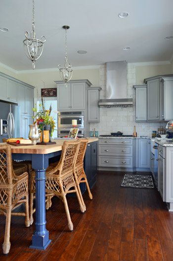
The marble subway tile backsplash was a nice classic choice too, and I don’t think we’ve ever met a glass-fronted cabinet that we didn’t like.
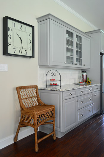
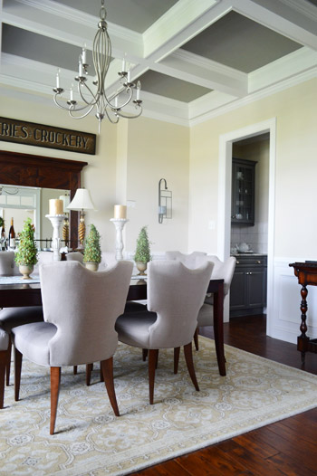
The butler’s pantry / dry bar area that connected the kitchen and dining room was a nice transition between the two spaces. The darker gray on these cabinets tied in with the color of the ceiling coffers (you can see that better in the next photo).
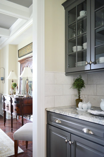
We love ourselves a coffered ceiling – especially since it lets this room get away with a dark ceiling color without making the room feel too heavy.
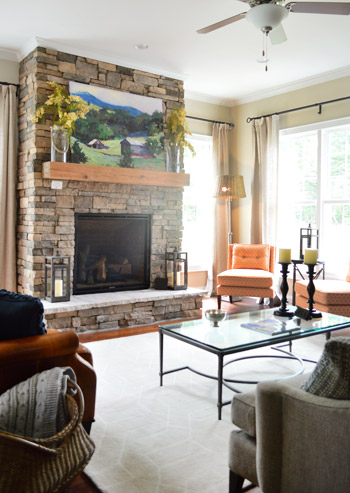
The living room was fairly traditional by most measures, but there were two patterned orange chairs in the corner that added an element of happy-casual. The stone + raw wood combo on the fireplace really cozied up the room.
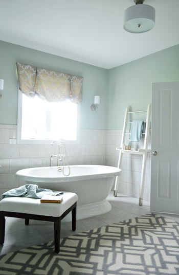
The house also had our favorite en-suite bathroom, namely because of the giant freestanding tub. This type of tub is similar to the one we’ve got slated for our showhouse project, so it was reassuring to see how awesome it could look in real life.
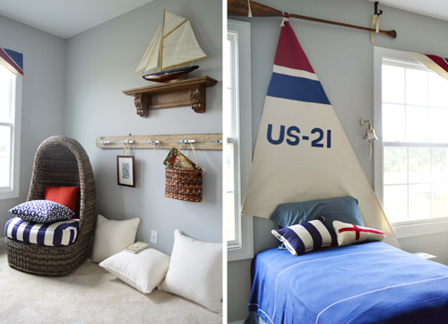
This nautical kids room was especially charming to Sherry, since she was (predictably) smitten with the egg chair. We both thought the details like the sail headboard (hung from an oar, no less) and the dock cleat hook rail were fun additions.
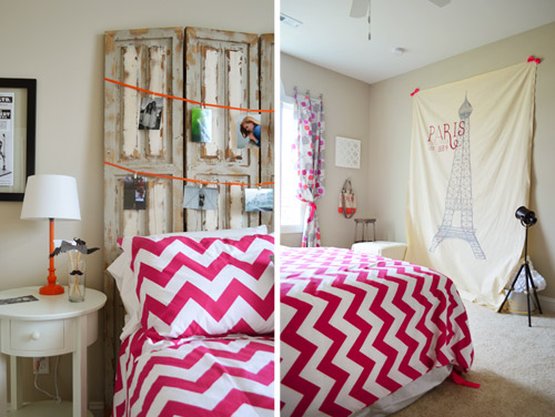
The teenage girl’s room was designed by – get this – an actual teenage girl. Apparently this high schooler is interested in going to school to be an interior designer so they let her get her feet wet in this space. It was a “Paris meets mustache” theme of sorts with fun details like actual photos of her and her friends, and this idea of a place for her friends to take silly photos against the big backdrop using props like the mustaches on a stick (in the bedside cup).
The second home had a more old world style to it, but the kitchen had one extremely modern feature. See that door to the left of the kitchen?
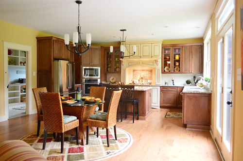
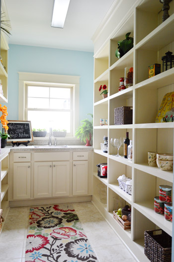
That’s a prep kitchen! According to the project coordinator of the show, they love sharing new trends in housing, and a prep kitchen is the next big thing. Essentially it’s an area where you can keep things like your toaster and your coffee maker out and plugged in all of the time, without cluttering up your kitchen counters. We’re not sure we’re fancy enough to require a prep kitchen, but if nothing else it’d serve as a nice pantry with a bonus sink.
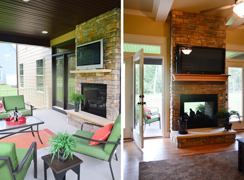
The house not only featured an open, covered porch with a planked ceiling (a kick you know we’re currently on ourselves) but it also had a DOUBLE-SIDED, INDOOR-OUTDOOR fireplace. How sweet is that? Oh, and let’s not overlook the outdoor TV.
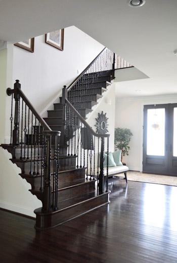
The third house I dubbed as the one occupied by “Richmond’s Kris Jenner.” I don’t know lots about the Kardashian matriarch, but I’ve picked up that she’s got a thing for high contrast black-and-white decor thanks to Sherry subjecting me to bits and pieces of the show. This house was the less in your face version of that, so I mean it as a compliment. It felt upscale, with a lot of white and gray along with some strategic punches of dark brown/black. For instance, we loved the visual oomph of this dark staircase.
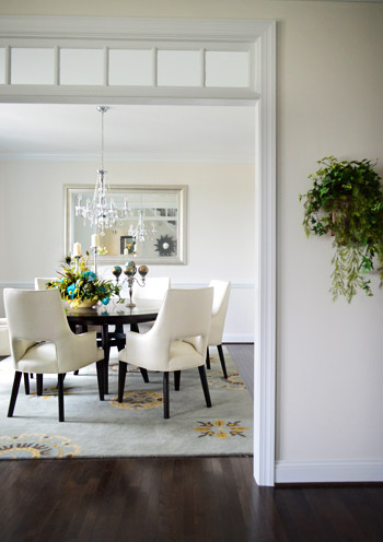
This dining room, like the one in the first house, featured a transom window in its doorway, which is always a nice added detail.
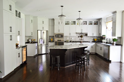
The kitchen in this home was definitely the most grand. I mean, look at all of those cabinets. And oh yeah, I couldn’t figure out how to turn that light off in the wine fridge. Oops. Just pretend ET’s in there, phoning home.
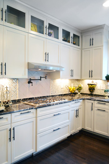
We loved the use of dark hardware to spice up the soft gray cabinets.
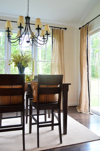
The breakfast nook off of the kitchen brought in some nice texture in the form of burlap curtains, which we learned was just some fabric that the designer added a black ribbon to with a glue gun. Sherry stood there smiling at them for a nice long time.
This last house was certainly the most decked out of the four – and probably the one with the most distinct style. It was packed with ornate, rustic pieces – sort like things you might find at Restoration Hardware. How great are those giant arched mirrors below?
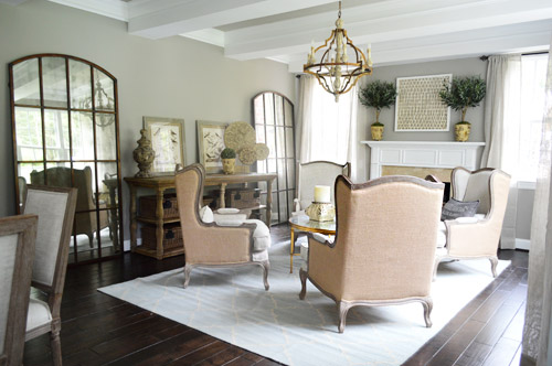
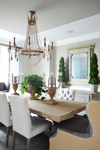
Here’s the dining room. Sherry always loves a beaded chandelier and I was digging the big cozy chairs at the head of the table… although I could see myself just falling asleep in one after a nice Thanksgiving meal and then dripping gravy drool all over the nice upholstery.
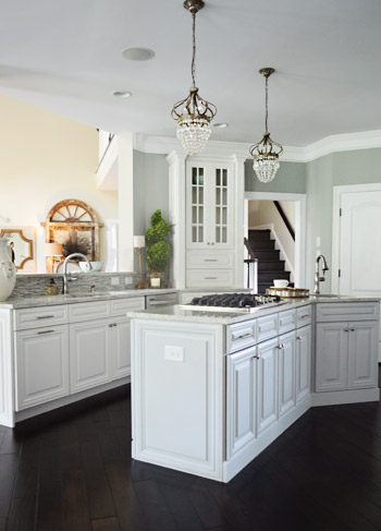
We were both fascinated by the kitchen because it was a layout we had never seen before. It was hard to capture on camera, but picture three identically shaped workspaces staggered apart but parallel to each other – one was a peninsula, one was an island and one was a wall full of cabinets and appliances like the fridge.
In the front sitting room there was this really interesting and well executed paint treatment that looked like grasscloth wallpaper. They even painted it in sections that mimicked where you might see the edge of one wallpaper roll meeting another.
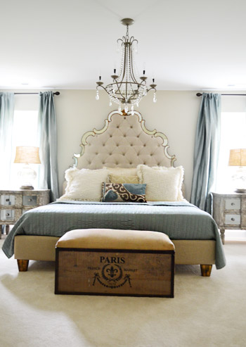
This house featured the new home trend of dual main bedrooms – one on the first floor and one on the second. Here’s the one upstairs (this picture doesn’t do the tufted headboard’s immense size any justice).
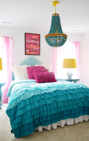
The girls bedroom strayed a bit from the rest of the home’s style (well, in color scheme at least). It seems to have been inspired by the chandelier, so we thought bringing in some of the yellow touches was nice, like those lamp shades on either side of the bed.
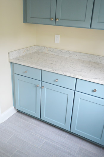
And last but not least, the mudroom in this home wasn’t styled yet but that didn’t stop us from ogling the mix of materials. The floor tile is what first got our attention, but it was pairing that with powder blue cabinets that made us excited to see how this space was coming together.
Obviously there’s a lot more to see in person, but this is a smattering of what caught our eye. These houses are open to the public Thursday through Sunday, this week and next (Sept 19-22 & 26-29) and all the info is on their website. It’s definitely a great cause!
Psst – Wanna see a finished showhouse that we designed? Click here for Our Full Showhouse Tour, which includes final pictures of every room, the floor plan, budget info, a video walk-through, and shoppable showhouse furniture & accessories.


erin says
anyway to find out the color of the darker gray cabinets in the first house? i’ve been looking for a gray to paint our kitchen cabinets and i really like the look of those cabinets!
YoungHouseLove says
I hope Justin drops in with that info for ya!
xo
s
Maggie says
i love house crashing!!!! sadly, i could not do it as much as i like (the cons of living in a small town). Can’t wait for your designed house, J & S !!!
Meg says
I NEED a prep kitchen in my life – how amazing!
Alli says
I keep going back and forth about painting our cabinets. It’s really cool to see new cabinets painted. Maybe if I show this to my mom she’ll be on board for helping me :)
Beth says
I love all of the houses, especially the one with the amazing freestanding tub in the master bath. I also love the rug in that picture, it would be wonderful to find out where it came from! Any ideas?
YoungHouseLove says
Hope someone drops by with that info for ya!
xo
s
Connie says
I am officially a “dork”. At least that’s how I felt when my husband walked in on me doing a squeal, tapping my feet really fast after reading the title “house crashing”. I guess you can say I get excited when you do these kind of posts. Nice house!
YoungHouseLove says
I love you Connie. Dork on, girl. I’m right there with you.
xo
s
Cristina says
John, Sherry:
Happen to notice if the indoor/outdoor fireplace was wood-burning or gas? We are thinking of a similar situation, and that picture is the perfect inspiration for our space.
Thanks!
Cristina
YoungHouseLove says
It was gas. So cozy.
xo
s
Erica says
At Homearama last year here in Louisville, burlap was all over the place. I thought it was really cool in the first house. After 13 other houses, I was so over it. Which is sad, because it’s kind of cool. And considering I have really long windows that require really long (and expensive!) curtains, that could be really cool. Especially since you can get burlap in so many colors now!
I can’t believe some of the things they considered “trends”. Dual Master Bedrooms? A prep kitchen? I guess these houses are way way way out of my price range, because I was in the market for a kitchen wasn’t a dual kitchen/laundry room. :-) That prep kitchen is amazing, though. I’d love having something like that as a pantry! *Drools*
Oh, and I LOVE that fireplace! I want to re-convert the fireplace in my living room and the walkthrough bedroom back into a 2 sided fireplace. However, I can’t use it unless I rebuild the chimney and pay thousands to fix the chimney flue, so it would be just for show. But totally amazingly worth it! I may have to save my pennies after seeing that!
katalina says
the floor in the mudroom reminds me of a reader that shared her amazing sunroom makeover with you…
YoungHouseLove says
Oh yeah, I can see that!
xo
s
Meghan says
Love love love the mud room tile! I think I need it in mine and am hoping someone might know the style & source.
Thanks for sharing! Lots of great ideas in these homes.
Pia says
I need, need, need a huge square black and white clock in my kitchen! :-) Thanks for the inspiration.
Sarah says
In the ‘Kris Jenner’ house, what is the thing that’s attached to the wall above the stove/beneath the extractor fan? I can’t work it out!
YoungHouseLove says
It’s a pot filler.
-John
Michelle says
The homes are so pretty!! I like the outsides of the two on the left. The dual master bedroom is a neat idea for when you are too old, or your knees can’t maneuver the stairs anymore. In your younger years, good for company staying with you. I love walking through model homes. The fall Parade of Homes is going in here in the Twin Cities. I have my Parade book sitting here. I think I will head out this weekend and see if I can find any new ones. The same houses are in the Parade many more times these days.
Lindsay says
So excited to see the stair runner install play-by-play. I have wanted to do this forever, but have been intimidated by it.
Bama Proctor says
I love a showhouse for a cause-these charity events are
great ! Please-when you or if you re-do your kitchen,
take the cabinets to the ceiling as in house # 3. I don’t
understand the “floating” cabinets with a dust top that
could have housed more storage and would look great with
glass fronts. My mantra-“Stop the skimpy cabinets”. Can’t wait to see the house you are doing for the Richmond event-
hope it has to the ceiling kitchen cabinets-woops-sorry if
I have offended anyone.
YoungHouseLove says
Aw, no worries Bama! I think lots of people have different opinions on things like cabinets and ceiling heights. Many of these showhomes have super high ceilings (we’re talking 10-12 feet, sometimes even 14!) so cabinetry to the ceiling when it’s that far overhead is a bit crazy since standard height is 8′ (not only would someone need a giant ladder, in some cases the upper cabinets would have to be 7-9 feet tall, which could look crazy out of proportion with normal height base cabinets). So I think that’s why some people can take them to the ceiling (the ceiling isn’t as high) while others have that space (just so they don’t have crazy tall upper cabinets dominating the space).
xo,
s
Rox says
Wonderful pictures and ideas… as I live in the Northern Virginia area, I can assure you that kind of house goes for at least 2-3 million, so it wouldn’t be affordable for most of us. However, back when I bought my house over 20 years ago, the builder was a visionary, so I have a “mini” version of it. We have the open concept with a 1st floor master bedroom and cathedral ceilings, at most people at the time thought we had a “weird” house, but we always loved it. As lots here are not that large, we wouldn’t be able to incorporate the “prep” area without major renovations which would run over 150K. However, in as much as I love the idea, sometimes bigger is not always better.
YoungHouseLove says
That’s so cool Rox! I love that you’re so in love with your builder! Sounds like a really cool house.
xo
s
Naomi says
I’ll preface with this: I hope none of what I’m about to say comes off as disrespectful or unkind (because that isn’t my intention).
I guess I don’t understand homes like these…the sheer size of them, the thin walls, the hollow-core doors, and the MDF moulding all for an enormous mortgage payment and the constant chasing and keeping up? It just seems like a vicious cycle of never being satisfied, you know?
My neighbor raised 5 boys in a 1,200 square foot home. The trade off for it? Owning her home outright by retirement, and not fretting about replacing shingles the tune of $15K.
I like having nice things, too–but when your house is so big that the average person can’t even afford basic upkeep, what’s the point? “House-poor” doesn’t sound very relaxing.
Anyway…like I said: I mean no disrespect.
YoungHouseLove says
I chatted about something similar a while back in the comments, but I really think the “affordability” of these houses depends where they’re built. Here in Richmond these homes are in the 500K range, which is definitely not cheap, but an average working family might be able to quality for them without being house poor. Meanwhile you might pay 2-3 million in Northern VA or NY for a house like this, so it really does seem to depend where it’s built. That being said, we certainly appreciate smaller homes (less to clean! cozy rooms to relax in!) but if we were a large family with extended relatives living with us (I grew up in a house of 7 people including cousins and my aunt) I can totally see how this house could meet those needs. I think when you’re trying to draw attention for great local charities, people like touring something a little fancy, and the builders’ love going all out for a good cause. It might help those charities attract more funds if the houses have a few special features, ya know?
xo,
s
audra says
You were in my neck of the woods! I know the whole Emerson clan and they are a bunch of nice people. Great houses. My mom also did her chemo at Massey so this is great for the cause.
Debby says
Oh thanks for the pics. We have been toying with the idea of residing our house. I have fallen in love with that blue/gray siding from James Hardie. We are also looking at removing our porch railing and just beefing up the columns. So I am loving the blue house. What an inspiration for me. Thank you
Mac says
I love those wicker chairs in the first kitchen. Any idea where they got them?
YoungHouseLove says
Hopefully someone will stop by with that info for ya!
xo
s
Arielle says
I am DYING for a prep kitchen now! Literally got tingles when I read that! My hubby is the master of plugged-in-appliance-forgetting and I loath the look of clutter on my counters! Now I just need to build a house….
Monica says
I actually like the prep kitchen idea, but I’m also not a fan of open concept and the kitchen opening to the entire living area.
One thing I LOVE LOVE LOVE about the houses that you have shown on these house tours is that most of them seem to have side facing garages. Not sure if it’s a Richomnd thing or what but not the case as much in Minneapolis. Many new builds around here seem to have a huge garage that is the first thing that meets people when the drive up to a home. Instead of ‘Hi welcome to my house’ it seems more like ‘Hi welcome to my huge three car garage oh and there is a house back there too’. But I also understand that that style build is probably most logical for many neighborhoods as it might take up less space. And to clarify I have nothing against a three car garage :). Anyway LOVE the side garage!
Heather says
I was SO excited to see the pictures of the idea of the prep kitchen! I do NOT have a house/space that would require a prep kitchen, but oh the ideas! See we just purchased a home that definitely will need a kitchen reno (picture original 1960), but for now we’re living with it and dreaming a lot! Right now we have a pretty small kitchen with another room next to it that is about the same size as the prep kitchen you showed (this used to be the laundry room….but it has been relocated to the basement). Ideally, we’d like to take down the separating wall and make it all kitchen. If that becomes impossible (load bearing, cost, time, layout, etc), the prep kitchen gives me a great idea of how we might be able to split/share the kitchen spaces! Woot! Woot! The gist of that whole story is to ask if you have any more pictures of the prep kitchen…different angles, storage options, etc. I live in upstate NY, so anin person visit is not gonna happen… Love your blog! Thanks, Heather
YoungHouseLove says
Aw thanks Heather! That’s the only photo we have, but maybe if you go to their website (linked in the top and bottom paragraph) they might have other pics? Not sure!
xo
s
Kamra says
Do you have any other pics of the island/table in the first blue house? I love the idea of putting the two together. Ours our separate and I feel like valuable space is taken up. I’d love to see other pics to get an idea of how to do that.
Thanks!!
YoungHouseLove says
So sorry Kamra! These are the only photos we have, but if you check out their website (linked in the first and last paragraph) they might have more pics.
xo
s
Suzanne says
I’d love some more info on the kitchen backsplash tile from the third house. It looks like small tiles with white, gray and silver, which I’m contemplating for my kitchen. Does that sound right? What was the overall vibe coming from them?
YoungHouseLove says
Yes your description sounds right! I’d check out their website (linked in the top and last paragraph) to see if there’s more info on sources or more photos for you!
xo
s
Tracy D. says
I love everything about the blue house except the color blue on the exterior. Not a big fan of country blue houses personally. The inside is amazing though.
Tracy D. says
I hope they put up a source list on the website at some point. I’d love to know where the metal and glass coffee table in the blue house is from!! Love the overlapping curvy part on the bottom of it.
julie says
OMG…I think I’m gonna start calling my walk-in pantry a prep kitchen…it has double pocket doors, open shelving and a fair bit of counter space…sadly no sink tho…who knew I was so fancy!
YoungHouseLove says
High fives for prep kitchens!
xo
s
Tirsa says
Beautiful houses – all of them. Too much for me and not my style, but still gorgeous. I hope they make a lot of $$$ for the charities.
Candace says
Is there any way to see the floor plans for these homes??? Thanks! xo
YoungHouseLove says
Maybe check out the showhouse website to see if any are posted or for sale?
xo
s
Meg says
Is there any way to find out where the blue ruffled bedding was purchased? My daughter is ready to redecorate her room and she LOVES it. Thanks! Love your blog!
YoungHouseLove says
Hope someone drops in with that info for you!
xo
s
Tracy D. says
It’s from Urban Outfitters. It’s called the tonal waterfall duvet cover, but I think they’re sold out of it. They have other ruffley bedding though!
Debbie Vietmeier says
I may be wrong but it seems to me that a prep kitchen is the same thing as a old fashioned butler’s pantry.
Glad the name has changed, who has a butler these days…
Kaitlyn says
Absolutely LOVE your blog – so inspiring! I am often talking about it with friends and family, and it’s my go-to website for alone time (I also have a 3-year-old daughter, so much fun!).
This is my first time leaving a comment though, I have to ask, do you know where the blue and wood kitchen island with attached table in third photo down is from? It is EXACTLY what I have been looking for for our 2 bedroom mill-style apartment with open kitchen/living room. We have exposed brick, timber ceilings, and concrete floors; that style table would fit in perfectly with our decor and it’d give us a lot of storage and space we’re in desperate need of. I’ve been google-ing since I saw this post, but can’t find anything quite like it so far. We could probably have a local wood store make something similar, but I’d really like to compare prices (having it made v. buying it online). We like the small DIY projects, but I don’t that’s a little beyond our abilities, space, and we don’t really have any of the tools I imagine would be needed.
Thanks so much for any feedback you have to offer, and thanks for doing all you do. You’re blog and homes have been gorgeous and just so incredibly inspiring.
Thanks! Kaitlyn from NH
YoungHouseLove says
Hope someone from that house can drop in with info for you! My guess would be that it’s cabinetry that they added freestanding legs to (and then painted it that color and topped it with butcher block). So I’d print out that picture and bring it to a kitchen designer (their services are free at Home Depot and Lowe’s) and ask them to help you recreate it. Good luck with everything!
xo
s
m says
Gorgeous houses — do you know where we can get the rattan egg chair from the “nautical” room ? Thanks !
YoungHouseLove says
I hope someone drops in with that info for you!
xo
s
Tara says
Do you know how they wired the tv above the fireplace in the second house? Where did they hide the DVD player, etc. since the fireplace is surrounded by windows/doors?
YoungHouseLove says
That’s a good question! I hope they drop in with that info for ya!
xo
s
Kobie says
Here in Australia, the prep pantry or scullery/larder/butlers pantry is become very common place in house designs. Personally I wouldn’t want too big of an area, i dont want to be stuck in a little room on my own doing dishes whilst everyone else is around the breakfast bar. It seems to be taking away from the open plan living that I like in the kitchen area. That said,for our soon to start build, I have planned a walk n pantry with a bench area in it for appliances like the toaster or slow cooker but don’t find it necessary to have a sink in there.
Gwenalyn says
Wow! I absolutely adore the cabinet color in the mudroom. If anyone knows the color name please share! I have ugly “golden oak” cabinets in my kitchen (and trim throughout the house) and I want to take the plunge and try blue cabinets. I might be crazy, but anything is better than golden oak. Eek!
YoungHouseLove says
Hope someone drops in with that info for ya!
xo
s
Nicole J says
Quadruple drool!!! Wow!
Katie says
I’m working on a boy nursery and love the blue/gray wall color in the nautical room. Any idea what paint was used? Or, do you have any suggestions for paint color? The bedding in the room is the gray, navy, and white whales from Land of Nod. Thanks!
YoungHouseLove says
So sorry, I don’t know that color but hopefully they’ll drop in with that info for ya! As for another suggestion, you could try a soft blue-gray like Quiet Moments by BM (looks so good with navy, gray, and white).
xo
s