Woot, it’s Friday! And we’re hard at work painting the trim in the living room at this. very. moment. So it seems like as good a time as any to go house crashing. We thought we’d share pics of this amazingly inspiring NYC pad that we virtually house crashed while we’re off getting our paint on. One thing’s for sure – Herman and Eduardo (the proud owners) definitely have made every last inch count. Speaking of size, their pad is just 500 square feet and it consists of a modestly sized kitchen, dining area, living area, bedroom, and bathroom. But it feels luxe and lovely, like it’s all anyone would ever need. It’s such a good example of living simply and making the smartest use of your space. Plus Herman and Eduardo did a ton of stuff themselves (from demo and floor planning to sewing their own pillows and curtains). But enough chitchat. Let’s start with the living area…
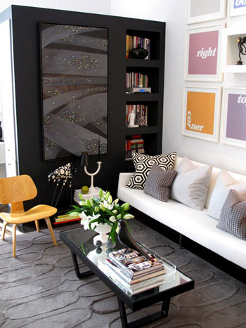
See that big black piece that they added to create a nice partition (from the bedroom) and tons of storage (accessible from all three sides)? It’s genius. An of course we love the art and those pillows and that gorgeous texture-rich rug from West Elm.
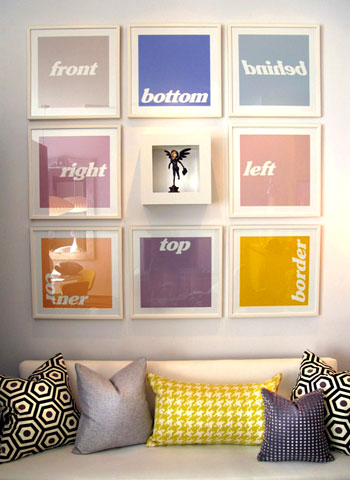
Speaking of that colorful art, we like that it doesn’t take itself too seriously (and it’s just begging to be DIYed for anyone out there in need of some wall interest). And there are some of those DIYed pillows that Eduardo made.
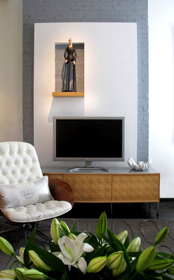
Here’s the TV that’s placed across from the sofa in front of a charming painted brick stripe (which was built out with drywall to include a little display nook- such a fun modern departure from the average wood mantel).
And see those Knoll Bertoia chairs over yonder? They’re like a celebrity crush. I know I’ll probably never be able to get my mitts on them, but oh how they make me weak in the knees (John says I’m allowed to look all I want, I just can’t touch. I know, I’m a lucky lady).
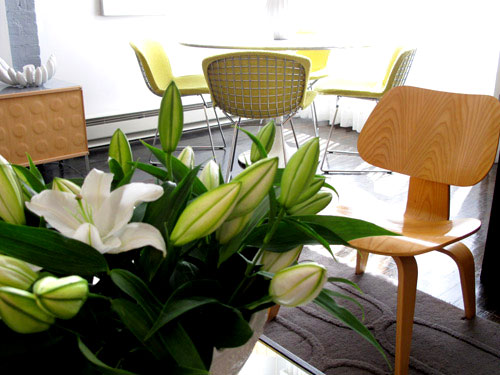
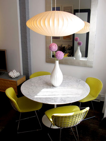
As you can see from the last picture, the living area is just a few feet away from this über chic dining zone complete with a gorgeous marble topped tulip table (get that look on the budget with this similar version from Ikea). Oh and speaking of budget, Eduardo made that gorgeous mirror himself.
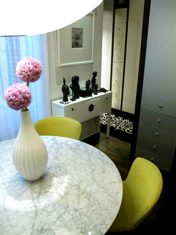
And around the corner there’s a short hallway that leads to a dreamy bedroom. But I’m getting ahead of myself. We’ll get there in a minute (but check out those great built-in drawers for a second):
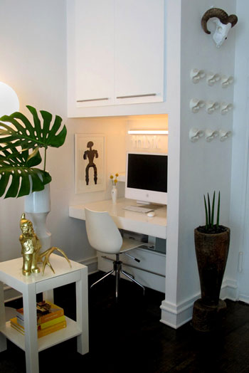
Before moving back to the bedroom we have the office, which is really just a corner of the same room that includes the kitchen, living area, and dining zone. And get this, they built the desk themselves. And then covered it with plexiglass for a slick look.
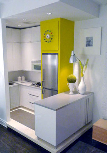
Speaking of the kitchen, here’s that corner (they raised it up a bit on a clean-lined pedestal to help define that zone in the room). It’s amazing how there’s room for everything and even a nice large span of countertop work space thanks to the peninsula packed with storage that was also added to subtly section off the area. Plus the counters and cabinets are from Ikea, so they didn’t break the bank. Even though they look like they did with that customized everything-fits-perfectly layout.
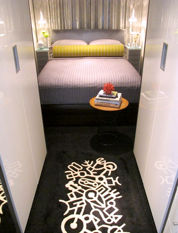
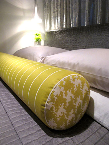
The time has come to revisit the bedroom that you saw a peek of from that second dining room shot. It’s gorgeous and dramatic yet super serene, complete with lovely metallic curtains along the back wall paired with a gleaming silver texture-rich headboard and a sunny yellow extra long bolster pillow. And in money-saving news, not only did Eduardo make that pillow, they actually got the coverlet from Bed Bath & Beyond. Sweet.
Next we have a peek at the bathroom (small rooms are hard to shoot- but we love this glimpse!):
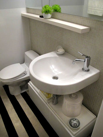
So that’s Herman and Eduardo’s amazing home. Sometimes it’s the smallest spaces that force people to be the most creative- and we love soaking up all the eye candy and inspiration. We’re sending out a big thank you to H & E for sharing the virtual tour while we paint the day away. Oh and you can drop in on Eduardo’s blog here for more info and inspiration. Now let’s play the what’s-your-favorite-part game. I’m obsessed with the gorgeous metallic headboard and the punchy art in the living room. John’s digging the amazing three sided storage unit in the living room and the cool modern light fixture in the dining area. Your turn.
Psst- Check out more house crashing adventures here.

Jessica J says
*swoon* That is an amazing use of space and I love all their chairs! And the use of plants/flowers is lovely and not overdone.
Jenna says
I never once thought about putting in storage under a floating sink like that. It looked awesome! Like that’s the way they are all supposed to be. I’m so impressed!
Wonderful job on a little space, Herman and Eduardo!!
Meredith says
I am going to guess the floorplan – walk in to the front door, row of hooks (or are those fish lips?) in the “entry” to the right, with the office nook just around that wall. Step up into the kitchen on the left. Walk twp steps step forward and you are in the middle of the living area. Continue 3 more steps and you are between the dining area and are just past the black room divider and you can turn right to venture down the tiny hall to the bedroom. The only thing I cannot place is the bathroom. Hmmmm……
This is inspiring. I dream of taking my family of 5 to live in NYC for a year just so we can see what it is like to not live in suburban sprawl and have to cut back on our belongings…I say as we are shopping for a 2700 sq ft house!
Elizabeth says
Just went to his blog and noticed they have a dog…now I want to know where all the dog stuff is hidden! Where’s the bed? Where are the bowls? LOL
Amy says
The yellow built-in that contains the fridge in the kitchen was my favorite part–what a great way to add color, interest, and storage (I think?)!
Steph says
I’ve missed the house crashing! Thanks for posting this one :)
Melo says
Oh my youngters, thank you SO much for featuring small spaces!
Favorites: The bathroom, the kitchen and the office… although that living room… and that dinning nook… oh, and that bedroom… and all that storage!… Ok, can’t decide. Great job Eduardo and Herman!
Alexandra says
I needed this. My husband and I are looking at moving out of our 1,800sq ft home in Texas to a 1 br apartment in the Upper East Side, and I’m a little freaked out about space. This gives me hope that we could turn our space into something I love and maybe not feel like I’m living in a shoebox.
As for my love? The continuous pop of yellow. How fun!
Jennifer K says
What an amazingly beautiful home!! Herman and Eduardo have some mad decorating skills and creativity.
Personally, the minimalist in me loves small spaces. My favorite place I’ve ever lived was a 500 sf studio apartment (it had a huge closet though LOL).
Christen says
This place is AWESOME!! I also live in a very small apartment(550 sq.ft.), which creates a lot of challenges, but there are some great ideas that I will be incorporating. I’m in love with the little office nook they created and the kitchen. They’ve made such great use of their space.
Allison says
Talk about loads of inspiration! They’re forced to use every space with purpose and they pull it off beautifully. Nothing looks cluttered or overly crowded, but they still are able to include art and fun pops of color. Well done!
Jen @ The Decor Scene says
I love the DR and all the awesome storage throughout the whole place. Great texture everywhere. Small spaces don’t have to be ugly or boring that is for sure, but they need to be functional and dimensional. They did an awesome job with 500 sq feet. {clapping}
Cristina says
bellissimo!! ;-)
And I love that filo conduttore (“common thread”?) that are those glimpse of acid green around the house (chairs, pillows, fridge column).
Really nice and cozy!
Cristina says
mm.. I see someone is referring to my “acid green” as yellow :-D I find always interesting how everyone can see different colors in the same color.
(last week I “argued” with my cousin about a sweater that I was seeing grey and she was seeing green O_o)
J'Anns says
I am soooo loving this! chic chic chic, unique unique unique. I have a small condo myself so I live for small space designs. Looks great!
http://jannsboutique.blogspot.com/
Shannon says
I am loving the color scheme throughout the place! So clean, fun and modern. The Tulip marble table and chairs, all with the light fixture….to die for!
Begoña says
MY FAVOURITE HOUSE CRASHING EVER!!! I could move in right now. That’s what i’m looking for right now, bright colours, modern look with a homy quiet calm feeling. Love the modern lines, great furniture and the best taste ever!
Theresa says
Their dining room table is a Knoll Saarinen table. Beeeeeeeeeeautiful. And I believe the chairs are Knoll, too. AMAZING. Modern art.
Eduardo says
Hey Meredith,
I’m impressed. Without seeing the floor plan, that was a very accurate walk through of our place. The bathroom is on a small hallway on the left as you come in the front door… it’s sort of behind the kitchen.
YoungHouseLove says
Thanks for stopping by with that info Eduardo (and for guessing so well, Meredith!).
xo,
s
Spring says
I love, love, love that bolster and the directional prints over the couch, but what i think is really amazing is how they got their bed in there. :)
misa says
wow, this is gorgeous! i love that desk! the whole place is stunning.
Kate says
LOOOOOOOVVVVE the elevated kitchen! What a great idea!
Andrea B says
I’m very impressed. Our master bedroom has similar gray coverlet/yellow accents in the works. I wish I knew how to sew like Eduardo to make my own pillow like that!
Oh well, guess I’ll have to stick with sewing felt flowers on pre-made ones. :)
Heather @ REOlisticRenovation says
I love house crashing! Thank you for sharing. There is definitely some inspiration here.
Eduardo says
Hi Kate,
I know you where asking for the type for fridge in our kitchen, so here you go:
http://www.ajmadison.com/cgi-bin/ajmadison/CP171SS.html
thanks!
Justine says
Wow! I am so impressed. My favorite part is…everything–how they utilized the space so so well. And, I love the pillows, Eduardo looks like an amazing sewer and knows how to pick fabrics (and mix them).
TIffany T. says
Made. My. Day!! My favorite part is everything..I love the dramatic color and the layout and I love how it’s simple yet has so much character at the same time. I can’t wait to pop over to Eduardo’s blog too!
Chicago Cuisine Critique says
I LOVE that rug! It’s gorgeous and one I will have to keep in mind once i’m ready to replace my current one.
Linda says
Question: is the built-up kitchen section on a “floating floor” (i.e. open under the corners)? If so, how does one clean under it? We are facing that question as we choose a new vanity for our bath. Many of the ones we like are on legs or are open on either just the front or just the sides, making it easy for all that yucky bathroom fuzz to gather in the far reaches under the vanity.
Thanks.
P.S. I am SOOO not into blogs but love yours and check it daily. GREAT JOB, you two!
Nakisha says
Love this house crash1 The colors have such energy without tiring your eyes. One suggestion though, if the homeowners don’t mind, it would be nice to have layout of the homes that are crashed. This house is giving me an idea for my entry.
Gina @ Temporary Nest says
This place is FANTASTIC!! My favorite part is the typographic art on the living room walls. Very clever… Very clever indeed…
Eduardo says
Hi Elizabeth,
LOL. Yes, Oliver, our Frenchie, has a bed that I made him. It’s dark gray so it blends in with the living room carpet. It sits in front of the TV console but I took it out for the pictures, and his water bowl sits in a corner in the kitchen. As for his toys, they’re usually spread out through the apartment, but nicely put away for the pics. :)
Delta says
Okay. I’m ready to move in. Maybe we can arrange a house swap. Do you want to spend some time in Dallas/Fort Worth, Texas? ;o) Looks AWESOME!
Lisa says
LOVE the art in the living room – so creative!! This place is amazing – I don’t know how people come up with such great ideas!! I. can’t. stop. looking!!
Herman says
Hi Amyks
The lego-like console is a from the Case Study Shelving system from Modernica. Their website is http://www.modernica.net. Hope this helps!
YoungHouseLove says
Thanks for stopping in with that info Herman!
xo,
s
Herman says
HI Michelle,
The white mid-century chair you love we bought at a vintage store in the Lower East side called Las Venus and had it upholstered in white vinyl. It comes with a ottoman foot rest but have it in storage because of space. ;( They also have a store in ABC Carpet and Home. But i’m sorry, can’t remember the name of the actual chair. If I find it, I’ll let you know. Thanks!
Oona says
My favorite things are the amazing pillows (seriously gorgeous) and that little niche about the television. I love how the sculptural art manages to meld well with all of the modern surroundings, but it definitely adds a dark note. Love.
Libby says
I love the bolster pillow on the bed. Would something like that work for a sofa in a living area or are bolsters primarily meant for the bedroom?
YoungHouseLove says
Hey Libby,
We love bolsters on a sofa! As long as they’re cushy and not too firm so you can lean back and feel comfy.
xo,
s
Eduardo says
HI Alexandra,
I hear you!! Don’t freak out. We also used to live in a 1800 sq.ft apartment in Chicago and we thought we’d never get used to a smaller place. But you ultimately do. The secret is in the space planning and being creative with storage. We’ve been living in this apartment for 10 years and we love it. Besides, you’ll be living in one of the most fun cities in the world.
Beth Ann says
AMAZING!!! I cannot imagine how they fit everything so perfectly into that space. I get so frustrated with our “small” 1200 sq. foot house…and it’s just the 2 of us! So beautiful and inspiring!
Karen J says
Cracking up at Lindsay’s “creepy Barbie” comment. I believe it is an antique dollmaker form. Here’s a similar one featured on a different blog:
http://myartisticside.blogspot.com/2007/12/flemish-dollmaker-form.html
karen @ our slo house says
Sherry & John,
Can I ask a dumb question?
When you create your mood boards, do you use a special program (like polyvore) or is it just photoshop?
I apologize profusely that this has nothing to do with the subject of the post… I was just hoping to play with and create some mood boards this weekend…
YoungHouseLove says
Hey Karen,
We use Photoshop but we’ve heard great things about polyvore! Good luck!
xo,
s
Sara says
I am seriously obsessed with the pillows – especially that houndstooth accent on the side of the bedroom bolster pillow. amazing.
Catherine says
So freakin’ impressed. Geez!
Carly says
I love this post! I wish my place was this cool. I also mentioned your blog on my own this morning! check it out here: http://ckb7.blogspot.com/2011/01/friday-favorites.html
carey says
Wow! That’s just FUN. Amazing what they’ve done in such a little space.
Your house crashing posts are some of my faves – – thanks!! :)
LindseyR says
love the simplicity and the raised kitchen. genius use of a small space! where do they hide their office stuff? paperwork? computer?
Kelly says
This is definitely one space I’d love to see the floor plan for! Everything looks so open and inviting, I’d love to visualize how it all comes together.
Amanda says
I never thought I’d yearn for a 500 square foot space. They really did an amazing job! I especially love the pillows hand made for the couch & the glimpse of the bedroom. Gorgeous!
Monica says
I been lucky to know Eduardo and Herman for over 20+ years and considered them my family. I been lucky to experience first hands 3 of their former homes and their NYC pad have been my favorite of the lot, which is surprising, since it’s their smallest! But, like everyone has pointed out, their complete use of the small space makes the apartment seem 10x bigger than what it is – and trust me I been there first hand, it never feels crowded, but spacious, open and full of functionality – every corner has a function.
Their talent and attention to details is amazing and their sense of fun and whimsy is always there in every corner of their living space – which I love because that is what makes a home a home, those special touches. I love their design talent so much that they have design/decorated two of my homes… and will count on them once more when we move to our new home next year.
Congratulations guys!