Woot, it’s Friday! And we’re hard at work painting the trim in the living room at this. very. moment. So it seems like as good a time as any to go house crashing. We thought we’d share pics of this amazingly inspiring NYC pad that we virtually house crashed while we’re off getting our paint on. One thing’s for sure – Herman and Eduardo (the proud owners) definitely have made every last inch count. Speaking of size, their pad is just 500 square feet and it consists of a modestly sized kitchen, dining area, living area, bedroom, and bathroom. But it feels luxe and lovely, like it’s all anyone would ever need. It’s such a good example of living simply and making the smartest use of your space. Plus Herman and Eduardo did a ton of stuff themselves (from demo and floor planning to sewing their own pillows and curtains). But enough chitchat. Let’s start with the living area…
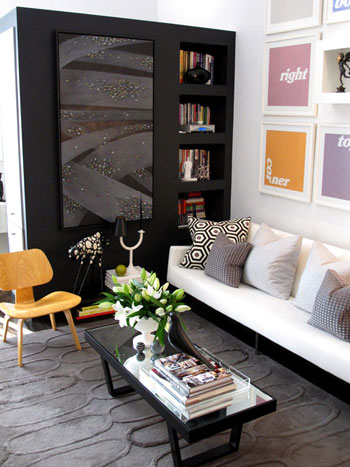
See that big black piece that they added to create a nice partition (from the bedroom) and tons of storage (accessible from all three sides)? It’s genius. An of course we love the art and those pillows and that gorgeous texture-rich rug from West Elm.
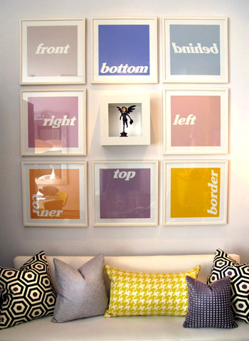
Speaking of that colorful art, we like that it doesn’t take itself too seriously (and it’s just begging to be DIYed for anyone out there in need of some wall interest). And there are some of those DIYed pillows that Eduardo made.
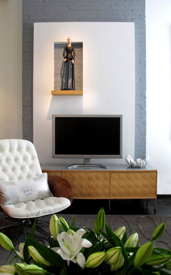
Here’s the TV that’s placed across from the sofa in front of a charming painted brick stripe (which was built out with drywall to include a little display nook- such a fun modern departure from the average wood mantel).
And see those Knoll Bertoia chairs over yonder? They’re like a celebrity crush. I know I’ll probably never be able to get my mitts on them, but oh how they make me weak in the knees (John says I’m allowed to look all I want, I just can’t touch. I know, I’m a lucky lady).
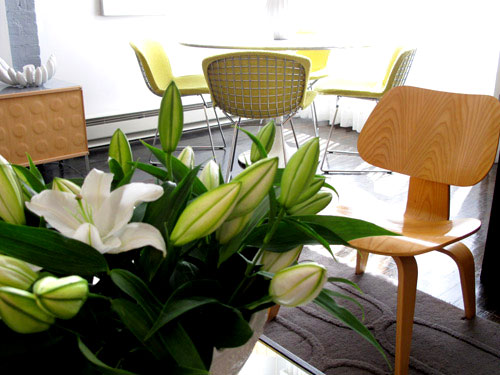
As you can see from the last picture, the living area is just a few feet away from this über chic dining zone complete with a gorgeous marble topped tulip table (get that look on the budget with this similar version from Ikea). Oh and speaking of budget, Eduardo made that gorgeous mirror himself.
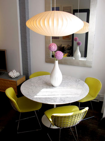
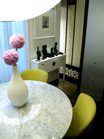
And around the corner there’s a short hallway that leads to a dreamy bedroom. But I’m getting ahead of myself. We’ll get there in a minute (but check out those great built-in drawers for a second):
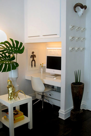
Before moving back to the bedroom we have the office, which is really just a corner of the same room that includes the kitchen, living area, and dining zone. And get this, they built the desk themselves. And then covered it with plexiglass for a slick look.
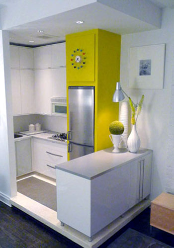
Speaking of the kitchen, here’s that corner (they raised it up a bit on a clean-lined pedestal to help define that zone in the room). It’s amazing how there’s room for everything and even a nice large span of countertop work space thanks to the peninsula packed with storage that was also added to subtly section off the area. Plus the counters and cabinets are from Ikea, so they didn’t break the bank. Even though they look like they did with that customized everything-fits-perfectly layout.
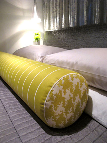
The time has come to revisit the bedroom that you saw a peek of from that second dining room shot. It’s gorgeous and dramatic yet super serene, complete with lovely metallic curtains along the back wall paired with a gleaming silver texture-rich headboard and a sunny yellow extra long bolster pillow. And in money-saving news, not only did Eduardo make that pillow, they actually got the coverlet from Bed Bath & Beyond. Sweet.
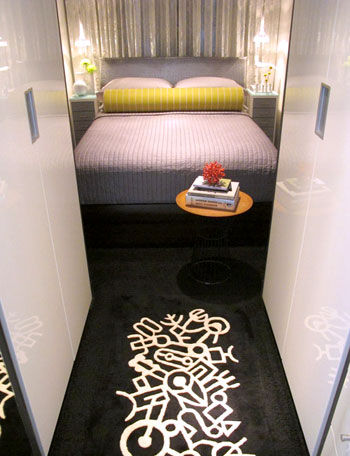
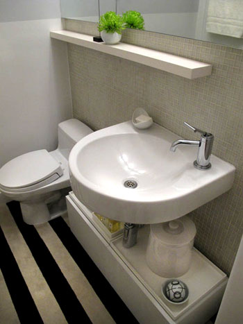
Next we have a peek at the bathroom (small rooms are hard to shoot- but we love this glimpse!):
So that’s Herman and Eduardo’s amazing home. Sometimes it’s the smallest spaces that force people to be the most creative- and we love soaking up all the eye candy and inspiration. We’re sending out a big thank you to H & E for sharing the virtual tour while we paint the day away. Oh and you can drop in on Eduardo’s blog here for more info and inspiration. Now let’s play the what’s-your-favorite-part game. I’m obsessed with the gorgeous metallic headboard and the punchy art in the living room. John’s digging the amazing three sided storage unit in the living room and the cool modern light fixture in the dining area. Your turn.
Psst- Check out more house crashing adventures here.

Lindsay says
Love love LOVE this one! It makes me seriously wonder exactly how much space I’m wasting in my 1450 sq foot casa? TONS, it would seem! I especially love the one bright wall in the kitchen. If I tried to do something like that it would end up looking like a circus, but this is just done SO WELL. Many times “modern” spaces end up looking a little on the cold side to me, but I could definitely just move right in! (They WERE asking for roommates, right? heh) :)
Lisa says
This is exactly the look I’ve been trying to achieve in my place,down to the colours (done about a thousand times better than mine will ever be)! Definitely one for the inspiration boards.
Carrie says
Sherry –
I scored 2 beautiful Bertoia chairs at a second hand store for $300, so keep the dream alive!!
:)
Jen_nifer says
Love it! But was taken aback at the bathroom. Is that really carpet on the floor of the bathroom?
orangesugar says
For a second I thought House Crash meant you actually got to go stay there and I was like what? How does that work because I want to crash too!
Agent Scully says
THIS. This is style. This is true design. I am salivating just sitting here. I wish there was a source list, because I really want to know where that couch comes from. And the bed frame. And the duvet. And the curtain fabric. And all the vases. I just love *everything* about this place.
Mollie says
The flooring in the bathroom is to sure for! Is that tile, or painted wood?
Dawn says
Amazing space! Love seeing small spaces that look amazing! So excited to see the painted trim!!
Kristin says
Amazing! They have done such an incredible job with their space – so inspiring.
As someone who went from living in 2500+ square feet to a one bedroom apartment when I became an ex-pat, I was worried about how my hubby and I would function in a smaller place. As it turns out, we needed far less room than we ever thought and now plan to always stick to smaller apartments/houses!
Thank you so much for sharing – loved this post!
Handy Man, Crafty Woman says
Wow, this is so beautiful! so much color & style packed into such a small space. Love it! Love the office nook!
Patti says
Wow, I’m so impressed with this creative and beautiful use of space. This has inspired me to re-think my 1100 square foot home!
Ana Silva says
I love the art idea over the couch and the curtains look nice. Any idea where they got them (or the fabric)?
YoungHouseLove says
Here’s hoping Herman and Eduardo can drop in with more info for those of you with questions soon! And feel free to head over to Eduardo’s blog as well!
xo,
s
Jennifer B. says
I love love love the art in the living space! I wish that kinda thing was my husband’s style too, but he’s more of the modern-clean-lines-but-still-old-world-look kinda guy. I also love the centerpiece on the table and the light fixture hanging overhead. Also, the pillows are great!
Jennifer B.
jillian m. {coffee, light and sweet} says
completely random (and totally besides the point)…but i love these witty titles you come up with! you never run out of ideas!
Paula/adhocmom says
I will never tire of seeing what people do with NYC apartments. It truly forces you to be creative, and you learn that you really can manage in a smaller space and be happy.
Miranda says
I like the pillow on the bed, the great use of space and the color pops, but the house looks so uncomfortable to me. More like a showroom than a home.
kat says
yeah – I definitely want to see tutorials for some of those pillows – I can sew basic ones, but that bolster is gorgeous! I love the style of their blog too – it’s really stylin!
Lisa says
I agree with John, the large storage unit was perfect for that space. Loved the bedroom curtains, and the pops of color everywhere. Amazing home in a small amount of space. Thank you for sharing!
candace @ thecandace.com says
Looooved this house crashing! It’s amazing and a perfect reminder that you don’t need a bazillion square feet to have a happy and awesomely designed home! Happy Friday!
Hally says
This is gorgeous. My husband and I have always been apartment people. This year we moved to Texas and we’re now renting a huge house. I’ve got to be honest, I miss the small cozy feel of a 1-2 bedroom apartment in the city.
Eduardo says
Hi Jen_nifer,
yes, those are FLOR carpet tiles in the bathroom. It is a quick and easy DIY project that can change the life of any room. These carpet tiles are great and easy to install. Better yet, they’re very durable and stain resistant. Here’s their site. http://www.flor.com/.
Lonely Wife Project says
I’m inspired and depressed at the same time that my house looks nowhere near that cute! I’m in love.
Eduardo says
Hi Agent Scully,
Thank you for your comments. I’m touched. I wish I could give you a source list for everything in our place, but that would take me a while. But here’s some info on a couple of items you mention.
• The couch is SPLIT RAIL FOUR SEAT COUCH from Modernica, which I slip -covered in white. (www.http://modernica.net/)
• The coverlet is called Crescent Moon and is from Beth Bath & Beyond
The vases are too many to source, but if there’s one in particular let me know.
Cheers!
Eduardo says
Hi Ana Silva,
The prints over the couch are from a Cuban artist called Consuelo Castañeda. Here’s her site: http://www.consuelocastaneda.info/ But as Sherry mentioned, you can create something similar in your computer and have them printed.
The fabric for the living and bedroom curtains I got them at Mood Fabrics. The same place the Project Runway contestants buy their fabric for their challenges.
http://www.consuelocastaneda.info/
tonya says
I have this overwhelming feeling that I know these two from a past life. Did Herman work at the Chicago Tribune back in 1998? That was my first job out of college and he came there from Miami. He is an amazing graphic designer and I learned a lot from his work. I remember being awed at the way he viewed elements on the page, something simple became art—turn it on it’s side, play with scale and tension. I was inspired. They also had a holiday party at their apartment and I still remember how amazing it was. That place was everything a downtown Chicago space should be, classic. If this is you, way to go Herman and Eduardo!
candyheartshome says
This is very inspirational- I’ve set up a blog to document my own impending renovations to what I thought was my small apartment, but this is even smaller and yet it looks luxe and sharp and has everything you need to live comfortably! I was considering a small computer nook and this has confirmed that it is indeed worthwhile doing. Not sure what our place is in feet, but it’s 70 square meters – not very big, but it’s only 500 meters from Sydney harbor, so I’m not complaining : )
eva says
I love there home. It’s so elegant in the color choices and pieces. Sherry hang on for those Bertoia chairs, I found some at a consignment shop in my college town for 400 dollars. I ate ramen noodles for a month but they were mine and I still proudly own them 5 years later. :)
Laura says
Wow, really beautiful!
I too would love to know what model/brand the fridge is. I’ve been looking for something just like it for my house.
Kristin (Australia) says
Wow!! Apartment living is not really my thing, nor bright colours, but everything just works sooooo well in that apartment! It’s absolutely beautiful, what a wonderful job they’ve done. I think this is the most gorgeous apartment I’ve ever seen… and that bedroom? DIVINE! I love it! Thanks for sharing (sorry about all the exclamation points – I got excited! :)
Kristin
Debbie says
I am so impressed with what you’ve done to such a small space. I LOVE it! The unexpected details, like raising the kitchen floor, or adding the drywall piece behind the tv, are so creative and just right. Great job!
andrea p says
Hey Sherry<
If you were to magically get the bertoia chairs, would you get white or silver finish? Curious minds want to know!
LOVE this house crash!
YoungHouseLove says
Hey Andrea,
Either! Any and all bertoias are beautiful to me! Haha.
xo,
s
Lauren @ Beautiful Fight says
LOVE the colors.
Kim says
Since you guys were painting trim today… How do you deal with the tiny flecks of dried paint that build up on the paint brush and then begin to end up on your glossy, just painted trim? I can’t seem to use the same brush for more than 30 minutes or so before this starts to happen. Oh, and I’m using the trim brushes that you guys love. Any tips? Thanks for your help!
YoungHouseLove says
Hey Kim,
Hmm, we haven’t ever had that problem before. Maybe don’t dip it as deeply (just dip the top 1/2″ of the brush in the paint, if you dip deeply it will get gunky and dried up top). Hope it helps!
xo,
s
liz says
Hiya!
beautiful! Where did the hexagon fabric (couch pillows) come from???
liz
YoungHouseLove says
Hey Liz,
We believe all the fabric is from Mood (a fabric shop in NYC). You can scroll back to read Herman and Eduardo’s comments for more info. Hope it helps!
xo,
s
Mandy of Kini Style says
Wow! SO impressed! I’ve been debating what fabric to use for an upholstered headboard for this past few weeks and this totally just solved my problem..I’m going for black faux croc!! Oh yes :)
vegas says
I find myself saying, hmm, and hmmmmm, and hmmm?! over the the cabinet space under the bathroom sink. We have a tiny house with a tiny bathroom and I’m wondering what they used there and how I could do it for cheap.
jja says
This is style. This is true design.
So many great peaces of classical design, so well put together. Two people don’t need much more space then this, more spase, more clutter.
Dianna says
oh, this is my favorite house crash yet! so much style & appreciation for design. love it!
Kay says
I LOVE LOVE LOVE all the nooks and hidden drawers! Plus, I die and go to heaven over anything from IKEA, so that kitchen was awesome! I all of a sudden feel the urge to purge our house of all unnecessary things. Our little bean has colic though so I’ll have to strategize a little beforehand. :)
LuLu says
Thank you SO MUCH for posting this. This is exactly the type of feeling I would love to emulate in our home. It’s simply WOW! This is definitely getting printed out and put on my inspiration board. I can’t thank you enough for posting this. Okay I’m gushing. I’ll stop now.
LuLu
Mary of How to Build a Porch says
Such clean lines and beautiful punches of color. I always think a home is so personable when you make some of your treasures yourself as Herman and Eduardo have. Now all they need is a small front porch :-)
Kristen@JLS says
yay…I’ve been waiting for a new house crashing post!! I’m so excited for this one, the space is amazing!!
threadbndr says
I love the way that the color accent in the kitchen marries up with the color on the chairs in the dining nook. It’s a great space.
Mia says
I love the pops of color throughout the place, particularly the green, and the build-out drywall box behind the TV – great use of that wall space!
amyks says
I just wanted to stop by and say that it was so awesome of Eduardo to answer so many of the questions that we asked…I will definitely check out Modernica as he suggested. Thanks so much for this house crashing. :)
YoungHouseLove says
Hey Amyks,
It was awesome wasn’t it?! Yay Eduardo and Herman! Thanks for the fun.
xo,
s
Rae says
Absolutely amazing! This is the true definition of what a small, chic home should be. I applaud Eduardo and Herman!
Kat says
Love love the picture on the wall. Beautiful colour theme!
Eduardo says
Hey guys,
Thank you for letting us share our space in YHL and I’m very happy you guys enjoyed the tour. It was our pleasure to answer some of your questions. Thank you Sherry and John for picking our place for a virtual house crashing!!
Cheers!
Eduardo
Pam says
I am loving the fabric for the pillows, and I would love to DIY some pillows myself, but I find the local selection of fabric seriously lacking. Anyone know of a good fabric store in the Hartford, CT area or perhaps a good online retailer of cool fabrics? Thnx.
orangesugar says
Hey Pam I live in the same area and agree that there aren’t many fabric stores around. JoAnn’s actually has a few decent selections in their Home Decor section. There is a Calico Corners in Avon. Osgoods in West Springfield, MA has a ton of fabric. But mostly I just stick to finding stuff online.