Woot, it’s Friday! And we’re hard at work painting the trim in the living room at this. very. moment. So it seems like as good a time as any to go house crashing. We thought we’d share pics of this amazingly inspiring NYC pad that we virtually house crashed while we’re off getting our paint on. One thing’s for sure – Herman and Eduardo (the proud owners) definitely have made every last inch count. Speaking of size, their pad is just 500 square feet and it consists of a modestly sized kitchen, dining area, living area, bedroom, and bathroom. But it feels luxe and lovely, like it’s all anyone would ever need. It’s such a good example of living simply and making the smartest use of your space. Plus Herman and Eduardo did a ton of stuff themselves (from demo and floor planning to sewing their own pillows and curtains). But enough chitchat. Let’s start with the living area…
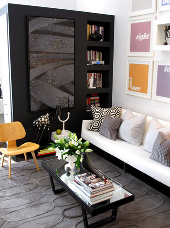
See that big black piece that they added to create a nice partition (from the bedroom) and tons of storage (accessible from all three sides)? It’s genius. An of course we love the art and those pillows and that gorgeous texture-rich rug from West Elm.
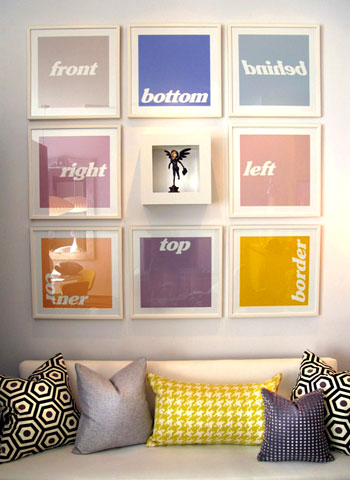
Speaking of that colorful art, we like that it doesn’t take itself too seriously (and it’s just begging to be DIYed for anyone out there in need of some wall interest). And there are some of those DIYed pillows that Eduardo made.
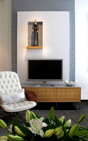
Here’s the TV that’s placed across from the sofa in front of a charming painted brick stripe (which was built out with drywall to include a little display nook- such a fun modern departure from the average wood mantel).
And see those Knoll Bertoia chairs over yonder? They’re like a celebrity crush. I know I’ll probably never be able to get my mitts on them, but oh how they make me weak in the knees (John says I’m allowed to look all I want, I just can’t touch. I know, I’m a lucky lady).
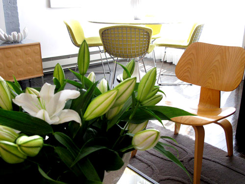
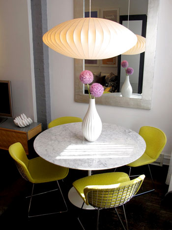
As you can see from the last picture, the living area is just a few feet away from this über chic dining zone complete with a gorgeous marble topped tulip table (get that look on the budget with this similar version from Ikea). Oh and speaking of budget, Eduardo made that gorgeous mirror himself.
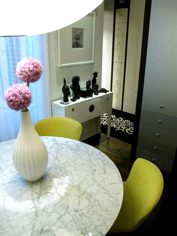
And around the corner there’s a short hallway that leads to a dreamy bedroom. But I’m getting ahead of myself. We’ll get there in a minute (but check out those great built-in drawers for a second):
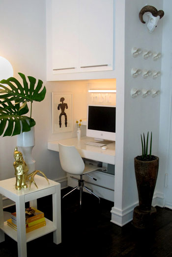
Before moving back to the bedroom we have the office, which is really just a corner of the same room that includes the kitchen, living area, and dining zone. And get this, they built the desk themselves. And then covered it with plexiglass for a slick look.
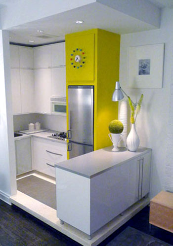
Speaking of the kitchen, here’s that corner (they raised it up a bit on a clean-lined pedestal to help define that zone in the room). It’s amazing how there’s room for everything and even a nice large span of countertop work space thanks to the peninsula packed with storage that was also added to subtly section off the area. Plus the counters and cabinets are from Ikea, so they didn’t break the bank. Even though they look like they did with that customized everything-fits-perfectly layout.
The time has come to revisit the bedroom that you saw a peek of from that second dining room shot. It’s gorgeous and dramatic yet super serene, complete with lovely metallic curtains along the back wall paired with a gleaming silver texture-rich headboard and a sunny yellow extra long bolster pillow. And in money-saving news, not only did Eduardo make that pillow, they actually got the coverlet from Bed Bath & Beyond. Sweet.
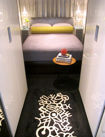
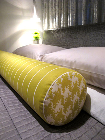
Next we have a peek at the bathroom (small rooms are hard to shoot- but we love this glimpse!):
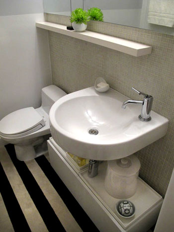
So that’s Herman and Eduardo’s amazing home. Sometimes it’s the smallest spaces that force people to be the most creative- and we love soaking up all the eye candy and inspiration. We’re sending out a big thank you to H & E for sharing the virtual tour while we paint the day away. Oh and you can drop in on Eduardo’s blog here for more info and inspiration. Now let’s play the what’s-your-favorite-part game. I’m obsessed with the gorgeous metallic headboard and the punchy art in the living room. John’s digging the amazing three sided storage unit in the living room and the cool modern light fixture in the dining area. Your turn.
Psst- Check out more house crashing adventures here.

Kim says
Lovin’ the furniture! Every piece fits the space so perfectly! Design layout = perfection. Very impressed!
Audrey says
Could you guys please add this to the House Crashing section of your site? It’s not listed there, and I think a few others might be missing too. It makes me sad, because really love to be able to look at them all in one place. :(
YoungHouseLove says
It’s on our to do list for sure. It’ll get done, no worries!
xo,
s
Therese says
I saw Eduardo and Herman’s apartment before they bought it. It was a *total* wreck, looked teeny tiny, and I would never have dreamed it could be turned into this. Their sense of style and eye for space is beyond belief. How they keep it so neat and spare is a mystery (it really always looks like this!)
Allana says
My favorite part is the black carpet with white details on the way to the bedroom–I almost started drooling! Oh, and was that repurposed bridle holders on the wall next to the office? LOVE it!
Danielle says
Love this space! I would definately be cool with a small space if it was decorated like this!