You know how excited we get to snoop around houses and share the goods with you guys (we’ve even crashed open houses and stores), so just picture our excitement to crash EIGHT houses on one block for your viewing pleasure.
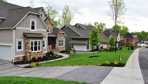
It definitely wasn’t our most traditional house crashing adventure – it was actually a home show here in Richmond called Richmond Homearama, where home builders team up with local designers to construct and decorate eight houses in a variety of styles. Most of the homes are already sold by now, but you can still stroll around for ideas and inspiration. So we thought we’d show you a few of our favorite nooks and crannies.
It was pretty cool how from one house to the next you could go from a casual elegant dining room…
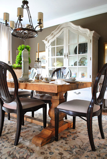
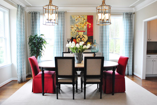
… to a polished transitional one. And since all of the rooms were done by local design pros, they seemed to be more layered and intricate than the average staged-for-sale new construction. A lot of the designers tried to do something different and take interesting risks (like two large light fixtures over a table or a backsplash made from river rocks) so it was fun to see them stretch the usual “keep it basic and neutral” house-selling rule.
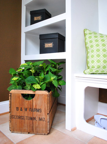
As much eye candy as there was to take in, some rooms definitely stood out to us as favorites. One being this could’ve-been-overlooked mudroom in the “European Elegance” home.
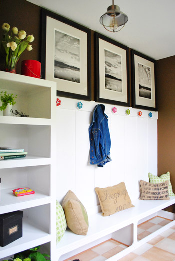
My penchant for old boxes and crates was satisfied, while Sherry appreciated the open space under the built-in bench where shoes could be casually kicked off while still remaining wrangled (let’s face it, kids don’t always put them in baskets, but the least they can do is kick them into that zone under the bench).
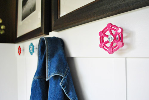
But our favorite details by far were these coat hooks made from brightly-colored valve handles. The designers picked them up at a local hardware store (Pleasants, for all you Richmonders) and spray painted them in a few happy colors (there are also ready-to-order collections on Etsy if you’re looking to recreate the look).
This house also featured one of our favorite bedrooms. And come to think of it, this was also where we found the first dining room pictured above (who would’ve thought we’d be so into European Elegance?). See that cute dog on the bench at the foot of the bed? He’s not real. But he could have fooled us when we walked in (and we later admitted we were sad that he wasn’t).
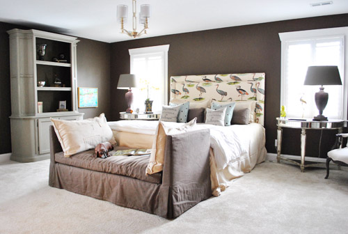
We liked this gutsy and graphic choice for the headboard. Maybe cranes (herons?) aren’t something we’re brave enough to do in our own home, but it was certainly fun and very memorable.
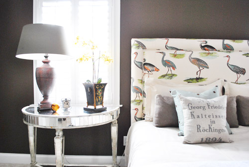
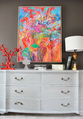
We also liked that they woke up the room with a big blast of color on one wall, thanks to this kick butt piece of art (from Crossroads here in Richmond, for anyone interested). It’s like, just when you thought the room might be too gray-washed… BAM! How you like them florals?
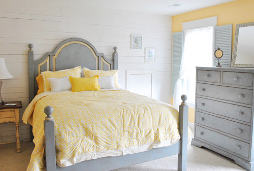
Speaking of gray + color, this guest bedroom from the “Swift Creek Cottage” also had a cozy stay-a-while vibe. We thought the shutters on the inside was a fun touch to play off the whitewashed wood wall. The whole room felt like a comfortable sun porch or something.
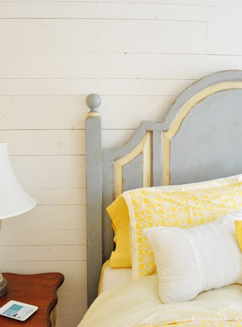
Here’s a closer shot of that wall, which they made from reclaimed pieces of lumber. And isn’t that yellow inset on the headboard a nice detail? Most of the furniture in all eight houses came from The Greenfront Furniture Market (although some of it was altered by the designers) so hopefully that helps if you’re looking for something.
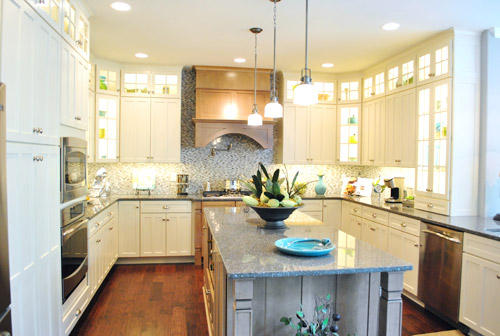
One room I’m bummed I didn’t get better pictures of is what I call the “Angel Kitchen.” Why? Because when they flipped on the lights it was like a chorus of “Hallelujahs!” It was like we had died and gone to white, glass-fronted, brilliantly-lit cabinet heaven. Feel free to play this music while staring at this picture for the full effect.
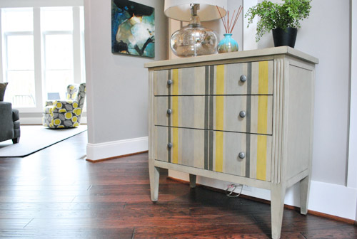
This home, named the “Modern Craftsman” was probably the closest to our current style. Actually, speaking of which – see that upholstered chair in the background of this striped side table shot? We actually used that fabric in one of our book projects!
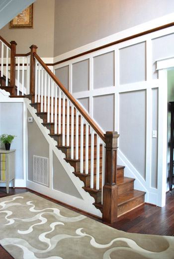
This house is also a good place to point out one trend that we noticed across all of the houses: lots of molding and trim that went the extra mile on both the walls and ceilings. For example, here’s the staircase right beside the table shown above. This was a huge double height entryway, so the trim-work cozied things up and made it feel less like an ampitheatre when you walked in.
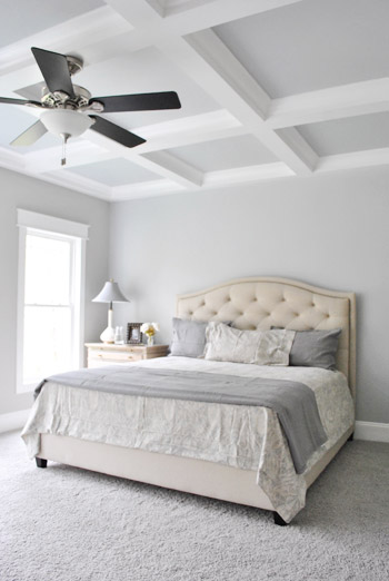
This house also carried the feature moldings into the bedroom with this pretty tone-on-tone coffered ceiling. Oh to have high ceilings like this…
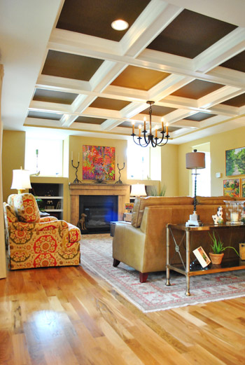
Coffered ceilings seemed to be all over the place actually. Some were more subdued (like the one above) while others were more bold, like this living room from the “European Elegance” house that used a darker color to cozy things up.
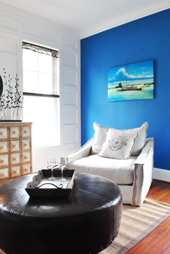
This sitting room in the “Swift Creek Cottage” used the white paneled wall to offset a bold blue accent wall, showing that just because a wall has some trim detail doesn’t mean it needs to be the only focus.
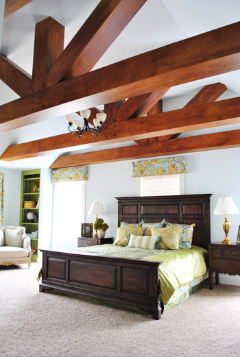
Back on the bolder end of things, the designer of the “Vintage Rediscovered” home had this outside-the-box solution for the monstrous ceiling in the main bedroom – she had the builder add faux beams (surprise, they’re actually just painted drywall).
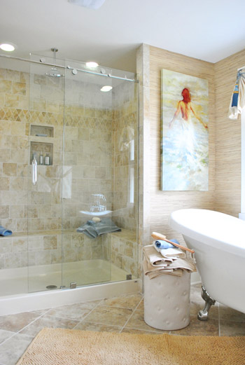
Though in this house it was the en-suite bathroom that caught our eye the most. The mixture of textures and tiles just made the whole space feel really comfortable and lived in. Sherry was thisclose to drawing herself a bath (and rubbing her face on that grasscloth wallpaper).
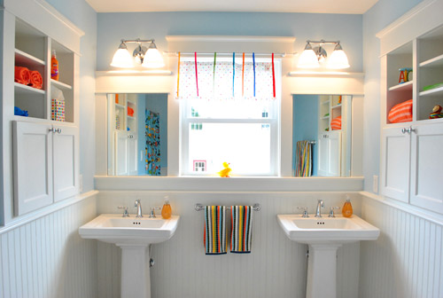
Another trend we noticed across the homes was how the builders didn’t miss opportunities to steal extra storage space by adding nooks and recessed shelves in the walls. Like this stylish kids’ bathroom in the “Swift Creek Cottage” with some built-in storage on either side of the sinks.
It seemed like every kitchen island had an open shelf or built-in bookcase on at least one end. And the kitchen from this same “Swift Creek Cottage” also had a little shelf in the half-wall next to the benched breakfast area.
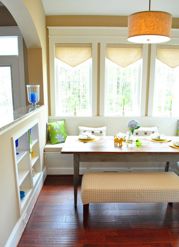
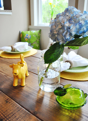
Now if only ceramic animals had been more of a trend in all of the spaces. Although we did find these guys chillin’ on the dining table…
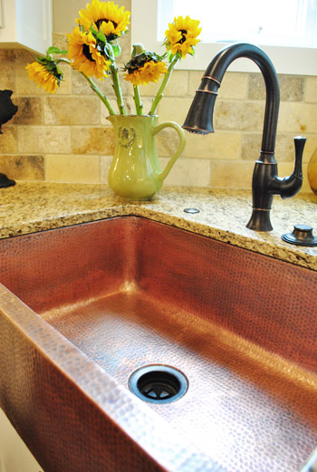
And while we’re still in the “Swift Creek Cottage”, let’s finish out some of the other cool details that we spotted there that certainly go beyond average builder finishes. Like this hammered copper apron sink (the first one we’ve ever seen in person):
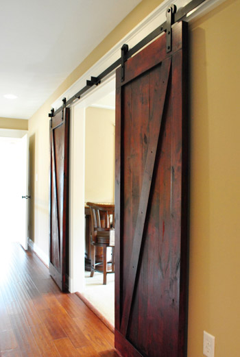
They also traded out standard double-doors for these cool rolling barn doors in an upstairs media room. Still gotta figure out a place to use these guys in our house somewhere…
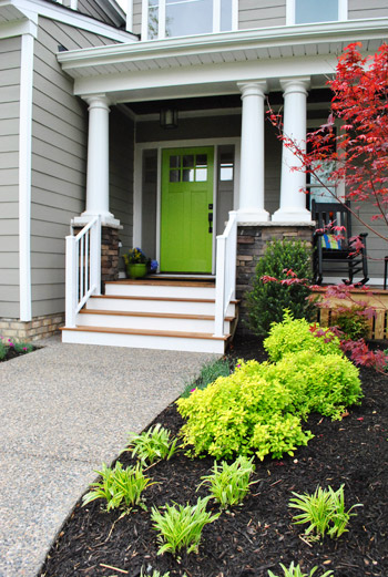
We even found the entrance of the “Swift Creek Cottage” inspiring. Check out the fun green door:
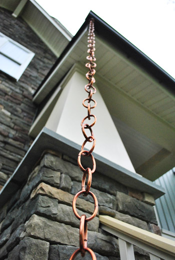
Speaking of entrances and outdoorsy stuff – we noticed more than one home that featured rain chains (which are basically downspout alternatives since rain hugs the chain and is led down to the ground). Looks like those are becoming more and more of a thing, even in new constructions. Sherry always wanted one for our first house, so we might have to make it happen in our current one.
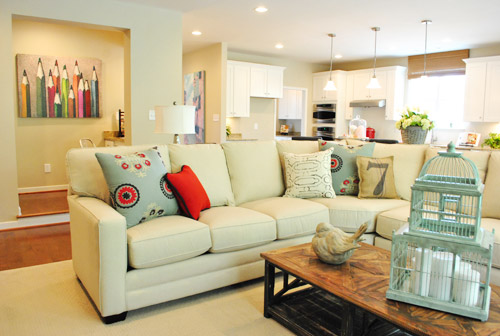
This home below was called “Simply Flexible” and featured another space that’s apparently really “in” right now which is known as the command center. See that area to the left with the pencil art? It was a small area that housed some built-in cabinets, a built-in desk and functions somewhere between a drop-zone and a mini office. Perhaps it’s the 2012 version of having a small desk for a laptop right in your kitchen?
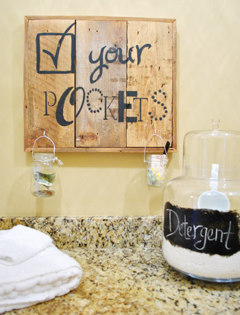
Of course, beyond these broader building trends there were still little decorating/crafty projects that we noticed. This Check Your Pockets sign in the laundry room of the “European Elegance” home (with jars to stash change, pens, candy, and money before they go into the washer) is a cute functional idea. Plus it’s inspiration to make sign art from scrap wood with any message stenciled on the front.
The equestrian-themed kids room in the “Historic Richmond” home had this cool idea of showcasing prize ribbons by clipping them on a couple of old shutters. We thought it was a fun idea even if you’d rather hit up eBay instead of the stables for your ribbons.

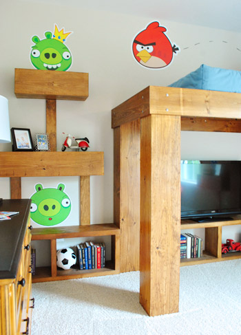
And speaking of themed kids’ rooms, I couldn’t resist showing you guys this Angry Birds room. Yes, it’s definitely bold, but I’ve gotta give them points for creativity. I loved how the bed, shelves, and even the nightstand were constructed to look like the game. Let’s just hope things don’t fall over or get blown up as easily as they do on my iPhone.
Obviously we’ve only scratched the surface of all eight houses at Homearama, so it’s totally worth a visit if you’re a local (it runs Wednesdays – Sundays through May 6th). As a heads up, it’s $10 for adults but free for kids 12 and under. Oh, and we’d love to know what home jumps out as your favorite, or if there’s a particular room or idea that you’d love to make yours. Or what general trends you’re noticing in new constructions when it comes to their layouts/design.
Psst- Still feel like snooping? Check out over 35 other houses we’ve crashed right here.

sarah says
you guys did an amazing job capturing these houses. i want to incorporate one of everything into my forever home. i am bookmarking this entire post to save for when we do start building some day.
Loren says
I seriously love the tables & chairs in that first dining room. I would absolutely do something something similar. With a heavy natural wood table & elegant scrolly round chairs.
Also I don’t think I could do a bird headboard in the master bedroom, but I think that bed would be PERFECT in a guest room. It’s quirky & fun but still neutral enough it wouldn’t been weird to sleep in. Love the house crashing posts :) You guys have great style and I enjoy hearing your thoughts on other peoples designs.
Morgan says
I think I just took half of these photos and put them in my inspire folder :)
Rhonda says
I wish we had something like this closer to where I live. I love house tours! I like to have a little glimpse into other people’s homes and decorating ideas. Knowing me, I would want to look in every linen closet and cupboard, sit on all the couches and chairs…I would get so excited to see everything!
Thanks for the tour!
Kari S. says
You know what would be so cool? If you and Sherry were hired to decorate a whole house for a ‘Parade of Homes’ type event. Now that would be very cool!
YoungHouseLove says
Oh man, that would be so much fun I’d probably explode.
xo,
s
Karen says
How did you manage to take all those pics with no other “house crashers”??
YoungHouseLove says
They actually opened things up a little early so we wouldn’t have a ton of folks walking through the pics! Haha. So nice of them!
xo,
s
Kristen @ Popcorn on the Stove says
All of those houses are really fun but I’m in love with that hammered copper apron sink. How cool!
Barbara says
I love the wall color in the first pictures – is it brown? Brown grey? What is it??
YoungHouseLove says
It was definitely on the brown end of things, but unfortunately we don’t know the exact color. Sorry!
-John
Izzie's...consigning with grace says
Barbara, Glad you like the color; it’s one of my favorites.
The name is Brainstorm Bronze SW7033 by Sherwin Williams.
Thanks for asking. Diana
Amy says
Our house is the same color as “Swift Creek Cottage” and my artsy husband picked the exact same green color for our front door last fall. I love it and we get lots of compliments on it, but it was a bold choice for sure! Thanks for these pictures – lots of great ideas here!
Barbara says
The bedroom color – not the other one! I’m losing it!
YoungHouseLove says
I think it was a rich brown color with some gray undertones. Hope it helps!
xo,
s
Izzie's...consigning with grace says
Barbara, the bedroom color is Well-Bred Brown SW7027; also by Sherwin Williams. diana
Jill G. says
The little yellow cow on the dining room table is from Target, although he is originally white. I kept wanting to buy one and paint it like they did in the photo but never got around to it and now my local store is out :( But good to know my design instincts were spot on!
YoungHouseLove says
Thanks for the tip Jill!
xo,
s
Robin says
I Love the grey on the walls. Do you have any idea of the names of those colors and who makes that paint? I am having a hard time finding the right grey.
YoungHouseLove says
So sorry, we don’t know any of the paint colors. Maybe try bringing home some swatches to see which ones you like?
xo,
s
Kathy says
I am in love with the bright colored artwork from Crossroads. Do you have a link for this store. Please, please…or the name of the artist.
One of your best house crashing adventures. This hosue is gorgeous! Very creative homeowners.
YoungHouseLove says
Here’s the store info: http://www.crossroadsartcenter.com/gallery.html
I bet if you emailed them the pic or called them you could find out more.
xo,
s
Izzie's...consigning with grace says
Kathy, the artists name is Judith Kowler and she has the most wonderful art. She was nice enough to loan us many pieces. We also had four other artists loan their work as well.
Crossroads is a wonderful gallery where local artist rent booths to sale there art. Hope you get a chance to visit it.
Sarah D says
Sherry- In case you want to add that yellow ceramic cow to your collection- I’ve seen it at the short pump target. Its priced at 4.99 I believe!
Erika says
I could move into Swift Creek Cottage today! Such lovely homes and great inspiration.
Briel K. says
Wow, some of these places are awesome! I love the Swift Creek Cottage the best but there are little things I like about the other spaces as well. Time to get to pinning! haha
Shelley says
I could stare at open houses all day! Thanks for sharing! How great is it that designers were much more creative than they would have been in the typical build-to-sell open houses! Some really interesting ideas! I would just die for the barn doors and that copper sink!
-Shelley
Kristen says
Thanks so much for this post. You know, it’s funny. I read a million blogs a day, along with reading design books and magazines and lord knows what else (like everyone, I’m sure, ha), but I am going to be re-doing our kitchen soon (a minor re-do) and I have been struggling for what to do in this one odd space by a sliding glass door in the corner. And then I saw the built-in cabinets in the kid’s bathroom above, and bam, that’s it! (Well sort of). Thank you for all your inspiration!!! :-)
kendra says
such eye candy – all of it!! loving the crane headboard not sure if i would be brave enough to do that but it really makes a statement…found the fabric here:
http://www.brickhousefabrics.com/product/Crane-blue.html
thx for the great post – and inspiration as always!
YoungHouseLove says
Love the link! And the confirmation that they’re cranes! Haha.
xo,
s
Kim @ Yellow Brick Home says
Ooh, I want a crane covered headboard now! :)
Izzie's...consigning with grace says
Kim, it is for sale! All the items in most of the homes are for sale. We got this one from Green Front in Farmville, Virginia.
lindsey says
what are you thoughts on command central/desk in kitchen idea? We are contemplating as it seems like a natural fit in our dining room/kitchen space but then I hear that they are a complete waste of space.
YoungHouseLove says
It seemed really smart to us if you have a need for it (ex: kids homework zone, place to pay bills, etc). But if you can’t think of anything you’d actually do in there (ex: you always pay bills in the office/bedroom and the kids do homework in their rooms) you might not get much use out of it!
xo,
s
Susan M says
We have a kitchen desk area, and it’s wonderful. The kids use the computer there for gaming and homework, we pay bills at it…I can’t imagine not having a space like it in the house.
hillary says
I would like to learn more about this new trend called the “command center” — I did a search online for more ideas/inspirations but the search results were all military in nature. Can you post more information?
YoungHouseLove says
You know how a few years ago lots of new kitchens had a desk area with a laptop hookup for paying bills and homework? It’s basically a more developed space like that (with a desk, computer hookup, some outlets for charging phones, a mail dumping spot, and tons of cabinets for storing things like homework and mail and bill supplies. It would be your little “command center” for things like computer stuff, bill paying, small homework projects and papers to be typed up, etc. Hope that makes sense!
xo,
s
Heidi P. says
Rolling barn doors, green front door (my favorite color!), and that hammered copper sink!!!!!!!!!!! Did I die? Yes I did.
YoungHouseLove says
Haha, so glad. Wait, not glad you died, but glad you liked it!
xo,
s
Heidi P. says
Haha
Kristy says
So much eye candy! Frantically pinning…
ashe says
OMG!!!
Everything was great but my son would flip his little lid for the angry birds room! It is almost his birthday and I was going to redo his room as a surprise. Do you have any more pictures of how the room was laid out? Did they carry the theme through the whole room? I love how they incorporated the game into the furniture! Knock on wood, but it looks like it would be pretty easy construction wise to pull off…
I am so stealing this! THANK YOU!
YoungHouseLove says
SO sorry, that’s the only picture we took, but the whole room basically had block-ish furniture in that tone and little decals stuck to the walls. It was colorful and fun- you can totally pull it off! Good luck!
xo,
s
Justin says
Hi Ashe – The interior design team at Lita Dirks came up with the overall design theme of the bedroom based on the popular computer game, and Orlean’s Homes did an amazing job of constructing the Loft style bed and shelves. Lita Dirks also custom ordered the “Angry Bird’s” decals from an online source called VinylDecals.com. It’s fun and cool in person!
Kristin Friesen says
LOVE that green front door!!!! Thank you for sharing all these wonderful rooms! I was very surprised to read that you both loved that master bathroom considering it is entirely beige… maybe your beige master bath isn’t so bad after all? ;)
YoungHouseLove says
Haha, it was totally the mixture of textures and finishes that kept things interesting! We seem to like a tone-on-tone look when there are things like multiple types of tile, textured wallpaper, pretty soft art and lighting, etc. Nice layers, ya know? I think it was the all-the-same-beige-tile-that-climbs-the-walls in our bathrooms that was driving us crazy! Haha.
xo,
s
Pamela @ Pink Hammers & Sippy Cups says
Oh my I love that pencil art! Any idea where one could get it, preferably online??
YoungHouseLove says
So sorry, we have no idea of the source. Anyone know?
xo,
s
Justin says
Hi Pamela – The pencil art is available at Art Classic Ltd. It looks great in a kid’s room too!
GretchenF says
I immediately spied one of the throw pillows in the “command center” room picture. It had a big 7 stenciled on it. I can’t believe you didn’t try to smuggle that out of there with you!
YoungHouseLove says
Haha- oh yes we loved it! We were happy he made it into the picture. Haha.
xo,
s
Kathryn says
My hubby and I are totally going to check this out! We live in Lynchburg, Va but we have the rest of the week off from work and we were thinking of taking a day trip to Richmond for some shopping. Now we have something else to add to our list! I’m so exctied! By the way, you guys should definitely check out Lynchburg sometime. It has a great downtown and tons of historic, charming homes….and a tour guide that happens to love your blog. =)
YoungHouseLove says
We’d love to check it out sometime! It sounds so sweet!
xo,
s
Rebecca says
First time commenting here…though I have been tempted to since I read your breastfeeding post, Sherry! I know you guys get this all of the time but I feel like if we lived in the same ‘hood we would be friends…totally possible too since I’m a fellow Richmonder!
My husband and I (plus our 2 1/2 yo and 10 month old) spent 3 HOURS doing the Homerama tour on Family Day last Saturday (talk about bringing snacks!!!). We loved the Southern Traditions home and couldn’t believe how massive the basement was…on top of all of the other sq. footage! Like you, we’re scouring our home for a place for the sliding barn doors. We have a step-down sitting room on half of our bedroom, so maybe there?
Also loved the board and batten in the sloped ceiling in one of the home’s bedrooms…fun twist on that idea. Oh! And we thought the reclaimed wood wall (in the Swift Creek Cottage) could easily play out as headboard idea, too…if you wanted less committment.
Hope to bump into you on a Home Goods outing one day! I wish I could promise not to be super awkward, but that’s unlikely.
YoungHouseLove says
That’s so funny! I can’t believe we didn’t bump into you! We didn’t get to see the basement for the Southern Traditions home but it sounds amazing!
xo,
s
Lynn @ SafeBeauty says
So yesterday I was stalking the back driveway at my husbands office where they were storing a stack yay high of old pallets they are getting rid of because I wanted to reclaim some and make something snazzy with it but too many of them had crazy splits in them and were super knotty so I passed. But now seeing that simple little “Check your pockets” wall art in your photos I am now praying that the pallets will still be there today when I swing by to get the man. Thanks for the inspirational picture guy!
My best, Lynn
Robin @ Our Semi Organic Life says
So fun! How can I convince my husband to go with me to this?! My favorite part is the ‘drop zone/mini office’. So practical! I would live in it if I had one!
Sarah says
wow – lot’s o’ inspiration in those homes. The Angry Bird room is perfect for my six-year-old son!! (Thanks’ for including that!)
Susan M says
I would have liked to see the river rock backsplash! And I loved the water shut off values as coat hooks – that whole mudroom idea, actually. I like that the bottoms are just open, so you can kick shoes off in there a lot. And I will NOT let my son see the Angry Birds room! But I might look around because they look like purchsed wall stickers…it would be a great addition to his room! There are so many great ideas!
Justin says
Hi Susan – The Angry Birds decals are from an online source called VinylDecals.com. I’m sure your son will love them.
Laura says
I LURV the acid green front door!! It was my favorite picture of your “tour”, which surprises me, since I’m mainly pretty traditional!
Careful on those House Tours – I went on one (Raleigh, NC 2003 Southern Living magazine Idea House) and bought the plans, AND built the house here on the Chesapeake Bay in Virginia. I knew I had to have it just standing on that white column veranda – before even stepping into the house!
So, do the Homerama folks publish a booklet with products and sources used in the tour home, like the Southern Living folks do theirs?? Would love to track down one of the chandeliers used…
Laura
YoungHouseLove says
Haha, I love that you built that house (and knew you had to have it even before stepping inside). I think most of the furnishings come from The Greenfront Furniture Market so I’d check that out to see if it’s from there. I don’t know if they have a source booklet (we didn’t get one while we were there, but we may have missed it). So sorry I can’t be of more help!
xo,
s
Robin says
Oh. My. Goodness. You guys were in the hood, and I missed it! LOL I live in Summer Lake. I haven’t been to the event yet, with the houses all decked out, but we did go to the preview. We have a home built by the Euro Elegance builder – same basic floor plan, different elevation. Please come crash my house next time you make it out to the ‘burbs. hehe
YoungHouseLove says
Haha, we’d love to! Send pics of your house for sure! We loved that floor plan!
xo,
s
molly says
this totally beats the parade of homes in colorado which are just expensive, enormous homes, with generic decorations. the one in va looks like it had so much more thought and focus and local design.
anna from door sixteen has a flower rain chain and it is pretty awesome http://bit.ly/dsvUzh
Jessie says
We have something similar in Portland, OR, called Street of Dreams. It’s the same kinda thing- custom built homes with designer interiors that are shown and sold. Normally they are big mansion-type homes, but a couple years ago (right after the recession hit) they did it in condos in downtown Portland and showed how to make a small space really outstanding. It’s so fun to walk around and look at them (and of course take pictures!).
Izzie's says
We would like to thank you both for loving our “European Elegance” house. Jill and I had so much fun with this project and Pat Harris, the builder was wonderful to work with. He gave us free rein and we took it and ran!
Come see us at Izzie’s … consigning with grace we would love to meet you both. Many of the items in our Homearama house are from our store.
YoungHouseLove says
We loved your rooms! And we can’t wait to check out Izzie’s!
xo,
s
Sophie says
Jeez – what I wouldn’t give to live in Swift Creek cottage!!! Oh, the colours, the nooks, the molding. SO. MUCH. WOOD. I’m in heaven!
Melissa says
Beautiful spaces! Do you happen to know where the pencil art in the command center came from? I love it!
YoungHouseLove says
So sorry we don’t know. Anyone have any idea?
xo,
s
tracy a says
wowzah! (nope, never typed that before) what an amazing set of places! those rooms are all gorgeous!!
Claudine says
Beautiful tour!!!
LOVED the barn doors as well!!!
Kathy says
Good news! Furniture from Homearama is on sale throughout the show as well as the Furniture Sale on May 7th.
Check this out.
http://richmondhomearama.com/images/FurnitureSale.pdf
Lanelle says
Love this post, thanks for sharing!
My parents put rain chains in their new construction in 1974, so it’s definitely been around a while. Just a warning, they tend to work better when the rain is a bit lighter. The house is in Seattle so there are all types of rain. If the rain gets too hard it goes shooting off the tops of the links instead of politely dripping down. It’s not always great for the surrounding house or plantings. That being said, I LOVE them and spent hours as a kid watching them and daydreaming. Just thought people would want to consider the volume of rain they’re dealing with as well as placement. I would expect the chain dimensions could make a difference too.
Justin says
Hi all – I was lucky enough to give Sherry and John the tour. What great fun! I’m gathering all the paint colors to share-hang tight! AND most of the items in the homes are for sale even the crane headboard.
YoungHouseLove says
Thanks Justin! For the tour… and for looking into the paint colors!
-John
Mary A says
You can look up the Swift Creek Cottage progression on Facebook
miranda bouck says
I want to live in each of these houses!
You wouldn’t happen to know where the painting/canvas/print of that boat from the “Swift Creek Cottage” room with the bright blue wall, would you? I’m in serious lust.
YoungHouseLove says
So sorry, we don’t know. Anyone recognize it?
xo,
s
Justin says
The boat canvas art in the sitting room of the Swift Creek Cottage is from Garden Ridge. It is a super peaceful addition to any room.
Krystal says
This event looks so much fun! My uncle is a contractor and he works on a lottery house every year in a big event kind of like this. They typically work on a block where four or five other houses are also being built, and then you can buy a $100 lottery ticket for a chance to win one. I love just scoping out the houses when they are all finished because they are absolutely gorgeous.
Elizabeth says
You two always notice the little things that make a room work, things that I don’t always catch the first time looking at a photo. That’s why I love your blog so much!
Do you think you’ll implement any of these design elements while doing renos in your own home?
YoungHouseLove says
Aw, thanks Elizabeth! I think we really liked the molding stuff and have been planning to try to add wainscoting to our hallway someday! We also just liked the function we saw, like mudrooms and places to drop mail and pay bills and use your house to the fullest!
xo,
s