You know how excited we get to snoop around houses and share the goods with you guys (we’ve even crashed open houses and stores), so just picture our excitement to crash EIGHT houses on one block for your viewing pleasure.
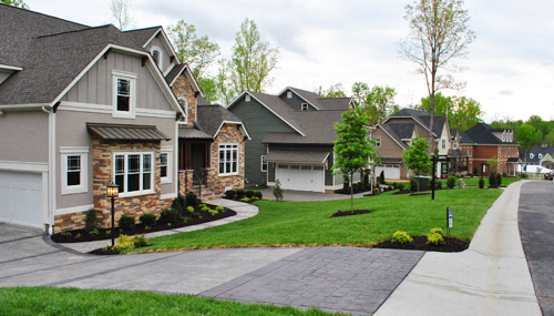
It definitely wasn’t our most traditional house crashing adventure – it was actually a home show here in Richmond called Richmond Homearama, where home builders team up with local designers to construct and decorate eight houses in a variety of styles. Most of the homes are already sold by now, but you can still stroll around for ideas and inspiration. So we thought we’d show you a few of our favorite nooks and crannies.
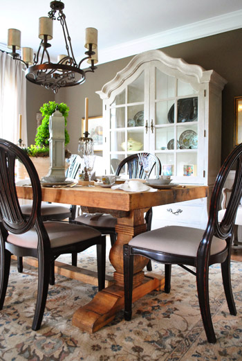
It was pretty cool how from one house to the next you could go from a casual elegant dining room…
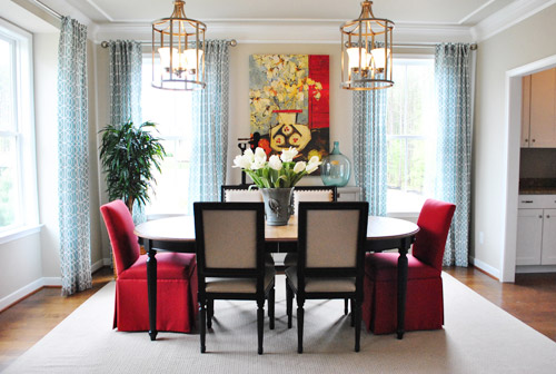
… to a polished transitional one. And since all of the rooms were done by local design pros, they seemed to be more layered and intricate than the average staged-for-sale new construction. A lot of the designers tried to do something different and take interesting risks (like two large light fixtures over a table or a backsplash made from river rocks) so it was fun to see them stretch the usual “keep it basic and neutral” house-selling rule.
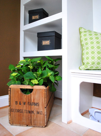
As much eye candy as there was to take in, some rooms definitely stood out to us as favorites. One being this could’ve-been-overlooked mudroom in the “European Elegance” home.
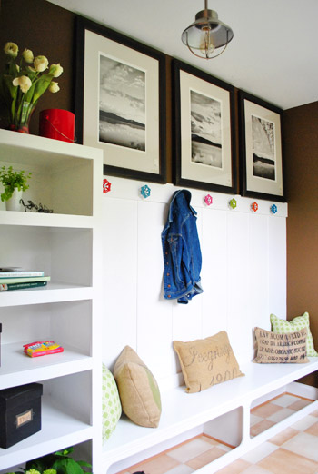
My penchant for old boxes and crates was satisfied, while Sherry appreciated the open space under the built-in bench where shoes could be casually kicked off while still remaining wrangled (let’s face it, kids don’t always put them in baskets, but the least they can do is kick them into that zone under the bench).
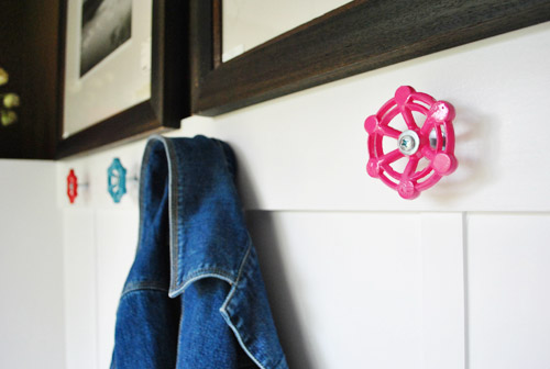
But our favorite details by far were these coat hooks made from brightly-colored valve handles. The designers picked them up at a local hardware store (Pleasants, for all you Richmonders) and spray painted them in a few happy colors (there are also ready-to-order collections on Etsy if you’re looking to recreate the look).
This house also featured one of our favorite bedrooms. And come to think of it, this was also where we found the first dining room pictured above (who would’ve thought we’d be so into European Elegance?). See that cute dog on the bench at the foot of the bed? He’s not real. But he could have fooled us when we walked in (and we later admitted we were sad that he wasn’t).
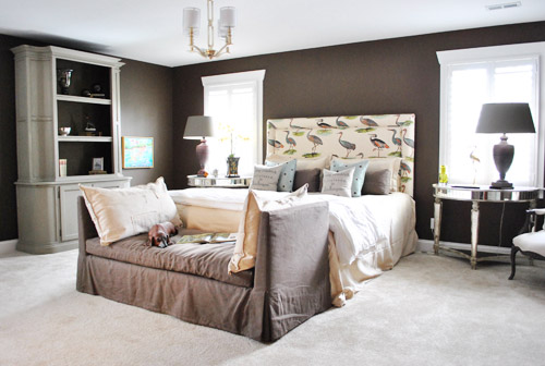
We liked this gutsy and graphic choice for the headboard. Maybe cranes (herons?) aren’t something we’re brave enough to do in our own home, but it was certainly fun and very memorable.
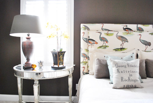
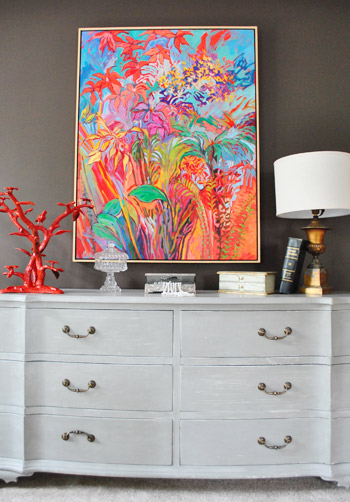
We also liked that they woke up the room with a big blast of color on one wall, thanks to this kick butt piece of art (from Crossroads here in Richmond, for anyone interested). It’s like, just when you thought the room might be too gray-washed… BAM! How you like them florals?
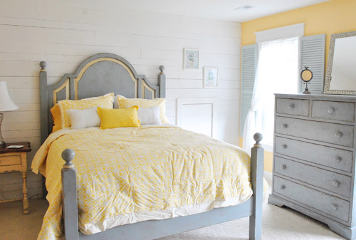
Speaking of gray + color, this guest bedroom from the “Swift Creek Cottage” also had a cozy stay-a-while vibe. We thought the shutters on the inside was a fun touch to play off the whitewashed wood wall. The whole room felt like a comfortable sun porch or something.
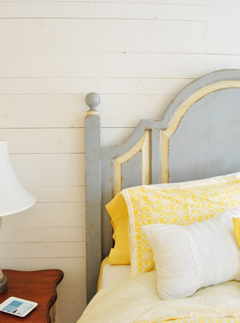
Here’s a closer shot of that wall, which they made from reclaimed pieces of lumber. And isn’t that yellow inset on the headboard a nice detail? Most of the furniture in all eight houses came from The Greenfront Furniture Market (although some of it was altered by the designers) so hopefully that helps if you’re looking for something.
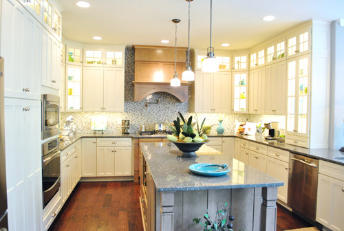
One room I’m bummed I didn’t get better pictures of is what I call the “Angel Kitchen.” Why? Because when they flipped on the lights it was like a chorus of “Hallelujahs!” It was like we had died and gone to white, glass-fronted, brilliantly-lit cabinet heaven. Feel free to play this music while staring at this picture for the full effect.
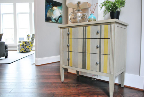
This home, named the “Modern Craftsman” was probably the closest to our current style. Actually, speaking of which – see that upholstered chair in the background of this striped side table shot? We actually used that fabric in one of our book projects!
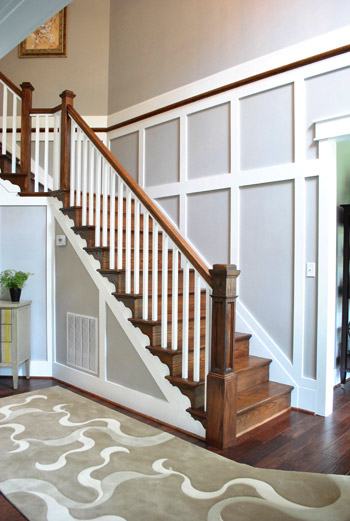
This house is also a good place to point out one trend that we noticed across all of the houses: lots of molding and trim that went the extra mile on both the walls and ceilings. For example, here’s the staircase right beside the table shown above. This was a huge double height entryway, so the trim-work cozied things up and made it feel less like an ampitheatre when you walked in.
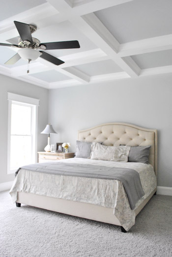
This house also carried the feature moldings into the bedroom with this pretty tone-on-tone coffered ceiling. Oh to have high ceilings like this…
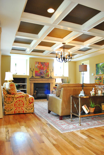
Coffered ceilings seemed to be all over the place actually. Some were more subdued (like the one above) while others were more bold, like this living room from the “European Elegance” house that used a darker color to cozy things up.
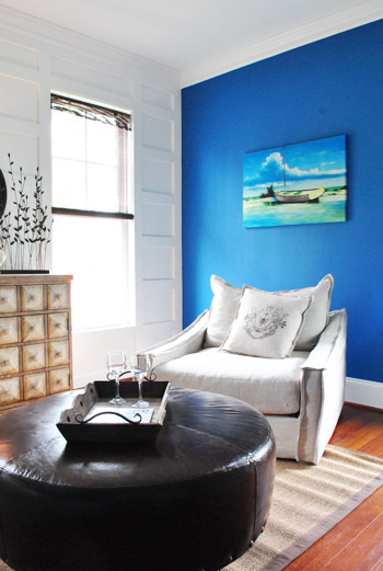
This sitting room in the “Swift Creek Cottage” used the white paneled wall to offset a bold blue accent wall, showing that just because a wall has some trim detail doesn’t mean it needs to be the only focus.
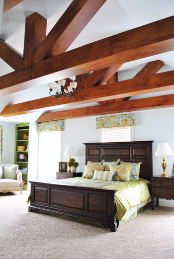
Back on the bolder end of things, the designer of the “Vintage Rediscovered” home had this outside-the-box solution for the monstrous ceiling in the main bedroom – she had the builder add faux beams (surprise, they’re actually just painted drywall).
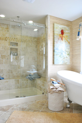
Though in this house it was the en-suite bathroom that caught our eye the most. The mixture of textures and tiles just made the whole space feel really comfortable and lived in. Sherry was thisclose to drawing herself a bath (and rubbing her face on that grasscloth wallpaper).
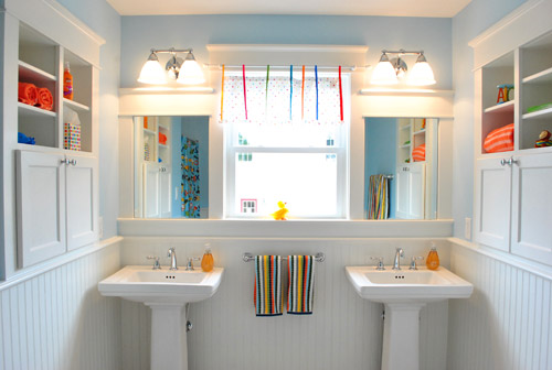
Another trend we noticed across the homes was how the builders didn’t miss opportunities to steal extra storage space by adding nooks and recessed shelves in the walls. Like this stylish kids’ bathroom in the “Swift Creek Cottage” with some built-in storage on either side of the sinks.
It seemed like every kitchen island had an open shelf or built-in bookcase on at least one end. And the kitchen from this same “Swift Creek Cottage” also had a little shelf in the half-wall next to the benched breakfast area.
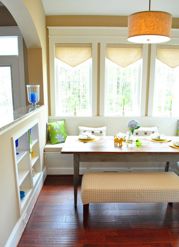
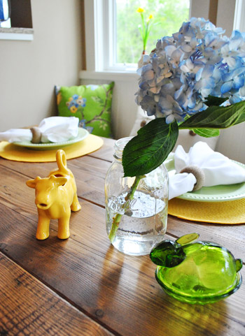
Now if only ceramic animals had been more of a trend in all of the spaces. Although we did find these guys chillin’ on the dining table…
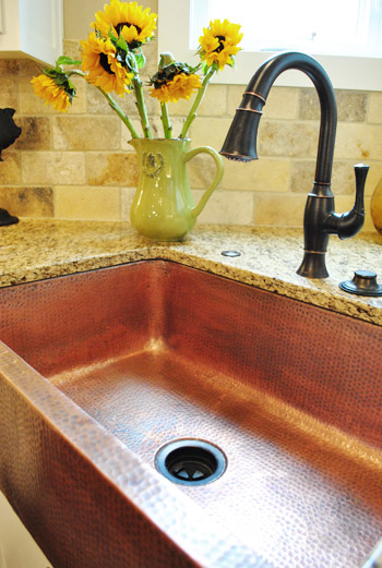
And while we’re still in the “Swift Creek Cottage”, let’s finish out some of the other cool details that we spotted there that certainly go beyond average builder finishes. Like this hammered copper apron sink (the first one we’ve ever seen in person):
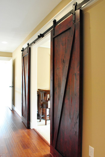
They also traded out standard double-doors for these cool rolling barn doors in an upstairs media room. Still gotta figure out a place to use these guys in our house somewhere…
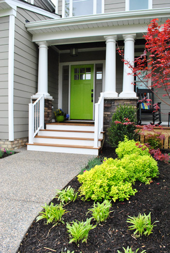
We even found the entrance of the “Swift Creek Cottage” inspiring. Check out the fun green door:
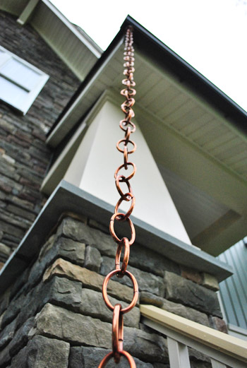
Speaking of entrances and outdoorsy stuff – we noticed more than one home that featured rain chains (which are basically downspout alternatives since rain hugs the chain and is led down to the ground). Looks like those are becoming more and more of a thing, even in new constructions. Sherry always wanted one for our first house, so we might have to make it happen in our current one.
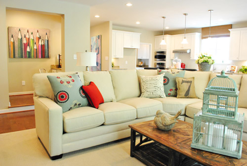
This home below was called “Simply Flexible” and featured another space that’s apparently really “in” right now which is known as the command center. See that area to the left with the pencil art? It was a small area that housed some built-in cabinets, a built-in desk and functions somewhere between a drop-zone and a mini office. Perhaps it’s the 2012 version of having a small desk for a laptop right in your kitchen?
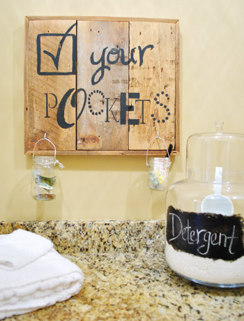
Of course, beyond these broader building trends there were still little decorating/crafty projects that we noticed. This Check Your Pockets sign in the laundry room of the “European Elegance” home (with jars to stash change, pens, candy, and money before they go into the washer) is a cute functional idea. Plus it’s inspiration to make sign art from scrap wood with any message stenciled on the front.
The equestrian-themed kids room in the “Historic Richmond” home had this cool idea of showcasing prize ribbons by clipping them on a couple of old shutters. We thought it was a fun idea even if you’d rather hit up eBay instead of the stables for your ribbons.

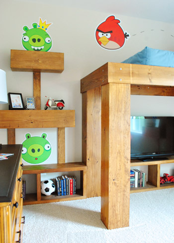
And speaking of themed kids’ rooms, I couldn’t resist showing you guys this Angry Birds room. Yes, it’s definitely bold, but I’ve gotta give them points for creativity. I loved how the bed, shelves, and even the nightstand were constructed to look like the game. Let’s just hope things don’t fall over or get blown up as easily as they do on my iPhone.
Obviously we’ve only scratched the surface of all eight houses at Homearama, so it’s totally worth a visit if you’re a local (it runs Wednesdays – Sundays through May 6th). As a heads up, it’s $10 for adults but free for kids 12 and under. Oh, and we’d love to know what home jumps out as your favorite, or if there’s a particular room or idea that you’d love to make yours. Or what general trends you’re noticing in new constructions when it comes to their layouts/design.
Psst- Still feel like snooping? Check out over 35 other houses we’ve crashed right here.

Jennifer C says
Much nicer than the Homearama down here in Hampton Roads.
Liz says
Any idea where those beautiful yellow bedding came from in the yellow and gray room? I love them!
YoungHouseLove says
No idea. Anyone recognize it?
xo,
s
Justin says
The bedding is from Target. It should still be there. It looks so great in this room – right?
YoungHouseLove says
Thanks for the info Justin!
xo,
s
Sam says
I love Homearama! We have two each year down here in Virginia Beach. Next one is in June and the other is October. You should come down since you’re close! http://www.homearama.tv
YoungHouseLove says
That sounds like so much fun!
xo
s
Ashley says
It’s nice to see what you can do with a house with white carpet. We have a contractor home in a cookie-cutter subdivision, and it seems like every blog or pin on pinterest is hard wood floors. It’s difficult to imagine how different certain styles would look with white carpet, so I always hesitate to try anything, but seeing that first bedroom photo, gives me hope!
YoungHouseLove says
Oh yes, they’re nice and neutral so a lot of things can work! So much easier to work with than periwinkle blue or dark green or something! Haha. Good luck!
xo,
s
Jen says
Love so many of the spaces you shared, but that green door is my favorite moment… Also loved the second dining room, everything from the pretty drapes to the mixture of dining pieces to the chandeliers. So pretty!
xo,
Jen
Jessie says
Hey guys! A little off topic but you have mentioned Crossroads a few times. Have you ever been to Art Works in downtown RVA? Sort of similar – it is very cool. I’m the assistant director there and would love for you guys to check it out sometime. We have 4th Friday openings, one this week actually.
<3 your blog!
J
YoungHouseLove says
We haven’t been there, but it sounds cool! We’ll have to check it out soon!
xo,
s
Kirsten says
Trying hard to pin things to Pinterest from your site. Isn’t working. Sad face. How will I remember the shoe-kick areas?
YoungHouseLove says
Hmm, is Pinterest just down? If you scroll to the bottom of each post (after clicking the title, like you do to comment) we have a Pin It button. Hope it helps!
xo,
s
Kristi says
Love the color in the breakfast area of Swift Creek Cottage. Any idea what it is?
YoungHouseLove says
So sorry, we don’t. Maybe someone from the event will drop in with that info for ya!
xo,
s
vicky says
Gorgeous! How do you guys go about deciding on whose house to crash when it’s occupied? I’d love to send pics of our renovations!
YoungHouseLove says
Send pics! We have an email address for submissions ([email protected]) and we just check out the pics and people’s location and try to make it work!
xo,
s
Andrea M. says
Any idea where the paint colors are from? Really love the yellow wall color featured in so many of the homes and would love to know if they gave out the info about color choices.
YoungHouseLove says
Here’s hoping someone from the show can drop in with that info for ya!
xo,
s
Nikki says
I need that pencil art from the Simply Flexible house!! Any idea where it’s from or where I can get it???
YoungHouseLove says
Someone from the show named Justin has commented on past comments about it with the info! Hope it helps!
xo,
s
Cristina says
So many great ideas here, thanks! Question: Any information about the pencil art above the “command center”? I love that!
Thanks, as always for the inspiration!
YoungHouseLove says
A person named Justin from the show commented with that info back in the comments. Hope it helps!
xo,
s
Erin says
Do you have any more pics of the Swift Creek Cottage kitchen/breakfast room area? That’s EXACTLY what I have in mind for our kitchen/dining room!! I want to knock down our wall and build a nook. Please?? :)
YoungHouseLove says
So sorry, we don’t. Maybe check their site to see if they have any (we linked up at the bottom of this post).
xo,
s
Crista says
At first I thought rain chains sounded like a really cool idea. But, as a mom of 3 little ones, my safety button was flashing. I can see my kids wrapping it around themselves with it being a potential strangulation/hanging method. Does the chain go all the way to the ground?
YoungHouseLove says
It usually attaches to something on the ground like a rain barrel. Hope it helps!
xo,
s
melissa says
Any idea where the blue drapes from the second dining room are from?? Love!
YoungHouseLove says
So sorry, we don’t know. Maybe someone from the show can stop in with that info?
xo,
s
Erin @ The Great Indoors says
Aaaah! I pinned at least 10 of these images. What beautiful and inspiring homes. Thanks for sharing!
Erin @ The Great Indoors.
S Reeves says
Angel Kitchen – lurve it all the way. I’m a white kitchen girl. Someday I need to send you my pix of our makeover although the only DIY was me deciding everything.
Copper sink – lurve, lurve. Wish I could afford one in my laundry room sink we’re working on now. Why do laundry rooms in Houston come with no sinks?
Barn doors – lurve, lurve, lurve. Need to buy a different home so I can have doors like those.
You – lurve all your your House Crashings!
Kristine says
I have been to Homearama in Virginia Beach VA last year and LOVED it. I couldn’t get enough of the great ideas I got from seeing these perfect homes, it was just so much fun!
Thanks for this post :) it was fun to see these houses!
Elyse says
Ahhh, I LOVE the copper sink — I’m debating adding one to our kitchen, but I’m afraid it’ll stick out like a sore thumb. I wish you had a whole-room pic of the Swift Creek Cottage kitchen, I’m interested in what the sink looks like in the grand scheme of things
YoungHouseLove says
Maybe click over to their site (the link is at the bottom of this post) to see if they have some wider shots there? Hope it helps!
xo,
s
Leigh says
LOVE those barn doors …. hoping for high ceilings to accommodate them … would be great leading in to luscious bedroom or as one of your readers said into a bathroom … stunning .. love love love them! Cheers Leigh in New Zealand
Helen Williams says
Thanks for posting about the Richmond Homerama. We live in Williamsburg and I only knew of the one in Norfolk. So excited to be able to go to this! Love the mudroom :)
Megan L says
What an awesome house! I actually LOVE the subway tiles in the background of the photo of the copper sink. Do you know where they got them and possibly who they’re by? I would love those for my kitchen. :)
YoungHouseLove says
So sorry, we have no idea! Maybe The Tile Shop since they have a pretty big Richmond presence?
xo,
s
Diane says
I love the green front door! We have been looking to re-paint our front door, and thought green would look great. I would love to know what color that is exactly?!? Love the blog!
YoungHouseLove says
Hi Diane,
Justin from Homearama actually commented with that info a few days ago. It’s Benjamin Moore Blooming Grove 413.
-John
Diane says
Thanks so much!!!
House extension architect @ GOAStudio London says
Ha! This post was a House Crash Attack! I don’t know where to start… It is true though that it is very interesting to compare different design ideas in similar houses and see what different home designers came up with.
Many things I loved, many things I was intrigued by. I got my face close to my screen to have a closer look at these: the European elegance bedroom, the “Swift Creek Cottage” bold blue accent wall, the grasscloth wallpaper (what a texture!), the barn doors, the copper sink, the rain chains. Just amazing little details, very intense. And I wish I had joined you for this House Crash too!
Jill says
Where did you get your decortive pillows in your living room??
YoungHouseLove says
They’re from West Elm, Bed Bath & Beyond and HomeGoods. Hope it helps!
xo
s
Alison says
I love the yellow and white duvet! It’s just what I’ve been looking for. Do you know where its from?
YoungHouseLove says
Anyone know? Wish we did!
xo
s
Melanee says
Love that you guys “house crash” for us. It gives me so much inspiration. I did a much simpler version of the water valve coat rack. My son’s friends absolutely love hanging their jackets on it. Thanks, again!
Meagan says
Do you know where the rustic dining table in the second photo is from? I would love to get one similar for my home!
YoungHouseLove says
I think it’s from Haynes here in Richmond?
xo
s
Cindy Roberts says
We have that same dining room table as in the first photo. Love it but will be selling it soon as we can’t take it when we move.
Shanna says
Please tell me the color of paint used on bright green door. & the lock set type n color . LOVE IT ! Need asap please!
YoungHouseLove says
Maybe try scrolling back through the comments to see if they provided that info? If not I’m afraid I don’t know it :(
xo
s