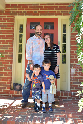
We can’t wait to share this house crashing adventure because you’ve actually seen how Lesley & Jeff live…. but that was over 4.5 years ago (before they had two sweet little boys and moved into a new home for their growing family). It’s actually a mid-century split level house in a charming woodsy neighborhood right here in Richmond, and of course Lesley and Jeff have completely made it their own.
But first, just to refresh your memory, here’s their first house – which we crashed all the way back in 2008!
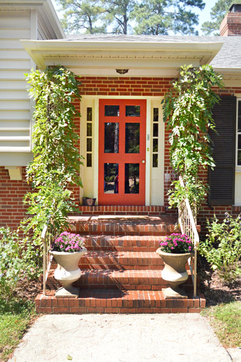
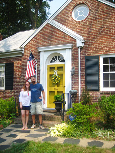
But back to their new place. You guys might remember that Lesley is a master of making ugly things into assets. For example, she didn’t like the dated iron columns full of swirls and zig-zags on her new front porch… so they trained some vines to grow around them and cover them. So charming right? No more swirly iron posts. And it was a lot more cost effective than demoing them out and redoing the porch (although they’re open to tackling that down the line).
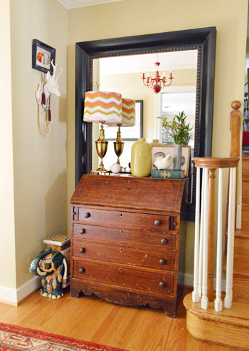
One of our favorite things about Lesley’s stye is how she mixes things. And not just anything, meaningful things. See the red chandelier in the mirror of her entryway? That was actually something she spray painted red years ago for her wedding. She and Jeff danced under that in their reception tent and now it graces their hallway. And lots of their furniture is secondhand (hooray for worn and loved pieces made from solid wood!).
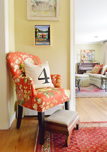
Here’s another corner of their entryway, complete with a pillow with a meaningful number and upholstery fabric that she chose to give the old seen-better-days chair a fresh look.
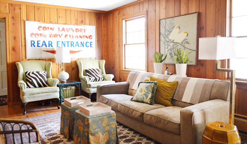
The family room was one of my favorites in the house. Why? Because it’s paneling, people! But they decided to embrace it. It wasn’t that flimsy faux paneling, it was thick solid wood and Lesley called it “embracing her inner Golden Girl.” How hilarious is she? So instead of drywalling over it or even painting it, she and Jeff added a few other retro touches (like that awesome old laundry sign that Lesley got from a local cleaners that was going out of business – she just asked for it and they gave it to her). Lesley is a master at effortlessly mixing and matching textiles (check out the layered patterns of those pillows, the rug, and those ottomans) to create a cozy and welcoming vibe. It was definitely one of those rooms that draws you in where everyone ends up. And see that pair of wing chairs? Lesley got them for $50 each on craigslist and didn’t even have to recover them (they had been covered with protective plastic for decades since they were bought!).
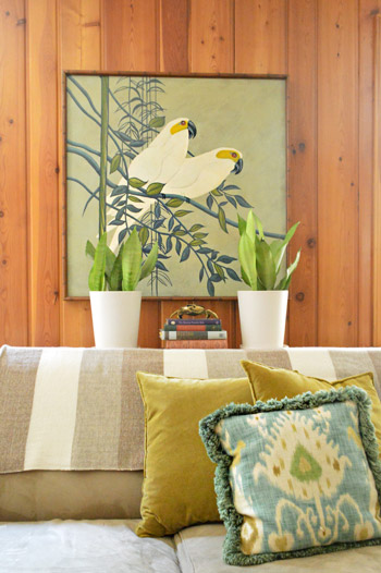
How awesome is this framed secondhand art that Lesley scored on sale for $50? Oh and the throw over the sofa is from her friend’s etsy store.
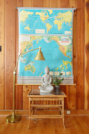
You know what John went wild for, right? This map. Lesley got it on ebay. I think the bright teal color looks awesome against the paneling with that chic gold lamp layered in.
Here’s the kitchen, complete with dark stone floors (the tile is just simple durable tile store stuff, but Lesley upped the ante by laying it in a herringbone pattern), dark painted beadboard for the backsplash that they DIYed themselves for under $40, creamy white cabinets, and dark hardware that ties into the dark floors and counters.
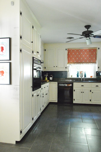
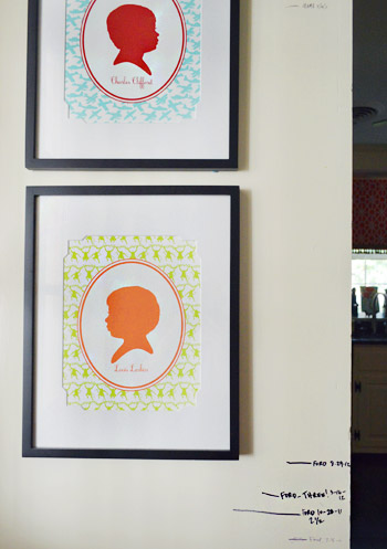
They also have a wall where they measure the kiddos and have bright silhouettes of each of them. You know we’re suckers for those personalized details.
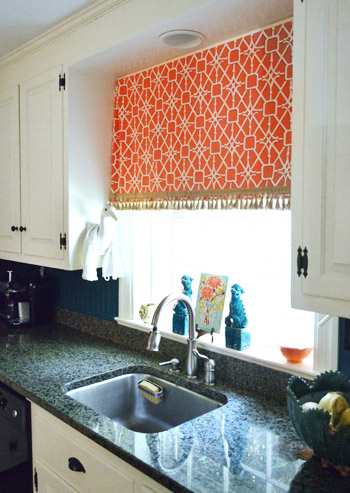
Lesley also made the curtain from happy and bright fabric with some fringe on the bottom. And check out that crane to the left of the curtain that Lesley rests her dishtowel on. Yup, I was certifiably crazy about it. And the aqua foo dogs.
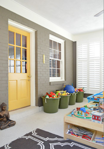
There’s an awesome sunroom off the back of the house that Lesley and Jeff converted into a playroom. They added functional toy baskets, a big train table, some rich color on the brick (Woodcliff Lake by Benjamin Moore) and the door (Goldsmith by Benjamin Moore) along with some beautiful and architectural custom window shutters. As you might guess, Clara made a beeline for that room and basically never left.
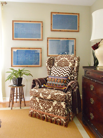
Upstairs in the bedroom is more patterned fabric, and touches of wood. And how great are those framed blueprints (from West Elm a while back)? I love how Lesley hung them in a fun offset way.
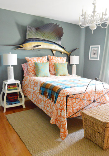
This is the guest room, complete with dusty grey blue walls, orange patterned bedding (from Pottery Barn), and a giant thrift store sailfish over the bed. And how awesome are those sculptural side tables (from PB Teen) and the textured white table lamps (from HomeGoods). It’s awesome how Lesley tempers her bold colors and accents with crisp white or rich wood to keep rooms from being too chaotic – even with a big ol’ fish on the wall.
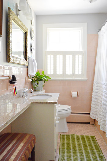
One of our favorite things about Lesley is her work-with-whatcha-got spirit. She actually embraced her pink tiled bathroom to the point that it feels totally like her. Isn’t the ornate thrift store mirror, the bright green rug from Target, and the blue-gray wall color (Metro Gray by Benjamin Moore) mixed with the ruffled curtain (from Anthropologie, but found on craigslist) so sophisticated and fun? I love how it doesn’t look too “serious” or “over designed” – it’s just easy and everything goes without being matchy-matchy. So I was so excited to share this picture for anyone else out there with a pink bathroom.
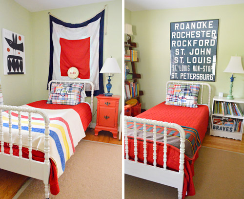
Her sons love sharing a room, and we loved how their beds were the same color/style (found on the cheap thanks to craigslist) but that the bedding was slightly different along with what was hanging over each bed (they were both secondhand finds – the flag was found locally and the old bus scroll was from ebay). We think it’s really cool to personalize each corner so things aren’t cloned but still tie together really well.
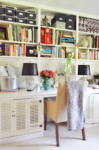
And this is Lesley’s office down in the basement. I loved everything from the black storage boxes and table lamps (those are HomeGoods lights for 30 bucks a pop) to the casual stacks of books going in all directions. Even with the blanket draped over the chair and the flowers in the vase, it definitely didn’t feel crazy-styled thanks to those random ribbons on the shelves and all of those colorful stacks of books just shoved in there. There’s something very easy-yet-chic about Lesley’s house. Like she’s not trying too hard but it still looks awesome, cozy, and personal.
So we’re sending out a huge thanks to Lesley, Jeff, and her two sweet boys for having us over so we could share all the photos with you guys! Hope you got some inspiration from things like the pink tiled bathroom and that paneled family room! Let’s play the whats-your-favorite-part game. Mine is the smart vine trick they pulled on the porch to hide those columns and the boys’ room with those matching but not too-matchy craigslist beds. And of course John loves the framed blueprints and that awesome teal map. No surprises there.
Psst- Don’t wanna stop snooping around? You can check out dozens of House Crashing adventures right here.

Kim in Iowa says
I also want to know about those silhouettes – beautiful!!
Lesley says
They are from gibsonlanestudio.com. They have so many colors and patterns to choose from!
Jamie says
I’m so impressed with herinner golden girl instincts and that wood paneling. Wowza! It looks good!
Lesley says
Hi! I am totally blushing (almost the color of our bathroom- ha!) at all the kind comments. Thank you!! Here are some of the things that people had questions about…
The silhouettes are by gibsonlanestudio.com. They are so crisp and make me happy every time I walk past them.
The beds are a Jenny Lind style- but if you are searching them on Craigslist, also search “spool” bed.
The red fabric on those chairs is from Williams & Sherrill here in Richmond, but I don’t remember the name of the pattern or manufacturer. I bought it about 3 years ago.
I will find the name of the color in the guest room and report back. I’ve got it somewhere!
And the iron bed was my first piece of “nice furniture”. It was a gift from my grandmother when I turned 20 and was about $200 at an antique store. It has such great memories it is one of those things we will always have. :)
YoungHouseLove says
Thanks Lesley! You’re the best!
xo,
s
Erica says
This house is sweeeeeeet. One of my favorite posts eva!
Emily H says
ooooOOOOOoOOoOO my freaking goodness I LOVE those shutters used as cabinet doors in the office!!!!!! I saw a TON of those down at Love of Jesus Thrift for $5 a pop a few weeks ago and left without them thinking, “hmmm……these are so cool, but what would I do with them?” DING! I may or may not be planning to drive back down there in 10 minutes…And of course, those off-set framed blue prints are THE BOMB!
Rosanna says
Thanks for sharing! Do you happen to know the color of their red front door?
YoungHouseLove says
Hope Lesley drops by with that info for ya!
xo,
s
Suzanne says
Yes, hope Lesley can tell us the color of the front door. I am loving that as well!
Lesley says
Hi! Sorry it took me so long to show up with this info- it is Terracotta Pot, number IB68, from Ralph Lauren Paint at Home Depot. :)
Nicole @ Liberty Belles says
I can’t believe I’m saying this but (eeks)…I love the paneling!
Meghan says
Think she’d come to my house? Abfab!!!
cassie says
WOW hats off to a woman who can make paneling look awesome!!!! what a fabulous home full of personality and style.
STC says
Love that elephant in the entryway and random Buddhist monastery-ish statues! So nice to bring some ethnic flair in.
Bridget says
I love that you featured a wood paneled room! We also have a knotty pine room which we call “the lodge”. I am constantly looking for examples on how other people embrace wood panel and decorate the room. (Ours is currently very bare.) If you come across other wood paneled rooms in your house crashings, I’d love to see a future post on how to embrace wood panel! :)
Audrey says
Oh, don’t mind me. I’m just green with envy! LOVE!
Kelly M says
I think this is my favorite house crash ever. It’s so beautiful. I love the mixing and matching. I can never quite pin point what my style is, but this is so it! Buddha mixed with antique furniture. It’s so eclectic, I just love it!
Rebecca in WA says
This is a fantastic house – I only wish I could have seen a full-on shot of the boys’ room. This place feels like somewhere I’d live: plenty of “stuff” around (I’m not all that tidy, so I prefer some chaos/kitsch in my life), lots of color, and lots of fun!
Colleen says
Awesome crash! I religiously read your blog (stumbled upon it last year while looking for painted fireplace inspiration!) but this is my first time leaving a comment. Do you happen to have any wider angle shots of the front of their house? We are trying to embrace our 1970’s split level. I love the inside, but the outside of our house leaves little to be desired. Off to the left of their porch I see what looks like an architectural/decorative support to their second level. I’d love to see more, I think that would be a great way of making sense to having the second floor of your house stick out OVER the first floor! I will never understand why that was so popular. Thanks for all you do!
YoungHouseLove says
Aw man, the lighting was harsh so we only took a detail shot. So sorry we don’t have a wider one for ya!
xo
s
Lesley says
I don’t understand the second floor sticking out either! Looks like a weird overbite or something. :) Our second level has off white siding, and the rest of the house is brick. Our shutters are a really deep green, and I like that with the front door, but I look forward to painting the house someday. The other “overbite” houses in our neighborhood that look the most attractive in my opinion, are the ones where it is all painted the same color. Takes your eye away from all the separate pieces!
Lisa in Seattle says
Love so much about this house, especially the airy, cheery palette. I’m crazy about the stone tile pattern in the kitchen. And that nook with the old secretary desk and the huge mirror? GE.NI.US.
Plus the whole family is just cute as bugs.
Amanda Jean says
Love, love, love this. It’s not too styled, personal, quirky. Now all of a sudden I feel like I can work with the deer head my husband deemed necessary to hang in our spare bedroom…Put a deer on it!!
littleoakcreations says
Love all of the vintage touches. I don’t have any pink tile but that grey is very interesting with the pink tile… I like it alot! :) Thank you for sharing!
Nora says
I love this house. it’s the type of home where you don’t have to have your shirt tucked in or ensure you’re displaying proper table manners at all times. (which fork is for the salad, anyway?)
heather says
That woman can put pieces together. Hands down. I definitely think she is the most talented at it, to date, of the house crashes I’ve read. While some of the items aren’t my personal taste (who really has the same taste anyway?) I have serious respect for how it all came together. I don’t think it’s easy to tie in a giant fish and have it look awesome.
Libby says
Love this house crash; would love to see more photos of the office and the formal living room you could see in the background of a photo. They have done a great job of mixing and matching so it really has that lived in look. Great choice!
Hope you are adding Atlanta to your list of book signings! Great job on the book, well done!
Also as a side comment, I think that I really enjoy your blog more than any others because you are consistent and always are on time. I enjoy looking up at the clock and seeing 10am knowing that a new post is up and ready to read every weekday. Great ideas and wonderful information. Really helps you step away from the grind of every day and look at your house in a different way.
YoungHouseLove says
Aw thanks so much Libby! And we definitely hope to add Atlanta to the tour list- hopefully soon! We’re just waiting on it being finalized and we can spill all the details!
xo
s
Megan says
Their first house crashing (attic bathroom) is actually how I stumbled on your blog!
Vanessa says
This is so refreshing! :) I thought I was the only one with a bedroom with a huge stuffed fish on top of the bed!!! Love it!
DeNacho says
wow did they take their screen/storm door with them from their old house?
YoungHouseLove says
I think they’re just the same style. There are lots like that here in Richmond!
xo
s
Lesley says
That was one of the first things we bought when we moved into this house. I love that kind of door! And yes, they are ubiquitous in Richmond. :)
Liz O says
I HAVE A PINK BATHROOM! I keep thinking about gray for it but just couldn’t picture how it would look, so thanks for sharing this one! I def think gray is a winner! :)
Jennifer F says
This is probably my favorite house crash ever. I love the beautiful modern kitchen, the happy and warm paneled room, and I love love love the pink bathroom. We didn’t rip out our baby blue tub when we remodeled our bathroom (a necessity because there was cardboard paneling around the shower and serious funk under the flooring)and I’m happy to see that we aren’t the only ones! They truely made it more beautiful with their well chosen touches (love the countertops in the pink bathroom.)
Misty @ 2brokebruces says
Such a charming house! Question: any idea as to the paint color in the boys’ bedroom? It’s the color I was going for recently when I painted a room in my house, but mine ended up waaay to bright… kinda like a highlighter threw up on the walls. :( I’d love to know in case I decide to tackle it again! Thanks!
YoungHouseLove says
Hope Lesley drops in with that info!
xo
s
Lesley says
It is Ben Moore C32-3, and the name is Bresbain. Sorry it took me so long to reply!
Jenna says
Wow, I really like this. It’s fun look at this house and their last, really unique style and knack for mixing and matching.
Erin says
The silhouettes are precious. I am noticing that the mattes are really interesting. Did Lesley do those mattes herself? I’m hoping she lets us know. Thanks!
Lesley says
I bought them at Ben Franklin (now AC Moore). They were mixed in with all the other ones in those flat mat displays. I thought they were cool too!
Diane says
Wing chairs covered in plastic = Everybody Loves Raymond!
YoungHouseLove says
Haha!
xo
s
Ali says
So fun to see their house through your eyes and pictures! Every time I’m at their house, I find something new I love. Only Lesley can make all that crazy stuff work together and have it look great. Plus, they’re great friends!
Meredith says
Oh my!! What a beautiful house – I am inspired how they worked with so much of what the house already had. Also, I really love the beadboard backsplash!! Do you know if they have any more close-up pictures of that, or even a tutorial on how to make it happen? Our kitchen is very similar color-wise and I think this could be just the ticket for our backsplash.
YoungHouseLove says
We don’t have any closer shots but maybe someday if Lesley starts blogging she can share some :)
xo,
s
SusanG says
I grew up in Richmond and BonAir in 2 split levels that had the pine paneled family rooms. Thank heavens only one of them had the pink bathroom! So many great memories! I sold the last one after my dad had died and when my mom had entered an assisted living.
Thanks for the update on what new families are doing in those homes, the kind that had such great bones. I’m fascinated that with the right outlook, even pine paneling can look timeless!
Camille says
Love it. My favorite crashed house ever. I appreciate that they didn’t try to dramatically change everything (like the pink bathroom). There is a lot of skill and talent in pulling that off! Plus it retains a little history to the old house, and it encourages all of us who can’t/won’t demo a bathroom.
renee says
Very cool. I loved the laundromat sign and the kitchen floors the most. The pink bathroom rocks, too. I wonder if she could revamp my “harvest gold” hideous hall bath. :)
ashlie says
I want to pin every picture in this post!!!
Laura says
I love everything about this space!
Kate says
Favorite house crash so far! What is that beautiful, soft beige/blonde color in the entry? I’d love to know.
YoungHouseLove says
Hope she shares that soon!
xo,
s
Lesley says
Hi! It is ‘Straw’ by Ben Moore and the number is 1079. Sorry it took me so long to reply!
Jen. says
OMG, how I love that house. Thank you and the homeowners for sharing!
Terresa says
I LOVE IT ALL. Now this is a REAL house. Not just gutted and made to look all glossy-picture-perfect. I love that pink bathroom. I’ve always kind of dug that pink tile, it’s not a horendous color, and they’ve pulled it off very well. I would have never thought to balance it out with some of the other colors they chose, especially that upholstered ottoman in there. But it works well:)
Tiffany T. says
I can.not.believe.that was four years ago!! I remember loving the eclectic feel of their place the first time and I like how they’ve just re-imagined the same feel..four years..dang I been readin a looong time : ) Loving every bit of it too!
YoungHouseLove says
Woot! Thanks for reading all this time!
xo,
s
Nicole says
I love how this house is layered- it looks like they didn’t gut it, but worked with what they had and added as they could. The result is so unique!
Karoline says
Hi guys! I have loved your blog for a while but this is my first comment. I was so excited to read that you were going to be “crashing” a split-level house. That’s what I have too. The house pictured here has great style! I know you guys are super busy but I have been struggling with a house question and I thought I would put this out there. I have the more traditional style of split level where you walk into a small square foyer and the stairs immediately lead up to the main level or down to the lower level. You go up about 6 stairs and then you are in our main hallway. My problem is, when you reach the top of those stairs you are basically staring at a wall and you have to turn right or left to go either into the living room area or back toward the bedrooms. I have yet to figure out what to do with this wall. My original idea was to do a long wall of family photos all the way from the corner of the living room back into the bedroom area, but I feel like that is awfully busy-looking for when you first walk in. I’m looking for a way to make that wall seem more…welcoming, somehow. A mirror? Or is that kind of scary because you walk up the stairs and BAM! there’s your reflection? I need something that will tie in with the family photos that I do have further down the wall, but somehow will say “hello and welcome to the craziness that is our home.” Any ideas? I appreciate it so much!!
YoungHouseLove says
Ooh what about a subtle paint treatment like soft tone on tone stripes or an awesome low-contrast stencil or wallpaper? It’ll make the whole wall an accent without being too busy.
xo,
s
Karoline says
Ooh! I can kind of see a low-contrast stencil working there, or a really subtle pattern that would sort of “flow” you into the rest of the house, if that makes any sense. I will have to give this some thought. Thanks so much for the reply!!
Allie says
Wow — the pink bathroom! My parents have one of those. To up the styling ante, however, they have blue fixtures — bathtub, sink and toilet. Truly vintage, but I’m not sure it’s in a good way, ha ha!
Katie says
I just looked at your book tour schedule for this week…holy moly!! Are you guys on the road until Saturday after the Dallas signing? I remember you saying once that you had never spent a night away from Clara (at the start of the tour) and now you had to jump into a week away from her. I’m sure you guys are counting down the days, hours and minutes!
YoungHouseLove says
Yes we are traveling until Sat. Seven flights in all. So hard to miss beansie, but she is happier at our house with her grandparents than living on planes and in hotels. We definitely love Skype right now!!
xo,
s
Morgen says
Her house is adorable! I’m so jealous of people who are able to have cute houses and have small kids. I’ve tried for the past 11 years and I can’t get the kids to leave the decorative stuff alone. Throw pillows on the floors, books used as skates on the rug, nick knacks disappear and become integrated into their rooms, and things hung on the wall are at risk to become target practice. Oh well, maybe one day, lol.
Katie @ Paisley Print Shoes says
I’m usually a YHL stalker and not a commenter…but I HAD to say something today! We have real wood paneling in our family room too – not only on the walls, but on the ceiling, too! I have had to learn to embrace it…and strangely, the room that I once hated is SLOWLY becoming one of my favorites. Thanks SO MUCH for sharing this house! I love the “work with what you’ve got” style!
Torey says
Do they have a blog? Also, can we see the living room? Loved the peek from the entry way, but I’d like to see the whole thing!
YoungHouseLove says
Whenever we don’t share a room it’s usually just because our shot didn’t come out well (a big glare, uneven lighting, fuzzy focus) or the homeowner has asked us to avoid shooting it. So sorry if things aren’t in here! We try to include as much as we can each time! As for a blog, I hope someday Lesley will start one. I’d read it every day!
xo,
s
Beth says
Wow! They have style! I could never pull that off!
Elizabeth says
This is my favorite house crash to date. So much to love the slightly beat up secretary in the entry, the brass lamps, the fish! I’m glad to see a house that looks homey and filled with collected items.