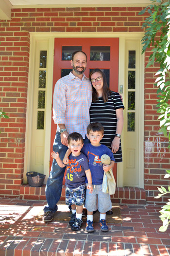
We can’t wait to share this house crashing adventure because you’ve actually seen how Lesley & Jeff live…. but that was over 4.5 years ago (before they had two sweet little boys and moved into a new home for their growing family). It’s actually a mid-century split level house in a charming woodsy neighborhood right here in Richmond, and of course Lesley and Jeff have completely made it their own.
But first, just to refresh your memory, here’s their first house – which we crashed all the way back in 2008!
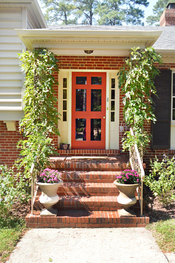
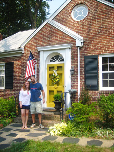
But back to their new place. You guys might remember that Lesley is a master of making ugly things into assets. For example, she didn’t like the dated iron columns full of swirls and zig-zags on her new front porch… so they trained some vines to grow around them and cover them. So charming right? No more swirly iron posts. And it was a lot more cost effective than demoing them out and redoing the porch (although they’re open to tackling that down the line).
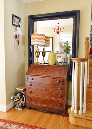
One of our favorite things about Lesley’s stye is how she mixes things. And not just anything, meaningful things. See the red chandelier in the mirror of her entryway? That was actually something she spray painted red years ago for her wedding. She and Jeff danced under that in their reception tent and now it graces their hallway. And lots of their furniture is secondhand (hooray for worn and loved pieces made from solid wood!).
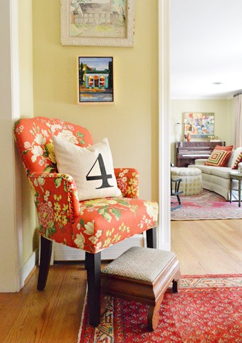
Here’s another corner of their entryway, complete with a pillow with a meaningful number and upholstery fabric that she chose to give the old seen-better-days chair a fresh look.
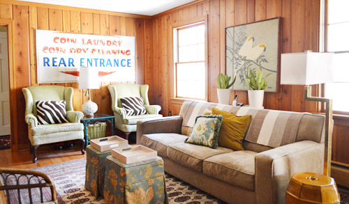
The family room was one of my favorites in the house. Why? Because it’s paneling, people! But they decided to embrace it. It wasn’t that flimsy faux paneling, it was thick solid wood and Lesley called it “embracing her inner Golden Girl.” How hilarious is she? So instead of drywalling over it or even painting it, she and Jeff added a few other retro touches (like that awesome old laundry sign that Lesley got from a local cleaners that was going out of business – she just asked for it and they gave it to her). Lesley is a master at effortlessly mixing and matching textiles (check out the layered patterns of those pillows, the rug, and those ottomans) to create a cozy and welcoming vibe. It was definitely one of those rooms that draws you in where everyone ends up. And see that pair of wing chairs? Lesley got them for $50 each on craigslist and didn’t even have to recover them (they had been covered with protective plastic for decades since they were bought!).
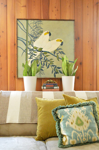
How awesome is this framed secondhand art that Lesley scored on sale for $50? Oh and the throw over the sofa is from her friend’s etsy store.
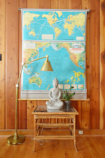
You know what John went wild for, right? This map. Lesley got it on ebay. I think the bright teal color looks awesome against the paneling with that chic gold lamp layered in.
Here’s the kitchen, complete with dark stone floors (the tile is just simple durable tile store stuff, but Lesley upped the ante by laying it in a herringbone pattern), dark painted beadboard for the backsplash that they DIYed themselves for under $40, creamy white cabinets, and dark hardware that ties into the dark floors and counters.
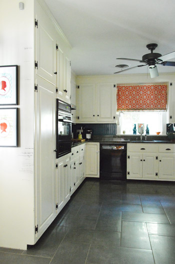
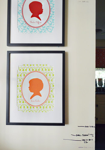
They also have a wall where they measure the kiddos and have bright silhouettes of each of them. You know we’re suckers for those personalized details.
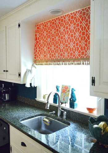
Lesley also made the curtain from happy and bright fabric with some fringe on the bottom. And check out that crane to the left of the curtain that Lesley rests her dishtowel on. Yup, I was certifiably crazy about it. And the aqua foo dogs.
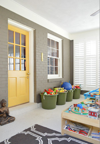
There’s an awesome sunroom off the back of the house that Lesley and Jeff converted into a playroom. They added functional toy baskets, a big train table, some rich color on the brick (Woodcliff Lake by Benjamin Moore) and the door (Goldsmith by Benjamin Moore) along with some beautiful and architectural custom window shutters. As you might guess, Clara made a beeline for that room and basically never left.
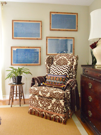
Upstairs in the bedroom is more patterned fabric, and touches of wood. And how great are those framed blueprints (from West Elm a while back)? I love how Lesley hung them in a fun offset way.
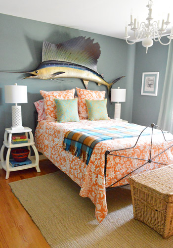
This is the guest room, complete with dusty grey blue walls, orange patterned bedding (from Pottery Barn), and a giant thrift store sailfish over the bed. And how awesome are those sculptural side tables (from PB Teen) and the textured white table lamps (from HomeGoods). It’s awesome how Lesley tempers her bold colors and accents with crisp white or rich wood to keep rooms from being too chaotic – even with a big ol’ fish on the wall.
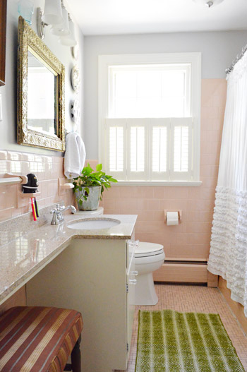
One of our favorite things about Lesley is her work-with-whatcha-got spirit. She actually embraced her pink tiled bathroom to the point that it feels totally like her. Isn’t the ornate thrift store mirror, the bright green rug from Target, and the blue-gray wall color (Metro Gray by Benjamin Moore) mixed with the ruffled curtain (from Anthropologie, but found on craigslist) so sophisticated and fun? I love how it doesn’t look too “serious” or “over designed” – it’s just easy and everything goes without being matchy-matchy. So I was so excited to share this picture for anyone else out there with a pink bathroom.
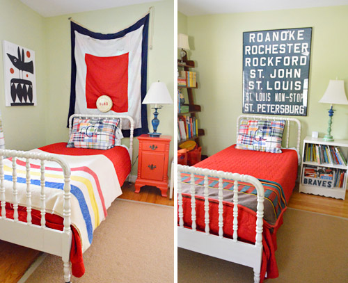
Her sons love sharing a room, and we loved how their beds were the same color/style (found on the cheap thanks to craigslist) but that the bedding was slightly different along with what was hanging over each bed (they were both secondhand finds – the flag was found locally and the old bus scroll was from ebay). We think it’s really cool to personalize each corner so things aren’t cloned but still tie together really well.
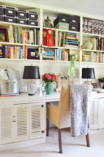
And this is Lesley’s office down in the basement. I loved everything from the black storage boxes and table lamps (those are HomeGoods lights for 30 bucks a pop) to the casual stacks of books going in all directions. Even with the blanket draped over the chair and the flowers in the vase, it definitely didn’t feel crazy-styled thanks to those random ribbons on the shelves and all of those colorful stacks of books just shoved in there. There’s something very easy-yet-chic about Lesley’s house. Like she’s not trying too hard but it still looks awesome, cozy, and personal.
So we’re sending out a huge thanks to Lesley, Jeff, and her two sweet boys for having us over so we could share all the photos with you guys! Hope you got some inspiration from things like the pink tiled bathroom and that paneled family room! Let’s play the whats-your-favorite-part game. Mine is the smart vine trick they pulled on the porch to hide those columns and the boys’ room with those matching but not too-matchy craigslist beds. And of course John loves the framed blueprints and that awesome teal map. No surprises there.
Psst- Don’t wanna stop snooping around? You can check out dozens of House Crashing adventures right here.

Rachel says
Wow! This house is so cozy and inspiring! I do have a question, though. We have a similar scheme going on in our kitchen with the white cupboards and black appliances and accessories. I noticed that these hinges were dark along with the hardware. Is it a major faux pas to paint the hinges white and have dark hardware? I don’t want our hinges to stand out and I think they’ll blend right in if they are painted white. Everyone else disagrees and says they “have” to match. What do you think?
YoungHouseLove says
Oh no I don’t think they do! Lots of kitchens have hardware that stands out and hinges that blend. Hope it helps!
xo
s
Carol says
I noticed the front door is awesome. Is it a storm door or a front door?
YoungHouseLove says
I think that’s a storm door. Hope it helps!
xo
s
Callie jennings says
This is a very cute home. Great inspiration for the rest of us. Love the use of black. You tend toward the white in your home (which i love but would be so impractical in my home) so it was nice to see the other side of the coin.
Courtney says
My favorite house crash so far. As a mom of two little ones I appreciate how this house seems lovely, lived-in, and intentional without going over the top. All of the houses you visit are great but some look more like model homes to me. This one says family through and through. Thanks for sharing!
shells says
OMG I am madly head over heels in love with their kitchen floor tile. I’ve been aiming for a similar look and a mid grey slate is the closest I can find, but EVERYBODY has warned me “DON’T DO IT”- crazy dog and dining room furniture scraping over it”
If Lesley happens to stop buy I’d love/kill to know where she got it from and an aprox cost.
Lesley says
Hi! I couldn’t find my receipt from the tile- just looked this afternoon. But they are 12×24 inches, and it was the kind of stuff that was in the boring, inexpensive utility section of the store. If you Google “tile laying patterns” or a similar thing, you will be shocked at the range of things you can do to make boring tiles look expensive and custom!
Between Big Moments says
Wow this house looks great. So many awesome ideas here.
Erika says
This is probably my favorite house-crashing you’ve done. They look like they have a style of their own –rather than using somebody else’s style/template. And it looks great and has tons of character!
Laura says
I love love love the fish over their bed! When my grandparent’s sold their house, each of the cousins were allowed to pick one thing we wanted from the house. I picked a similar-looking giant fish that my Poppy caught in the Gulf in the 50s. EVERYONE in my family made fun of me for it, but now EVERYONE in my family wants the fish.
Frida says
My favourite part is that fish above the bed… genius…also, it’s probably the first time that I don’t think of unpainted wood paneling as dated. Love this house!
Susan S. says
Thank you for sharing this awesome house. Most of us do not have the option of gutting our rooms and starting from scratch to decorate. We live with our hand me downs, our spouses divergent tastes, and the design choices made by previous owners. Styles come and go…it is nice to see a home where the owner embraced those divergent styles. The end result is a home, you want to live in.
Anna K says
Great post! Did she ever come back with the source for the silhouettes? LOVE!
YoungHouseLove says
She did! They’re from gibsonlanestudio.com
-John
maren says
Do you know what kind of vine it is? I’ve got a pergola that I’m trying to spruce up and that would be perfect!
YoungHouseLove says
Lesley told me but I’m totally blanking. Hope she drops in to let you know!
xo
s
Lesley says
It’s wisteria. So inexpensive, and it grows like a weed! Loves bright light and it flowers in the early summer. :)
Amanda says
Any source for the gold floor lamp? Recent or a thrift store find?
YoungHouseLove says
Hope Lesley drops in to let you know!
xo
s
Lesley says
This is the lamp. However, I almost CHOKED when I saw the price- It was absolutely nowhere near that price when I bought it three years ago! I have no idea why it has gone up.
http://www.wayfair.com/Robert-Abbey-Doughnut-C-Floor-Lamp-in-Antique-Natural-Brass-146-RAB1066.html
Cara says
I LOVE this crash. She has a couple trendy things mixed in with a whole lot of unique. I’m surprised myself,but I love the giant fish!
lucy says
Oooooh! I love love that pink bathroom, and the wonderful combo of color and texture everywhere! Isn’t one of her pillows a match to your old chair fabric from the dining room? :) My favorite part of their home is the way the boys’ room comes together. Thanks John & Sherry for working hard to keep us YHL-blog addicted folks well satisfied while you are book touring!
YoungHouseLove says
So funny, we didn’t notice that about the pillow! And you’re very welcome about keeping up with posts while we’re touring- we love you guys so we don’t want to leave you guys high and dry. The blog is our first love, so we love tending to it :)
xo
s
Kiki says
I really love this house crash for a few reasons. The mix and match, as you noted, makes it really unique, but I also feel like sometimes everything I see on the internet sort of looks just a teensy bit like your style. As in, the influence of YHL has a giant trickle-down effect, so that there is a very similar style to many of the crashes (and I’m thinking broader blogs on the web as well). This house had some things that you guys clearly loved, but did not look like an imprint of you guys. I don’t mean this to make the other crashers (or other people in general) seem like copy-cats, but you guys kind of have a finger on a certain pulse, I think, and there are some trends you guys are in line with AS WELL as create with your enthusiasm. I think I’m digging a bigger hole for myself? In any case, this house stood out from among the crashes and just in general. I love all the crashes, but this one felt near and dear to me.
YoungHouseLove says
Aw, you’re so sweet Kiki! I know what you mean- we love snooping around pretty much any home and are so grateful for everyone who invites us to crash, but the ones that surprise us and have things we never could have thought of doing (keeping the paneling! pink tile bathroom!) are often the most exciting for us – just because they’re such a different POV and it’s thrilling to see!
xo
s
Julie S says
This is my favorite house crashing ever! I love her style. It feels different from yours, and sometimes I notice you guys tend (naturally!) toward people with a similar style/taste as you. She really did a marvelous job working things together. I’m going to have to go back and study the details to try and learn from her. Thanks for sharing!
Hillary says
Love this house!! Any idea what paint colors were used in the entry and in the room with the blueprints on the wall??
YoungHouseLove says
I hope Lesley drops in with that info for you soon!
xo,
s
Lesley says
Sorry it took me so long to reply! The entry color is Ben Moore ‘Straw’, number 1079. I can’t for the life of me find the color from our bedroom (the room with the blueprints) but it is definitely Ben Moore too. I like their Natura no-VOC paint.
april says
please, please, please have mooooore house crashes just like this one. i love the embracing and the great mix of new/old/amazing things. i love home projects, but me & hubby don’t know how to do a lot ourselves, so I like to embrace what we got. thank you so much for sharing.
april says
do you guys ever put the sq feet of the house in the house crashes? i would love to know…especially the sq ft comparison between their first house and this current house. it just helps me with perspective. maybe you don’t for some reason, but just curious. thanks!
YoungHouseLove says
Oh yes I’d love to remember those stats if I can!
xo,
s
Lesley says
Our old house was 1600 sq ft and this one is about 3000. We only have 3 bedrooms here (same as last house) but we have 3 living room/dens, like a lot of split levels do. :)
BreAnn says
Hey Sherry, thanks for posting the pic of the pink bathroom! I too have a 1950s pink tiled bathroom that we decided to embrace (at least for the time being). We also went with light gray on the walls, but stuck with cool neutral accents (white shower curtain and rug, dark gray vanity, black mirror and shelves). Those minor changes helped to cut down on the overly girly vibe for my hubby. :)
Sarah@Kids Heart Real Food says
I just pinned the picture of her office for inspiration when I actually have a room to use for an office. Beautiful!
Kate says
Ahh, this post made me smile…pink bathrooms get me every time! I was pretty much sold on our house as soon as I walked in and saw the 1950’s pink bathroom. The previous owners painted the vanity black, added a black mirror, and DIYd black and white curtains…it looked so retro but trendy. When we moved in I added some add’l black and white accents, and a ceramic pink owl (of course!). Then a month or two later my mom ironically found an article featuring this website: savethepinkbathrooms.com
So now I’m spreading the word…save the pink bathrooms! :)
pj says
the paneling is AWESOME! love to see that great old wood proudly showing. Love the map. I have a huge mirror like the one in the entrance. great to see how they sat a desk directly in front of it. I’m going to do exactly that with mine. Thanks for the ideas!
Jessica says
BOY did I need to see a retro pink bathroom that works! We have been battling with ours since we moved into our 50’s style home. We’re trying to embrace it. Thanks for sharing!!
Kate says
The pepto pink bathroom is fabulous inspiration for me! Mine is the same color and ive been stumped on how to make it cool and classy without doing a big money reno. Just what I was looking for!
Tracy D. says
This is probably my favorite crash you’ve done so far! I LOVE that they kept the wood paneling because we have the exact same wood paneling in the eat in area of our kitchen. I keep going back and forth – to paint it or not to paint it? I had pretty much decided to paint it because yours looks so good, but now after seeing this, I’m back to not painting it. GAH!!! But their house is amazing, so warm and inviting. Love it to death! Thanks for sharing it!
cate says
I’m struggling to find just the right neutral light sand/tan for my hallway. What color do they have in theirs? I like it.
YoungHouseLove says
I hope Lesley stops by with that info for ya!
xo
s
Lesley says
Sorry it took me so long to reply! It is Ben Moore ‘Straw’, number 1079. :)
kasey @ girl in the gray house says
what a cute house! i love its personality.
Bonnie says
Love the front door. There seem to be a lot of them in Richmond and further south. I can’t find one in Northern Virginia. Where do you get them in Richmond?
YoungHouseLove says
Most of them tend to come with older homes here. Or maybe try a salvage yard?
xo,
s
Lesley says
We bought ours through Pleasants Hardware on Broad St. in Richmond. That is the original Pleasants and they carry the largest selection of old fashioned items- the other locations are more like regular hardware stores. I hope they can ship to you!
Louise from NZ says
My favourite house crash ever! I love it so much. I think what appeals is that they have “worked with what they’ve got” and it’s nice to see that it can be done in such a stylish way. The demo’ing and the re-doing blogs are fantastic, but the ones where they make something potentially hideous (like pink-tiled bathrooms) into something inspiring and lovely.
Mallory says
I can’t be the only one who wants to know what the paint color is in that guest room (with the fish). I am trying to find the perfect blue/green/gray/aqua for my kitchen…
YoungHouseLove says
Hope she drops in with that info for ya!
xo
s
Lesley says
It is Blue Fir, number MSL124, from the Martha Stewart paint line at Home Depot.
bfish says
Rather than “colorful stacks of books just shoved in there” I would describe it as people who bought and arranged their books to read/use, rather than for the ability of a book jacket to coordinate with their decor. And I won’t even get started on making paper book jackets so all one’s books look uniform and color-coordinated. If you have books, display them in a way that makes them easy to find and enjoy; otherwise just let wallpaper/fabric/decorative objects do the heavy lifting in dressing up bookcases rather than the super-contrived “books intended primarily for decoration.”
Sorry, pet peeve of mine!!
Teri says
My kitchen is the same colors! However, I must know how you did the curtain above your sink! Please let me know. I’d LOVE to do the same thing and have even found my fabric!
YoungHouseLove says
Hope she swings by with that info for ya!
xo
s
Lesley says
Hi Teri, I just saw your question! Here’s how to do it:
1. Cut a 1×4″ pine board to the width of the opening over the window, then set it aside.
2. Figure out the length that you want the shade to be and buy the fabric for it. Also make sure to buy blackout fabric for the lining behind it. The blackout gives it a crisp, professional look.
3. Sew the layers together, iron it, then sew on your trim. Then take the completed curtain and fold it about 1″ over the wide part of the board (this part will be hidden when you put it up) and then use a staple gun to attach it.
4. At this point you might want to iron it again if it got wrinkly through all the stapling.
4. Then hold the board up to the ceiling where you want it hung, peer up underneath the fabric, and put one screw at either end of the board to secure it above your window. Voila!
Hope this wasn’t too confusing. It is hard to explain without pics!
Mary Ann says
Would love to have more info about the office desk, shuttered cabinets, bookcases and countertop. Is it homemade or ??
YoungHouseLove says
Hope she drops in with info for ya!
xo
s
Lesley says
Hi Mary Ann, I just checked back here and found your question. Sorry it is so many months later! My desk with those cabinets is part of a big old built in thing down one wall in the room. Totally 60’s homemade!
eileen marie says
When we were house-hunting in the environs of Chicago, they had a name for that tile: “Skokie Pink”.
Ann says
Thanks for sharing! What a beautiful, happy place to be! It looks like things you love and who you are get to be part of what makes this home work.
I’m also thrilled to see some great ideas for two challenges we also have in our ’50’s ranch–the metal scroll-y columns and a very PINK tiled bathroom. I like the way the soft gray adds a grown-up feel, with great accessories. Our other bathroom is blue-green tile…
Celeste says
This makes me wish I had pink tile in my bathroom!