You guys remember our friends Carey and Jordan? We House Crashed them earlier in the year and their mudroom slays me every time I lay eyes on it. Well, we’ve crashed another one of their places – this time it’s a rental home that they recently renovated and furnished. So yes, more eye candy AND more budget friendly tips and ideas to steal for yourself.
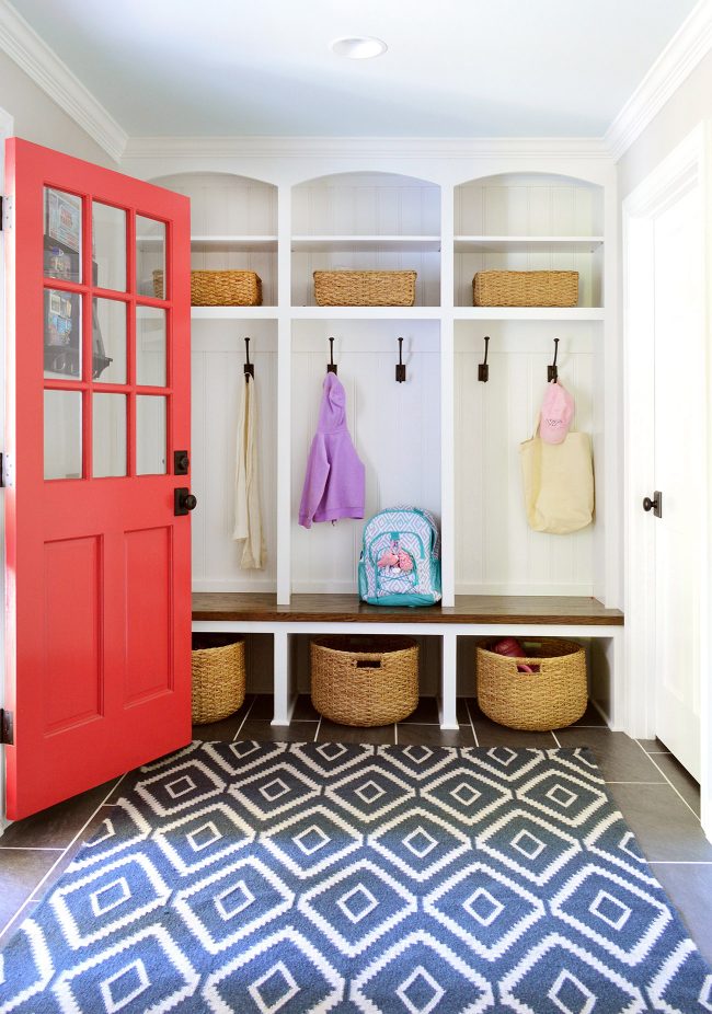
rug / round baskets / hooks / rectangle baskets / door color: Poppy by Ben Moore
The rental is a sweet ranch home in the Richmond area that they’re using primarily as a long term furnished rental, but also as a short term Airbnb between renters. It’s full of furniture and accessories from a range of places and price ranges. There are thrift store pieces, HomeGoods finds (like the console table pictured below) and Target accessories (like the gold mirror) mixed in with some elevating pieces, like Restoration Hardware cabinet pulls to make their kitchen look top of the line.
Carey even hunted down a few budget-friendly pieces in some pretty random places – like the rug below that she bought at a steep discount from a local showhouse after the show ended (it’s this rug designed by Justina Blakeney for Loloi actually!). And the awesome marble coffee table and the sectional below are from CB2, but a friend of hers was moving so she bought them from her!
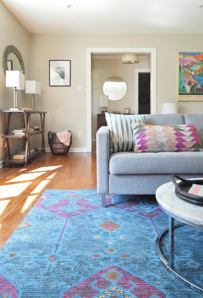
rug / coffee table / sofa / gold mirror/ foyer light fixture
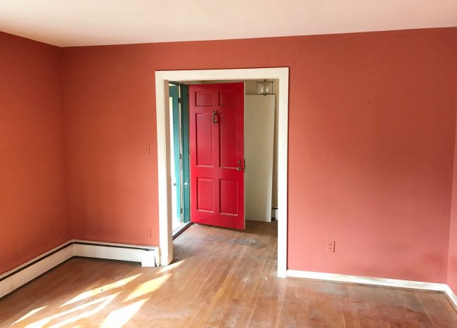
Some of the coolest things to look at are the before photos, just to see how much this house has changed – especially thanks to simple and inexpensive fixes, like PAINT! This is the same living room as the one above. I know. It’s crazy. The new wall color is Agreeable Gray by Sherwin Williams, which they also carried into the foyer for more of an open feeling.
Here’s a better shot of the foyer where Carey and Jordan repainted the red front door a moody black color (Caviar by Sherwin Williams) and got that cool sculptural pendant from Shades of Light. The little table and lamp are a HomeGoods finds and those cute framed prints over the table are from Etsy by a Richmond-based artist (here’s her shop).
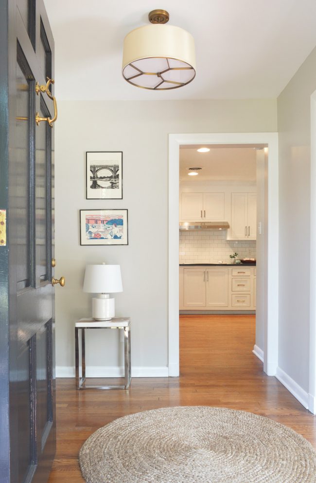
rug / light / art / wall color: SW Agreeable Gray / door color: SW Caviar
And see that view into the freshened up kitchen above? Well, this used to be what you saw through that doorway. I KNOW!!! THEY ARE BASICALLY WIZARDS AND I WANT TO STEAL THEIR WANDS!!!
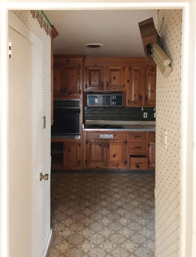
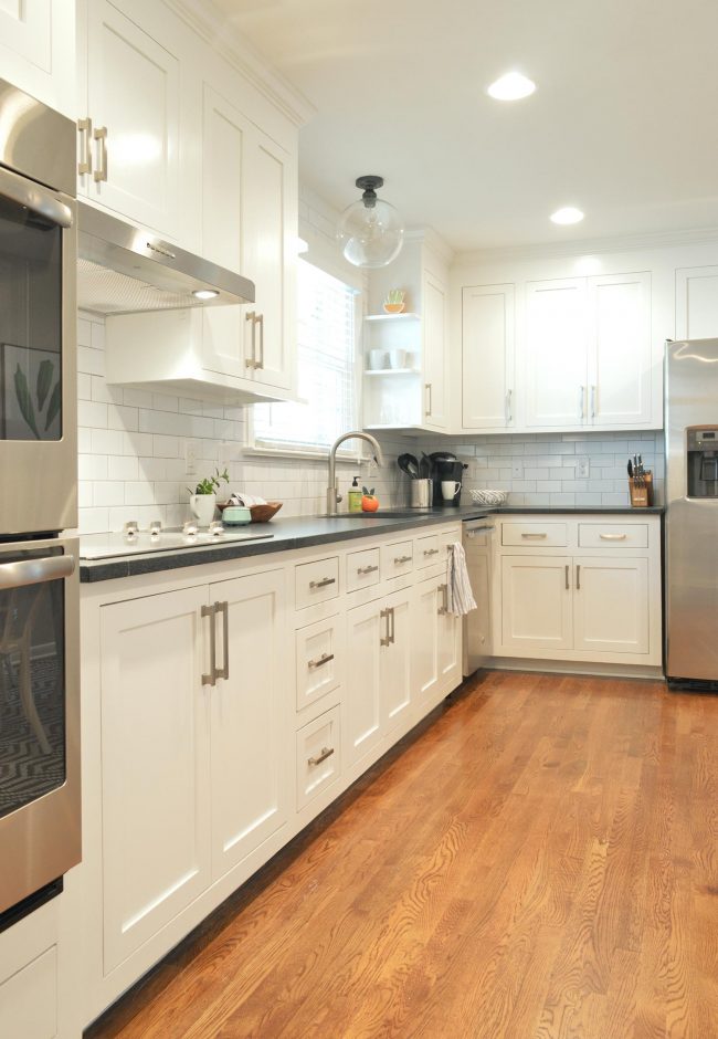
And now I’m going to really shock you. THOSE ARE THE SAME CABINETS! I repeat: THEY DIDN’T RIP OUT THE CABINETS. They just hired a local carpenter to make new inset doors for them and painted everything Extra White by Sherwin Williams. Can you even believe that?! I’m sorry for shouting at you BUT I CAN’T EVEN GET OVER HOW GOOD THIS LOOKS.
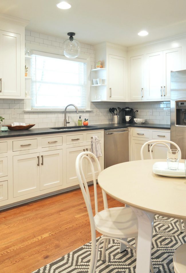
The cabinet hardware is from Restoration Hardware and the glass light over the sink is from Pottery Barn. Those choices, along with the classic subway tile backsplash and the new black granite countertops really updated the room (along with some new stainless appliances). They also laid hardwoods in here to connect to the ones that already existed in a lot of other areas of the house, which really helps with the flow and to keep things feeling open. They even squeezed in a small cafe table that seats four people, which adds some really nice function to the wall across from the sink.
Just gotta hit you with one more before, because I’m still trying to process this right along with you guys.
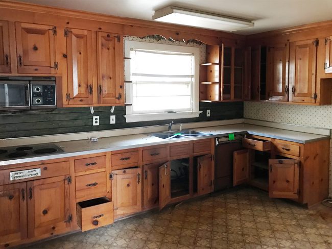
I MEAN. IT’S MAKING MY FACE CONTORT INTO A CRAZED JOKER SMILE. How cute is it to see those little shelves flanking the window go from old and rustic/country looking to sweet and clean-lined and modern?! The power of paint. Also, the power of removing the swirly header over the sink and switching out that big fluorescent light.
Here’s another kitchen shot from a different angle to show you how the table fits into the mix.
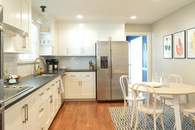
similar rug / similar table / chairs / cabinet hardware / art prints / light over sink
The table is from Target, but it’s no longer made, so here’s a similar one, and the chairs are from Target too, as is the rug (here’s the closest one I could find that they sell now). Carey joked that they must’ve paid someone’s salary at Target this year from all the shopping they’ve done there. Me too, Carey, me too.
Speaking of the rug, it’s actually an outdoor one, which is so smart for under a kitchen table – especially in a rental. Or if you have children who eat like small wild animals (isn’t that all of us, really?). The colorful art on the wall is from Lightbox print company, another local Richmond shop.
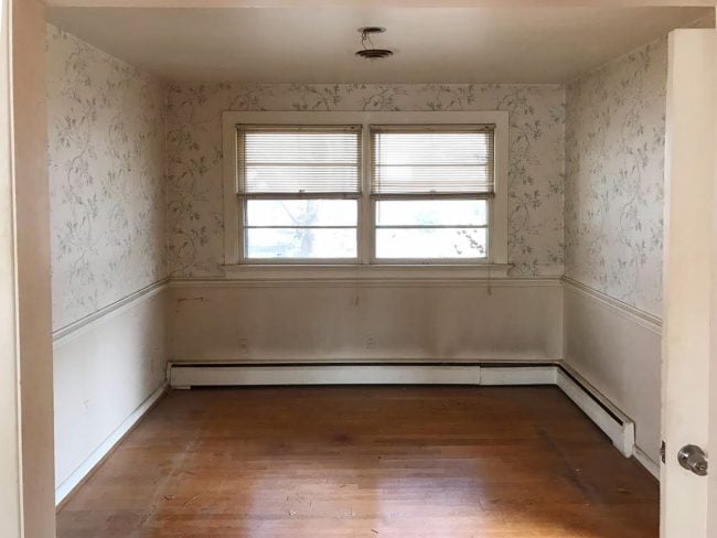
But let’s move on to another room transformation. This time it’s the dining room, which was drab and wallpapered and just pretty dingy looking.
Now it’s so fresh and extra crisp (extra crispy? or does that sound too much like a chicken strip?). I love that Carey and Jordan don’t shy away from bold colors (this is Indigo Batik by Sherwin Williams) but they keep them from feeling too overwhelming by tempering them with soothing white curtains from Ikea, that pretty white shade on the chandelier, and the light wood tones in the table and the sideboard, which was a HomeGoods find. The big mirror above the sideboard is also from HomeGoods, and it bounces a ton of extra light around the room, which is also a good tip if you have a dark room or if you use a deep color on the walls – a big mirror can be your friend.
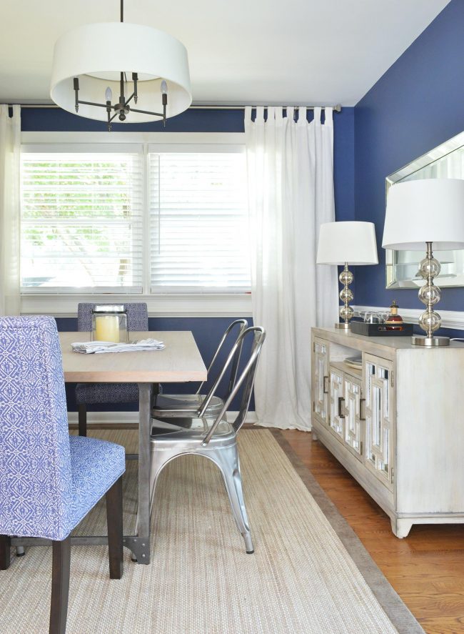
rug / metal chairs / end chairs / table / lamps / chandelier / curtains
Beyond the dining room is a cute little brick-walled room that Carey and Jordan turned into a small office/reading space. The pink chair is such a fun non-neutral choice (you know I like pink…) and that little blue filing cabinet makes me grin like a weirdo at my computer screen. That faux fiddle leaf fig is one of the Target ones I love (WHY DON’T THEY SELL THEM ANYMORE?! WHYYYYYYYY?!). And yes, I’m pretty sure she put that stack of our books out because she knew we were coming over, but man do I love that they match the file cabinet ;)
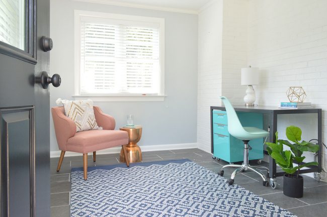
desk / pink chair / desk chair / file cabinet / similar rug / similar copper table / blue wall: SW North Star
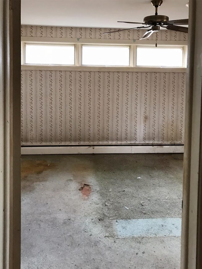
Onto the master bedroom. It was another spot that was looking extremely worn and in need of some love, along with some serious wallpaper removal.
Once again Carey and Jordan went for crisp white trim and bedding to contrast this rich and cozy wall color (Roycroft Pewter by Sherwin Williams). The rug and the bench at the foot of the bed (found at HomeGoods) add so much coziness, and the white pin-tuck bedding is from West Elm. The night stands are from Crate & Barrel, and the mercury-glass lamps, headboard and little black & white bolster pillow are all from Target.
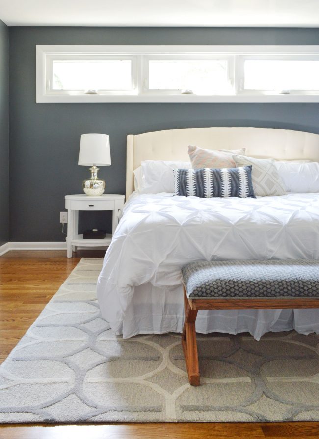
headboard / white bedding / night stands / black & white pillow / rug / bench: HomeGoods
The bathrooms are all super crisp and classic, with really nice touches like lots of storage and pretty vintage-inspired tile on the floor. The rich wood vanity in the master bathroom (via their carpenter) is such a nice contrast to the white hex floor tiles. The Pottery Barn mirror and silver sconces elevate the entire room, while the colorful rug adds some pattern and warmth (here’s the most similar one I can find).
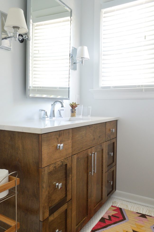
mirror / sconce / white hex floor tile / similar rug
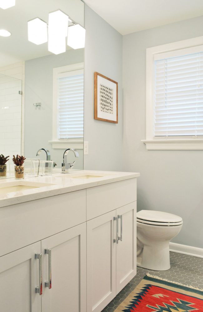
Carey and I have a theme of buying the same things by accident, so we LOLed when we realized that we both bought this framed dots Target art (she hung it in this bathroom and ours hangs in our dining room). I’m also really into the gray hex floors in here (here’s something similar). And look at all of that storage space! This vanity (also through their carpenter) is approximately 558 times nicer than our own master bathroom, which still boasts two sea-shell-shaped sinks, conveniently separated by a wall (why??? WHY?!?!). The rug in here is a secondhand score from a local consignment place called Revival here in Richmond.
So I hope you guys liked the tour! And a huge thank you to Carey and Jordan for letting us poke around with our camera (and share the pics with the interwebz). If you’re a local and you’d like to renovate a house with them (they help a ton of homebuyers in the area buy older homes and bring them back to life) you can find them here on their reno website. And if you’re looking for a rental property around here, you can get their help on their rental site. Also, if you’re ever lucky enough to meet Carey around town, you have to befriend her because her gumbo is off the chain. Yes, I’m still using that term because I’m a cool suburban mom. But seriously, it’s delicious.
And to everyone who is requesting gift guides and a big ol’ holiday post of our house all decorated, both are on my to-do list, so I hope to be back soon with more holiday goodness! Until then, just try to work “off the chain” into as many sentences as possible. I promise you’ll feel too legit to quit each time.
Psst- If you’d like to check out Carey and Jordan’s House Crashing post from back in Feb, here’s that link for you again (sometimes scrolling back up to the top of the page can be exhausting).
*This post contains affiliate links*
