We can’t believe it’s been five years (!!!) since we house crashed John’s sister Emily. And since they’ve completed a lot more rooms (we crashed them right after they moved in), we can’t wait to share the goods.
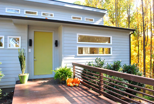
Oh and their front door is Cornichon by Martha Stewart. Every time we pull into her driveway it makes me smile.
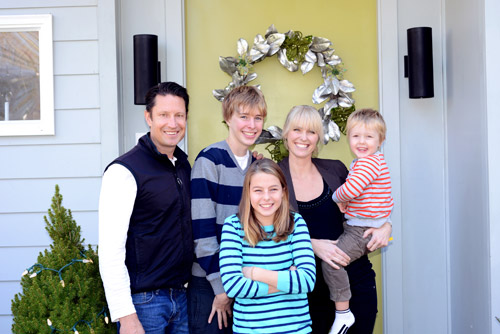
Here’s that cute family of ours now. You might remember that Emily lives with her hubby Todd, three kids, and a pretty sizable pooch named Tuck – so this is a hard working house with a big dog, a four year old, a tween, and a teen running around.
We love that it always feels welcoming and nothing’s too precious, but it still has that clean and modern aesthetic that makes people say “three kids and a big dog live here?!” And Emily definitely has a few tricks, so we’ll share those as we go. Emily’s a lot like us in her shopping ways – she finds things at thrift stores and yard sales, happily works in a few hand-me-downs, and is no stranger to affordable stores like Ikea and HomeGoods.
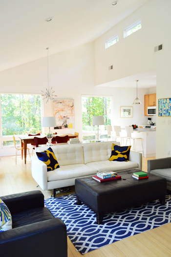
For example, her dining table is a yard sale find, the ottoman is from HomeGoods, and the rug is from Marshall’s. There’s also a splurge in there every once in a while if they save up for something, like their sofa from Crate & Barrel (if you look at our first crash, they had an old hand-me-down couch for a few years while they squirreled away the cash for a new one).
Their simple and clutter-free aesthetic definitely lends itself to the sunny and airy look of the house (they designed it themselves, and Todd is a photographer so giant windows to let in a ton of light were a must). It’s one of those “everything we need and nothing extra” houses, which always inspire me. And not having tchotchkes all over is definitely a kid and dog friendly choice (not to mention it saves major dusting/cleaning time).
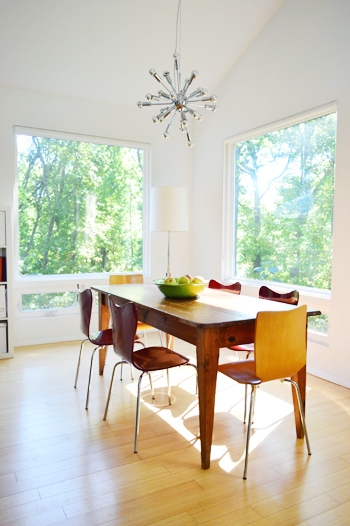
If you look closer at the picture above, the furniture picks are also practical for kids and dogs. The West Elm chairs are wooden (no upholstered seats to worry about staining) and the table is rustic and old. So even when their youngest son repeatedly bangs it with a metal car, the dings blend right in. I also love that the end chairs are light wood, the side chairs are deep red, and the table is medium wood. Nothing’s too fussy, and it oozes informal charm.
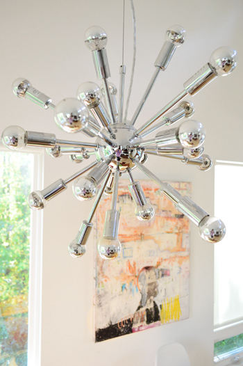
Something that makes their house even more stunning in person are the light fixtures. This one above the table is a secondhand find from ebay (search “sputnik” for others like it). And since they’re the one thing the kids/dog can’t reach, it’s an easy way to add a nice dose of unbreakable glamour.
A few more of her tricks:
- a bold patterned rug can hide stains like a champ
- wipeable furniture (like chairs, sofas, or ottomans covered in leather or a leather-like material) are easy to care for – and can even look better as they get more beat up
- white walls can make a room feel clean and airy even when there’s dusting and vacuuming to do (Emily gets rid of any wall-marks with a Magic Eraser)
- a white sofa can be covered with a white washable blanket when messy kids are doing their thing (and since it’s the same color as the sofa it doesn’t scream “blanket covered couch, here!”)
And we’re always getting requests to share non-white-cabineted kitchens, so here’s a shot of theirs, complete with wood ones:
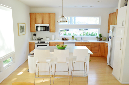
The awesomely unusual choice that they made for a modern new construction house was sleek white appliances over stainless ones – and we always marvel at them in person. They still look really clean and modern and have worked well for them over the last five years (they’re from the Jenn Air series). Oh and the island is from Ikea while the stools are from West Elm.
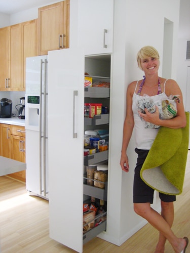
And see the white pantry that’s next to the fridge in that shot above? In our first house crashing we shared how cool it is (it pulls out and is accessible from both sides), so here’s an old photo, just for kicks. And because I’m in love with it. It’s so functional to be able to access it from either side.
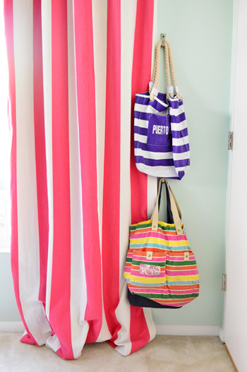
While a lot of the main floor is airy and light, the kids rooms are full of color. Here’s twelve year old Olivia’s room, complete with no-sew curtains that Emily whipped up with the ol’ hem-tape method. And you can read more about the upholstered headboard that we made for her here and the pink painted dresser here. The walls are Lazy Days by Valspar.
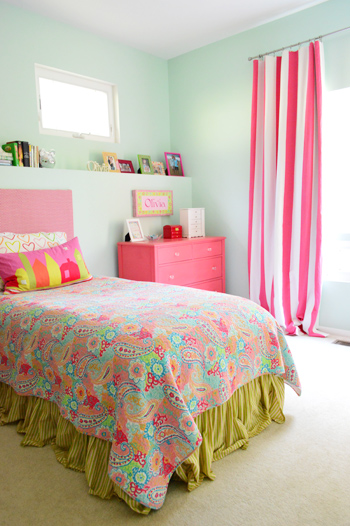
I’m in love with the bold curtains and even the hooks for bags that Emily hung behind the door to add function. Oh and she got that curtain fabric at a local store here in Richmond (called Williams & Sherrill) for anyone wondering.
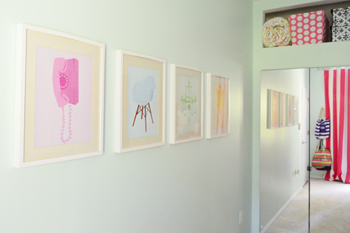
Speaking of function, above the built in mirrored wardrobe from Ikea (their modern alternative to traditional closets) there’s a nice little niche that Emily and Todd had their builder add – just to squeeze out even more storage and to create a place for colorful bedding and bins. And see those retro-ish prints on the wall? I made those for our print shop about four years ago (back when we had one) and gave a set of them to Olivia – so it’s always sweet to see them hanging in her room all these years later.
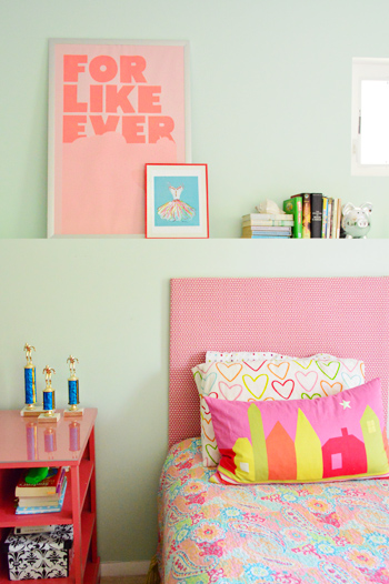
Here’s another shot of the headboard that we made along with the pink painted desk that Emily smartly topped with a sheet of affordable acrylic to protect it for the long haul (more on that here).
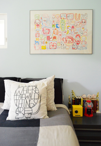
Jake’s fourteen, and he wanted a more subdued room, but it totally captures his personality thanks to the plaid bedding, the blue accent wall paired with the red side table (it’s stained instead of painted so it has a cool transparent quality), and the basketballs hanging right on the wall (which aren’t just for looks, he uses them too).
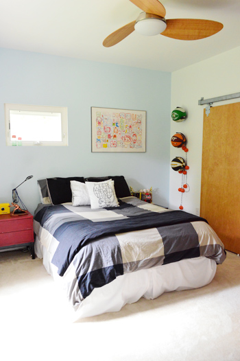
I also love the graffiti-ish monster print on the wall from Ikea a while back, but my favorites are the yellow safe and the red gumball machine (didn’t you have those things as a teen? I totally did, but my safe was purple).
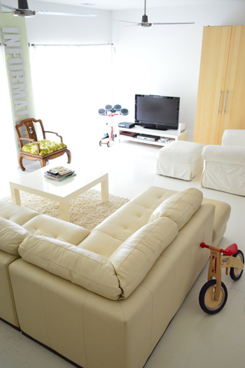
And here’s their basement rec room (it definitely comes in handy when the kids have friends over). Since Emily and Todd love their white, they opted to paint the concrete floors with a glossy (and wipeable!) floor paint. Then they layered in a giant leather sectional, which is also easy to wipe down (it has held up really well through juice stains and finger paint over the years).
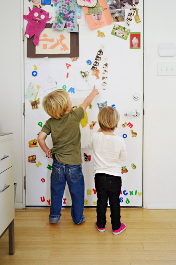
I think that the coolest thing about Emily and Todd’s white & modern house is how awesomely it lends itself to pops of color and playful touches. Take the back of their metal front door for example. It’s magnetic, so it has become a place to display kid art, favorite photos, animal and letter magnets and other random bits. I love how casual and fun it is, and Clara and Emanuel can be found playing there whenever we come over (here’s an old pic of them in action).
I think it’s tempting to wonder if modern homes with lots of white are really “lived in” or kid friendly, but Emily and Todd’s house is a great example of how they can be. And I love how when you look closer, there are some really smart choices that would work for a house of any style (like weathered wood furnishings, wipeable fabrics, and gorgeous fixtures up where no one can reach ’em). Toss in some really cool functional upgrades (like built-in niches over the closets and a pull out double-sided pantry) and you’re golden.
So we’re sending out a huge thanks to Emily, Todd, Jake, Olivia, Emanuel, and Tuck the Mutt for letting us get snap-happy at their house. Now let’s play the what’s-your-favorite-part game. Mine’s the front door (both the happy green side and the fun magnetic side) along with Olivia’s brightly striped curtains. And John lovingly runs his hands over the appliances every time he’s there. True story.
Psst- The latest edition of Clara Conversations is up on Young House Life, and it’s my favorite one yet (I say that every time, but the kid gets funnier by the day…).

Emily says
Thanks for all the feedback.
The fans are from Home Depot. I do know they do not make that same model anymore as we had to track one down 75 miles from home when we had an unfortunate incident with a balloon string. I believe they are made by Hampton Bay.
The pillow in my son’s room is from Urban Outfitter a couple years ago.
To hang the basketballs: They are called Ball Calls http://www.ballclaw.com/
We love them and I need to order more.
Basement: I use a wet mop to clean the floors and often end up spraying an area and then wiping it down with a small towel. We do have a vacuum that is great on hardwood and the basement floor. It’s great with getting the dust and dog hair.
I think I got them all for now, but I will check back later!!
YoungHouseLove says
Thanks for all the info Emily!!! And thanks again for letting us crash your pad!
xo
s
Meredith Williams says
LOVE your basement couch!!! Where is it from? Thanks! :)
YoungHouseLove says
It’s from a local furniture outlet here in Richmond called The Dump. Hope it helps!
xo
s
Megan G says
Did Todd take some of these photos, too? That dining room pic looks like a page from a magazine!
YoungHouseLove says
We took them all while he was out shooting a magazine! Hahah! I’ll have to tell John you said that- he’ll be so proud :)
xo
s
Megan G says
How ironic that he was shooting for a magazine at the time! You guys are getting good. I love how you captured the brightness of the room while still being able to see out the beautiful woods out the window.
YoungHouseLove says
Aw thanks Megan! It’s not too hard to make such a gorgeous and light-filled house look good :)
xo
s
Melissa @ Loving Here says
Love how white it is! It makes it look so bright and cheery, and is great for adding bright colored furniture!
Ashley@AttemptsAtDomestication says
I love how modern and bright their house is! I love love love windows and can’t get enough of natural light! :)
Sarah says
LOVE their house! So stylish but attainable/realistic/lived in. As for the appliances, does anyone else think stainless is on its way out? They may have been ahead of the curve on that one!
Karin K says
Well done! Love it all. Do you know where they got the sectional in the basement? If they live in the area that I think they do, because that architecture is very specific to the neighborhood I am thinking of, they have the best house there, hands down. They totally worked the house in the direction it naturally wanted to go, and it looks fabulous. I had friends who bought similar houses and tried to do a design that never worked at all with the bones of the house.
YoungHouseLove says
Yes, they got it from The Dump for a huge deal (they’re a furniture outlet). Hope it helps!
xo
s
Pesh says
You guys used the word “awesomely” in three sentances in a row. Three times in three sentances – is this a new buzz word that I don’t know about?
YoungHouseLove says
Haha, Emily’s house is just awesomely awesome.
xo
s
Lynn @ Our Useful Hands says
That’s too funny because I was just thinking about this house yesterday and what elements I want to put into this house of ours. Too funny! My favorite things (since you forced my hand) are definitely their kitchen table with the chairs and the bowl of fruit. I loves it! And then the wall of INFORMATION in the basement? It’s a little off frame but I’m just imagining it in all it’s large fonty glory being awesome in person. I just love your house guys! Minus one more baby we are in the same boat over here, so this light and bright ambiance they’ve created helps me remember that I’m not crazy for having all white cabinets in my kitchen. :o)
My best, Lynn
YoungHouseLove says
Oh yes, that Information sign is from a thrift store and it’s so cool in person – especially with light coming in from the sliders on both sides of it!
xo
s
verucaamish says
I’m totally loving how considered John’s sister’s design is. I love this philosophy of choosing what’s most impactful TO YOU. Why have a million beautiful knick knacks in a house full of kids when you can get a really great statement piece of a light fixture? In my personal life, all my clothes are thrift and sale items but my eyeglasses I spend bank on. This reminds me of a previous post you did on throwing parties. How Clara’s Nonna would make all the food from scratch but would just email invitations whereas you two would make invitations and go all out on decorations and gift bags and order pizza. For some reason that’s so reassuring to me. I’m like Sherry’s mother. I can totally do a 5 course plated dinner but can’t even put together an evite.
YoungHouseLove says
Aw that’s so sweet! And I envy your cooking ability! Haha!
xo
s
Cathy says
Magic Eraser to remove spots on the walls? Gee, I tried it a couple of times and it left marks behind that are particularly obvious when light (either sunlight or artificial light) shines on them. I wouldn’t recommend that anybody use Magic Eraser on any painted surface. Oh, and I use top of the line paint, so I don’t think that’s the problem.
YoungHouseLove says
Weird! Someone else commented right on this thread that she uses a Magic Eraser on her white walls too (very regularly) and loves it! Maybe the difference is if your walls are a color (it might leave a dull spot in the paint) vs. white (which might not have the same issue). Hope it helps!
xo
s
Tiffany S. says
LOVE it! It’s hard to find a new construction kitchen up here in the Pacific Northwest that is white. We’re moving into new construction and white cabinets were not an option. Interestingly enough, the younger buyers (30’s, I’m guessing) all went with dark Espresso cabinets with white counters (Novustone). We were the only ones who chose fir cabinets with white counters.
I wanted white appliances but wasn’t sure that was the right thing to do for resale. *sigh* I hear the glass front white refrigerators show fingerprints worse than the original SS.
Ah, the sputnik. Swoon.
First House Spouse says
OK…we’re starting to get concerned with the amount of sunlight that is pouring into everyone’s house but ours. Please tell us this is due to excellent photo editing and beautiful camera settings so we don’t begin feeling depressed with our lack of big, gorgeous windows :)
YoungHouseLove says
Haha, in this case it’s totally the house! It’s built up in the trees (the main floor is actually three stories up in the back of the lot, so it gets tons of sun) and the windows are giant (like me-sized in both directions!) but we definitely can relate to having dark rooms (our first house had a few and our current house does too). A lot has to do with what direction the house faces, and with trimming back trees if they totally shade the house. And then adding things like mirrors, breezy curtains, white trim, and other things to lighten it up :)
xo
s
Catherine says
I love white appliances, always have. So happy to see them coming back into fashion! I might be able to convince my hubby that they would be better than stainless steel yet. This is a gorgeous house and I aspire to get my house as clutter free. This is the year!
Jessica says
I LOVE this house! Thanks for sharing.
I think the “Upholstering a Headboard” post that you linked to has inspired me to try a similar project for our master bedroom. Now I just have to figure out how to attach it to a king-sized Malm bed…
Anyone have any suggestions? (I’ve check Ikea hackers but their Malm headboard solutions sound kind of complicated and tool-y)
YoungHouseLove says
Hmm, I would try resting it in front of the Malm headboard and screwing through it from the back of the headboard and into the one you made to connect them. Would that work? You could also add a brace piece of wood to the top of your headboard that is screwed into the wall to support it up top if you lean back :)
xo
s
Theresa says
I am so excited to finally see the rest of this awesome home. I wanted to see more from the first glimps. I have to say this is hands down one of my favorites. I love everything about it. They have done such a wonderful job of creating a modern clutter free home and still making it feel cozy.
Janelle says
The architecture of the house is incredible. It’s stealing the show for me! Although I do also like the crisp wall colours which make everything feel so bright & airy. And the bedding in Jake’s room is so cozy. I’d love to have that for my room! Haha.
Lauren says
Oh, and do you happen to know where the bedding in the girl’s room is from? Adorable!
PS–saw a shout out to YHL in my most recent issue of Real Simple…awesome! :)
YoungHouseLove says
Ahh, we haven’t seen it yet! Our issue won’t come! Haha. As for the bedding, I hope Emily stops in with that info for ya :)
xo
s
Annelise in Edmonds says
LOVE their home! Thanks to Emily and family for sharing!!
Rachel says
wow, what a gorgeous house! I’m always drawn to ultra-modern homes done up in white, but I don’t think I’m quite brave enough to tackle it myself!
The Norwegian Girl says
Love the house! great mix of modern and old, light and dark, and especially love those pink and white curtains in the girl`s room! So pretty!
Jenny A. says
I LOVE your sister/sister-in-law’s house!! Oh my goodness. Of course I have a huge weakness for modern spaces. The light in there is just gorgeous. The sputnik fixture is amazing, too. Seriously in love with this house.
Rachel says
Lord in heaven, I LOVE that pull-out pantry so much!! Ours is a sad little cabinet-style one. It looks beautiful when it’s shut, but the shelves are more than an arm’s length deep — which makes it darn near impossible to know what’s in there!
Would it be hard to swap out, do you think?
YoungHouseLove says
I would check out Ikea and see what measurements it comes in and see if they match what you have! Might be an easy enough exchange :)
xo
s
Stacey @ Likes to Smile says
Wow!! I love the table with the same-but-different chairs. I never would have thought to mix different wood tones, but it really does pop in a sophisticated way!
heather says
I must know what kind of big dog they have, and if it’s a shedder, how in good (bleepidy bleep) they keep it from being everywhere.
Sidenote: Do not wear black to my house.
Other sidenote: I own stock in rollers at this point.
YoungHouseLove says
There are some photos of Tuck that we added in the comments (with an Update line and a link). He has short hair but he definitely sheds – and I think in Emily’s comment she recommended a few things that help with dog hair (she vacuums like a fiend – seriously it’s her idea of a good time). Haha!
xo
s
rachel says
My favorite is the dining table and the magnetic door- both are so unique!
Alisa says
In the basement there is the word INFORMATION on the wall. How was that done? I just saw an interesting art project with those craft store 3D cardboard letters. Just wondering.
YoungHouseLove says
It’s an old sign from an information desk that they found at a thrift store. Isn’t that cool? I love that they hung it vertically!
xo
s
Kelsey says
Love the design choices here–fun, light, and livable. This place is right up my alley!
Rainbow Miller says
What an inspirational space! Im a total sucker for light and airy, and I highly dislike clutter. great space! thanks for sharing! (I must add that it was refreshing to see a smaller rug work in their living room.)
Laura C says
Love their house – what I wouldn’t give for all those windows. *sigh*
keisha says
I agree, Laura… and the views that go with them.
Diane says
I remember your print shop very fondly. I bought a dachshund print for a friend who still loves it and has it hanging in her home office.
YoungHouseLove says
Aw thanks so much Diane! Those were the days!
xo
s
Meggen says
Unrelated random question: Any good tips/tricks/sources on pairing wood doors/trim with wood floors?
We’ve been slowly but surely replacing all the cheap 50’s hollow laminate doors in our home w/ solid wood and have been staining them and the trim with Minwax Gunstock stain.
We love the look of unpainted wood, but we’re finally to the point we can afford to rip out our dated carpet, and I’m not sure what color the floors should be. The same stain, a few shades darker? Blog land and Pinterest all lean heavily toward painted white trim. Any insight is greatly appreciated!
YoungHouseLove says
Anyone have tips for Meggen? Maybe try searching Pinterest to see what comes up? Or Houzz? And inspiration pic or two would go a long way I think!
xo
s
Emily says
Bedding in Olivia’s room is from TJ Maxx.
The white glass front appliances are a dream to keep clean. Only the fridge and stove are glass front. The microwave and dishwasher are not, but I find all of them easy to keep clean. Hope that helps.
Thanks again for all the comments.
YoungHouseLove says
Thanks so much Emily!!!
xo
s
Wendy says
Thanks for the bedding info! I showed Olivia’s room to my daughters (6 and 9) and they want their room to be just like hers, so now I’m on the hunt for that bedding. :)
YoungHouseLove says
So cute!
xo
s
Jessica says
Wendy,
As someone who fell in love with a Cynthia Rowley quilt from HomeGoods for my daughter’s bedroom that I saw online in an inspiration room, I would recomend not driving yourself crazy going from TJ Maxx to TJ Maxx looking for that bedding (like I did). What worked for me was Googling with the bits of information I knew until I discovered the brand and line, then Googling some more until I found it available for purchase (on eBay in my case).
BTW, the Cynthia Rowley Naomi line looks pretty similiar as does the Pottery Barn Teen Paisley Pop design. Spring Paisley by Doodlefish Kids is also a girlie paisley but minus the orange tones.
YoungHouseLove says
Great tips!
xo
s
Kim says
This is unrelated to this post, but has to do with paint colors so I’m hoping it’s not totally off base…
But I am having HUGE issues picking a paint color in my house for all the main areas and just tried my SIXTH sample from BM that didn’t work out (all gray/blue). Apparently the light in my house is very deceiving and it’s getting expensive! Have yall ever had this issue? In a few years of reading I’m not remembering yall having to agonize too much about a paint color, but just wanted to check and if so see how yall handled it. I’m wondering if I should keep going or if maybe I should move on to a different color – maybe I THINK I want gray/blue but my walls really want something else…
YoungHouseLove says
I would just bring home swatches and tape them up on the wall and watch them throughout the day. It’s free and hopefully it’ll help you at least narrow it down to a few favorites. My one foolproof favorite for a blue-gray is Quiet Moments by BM. I’d get a swatch of that and check it out! Ideally anything that looks pretty gray with a dash of blue in it in the swatch is key (since it’ll get a lot more blue on the walls, so to avoid something bolder than you expect, err on the side of more gray and once the whole space is painted it’ll totally be blue-gray). Good luck!
xo
s
Kim says
Thanks! Quiet moments is actually one of the six but it is showing up as greenish! Haha the lighting in my house must be super weird.
YoungHouseLove says
Oh no! I love that color! But you’re right about lighting in a house really varying!
xo
s
Cara! says
Any names of the artist’s whose work is in their living room? I love both pieces!
YoungHouseLove says
I think they’re both paintings by locals (the one in the dining room is from a hair salon that Emily goes to but she can’t make out the artist’s name on the canvas).
xo
s
Kelly says
I envy the simplicity :)
ps- love that VT basketball in the teen’s room. Sorry John but GO HOKIES!
Erin says
I remember this house! I loved it the first time it was featured – even before I realized I knew Emily! Love how open it is and the white is so clean without seeming stark or harsh.
It’s always nice to see affordable pieces being used to create such a high-end look!
Less is obviously the new more :)
Krystle @ Color Transformed Family says
Thanks for sharing all different kinds of house crashes. I think this house is beautiful and I love their style. Even though I’m pretty sure I’ll never have that modern of a house I love seeing how people make it work and getting ideas from them. For instance: white wall don’t have to mean lack of color.
Bonnie says
I love the front door. We do the same thing with magnetic animals on our door (I think I see some of them in that picture!) but I never considered putting other things on there too. Cool idea!
Shawna says
I saw the note above about the painted floors – Behr porch and floor paint in their stock white color – I’d love any other pointers she might be able to offer for DIYing it… I live in a relatively new build house (only about 2 yrs old) and had to do standard lenolium + carpet when we moved in and it has taken a beating – I would LOVE to pull it all up and paint the cement… we have two medium sized dogs so it’s good to hear that what she used has stood up to the kids and dog – that’s perfect… and I LOVE the white, never thought about that before! Thanks for sharing!!
YoungHouseLove says
I think it was just applied per the directions on the can (perhaps with a roller on a long rod and they painted themselves out of the room). Hope it helps!
xo
s
Lesley says
Say what 5 years ago you did that house crash? I am pretty sure I was following you back then. Of course back then I was not in the know about RSS feeds and FB to mkae my life easier.
YoungHouseLove says
Haha, isn’t that crazy?! Time flies!
xo
s
Sandra @ The House Of Bing says
The house is so bright and clean looking. It makes me wish I could paint my front door something fun. The HOA doesn’t know what it is missing out on!
Sarah @ An Inviting Home says
This home is beautiful! I love the white paint. I’m wondering if the paint is flat? and if that is how Emily keeps it clean with the magic erasers. I’ve had so many problems with the magic erasers taking the sheen off of semi-gloss paint (but yet we didn’t want to go with flat because of having so many kids in the house) and now I am leaning towards going with flat because you can clean it much better than semi-gloss by using those erasers.
thanks!
Sarah
YoungHouseLove says
Oh that’s possible. Maybe it’s eggshell? It doesn’t look flat but not glossy either. I also think with colored paints it might show more if you Magic Erase them, but colorless choices like white might look less faded in those scrub spots? Someone else commented to say she uses them on her white walls too and loves them!
xo
s
brooke says
just gorgeous! I love that it’s so full of light, what a happy home. thanks for sharing!
lauren says
Is this near the city or out in the suburbs? We are looking to move to Richmond and I haven’t seen many houses in that style.
YoungHouseLove says
This is a house they built from scratch on an empty lot, so it’s in the suburbs of Richmond, but there aren’t any others like it!
xo
s
Melanee says
Love…Swoon…Love…The sputnik light fixture and the dining room table and chairs. We are currently remodeling a home in CO and I have been perusing the web for dining table ideas. Thank you for sharing. I second the leather kid rule. We love our leather sectional and ottoman.
keisha says
Most-est favorite-est? Gotta be that pull-out pantry. Green with envy over that.
I also love that they have white appliances, because that’s what we have, and I know it goes against the “all-stainless” trend. I truly believe white appliances will never really go out of style.
And if my son wouldn’t throw a fit over losing a hard surface to play / draw on, I’d love to have an ottoman like that for our coffee table.
Emily says
You know what would be awesome? A run down on how they went about designing and building their beautiful home. I’m always curious about people’s experiences working with builders and making construction decisions. Would they be willing to share details surrounding that topic?
(Sorry if this is a dupe comment, I tried to scan to make sure it wasn’t first!)
YoungHouseLove says
I would love that actually! It was a long hard process for them, so assuming that wouldn’t give them heartburn to rehash I’d love to share their take!
xo
s
Melissa says
Great share! Love the huge windows and natural light. Such a stylish and functional home for a family of 5 + pets!
Sue says
This house should be in “Atomic Ranch” magazine. Neat-o!!
YoungHouseLove says
Totally!
xo
s
Bri says
Love their house inside and out! I want to move in!!