We can’t believe it’s been five years (!!!) since we house crashed John’s sister Emily. And since they’ve completed a lot more rooms (we crashed them right after they moved in), we can’t wait to share the goods.
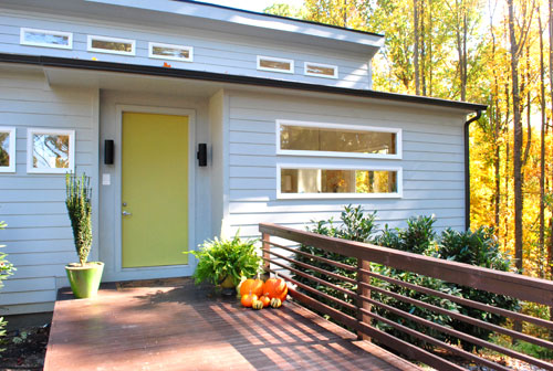
Oh and their front door is Cornichon by Martha Stewart. Every time we pull into her driveway it makes me smile.
Here’s that cute family of ours now. You might remember that Emily lives with her hubby Todd, three kids, and a pretty sizable pooch named Tuck – so this is a hard working house with a big dog, a four year old, a tween, and a teen running around.

We love that it always feels welcoming and nothing’s too precious, but it still has that clean and modern aesthetic that makes people say “three kids and a big dog live here?!” And Emily definitely has a few tricks, so we’ll share those as we go. Emily’s a lot like us in her shopping ways – she finds things at thrift stores and yard sales, happily works in a few hand-me-downs, and is no stranger to affordable stores like Ikea and HomeGoods.
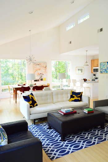
For example, her dining table is a yard sale find, the ottoman is from HomeGoods, and the rug is from Marshall’s. There’s also a splurge in there every once in a while if they save up for something, like their sofa from Crate & Barrel (if you look at our first crash, they had an old hand-me-down couch for a few years while they squirreled away the cash for a new one).
Their simple and clutter-free aesthetic definitely lends itself to the sunny and airy look of the house (they designed it themselves, and Todd is a photographer so giant windows to let in a ton of light were a must). It’s one of those “everything we need and nothing extra” houses, which always inspire me. And not having tchotchkes all over is definitely a kid and dog friendly choice (not to mention it saves major dusting/cleaning time).
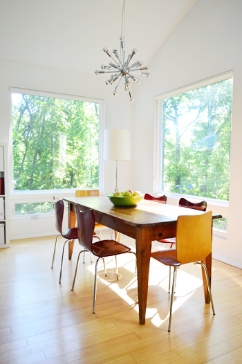
If you look closer at the picture above, the furniture picks are also practical for kids and dogs. The West Elm chairs are wooden (no upholstered seats to worry about staining) and the table is rustic and old. So even when their youngest son repeatedly bangs it with a metal car, the dings blend right in. I also love that the end chairs are light wood, the side chairs are deep red, and the table is medium wood. Nothing’s too fussy, and it oozes informal charm.
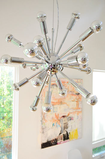
Something that makes their house even more stunning in person are the light fixtures. This one above the table is a secondhand find from ebay (search “sputnik” for others like it). And since they’re the one thing the kids/dog can’t reach, it’s an easy way to add a nice dose of unbreakable glamour.
A few more of her tricks:
- a bold patterned rug can hide stains like a champ
- wipeable furniture (like chairs, sofas, or ottomans covered in leather or a leather-like material) are easy to care for – and can even look better as they get more beat up
- white walls can make a room feel clean and airy even when there’s dusting and vacuuming to do (Emily gets rid of any wall-marks with a Magic Eraser)
- a white sofa can be covered with a white washable blanket when messy kids are doing their thing (and since it’s the same color as the sofa it doesn’t scream “blanket covered couch, here!”)
And we’re always getting requests to share non-white-cabineted kitchens, so here’s a shot of theirs, complete with wood ones:
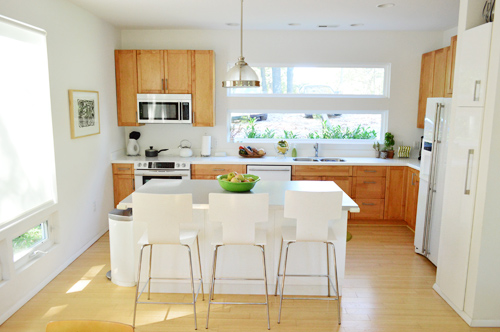
The awesomely unusual choice that they made for a modern new construction house was sleek white appliances over stainless ones – and we always marvel at them in person. They still look really clean and modern and have worked well for them over the last five years (they’re from the Jenn Air series). Oh and the island is from Ikea while the stools are from West Elm.
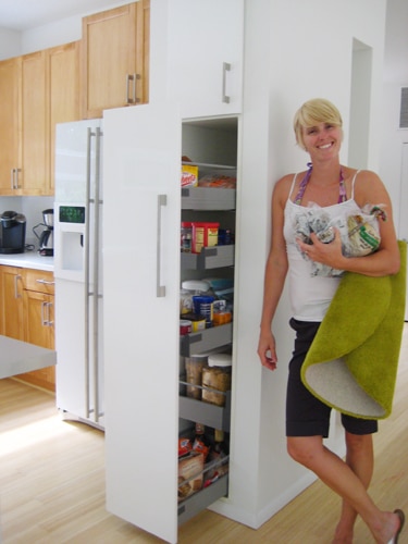
And see the white pantry that’s next to the fridge in that shot above? In our first house crashing we shared how cool it is (it pulls out and is accessible from both sides), so here’s an old photo, just for kicks. And because I’m in love with it. It’s so functional to be able to access it from either side.
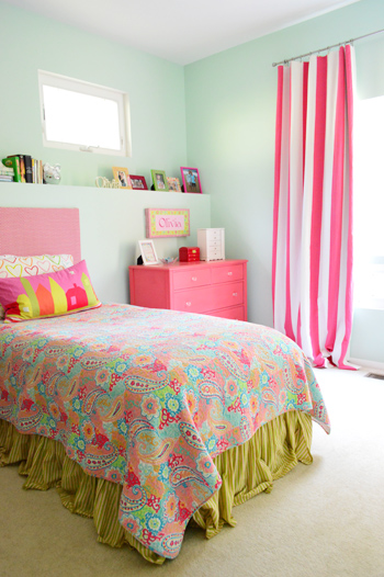
While a lot of the main floor is airy and light, the kids rooms are full of color. Here’s twelve year old Olivia’s room, complete with no-sew curtains that Emily whipped up with the ol’ hem-tape method. And you can read more about the upholstered headboard that we made for her here and the pink painted dresser here. The walls are Lazy Days by Valspar.
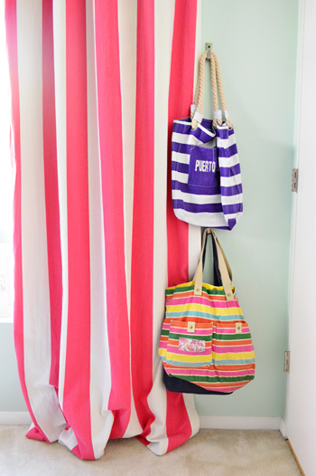
I’m in love with the bold curtains and even the hooks for bags that Emily hung behind the door to add function. Oh and she got that curtain fabric at a local store here in Richmond (called Williams & Sherrill) for anyone wondering.
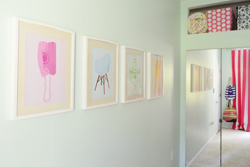
Speaking of function, above the built in mirrored wardrobe from Ikea (their modern alternative to traditional closets) there’s a nice little niche that Emily and Todd had their builder add – just to squeeze out even more storage and to create a place for colorful bedding and bins. And see those retro-ish prints on the wall? I made those for our print shop about four years ago (back when we had one) and gave a set of them to Olivia – so it’s always sweet to see them hanging in her room all these years later.
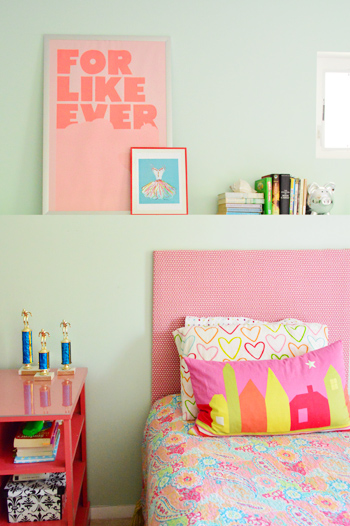
Here’s another shot of the headboard that we made along with the pink painted desk that Emily smartly topped with a sheet of affordable acrylic to protect it for the long haul (more on that here).
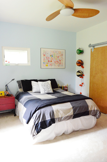
Jake’s fourteen, and he wanted a more subdued room, but it totally captures his personality thanks to the plaid bedding, the blue accent wall paired with the red side table (it’s stained instead of painted so it has a cool transparent quality), and the basketballs hanging right on the wall (which aren’t just for looks, he uses them too).
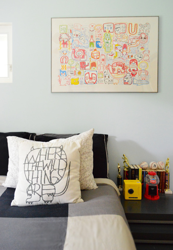
I also love the graffiti-ish monster print on the wall from Ikea a while back, but my favorites are the yellow safe and the red gumball machine (didn’t you have those things as a teen? I totally did, but my safe was purple).
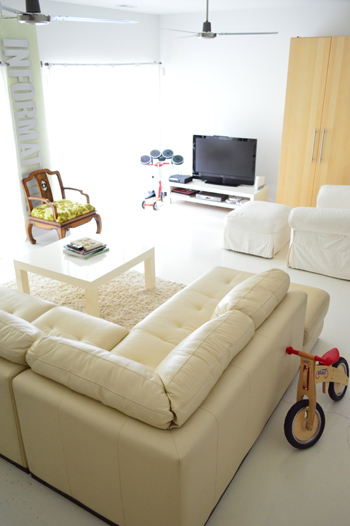
And here’s their basement rec room (it definitely comes in handy when the kids have friends over). Since Emily and Todd love their white, they opted to paint the concrete floors with a glossy (and wipeable!) floor paint. Then they layered in a giant leather sectional, which is also easy to wipe down (it has held up really well through juice stains and finger paint over the years).
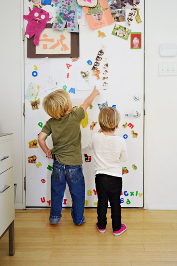
I think that the coolest thing about Emily and Todd’s white & modern house is how awesomely it lends itself to pops of color and playful touches. Take the back of their metal front door for example. It’s magnetic, so it has become a place to display kid art, favorite photos, animal and letter magnets and other random bits. I love how casual and fun it is, and Clara and Emanuel can be found playing there whenever we come over (here’s an old pic of them in action).
I think it’s tempting to wonder if modern homes with lots of white are really “lived in” or kid friendly, but Emily and Todd’s house is a great example of how they can be. And I love how when you look closer, there are some really smart choices that would work for a house of any style (like weathered wood furnishings, wipeable fabrics, and gorgeous fixtures up where no one can reach ’em). Toss in some really cool functional upgrades (like built-in niches over the closets and a pull out double-sided pantry) and you’re golden.
So we’re sending out a huge thanks to Emily, Todd, Jake, Olivia, Emanuel, and Tuck the Mutt for letting us get snap-happy at their house. Now let’s play the what’s-your-favorite-part game. Mine’s the front door (both the happy green side and the fun magnetic side) along with Olivia’s brightly striped curtains. And John lovingly runs his hands over the appliances every time he’s there. True story.
Psst- The latest edition of Clara Conversations is up on Young House Life, and it’s my favorite one yet (I say that every time, but the kid gets funnier by the day…).

Lianne says
I just did a quick “find” through the comments so I didn’t read them all, but didn’t see an answer. Where are the pillows on the couch in the living room (blue and yellow) from? The are gorgeous!
YoungHouseLove says
Hope she stops in with that info Lianne!
xo
s
Emily says
The pillow covers are from IKEA – again like 2 or 3 years ago so I don’t know if they still have them.
Lianne says
Thanks Emily!
Emily says
To answer about the dog hair… I could vacuum everyday and it still seems like I find more hair. Sherry is right though I do love to vacuum and just got a new one that makes my life so much easier going from hardwood, concrete, to carpet.
The smaller painting in our living room (not the one with the army helicopter by the dining room) but the square one is from a local painter and super talented designer Sunny Goode. In fact her stencils were featured on Lesley & Jeff Glotzl’s first house crash. Sunny Goode and her products hold a special place for Todd and I. We first met on a photo shoot for her new paint line. So besides loving the painting it has special meaning for us as a couple.
http://sunnygoode.com/
White floors: We traded services with one of my actors (I am a talent agent) who also is a painter and he happened to need new headshots. So it worked great. We had him paint them right when we moved in so there was less to move out. We used Benjamin Moore porch and floor. At the time I believe only oil based was available, but we scheduled on a weekend when we were gone and we could air out the area very easily. I don’t think I would have had the patience for that task. Sure it has some scratches and at some point will need to be repainted but I would do it again the same color no question.
I think I answered everything… let me know if not.
YoungHouseLove says
Thanks so much Emily! You’re a wealth of knowledge :)
xo
s
Laura says
Dear Emily,
Do you know if your painter used dry lok or some kind of concrete sealant before he applied the paint?
YoungHouseLove says
Hope she drops in with that info for ya Laura!
xo
s
jbhat says
I have always loved her house. Thanks for the update!
jbhat
Lauren {L'amour chez nous} says
Love the layering of old and cheaper pieces with the higher end ones. It makes it more personal, stops it from looking cheap, or on the other hand, straight of a west elm ad.
decoratica says
Beautiful and totally my style. I love your nice’s bedroom, she’s a lucky girl :)
I’m wondering what for a magic eraser she uses to wipe the walls (just in case I can find something similar here). I’m dealing with some marks that I would love to get rid of..
xo
YoungHouseLove says
The product is actually called a Magic Eraser (it’s made by Mr Clean). Hope it helps!
xo
s
Heather says
Magic Eraser is a brand name, you can try looking for “melamine foam” which is what it’s made out of. Good luck!
decoratica says
Thank you so much! I’ll have a look :)
Great help!
xo
decoratica says
I’ve found it online. Same name translated into Spanish (duh). And it seems there are multiple brands available (I tell you just in case you happen to travel to Spain and need some magic erasers, hahaha!)
I always discover this useful things through american blogs, like when I read about bathroom cleaning pads at apartment therapy, found them here and never understood why I haven’t heard of them before…
I’ll check at my store this weekend. Thanks again for the great help!
xo
YoungHouseLove says
So glad! Happy scrubbing!
xo
s
Terresa says
I love this house crash and I love seeing pics of your family. I see some similarity between John and his sis, but I really, really think his nephew looks like him. Great post!
Johanna says
Wow, I am in love with their house!! It is so beautiful. My favorite part is all of that natural light… soo much of it *drool* And I love all of the white. So crisp, clean and clutter free!
Johanna says
P.s and that window above the kitchen sink… Seriously? I’d do dishes all day!!!
YoungHouseLove says
Hilarious fact of the day: I’m so short that I can’t see out that window (the stripe is in front of my face). But everyone else in the household has a clear view… including her son who is 8″ taller than me!
xo
s
Alyssa says
I LOVE Olivia’s lumbar pillow adn would love to know where it’s from. It totally works for her room, but I think it could spunk up a couch without being too tween.
Also loving the kitchen island!
YoungHouseLove says
I’m 85% sure it’s from Ikea! Hope Em can stop in to confirm!
xo
s
Emily says
Yes! IKEA!
Allison W. says
I love that house!!!!
Mary | lemongroveblog says
Love it! Looks like good taste runs in the family ;)
katalina says
I am sorry if this was answered in the old post of this beautiful home–
what kind of flooring did they go with–wood wise or bamboo or laminate?
I have been researching floors and heard that bamboo might be the best pet choice.
YoungHouseLove says
They did bamboo!
xo
s
Lauren says
I was in love with that Cornichon color, so much that I painted my kitchen that color. Let this serve as a warning- the color does not work in a small, windowless 1900’s Richmond Fan apartment. I wanted so much to like it, and got the opinion of many friends, but everyone said the same thing-repaint it.
Also, I love white appliances.
YoungHouseLove says
Aw man! That stinks! But ten points for being bold and giving it a shot!
xo
s
Gabbi @ Retro Ranch Reno says
What a beautiful home!! I am just drooling over the big, open windows and amazing sight lines. They have done a fabulous job!! :)
mp says
Glad to see someone else loves the clean simplicity of white appliances!
Felicia says
I love how open, de-cluttered, but still warm their house is. Striking that balance between being clutter-free but not cold is something I’m still working on.
On a separate note (but still style related) how cute is it that all the kids are wearing stripes in the second picture? The distance between stripes even gets smaller the younger the child is. Was that planned or are they just as stylish as their house?
Emily says
Totally unplanned, but not surprising as I have a thing for stripes. Not to mention the older kids get to pick out of their own outfits with some instruction depending on the occasion….so funny that they both picked stripes when I forced them to take a family picture :-) Thanks for thinking we are stylish too!
Janice says
Beautiful! Just wondering which “white” they used on their walls. Sorry if it was mentioned, but I didn’t see it…
YoungHouseLove says
I’m not sure, but my best guess is Benjamin Moore’s Decorators White. Maybe Emily will drop in to confirm? Hope it helps!
xo
s
Vivianna says
I LOVE all the windows!!!!!!!!!!!!!! So much light, love, love, love!
karen says
i think jake and clara look very much alike, don’t you?
YoungHouseLove says
They definitely look related. The funny thing is that Jake’s baby pictures resemble John a lot!
xo
s
vel says
Creativity truly runs in your family John! Love your sister’s digs, it is clean, slick and still feels homey!
Destiny says
So much to love! While the house is clean, tight and functional, you can see lovely, bright, happy and personal touches everywhere. That, in my opinion, makes a house a home…
melissa says
I love the large windows in the dining room! I like the idea of such a thing but am a little weirded out about not having curtains. Do I see some kind of shade in one of the pictures? It’s barely noticeable when rolled up. I love that! Any info on what kind of shade it is?
YoungHouseLove says
Oh yes, they have these awesome shades that are almost invisible (white and tightly stored at the top of the window) but they can come down for privacy and glare. I’m not sure of the maker so hopefully Emily will stop in with that info!
xo
s
Kelli says
Love! Great photographs! Clearly good design and good taste runs in the family. Thank you to all for sharing!
Alisha says
I love their kitchen because I HATE stainless appliances! That’s definitely my favorite part. :)
Heather says
I always love pictures of houses with lots of natural light, but then when it comes to my own house, I’m a cave dweller. (Possibly needing my eyes checked, with how sensitive they have become to light, but still!)
My parents have a pantry cupboard similar, but it has a swing door like the rest of the cupboards and the drawers pull out individually. I LOVE that cupboard and want one for my Grown Up Someday House.
I think my favorite part of this house crash? The mismatched living room furniture. It looks so intentional that it doesn’t look weird. Same with the dining room, not being matchy-matchy but coordinated. Love it.
Tamira says
I see someone asked about hearing their story about designing and building the home, but wasn’t sure if it’s been asked yet to share a copy of the layout? We live up in Alaska and are looking to design a modern (yet rustic) home and some of Emily & Todd’s home embrace the style we’re looking for. Many builders present their layouts in a pdf form w/ approximate (and not to scale) measurements for only the major rooms/areas of the home, if that were to ease some concerns with infringing on floor plan copy write. Just looking for some inspiration :). Thanks!
YoungHouseLove says
Thanks Tamira! They moved in over five years ago so I’m not sure if they have these plans anymore to share, but if they do I’ll update this comment with a link :)
xo
s
Jenia says
The windows are my absolute favorites! Huge windows and a huge kitchen are the main things for me :)
Debby says
Love the openness of the main floor, and the individuality of the kids bedrooms. Are their pics of the little boy’s room? Or the master? Bathrooms? Thanks
YoungHouseLove says
We’ve shared a picture of the master in the original house crash (linked to this post at the beginning) and the nursery was covered here :)
xo
s
S'Mo says
I LOVE the big ottoman perched in front of the white couch–which leads me to this question:
My fiancé and I have a 95″ chocolate brown PB Comfort Sofa, aka “Sofia.” (We had to find a couch long enough for him to lie down on comfortably, and he’s 6’3″!) We want to swap out the coffee table currently in front of the sofa for an ottoman, but with a nearly 9-foot-long sofa, I’m having a hard time finding something that would (1) look proportionally appropriate, and (2) not break the bank.
Do y’all have any suggestions? Should we do a pair of smaller ottomans? Hold out for a huge one? Is there a general ottoman-length-to-sofa-length ratio that I just don’t know about?
Thanks!
S'Mo says
Also, I just realized I did my math wrong–I should’ve said “nearly 8-foot-long sofa.” There’s a reason I teach English and not Math. :-P
YoungHouseLove says
I totally know what you mean! I’d either hold out for one large one or buy two smaller ones that you love. My only advice would be not to settle for anything since you’ll end up buying something twice that way (always hating the first option). So maybe check overstock.com and HomeGoods and even craigslist for ottomans and hopefully one will come up! As for visualizing the size, you can tape it off on your floor which can help you to see if something might look too small :)
xo
s
Amanda says
Wow, her house is SO gorgeous and inspiring! I love how light and airy it is while still being completely liveable and not stuffy. Beautiful!
Alison@soiledrotten says
This is so adorable! Loving the girls room the best!
Jenb says
I like thier son’s duvet cover. Because my son has the exact same one.
YoungHouseLove says
Haha!
xo
s
Molly says
I’m on the hunt for a sectional… any clue where she got the one in the basement?
YoungHouseLove says
It was from a local furniture outlet called The Dump.
xo
s
Juliet says
I think Emily was ahead of the curve selecting white appliances. Whirlpool is really hyping their “Ice” finish for appliances, and I am digging the look. Stainless still looks good to me, but the wow factor is not what it once was…
Heidi says
Love that aqua color for a girls room! Also, you just can’t help but say “Cornichon” is a fancy french accent :P
YoungHouseLove says
Haha it’s true! Fancy little pickle.
xo
s
Kathy says
Loved the house. Clean and crisp and family friendly. Sorry that Tuck missed the shoot!
YoungHouseLove says
Oh yes, we linked to a Tuck pics in the comments :)
xo
s
Sarah F. says
This is great! We just bought (well, actually closing tomorrow) a house that looks very very similar to this one. My design aesthetic is also very similar to this, so it’s great inspiration for me! Perfect timing!
YoungHouseLove says
So exciting! Congrats Sarah!
xo
s
Amanda @ The Scacchi House says
I love that this house is modern, yet very livable for a family. Thanks for sharing!
mary says
LOVE this house! Cant believe its a new-ish build! It has a very 50’s exterior feel to it judging from the few exterior shots we can see. Any chance of seeing more of the exterior? I would love to see more!
Also, what color is the white used on the first floor throughout? It looks great in pictures. I’ve been away from all white for so long, I am not sure I could do it. There was a time when every house you moved into was white, but it was always just chalky and gross and it begged to be painted! But I am very intrigued by it nowadays!
What is the overall feeling of seeing all that white on the walls?
YoungHouseLove says
I believe the white is Decorators White by Benjamin Moore, and it has a really clean and airy feeling (especially with all the windows and light). Nothing chalky about it :)
And as for the exterior, if we take more pics we’ll be sure to share them!
xo
s
Chantal says
it’s STUNNING!
I have a question, would it be possible to find out what kind of white floor paint they used in the basement? Do you know if they had to prime the concrete first and is it skid resistant? sorry for all the questions, really a gorgeous house :)
YoungHouseLove says
I think if you scroll back through the comments Emily listed what she used and how they prepped/applied it. Hope it helps!
xo
s
Wendy says
I realize that I am late to the game posting here, but I have come back to this post several times so just had to comment. I love this house, especially the kitchen. We are remodeling our kitchen and I have had a difficult time visualizing what it will look like with doug fir cabinets, bamboo flooring, white appliances, etc. and then BOOM there was Emily & Todd’s kitchen. It is even the same layout, minus all the awesome windows, so I think we are going to be okay. I was concerned with the white appliances, but really like my white appliances and did not want to buy all new. We will not have a dish washer (I know virtually unheard of in this modern age!) but will have a white apron front sink and plan to use white subway tile or possibly bead board for the backsplash to tie all the white together. We plan to install dark slate counters but I think we can still pull that off even though I love the white counters in E&T’s kitchen. Anyway, thanks for the timely post. I am sure that I will be back for a visit again.
Meg says
Any chance you have your sisters white wall color? I have almost the exact living room layout and I am doing white, but I can’t decide on what white! I am doing white trim, maple floors…THANKS!
YoungHouseLove says
I’m pretty sure it’s Decorators White by Benjamin Moore (in eggshell finish). Hope it helps!
xo
s
Genevieve says
Hi there! Where is Jake’s bedding from? I’m helping my boyfriend with his sons’ bedroom and something like this would be great. Thanks!
YoungHouseLove says
Maybe Ikea? I hope Emily drops in with that info :)
xo
s
sapna says
Where did they find the white leather sofa which is in the basement…..
YoungHouseLove says
That was from a local furniture outlet here called The Dump.
xo
s