Remember when we mentioned that we enjoyed Richmond’s West Avenue Garden Tour last weekend? Well, one very smart family seized the opportunity to host an open house smack in the middle of the tour. And we actually knew one of the ladies manning the house (she also writes for R. Home magazine) so she was absolutely awesome about us snapping some pics and spreading the word about her friend’s house. Here’s every delicious detail that we captured as we breezed through.
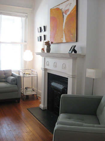
It was immediately clear that these homeowners favor a minimalist and modern aesthetic, but they still like plush and comfy furniture- as long as it has clean lines. And the art. Oh the art! This amazing tangerine dream above the fireplace in the front room was a total stunner. Especially set off by the clean white walls and the charcoal upholstery. Yummy.
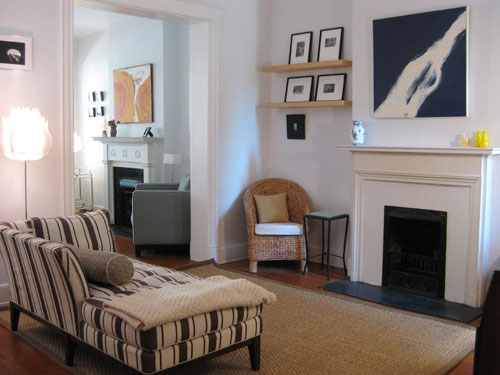
Almost all of the brownstones that we’ve toured have some pretty amazing wide doorways that connect the more formal front room to a less structured living room that’s centrally located. And check out the bold square art that they hung above the fireplace in this room (which gorgeously mimics the square art in the adjoined sitting room at the front of the house). And seriously, how much fun is that striped chaise?
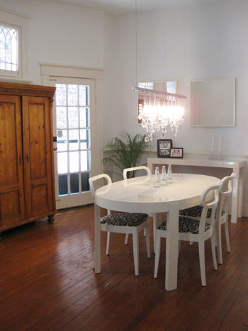
Their dining room was another minimalistic and modern space- and the uncluttered vibe puts the focus where it belongs: on that breathtaking linear chandelier.
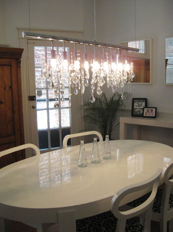
Here’s a close up for your viewing pleasure. And don’t worry, drooling is a perfectly acceptable response.
As we walked upstairs to the bedrooms I couldn’t help but snap another picture of the awesome living room below. The seagrass chairs and the jute rug were a bit unexpected with such a modern aesthetic, but they totally worked. And you know we love us some woven materials.

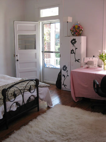
This guest bedroom/sewing room charmed us the moment we stepped inside. Not only does it have a gorgeous back balcony, but the way that the iron bed works with the black decals on the inexpensive Ikea cabinet had us at hello. We also loved the inexpensive ingenuity that the owners demonstrated. Who doesn’t have a less than perfect table that could benefit from a piece of fabric being draped over it? And the fact that it was a pink sheet sweetened up the whole space.
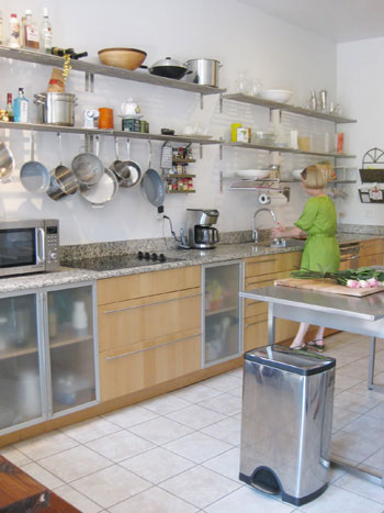
Their kitchen was another awesome exercise in modern simplicity at its best. The stainless steel open shelving looks chic and confident (and really works well with the industrial stainless steel island). And the oversized base cabinet drawers (be still my beating heart) and frosted base cabinet doors were truly the icing on the cake. Look how Domino-esque this shot is with one of the tour guides working at the sink. I didn’t even instruct her to pose like that- it just sort of happened. This impromptu house crashing adventure was meant to be.
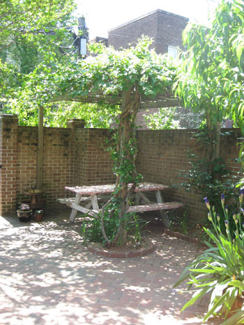
And of course since they were a part of the West Avenue Garden Tour, they also had a lovely back garden complete with a leafy vine-riddled pergola. If that’s not a little slice of heaven I don’t know what is.
So that conculdes our random house crashing session. We hope you’ve enjoyed the tour. Oh and if you’d like to see another AMAZING downtown brownstone, check out this house crashing tour of Katie Ukrop’s home that we posted back in January (her house was even in Domino last year!). Lovely. Lovely. Lovely.

Heidi says
I love that striped chaise. And that stunning chandelier. I bet they’re beyond flattered that you thought their open house was worth blogging about! What a great find.
Becca says
I am in love. Every room is homey and wonderful. I could move right in! And that kitchen with the open shelves is so cool and industrial.
Paula says
Is that linear chandelier the one from Z Gallerie?
http://www.zgallerie.com/pc-1466-38-linear-strand-crystal-chandelier.aspx
Jessica R. says
Where DID they get the art like that?! I would love a modern, stretched canvas piece like that, one that doesn’t break the bank, but I am creatively and time challenged. Any thoughts? I LOVE both of the pieces above the fireplaces.
Audrey says
Such a chic home! That dining room chandelier was used on a Rate my Space episode I caught the other day – in a bathroom no less! Guess it’s a pretty versatile little light.
Elle R. says
I was just browsing your archives today and thought to myself, “gee, I wish they would do some more house-crashing posts”. It looks like you read my mind! These are great posts and I think it will do well to keep them coming in the future. The Fan and other areas have fabulous homes (and probably devoted readers of your blog) that would so open to have you crash their place and blog about it. Kudos for the post!
Lisa says
I NEED their dinning room table. They surely don’t still need it, since they are moving and all. . . Any ideas where it’s from?
layersofmeaning says
Sherry
Do you have any idea where I can find a similar light fixture than the one in the dining room?
Thanks,
Fe
DawnMarie says
Wow. I could move right in and not change a thing. Really comfortable and inviting but really well decorated. Love it.
Averill says
Love that dining table/chairs! Anyone know who makes that?
Jill says
OMG……..great house. Love that chandelier–gorgeous.
The only thing I would do is #1– paint (all that white would make me nuts) and #2 get rid of the sewing machine I have no clue how to use. Then I could move right in. I may cook more with that cool kitchen too! LOL
jenny says
Oh my gosh…where did they get those seagrass chairs?? I want them!
melissa @ den design studio says
Gorgeous find you’ve got here. I love the GRUNDTAL (from IKEA) open shelving in the kitchen. At only $19.99 a piece with what looks to be 10 shelves for a total of $200, seems like a much better deal than cabinetry. I also love the unexpected addition of the frosted glass doors on some of the lower cabinet doors.
Lisa says
I think the chandelier is from Z Gallerie (http://www.zgallerie.com/pc-1466-38-linear-strand-crystal-chandelier.aspx). And I love the dining room table — such a versatile shape, and it matches the white West Elm-looking console so well.
taradoherty says
wow…i love the cab with the decal…how cute…and the fact that someone can identify the ikea shelves is ammmmazzzzzzzing…..i love this site…
Live a Colorful Life says
This house has to be one of my favorites: minimalist with lots of warm touches. I loved everything about it. Thanks for sharing it! And any info would be welcome!
jbhat says
“I want to go to there.” Very cute. Love the chaise, love the light fixture, love the art.
catbiscuit says
The chandelier over the dining table is available at Ferguson (2703 Ackley Avenue, Henrico, Virginia 23228-2141, (804) 264-6400). Not sure who the manufacturer is. I was shopping there last weekend and drooling over it myself.
MaryB in Richmond says
Oh, I want that chandelier. Honest to Pete, I’d hang it somewhere, even though it would totally not work in my house. Hell, I’ll buy a new house that would work with it!!!
Tom says
GREAT pics! We DO have that light at The Shade Shop! Feel free to call Shirley at 434.293.1361 if you have questions. Thanks!
Tom
http://www.twitter.com/shadeshop
Alysia says
I love the floating shelves near the fireplace. We have a similar space and I finally figured out what I am going to do with that space. Wooho! Thanks for house crashing.
Katie @ Making This home says
Love the kitchen especially! It seems like half of the homes I’ve been in around Germany are going for open kitchens. They’re beautiful, as several already said, too!
Katie
Ann says
I’m in love with that house!
Tawna says
Hey guys!
I am LOVING your blog. Still in a tiny apartment with the hubby and our 2 sons (we’re finishing up at Brigham Young University) (Huzzah!!) but I am OBSESSING over my beautiful future house..wherever she is… :)
Anyways. I notice in lots of posts/comments you guys request before/after pics- and I was wondering if you receive a lot- and if you do, would you mind archiving them into a section of like reader’s before/afters? Im confident we’d all love to see what everybody else is doing with the various inspiration they find here…
You guys are awesome!
YoungHouseLove says
Hey Tawna,
We have yet to create an archived page of Reader Redesigns (not to worry- it’s totally on our list!) but until we do you can click the “Before & After” category in the top right box on our page which is full of our before & after pics along with a ton of reader submitted ones. You can also search “Reader Redesign” in our search box to see every single one we’ve ever featured. Hope it helps!
xoxo,
Sherry
Emma says
I’d bet my bottom dollar that that is either the Cellula chandelier, available at DWR…although I did see a pretty great home-made version at Ikea Hacker back in the day. Pure gorge-ous-ity.
Danielle says
I have seen that chandelier before on a home show. But I remember this lady paying $3,000 for it! I think it is the one from Z Gallery, which is way more affordable. http://www.zgallerie.com/pc-1466-38-linear-strand-crystal-chandelier.aspx
KatyW says
I’ve seen that chandelier on plenty of online lighting shops. Google “contemporary” chandelier and you’ll find it. It is gorgeous!
I love the art too!
Thanks for “house crashing”, Youngsters! Please do it again soon. :-)
Christine says
Sherry,
I don’t know if you were busy enough yesterday! I logged on at home after work to go back and find that kitchen re-do and I had to scroll to the bottom of the page to find it!! :)
I have you guys on my google homepage- love to see all the updates!
CW
Patty says
OMG… I love this house! I am in love with the charcoal gray furniture. We’re buying a house later this year… this is totally my new inspiration!
Thanks!
D says
Any idea where the couch and chair in the living room are from?
YoungHouseLove says
Hey D (and everyone else with furniture questions),
We don’t know where any of the pieces in this house are from since we just swung through without meeting with the homeowner and taking notes. A lot of people have weighed in on where similar chandeliers can be found (see above) and I’m fairly certain that the art is from a hip local gallery called Quirk. Hope it helps!
xoxo,
Sherry
nlw says
I saw a couple use that light fixture for their guest bathroom. They updated the entire room for around $3,000 on DIY network show Bathtastic. The chandelier made the room.
M says
This looks like their table:
Atelier Dining table oval
http://www.eurofurniture.com/products/atelier_dining_table__oval_/165.php
Kara says
Thank you M, I have been looking for those chairs (yes, saw them on a soap opera) for a while and found them with the table, now if I could just afford them! Only 7 months till Christmas. Try md-canvas.com for art.
Lynnie says
As *soon* as I saw the table & chairs, I thought Calligaris! The chairs are their “Princess” chairs in white lacquer, I reckon:
http://international.calligaris.it/catalogue/Chairs-and-Stools/Wood/Princess/2/10/69
Lynnie says
Sorry, this is probably a more useful link for you Stateside peeps!
http://www.eurofurniture.com/products/princess_chair/417.php?page_id=83
JLG says
I don’t think anyone mentioned…
The kitchen base cabinets are all Ikea as well!
lily says
Hi SHerry!
I have been obsessed with your blog since finding it only recently1
Would you know where the beautiful white oval dining table is from?
Thank you!
Lily
YoungHouseLove says
So sorry, no idea. Anyone know?
xo
s