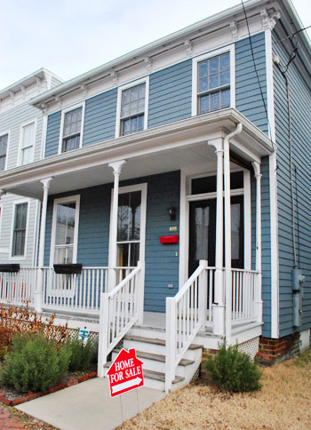
When Danielle and her husband Nick sent us a link of their newly listed home in gorgeous and charming Church Hill we couldn’t just ogle the listing and let it go. We knew we had to house crash them in the flesh and share all of the eye candy with you. They bought it in pretty rough shape in 2003 and they worked with one of our favorite local organizations, Better Housing Coalition, to restore it to a livable condition. Records trace it back to existence as early as 1855 (although it’s unclear whether it was burned to the ground in 1865 and rebuilt then). Either way it’s extremely old and it needed lots of work when Nick and Danielle purchased it.
After two years of renovation (!) they finally moved in back in 2005 – and they’ve been loving their first place ever since. Now that her two boys are older they’re moving into our neck of the woods (Bon Air) for the schools, but they’ll always have a special place in their hearts for the home that they so lovingly revived after years of work. So without further ado, here’s Danielle’s amazing house (if you wanna move in, click here to contact her realtor).
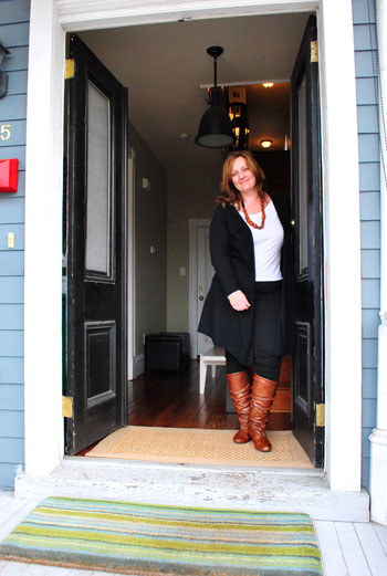
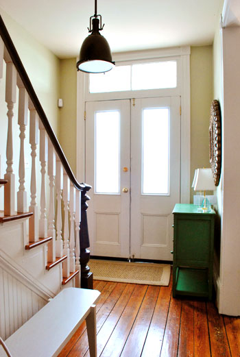
This stately foyer is crowned with a classic Restoration Hardware light fixture. And how amazing are those transom windows above the double door?
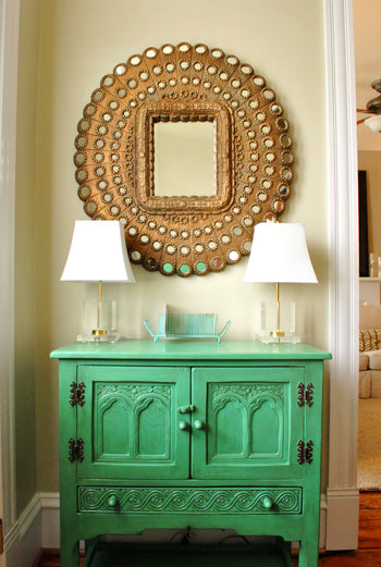
Danielle snagged this stunning mirror from Pier 1 on clearance thanks to a small missing mirrored disk around the perimeter (which she repaired by gluing on a new one). Paired with that showstopping green cabinet it’s just about my favorite entryway idea ever. She got that awesome piece from a local thrift store called Class & Trash, painted it Palmetto by Martha Stewart, and then added an antique glaze from Lowe’s for depth. Genius right? I’m so in love.
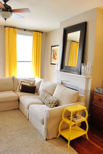
Here’s the living room with cheerful yellow accents. We especially loved the side table (snagged on sale from Serena and Lily) and those dramatic floor to ceiling curtain panels (from Pottery Barn).
The kitchen is dreamy and Paris-like, complete with granite counters that look like marble, ornate wooden brackets under the counter lip, a classic subway tile backsplash, and charming metal stools from Overstock (which are easy to wipe down when her boys get something sticky on them).
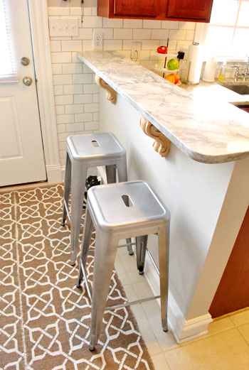
Oh and that rug is actually two runners from Ballard Designs that Danielle stuck together with rug tape to create one larger “custom sized” mat for that area of the kitchen.
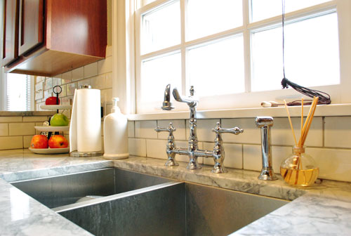
And check out their fantastically deep double sink and that gorgeous vintage looking faucet (both from Overstock, seen here and here).
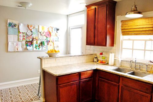
Here’s a wider shot of the kitchen which includes the giant bulletin board that Danielle made to showcase all of the sweet art work that her sons whip up. And check out the lovely and industrial pendant light above the sink.
This is the playroom, which is right off of the kitchen. We love the wall to wall seagrass carpet that she had installed – especially paired with the charming patterned area rug from Ikea on top. And the use of those sleek white Ikea bookshelves for toy/magazine/book wrangling (look at all that storage!) was so smart.
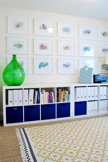
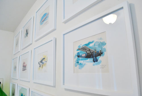
See those lovely prints of planes hanging in a nice neat grid? Danielle’s late grandfather was a pilot in the Navy, so her husband surprised her with this gorgeous set of vintage watercolor prints by Nixon Galloway. We’re nothing short of obsessed with the whole arrangement. Especially because it’s so meaningful to their family.
When you travel upstairs there are three bedrooms and two bathrooms (and a charming pooch if you’re lucky).
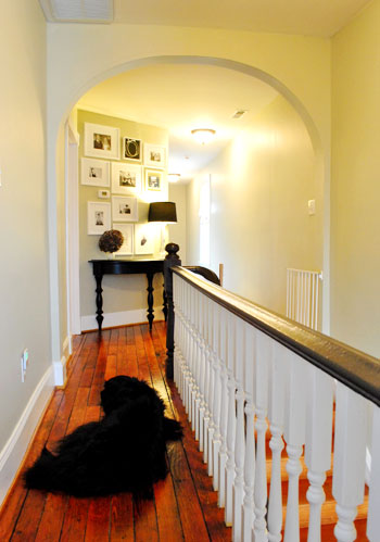
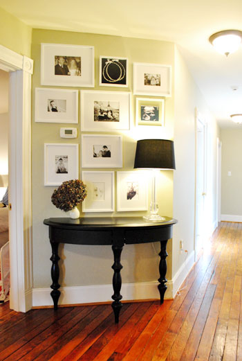
We loved this little “moment” that Danielle created along that diagonal wall with a cabinet and a collection of frames full of meaningful objects like an ultrasound photo, inked baby footprints from the hospital, wedding photos, childrens portraits, etc. And the bold black color in the table and the lamp shade coupled with the black and white prints was the perfect amount of drama and contrast. We also love how the white frames make the thermostat fit right in instead of sticking out like a sore thumb.
Here’s the hall bathroom complete with gorgeous floor to ceiling subway tile (which masked some unsightly wall issues that they had to deal with during the renovation). We loved how the tile goes behind the mirror, which is hung in front of it. Such a pretty look that you don’t see every day.
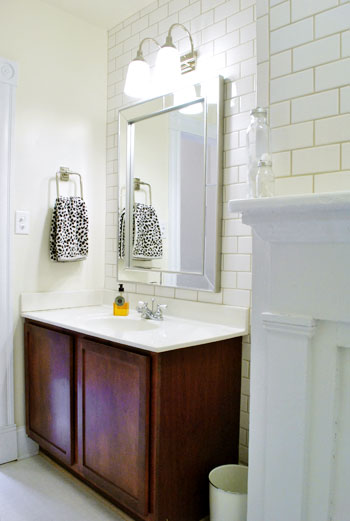
And yes, that’s a fireplace mantel in the corner of the shot above. It’s non-working but still a stunning architectural detail. Especially for a bathroom!
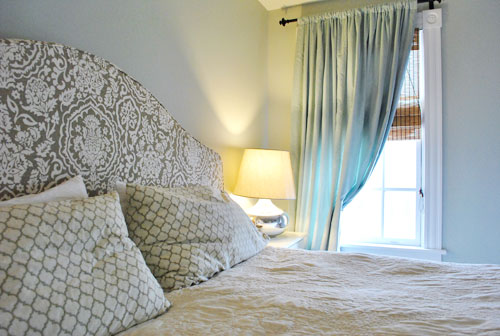
Here’s Nick and Danielle’s bedroom, which is warm and welcoming thanks to breezy gray-blue curtains…
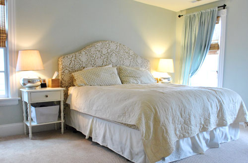
… and a gorgeous printed headboard that Danielle snagged on sale from Pottery Barn (the headboard’s patterned slipcover, also from Pottery Barn, was something she found on eBay along with the Crate & Barrel lamps).
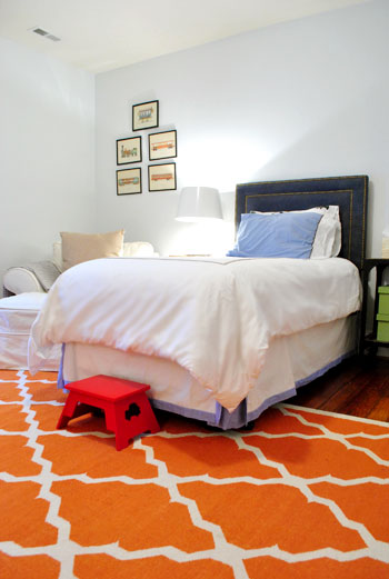
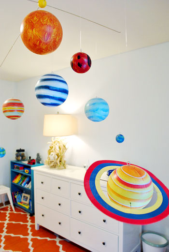
Here’s their older son’s bedroom, complete with a charming nailhead & denim headboard (from Target) and a fun orange patterned rug (from West Elm).
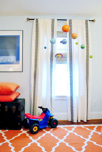
We also thought the planet mobile (from Pottery Barn Kids) and those super fun greek key curtains (from Pottery Barn) were great graphic touches.
And the long Ikea dresser provided tons of storage while the driftwood lamp on top of it totally had me drooling. Cutest thing ever? There was a little white owl ornament tucked into the lamp’s branchy base by Danielle’s mom (she did it the last time she came over and they left it there because it made them smile).
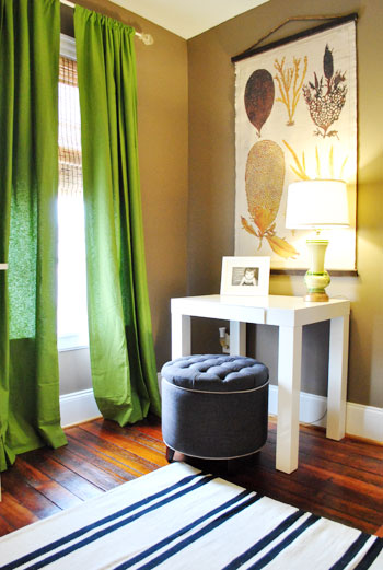
This is the corner of the guest bedroom. Everything from the bold green curtains to that pretty scroll art work on the wall (from Pottery Barn) and the West Elm mini parsons desk was totally speaking my language.
So there you have Nick & Danielle’s lovely Church Hill home. We’re sending them a big wet kiss for letting us run through and snap some pics for you guys.
Now let’s play the what’s-your-favorite-part game. I was enamored with those plane prints in the playroom and the two runners that Danielle rug-taped together in the kitchen. John loved the pops of yellow in the living room and the fun planet mobile in the kids room. Now you.
Psst- Check out tons of other House Crashing adventures here.

Dianne says
I want those front doors!!!!! What a great house.
tiffany says
love that double sink in stainless!
and your new light fixture (from yesterday) that required
some vision, i have looked at this light,
and know how big it is, i would have thought
it wouldn’t have fit, but you guys did it
just right of course!
Charisa says
Everything. I love everything about this house. It’s my new Inspiration House. Thanks so much for crashing it for us!
karen says
GORGO!!!
JELLO!!!
translation: Gorgeous! Jealous!
karen @ our slo house says
It’s hard to pick a favorite part, because the entire house was so beautiful! They really did such a good job.
Something I can relate to is the transom windows above the front door. We are going to install a series of transom windows in our little loft space that “hangs over” the great room. We get such amazing natural light via the loft’s windows and it flows down to the great room. If we close up the loft space, we’ll lose all that great light. You can see the loft space here. http://ourslohouse.blogspot.com/2011/01/house-tour-part-iv.html
Colleen says
What a gorgeous house!!! I loved the table at the top of the stairs w/ all of the photos and the lamp.
Kristin says
Adorable house! I especially like the mixture of modern (like in the playroom) and more traditional elements. Love the colors, too!
We recently painted our bedroom, so I wanted to send pictures in for a reader redesign, especially because the color was a tip from you (in the comments of a post on bedroom colors) – but I learned you don’t do these anymore. Well, maybe I’ll just upload them and post a link in the comments, as I’m not on facebook.
Faith says
I’m envious of that entryway! (And the rest of the house, for that matter.) I’m in search of the perfect piece for ours. Alas, I still just have an empty spot under a painting
Robin @ Our Semi Organic Life says
I so wish we could afford to buy a (this) house when we move to Richmond this summer. This is JUST my husband and I’s style. I think grad school (& loans) and half as much income plus a new city will be enough for us. But I super really appreciate the look into homes in the area – gives us a good basis as to where we want to live in Richmond.
Sarah M. says
Love Love Love! Great job, Danielle! I am lusting after the color in the entry way and halls…would love to know what color it is.
Danielle says
Hey Sarah! The color is Camouflage by Benjamin Moore. It’s a great neutral. Thanks for the kind words.
Amber says
I can’t help but notice the wood floors. Something about them screams character. I also love the area upstairs with the personal photos above the desk.
Melissa @ HOUSEography says
So cute! I love the house and all of the cute touches. Hope they make a quick sale but I am sure they are going to really miss their house :(
Danielle says
We will Melissa. If we move it will be very bittersweet. We love our neighborhood and feel very fortunate to be part of this house’s history. I’m such a sap. I get sentimental looking at the before pictures!
maribel says
I love the pop of color in all her rooms. She even thought of the mailbox…love the red. I recently sewed an orange accent pillow for my bed. It makes me smile every time I walk in my room.
Susan says
Gorgeous house! I especially love the red mailbox:)
WendyMI says
I love the overall contemporary industrial feeling. Her house is so cohesive that it’s incredibly calming. Love it!
susan says
So inspiring. Just what I needed today. I liked the rugs taped together and the 2 lamps they snagged on ebay. Thanks guys for this post. susan
chrissielynn says
i am absolutely in LOVE with this house.
the bold color is something that i find really inspiring, we bought our house (a 1920 Cape) a little over a year ago and i’ve been struggling to find a “color scheme that flows” throughout the house, but as someone who loves color and can’t make a decision, Danielle proves you don’t have to compromise…
gorgeous.
Ashley @ pure + lovely says
Gotta say-I’m oogling over the plane prints as well. AND that faucet in the kitchen. AND the entry way piece in green. And the rug in the kitchen. And that wall with the photos. AND…I’ll stop now. Gorgeous space.
WendyMI says
Oh, forgot to mention that the green restored cabinet in the front entry is my favorite single piece. Love the detail, and the glazing just makes it pop!
Anita says
If Danielle stops by to answer questions, I am dying to know where the yellow patterned rug in the playroom is from. I really want to do my living room with pale yellow and cobalt blue accents (like moorish tiles) and that rug would be just perfect.
Jessica says
I’ve been coveting that rug for ages! it’s from IKEA :)
Amy Wolff says
Great post!
Danielle- where did you get the rug in the playroom? Love those three colors together!
Alexis says
I think that rug is from IKEA.
http://www.ikea.com/us/en/catalog/products/50168285
=)
Amy Wolff says
Thanks, Alexis!!!!!
Danielle says
Yes! I got it from Ikea. It’s a great rug and really affordable.
Lili says
Architecturally, I am in lurve with the archway at the top of the stairs! Aesthetically, I love the guest bedroom, with the gorgeous green curtains playing off of the simple neutral walls, as well as the little hall set up they have with the frames and table.
The kitchen was kind of “meh” for me… and even if the fireplace is not usable, I hate that it is being covered! What a beautiful piece of architectural history.
all in all, an amazing house! And I am so glad that you “crashed” a new one, I too, have been missing these posts :)
Relevant Notes says
What a beautiful house! I especially love everything on the walls – the mirror, the frames, the kitchen builten board – they’re perfect.
Jordan@the2seasons says
What a beautiful home thanks for house crashing. I am in love with the hardwood floors. They were just beautiful. I mean I could live in the whole house but ahh the floors!
ChristinaTE says
I’d love to know the paint color in the master bedroom too. :)
My favorite is that entryway cabinet. *swoon* Love it! :)
Danielle says
Hi Christina, it’s #1569 from Benjamin Moore. Great color!
lauren says
defintely her rugs and her surprise color pops!!! love love love those! makes me want to paint somehting.. like now. :)
Cristina says
Love it all. Every room has some its “personality”, but the entryway, with those green cabinet and mirror, is my favourite!
John M says
Nice job. The home is beautiful. I have one comment. They need to add some jewelry in the kitchen, aka knobs or pulls. I noticed there are no knobs or pulls on the cabinets in the kitchen. They are useful, they keep the cabinets clean, and add visual interest.
Danielle says
Duly noted. Something that’s been on our list but we’ve never finished. Even have the hardware!
Mrs. Fun says
I can’t choose a favorite. I love the hallway and the orange rug and the entry way and the kitchen sink. I love the colors that pop.
Makes me want to move in……
Lindsey says
I’m in love with those floors! Such a beautiful contrast to her soft color palette!
Sarah says
The old wood floors in that house are amazing!
Erika says
I love the green table in the entryway, and the yellow end table in the living room.
Cristina says
Yes, love it! My favorite part is the watercolor wall. Need to copy that idea! Would also like to know paint colors in the master bedroom and the boys room. Gorgeously calm and serene.
Danielle says
Hi Cristina! Paint colors are both by Benjamin Moore. Here ya go:
Master bedroom – 1569 Night Mist
Boys room – Marylin’s Dress
Steve says
I find the term “crack-like house” offensive. There are a lot of reasons that people are unable/don’t take care of their houses. I’m all for recycling and fixing up, but things like gentrification and materialism go hand in hand with the process sometimes, which should be acknowledged and is not reason to disparage previous owners.
YoungHouseLove says
So sorry to offend! I was just using the language that Danielle provided when it came to the house’s history (which they’ve researched back to the mid 1800’s).
xo,
s
Bob says
Wait, they have documentation of the house being used to sell crack in the mid-1800s? I had no idea that crack even existed then!
YoungHouseLove says
Nope they just traced the history back that far (which means they also know the much more recent happenings). But I edited the post for you. Now it just says “run-down.” Hope it helps!
xo,
s
Danielle says
Steve – no offense intended. The house in its pre-renovated state … it was totally trashed. I won’t go into the details but let’s just say it wasn’t pretty. Happy to report this house and our entire community has really transformed. For the better. Much thanks to Better Housing Coalition. For the record, the house was abandoned when we bought it. The house was unloved and neglected for years. We would never intentionally disparage previous owners and want nothing but good things for this house and its neighbors.
Karen says
The black and white photo wall with the table and lamp! Omg!!
Missy says
I love the entry way and that huge orange west elm rug.
Barb says
Is that a fireplace mantel in the hall bath?
YoungHouseLove says
Yes! It’s non-working but gorgeous!
xo,
s
Ashley says
Oh my goodness…. you’re making me want to move in!!! I love that house… everything about it. Suffice to say, if we lived anywhere nearby we’d be taking tour in person for sure. I tour that would likely end with my begging my husband to buy it and him being thankful that someone else did all the hard work to bring an old home back to it’s original glory!
Jessica D. says
I am oh-so-jealous of those beautiful hardwood floors! One day I’m going to rip out all of the carpet in my house and put down planks like that!
Amy says
love this! i can’t wait to have my own house to renovate some day! (if my husband lets me…)
Jessica@The Adventures of Nick and Jessica says
What an amazing house!! I love the green entryway table. I was thinking about some green in my own entryway for a while now and I think this house has given me the confidence to go ahead and do it, after seeing it done so well here! Thanks for sharing!
Kelly says
OMG I love love love that green chest with the mirror! All the bright pops of color are so inspiring. These pics I’m definitely going to SAVE as inspiration!
Connie says
I LOVED the archway upstairs, the banister and the collection of their family photos over the black table. So classic and warm feeling, but truly artistic!
Kim P says
I would love to know Danielle’s paint colors, esp. the green? in the upstairs with the photo wall. And how she made the big bulletin board. Thanks!
Heidi M. says
Me too… I would love to know that pale green paint shade she used in the hallway!
Danielle says
Sure thing. It’s Camouflage by Benjamin Moore. :)
Danielle says
Oops missed a question – the big bulletin board was a really easy DIY project. It’s a piece of insulation board from Lowe’s. They cut it to size for me. Then I stapled fabric on it. My husband drilled holes in the four corners and used decorative washers and nails (probably not the right terms)to hang it. It’s been great for artwork, notes, invitations and fills a big empty space. We just use push pins and it’s worked just like a bulletin board.
Allison Suter says
The floors! And the yellow! Be still my heart.
Erin says
Love love the wood floors! B-e-a-utiful! And I love the entryway mirror and restored cabinet. House crashing seems much more fun than party crashing!
Lauren says
Beautiful! Do you know what she used to partially pull back the curtains in her master bedroom? I love the way it looks!
YoungHouseLove says
Maybe curtain hardware (those big metal loops?). Here’s hoping she stops in with that info.
xo,
s
Danielle says
You’re going to laugh at my hack, but I have clothes pins holding the curtains!
Candi says
Love the house…it’s beautiful! The splashes of yellow living room blew me away, inspiration noted for my first home!! Keep on house crashing!!
LauraC says
Yeah!!! A house crashing post! Beautiful, lovely, and fun to scroll through. Thanks. I’ve been missing house crashing and reader-submitted makeovers. I assume the reader makeovers are relegated to FB now?
YoungHouseLove says
Yup, head over to FB to see reader makeovers on the regular!
xo,
s
Gracie says
That house is so amazing. Cuddos to them for fixing it up. I love old houses and it makes me so happy when people take the time and energy to restore them. There are so many things that I loved about the house from the light fixtures to all of the plane watercolors (so pretty) to those wonderful yellow curtains. I would have NEVER thought to put yellow curtains up like that, but it turned out so cute with the matching yellow side table. Thanks for sharing this house!!