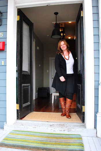
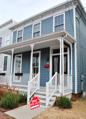
When Danielle and her husband Nick sent us a link of their newly listed home in gorgeous and charming Church Hill we couldn’t just ogle the listing and let it go. We knew we had to house crash them in the flesh and share all of the eye candy with you. They bought it in pretty rough shape in 2003 and they worked with one of our favorite local organizations, Better Housing Coalition, to restore it to a livable condition. Records trace it back to existence as early as 1855 (although it’s unclear whether it was burned to the ground in 1865 and rebuilt then). Either way it’s extremely old and it needed lots of work when Nick and Danielle purchased it.
After two years of renovation (!) they finally moved in back in 2005 – and they’ve been loving their first place ever since. Now that her two boys are older they’re moving into our neck of the woods (Bon Air) for the schools, but they’ll always have a special place in their hearts for the home that they so lovingly revived after years of work. So without further ado, here’s Danielle’s amazing house (if you wanna move in, click here to contact her realtor).
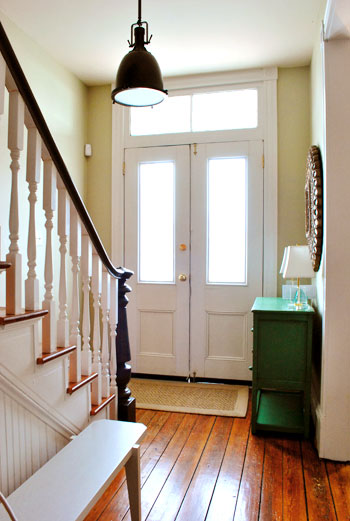
This stately foyer is crowned with a classic Restoration Hardware light fixture. And how amazing are those transom windows above the double door?
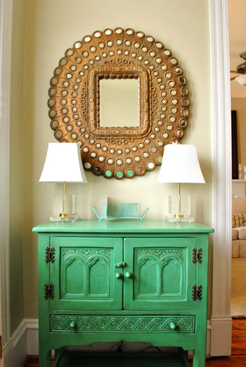
Danielle snagged this stunning mirror from Pier 1 on clearance thanks to a small missing mirrored disk around the perimeter (which she repaired by gluing on a new one). Paired with that showstopping green cabinet it’s just about my favorite entryway idea ever. She got that awesome piece from a local thrift store called Class & Trash, painted it Palmetto by Martha Stewart, and then added an antique glaze from Lowe’s for depth. Genius right? I’m so in love.
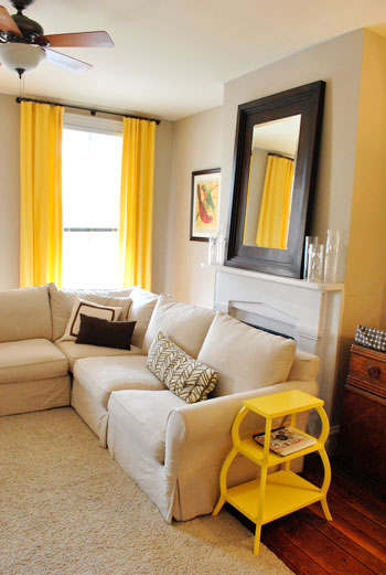
Here’s the living room with cheerful yellow accents. We especially loved the side table (snagged on sale from Serena and Lily) and those dramatic floor to ceiling curtain panels (from Pottery Barn).
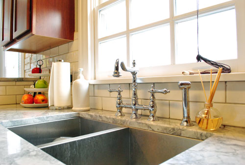
The kitchen is dreamy and Paris-like, complete with granite counters that look like marble, ornate wooden brackets under the counter lip, a classic subway tile backsplash, and charming metal stools from Overstock (which are easy to wipe down when her boys get something sticky on them).
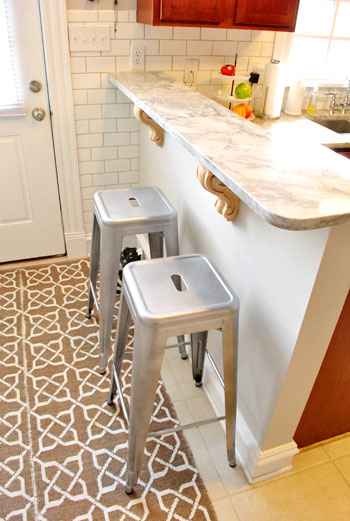
Oh and that rug is actually two runners from Ballard Designs that Danielle stuck together with rug tape to create one larger “custom sized” mat for that area of the kitchen.
And check out their fantastically deep double sink and that gorgeous vintage looking faucet (both from Overstock, seen here and here).
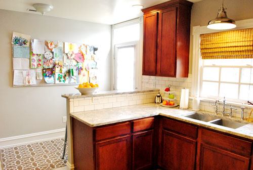
Here’s a wider shot of the kitchen which includes the giant bulletin board that Danielle made to showcase all of the sweet art work that her sons whip up. And check out the lovely and industrial pendant light above the sink.
This is the playroom, which is right off of the kitchen. We love the wall to wall seagrass carpet that she had installed – especially paired with the charming patterned area rug from Ikea on top. And the use of those sleek white Ikea bookshelves for toy/magazine/book wrangling (look at all that storage!) was so smart.
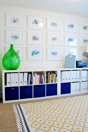
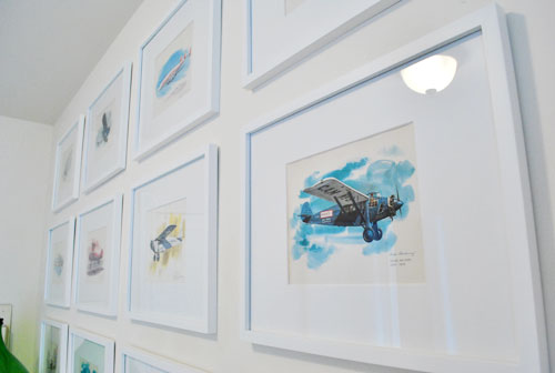
See those lovely prints of planes hanging in a nice neat grid? Danielle’s late grandfather was a pilot in the Navy, so her husband surprised her with this gorgeous set of vintage watercolor prints by Nixon Galloway. We’re nothing short of obsessed with the whole arrangement. Especially because it’s so meaningful to their family.
When you travel upstairs there are three bedrooms and two bathrooms (and a charming pooch if you’re lucky).
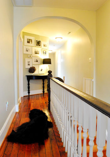
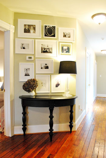
We loved this little “moment” that Danielle created along that diagonal wall with a cabinet and a collection of frames full of meaningful objects like an ultrasound photo, inked baby footprints from the hospital, wedding photos, childrens portraits, etc. And the bold black color in the table and the lamp shade coupled with the black and white prints was the perfect amount of drama and contrast. We also love how the white frames make the thermostat fit right in instead of sticking out like a sore thumb.
Here’s the hall bathroom complete with gorgeous floor to ceiling subway tile (which masked some unsightly wall issues that they had to deal with during the renovation). We loved how the tile goes behind the mirror, which is hung in front of it. Such a pretty look that you don’t see every day.
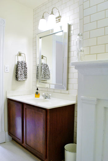
And yes, that’s a fireplace mantel in the corner of the shot above. It’s non-working but still a stunning architectural detail. Especially for a bathroom!
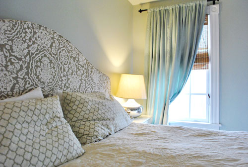
Here’s Nick and Danielle’s bedroom, which is warm and welcoming thanks to breezy gray-blue curtains…
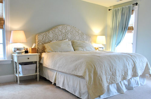
… and a gorgeous printed headboard that Danielle snagged on sale from Pottery Barn (the headboard’s patterned slipcover, also from Pottery Barn, was something she found on eBay along with the Crate & Barrel lamps).
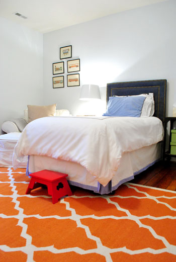
Here’s their older son’s bedroom, complete with a charming nailhead & denim headboard (from Target) and a fun orange patterned rug (from West Elm).
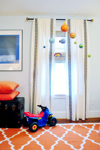
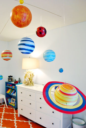
We also thought the planet mobile (from Pottery Barn Kids) and those super fun greek key curtains (from Pottery Barn) were great graphic touches.
And the long Ikea dresser provided tons of storage while the driftwood lamp on top of it totally had me drooling. Cutest thing ever? There was a little white owl ornament tucked into the lamp’s branchy base by Danielle’s mom (she did it the last time she came over and they left it there because it made them smile).
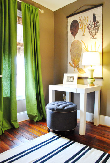
This is the corner of the guest bedroom. Everything from the bold green curtains to that pretty scroll art work on the wall (from Pottery Barn) and the West Elm mini parsons desk was totally speaking my language.
So there you have Nick & Danielle’s lovely Church Hill home. We’re sending them a big wet kiss for letting us run through and snap some pics for you guys.
Now let’s play the what’s-your-favorite-part game. I was enamored with those plane prints in the playroom and the two runners that Danielle rug-taped together in the kitchen. John loved the pops of yellow in the living room and the fun planet mobile in the kids room. Now you.
Psst- Check out tons of other House Crashing adventures here.

Alison says
Some great architectural detail and color choices, but why oh why did they cover that beautiful fireplace with the sectional? Also, I would have chosen white cabinetry over their choice of cheery-like stain. The colour just doesn’t seem to flow with the rest of the kitchen. Love those beautiful floors and front door though!
Danielle says
Alas, been wanting to get our kitchen cabinets painted white for years. I priced it out and it was too expensive to tackle with the other upgrades we did. I agree with you, it would fit the house better. Oh – and about the fireplace. I answered another commenter on that. The sectional was the best solution for our fam … all our fireplaces are non-working but we kept them anyway. We have four others (including one in the adjoining dining room) that aren’t blocked. Promise!
Connie says
Love the floors and love greek key ANYTHING, but was the fireplace in the living room really hidden by the sectional??? Let’s hope “Karl” would never try anything like that!
Amanda says
I love the blue-gray curtains in the bedroom with the fun pattern on the headboard. So cozy and soft. I also love the mirror in the bathroom (with a mirrored frame .. love it!)
Amber Peters says
I love this house tour! Thanks for sharing. I really love that gallery wall of their special family moments. I am going to do a gallery wall in my master bedroom and I love the idea of using ultrasound photos and baby footprints next to wedding photos, etc.
Alison says
Some great architectural detail and color choices, but why oh why did they cover that beautiful fireplace with the sectional? Also, I would have chosen white cabinetry over their choice of cherry-like stain. The colour just doesn’t seem to flow with the rest of the kitchen/age of the house. But, only my own opinion! Love those beautiful floors and front door though!
Danielle says
Alison – please see previous comment above re: the fireplace. And for the cabinetry – I would have love to have chosen white but unfortunately wasn’t in the budget.
hillary says
Wow, there’s one house that does NOT need to be staged. I love every room for different reasons. The entryway “moment” is awesome, as is the bit at the top of the stairs. I love how they have chosen mostly neutral finishes and furniture in every room, but use accessories and rugs to bring color and life. I am always attracted to wacky printed sofas, much to my husband’s dismay, and it’s nice to see that beige furniture can be made strategically un-boring! Yellow side table, be still my heart.
(The only thing that bugged me about the house tour was that none of the cabinets in the kitchen and bathroom had handles! I’m sure it was a choice on their part but it left the rooms looking like a little black dress with no jewelry.)
Danielle says
Ah! You caught me. I’ve been indecisive about hardware for our cabinets. We actually have a box of Restoration Hardware knobs and pulls we never installed. Haven’t had time with the two kiddos. Actually – just remembered – we do have hardware in the downstairs bathroom (not pictured).
Mary says
I love the whole thing. I would move in tomorrow if I could! I love the mix of vintage and modern. And is that a fireplace in the bathroom??
YoungHouseLove says
Yes! So cool.
xo,
s
Samantha Sue says
i LOVED the old wood floors throughout the house. it makes it feel so warm and inviting. We are buying a 1920’s farm house and we are crossing our fingers that we will have some nice old floors like Danielle’s!!
P.S. I love your website. I check in every day, sometimes twice a day. You both are creative and witty.
diana says
I love these posts! And Danielle’s house? I keep going up and down the post, drooling over images like a shameless squatter, taking in the surroundings…
The house is magazine-ready, me thinks. It has the necessary edge. I especially like the fact that nothing is matchy-matchy, but subtly going together. Of course, with the obvious yellow and then black-and-white exceptions, which are so well done that they’re emphasising the rest.
Hats off, Danielle! Now you MUST show us your next house!
OK, I’m done with the exclamation points, I’m heading overstock to check availability…
Danielle says
Thanks Diana! I’m flattered. One never feels like their house is done, you know? Would love to share our next place. :)
renee says
I love the subway tile in the bathroom. I would have never thought to put it all the way up to the ceiling, but I am now considering it for my bath renovation because I think it will make the room look bigger. I’ll be sure to post the before and afters.
Danielle says
Renee, I think that subway tile made the biggest impact over any other thing we did. You’re right, it made the room look bigger and taller. It went from sort of boring to a place I love to be, which is great because we spend a lot of time in there giving the boys baths.
Emily Stearley says
What a dream to be able to renovate that house!
p.s. I’m also happy to see a front door that’s black on the outside and white on the inside. That’s what my front door is like and I’m always worried I’m breaking some crazy rule or something.
Samantha says
love the pictures!
Corinne says
I’m in love with the bathroom of all things! Subway tile all over the walls and behind the mirror isn’t seen too often, but I love it!
Laura says
Such a beautiful home! And you guys are taking really nice pictures. What stood out the most to me were the hard wood floors. They did a great job restoring/renovating. I like how they kept the bones of the house original feeling, and used their decor to add a modern touch.
D says
I just caught myself drooling….
Gloria says
The wood floors. Sigh. If Danielle wants to share what product they used to finish them, I’d be interested. I also love the footprints and ultrasound pic among the black and white photos. They go together well. Thanks for the tour!
Danielle says
Hi Gloria. I would share what was used for the floors but not sure I have that info. I’ll check. The finish wasn’t something we chose. Honestly I think you just can’t beat the look of 100+ year old hardwoods. What I really appreciate is the random width of the planks.
Megan Carlisle says
The antiqued hutch/cabinet in the entry is by far my favorite part of the “crash”. We refinished a dining room hutch last fall and looked everywhere for a product that would antique painted furniture. Would it be possible for you guys to get us any more information on what product was used? I searched “antique glaze” on lowes.com, but only got cabinet finishes as a result. I would appreciate any information you could gather! :)
YoungHouseLove says
Here’s hoping she’ll drop in and spill the beans! I emailed her to let her know her post is up, so she’s probably working or kid wrangling. But here’s hoping she has a moment to stop by soon.
xo,
s
Allison Stuart says
I just finished painting and glazing a dining room table and chairs. I used this post at All Things Thrifty for all my info. And it turned out great! http://www.allthingsthrifty.com/2010/03/glazing-furniture-101.html
(Hope it’s OK to post a link)
Danielle says
Hi Megan! It’s Valspar Antiquing Glaze. I found it in the faux finishes section. Here’s a link:
http://www.lowes.com/pd_98278-4-007.0098278.003_4294856872+4294962470+5003719+4294868186_4294937087_?catalogId=10051&productId=3087555&Ne=4294937087&identifier=No&N=4294856872+4294962470+5003719+4294868186&langId=-1&Ns=p_product_prd_lis_ord_nbr|0||p_product_quantity_sold|1&storeId=10151&searchQueryType=1
Jessica Horton says
oh PLEASE come crash our home…. we’re putting it up for sale next weekend!
(LOVE that home too!)
YoungHouseLove says
If you live nearby feel free to email us pics! We’d love to see it!
xo,
s
Julie says
My favorite thing was the small table at the top of the stairs! Usually you see the same set up by the front or back door, having it at the top of the stairs is a great place. I have a similar set that I’ve been wondering where I could use it (my new space doesn’t quite accomodate it)so I think I’ll have to give her a try upstairs. Thanks for the inspiration and good luck on the sale!
Carrie says
I love the entryway and the wideplank wood floors! And the doggie is pretty cute too even if it isn’t part of the house! :)
I would love to know the paint colors in the master bedroom, it is such a great calming color! And also the paint colors in the living room and the upstairs hall. Maybe it is the same color and the light makes it look a little different? I am repainting my living room when it gets a little warmer and want a nice light neutral like this. I only get good outside light in the morning… too bad I have to be at work then and can’t stay home to enjoy it!
Danielle says
Hi Carrie. Thanks – our dog is definitely the star of the house! Here’s the paint info:
Master – 1569 Night Mist Benjamin Moore
Hallway – Camouflage Benjamin Moore
Living Room – Sharkey Grey Martha Stewart
Carrie says
My pup is the most popular thing in the house too. Wouldn’t have it any other way! :)
Thanks so much Danielle! I appreciate you taking the time to answer!
Erin says
Beautiful house!
Totally off-topic question for Sherry: what did you wear to work on home reno and decor projects when you were preggo? At 24 weeks, I’ve outgrown my painting/reno clothes! Last night I was painting in my PJs since my only other pant choices were expensive mat jeans or work dress pants :)
YoungHouseLove says
I looked straight up crazy. I’d squeeze into my same painting sweatpants that I always wore and an old Red Socks t-shirt. There was about 10″ of belly on blast. I looked ridiculous.
xo,
s
Anjali says
Love the post. Could you tell me where the rug in the playroom is from? I absolutely love it!
YoungHouseLove says
Here’s hoping she stops in with that info soon!
xo,
s
Brigid says
I’m pretty sure that rug is from Ikea! http://www.ikea.com/us/en/catalog/products/50168285
Danielle says
Yes! It’s Ikea and a great buy!
Melody says
Beautiful! For me it’s a toss up between the upstairs hall and the guest room corner.
rachel says
Loved the green entryway table and the colorful rugs… i tend to be scared of bold color but am definitely interested in trying it out!
Sierra says
That Class & Trash entry table and the space mobile had me all swoonie!! Love love love! Gorgeous house with all kinds of charm & character. :)
Sarah@StyleandCentsability says
They really get colors! The combinations are so fresh and inspiring.
https://styleandcentsability.wordpress.com/
Christie says
I am absolutely in love with the little cabinet in their entry! I have an antique china cabinet that is painted like that and I’ve been dying to paint some other furniture to match it. So I’m almost TOO excited that y’all said which colors they used to paint it! YAY! Thank you!
hyzen says
Geez, this is all great, but I especially love the entryway. Awesome job with the green table–it looks perfect. Oh, and count me as jealous(!!) that they have a lovely playroom off the kitchen.
Lauren says
I ABSOLUTELY love their use of bold and serene colors. They work so wonderfully together. I am so glad they renovated this beautiful home. Makes me fall in love with our beautiful city again and again!
Sheila Zeller says
I loved the entry area – Pier 1 mirror with Class & Trash table vignette, the Restoration Hardware light fixture… But my favorite, favorite was the angled wall of love upstairs – it totally spoke to me!
jbhat says
What a lovely home. I’m sure they are probably bummed to leave it, but I am betting that she is itching to start fresh too. Thanks for the crash!
jbhat
Danielle says
Yes, it’ll be hard to leave but it would make us happy to pass on the house to someone who would love and appreciate it as much as we have. We’re excited to start a new chapter of our lives but this house will always be special to us.
Anna says
Oh, I’m awe struck by the foyer! It’s stunning! And the black and white prints with the accent table upstairs!
Jen O says
I can’t handle this home- LOVE it to pieces! And my heart is completely filled with envy for the INCREDIBLE house prices in Virginia. The listing price of this home would barely get you a bachelor apartment in the burbs, and a house like there’s would easily get $1 million up here, and most people would think that’s a steal. SO so jealous!
Kelley says
I’m not sure if Danielle is posting, but if so could she KINDLY share the sources of: the chevron pillow in the living room, the silver pendant light in the kitchen (LOVE) and the blue/white stripe rug in the guest room??? I would be SO grateful.
YoungHouseLove says
She just stopped in with some details- here’s hoping she drops in again!
xo,
s
Danielle says
Sure thing. I’m happy to share as many bloggers have done for me! The chevron pillow is West Elm. I never saw it online, only in store. The silver kitchen pendant is Quoizel Emery Pendant ER1814 in Imperial Silver (bought online using Google shopping – can’t remember where, but it was a restock and significantly marked off).
KCG says
Wow! I particularly love the wooden plank floors, all of the GREAT rugs throughout their home, and the picture walls – both the aviation-themed wall as well as the wall upstairs. (And, you’re totally right, by using white frames it does make their thermostat blend in – genius!) Thanks for sharing and I too would love to see how this family decorates their next house!
hollyG says
Love the pops of yellow in the living room – and the reflective area there in the guest room!
Jen says
We love Class & Trash! Our kids love it too :) It’s such a fun place, and the owners are so sweet!
Danielle says
Ditto – the owners are wonderful (and have a great eye). My older son loves a trip to C&T almost as much as his mama.
bungalowbliss says
What a great place. I love the punches of color, and I’m totally with Sherry–that entry is amazing!
Hilary @ My So-Called Home says
The hardwood floors are stunningly beautiful, as is the entire house truly. Did you actually take the photos or did she send them?
Jamie says
Oh I love! I wish I lived there so I could buy this place. I love the simplicity of their decorating, everything is so perfect. I especially love the little memory wall in the hall and those floors…my heart goes *thump thump*. Thanks for sharing guys!
Tori says
cute place. I’m curious as to the floor plan of the living room that the couch is in front of the fireplace?
Danielle says
Hi Tori – if you click on the real estate listing, it will give you a better idea of the floor plan. Several people asked me about covering up the fireplace. See above comments.
Bobbie Brown says
Ahhhh, how can I pick a favorite out of this house?! I have quite a few! LOVE the mirror and the table in the foyer, but, possibly my FAV thing is the wall in the hall with white frames. LOVE LOVE LOVE!
Rebecca says
I drooled over the floors. Literally. Amazing hardwood!
Laura says
Oh how I ENVY non-California home prices :(. 2500 sq. ft would cost about 4x’s that where I live :( So cute though what a great place to call home. *sigh*
Danielle says
Laura – I’m the homeowner. And a California native myself, so we definitely appreciate the affordable prices in VA!
Kristi says
I’m obsessed with little diagonal wall. I have a weird wall like that in my studio and I can never figure out what to do with it!
On an unrealted note, Sherry have you seen these white ceramic animal lights on sale at Urban Outfitters? I’m definitely getting the owl!
http://www.urbanoutfitters.com/urban/catalog/productdetail.jsp?id=19880608a&pushId=SALE_APT&popId=SALE&navCount=18&navAction=jump&itemCount=80&itemdescription=true&parentid=SALE_APT&startValue=1&sortProperties=+subCategoryPosition,+product.marketingPriority
YoungHouseLove says
So much fun!
xo,
s
Karen says
This house has actually been on our saved list of homes for a while now. I emailed my husband immediately after checking out the post this morning with the subject “LOOK! It’s the dream house!”
I see the price has dropped, but we haven’t scheduled a walk through because of the neighborhood. We’re moving from out of state and were wondering how the Church Hill neighborhood is. The price is a bargain compared to our Boston real estate prices, but we don’t want to move into a developing area.
Shannon says
My husband and I bought in Church Hill this past summer and we absolutely love it. Parts of the area are certainly in need of work, but it’s improving by leaps and bounds almost weekly. I’m almost certain these prices are going to skyrocket in the next few years and we’ll be thrilled we bought when we did. We lived in the Fan before moving and we absolutely prefer Church Hill, it has a really great close-knit feel.
Danielle says
Hi Karen, I’m the homeowner. Please do come by for a look if you can. We’d love to have you! I moved to Richmond from Boston myself. One of the things I really loved about Church Hill was that it instantly reminded me of old Boston neighborhoods. We’ve loved living here and have wonderful neighbors. There are all kinds of people in Church Hill – very diverse – I love that aspect but even better, people are accepting, unpretentious and friendly. There are some fancy parts of Church Hill, but our area is not in the posh district. For years it was rundown. Now it’s up and coming, but definitely in transition. That scares some people away … but we’ve really had no problems living here. Sure, you gotta have some street smarts and use common sense, like with any urban neighborhood. Certain areas of Church Hill have a stigma but I bet if you ask anyone who actually lives here, they’ll tell you they love it. Just sharing my perspective!
Rachel K. says
What a beautiful home! Love the mix of different decor styles.
ginai says
Oh my golly! this home is gorgeous! wonder if she has a how to blog? ((:
Love all the texture and pattern and all the bright colours!!!
Love all you and John do Sherry! ? ***Typos and all***
YoungHouseLove says
Sadly Danielle doesn’t currently write a blog, but if she does we’ll be sure to link up!
xo,
s
Alyssa says
Love and adore the diagonal wall arrangement…I was drooling. And secretly wishing I had a diagonal wall around.
Mary says
Amazing!! There’s so much curb appeal eye candy in RVA that I’m always dying to see the inside of so many of the homes here…so thanks!