For the last few weeks you guys have been requesting a House Crashing post with photos of the other six Homearama homes in the show, so we slipped through and snapped a bunch of pictures of each house, just like we did for this Homearama House Crash from 2012 (that’s your warning that this post is extremely image-heavy). Everyone who has attended the show so far seems to have different favorites, which is definitely part of the fun (there’s a “people’s choice” award that everyone who passes through can vote for, and each of the seven boxes have a ton of papers in them).
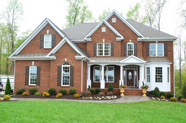
All of the houses in the show sit on a cul-de-sac and are numbered, so we’ll do the most logical thing and start with House #1, which was built and designed by LeGault Homes.
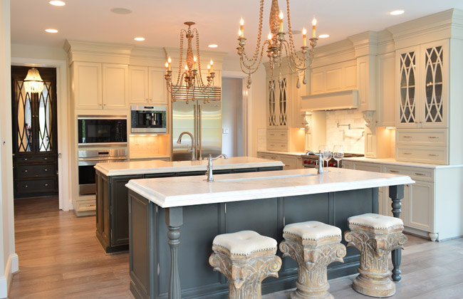
Perhaps the most luxuriously decorated home of the show, it has some of the coolest cabinetry we’ve seen in a while. Their kitchen included double islands – one with a standard sink, and one with a prep sink that could be used for housing ice/drinks at a party. Note the coordinating dark, mirrored cabinets through the doorway into the mudroom.
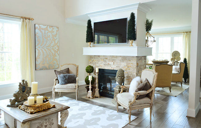
The living room also had a double-sided fireplace with a seating area behind it.
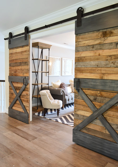
Upstairs there were sliding barn doors that fooled me into thinking they had lots of metal trim (only when I touched them did I realize that gray “steel” is just painted wood).
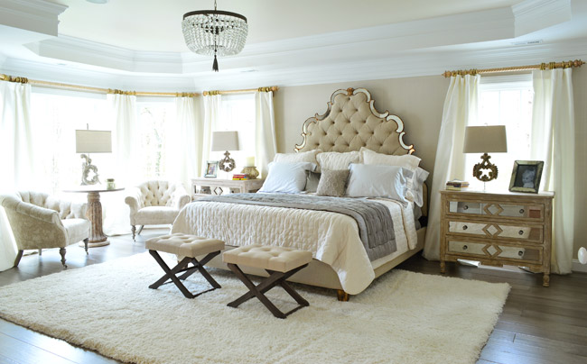
Here’s the main bedroom, which had awesome light streaming in – along with a lot of upscale, light colored furnishings.
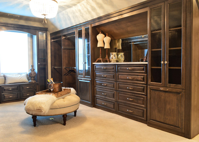
One frequent trend that we saw in other houses was a closet that was accessed by walking through the main bathroom – and this home boasted one of the most upgraded ones we’ve seen. In addition to being spacious and full of nice cabinetry, it even had its own drink station / coffee bar complete with a mini fridge.
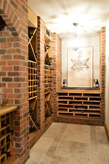
Speaking of beverages, this is the only home in the show with a basement – and they used some of that space to create a wine cellar. The stacked shelving on the far end is made from pallets and provides even more bottle storage.
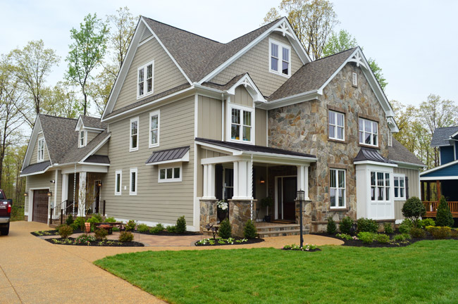
Now let’s skip over House #2 (that’s ours) and go straight to #3, which is built by Southern Traditions and designed by Elaine Reeder. They’ve got a really pretty stone accented exterior (with some tin awnings along with a few white rain chains) that we’ve been admiring from afar for a while, so it was nice to finally get to peek inside.
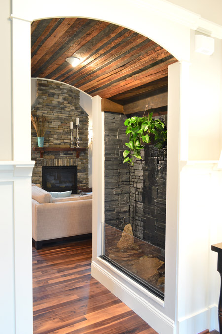
This house has a lot of interesting mixes of materials, like in this little passage between the foyer and the living room that combines a rustic wood ceiling with a stone wall water feature.
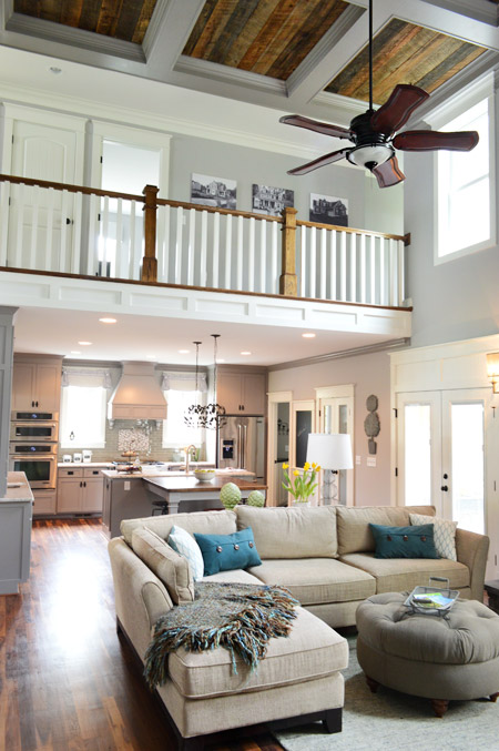
The main area of the home is nice and open, with a two story living room that carries the rustic wood look into the coffered ceiling above.
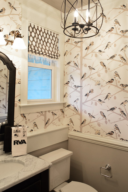
They also went bold in the half bathroom downstairs with this graphic bird wallpaper over the wainscoting. There’s even a little local touch with the Richmond RVA hand towel.
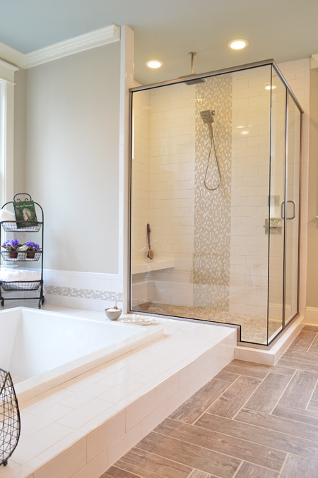
And the en-suite bathroom included something we’d never seen before: a sunken tub.
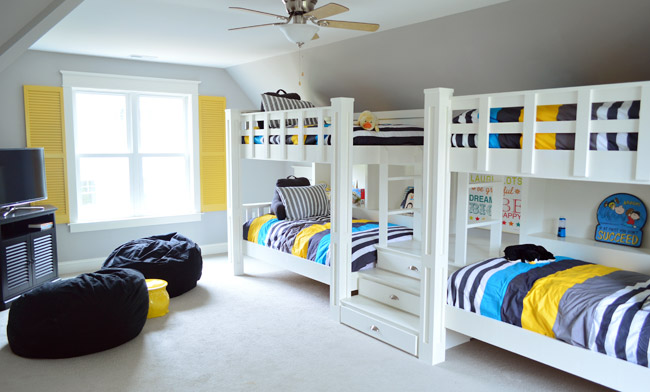
Upstairs they turned the playroom into a sleepover room with two pairs of built-in bunkbeds. The builder’s carpenter built them from scratch (including the hidden drawers in the steps) and they certainly got our wheels turning more than your ordinary bonus room does.
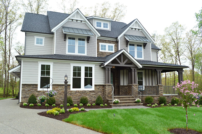
House #4 is built and designed by Ray A. Williams Custom Homes, and it brought some nice dark exterior trim to the show (which is something we’ve admired on a few homes in our own neighborhood).
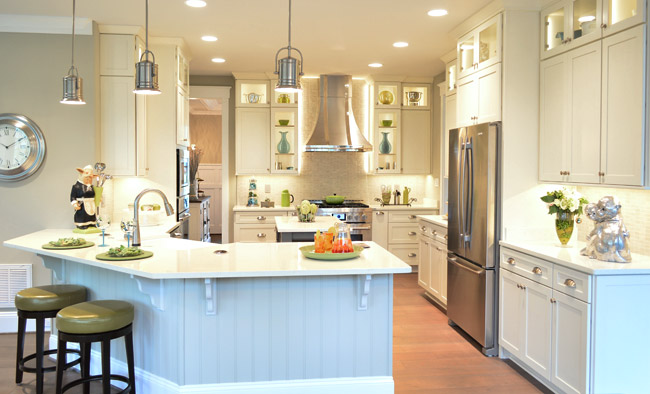
Their kitchen was one of those where you flip the lights on and it’s like the clouds part for a moment and you hear a chorus of angels singing. And of course Sherry was loving the silver monkeys on the far right.
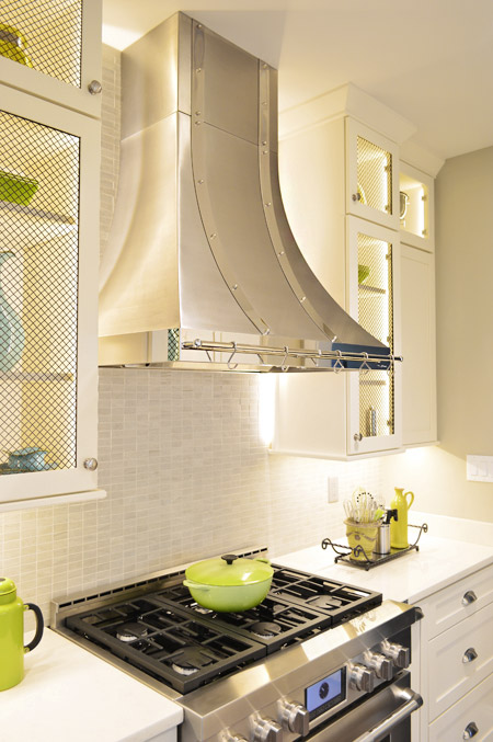
There were also great details like the metal straps on the hood and the mesh on some of the glass cabinet doors.
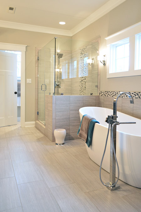
This home probably had the most modern bathroom of them all, complete with small mosaic accent tile and sleek glass shower doors.
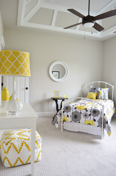
One of the architectural themes of this house were the decorative ceilings throughout, like this paneled one in one of the bedrooms.
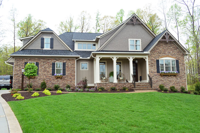
Next door is House #5, which is built by Harring Construction and designed by Diana Ragsdale. She decorated one of our favorites from last year – and we love the look she pulled off this year too.
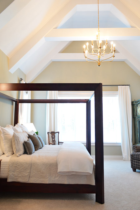
One of the highlights was the main bedroom, which had this awesome vaulted ceiling and stunning gold chandelier.
The gold details continued into the en-suite bath fixtures as well. How awesome is a bathroom that can fit such a giant wooden wardrobe?
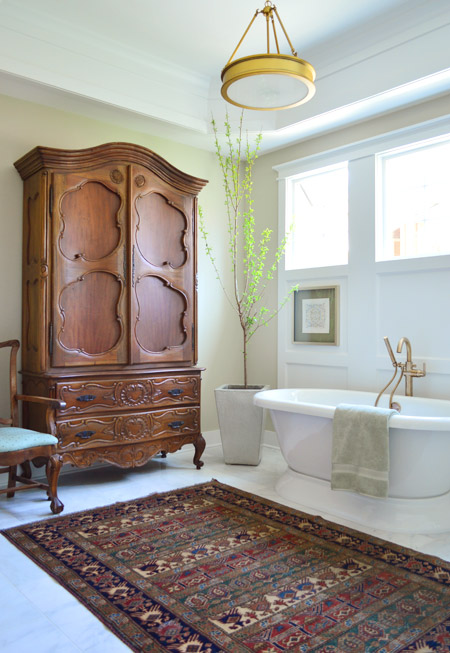
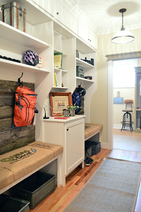
The mudroom had great built-ins too, with a nice rustic touch by using old grain sacks as the bench fabric and reclaimed wood across the back.
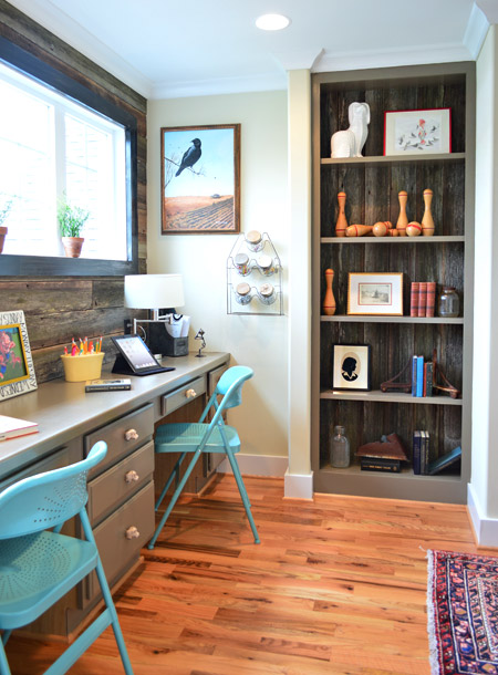
That reclaimed wood, which was found at Diana’s friend’s North Carolina barn, continued upstairs where it accented the back wall of a desk area that was carved out of an otherwise empty hallway space (as well as on the back of that built-in bookcase).
Speaking of bookshelves, in the nearby boys room there’s one that acts as a secret doorway…
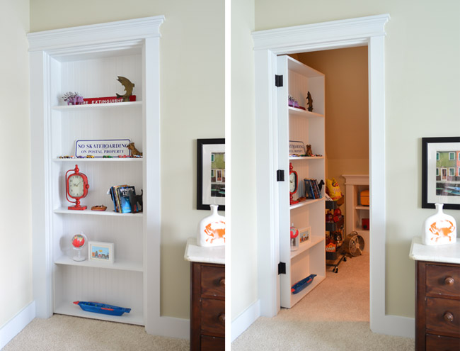
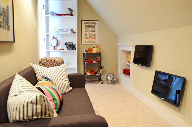
… which leads to a tucked away TV/video game room. My 16-year-old self would’ve flipped for something like this. Although I probably would’ve just practiced my marching band music in there. #nerd
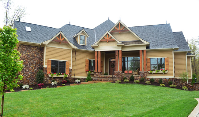
Next door is House #6, which was built by Falcone Custom Homes and designed by Catherine Stanley. It’s one of the largest in the show and it boasts some of the grandest features (it’s known as “the one with the pool” to almost everyone who worked on Homearama).
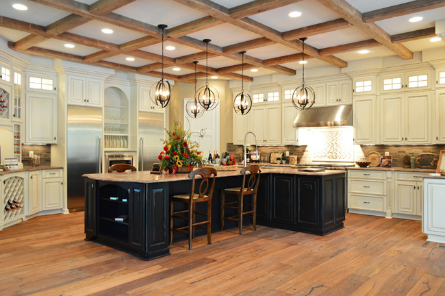
The kitchen sports a separate fridge and freezer and a 100-bottle wine rack, not to mention a pretty expansive ceiling beam detail.
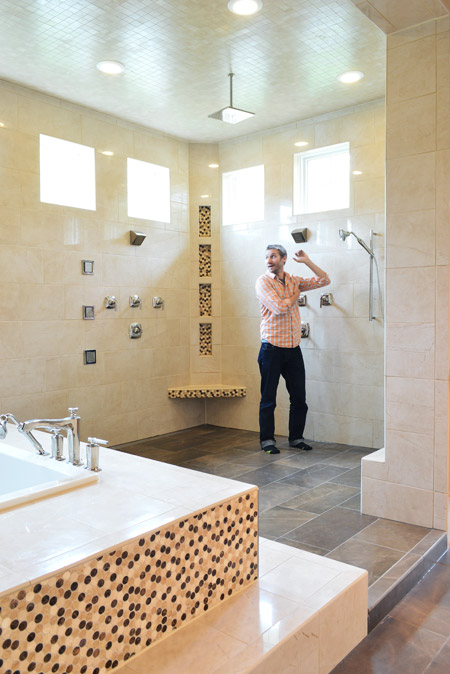
And the en-suite bathroom is unlike anything we’ve ever seen. The bath/shower area alone is 600 square feet and has an infinity tub, rain showerhead, and body spray jets all around. I had to snap one of my infamous “John for scale” shots just to illustrate how big it really was.
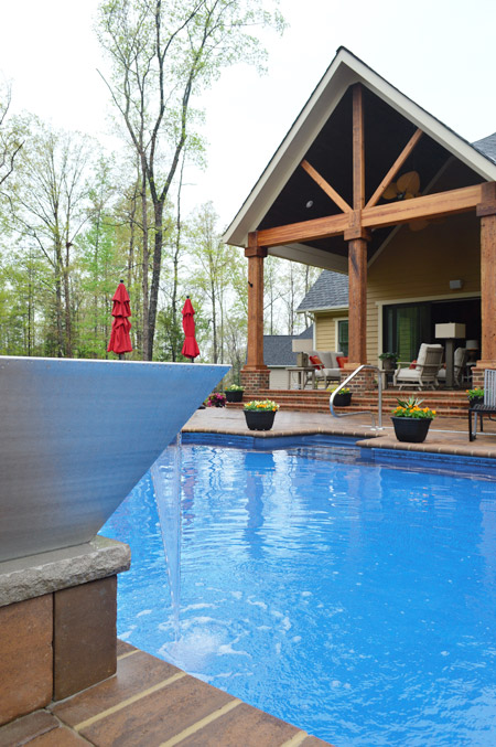
And here’s the pool, which we shared briefly during construction. The outdoor area has lots of other fun features like this combo water/fire feature in the foreground (I couldn’t figure out how to turn the fire on, so you’ll have to use your imagination).
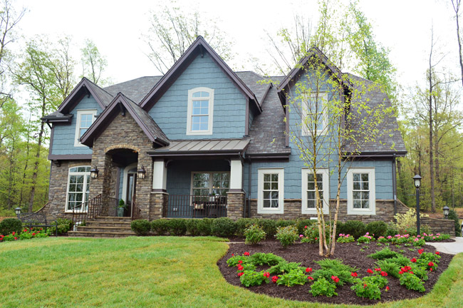
Rounding out the cul-de-sac is House #7, built by LifeStyle Builders and designed by Priscilla George. We spotted a few similar choices between this one and ours – like both choosing a blue exterior paint color – even though ours was deeper and theirs was lighter and mixed with more stone and dark trim along the roofline.
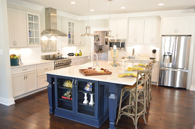
This home also sports a navy kitchen island, but the leg details and glass fronted end cabinet add a nice twist. They also went for some accent tile over the stove and a stainless range hood with chrome lights over the island.
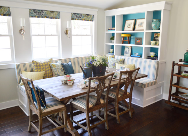
And they also did a built-in banquette, although it was L-shaped and had chairs on the other two sides. We especially loved the cheerful teal backs of the bookshelves.
In the en-suite bathroom, they also had a dual shower area – but they created two distinct zones (one side featured a tradition and rain-shower head, while the other had a bench and handheld shower).
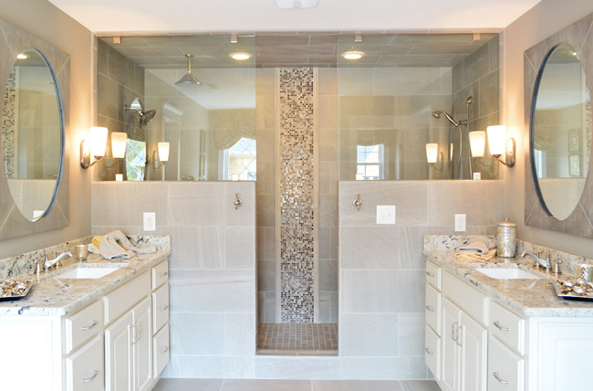
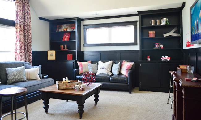
Upstairs they went bold in a bonus room by going all black with the trim and built-ins, which would make for some cozy TV watching for sure.
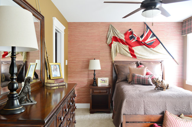
And each of the bedrooms had an interesting theme/style. I was especially drawn to this one with the cool old flag against the grasscloth wallpaper. I think I may be developing a thing for flags, much like my existing map and bike tendencies…
So 30+ pictures later, I’ll wrap this up. There’s plenty more to see in person if you can make it out, but at least you’ve hopefully gotten a flavor for the other homes. And while I’m sure there are plenty of source questions out there (“what’s this paint color?” “where’d that furniture come from?”) we sadly don’t know a lot off the top of our heads and most of the Homearama crew is occupied this weekend with the show itself. So feel free to ask away, but please be patient if the answers don’t come right away (we’re hoping Justin drops in with info within a few days for you).
Psst – Wanna see more showhouse info & photos? Click here for Our Full Showhouse Tour, which includes final pictures of every room, the floor plan, budget info, a video walk-through, and shoppable showhouse furniture & accessories.

Mary Beth says
Oh gosh you guys. Good thing my schedule is light today, because I am going to look at this post FOR HOURS.
Holy smokes.
I will likely never live in a home as beautiful as any of those.. just wow.
The photos literally made my heart RACE. Stunning.
MB
http://www.hystericallyeverafter.com
Corien says
hi John, I love looking at those showhouses! Great ideas! But I don’t get what the concept it. Can people buy them? With all the stuff that is in them? Or can you buy houses like these ones?
YoungHouseLove says
These seven showhouses are sort of upscale “inspiration homes” for Richmonders to explore and then they’re available for anyone to buy (as well as some of the furnishings in some of them), but the whole event is also set up to benefit Habitat for Humanity. A chunk of money from the sale of our house is going to Habitat thanks to our awesome builder, along with a chunk of the ticket sales for the event, and we’re donating our design fee to them (you can read more about that in this post). This show is also a way for the builders to show people what they can do (for example, someone has hired our builder to make our exact house on another lot in the area).
xo
s
Stardancer says
Someone is building your exact house? That’s amazing! If that doesn’t say you did it right, I don’t know what does. Do you know if they’re just using the layout or are they also pulling design inspiration from your showhouse?
YoungHouseLove says
It’s pretty amazing! They’re even adding some of the custom built-ins that our team brainstormed and are SO NICE! We met them at one of the parties for the builder, and they even said they’d be cool with a house crash someday!
xo
s
Corien says
Thanks Sherry! Finally I get it! In the Netherlands there is sometimes a showhouse in a new appartment building or in a new vacation park – so people can see what it looks like, but this is a different concept. Love it, also the fact that part of the sale goes to Habitat for Humanity! So cool that your house is going to be copied! Looking forward to the housecrashing! Must be awesome to see a real family living in your house!
Rachel says
That is so incredible they are making your exact house. You guys did so awesome. What a cool thing :-)
Jackie says
By exact house – does that mean the layout/structural design or both that and the interior finishes? As in, do the floors, paint colors, tile, countertops, etc. get done the same way or are they just having the bones of the house constructed and will pick out their own kitchen, master bath, etc.?
I’ve always wondered how that worked!
Thanks!
Jackie
YoungHouseLove says
The same building plan (it’s called The Clover) along with some of the add-on carpentry features and flooring that we incorporated into the showhouse. They also said they might borrow some paint colors, so we can’t wait to see it when they’re done!
xo
s
Jackie says
Ah, thanks for explaining. If I understand what you’re saying, they’ll use the same building plan but also keep some cabinet details, kitchen nook, butler’s pantry, etc. that you had a hand in influencing. While the layout of rooms like the master bath will be the same, they’ll choose their own tiles/sinks/etc. And they loved specific design choices you two made on things like the color of the house exterior that they’ll definitely want to copy for their version.
That would be SUPER interesting for you to do a house tour of the doppleganger Clover – I would be totally fascinated to view that kind of a side-by-side on a room by room basis. I really hope you do that (or that you’re given the opportunity to do that) down the road.
Best,
Jackie
YoungHouseLove says
Yes, I believe some rooms will be more similar than others (for example, the living room might look identical with the same wall color, layout, fireplace surround, and floors – but we didn’t get into which tile/lights they’d do in the bathrooms). Can’t wait to see it!
xo
s
Robin says
I also shared a review of our tour this past weekend for anyone who wants more (and more) photos! It’s crazy to see your shots and I already have forgotten parts. I think we missed a couple rooms include the entire house #1. What a fun project.
Rebecca says
Love all the different light fixtures you captured!
Margurette Awad says
I LOVED the hidden entry way/bookshelf when I was there. I think I went in and out at least a few times and said COOL! out loud. So I’m right there with ya. That and the jars of “fireflies” one of the houses had in the kids bedroom were definitely my favorite bits.
Some of the other homes felt too ornate for my taste and I knew I’d be nervous to live in a house like that for fear of spilling anything not white/clear, but I liked seeing layouts and how they layered in details.
Of course, I totally voted for house #2! ;)
Kim says
Absolutely gorgeous! I can’t even comprehend living in a home that perfect
Lindsay says
Maybe I’m biased, but your house is still my favorite BY FAR. All of the “luxurious” ones are kind of initially pleasing to the eye, but I would NEVER live somewhere that gaudy. You guys are it. That’s all I’m saying. :)
Reenie says
I agree with you Lindsay. I think YHL’s home is much more cozy. I also like house #7 for that reason too. But…. to each their own…. the others are much too luxurious and fancy for me. =)
Mary says
I thought the same thing, I like the YHL house the best. I did notice that the kitchens all have a sameness about them, white cabinets, painted island and stainless steel appliances. Is anyone else getting bored with that look?
Melissa says
I agree too. I feel like the YHL house was happier and cozier than the more luxurious homes. But that’s my taste and I’ve always felt like houses shouldn’t try too hard. :)
Christine says
I agree with you guys. I went to the show last weekend. All of the houses have beautiful, individual elements, and I could see having a heck of a party in all of them. But I was struck by how complicated the other floor plans are— at least to me. The bedrooms, bathrooms and dressing rooms were just a jumble, to me. I think the other homes appeal to people who really want 5-6 thousand feet, and if that’s what you wanted, those other homes would be really appealing. It’s def. an individual taste thing.
Paige @ The Room Kit says
Add me to the list, too! YHL’s house was far and away the best because it felt like people actually lived there. Some of the others looked nice, but they didn’t seem to add the same level of detail to the accessorizing. They were fine instead of being AWESOME, you know?
haverwench says
I agree. There were particular bits I liked in all the houses, but none of the others was as appealing throughout as the YHL house. I think what makes the difference for me is that yours is the one that feels most like you thought about who would be living in it and how they would use the space. The other showhouses are just that, but yours is a home. (Moreover, I think I actually like all three of John and Sherry’s real houses better than I like their showhouse, because they really are homes, and I know the actual stories behind how all the spaces were designed.)
Amy S says
It would be so hard to choose a favorite! I would love if there were an a la carte version of home buying from these, where you could choose the outside of house #7, the kitchen in house #2, the master suite from house #1, etc. What a great experience for you guys! For the record, I think yours is still my overall favorite :)
Alicia says
Thanks for the tours! Theyre all great inspiration. Any chance you know where House 5’s gold light fixture in the master bath came from?
YoungHouseLove says
I love that one too! Hope Justin can drop in with that info for us!
xo
s
jaclyn says
The link below might help you with the light fixture:
http://www.shadesoflight.com/traditional-urban-hanging_pendant.html
I’m using the brass sconces from that collection in my own bathroom remodel!
YoungHouseLove says
Thanks for sharing the link Jaclyn!
xo
s
Justin says
Aren’t the fixtures in this home great?! They all came from Ferguson. If you are local visit the location on Hull Street Road and ask for Ashley King.
YoungHouseLove says
Thanks Justin!
xo
s
Rene @thedomesticlady says
Love the masterbedroom in house #5. And the bird wallpaper. SO SO SO cute. Love that cute little bathroom.
Rene @thedomesticlady says
Ps most of those homes would be too ornate for my taste. But I appreciate all the great details. They take so much time and effort to design and execute.
Crystal says
Wow…but your house is my fav! ;) Have a great day!
Eileen says
Me and my 2 daughters drove from Maryland to see the Homearama show on Saturday. It was a blast! Every single home had take-away ideas in it. But I have to say, house #3, the “Southern Charm” was my favorite. It had a “secret garden” off the master bedroom wing. I notice you didn’t show a lot of the landscaping, but all of the houses did beautiful things with their backyards, too.
YoungHouseLove says
Yes they did! We wish we had more room for photos (30 is pushing it since we can crash if too many have to load all at once), but the show is definitely worth seeing in person if anyone can come out for the show :)
xo
s
Jamie says
I would love a post about the landscaping! Does anyone know of any great landscape/garden blogs?
YoungHouseLove says
We are planning an outdoor tour of the spaces and landscaping, but bhg.com also has great free plans and photos.
xo
s
Rachel says
I would love to know of any great gardening/landscaping blogs too! I have found BHG’s plans and articles helpful.
Heather says
We were there this past weekend, and while all of the homes were amazing, yours was by far our favorite. The tiny little details in yours (the earrings on the nightstand, the books every where, the burnt wicks on the candles) made it feel like a real home.
And it’s a small thing, but in house #1 there was a faucet on a retractable arm over the range. And that completely blew my mind. Such a simple idea and so brilliant.
And it was hot Sunday, so the pool at house #7 was super inviting.
Leah says
I do love the pot fillers over the range, but I always think about lifting the pot afterward. That water has to go somewhere else eventually. At least when I fill in the sink, I know I can lift the pot.
Or maybe that’s just me justifying, because I am sure I will never have a house that fancy ;-)
Alicia says
Hi guys! Thanks for the pics- awesome inspirations!
I know you don’t have access to everything, but any chance you know where the gold light fixture in House 5’s master bath came from?
YoungHouseLove says
I hope Justin can drop in with that info for ya!
xo
s
Lisa E says
Looks like this one that Addicted 2 Decorating has:
http://www.lampsplus.com/products/harbour-point-19-inch-wide-liberty-gold-ceiling-light__2w943.html?sourceid=DFGBPB2W943pla&cm_mmc=GBPB-SH-_-Close%20to%20Ceiling%20Lights-_-Close%20to%20Ceiling%20Lights-_-2W943pla&tid=plusbox&kw={keyword}&gclid=CJCBxcvek70CFUNo7AodcT0A8g#read-reviews-tab
YoungHouseLove says
Thanks Lisa!
xo
s
Justin says
All of these light fixtures are from Ferguson. Locally you can see them at their Hull Street location. Ask for Ashley King.
Gillian says
Wow! I’m not fancy enough for some of those houses! Not that I’m biased or anything, but yours is still my favorite. The vibe in your house is a cool, got it together family. It’s the house where you feel welcome to be comfortable there and not sit on the edge of the sofa hoping you don’t spill something.
There are elements from all that I love, but for overall “I wanna move in tomorrowness”…yours :)
Happy Friday!
Lindsey says
They are all beautiful! What a cool thing for the community. I was wondering if there is a source list for the other homes? I like that white iron bed from house #4 and was wondering where the designer got it :)
YoungHouseLove says
We’d love for Justin to drop in with that info for you when she can!
xo
s
Ashley@AttemptsAtDomestication says
I need to see if I can convince the hubs to go to the Homearama before it’s over! So much inspiration and eye candy!
Nicole @ Liberty Belles says
WOW is all I can say!
Lisa says
Gorgeous! Thanks for sharing. Wish I lived closer so I could visit the houses in person.
I would love to know the name of the blue paint used on the exterior of house number seven.
YoungHouseLove says
I hope Justin can swing by with that info for you!
xo
s
Justin says
It’s a great color blue. The color is Sherwin Williams Hamburg Grey.
Amelia says
I was interested to see how many of the houses (including yours) had sinks on the island. I can see that this would be nice to let the dish-washer feel connected to the family, but I can’t help but think that it would get SO messy when there was real washing up to be done! Curious if you had thoughts on that subject.
YoungHouseLove says
I think in interior kitchens without a chance for a window to look out while you do dishes people would rather do dishes at an island and look out into other spaces instead of staring at a wall, so I believe that’s why a lot of builders/architects put them there in those cases :)
xo
s
Analise says
That mudroom in House 5, with the reclaimed wood and grain sack cushion covers? COME TO MAMA. Thanks so much for sharing these! It’s so fun to see what different folks did with blank slates. Totally inspiring. :)
Eilene says
DYING! These can’t be real and if they are… why doesn’t my house look like that?! I’m both really excited and a little depressed. What a great job everyone did and for a good cause. I love it!
Luxie says
They all look great! Thanks so much for doing this. Any reason the “pin it” button is gone?
YoungHouseLove says
It’s gone?! Anyone else not see it? We see it on each pic when you roll over them (on the bottom left of the pic – it’s a little orange triangle). Maybe you have an ad blocker on and it’s blocking it?
xo
s
Erica M says
It’s there for me!
Crystal says
I see it
Aimee says
I got only the pin button on the pic of the master BR in house #1 :-( Even R-click show picture won’t let me gawk at that one. Only pic I can’t see in the bunch. I am running AdBlocker but I still have the pin buttons.
YoungHouseLove says
So strange! I have no idea why that would be glitchy like that other than individual computers blocking them somehow (all of our computers show them on all the browsers we have checked). Maybe try another browser in case your ad blocker is reacting strangely with a certain browser when it comes to those buttons? You can also add the pin it button to your bookmarks on pinterest and then you can pin any image in any post (unless of course they’re on a site that blocks Pinterest).
xo
s
Blair R says
I love the bookcase / hidden room. I’m wondering about the items on the shelves when you open or close the bookshelf. Does everything move around a lot?
YoungHouseLove says
Good question! John only opened it a few times and nothing really slipped around too much, but the toy cars shifted a little (since they’re on wheels) but didn’t roll off. I think if you swung it open fast things might jump off, but opening it at the speed you open most doors seemed to be ok.
xo
s
Kate Ediger says
I think that would be such a fun detail to add to J&S unfinished bonus room. It’s already a hidden room, why not play into that. :)
Stacy says
Can I say, without bias, that based on these photos your house is my favorite? These are all beautiful but your style just feels so much more accessible…like, all these houses are for super rich people, but your house could make people who are only moderately rich feel right at home :)
Liz S. says
Your show house is still my favorite though! ;)
Tricia says
No snark intended, just wondered- I’ve already bought tickets to the show, but if I hadn’t I sure wouldn’t now- they’re ok with you sharing these? I would think it’d deter people from the effort of going if they’ve already seen the great rooms.
YoungHouseLove says
Oh yes, Justin is the person who arranged the event (she’s the one John mentions at the bottom of the post dropping in with source info when she can). She invited us to crash during the show last time (you can check out that link in the first paragraph) as well as this time. These homes have 20+ spaces each, and Justin said she saw a lot of interest from folks who saw a few rooms on our blog and wanted to see more in person. For an awesome cause like Habitat we’re trying to get as many people through as possible :)
xo
s
Richelle B says
This post totally made me WANT to go b/c I want to see all of the rooms in every house now!
Jasmine says
I feel like this was definitely a tiny teaser of what there is to see – I’d totally still buy tickets and go if I were local :)
kathy v says
Tricia I disagree. It makes me want to attend after seeing this post. I’ll be going on Saturday. It’s also kind of like reading a book and then deciding to go see the movie!
JennP says
I disagree too. If I were local and it were an option for me, these pics would only make me want to go more!! House #6 for example, is probably 5,000 sq ft at least, but there are only 4 pictures. Obviously there is tons that we’re not seeing.
Erin says
This was such a fun post – a nice little mini-trip for me at my desk this morning. And I have to say, it was fun to see what the other designers were up to, but yours is without a second’s thought the one I’d want to live in! Thank you for sharing!
Yancey says
Great show! I liked the variety in all the different houses. Yours of course feels the most light and airy which I prefer. Also, when you mentioned you might have a thing for flags, this is the first thing I thought of. Ha!
http://youtu.be/gJ768C6d3ao
Brenda says
YES!!!!
Anastasia says
YES! This is the first thing that came to mind for me as well. <3 Sheldon
Elisabeth says
You had me at secret doorway. I am determined to one day own a home with a secret room/passageway. And when that day comes I will invite you to crash it. And then we’ll play a real life version of the game Clue. I call Mrs. Peacock!
Anastasia says
Haha I always was Mrs. Peacock when I played! She’s the best
Lori says
Thanks for showing us “non locals.” I do have to say if I were to vote (just from the pictures you have shown us)…you guys would be my fav. It feels like you almost built the house for my family! Two kids and a work at home mom….I love my office!!!
Melissa E. says
I still love your house the most! And while the bathroom in “the house with the pool” looks amazing, I get anxiety thinking about cleaning it lol.
lisa says
How about the showering in that open shower in house #6. Gave me anxiety just thinking about how my not perfect naked body would look showering in such perfection. LOL! That is the bathroom for a Gisele Bundchen and Tom Brady! Seriously cracks me up just thinking of it!!!
Larissa says
I have to comment before I even look at the post! When I saw what it was I had to go get a cup of coffee and turn the music down so I can settle in and really study the pictures. Can’t wait! Thanks for taking the time to do this!
Jill says
Ahhh! Does anyone else comment before they even read a post? I’m going to go get myself a cup of coffee and enjoy the eye candy!
I love your showhouse. And I know they’ve told you it only takes one person to buy- I think that will NOT be a problem. Congrats and thanks for sharing the other homes too!
Lisa | Winter Heights says
These are love-a-ly, but your house still has my vote. ;)
Also love that your house probably pops out with the exterior color you chose. :))
Shelley @ Calypso in the Country says
You just made my day – I live for house tours and that tour was fantastic! Thanks! – Shelley
IrisM says
Wooow ! These houses are SO beautiful! We definitely don’t have houses like this in France, it’s a different style! But I looove it!
Iris
http://www.thecoloredmarriedlife.com
Rosemary says
100% I prefer yours. Mainly because it looks like a warm home meant to be lived in. I get rather frustrated sometimes with how showy people have become and feel that some of these homes are just way overdone. Who needs a bathroom that looks like the Taj Mahal? I may be in the minority here but I think life is meant to be lived comfortably in a beautiful yet home that feels like home not a showplace. Keeping up with the Jones is just not my style. I also look at these homes and wonder about just daily maintenance…you would need more than a single cleaning lady for them and you certainly could not keep them up alone.
Kate C says
Agreed. Those kitchen stools in house #1? Ugh. But honestly, at the price some of these will sell for, I’m sure the owner has the budget for house maintenance staff.
kathyg says
I’m kinda the opposite, but only in that I go to these shows to see “over the top”, get ideas executed that I’ve seen on Pinterest, or I wouldn’t have thought of myself. Would I want to buy one? Probably, if I had the $$$$ to do so! And if I could afford the home, I could probably afford the cleaning lady too! But as far as eye-candy, oh yeah!
Laura says
A friend and I are driving up from NC tomorrow to go to the show. We’ve been planning it for months, and we’re so excited! We’re also going to be checking out some of the thrift stores you mentioned in your Richmond post a few weeks ago. (and the Proper Pie Co. too! So excited!)
YoungHouseLove says
Wahoo! Have so much fun Laura!
xo
s
lisa says
I’m getting a girls weekend away too with one of my best friends and we’re driving down from NJ. Can’t wait!!!! We haven’t mapped our whole itinerary yet though. I have to go back to that Richmond post too. Seeing these pics makes me even more excited too!
YoungHouseLove says
Have fun Lisa!
xo
s
Shannon says
Drool. These are gorgeous but I still like yours best. Some do have some pretty nice features though, but overall, I’d live in yours. :)
Martha says
Oooooo, I love House #7 and would love to see more of it! It’s definitely the right style balance for me between classic and modern touches. The kitchen is awesome – it’s like your show house kitchen and the dream kitchen in my head met, married, and had a baby!
Andie says
That 600 sq ft bathroom makes me kind of sick! That’s the size of my entire one bedroom apartment that I pay a ton of money for in rent. And some people have bathrooms that size. As nice as that bathroom would be, there are better things to spend your money on. Too much wealth and excess in this country.
Gisela says
Agreed, though all looks lovely and all, I still kept thinking “over the top” I thought it was my third-world mentality.
Gisela
Judy says
It must SURELY be 60 sq ft!
lauren says
It’s gotta be a typo… 600 HUNDRED square feet?!? That’s almost as big as my entire house.
YoungHouseLove says
We thought we had misheard it and then asked a few other people to double check. It’s miiighty big!
xo
s
Brenda says
First of all, that hidden bookcase door is the best thing ever! I want one of those so badly. Secondly, everyone has different levels of expectations and comfort in their own homes, but I love how your house is lovely and fun and feels livable right away. You have such a practical and real life kind of style. There are so many cool details in the other houses, but yours feels like a place where I could kick off my shoes and get comfy.
Chasity says
Gosh, this makes me wish I lived in the area (I’m way down in Texas) so I could tour the homes! My husband and I would love it – sometimes we go to open houses in our area just for fun, even though we’re not in the market for a house :)
Kara says
Sherry & John– You both seemed so budget conscious the whole time you were working on this house, I don’t understand how any of the other builders stayed within the same budget! Especially that first house! Am I missing something?
YoungHouseLove says
Many of these homes have decorators who own furniture stores (Diana has an awesome local store called Izzie’s) or the builders themselves have purchased all of this furniture to furnish other models so they got to reuse it in this show (for example, almost all of House #1’s furniture was in another showhouse we saw a while back, so once that ended they stored it and then brought it over here).
xo
s
kathyg says
That doesn’t seem fair! Or I guess the question is, in your mind do you think you would you have done things any differently if you had an unlimited budget (or just a bigger one)?
YoungHouseLove says
We were able to hustle and get a ton of amazing donations that we get to pay forward to Habitat’s ReStore, so we’re really happy with how things ended up. Of course there are things we would do differently (we wish we had more time to redo/update a few things) but overall we’re thrilled that we completed the house in those crazy few weeks – and that it feels like us :)
xo
s
Christina says
I wish I lived closer to VA so I could drool over these in person! I think your home is my favorite since its closest to my style but the two story living area in #3 makes me wish it was Christmas so I could have a 20 foot tree in there! Do you guys have a favorite other than your own? Or is it like having a baby and yours is always the cutest?
YoungHouseLove says
It’s so hard to play favorites since we’ve become friendly with a lot of other builders and designers throughout this year-long process. There’s definitely something in each house that made us say “oh man, that’s so smart – I love that!”
xo
s
Randa says
We went to Homerama today and I felt that same way – each house has at least one space or element that we adored. We loved how outdoor/indoor your outdoor spaces are in The Clover! I would be living on the back porch if it were mine. Good job team YHL.
Heather says
These houses are awesome! I love the one y’all designed the best though! Even through pictures it felt very cozy and “homey”.
Just curious if you saw anything in any of the other houses and wished you had had that idea or done that in your house?
YoungHouseLove says
That swinging bookcase definitely was one of those “wow” moments for us. There were things in each house we ended up loving. It’s so much fun to walk around and say “dude, that’s smart.”
xo
s
Xochi says
I’ve enjoyed every post on the home show to date. I was hoping that you would add your show house to the House Tour page on your site when you’ve finished sharing every room and detail so all the links are in one spot? I love going back and looking at the beautiful home you’ve designed.
YoungHouseLove says
Definitely will do that – complete with a video tour :)
xo
s
Hemma says
As an energy conscious person it is very disheartening to see that none of the houses appear to have any consideration for energy efficiency and energy conservation with these huge rooms, enormously high ceilings (imagine cooling and heating those rooms) and overall over the top spaces. Sure they may have “energy saving ” appliances but that is a drop in the bucket. It is quite disappointing that they all seem to completely miss the boat re smaller houses and treading lightly.
When will we ever learn……
YoungHouseLove says
There’s actually an eco house in the mix (#5) where there are notes throughout the house about how they made the house more green/efficient. Our builder also made a bunch of eco choices (special insulation & heating/cooling systems, water saving toilets, low-e windows & doors, a tankless water heater, etc). I agree that giant lofted rooms are definitely more of a challenge to heat and cool, but in new builds there are some pretty awesome materials that can make larger spaces even less wasteful than smaller drafty ones from before those materials were introduced.
xo
s
Amanda H. says
These homes are all beautiful and it is so hard to choose a favorite. But I have to be honest, I love the way you guys keep it modern and simple but whimsical and quirky at the same time! There are things I like about each separate house (Those showers!!! and ceilings!!!) but as a whole, I like your design best. It feels the most comfortable and livable to me, speaking as a mom of three small people. You all did a fantastic job!!!
JoniB says
I just LOVE looking at home plans and room design, but since my house is only 824 sq. ft. I don’t have a lot of space to play with. Thanks for giving me a moment to indulge in the awesomeness of these home designs. While some of them are a bit too formal for me, it still made my heart happy to look through them all. Yours is still my favorite!