For the last few weeks you guys have been requesting a House Crashing post with photos of the other six Homearama homes in the show, so we slipped through and snapped a bunch of pictures of each house, just like we did for this Homearama House Crash from 2012 (that’s your warning that this post is extremely image-heavy). Everyone who has attended the show so far seems to have different favorites, which is definitely part of the fun (there’s a “people’s choice” award that everyone who passes through can vote for, and each of the seven boxes have a ton of papers in them).
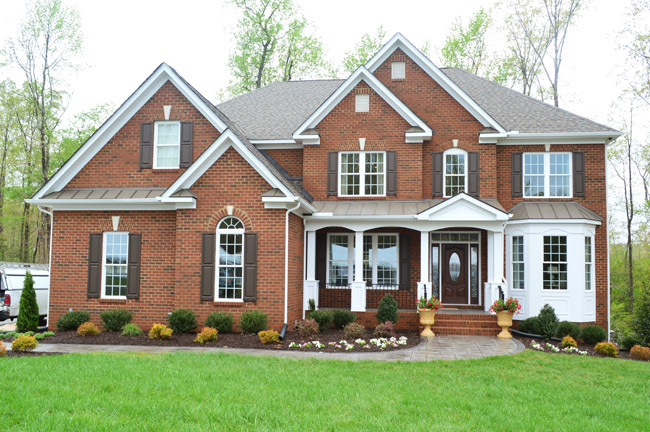
All of the houses in the show sit on a cul-de-sac and are numbered, so we’ll do the most logical thing and start with House #1, which was built and designed by LeGault Homes.
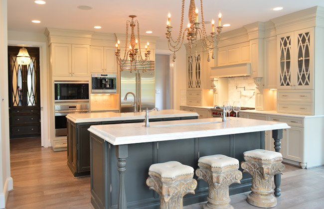
Perhaps the most luxuriously decorated home of the show, it has some of the coolest cabinetry we’ve seen in a while. Their kitchen included double islands – one with a standard sink, and one with a prep sink that could be used for housing ice/drinks at a party. Note the coordinating dark, mirrored cabinets through the doorway into the mudroom.
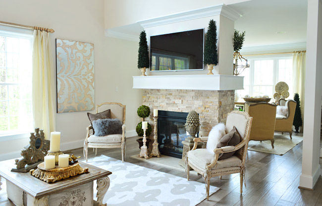
The living room also had a double-sided fireplace with a seating area behind it.
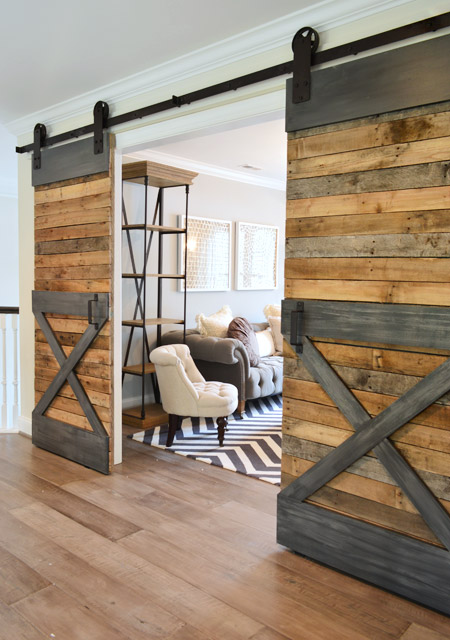
Upstairs there were sliding barn doors that fooled me into thinking they had lots of metal trim (only when I touched them did I realize that gray “steel” is just painted wood).
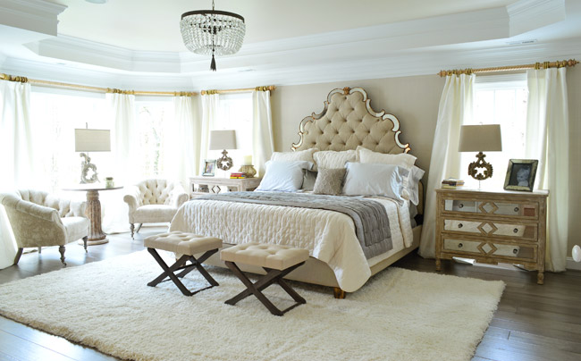
Here’s the main bedroom, which had awesome light streaming in – along with a lot of upscale, light colored furnishings.
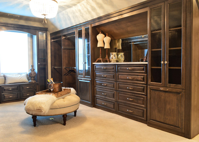
One frequent trend that we saw in other houses was a closet that was accessed by walking through the main bathroom – and this home boasted one of the most upgraded ones we’ve seen. In addition to being spacious and full of nice cabinetry, it even had its own drink station / coffee bar complete with a mini fridge.
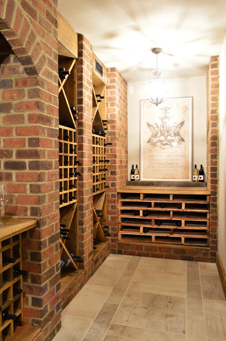
Speaking of beverages, this is the only home in the show with a basement – and they used some of that space to create a wine cellar. The stacked shelving on the far end is made from pallets and provides even more bottle storage.
Now let’s skip over House #2 (that’s ours) and go straight to #3, which is built by Southern Traditions and designed by Elaine Reeder. They’ve got a really pretty stone accented exterior (with some tin awnings along with a few white rain chains) that we’ve been admiring from afar for a while, so it was nice to finally get to peek inside.
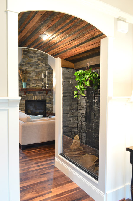
This house has a lot of interesting mixes of materials, like in this little passage between the foyer and the living room that combines a rustic wood ceiling with a stone wall water feature.
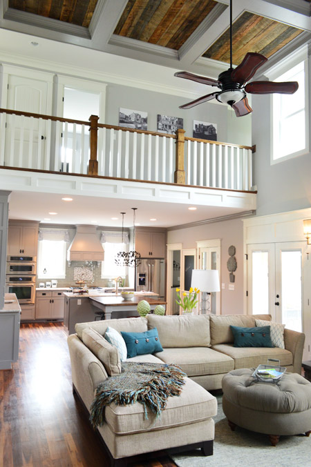
The main area of the home is nice and open, with a two story living room that carries the rustic wood look into the coffered ceiling above.
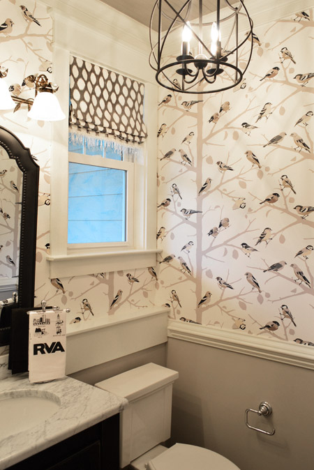
They also went bold in the half bathroom downstairs with this graphic bird wallpaper over the wainscoting. There’s even a little local touch with the Richmond RVA hand towel.
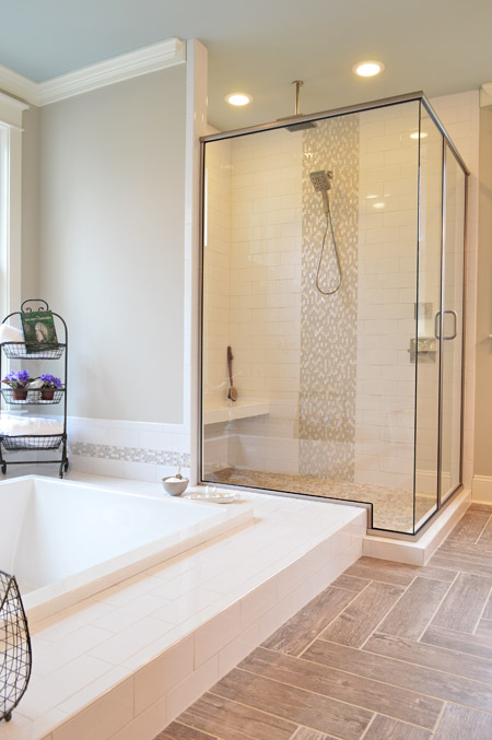
And the en-suite bathroom included something we’d never seen before: a sunken tub.
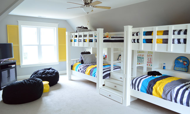
Upstairs they turned the playroom into a sleepover room with two pairs of built-in bunkbeds. The builder’s carpenter built them from scratch (including the hidden drawers in the steps) and they certainly got our wheels turning more than your ordinary bonus room does.
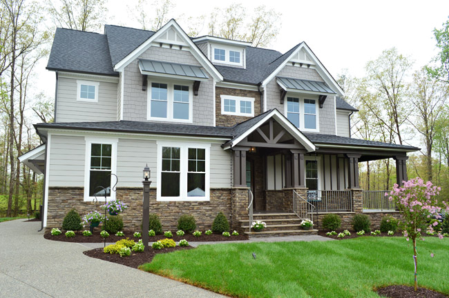
House #4 is built and designed by Ray A. Williams Custom Homes, and it brought some nice dark exterior trim to the show (which is something we’ve admired on a few homes in our own neighborhood).
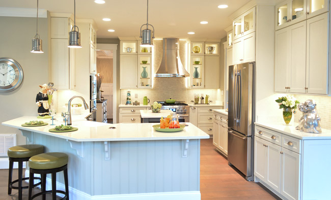
Their kitchen was one of those where you flip the lights on and it’s like the clouds part for a moment and you hear a chorus of angels singing. And of course Sherry was loving the silver monkeys on the far right.
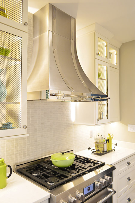
There were also great details like the metal straps on the hood and the mesh on some of the glass cabinet doors.
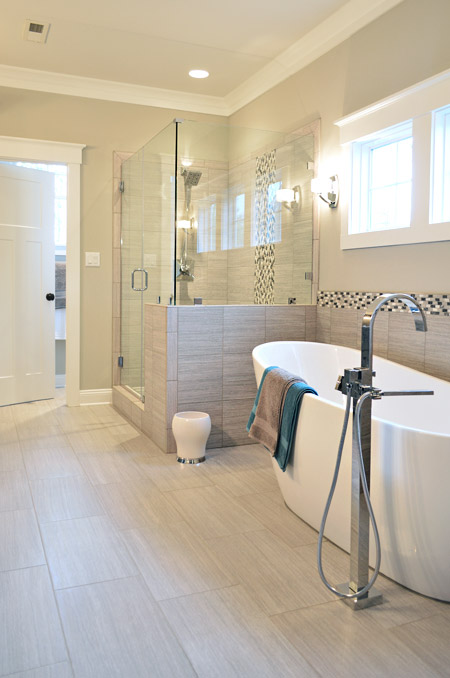
This home probably had the most modern bathroom of them all, complete with small mosaic accent tile and sleek glass shower doors.
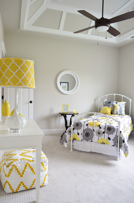
One of the architectural themes of this house were the decorative ceilings throughout, like this paneled one in one of the bedrooms.
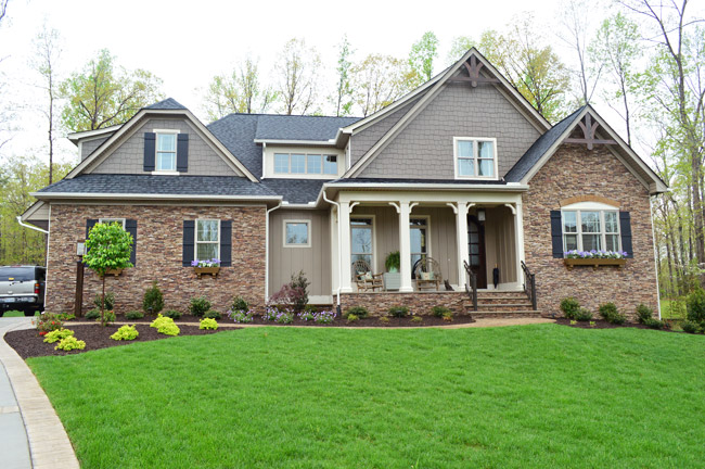
Next door is House #5, which is built by Harring Construction and designed by Diana Ragsdale. She decorated one of our favorites from last year – and we love the look she pulled off this year too.
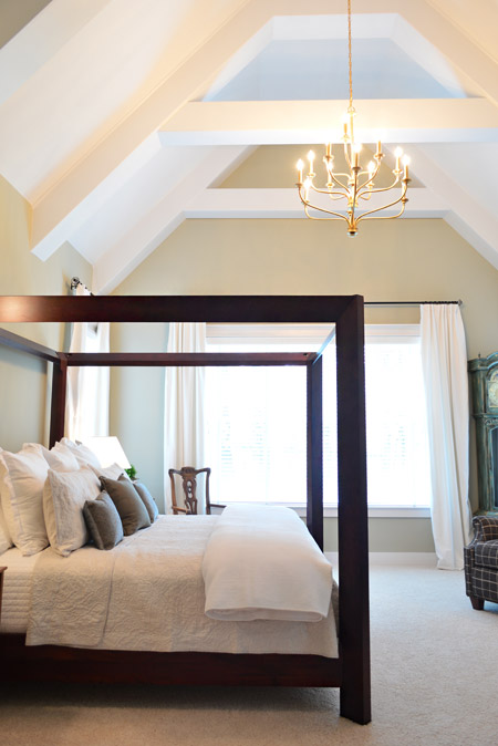
One of the highlights was the main bedroom, which had this awesome vaulted ceiling and stunning gold chandelier.
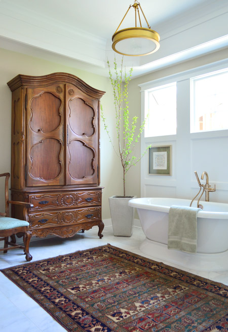
The gold details continued into the en-suite bath fixtures as well. How awesome is a bathroom that can fit such a giant wooden wardrobe?
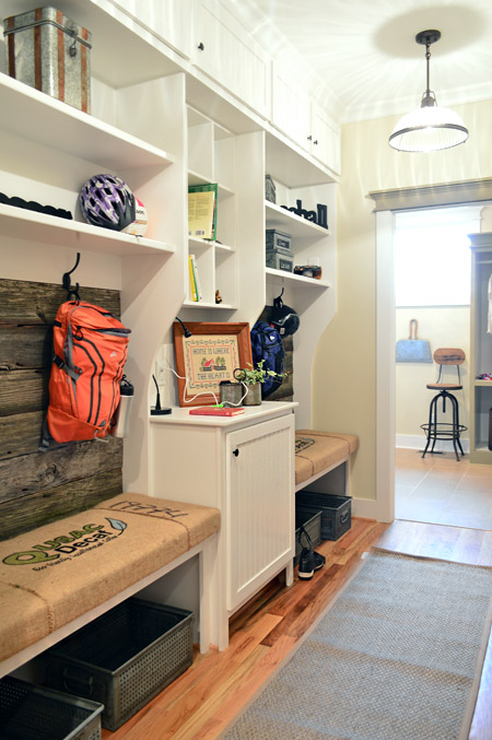
The mudroom had great built-ins too, with a nice rustic touch by using old grain sacks as the bench fabric and reclaimed wood across the back.
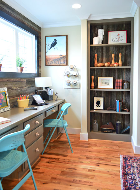
That reclaimed wood, which was found at Diana’s friend’s North Carolina barn, continued upstairs where it accented the back wall of a desk area that was carved out of an otherwise empty hallway space (as well as on the back of that built-in bookcase).
Speaking of bookshelves, in the nearby boys room there’s one that acts as a secret doorway…
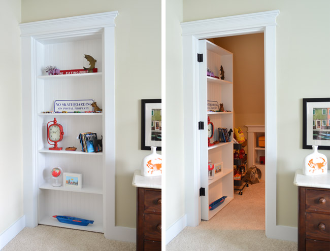
… which leads to a tucked away TV/video game room. My 16-year-old self would’ve flipped for something like this. Although I probably would’ve just practiced my marching band music in there. #nerd
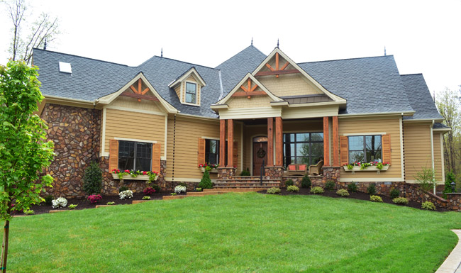
Next door is House #6, which was built by Falcone Custom Homes and designed by Catherine Stanley. It’s one of the largest in the show and it boasts some of the grandest features (it’s known as “the one with the pool” to almost everyone who worked on Homearama).
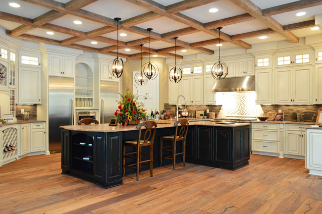
The kitchen sports a separate fridge and freezer and a 100-bottle wine rack, not to mention a pretty expansive ceiling beam detail.
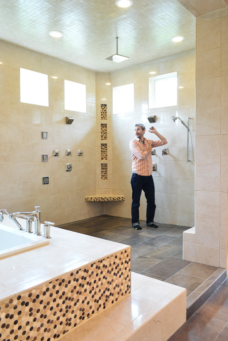
And the en-suite bathroom is unlike anything we’ve ever seen. The bath/shower area alone is 600 square feet and has an infinity tub, rain showerhead, and body spray jets all around. I had to snap one of my infamous “John for scale” shots just to illustrate how big it really was.
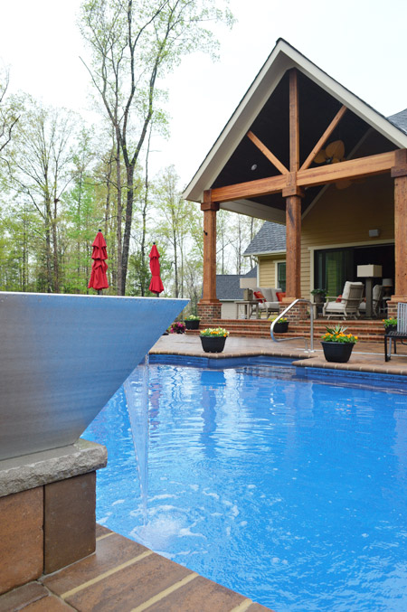
And here’s the pool, which we shared briefly during construction. The outdoor area has lots of other fun features like this combo water/fire feature in the foreground (I couldn’t figure out how to turn the fire on, so you’ll have to use your imagination).
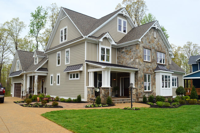
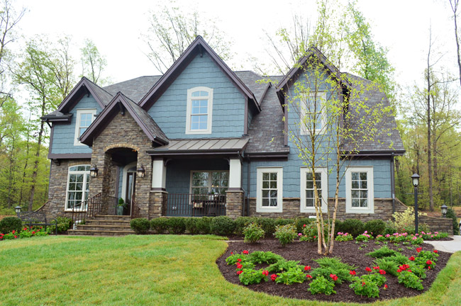
Rounding out the cul-de-sac is House #7, built by LifeStyle Builders and designed by Priscilla George. We spotted a few similar choices between this one and ours – like both choosing a blue exterior paint color – even though ours was deeper and theirs was lighter and mixed with more stone and dark trim along the roofline.
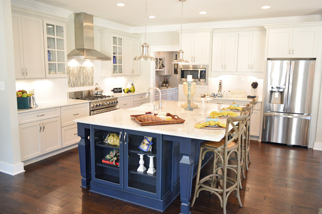
This home also sports a navy kitchen island, but the leg details and glass fronted end cabinet add a nice twist. They also went for some accent tile over the stove and a stainless range hood with chrome lights over the island.
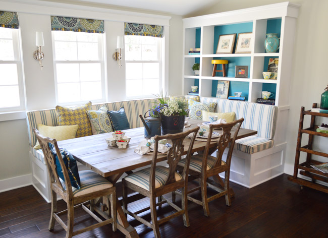
And they also did a built-in banquette, although it was L-shaped and had chairs on the other two sides. We especially loved the cheerful teal backs of the bookshelves.
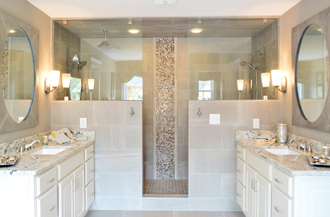
In the en-suite bathroom, they also had a dual shower area – but they created two distinct zones (one side featured a tradition and rain-shower head, while the other had a bench and handheld shower).
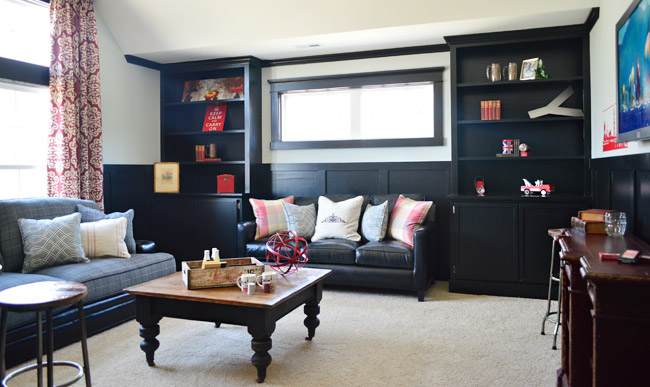
Upstairs they went bold in a bonus room by going all black with the trim and built-ins, which would make for some cozy TV watching for sure.
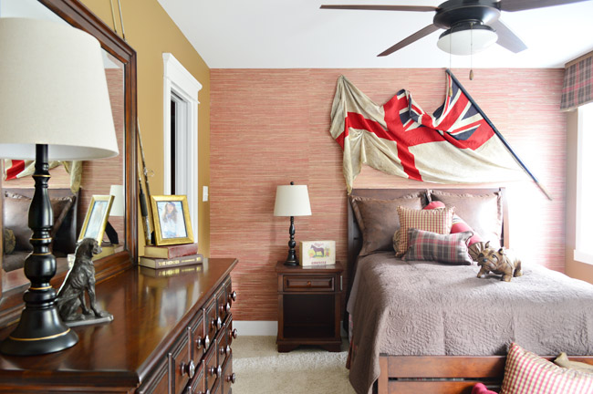
And each of the bedrooms had an interesting theme/style. I was especially drawn to this one with the cool old flag against the grasscloth wallpaper. I think I may be developing a thing for flags, much like my existing map and bike tendencies…
So 30+ pictures later, I’ll wrap this up. There’s plenty more to see in person if you can make it out, but at least you’ve hopefully gotten a flavor for the other homes. And while I’m sure there are plenty of source questions out there (“what’s this paint color?” “where’d that furniture come from?”) we sadly don’t know a lot off the top of our heads and most of the Homearama crew is occupied this weekend with the show itself. So feel free to ask away, but please be patient if the answers don’t come right away (we’re hoping Justin drops in with info within a few days for you).
Psst – Wanna see more showhouse info & photos? Click here for Our Full Showhouse Tour, which includes final pictures of every room, the floor plan, budget info, a video walk-through, and shoppable showhouse furniture & accessories.

Sarah says
I was there last weekend and loved all the houses, but have to say yours looked the most lived in –rather than just “staged.” Great job guys ! So many little details that made it come to life :)
Lauren (in PA) says
Will drool more later, after work, but…
I agree with a few posters that some things are a bit over the top for a house I’d want to acutally live in (aka, that crazy bathroom!! would love to try it out, but not clean)
But I really loved the desk area at the end of the hallway, with the wood against the wall and in the bookcase. Very sharp. And I loved the secret door/bookcase!
I didn’t really like the double island in the kitchen.
Can’t wait to really drool tonight! Thanks for the post!
Caitlin says
These were all so gorgeous! I am dying to know what they are listed for?! Can I be nosy and find them on zillow or trulia?
YoungHouseLove says
The range seems to be the 600s (like ours) all the way up to the 800s-900’s (like the one with the pool). They’re in Magnolia Green if that helps you hunt down the listings (not sure all of them are up yet).
xo
s
Jerrika says
This article talks about square footage and price of each house
http://www.timesdispatch.com/business/economy/homearama-showcases-latest-in-new-homes/article_e4f14992-d260-5559-9573-839705a31cfb.html
YoungHouseLove says
Thanks for sharing the link!
xo
s
Ali says
I’m really excited you’ll do a video tour of the house you designed!! It’s my favorite !!! Love many features in the other homes but, I loved everything in ya’ll design home !
Great job !!
Maura says
Oh my goodness. I can’t even handle these houses. I think if you take a mish-mash of house 3 and 4 with the barn doors from house 1 you would have my perfect house. Thanks for sharing!
Ashleigh says
This may have been covered recently, but were there square footage or price restraints that the builders/designers had to stay within? We are looking to build and trying to gather perspective on the photos I’m looking at.
YoungHouseLove says
A lot of that has to be “approved” by the neighborhood but there’s a giant range. Our house was the smallest in the show (around 3500), and the largest one is around 5,700 square feet as well as some being priced in the 600s (like ours) and others being priced in the 800-900s (like the one with the pool)!
xo
s
Leah Renter says
Looks like so much fun on site! Must feel weird having these cul de sac “neighbors” by day, but go back to your actual house at night. A cozy little interim community.
YoungHouseLove says
It’s true! We feel like we have an extended family/neighbor scenario at the showhouse. Will be sad when it’s all over…
xo
s
Ali says
Love the exterior of home # 1 ! Love that classic red brick !!
Richelle B says
Thanks for sharing with those of us who can’t visit in person! Now that the whole experience is behind you would you say Yes if they asked you to design a home again?
YoungHouseLove says
We definitely want to work with John The Builder again. He’s THE MAN. We learned so much, had so much fun, and he’s practically family now. Although I think with Teddy we’re happy to take a breather for a little while ;)
xo
s
Kaitie says
YHL posts are always better with one of John’s Fully Clothed Reenactments.
Cheryl says
Haha! That was my son’s reaction when I called the family over to ogle to 600 square foot bathroom – “Why does he have all his clothes on?”
YoungHouseLove says
So funny!
xo
s
Jerrika says
These homes are all great, but your showhouse it still my favorite!
Katie B. says
I just told my husband that the only ABSOLUTE requirement I have for our “forever” house is a spacious sunroom looking out over a beautifully landscaped back yard.
Now I have to add sunken tub and 600 sq ft shower to that list.
DANG YOU, DESIGNERS!
Meg says
I slowly scrolled through this post with my jaw hitting my chin — just can’t begin to describe how gorgeous these homes are! Wow. Wow. Wow. Wonderful job, everyone!
Mary | Lemon Grove Blog says
Seriously – what amazing homes!! Every detail is out of this world stunning! I think it would be pretty cool if these types of events started to scale the houses down a bit to be more “normal” though. I mean – really, a 600 sq. foot bathroom – that’s just crazy (and excessive, in my book!) :D It would be fun to create homes that we’re super stylish, but maybe 2,000 square feet, instead of these big ol’ hunkers! :)
Kate C says
My thoughts as well. That bathroom is half of my house, and for many city dwellers it’s as large or larger than their space.
A says
I agree! The trend in housing is that people are actually scaling down in square footage. Even people who can afford larger.
I too would be MUCH more likely to buy tickets to go see a show that showcased how to live richly but also reasonably, with respect for the environment.
I too found the 600sqft bathroom gross and ridiculous. Having said all that, there were a lot of beautiful photos here.
Sally G says
Maybe it will end up a multi-use space. Perhaps they can hold book-club in there. :D
Alexa @ travelmiamor says
I love the counter stoold in house #1! I need to get me some of those!
Kadee says
I’m totally not being biased at all… But I love your show house way more than any of the rest of them. House four and seven have nice kitchens, they look a lot like yours. Some of the others look a little too “old” or stuffy as far as the designing goes. Great job guys!
Kaylin says
Like everyone else has said, WOW!
These are so beyond gorgeous!
I can’t wait for the day we are debt free and can build our forever home! What great inspiration from these homes!
Sarah says
My favorits are House #5 and yours. That bathroom in #5 is so gorgeous, homey, and a little different. I LOVE it! I wish a lot of the other designers hadn’t made the homes look so formal/lavish. There is something to say about understated elegance.
Ashley says
Heyya! I love your blog & work & showhouse & house.
Please don’t forget to mention the architects for all these awesome houses!
Thanks,
A soon to be architect :D
YoungHouseLove says
We’d love to get that info and update you! Justin do all the builders mind sharing that info?
xo
s
Kate C says
Of these homes, #3 is my favorite. It just looks like you could really live in it. A number of the others are a bit pretentious, but I realize that the idea was to show what designers and builders could do. It would be lovely if Homearama would consider a project like this on a smaller scale next year, building and designing homes with the intent to sell/give them directly to Habitat for Humanity.
I would love to know about the couch in home #3, if you guys get a chance! Thanks for the pictures!
YoungHouseLove says
I love that idea! Justin do you have info on that couch?
xo
s
Justn says
La-Z-Boy! Isn’t it great?
Kate C says
Lay-z-boy! Thanks, you guys are great!
rachel says
I can haz all of them?!
Kerry says
Sooooo…the shower/tub area in house #6 is 2/3 the size of my entire apartment in New Jersey. Just thought you’d like to know that.
Love this post – I love love love looking at floor plans and going to open houses and model homes – both for decorating inspiration but also just because I’m nosy. This is fantastic, and for such a good cause too!
PS – Love that John is (I think) washing his armpit in the shower-for-scale shot. Gotta do what you gotta do!
Corinne says
I am in love with the kids bedding in house #3. Any idea where they got or if it was made??
YoungHouseLove says
Justin?
xo
s
Justin says
The bedding from the bunk room is from Land of Nod. And, it will be for sale after the show!
Darcy says
Thanks so much for sharing all these photos — I wish I still lived in PA — I would totally drive on down to see it all!
And, I agree with other commenters– your house is still my favorite! The other homes have some amazing details, but for that “I want to move in NOW!!” feel–you guys are the clear cut winner!!!
That is soo cool that you met the couple who is going to build your exact house — I really hope you will get to crash it one day — would love to see their design choices! So fun!
And one last thought…I was watching something recently, that called that hidden door, a Scooby Doo door!! I thought it was cool, but that name to me, just makes it even cooler!! I have to have that one day for my boys!! LOL!
YoungHouseLove says
So funny!
xo
s
Susan in Colorado says
Oh how I wish I lived closer to see these houses! Sadly Denver kinda did away with a Parade of Homes thing.. probably economy.. Now they do one along the lines of you have to drive all over town to check each house out.. They are not all grouped in one location. So it’s been years since I have been to a Parade of Homes.. ANYWAYS… While scrolling through the pictures I wonder some things like
1. Do all the builders and designers get together so that two or more houses don’t end up very similar in style or designs?
2. Is it up to you guys to decide how fancy to go or do you have something you have to follow?
3. When you see the other houses do you go.. ohhh I wish we thought of that, or secretly go ewwwww on some choices?? heehee
4. Would you do it again if asked?
5. How do you feel your house compares to the other ones? Like oh man our house we could have done so much more?
Just my thoughts.. :) I LOVED your house by the way.. I am ready to make an offer on the house and everything in it!! THANKS.. I just need to figure out when that Prince from Nigeria is going to send me my millions.
YoungHouseLove says
1. There are some coordinators for the show who will encourage you to do something else if they think too many other homes are doing the same thing.
2. Every design/team and builder just gets to do their own thing inside the house (some things outside need to be approved by the neighborhood).
3. There are tons of smart/fun ideas in every house! We loved walking through all of them.
4. We learned so much and had a blast. It was a lot of work, but we’d love to team up with our builder again.
5. Ours is the smallest in the show and I think it’s one of the most modest ones when it comes to decoration and where we got stuff, but we also think it’s nice and cozy/comfy, and one of the most colorful/happy ones. We love something about each and every home though! There’s so much to look at/drool over…
xo
s
Susan in Colorado says
Thanks for replying!!
Chris says
The kitchens seem to look the same. White cabinets, painted islands, stainless steel appliances and no windows. Looking for new kitchens ideas.
Amy says
Are these homes for sale?
YoungHouseLove says
Yes, after the show they’re all for sale.
xo
s
Caroline says
600 sq ft bath/area?! Our first cottage we lived in was 630 sq ft lol! Gorgeous spaces. No offense to the others but I love that your “house” isn’t stuffy. It’s totally to each their own thing, but I like comfy houses where real people live. Not perfect houses where all I can imagine is my 1 year old and 4 year old breaking everything ;)
LeCheech says
… What I wanna know is… What kind of GRASS did they use on those yards?! Oh my cheeses, it’s so green and lush and gorgeous!!
I live in the desert, can you tell? LOL
YoungHouseLove says
Sod! Lovely sod that got watered every day.
xo
s
Shannon says
These houses are all incredible! I have to say though from the pictures you posted, I’m most in love with the house you two designed. Out of all the features though, you know, if I could indulge, it would be the master closet and the basement from House #1, even though their decor style is not really my thing. It would be super cool if once the Homearama show is over if you had a voting contest on the best feature or best house on your blog. Great stuff!
Stephanie says
I LOVE the flag!! It reminds me of Les Miserables!! Haha!! Even though it’s not a French flag…still love it.
As for the house and kitchen that mirrors yours? Imitation is the finest form of flattery!!
These houses are beautiful, but I still love the style and artistry in your show house the best!!
Beth W. says
I immediately thought of Les Mis too! :)
Jennifer says
These are all so beautiful, but I have to say that yours seems the most ‘livable’, or down-to-earth. The others are a little over-the-top for my taste! Great job!!
Jazmin says
In the words of ‘Iggy Azalea’ the first house is “SOO Fancy” that I don’t like it! Thanks for snapping pictures!
Jazmin
Christina says
All of these houses are so inspiring! Would you guys consider doing a secret entrance to your bonus room?
YoungHouseLove says
That could be fun!
xo
s
Carly says
I know you don’t know this but the bedroom with the iron bed and yellow/gray bedding. I think that is a perfect paint color. Justin- if you see this, thank you in advance.
Do the builders have links on their website for their show houses? There were definitely things I liked about each one. And some great ideas! Thanks for sharing.
YoungHouseLove says
Justin, do you know about that paint color? As for their sites, I don’t know how much each builder has shared of their houses, but maybe just click over and look around?
xo
s
Justin says
The paint color in that bedroom is by Benjamin Moore Smoke Embers. It is a nice calm color!
Carly says
Thanks!
Brittany M says
I love the outside of your design best and I’m still reeling over the 600sq ft shower. I wish I were able to see all of them in person but I’m so glad you’ve given those that can’t go a glimpse into each. Do you know what the price ranges will be when they’re put on the market? I assume they’ll go fairly fast, or before they’re even posted on the market.
If I get half a bathroom and closet that all of these houses have in my next house I’ll be one happy woman!
Thanks for sharing guys!!
<3 Brittany
stephieZ says
I have to say that your house design wins my vote. I’m not really a fan of most of the rest of these. That huge house is seriously gaudy and 600 sq feet just for a bathroom? Absurd.
Lauren N says
These houses are gorgeous, half the time though I think “how on earth do you clean all that?!”
Leah M says
Just curious if any of these houses display their suggested value? Having built a house 2 years ago, I learned how much all of those extras add up!!!
YoungHouseLove says
Someone linked to an article with all of the square footage and asking prices in it :)
xo
s
Diane says
I love the post today. One of my favorite things is looking at model homes for decorating ideas. You gave me a lot to think about today!
I do have to say that while there was features I liked in the other homes…POOL!..your house is the coziness family oriented home there.
Erin says
Gimme dat sunken tub.
Aimee says
It needs a slide!
Emily says
I’m sure these would be so much fun to see in person!
I’m totally digging a lot of things in #3 – I’ll pick that one as my fav of this post. That sleepover room is perfect! Also liking the mudroom and secret bookcase room in #5. All I can say for #6 is “That’s too much!”
Kelley says
Thanks so much for sharing those amazing homes! I would love to know the source of light fixture in house #3, downstairs half bath – the “bird wallpaper bathroom”. Just love it!
YoungHouseLove says
Hope Justin shares that for ya!
xo
s
Justin says
The light fixture is from Ferguson here in town. The bathroom is too cute!
Sally G says
So many gorgeous homes! What an amazing project. The. Work… Oh the Work! I’m still reeling and I didn’t even do any of it. I have to say, I’m a fan of the YHL house. :) It feels most like a home to me. Grand features are nice, but a feeling of home is not easily imparted. You guys knocked it out of the park.
Lindsay P says
We went last weekend and had a great time! Our favorites were (in order): yours, #5, and #4. All the houses seemed to have the leathered countertops, which we had never seen before. Is that a Richmond thing? We’re from DC and have never seen it.
YoungHouseLove says
Maybe! It’s more durable and hides stains/imperfections, so maybe it’s just more livable so it’s a common choice these days? Or it could be a Richmond thing!
xo
s
Sally G says
P.S. The flag WAS genius. That house was my #2 fav.
Melissa says
I have to tell you I’m really enjoying your new posting cadence. I often felt guilty for all the posting you guys did, loving the content but worried that you were always battling with the “Never Ending Content Consuming Machine” that a blog and its audience can be. I know that feeling all too well.
I hope the new pace is feeling right for you all as well.
CALI says
UNBELIEVABLE!!!!!
Briel K. says
I think that even if I didn’t know you guys and hadn’t been reading your blog for years that your show house would still be my favorite! There are just so many aspects that I loved and I liked the colors you used throughout the house. Wish I could see it in person! I hope you guys get the peoples choice award! :)
Laura@SneakersandSpatulas says
How big are the lot sizes for the homes? I grew up in the country and miss having a ton of lawn and it always seems strange to me to see giant houses on teeny tiny lots.
YoungHouseLove says
I think they range (the house with the pool has a big yard and some others seem to have smaller ones). Justin do you happen to know the lot sizes?
xo
s
Justin says
Officially the lots are 90′ wide by 130′ deep which translates to roughly 1/3 of an acre. There are slightly larger lots in that section of Magnolia Green also.