For the last few weeks you guys have been requesting a House Crashing post with photos of the other six Homearama homes in the show, so we slipped through and snapped a bunch of pictures of each house, just like we did for this Homearama House Crash from 2012 (that’s your warning that this post is extremely image-heavy). Everyone who has attended the show so far seems to have different favorites, which is definitely part of the fun (there’s a “people’s choice” award that everyone who passes through can vote for, and each of the seven boxes have a ton of papers in them).
All of the houses in the show sit on a cul-de-sac and are numbered, so we’ll do the most logical thing and start with House #1, which was built and designed by LeGault Homes.
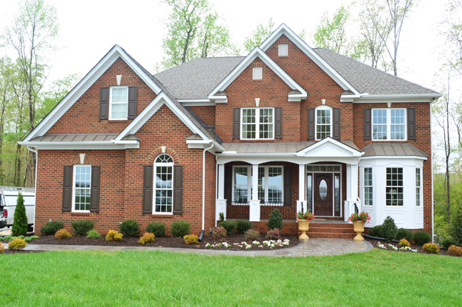
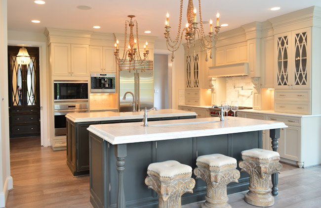
Perhaps the most luxuriously decorated home of the show, it has some of the coolest cabinetry we’ve seen in a while. Their kitchen included double islands – one with a standard sink, and one with a prep sink that could be used for housing ice/drinks at a party. Note the coordinating dark, mirrored cabinets through the doorway into the mudroom.
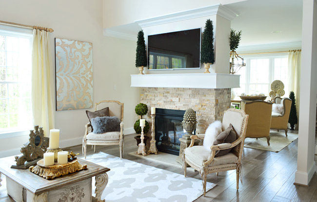
The living room also had a double-sided fireplace with a seating area behind it.
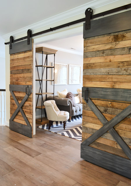
Upstairs there were sliding barn doors that fooled me into thinking they had lots of metal trim (only when I touched them did I realize that gray “steel” is just painted wood).
Here’s the main bedroom, which had awesome light streaming in – along with a lot of upscale, light colored furnishings.
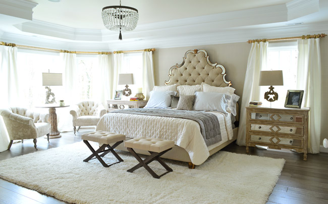
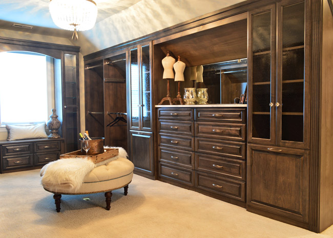
One frequent trend that we saw in other houses was a closet that was accessed by walking through the main bathroom – and this home boasted one of the most upgraded ones we’ve seen. In addition to being spacious and full of nice cabinetry, it even had its own drink station / coffee bar complete with a mini fridge.
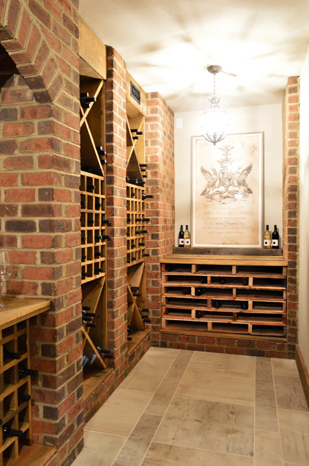
Speaking of beverages, this is the only home in the show with a basement – and they used some of that space to create a wine cellar. The stacked shelving on the far end is made from pallets and provides even more bottle storage.
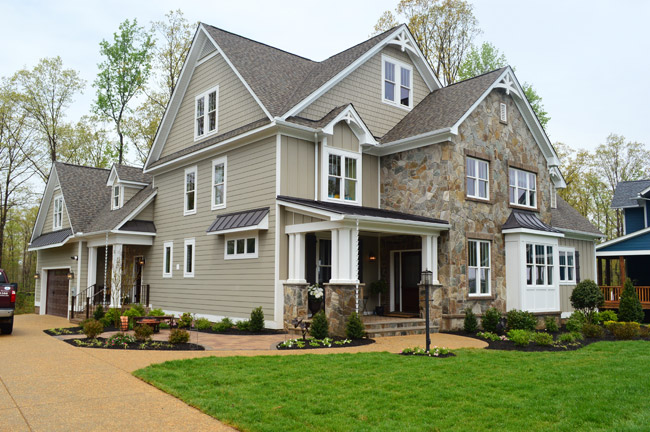
Now let’s skip over House #2 (that’s ours) and go straight to #3, which is built by Southern Traditions and designed by Elaine Reeder. They’ve got a really pretty stone accented exterior (with some tin awnings along with a few white rain chains) that we’ve been admiring from afar for a while, so it was nice to finally get to peek inside.
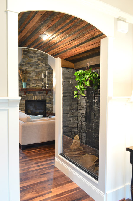
This house has a lot of interesting mixes of materials, like in this little passage between the foyer and the living room that combines a rustic wood ceiling with a stone wall water feature.
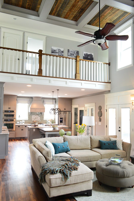
The main area of the home is nice and open, with a two story living room that carries the rustic wood look into the coffered ceiling above.
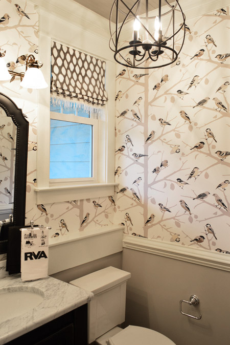
They also went bold in the half bathroom downstairs with this graphic bird wallpaper over the wainscoting. There’s even a little local touch with the Richmond RVA hand towel.
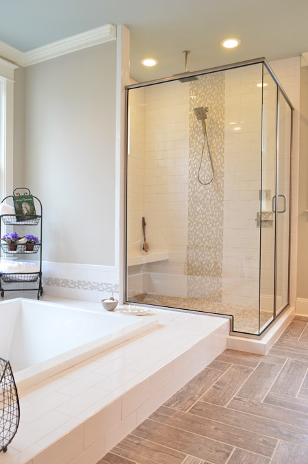
And the en-suite bathroom included something we’d never seen before: a sunken tub.
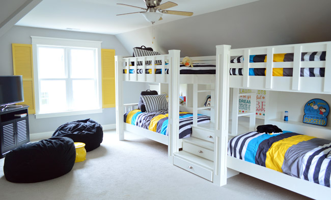
Upstairs they turned the playroom into a sleepover room with two pairs of built-in bunkbeds. The builder’s carpenter built them from scratch (including the hidden drawers in the steps) and they certainly got our wheels turning more than your ordinary bonus room does.
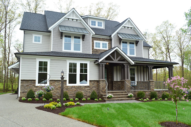
House #4 is built and designed by Ray A. Williams Custom Homes, and it brought some nice dark exterior trim to the show (which is something we’ve admired on a few homes in our own neighborhood).
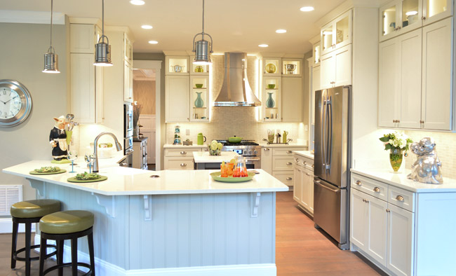
Their kitchen was one of those where you flip the lights on and it’s like the clouds part for a moment and you hear a chorus of angels singing. And of course Sherry was loving the silver monkeys on the far right.
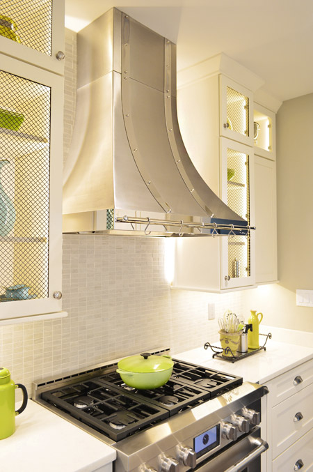
There were also great details like the metal straps on the hood and the mesh on some of the glass cabinet doors.
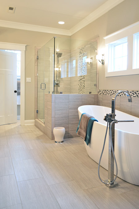
This home probably had the most modern bathroom of them all, complete with small mosaic accent tile and sleek glass shower doors.
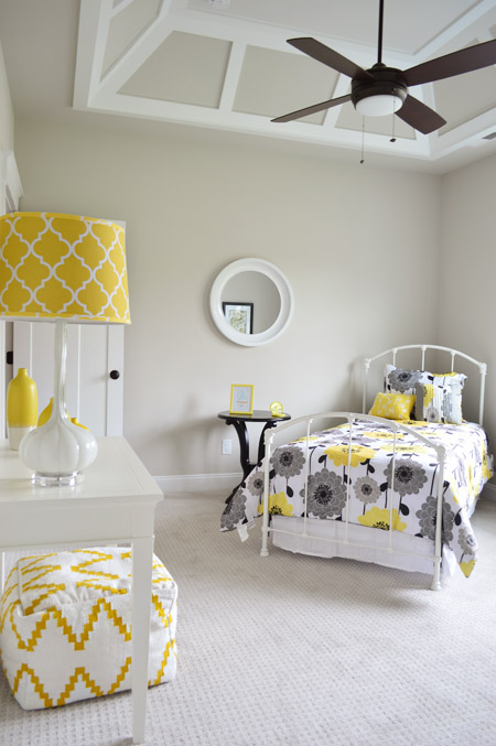
One of the architectural themes of this house were the decorative ceilings throughout, like this paneled one in one of the bedrooms.
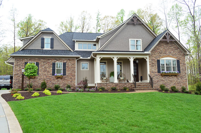
Next door is House #5, which is built by Harring Construction and designed by Diana Ragsdale. She decorated one of our favorites from last year – and we love the look she pulled off this year too.
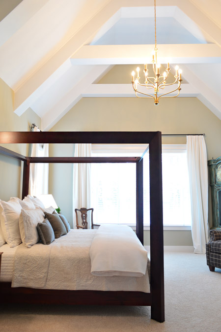
One of the highlights was the main bedroom, which had this awesome vaulted ceiling and stunning gold chandelier.
The gold details continued into the en-suite bath fixtures as well. How awesome is a bathroom that can fit such a giant wooden wardrobe?
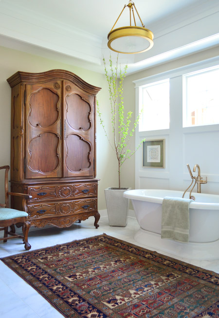
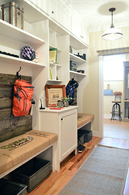
The mudroom had great built-ins too, with a nice rustic touch by using old grain sacks as the bench fabric and reclaimed wood across the back.
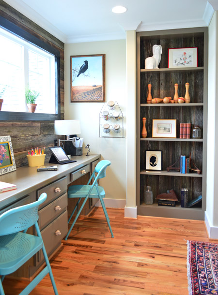
That reclaimed wood, which was found at Diana’s friend’s North Carolina barn, continued upstairs where it accented the back wall of a desk area that was carved out of an otherwise empty hallway space (as well as on the back of that built-in bookcase).
Speaking of bookshelves, in the nearby boys room there’s one that acts as a secret doorway…
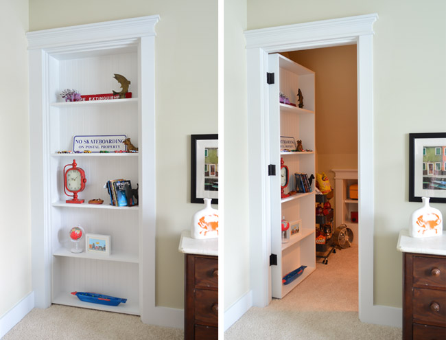
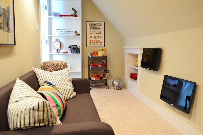
… which leads to a tucked away TV/video game room. My 16-year-old self would’ve flipped for something like this. Although I probably would’ve just practiced my marching band music in there. #nerd
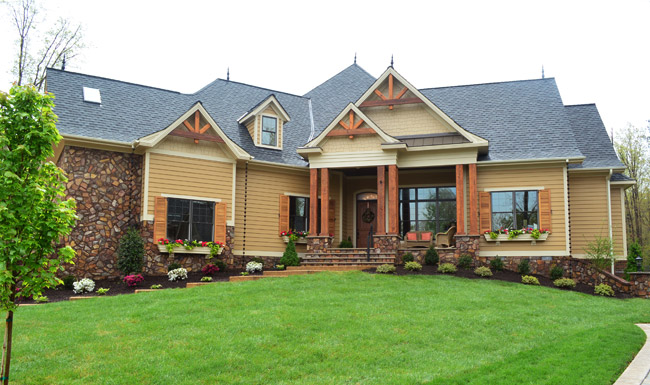
Next door is House #6, which was built by Falcone Custom Homes and designed by Catherine Stanley. It’s one of the largest in the show and it boasts some of the grandest features (it’s known as “the one with the pool” to almost everyone who worked on Homearama).
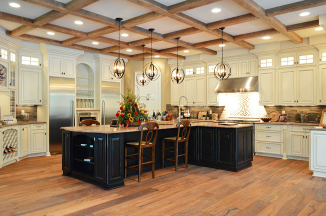
The kitchen sports a separate fridge and freezer and a 100-bottle wine rack, not to mention a pretty expansive ceiling beam detail.
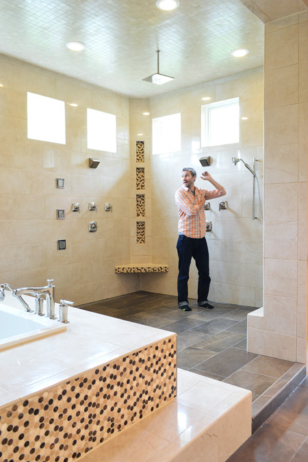
And the en-suite bathroom is unlike anything we’ve ever seen. The bath/shower area alone is 600 square feet and has an infinity tub, rain showerhead, and body spray jets all around. I had to snap one of my infamous “John for scale” shots just to illustrate how big it really was.
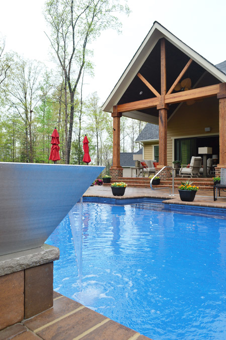
And here’s the pool, which we shared briefly during construction. The outdoor area has lots of other fun features like this combo water/fire feature in the foreground (I couldn’t figure out how to turn the fire on, so you’ll have to use your imagination).
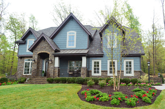
Rounding out the cul-de-sac is House #7, built by LifeStyle Builders and designed by Priscilla George. We spotted a few similar choices between this one and ours – like both choosing a blue exterior paint color – even though ours was deeper and theirs was lighter and mixed with more stone and dark trim along the roofline.
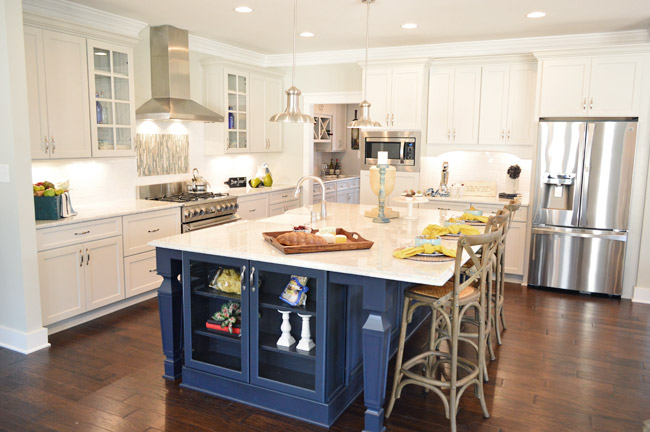
This home also sports a navy kitchen island, but the leg details and glass fronted end cabinet add a nice twist. They also went for some accent tile over the stove and a stainless range hood with chrome lights over the island.
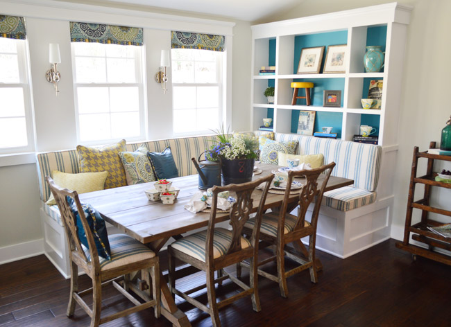
And they also did a built-in banquette, although it was L-shaped and had chairs on the other two sides. We especially loved the cheerful teal backs of the bookshelves.
In the en-suite bathroom, they also had a dual shower area – but they created two distinct zones (one side featured a tradition and rain-shower head, while the other had a bench and handheld shower).
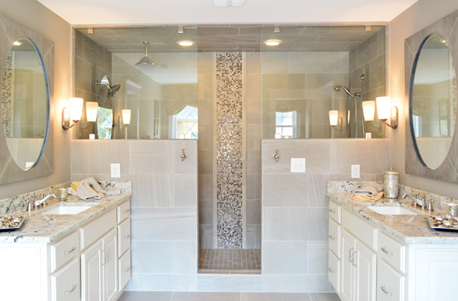
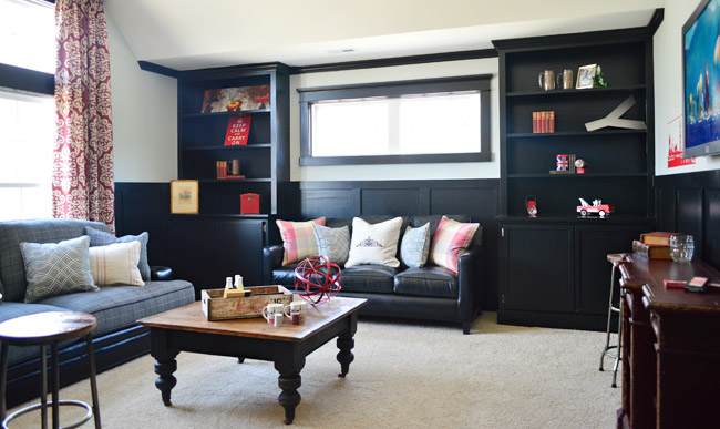
Upstairs they went bold in a bonus room by going all black with the trim and built-ins, which would make for some cozy TV watching for sure.
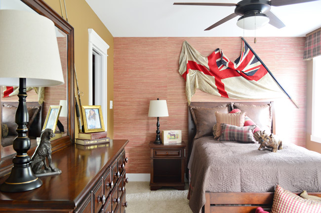
And each of the bedrooms had an interesting theme/style. I was especially drawn to this one with the cool old flag against the grasscloth wallpaper. I think I may be developing a thing for flags, much like my existing map and bike tendencies…
So 30+ pictures later, I’ll wrap this up. There’s plenty more to see in person if you can make it out, but at least you’ve hopefully gotten a flavor for the other homes. And while I’m sure there are plenty of source questions out there (“what’s this paint color?” “where’d that furniture come from?”) we sadly don’t know a lot off the top of our heads and most of the Homearama crew is occupied this weekend with the show itself. So feel free to ask away, but please be patient if the answers don’t come right away (we’re hoping Justin drops in with info within a few days for you).
Psst – Wanna see more showhouse info & photos? Click here for Our Full Showhouse Tour, which includes final pictures of every room, the floor plan, budget info, a video walk-through, and shoppable showhouse furniture & accessories.

Cathy Ropiski says
Reading your post is a wonderful way to begin my work day here in sunny Colorado! Thanks for sharing these great homes. I am inspired by your posts every day!
Joanna says
There is a lot to love about these houses – especially all of the custom trim work and cabinets. Also, I would probably sell a kidney just for a mudroom with a few of those awesome built-in lockers for each family member’s stuff.
However, I am not/not a fan of the double island trend in kitchens. (First house.) They look… off to me. I think you can reach a point these days where a kitchen is just kind of so ridiculously large to the point of impractical from a functional cook-in-it standpoint. And, double islands kind of scream that to me.
Mandy says
WOW! Looks like Richmond has a lot more going on, style-wise, than we do here in my town. These houses are beyond gorgeous. I wish I could see them in person.
Heather says
I could totally pick a few things from each house to make my dream home. Like that sunken tub. And the wine cellar. And the sleepover room. And any of the kitchens. And the pool. Sign me up!
Andrea says
This was great! I love that all of the houses had very distinct looks.
You might already be planning to do this, but will you add a page on your website with a complete house tour from your Homearama house? Like, every room? I keep wanting to go back and look at it and I though it’d be nice to have a way to click directly to your Homearama house tour from your homepage.
Wishing I lived in Virginia so I could go see these houses in person… le sigh!
YoungHouseLove says
Yes we’d love to do that!
xo
s
Brittany says
Awesome job on the photos, John! You’re getting so good!!
Katja @ Shift Ctrl Art says
These houses look great. I love how you photographed them from their good side :)
I did something similar when I toured some newly built homes here in California to do some trend spotting:
http://shiftctrlart.com/Blogpost/ulrq/Trend-spotting-in-new-construction–California-2013
It’s fun to see the similarities and differences.
Samantha Izaks says
That was my first thought too! Lol! Wonder if John’s a distant cousin! Ha!
Jennifer RaBorg says
I know house #3 is not the one you all designed so you may not know this, but I’m looking to find out where the sectional in the great room came from. Would you all happen to know?
Your house turned out fabulous!
YoungHouseLove says
Hope Justin shares that info!
xo
s
Justin says
La-Z-Boy! It is super comfy too!
Kari says
I like yours the best. While those bigger ones are nice to look at (and, of course, if someone gave it to me, I wouldn’t turn it down), from internet pictures your house seems to make a large space more intimate and comfortable, and someplace I could actually see myself living.
(But don’t tell the other builders and designers, I’m sure they’re very nice people! ;) )
Laurel says
Serious eye candy- thank you!!! There isn’t one house that totally grabs me, but I love something about each one- ie- house #1 may be farthest from my taste, but those sliding “barn” doors are fantastic! I tend to find those rustic elements make for the most interesting spaces- that coffered ceiling and rustic passage way in house number 2 really make that living space exceptional! I just think right now there is far too much painted wood & cabinetry out there that will surely date this time as a short term fad, and just seeing that exposed raw wood helps overcome or balance all of this painted wood. Don’t get me wrong, I like the colored cabinets as well, just feel they look overdone when there is no natural wood tones in sight!
Carissa says
Hi! Just have to say, even though the other homes are beautiful, I like your show design the best! You guys did such an AWESOME job :D
Oksana says
Any idea what hardwood flooring was used in House #1?
YoungHouseLove says
Justin, do you know where those are from?
xo
s
Justin says
Those floors are getting rave reviews. Locally, they are from Costen Floors but just in case you are out of town the floors are Johnson Maple Hardwood Floors, English Pub Series and the color is Moonshine.
Jessica says
My favorite exterior is number 5, favorite interior is number 3, and least favorite is number 1 :) I’m so excited to see the rest of #2!!!!
Amy D. says
Thanks so much for posting all of these photos! We are RVA locals and toured the homes last weekend but I didn’t take any pictures and I wish I had!
We also missed seeing house #1 as we had our three-month old with us and she decided she was over Homearama. :-) But now I want to go back to check out that secret room! Hmmmmmm….
Happy Mothers Day to you sherry! Enjoy your two little beans!
Helen says
I’m 90% certain that the shower alone in house #6 is bigger than my living room/kitchen. Is it bad that all I can think of is how much work that would be to clean? Although if you can afford that you can probably afford some hired help…
Kui Hew Len says
I have a question that might have been asked but I didn’t read through every comment to see, but how is it decided what the budget would be for each house and who would get to be the designers for each house?
YoungHouseLove says
The budgets (and house sizes) were set by each builder individually (some homes are being sold for $250,000+ more than others) and as for who worked with who, some builders have designers/decorators they always team up with and a few were open to working with us and didn’t have a set team yet (like John the Builder) so we met with them and picked the builder we thought had the most similar aesthetic :)
xo
s
Mich says
Oh wow!! Thank you for sharing. It is so neat to be able to see these, as I live half way across the country. Makes my model home loving heart go pitter-patter. While these are nowhere near anything I could afford, I do love looking. So many great ideas you can implement in your own home. :) Loved the chickadee wallpaper in the 1/2 bath in the one house. :) (love chickadees!!!) I too love the one you both worked on the most.
sarah honce says
holy cow! these places are gorgeous. (including the one you made) i’ll take one of each, thanks :)
Ash says
First, I would do absolutely ANYTHING to know how they did that secret door in House #5! If the builders are willing to share a tutorial (or say, if this became the door to your bonus room near the laundry, you guys could do it, too! Here, allow me to put MORE projects on your plate ;P), it would be SO COOL to do the same thing in some future house of mine. Lusting after that door like nothing else, and I’m going to firmly blame my Nancy Drew obsession for that.
Secondly, that 600sf bathroom is the size of my first apartment. HOLY POTATOES.
Thirdly, fun fact! That flag you like so much is a Royal British Navy ensign. My British boyfriend, who was living on a sailboat when we met, has one that is solid red which is for civilian use. I think it’s pretty cool :P
YoungHouseLove says
A tutorial for that bookcase would be awesome!
xo
s
rachael says
600 sq. feet for the bath area?! That seems like waaay too much. My house is 800 sq. feet for 2 adults, 2 kids under 3 and a small dog. Out of all of these yours is my favorite. It just seems so livable and real.
Amy says
These are beautiful, but some are too over-the-top for my taste, even my fantasy house taste, haha. And my 100% honest opinion is that yours is the best one! It’s got such a happy, homey vibe to it and is upscale and gorgeous while not feeling stuffy and overly luxurious. I think you guys really nailed it.
Elizabeth G says
Hi Friends!
My sister, friend, and I had a chance to go through the show homes last Sunday and loved it! Such a fun & charitable event in Richmond. It was amazing getting to see the house y’all designed in person, pictures are great but walking through showed me just how down to earth your house design/aesthetic was. We even got to meet John the builder and ask a bunch of questions. Congratulations on a job well done!
Christine says
Love that kitchen in house 7, any chance we know where the island lights came from?
All the houses look great but yours def seems the most cozy and family friendly :)
YoungHouseLove says
I hope Justin shares that info!
xo
s
Justin says
All of the light fixtures in Chateau on the Green (#7) are from Progress Lighting. They have great presence!
Rachael says
Here they are Christine:
http://www.nationalbuildersupply.com/progress-lighting-brookside-brushed-nickel-1-light-pendant-light-p5024-09/p12687
GennieS says
There must be a one, but I can’t think of a graceful way of getting into that sunken tub ;)
Tracy says
I went this past weekend and loved it. I live in WV and drove with a few friends for a girlfriend’s get away. We stopped in on a few of the restuarants and thrift shops too. It was an awesome weekend. We started giving all the houses names, because then it was easier for us to remember what was located in each house. I think I really loved number 7 and yours the most. Although I agree with you that each house had some amazing features. House #3 or 4 had the most amazing back porch to relax on. And so many had the barn doors (swoon!). The shower in house number 5 is really the biggest shower I had ever seen in my life. In fact, we dubbed that the swinger house, because whoever is entertaining there were not going to just show off the kitchen. The whole house was amazing. I really wish I could go back and see it all again!
Oh, and on another note, we ate at Burger Bach (yum), the Sugar Shack (finger licking good), and the Urban Farmhouse. All were great. We also tried Pasture, which I would recommend sometime if you haven’t been. We also got lucky to walk along the canal and enjoy all the artwork, which is definitely worth a look for a visitor. Not to mention there was the collegiate bike race in the city. So much to see and explore (it was fun for those of us that have moved away from cities!). Oh and the couple who owned Thirll of the Hunt were super nice and wonderful to talk with.
YoungHouseLove says
Sounds like you had an awesome time! Pasture is delicious too!
xo
s
Jen @ Migonis Home says
That was a blast to look at, John and Sherry! Thank you for giving us the tour! You pulled out great details from each of the houses! :)
Rachel K says
These houses are awesome! Even though I am biased since I love you guys, I still vote for your house as far as the kitchen and master bed/bath design. I mean that closet in home #1 was pretty sweet though. The only thing is – I would vote for House #1 for best exterior because I LOVE me a brick house :)
Sarah @ Sarah's Daybook says
I loved that coffered ceiling, when I saw it I was in love! That “house with the pool” though. $899,000. Holy smokes. I didn’t make it up to the upstairs, but my mom said that it had some weird angles.
I was so inspired by the built in benches, though! Want them in my breakfast room!
Your’s is still my favorite :)
Sarah
http://www.sarahsdaybook.wordpress.com
Jessica says
Wow! I know I loved your show house before, but now I am certifiably smitten with it! Some of those other houses literally had me cringing out loud. NOT my taste! I know a lot of hard work goes into each house, so that’s not a knock to their teams at all — it just re-affirms to me that yall are, like, totally my flava :)
Julianne says
Wow…those homes are S.T.U.N.N.I.N.G!! I love the colours, the decor, style, openness, landscaping, everything suits me just fine! That shower is to die for :O)
Stephanie says
I don’t know if someone already asked this, but any idea of where to purchase the bird wallpaper?? Love all of these photos:)
YoungHouseLove says
Justin do you know where that’s from?
xo
s
Justin says
The wallpaper is super cute and it’s designed by Sarah Richardson. It comes in a few different background colors.
Nancy says
never seen a sunken tub? Oh, you youngsters are showing your age… I mean… you’re showing your youth!!
What fun to see all the gorgeous pics. What stands out most in my memory are the beautiful double shower and the hammered copper sink (oh, that may be from the 2012 pics, but it was beautiful!)
Thanks for sharing!!
Kate S says
I guess they’re technically pretty but I could never live with such over the top decorating. I like mid century modern- simple, spare and easy on the senses. And so much easier on the wallet- instead of adding you edit.
Each to his own:) And I agree I prefer yours to the others.
Debbie C says
Like many others, I’d live in your home above the others. I love how it’s bright and colorful and the style is consistent from room to room, and not over the top. But I do so love that playroom with the bunkbeds (can’t remember which house it was)…how fun for the kids!
Kristin says
It would be great if the organizer could make these homes into a coffee table book that would benefit Habitat for Humanity. I am too far to be able to attend but I would love to buy a book to pore over and cull ideas from.
Thank you so much for giving us a tour of each of these homes. There are bits of each one that I would love in my own home. Of course, yours is my favorite by far.
YoungHouseLove says
That would be so cool!
xo
s
Anna // Gone Banannas says
I wish it was possible to include GIFs in the comments section because there are so many hilarious ones out there that could perfectly illustrate the jaw dropping that happens when you look at all these houses. I HATE that I live so far away from them! But, I am thankful I have you guys for the virtual tour :) It’s amazing how talented people are. As general as that sounds! I can’t get over the visions that everyone had for these houses. You were in great company, but so were they! :)
Meg says
So fun to look through these photos! I’m “when-can-I-move-in?” in love with house #3! And it just makes me even more excited to see the remainder of the spaces in the house YHL designed. So cool of you guys to contribute to this event and donate to Habitat, especially when you already have so much on your plate.
Holly P. says
House #5…boy does that desk area design LOOK FAMILIAR! Maybe it was inspiration from a well known and awesome blog that rhymes with Sprung Louse Dove from their House #2 office area? ;)
Callye says
Real talk…
Y’all’s house looks the best. Vibrant, welcoming, comfortable, and all around awesome.
Amber says
Well, it’s pretty clear that you’re the winners as far as we’re all concerned :) I wish there was a way to vote long-distance!
Just out of curiosity, do the winners of the people’s choice get anything other than bragging rights?
YoungHouseLove says
There’s a cool trophy that the builder gets, but mostly it’s just bragging rights ;)
xo
s
Brooke says
These are all nice (though not my style) BUT the YHL show home wins hands down for the best designs etc. Great job to the both (I guess 5 technically!) of you!
Laura C says
I like some elements of these homes but, overall, they just scream “McMansion”
Katherine says
Completely agree!
jenngchicago says
That bird wallpaper in the powder room makes me swoon. Any ideas on the source?
YoungHouseLove says
Someone else was wondering that too. Hope Justin shares that info!
xo
s
Justin says
Super cute wallpaper is from Sarah Richardson.
YoungHouseLove says
Thanks Justin!
xo
s
Amanda S. says
LOVE all the photos!! Thanks for sharing!! :)
I didn’t have a chance to read all the comments so sorry if this is a repeat question that you’ve already answered…. any chance in your spare time you guys could do a video tour of each of the houses? Kinda like your home tour ones you usually do? Not that you are bored or have tons of spare time right now! ;) I just love looking at model homes and it would be awesome to have that kind of tour of these awesome houses, including the one you designed!! :)
YoungHouseLove says
I’m not sure if we’d be allowed to reveal that much of each house (it’s the builder/design team’s baby) but perhaps on their websites the builders will add a complete video tour after the show is over? That would be awesome!
xo
s
deb says
A few people have already said this but it bears repeating. All of the show homes are lovely! But the YHL home is really the best. It’s the one I would actually love to live in.
Shannon Summers says
I am super interested in that rain chain, I had never heard of such a thing! Do you have more pictures? Maybe you could make an album with all the extra photos (instead of crashing your blog) on Facebook or Flickr or something? Just dying to see more…
YoungHouseLove says
Yes, we used them on our house too (in an oil-rubbed bronze finish). We’ll share more on them in our outdoor post :)
xo
s
Katherine says
I’m dying over the master in house #1 and the bathroom in #5. But these homes are SO HUGE! I would have been completely overwhelmed trying to design and furnish such giant spaces.
Huda says
Wow, thanks for the photos.
I love something about each of those house. Totally love YHL house the most because it’s cosy and my kinda home.
Well done to everyone for their effort that contribute to an excellent cause.
Aaron says
Beautiful homes inside and out. I actually kind of dig home number 3 (even though I’m not a fan of sunken tubs). But to be honest, these kinds of homes are just a bit too big for me. My wife and I live in a cottage that is just under 350 square feet….almost half the size of the master bath/shower area in home #6, LOL.