For the last few weeks you guys have been requesting a House Crashing post with photos of the other six Homearama homes in the show, so we slipped through and snapped a bunch of pictures of each house, just like we did for this Homearama House Crash from 2012 (that’s your warning that this post is extremely image-heavy). Everyone who has attended the show so far seems to have different favorites, which is definitely part of the fun (there’s a “people’s choice” award that everyone who passes through can vote for, and each of the seven boxes have a ton of papers in them).
All of the houses in the show sit on a cul-de-sac and are numbered, so we’ll do the most logical thing and start with House #1, which was built and designed by LeGault Homes.
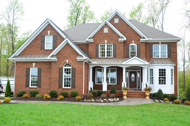
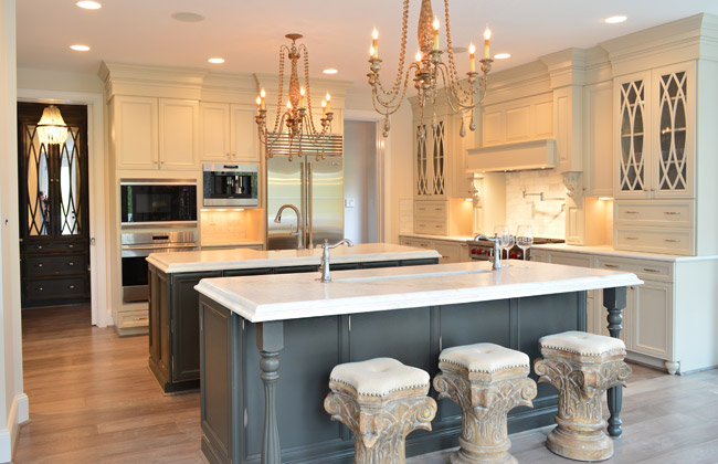
Perhaps the most luxuriously decorated home of the show, it has some of the coolest cabinetry we’ve seen in a while. Their kitchen included double islands – one with a standard sink, and one with a prep sink that could be used for housing ice/drinks at a party. Note the coordinating dark, mirrored cabinets through the doorway into the mudroom.
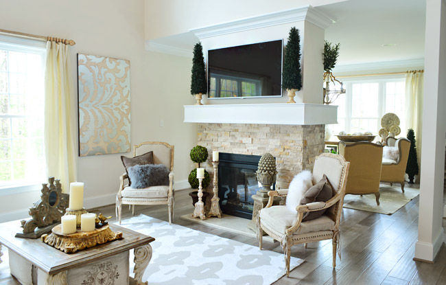
The living room also had a double-sided fireplace with a seating area behind it.
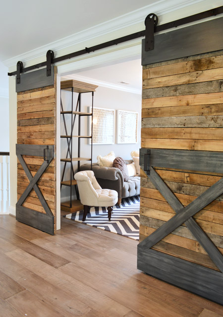
Upstairs there were sliding barn doors that fooled me into thinking they had lots of metal trim (only when I touched them did I realize that gray “steel” is just painted wood).
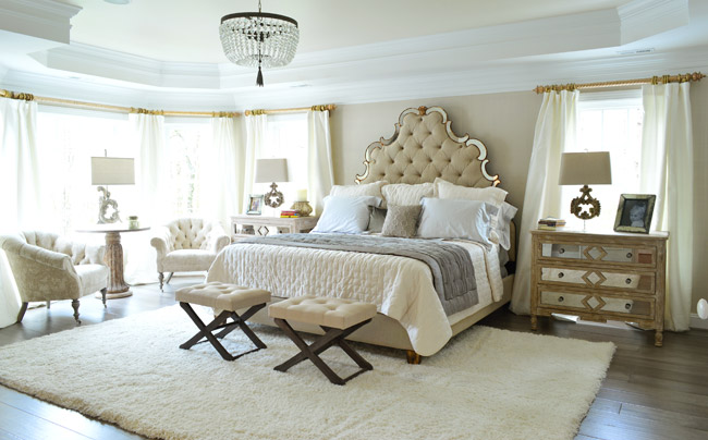
Here’s the main bedroom, which had awesome light streaming in – along with a lot of upscale, light colored furnishings.
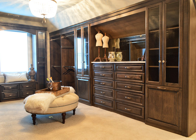
One frequent trend that we saw in other houses was a closet that was accessed by walking through the main bathroom – and this home boasted one of the most upgraded ones we’ve seen. In addition to being spacious and full of nice cabinetry, it even had its own drink station / coffee bar complete with a mini fridge.
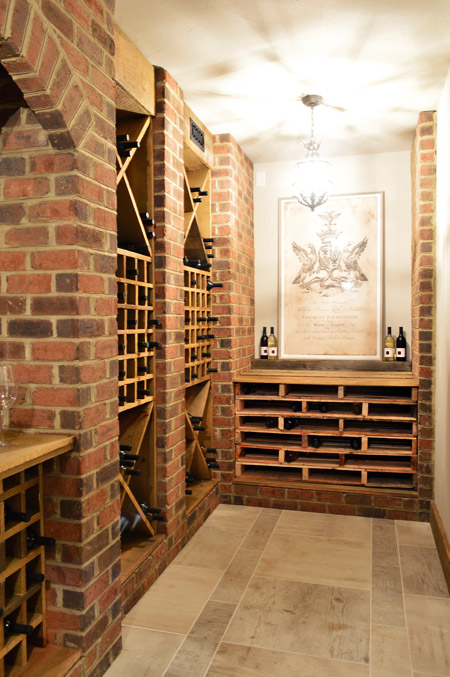
Speaking of beverages, this is the only home in the show with a basement – and they used some of that space to create a wine cellar. The stacked shelving on the far end is made from pallets and provides even more bottle storage.
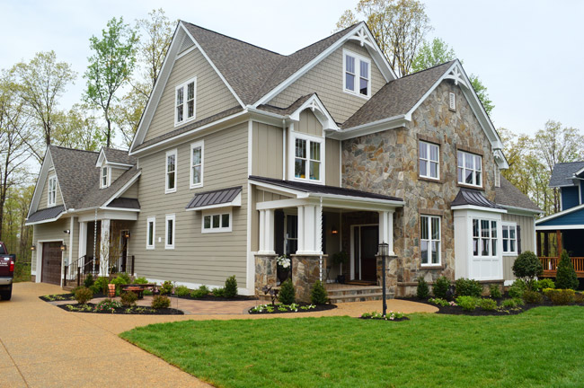
Now let’s skip over House #2 (that’s ours) and go straight to #3, which is built by Southern Traditions and designed by Elaine Reeder. They’ve got a really pretty stone accented exterior (with some tin awnings along with a few white rain chains) that we’ve been admiring from afar for a while, so it was nice to finally get to peek inside.
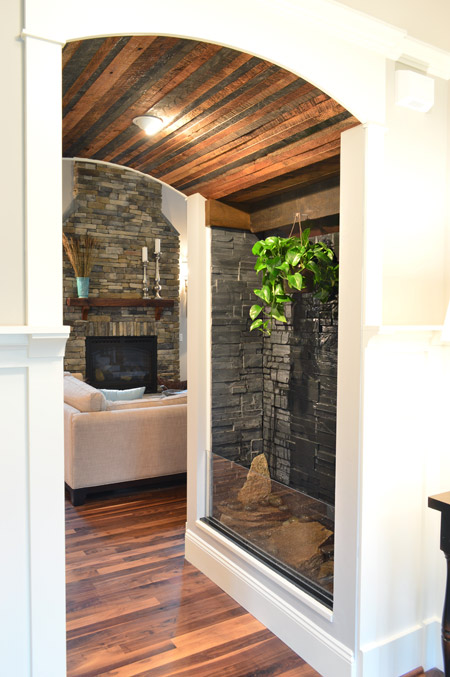
This house has a lot of interesting mixes of materials, like in this little passage between the foyer and the living room that combines a rustic wood ceiling with a stone wall water feature.
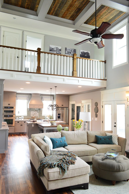
The main area of the home is nice and open, with a two story living room that carries the rustic wood look into the coffered ceiling above.
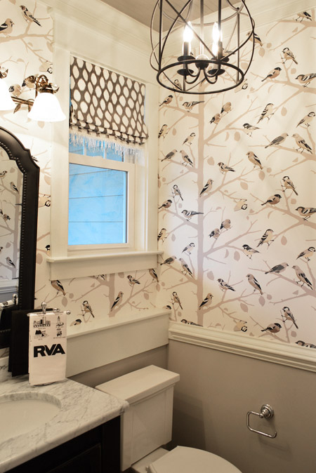
They also went bold in the half bathroom downstairs with this graphic bird wallpaper over the wainscoting. There’s even a little local touch with the Richmond RVA hand towel.
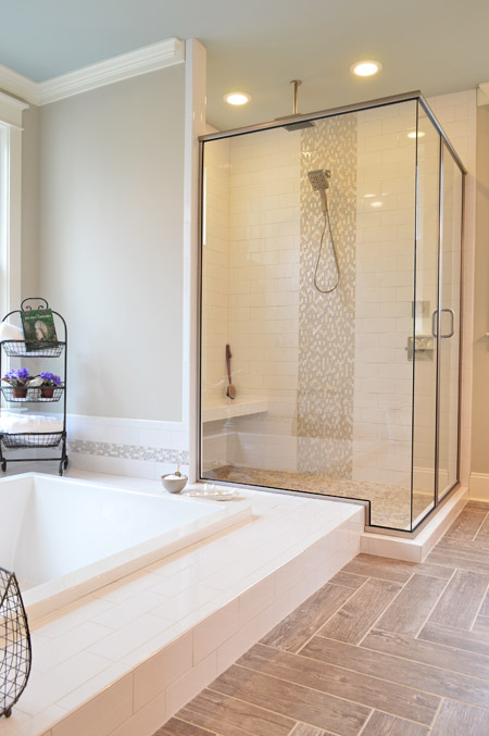
And the en-suite bathroom included something we’d never seen before: a sunken tub.
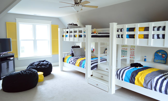
Upstairs they turned the playroom into a sleepover room with two pairs of built-in bunkbeds. The builder’s carpenter built them from scratch (including the hidden drawers in the steps) and they certainly got our wheels turning more than your ordinary bonus room does.
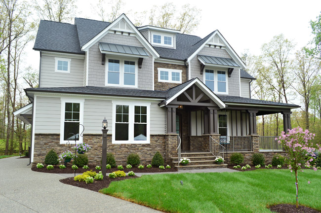
House #4 is built and designed by Ray A. Williams Custom Homes, and it brought some nice dark exterior trim to the show (which is something we’ve admired on a few homes in our own neighborhood).
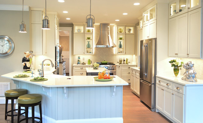
Their kitchen was one of those where you flip the lights on and it’s like the clouds part for a moment and you hear a chorus of angels singing. And of course Sherry was loving the silver monkeys on the far right.
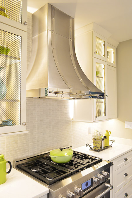
There were also great details like the metal straps on the hood and the mesh on some of the glass cabinet doors.
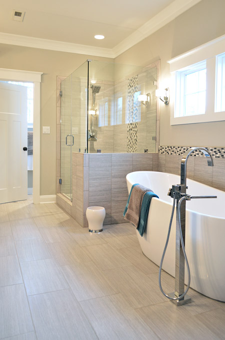
This home probably had the most modern bathroom of them all, complete with small mosaic accent tile and sleek glass shower doors.
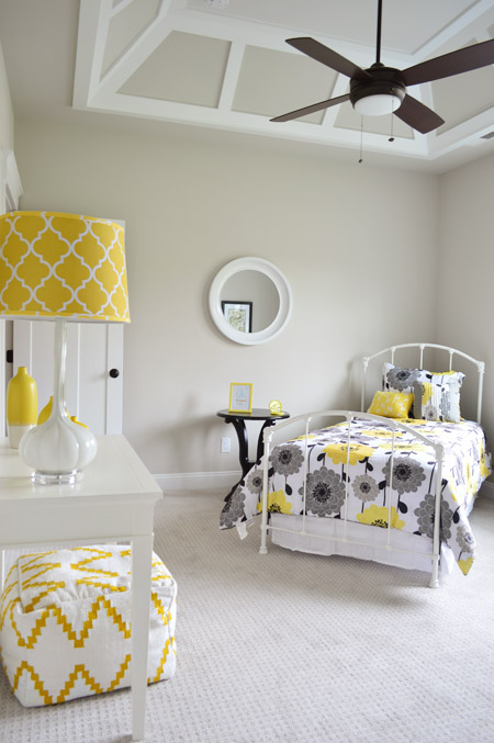
One of the architectural themes of this house were the decorative ceilings throughout, like this paneled one in one of the bedrooms.
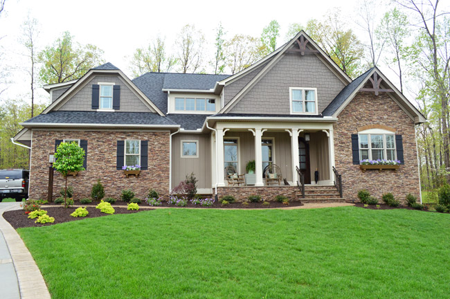
Next door is House #5, which is built by Harring Construction and designed by Diana Ragsdale. She decorated one of our favorites from last year – and we love the look she pulled off this year too.
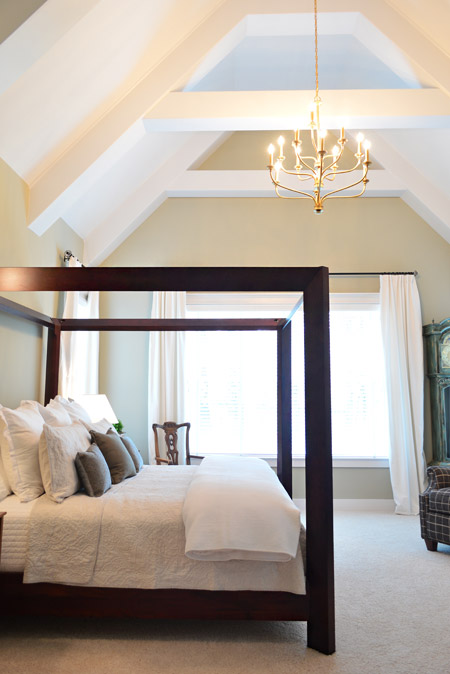
One of the highlights was the main bedroom, which had this awesome vaulted ceiling and stunning gold chandelier.
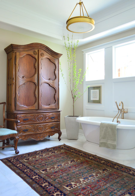
The gold details continued into the en-suite bath fixtures as well. How awesome is a bathroom that can fit such a giant wooden wardrobe?
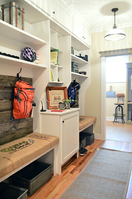
The mudroom had great built-ins too, with a nice rustic touch by using old grain sacks as the bench fabric and reclaimed wood across the back.
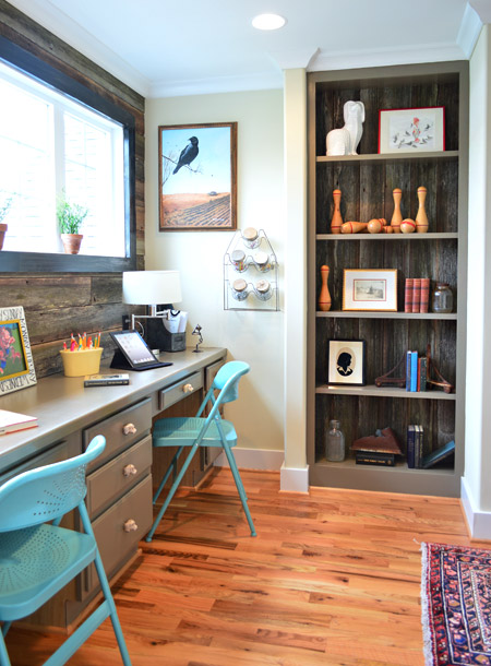
That reclaimed wood, which was found at Diana’s friend’s North Carolina barn, continued upstairs where it accented the back wall of a desk area that was carved out of an otherwise empty hallway space (as well as on the back of that built-in bookcase).
Speaking of bookshelves, in the nearby boys room there’s one that acts as a secret doorway…
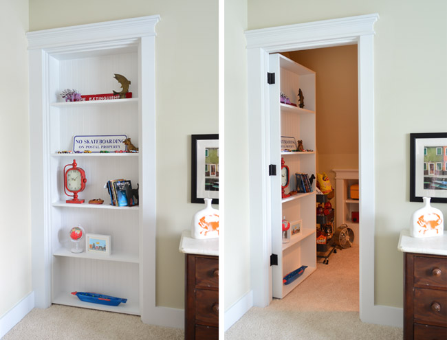
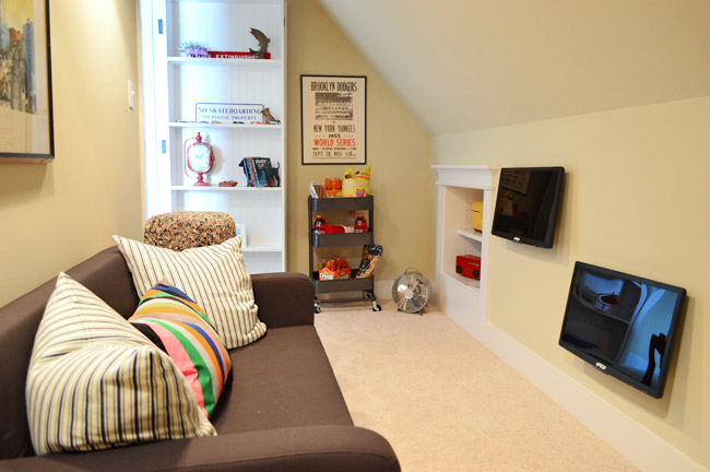
… which leads to a tucked away TV/video game room. My 16-year-old self would’ve flipped for something like this. Although I probably would’ve just practiced my marching band music in there. #nerd
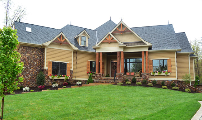
Next door is House #6, which was built by Falcone Custom Homes and designed by Catherine Stanley. It’s one of the largest in the show and it boasts some of the grandest features (it’s known as “the one with the pool” to almost everyone who worked on Homearama).
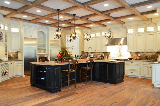
The kitchen sports a separate fridge and freezer and a 100-bottle wine rack, not to mention a pretty expansive ceiling beam detail.
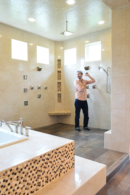
And the en-suite bathroom is unlike anything we’ve ever seen. The bath/shower area alone is 600 square feet and has an infinity tub, rain showerhead, and body spray jets all around. I had to snap one of my infamous “John for scale” shots just to illustrate how big it really was.
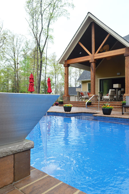
And here’s the pool, which we shared briefly during construction. The outdoor area has lots of other fun features like this combo water/fire feature in the foreground (I couldn’t figure out how to turn the fire on, so you’ll have to use your imagination).
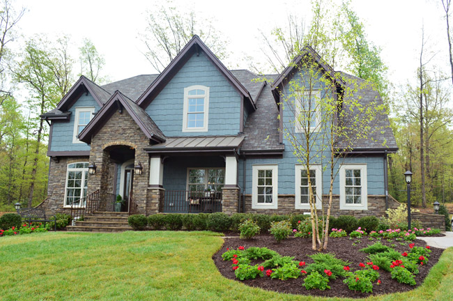
Rounding out the cul-de-sac is House #7, built by LifeStyle Builders and designed by Priscilla George. We spotted a few similar choices between this one and ours – like both choosing a blue exterior paint color – even though ours was deeper and theirs was lighter and mixed with more stone and dark trim along the roofline.
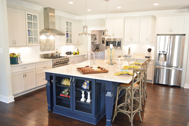
This home also sports a navy kitchen island, but the leg details and glass fronted end cabinet add a nice twist. They also went for some accent tile over the stove and a stainless range hood with chrome lights over the island.
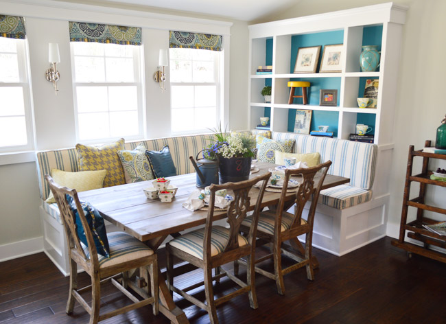
And they also did a built-in banquette, although it was L-shaped and had chairs on the other two sides. We especially loved the cheerful teal backs of the bookshelves.
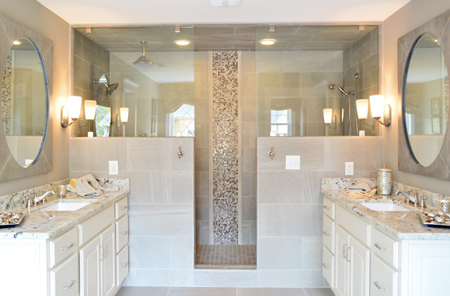
In the en-suite bathroom, they also had a dual shower area – but they created two distinct zones (one side featured a tradition and rain-shower head, while the other had a bench and handheld shower).
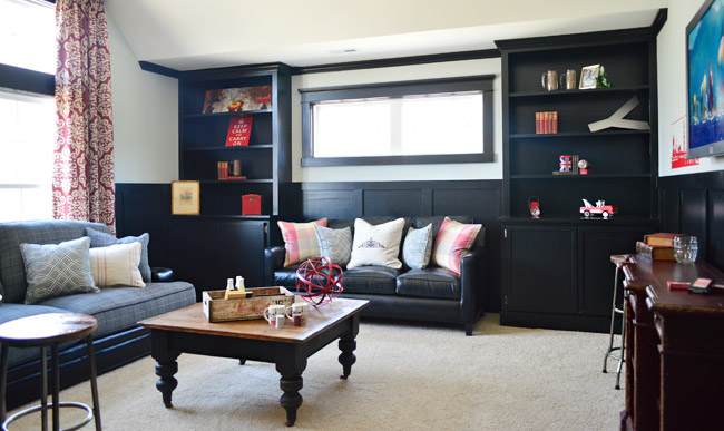
Upstairs they went bold in a bonus room by going all black with the trim and built-ins, which would make for some cozy TV watching for sure.
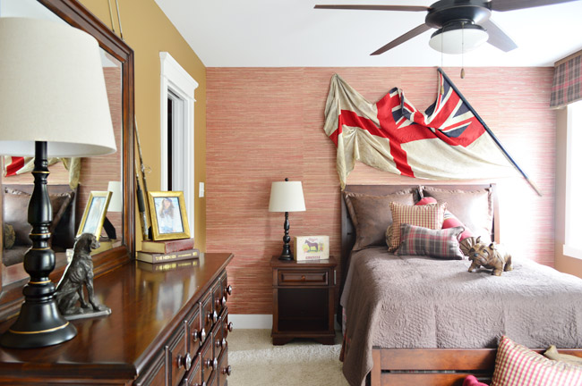
And each of the bedrooms had an interesting theme/style. I was especially drawn to this one with the cool old flag against the grasscloth wallpaper. I think I may be developing a thing for flags, much like my existing map and bike tendencies…
So 30+ pictures later, I’ll wrap this up. There’s plenty more to see in person if you can make it out, but at least you’ve hopefully gotten a flavor for the other homes. And while I’m sure there are plenty of source questions out there (“what’s this paint color?” “where’d that furniture come from?”) we sadly don’t know a lot off the top of our heads and most of the Homearama crew is occupied this weekend with the show itself. So feel free to ask away, but please be patient if the answers don’t come right away (we’re hoping Justin drops in with info within a few days for you).
Psst – Wanna see more showhouse info & photos? Click here for Our Full Showhouse Tour, which includes final pictures of every room, the floor plan, budget info, a video walk-through, and shoppable showhouse furniture & accessories.

Abby says
While I see many others have already told you, your entry is my personal favorite. Though the other homes were executed beautifully and there were aspects from each that I pinned for later, yours had the best cohesively warm feel to it. Maybe it’s because I read your page religiously (and actually reference it and recommend it to others on the daily! lol) but your house is the most inviting and a place where I would want to call home! Props to you both!
Hanna says
Awesome, awesome houses. Your exterior is still my favorite by ar, but that first one (the brick one) would have given it a serious run for it’s money if they had gone with bronze windows instead of white. But even so, still top notch. :)
mackenzie says
My fiance and I have already made plans to come to homearama next year if it is still going on!!
Em says
Are you guys going to post the rest of your house (or did I miss it?) Was looking forward to seeing how the dining room and other spaces came out.
YoungHouseLove says
Oh yes, we have the rest in the hopper for you!
xo
s
jeannette says
i like yours waaaaaaaaaaaaay better. it has that jersey girl/springsteen thang. not so big on the preppy confederate look.
Leah says
THANK YOU. These houses are all amazing. Putting yours aside my favorite (from your pics) is #3. I want a product/vendor list for that house…stat. Congrats on being part of such an amazing project and knocking it out of the park.
Stacy says
I just pinned a lot of those pictures for some inspiration for my house. I wish I lived closer so I could go look for hours at them. Everyone did a great job, but I think I still like your house the best!! :)
Dawn says
Your house was definitely the most livable for a family. I have taken a page from your book, and am lightening up my house and decor. I am moving from more traditional to more comfy/cozy/friendly/bright. I have used some brighter colors and am planning a tuxedo kitchen with navy blue cabinets on the bottom and soft white on top (as in “Chris loves Julia” if you follow that blog). I think that will look good with our Brazilian cherry floors. Can’t wait to get started painting. Actually, that’s a lie… can’t wait to be done with painting!
Jannean says
They are all quite beautiful, each unique but with a lot of similarities. My particular favorite item is that range hood in #4, simply gorgeous! Out of all these I like #7 the best probably because it’s the most similar in design style to yours. Thanks for the tour for those of us who can’t make the show in person.
Mere says
Any way to find out where the couch in the main room of house #2 is from? We’re doing some searching for a house we’re building and it’s exactly what we’re looking for but have not yet found.
YoungHouseLove says
I think Justin might have answered that for another commenter, but if not I hope she swings back through with that info!
xo
s
Betty says
Sherry, isn’t house #2 yours? Mere, if you are asking about the couch in house #3, the one that’s nice and open, with a two story living room that carries the rustic wood look into the coffered ceiling above, Justin did answered that. She said it’s from La-z-Boy.
YoungHouseLove says
Yes, you’re right! Thanks Betty!
xo
s
Jenny B. says
They are ALL beautiful! Love the exteriors, and that bunk room is so cool!
Mrs. Frugalwoods says
Wow! I love those barn-style doors–what a great (and frugal) idea to paint the wood grey!
Helena Dias says
All the homes look amazing. Truthfully, I’m partial to yours. Love it
Tamara @ Provident Home Design says
Thank you so much for taking the time to share these photos! I eat this stuff up! It ‘s so fun to see how each designer chose to define their spaces. I appreciate the talent of all the designers. I resonate with the style of your house the most. I wish I could go to the show just to have the chance to experience your home in person! Mmm, I can only imagine!:-)
Monnaie says
Very rich stuff, So beautiful, Thanks for giving a lovely experience to my eyes…
Karen Jones says
First, I love your website and look forward to all of your post. Second, I totally understand about taking time to reflect and enjoy your family. Trust me, Clara and Teddy will grow up fast! Do post/write when you have time. I look forward to reading about your projects and family!
Now I want to share with you. I follow a blog entitled a Bowl Full of Lemons. This morning her post was about her kitchen. Your product line at Target was mentioned with a link. She showed a picture of them and how she used them as handles for her pantry doors. Just wanted you to know.
YoungHouseLove says
Thanks so much! Off to check it out!
xo
s
Hems says
I like the barn doors and that closet(i wish) in house #1, the cool passage from the foyer in house #3, kitchen and yellow & gray bedroom in #4, mudroom & secret gaming room in #5, the huge bathroom in #6, the outdoors in #7. You are all super awesome to have designed such inspirational spaces guys!
xo, Hems
agoldentulip.blogspot.com
Kali says
Oh my goodness. All of these homes are insanely gorgeous. I can’t pick a favorite!
kavee says
This post makes me sad. It’s as if the recession taught us nothing. Puffed up, overblown, mini-mansions. YHL’s is the best of the bunch because it is so much more modest, fun, and attainable than the others. I believe in what Habitat does but most of these houses are the antithesis of their mission and I’m sure the developer is so happy to get all this great promo.
Georgia says
Thanks for sharing those. Funny, as there is not one single house where I’d want to live, but I do love at least one feature from each. May have even pinned a few.
Great Job, guys.
Jim says
I have to give it to LeGault Homes. That’s an amazing hime. Especially that bathroom. Overall, 10 out of 10 in every room.
Catherine says
Thanks for posting these pics…I love to look at houses and see what others are doing. As a designer myself I think it’s quite odd how that other house seems to be a copy of yours. To close to be a coincidence!
Sava says
I have to say, of all the homes, I find yours most appealing. I think it the right blend of traditional with some modern funk. And it may have the most personality.
KarenH. says
Neat!! Thanks for the tour. Just one question.
“Upstairs they turned the playroom into a sleepover room with two pairs of built-in bunkbeds. The builder’s carpenter built them from scratch (including the hidden drawers in the steps) and they certainly got our wheels turning more than your ordinary bonus room does.”
So do you have some ideas germinating now for your storage area upstairs? :D
YoungHouseLove says
Yes! So excited about that!
xo
s
Elissa says
I would love to know who makes that bird wallpaper from house #3. LOVE the barn doors in house #1!!
YoungHouseLove says
Linda clued us in a while back in the comments. Here’s a link to her info: https://www.younghouselove.com/2014/05/house-crashing-the-whole-show/comment-page-4/#comment-3610576
xo
s
Chronicles of Nardia says
Wow, there are some amazingly luxurious houses there!! I love elements of each of them but I actually really like yours the best – it seems more liveable to me than a lot of the others – especially the one with that big grand master bedroom dressing room (with wine rack and mini bar!!!!????).
I’m curious though to know the ballpark range for what these houses will sell. In Australia these would be multimillion dollar, or close to it homes, depending on where they were located. In my small regional city, to build something to the size and calibre of some of those displays would definitely sit in the $1-2 million mark… in a metropolitan city much much more.
Anyway, thanks for the 30+ pics John, you’ve captured so many amazing little ideas and features – a few have been added to my ‘someday’ file (you know, the one post kids when the carpet has been well and truly trashed and the furniture banged up beyond recognition – lol!).
YoungHouseLove says
These homes are all selling in a few different price brackets depending on their size/features/etc (ours is in the $600’s but the one with the pool is in the $800-900,000 range).
xo
s
KelliB says
Interesting that all the kitchens had white cabinetry and most (if not all) had an accent color on the island. Do you think cherry/dark wood cabinets are outdated now? We are thinking of a redo and already have white laminate cabinets but they definitely need replacing. Should I stick with the white? I love white but want to choose what’s going to be “in” if we sell our house in the next few years.
YoungHouseLove says
That’s a big question! I think painted cabinets will probably always have a fan club along with wood cabinetry – it really seems to be a personal preference thing. We have friends who have replaced painted cabs with wood ones and others who have painted new wood ones the second they moved in. We painted our first kitchen’s wood cabinets in 2005, and it’s 2014 and we still like painted cabinets, so they’ve already been our preference for almost ten years, but it’s hard to say if they’ll feel dated someday. I tend to think they’re more like woo finishes and they’ll cycle back and forth (sometimes dark is in, then light, etc).
xo
s
Renee B says
You guys did an amazing job on your showhouse, and I have LOVED all the pics you have shared of all the houses.
Is there a Homearama website or anything set up where I can look at even more pictures of all the houses? Unfortunately Australia is not local otherwise I would have been there as fast as I could touring those homes in person! :-)
thanks!
YoungHouseLove says
You might be able to find more pics on each builder’s site (we linked to those in this post) and there might be more on those sites in a few weeks when the show’s over.
xo
s
Kim Sall says
Wow! House #1! That kitchen is amazing! My favorite thing by far is that double sided fireplace- Spectacular!
http://www.screwdriversandmimosas.com
Monnaie says
Looking very beautiful!
Melinda says
We stopped by Homearama on Saturday! It was great!
Random question, but do you have any more photos of the houses? My stupid camera messed up and I don’t have a photo of the bathroom that had the birch trees handpainted on the walls. It was so neat and I’d love to try to replicate it. I think it was the 4th house, but honestly the whole thing was pretty overwhelming!
Of course I voted for #2!
YoungHouseLove says
Oh no! I’m sorry about your camera. I’m afraid we don’t have a picture of that but maybe clicking the link in this post to that builder’s site will yield some room pics if they’ve posted them?
xo
s
Rachel says
Drove up from Raleigh Saturday. Had a pie from Proper Pie Company first. Amazeballs!! Thanks for the stellar recommendation!
Add us to the list of folks who think your house was the best. It really looked like a family lived there and it had the best flow. I also LOVED the outdoor stuff behind the house! Oh, and now I super appreciate your photography skills, having taken so many pics myself! Over 150 crummy cell phone photos, lol.
We met John the Builder. When we told him how AWESOME your staging was, he had sooo many complimentary things to say about y’all and how hard you worked with a baby on the way!
Question: the boy’s bed seemed pretty short, so we were wondering what you envisioned to accommodate a larger bed when he got to be a pre-teen/teen. We thought about sticking a full or queen sized bed outward, but with the built-in stuff just under the bed, we weren’t sure how that would work. Did you have ideas about that?
YoungHouseLove says
Aw thanks Rachel! We love John The Builder – so glad you got to meet him. We envisioned either someone jutting a larger (queen/full) bed out eventually if they wanted something bigger and then they could just add some under-bed storage (like some rolling drawers on wheels that Ikea sells or something more custom) to make up for the drawers that were under the twin bed). We also thought eventually the guest room could become an older kids room (then the kids wouldn’t have to share a bathroom either) and the original boys room could become a spare room for something else, like crafting (the bed could just be like a window-seat in that case, and all the storage around it could be for craft supplies).
xo
s
Rachel says
Thanks for your response. :) And oops, I forgot my other question! I noticed in the girl’s room you had those little metal letters (LOVE them in the office, too!) that said “Alice.” I know Alice was a contender name for Teddy. Was “Joey” (in the boy’s room) another contender name?
YoungHouseLove says
Yes! We have always thought Joey is a sweet name, but Teddy had a lot more family meaning – so it was nice to use Joey and Alice in the showhouse for the imaginary kiddos ;)
xo
s
Erica says
Pretty houses aside, I was BLOWN AWAY by the 600sq ft. shower. That’s half the size of my ENTIRE HOUSE! Holy cow!
I have to agree with many of the others. The houses were pretty, but I think I liked yours the best too. The first one was far too fancy for my tastes!
I love going to Homearama and seeing all the huge houses! Last year, though, ours was full of BURLAP. It was cool in the first house, but after 12 houses, I was over it. :-) Thank you for not using burlap all over your show house. :-)
Britt says
Sorry if this was answered already… I’m a skim reader ;) … but where would one find the product list for some of the homes? For example, the floors in House #1 built by LeGault Homes are lovely. Do you happen to know the product? I’ve been YHL’d and now I assume everyone just shares their info.
YoungHouseLove says
I think Justin may have dropped in with info about that in prior comments, but you can click over to the builder’s site too and see if they have more info there :)
xo
s
Jennifer M. says
My sister-in-law and I convinced our husbands to make a weekend trip down to see all the houses. We drove from Maryland and they drove from WV. We attended the first weekend of the show and spent the entire afternoon wandering around the homes. We all liked some things from each house, but your house was the winner for all of us with the best layout and felt the most practical to live in. Although we had seen some pictures before hand, seeing it in person was so much better. The attention to detail and all the custom work made the house look so great. You guys did an awesome job!!
I would love to know where the foyer light in house #3 was from as well as the sliding barn door hardware that a couple of the houses had.
YoungHouseLove says
Thanks so much Jennifer! I hope Justin drops in with that info for you.
xo
s
Danielle says
I snorted my coffee through my nose when you said the prices of the homes. $600,000 to $900,000? That’s it? There is a 1,100 square foot house in my neighborhood that just sold for $1.1 million. Ugh, i hate you guys that live in cheap cities.
Haley says
Thanks for sharing the other homes. I love getting to see how other places are decorated. I love how your house seems a lot more original and has touches that make it feel more personal and homey.
PS. OMG, that shower/bathing area is almost as big as my entire apartment!
Kimberly says
Is this something they only do in Richmond? I’d love to see these houses in person and have been looking for something similar in Atlanta?
YoungHouseLove says
I’d search “parade of homes” and “homearama” and “street of dreams” (along with “Atlanta” to see if they’re in your area) I hope something comes up! Those are other names of house tours that seem to be in a lot of cities. Hope it helps!
xo
s
Jan says
Dear Young House Lovers :)
It was like a dream come true when my husband and I were able to drive down (last minute-ish) from Maryland to see the home show on Saturday. We heard that you both had been there on Friday and we were sorry that we had missed you (darn!)
It was so much fun to see everything you had done and that I had been following on YHL! What a great job – I especially loved your outdoor spaces (obviously the judges agreed also).
I also loved house #5 (I liked her mix of new and older objects). My husband liked the design of house #4. I took lots of pictures!
YoungHouseLove says
Thanks so much Jan!
xo
s
Andrea says
Wow, these houses are amazing. I absolutely am in love with the sliding barn door separating the rooms, ha but I suppose I’m partial. The house’s are beautiful but I wouldn’t want to touch anything in case I messed it up. Perhaps some are not the most family friendly but they’re sure something to look at!
Greta says
We are remodeling, and I’d love to know where the bathtub in the master bathroom of house #5 is from. Do you have that information?
YoungHouseLove says
So sorry we don’t.
xo
s
Monnaie says
Love the architects design and interior designing and furnishing!