Picking paint isn’t always easy, and boy did we have a hard time deciding on a beach house color. If you follow us on Instagram or Facebook, you probably saw us share a bunch of photoshopped options a few weeks ago that flashed by, slideshow-style, like this:
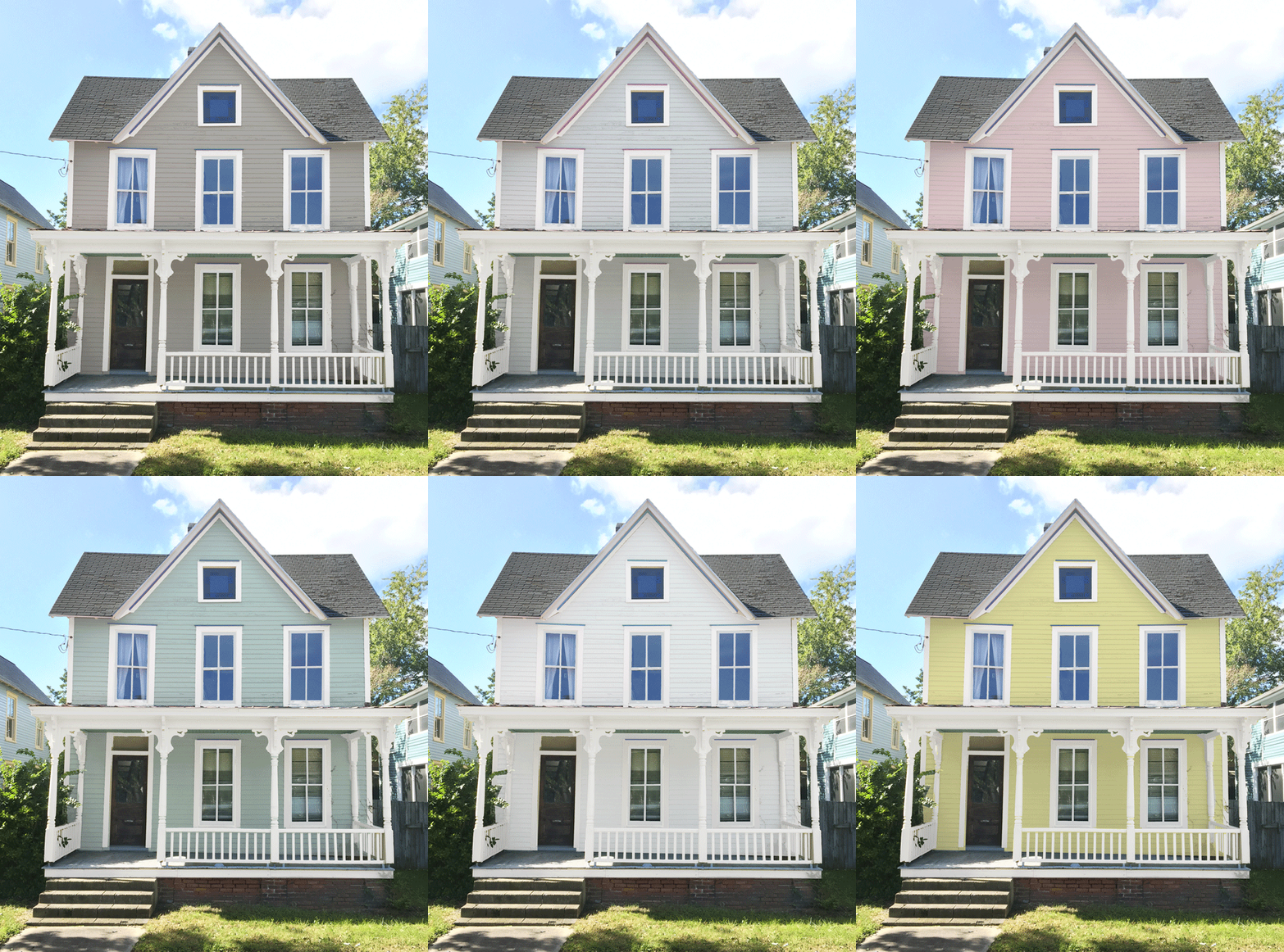
And if you listen to our podcast, you’ve heard all about the house colors next door and the other factors that need to be taken into account (like not wanting to paint our original wood door, for example). All of that’s in Episode #28, which you can play below to get all caught up. Note: If you’re reading in a feed reader, you might have to click through to the post to see the player.
Podcast listeners were also the first to hear the conclusion of the debate this week in Episode #31, where we talked through a few of our initial instincts, how we changed our minds along the way, and what unexpected object finally inspired a firm choice. There’s no going back now, guys!
So consider this a visual recap of a lot of the details we shared in those two episodes above. We thought the most logical way to go about this was to address each potential color (or color category) one at a time, starting with…
The Existing Color
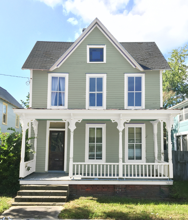
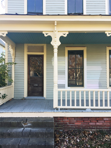
When we bought the house it was sporting a green-gray siding color with creamy yellow trim (see the before here). We knew immediately we were going to paint the trim white to make it look fresher and beachier (many of our neighbors have white trim, which looks great). So we photoshopped white trim into the picture above, and we fleetingly considered keeping the siding the same green-gray color. You know, to honor its existing look?
But it felt a little muddy and dull compared to many of the other colorful houses around it in this beachy and bright community. And ultimately we decided that we wanted a clearer signal to the neighborhood that this house is coming back to life (as if the dumpster out front isn’t a clue) and a new exterior color felt like a great way to do that. Plus if you’re paying all this money to replace rotted siding and repaint everything, it’s part of the fun to get to choose a new color. Also part of the fun: second guessing yourself a million times as you go!
Blue
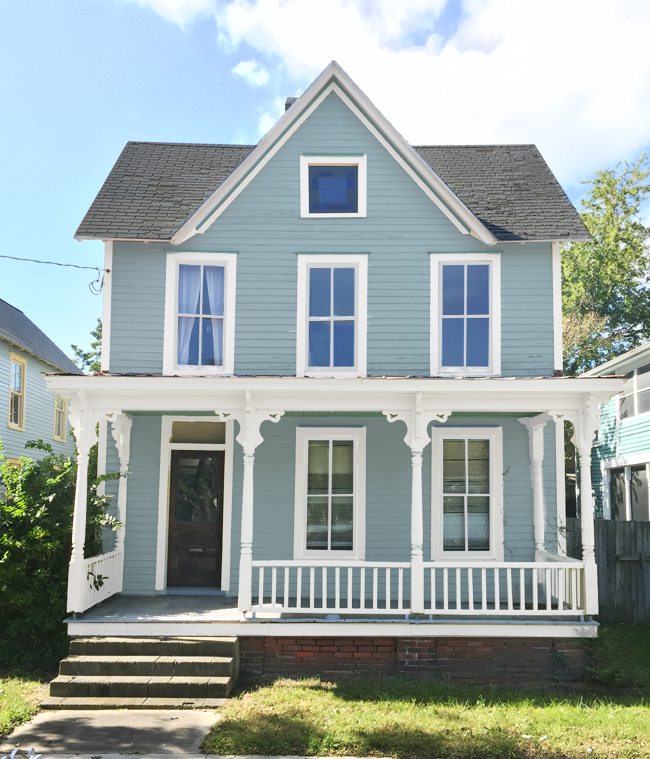
We’re SUCKERS for blue (yes, that deserves all caps due to our extreme unwavering affinity). We’ve used it a lot in all of our houses, we painted our showhouse a deep blue, and our current house’s front door is a bold teal. There are so many great options to choose from (light blue-gray, navy, cobalt, aqua, teal) that would make for a pretty inviting beach house. The problem? All of our neighbors already had the same thought.
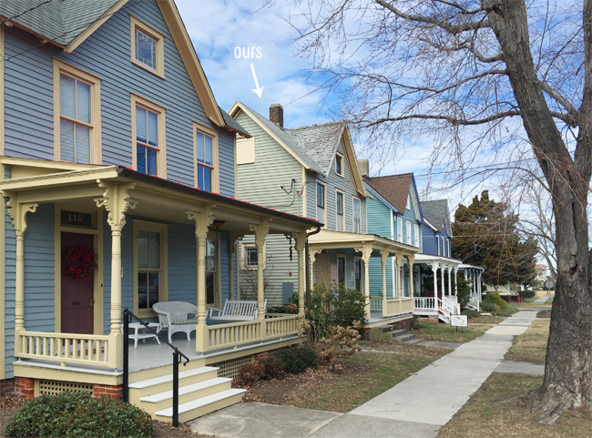
We’re one of four identical houses in a row on our block (same porch columns, same stained glass window up top, etc). And the other three are already some shade of blue. We debated going for blue too, so we’re all sort of a gradient or a little “blue house” team, but every instinct we had told us that it would be better to do something different instead of just blending in and becoming ombre house bros (ombre hombres?). We liked the idea of being “the _____ house on the street” versus being “yet another blue house on the street.” Plus some of the cutest parts of this town have more of a “painted ladies” feeling, so we moved on to the next option.
Green
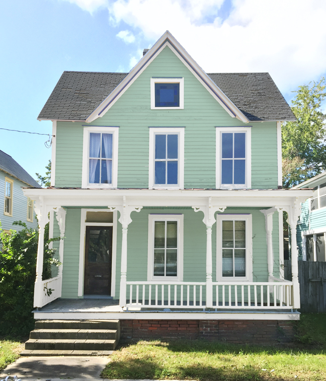
Most of the greens we considered got nixed for the same reason above. We loved the idea of something minty or in the seafoam family, but every tester we tried just felt too close to blue (see the neighboring house colors peeking into frame above?). Even if we chose something on the yellower side of the green spectrum – you know, more avocado – we didn’t feel like it would bring enough contrast to the blueness on the street. We decided that if we really wanted to contribute to that happy almost rainbow feel of beach towns then we should choose more of a complementary color instead of one so close on the color wheel.
Gray / Beige
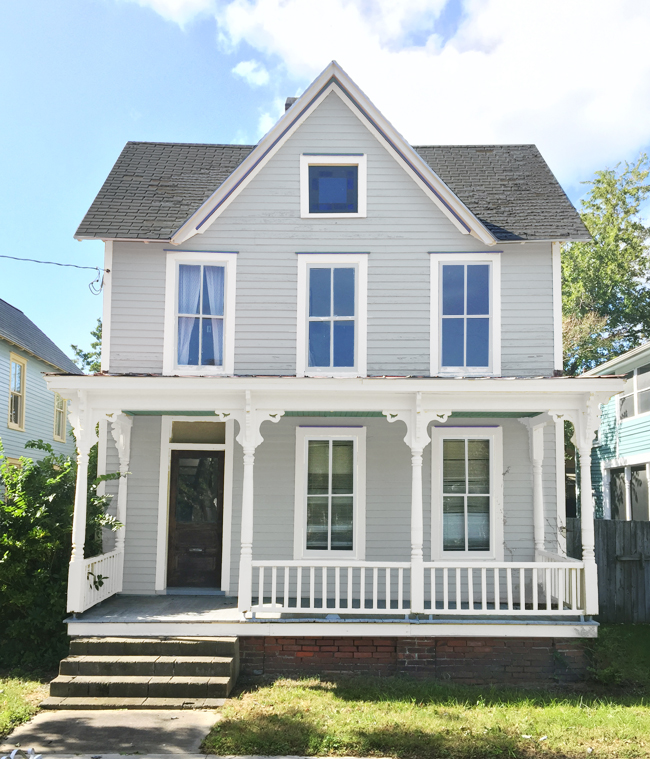
Now I realize it sounds weird to say a “rainbow feel” and then talk about painting ours a neutral color. But we do love a good neutral – especially because in this context it would allow us to pick bright porch furniture or even put colorful accents elsewhere on the house (some houses paint the eaves, the porch ceiling, or even some details around the window). We also thought that maybe a neutral would bring some balance to all of the bold blues on our side of the street. We spotted quite a few light tan and gray houses around town that look great, so we didn’t want to rule it out.
And when Sherry scoured her inspiration folders (she’s been pinning and tearing beach houses out of magazines for years), she realized light gray/tan houses were some of her favorites – and they still felt plenty beachy. Especially with all the colorful planters and furniture that can be layered in (don’t forget that staged colorful bike out front!).
In addition to Pinterest, we also looked around Cape Charles itself for what stuck out to us. As much as there are lots of colorful houses, the soft neutral houses with crisp white trim certainly felt at home near the water too. Our minds swirled around neutral colors like this for a while. Partly, I’m sure, because it’s a pretty “safe” choice – which isn’t always a bad thing. Heck, safe can also mean classic and relaxed (and not “that one all the neighbors hate because it’s crazy!”), right? Maybe we didn’t need to be too in-your-face with color after all? Hmm….
White
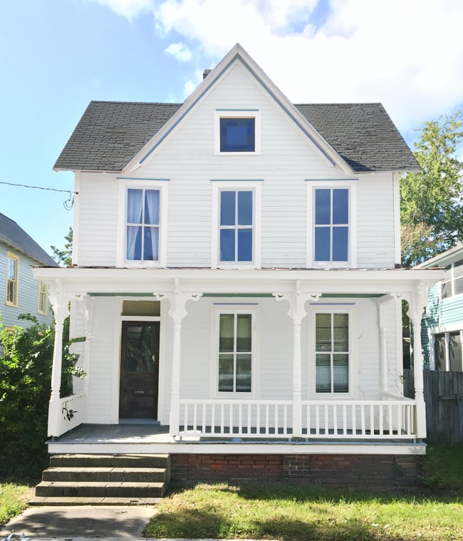
Heading down that same neutral rabbit hole was white. Man, if you thought Sherry’s Pinterest board had a lot of gray or tan beach houses, don’t even get me started on the whites. SO. MANY. WHITE. HOUSE. PINS. And after spotting some around Cape Charles too – including an immaculate bed & breakfast that is crazy charming – we were starting to seriously consider white. With a dark roof and a hit of tin (our beach house’s front porch has a tin roof) along with little hits of color (like a porch swing, planters, some colorful adirondak chairs, etc) we were definitely warming up to the idea. The white felt very crisp and undeniably beachy.
But two things poked holes in this idea for us: greenery & maintenance. On the latter front, we asked one of our friends about the white HardiePlank siding she put on her house a few years ago (which you’ve seen here on Instagram). She – like us – loves the look, but she warned us that it looks dirty faster than she’d like, so they have to clean it regularly (lots of power washing). That didn’t sound like a great idea for a rental house we were trying to minimize maintenance time/costs on.
Plus, we realized a lot of our pins – and even the local B&B – are often surrounded by beautiful, lush greenery that provides a colorful backdrop for the white to pop against. We don’t have that at our house since the houses are all lined up and pretty close to each other (no room for even a tree between them). So besides a few medium bushes, you definitely wouldn’t describe them as “lush” or “nestled in the trees.”
The nail in the coffin for white was that the cool ornate columns we have on our porch sort of get lost in the white-on-white look, and it feels sad to make all that architectural detail blend into the background. So the white house of our dreams was probably not the best choice in reality. Onward!
Yellow
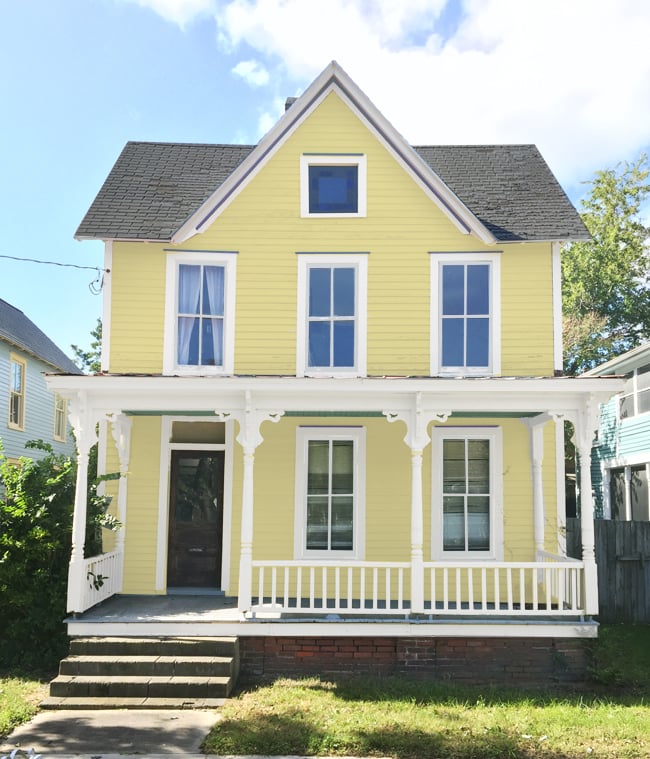
Yellow was one of the most popular picks on Instagram and Facebook, despite the fact that many other people warned us that yellow fades the fastest and can show a lot of dirt (something I sense is an issue with any lighter siding color). We have this painting of my grandma’s house rendered yellow that we LOVE (the house is white in real life, but she loves yellow and the artist likes to paint houses to “match” their owners) so it felt kinda sweet to have a yellow house of our own.
Around this point our contractor called with a curveball that meant we had to reside the entire house (more on this in podcast Episode #31), which impacted our color debate because there were some stock, factory-finished colors that we could choose from. They’re more expensive than just the plain primed HardiePlank (which you then have to pay to get painted), so cost-wise it would be about the same, but we thought looking at their stock colors might help us narrow down our choices.
We’re going with HardiePlank fiber cement siding because it’ll hold up better to moisture/termites/cold temps/etc (it’s even fire resistant!) and doesn’t need to be repainted nearly as often as wood siding, which will save us money and maintenance in the long run. So we ordered a few samples of their stock colors. They mostly offer neutrals, but they did have a light buttery yellow option called Woodland Cream, along with some other grays, tans, and even a light green.
To better visualize the stock colors, we drove around some new construction neighborhoods near us to hunt down full houses sided with it (holding up our samples to make sure we were judging a true match). That was a really helpful exercise because aside from some of their neutrals, like light gray, white, and light blue-green, we realized we didn’t really love any of the stock colors. They were all nice, but a bit more muted than we could get away with in a fun little beach town (they’re probably best suited for the suburban neighborhoods they’re most typically used in). Obviously, we knew we could just order the primed siding and choose any yellow paint that we wanted, but seeing a bunch of yellow houses in person kinda cooled our excitement for it. I can’t really pinpoint why, but we just didn’t have that “this is it!” feeling.
Pink / Coral
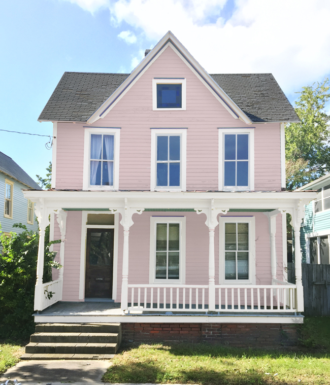
Along with yellow, the other most popular pick in the comments on Instagram and Facebook seemed to be pink (can you believe over 1500 people weighed in?!). It certainly stands out as one of the more “fun” choices in the slideshow when you see them all flashing by, but a pink or coral color is a pretty far cry from the calm, classic blues and neutrals we’re used to decorating with.
We have a few small doses of pink in our house (some art here, a pillow there) but this would definitely be a BIG statement – and a BIG commitment – by comparison. But as you can see from one of our early batches of test colors below, pink was on our consideration list from the very start. It just felt like a good complementary color to go between the blue houses on either side AND to work with our wood door AND to feel colorful and fun and beachy. A pink house wouldn’t exactly fit into our suburban neighborhood, but in Cape Charles? Sure!
The idea of something in the pink family took a backseat during our detour to try to fall in love with a stock HardiePlank color (of course there were no stock pinks). But around the same time we decided to just order primed boards that we could paint any color we wanted, we happened to lay our eyes on this:
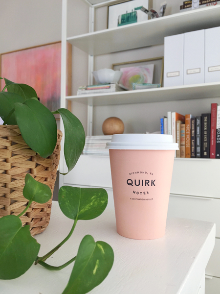
Yes, it’s a coffee cup. And it solved this entire dilemma.
It’s from a boutique hotel here in Richmond called Quirk, where my youngest sister stayed for one night over the holidays with her husband (to escape everyone with screaming kids! ha!) and this little paper cup came with her to our Christmas Eve gathering. Sherry spotted it and immediately said to me “beach house paint color?” with a gleam in her eye. It’s probably best described as peach, but also is definitely in the coral family (in fact the best match we’ve found is a Sherwin Williams color called Mellow Coral).
So less than a week later we were excitedly painting cup-matching swatches on the house and stepping back and feeling something we hadn’t felt before. Instead of “nope, keep trying” it was more like “yes, yes, yes!” – and when a few neighbors stopped by to stand back and stare at our 20+ swatches on the house (this isn’t an exaggeration) it was unanimous. Peachy coral beach house, here we come! This is but a lowly photoshopped rendering, but you get the idea.
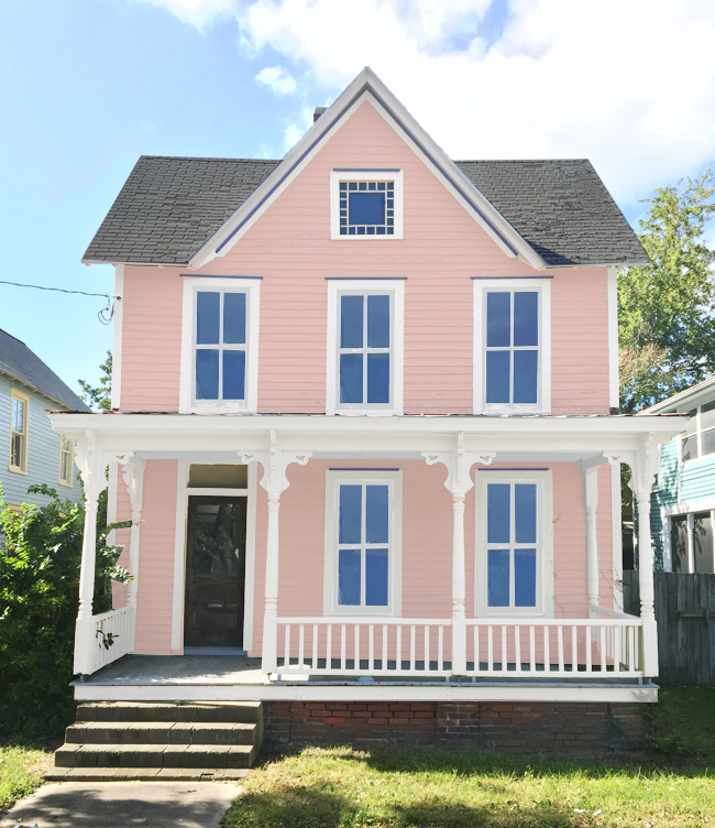
I can’t say that we thought that after ALL THIS TIME our answer would come in the form of a friggin’ paper cup, but I’m not arguing with it. Best of all, we think it’ll really help the house stand out to renters and neighbors alike. If you look closely at the picture above you can see how great it’ll be between those two blue houses. Complementary colors for the win!
So there you have it, folks. The coffee cup that saved the day, and one HUGE decision made. Now we just have 572 more to go…
