The office ceiling and walls are officially painted, which is good news because we’re at T-minus 48 hours until this baby’s scheduled delivery. Note: the trim is pure white in here (the same color as the desk in the middle of the room). No idea why it’s looking a little cream – maybe just the time of day/lighting?
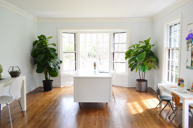
It’s still looking really stark in here (holy cow, who watched Game Of Thrones last night?), so we can’t wait to add:
- a rug
- window treatments
- a fun pendant or two over the desk area
- art
- more storage along the left wall (and a craft table/photography zone)
- an updated kid-desk area on the right
- etc, etc, etc
But even though we’re only around 10% done, it has come a long way since its former days of blue-trim.
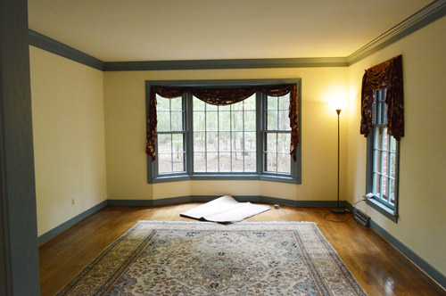
And there’s nothing like some final-hour pre-baby hustling to get your blood pumping.
In the past we shared this video where I demonstrated a few cutting in tips that work for me…
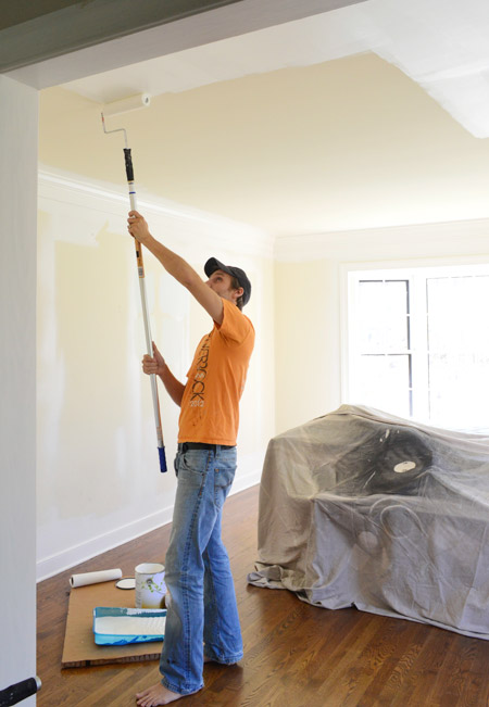
… and there were a bunch of requests on this post for video footage of John rolling a ceiling and a wall, so our office-painting update was the perfect opportunity to catch him in action. This is by no means the professional way to paint a room, it’s just what works for us. So without further ado – here’s how John rolls:
*We mentioned a few brands by name, but none of them were paid/perked, they’re just what we like (we curated color collections with Benjamin Moore in 2012 & 2013, but didn’t have time to do one this year – and never used them exclusively, were paid to mention them, or accepted free paint while we did).
For those who can’t watch the video, here are a few highlights:
- John likes to use a rod extender to take the strain off his back while painting ceilings
- we don’t have textured ceilings so we use a roller that’s meant for “smooth surfaces” – usually by Purdy, Wooster, or Ben Moore (we’re not brand loyal, and usually just grab whatever’s on sale)
- if this room were carpeted we definitely would have covered the floor, and if you have issues with splattering or just prefer to keep yours under wraps it never hurts to use drop cloths (pros would for sure)
- watch the speed, amount of paint, and pressure you put on the roller – upping all of those things can be tempting to get things done faster, but keeping them all in check can contribute to more even coverage and fewer drips/splatters
- higher quality paint is usually thicker, so it tends to drips less (we don’t use ceiling paint on ceilings, we just use good quality flat paint)
- we skip the rod extender when rolling the walls, but otherwise it’s the same technique
- our preferred order is for me to cut in so John can roll right behind me, then I’ll do my second round of cutting-in and John will once again follow right behind with the roller (that way the roller can get as close to the moldings and eliminate any brushstrokes that I might leave while cutting in)
We’ve shared a few time lapse room-painting videos in the past, so we thought those might be helpful to include here too. Here’s one of us painting our old master bedroom in 2012. You’ll notice we used pretty much the same approach back then (I was less steady with cutting in along the ceiling, so sometimes we used tape up there).
And here’s another time lapse video of us priming the kitchen (along with the overhead beams) from 2011.
Now that we got the “how” out of the way – let’s switch gears to the “whys” of choosing our office wall color…
- We wanted something light and refreshing (we’re both drawn to airy and bright offices)
- The dining room on the other side of the foyer is going to be dark and moody, so we didn’t want another bold or dark room across from it
- I was campaigning hard for a soft honeydew green, but John worried it could hinder the function of the room (we plan to photograph smaller projects in here on a craft table, and he thought too much green would reflect in our shots)
- We had trouble agreeing on colors in here, so we grabbed four test pots (in Daiquiri Ice, Lime Froth, Palest Pistachio, and Tint of Mint)
Oh and one more tip is that when we applied those test paint pots (couldn’t get an accurate picture of them, but just picture four blobs on the wall in a few different places around the room) we painted them from top to bottom in alphabetical order, which helped us remember which swatch was which, so we didn’t mix them up. After a few days of debate we finally agreed on Palest Pistachio. It felt airy and light, wasn’t too green, and it didn’t hurt that it was named one of ten “Happiness Inducing Colors” by Remodelista. So here’s the room all done, in Palest Pistachio. It’s photographing a little bluer than it looks in real life – but it’s definitely a happy color that feels bright without being bold or neon.
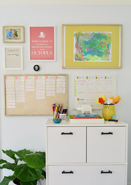
Don’t mind me, this is just my favorite picture ever.
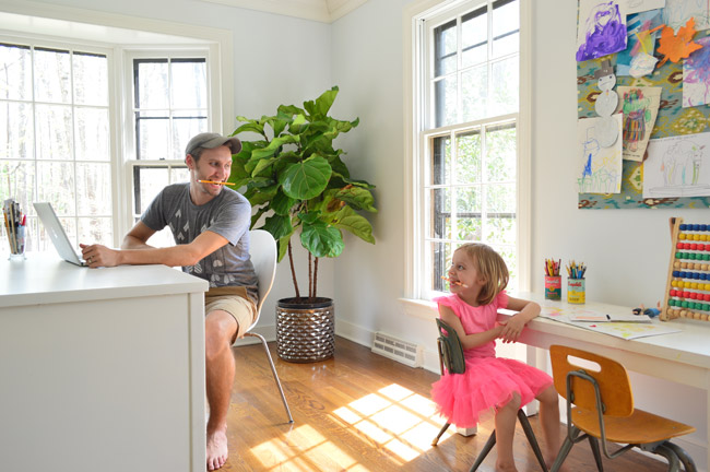
We have big plans to make a larger bulletin board above this kid-desk area, most likely from window to window, so that should be fun (the screens are open so the windows look crazy here – just pretend you don’t notice).
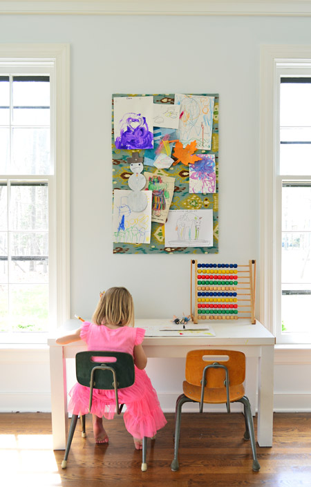
Feels good to have one more to-do list item checked off. You know, until a newborn comes along and the whole house goes to heck again…
Our Favorite Paint Colors
If you’re having trouble picking the right color to paint your room, check out these detailed deep-dive posts about our favorite paints:
- The 12 Best White Paint Colors
- Benjamin Moore Edgecomb Gray
- Benjamin Moore Simply White
- Sherwin-Williams Pure White
- Sherwin-Williams Extra White
Psst- Wanna know where we got something in our house? Just click on this button:


Angela R says
Hi guys! Love the office- so fresh and clean!
Also- I didn’t even notice the ad banner on top! There is one other DIY blog I read often and they have one right under their header. That one bothers me because for some reason it takes awhile to load and I will be half way through the post and it brings me back up to the top. But it doesn’t stop me from reading :). I like your new design although I kind of miss your adorable family and house pics in the header….
Lastly- best wishes with your new baby & delivery! My 2nd c-section was sooooo much easier and better than the first! (Probably because it’s not an emergency!). I will never forget what my 4.5 yr old said that day: first he told my friend on the way to visit me and baby that he couldn’t wait to see what color the baby’s skin was (funny bc my hubby, I & family are all white lol). Second- the first time he held the baby he looked down and said “mom- how could anybody NOT love him??” Melted my heart. They’ve been inseparable since. Love it!! Prayers for health, safety & joy!
YoungHouseLove says
Thanks so much Angela!
xo
s
Christy says
Love the office look and the new blog update, you guys are awesome!
Gillian says
I agree. Not a big fan of the top ad. I always view your blog on my phone and zoom in so I don’t see the side ads but you can’t escape that ugly as distracting you from your gorgeous header. But more importantly, wishing you all the best with your birth too. Praying it all goes well xx
Sarah says
Good luck to you guys this week! I’m looking forward to having your blog grow and evolve with the new baby! You must be relieved to know that things are scheduled and controlled as much as possible after your experience with Clara.
I’m not in love with the blog header ad but you guys gotta do what you gotta do. I think that the side bar ones didn’t bother me because they were more “designed” whereas the ad network ones are kind of ugly (I just got an Allstate Banner and a Sleepies ad). That said, the visibility is probably good for you guys. You have to make money and streamline things for your new family, no big deal.
Karen L. says
Love the new look and the header ad isn’t a biggie for me as I always love your posts! Y’all are the real deal which most definitely shows in all that you do and all that you choose to share with your blog fans. Have purchased the tickets for the showhouse and will be praying for you all on Wednesday. God bless! We have a boy and a girl, too, although they’re grown now with kids of their own. You’ll love how much fun they’ll have together as they grow up!
YoungHouseLove says
Thank so much Karen!
xo
s
Autumn Beach says
Love the new look. Love the office. Sending you a hug, and praying for a safe delivery. SO excited.
YoungHouseLove says
Thanks so much Autumn Beach!
xo
s
Autumn Beach says
:) :) :) You are so welcome, my friend. <3 <3 <3
jen says
hi! :) i was wondering if you could tell me what trees you have in your office? i think i might be needing something green in mine! thanks!
YoungHouseLove says
They’re fiddle leaf figs that we found at Home Depot. So far they just need water and sun so they haven’t been too hard to keep alive (it’s still early days though…)
xo
s
Kristen says
Looks wonderful! 2 things though- the beginning of your videos makes me jump EVERY. TIME. No matter what. I always forget how it goes! ALSO. John, you need goggles or safety glasses for ceilings!!!!!!!!!!!!!!!!! I totally got a glob of paint in my eye whilst painting my ceiling last summer. Granted, it was the last patch, and I’d been painting for days, so I wasn’t being careful & didn’t roll off well or wear my goggles and I was going really fast. I had to rinse my eye out with a hose for 10 minutes, lolz. I’m fine now! But I cringed when I saw your uncovered eyes. I think you should tell your readers “safety first” ;).
Blessings for babytime! My friend Sarah and I talk about your daily post every day, thanks for being a positive part of our work day!
YoungHouseLove says
Thanks Kristen!
-John
Darlene says
In response to a prior comment by Sherry, let me say that I am thrilled that I don’t have to like, follow, or comment, to enter your giveaways! Love everything that you both do and share! Happy Birthing!!!
YoungHouseLove says
Thanks Darlene!
xo
s
Julianne says
Don’t know how you both get so much done, but boy….it certainly looks great! Didn’t realize you were so close with delivering! Eeeeeek…so exciting!! :O)
Andrea says
Oh guys, you made a GOT-fangirling, traingle-loving girl very happy with today’s post and your blog update ;)
Since basically everybody on the first comment page mentioned it, I thought I’d chip in to tell you that I didn’t even notice the ad below the header BUT loved the clear space next to the content. Used to distract me a lot :)
Your office turned out great – I know it’s far from finished but I really like it so far!
All the best for you guys, enjoy the remaining 24 (?) hours! Can’t wait to meet the Barnacle :) Hope all goes well.
xo
Andrea
YoungHouseLove says
Thanks Andrea!
xo
s
.:Van:. says
my favourite part about this space is how much brighter it looks…
“in bocca al lupo” , sherry!
Julie @ A Life Exotic says
Love the color! Light, bright, and calming. I also think it makes a great background for some of the bright & springy pops of color you have going on with the artwork and other smaller items.
On a somewhat related note, I saw this Richmond print on pinterest the other day and it made me think of you guys:
http://www.evelynhenson.com/products/richmond-map-print
Maybe something you could even DIY your own version of! Good luck & best wishes for Wednesday :)
YoungHouseLove says
SO CUTE! I love that. Thanks for sharing the link Julie!
xo
s
danielle says
My 4yo daughter dresses in head-to-toe pink and declares she’s dressed like a flamingo. Is Clara in her flamingo outfit, too?
YoungHouseLove says
Haha, it must be! She picked this out herself and is SO into it. It’s pretty cute.
xo
s
Lynda says
Great post, I like the lighter look. Our staircase ceiling is 18 ft tall and it desperately needs painting and a new light fixture. Any Richmond-area references for this would be great. I don’t want my husband doing it, he already had surgery for one back injury.
YoungHouseLove says
Anyone have any local painter recommendations for Lynda? I wish we had someone to recommend. Maybe try Angie’s List?
xo
s
Kat says
Your office space is looking good! While perusing CL in Indy, I came across this desk. Would be great for the two of you! Thought I would share. Keep up the great work!
http://indianapolis.craigslist.org/fud/4422861631.html
YoungHouseLove says
So cool!
xo
s
Ashlee says
I’m sure this has been asked and answered, so I apologize in advance, but I can’t seem to find the info on Clara’s desk? Thank you so much for your time, Ashlee
YoungHouseLove says
Here’s that post for ya: https://www.younghouselove.com/2011/12/a-door-turned-desk-turned-tinier-desk/
xo
s
Vix says
Nice look.
Could we make the font one point size bigger? On iPad 2 the text is tiny. At first I thought it was my eyeballs but then I realized I had my new glasses on.
Blessings on the barnacle.
YoungHouseLove says
So sorry! We didn’t change the size at all but maybe it’s loading strangely? If you refresh a few times and it’s still an issue, there’s a command you can do to make the font bigger: try pressing the Control key and the ‘+’ key together if you have a PC. On a Mac I think it’s the Command key and the ‘+’ key together that make the type bigger on your screen.
xo
s
Angela says
I love that paint color. It’s so fresh and bright. The room looks fabulous and is at a perfect resting spot while you enjoy your babymoon. Praying for healthy baby and mama this week.
Amy K. says
Hi J&S,
Where did Clara’s desk come from? I love it, and have been looking for something similar for my son’s room.
PS: Anyone who doesn’t like the ads can just install AdBlocker on their browser like the rest of us and be done with it! The new site redo looks great. :)
YoungHouseLove says
Thanks Amy! Here’s the post about that desk for ya: https://www.younghouselove.com/2011/12/a-door-turned-desk-turned-tinier-desk/
xo
s
Amy says
Ok you two… time is running out… name poll!! Give us options. Have us guess. This would be fun, no??
YoungHouseLove says
That would have been fun! But I’m afraid time is officially out. We have today’s post written and ready to go up, and then we’re spending a special day with Clara and closing our laptops until after this little man comes along :)
xo
s
Marissa says
I really like the blog updates, and if the top banner ad makes it easier for you to provide me with free entertainment five days a week, then I’m all for it!
Now a reminder: when you first started using Pinterest, you pinned a very sweet black and white photo of a pregnant mother sitting next to her young daughter. The mother’s belly was exposed, and she had her hands on her belly. Her daughter was imitating the same pose on her own little belly. Does that ring a bell? Anyway, you commented on the photo that you wanted to take that same photo someday with Clara. Since this is your last day to do that, I thought I’d remind you of it. It was such a sweet pose that it really stuck with me.
ALL THE BEST for tomorrow!! I’ll be thinking about you and your family!
YoungHouseLove says
Oh my gosh, I forgot about that! Better go back and look at that pregnancy file to see what else I’m forgetting!
xo
s
Marissa says
Ok. Just went into Pinterest and found it!
http://www.pinterest.com/pin/227994799859097303/
heyruthie says
The site redo looks great, but WAIT! John’s personally crafted “YHL” logo is missing. Say it’s not a thing of the past! I’ve been with you since you were TYH, and loved the evolution into YHL, including John’s own carefully-designed branding effort. Please bring it back into the header, somehow! It’s special, and plenty “good enough.” Don’t let advertising execs tell you it’s sub-par. It’s a home-grown part of YHL, and we all love it!
YoungHouseLove says
You’re so sweet Heyruthie! We just wanted to play around with something new (we’ve had the old look for a few years, and every few years we get antsy) but we can always bring back those hearts in some way if we miss them :)
xo
s
Christina P (NS) says
The office is coming along nicely, love the photo of John & Clara – so sweet.
Just to weigh in; the banner ad doesn’t really bother me but I am not a huge fan of the ‘new look’ the plain white seems stark and the triangle heart seems a little boring. I loved the personality in the old header.
Good Luck on your delivery, we can’t wait to meet the little guy!
AnnF says
You’re doing amazing work with this home, just like the previous ones. I hope the Barnacle loves it as much as his beautiful big sister. Good luck with the birth–may it be a ho-hum average birthing process, with a truly joyful outcome :) All the best to the current, and future expanded, family!!
Barbara says
Should you EVER decide to move again, that house is going to be worth double, for the work you’ve put into it alone. It’s a completely different house already!
My Crappy House says
It looks very fresh and airy. Very nice. I would imagine the trim looks cream because your floors are brown and that color is reflecting.
Sheryn says
Just wanted you to know I’m thinking about you guys a lot this week and sending lots of love as you welcome the newest member of your family! :’)
Katie says
Love you guys! Hate the ad at the top of your blog. It is distracting, but it also says “hey, our blog is out to make MONEY!!!” Anyone who has read Young House Love for any period of time knows that is not your deal (we appreciate the ethical lines you draw). I think that in light of that, you don’t want to undermine that with a top of the page ad. It just isn’t classy.
Nuff said. Go have a beautiful baby boy, and keep doing a great job with your blog. I LOVE LOVE LOVE your content.
Debbie C says
I love the bigger photos! Also, the paint color looks great! Lesson learned this weekend…always buy the test pots of paint before committing to the whole bucket. We just repainted our bathroom to coordinate with the new tiles in the shower, and while we made sure the color would coordinate, we forgot to consider how it would make us feel. The color is a blue gray called Autumn Fog, which makes me feel a little sad (should’ve picked up clue from the name!). I’m tempted to repaint and bring back some happiness…
bella says
I just wanted to give you and your readers another tip for painting, especially large spaces. The pros use a 5 gallon bucket and a paint grid which fits in the bucket and is used to scrape paint off the roller. Link is safe, from This Old House http://www.thisoldhouse.com/toh/skill-builder/0,,20159830,00.html
You can get a paint grid and 5 gallon bucket for less than $8 at Home Depot.
=)
bella says
Hey! What happened to my link? sorry. copy and paste it all to see it. =)
YoungHouseLove says
Great tip Bella!
xo
s
Emily says
This room is looking so awesome! I really like the paint colors you chose. And I am LOVING the blog update! Somehow it makes it a bit easier to read. Praying for an easy and smooth as possible baby delivery tomorrow! Can’t wait to virtually meet your new little one :)
erin says
Sooooo thankful you posted these – timely for me, as hubs and I just loaded up on a million gallons (yes, a million) to repaint every room in our entire house… beeeecause there was a 40% off sale at Sherwin Williams. Are we crazy maybe? Oh well! He thought I was insane for not wanting to load up on the blue tape for trim… ain’t nobody got time for that! I just showed him your cutting-in video, argument averted. YHL, saving marriages one DIY video at a time! Haha! Thanks! ;)
Julie says
Yay, you finally got a favicon!
YoungHouseLove says
Woot! Only took 6.5 years to figure that out!
xo
s
Holly says
Love the new site changes (especially the wider content area)!
Question: Where did you buy Clara’s desk? I don’t remember where you might have mentioned that, but it would be perfect for a project I’m working on!
“Happy Happy” to you and your new baby!
Holly says
Never mind…just found the post where you talk about altering it/making it (of course you did!). Back to the drawing board for me! ;)
Kirsten says
Y’all are such a bright spot in my day. I just wanted to wish you perfectly smooth sailing tomorrow. Great big blessings to you and your sweet family! Can’t wait to meet Mr. Barnacle, a very lucky baby, indeed.
Kati says
Don’t feel like you have to approve this comment on this day of ALL DAYS!!! EEP!!! BUT I wanted to share this link with you: It’s a before and after of exteriors, and #34 resembles your house! Now i’ve never thought yours was “bland or boring” but it is interesting to see the before and after… makes me want to root for you adding a balcony to the master bedroom! :-D :-D :-D Anywho, here it is. Maybe make for good reading while you’re in the waiting room: :-) http://www.bhg.com/home-improvement/exteriors/curb-appeal/before-and-after-home-exteriors/#page=34
YoungHouseLove says
Really cool! Such a fun link!
xo
s
Sherry's Immature Brother says
How did you not laugh (or did you) when posting on the internet that “John likes to use a rod extender”?
YoungHouseLove says
Oh Dan, you are pun king (like dad) meets Michael Scott (that’s what she said).
xo
s
Bobbi says
I love that your brother posted here!! And congrats to your expanding family! Welcome to Barnacle the baby brother! We are so lucky to get to follow your family with the little bit that you share! Thank you for sharing your ideas and experience. I love seeing painting from lots of perspectives and to tell you my secret, I actually found your blog years ago when I searched “how to paint a room”! I’ve read every post on your blog and think I’ve learned something every…single…time; How to paint a wall, Sherry’s secret crush on Eminem, John does comedy??!! Love it all!! Keep it coming Petersiks! I’ll be here to read it!
Summer says
Love the light blue – it’s the color I have been trying to find for our kitchen!
Melissa says
Hi, im attempting painting this week for the first time. I was offered advice that you should cut in and roll in small sections before the cutting in dries but i noticed you cut in the whole room first. What is your advice? I also noticed you dont use an undercoat which i was also told to use from going cream/beige to an almost white / grey. Since the paintchips are based on a white background. Have you ever needed undercoat? Thanks and congrats on Teddy :)
YoungHouseLove says
We usually just use primer when going from a super dark color to a super light one (or vice versa). Otherwise two coats of paint seem to do the trick. You definitely can cut in small areas and then roll to stay closer with those, but we have found just alternating can work too (just cut in first, roll, cut in again, and roll).
xo
s
Laurel Loves says
Love the look of your place, looks amazing!
And congratulations on your new addition to the family, best wishes to you.
http://www.laurelloves.com
Seaweed & Raine says
It totally does not look like the same room. BUT, it does look amazing. Love the freshness of it!
Sheree
indoorplants says
Wow that second picture is an amazing room. I love how the carpet just sits perfectly and the drapes on the windows look.
Norma Jean Barrett says
I am wondering where the two desks on the side walls came from (i.e. the child’s desk and the one on the other side of the room with the white chair).
Thanks! Love following along with your projects. Congrats on the newbie.
YoungHouseLove says
Thanks Norma Jean! The kid desk is something we made (here’s that tutorial) and the other one with the white chair is from West Elm a while back (their parsons desk, I think they still sell it).
xo
s
Anna says
Hey john and sherry! I was wondering if you typically do two coats when you paint ceilings (with white) & do you notice a big difference coverage wise with Benjamin Moore in comparison to the valspar paints?
YoungHouseLove says
Yes, we usually do two coats just to make sure we didn’t miss a spot. BM covergae is a lot thicker than Valspar, so if you have the money it’s worth it. But if you don’t 2-3 coats of Valspar should do the trick (might be more drippy since it’s thinner so definitely use good floor-coverings). Good luck!
xo
s
megan says
ok I’m sure it’s in here but I missed it!! What color did you use? need it for the study room!
YoungHouseLove says
It’s Palest Pistachio by Ben Moore.
xo
s