At first I had typed the original “I like to move it, move it” lyrics but then I realized that I don’t really enjoy the moving process at all, so it was sort of an unpleasant deja vu moment when we started unloading furniture into the Homearama showhouse on Monday. But my glass half-full version of the situation is: we’re finally getting to the furnish the showhouse! Note: for anyone wondering what the heck this showhouse is, and how it benefits Habitat for Humanity, click here and here for more info.

With almost everything done construction-wise in the house, we greeted a truck from Green Front Furniture (the local place loaning pieces to many of the houses in the show). They were delivering a bunch of bigger items like beds, desks, and sofas, so we had an “all hands on deck” day to carry things in and place them. Here I am with Charlie the listing agent hoisting the king-sized mattress out for the main bedroom.
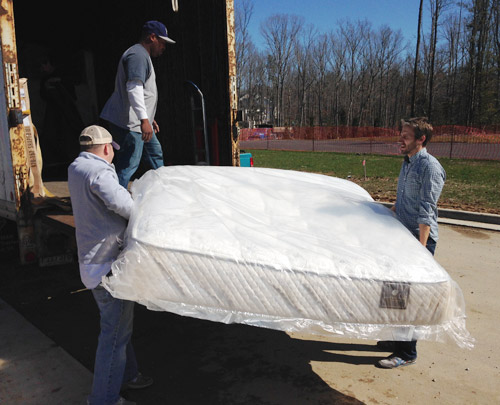
Not everything is coming from Green Front, so more stuff has been trickling in as the week went on. And Sherry and I have spent a few hours every day going to thrift & secondhand places, small local shops, and big box stores to buy all that makes-a-house-a-home stuff to fill blank walls, empty shelves, and other empty feeling nooks and crannies.
There has also been some great progress outside. The wood beams have been stained and sealed, which made their color a bit richer/darker as planned. It still looks somewhat naked without any landscaping, so we can’t wait to see that stuff go in (should be rolling out sod this weekend) but the front door has officially been painted.
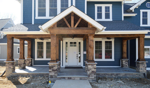
After the rest of the Homearama team weighed in on the door color debate, the write-in vote for white from you guys stuck (we all liked the idea of making the door look more substantial, so keeping it the same color as the white sidelights gave it more visual heft). The real stars of this exterior are the deep siding color and the rustic wood porch anyway, so we were all happy to let the door take a supporting role rather than competing for attention. Especially since we’ll be adding things like landscaping/potted plants/porch furniture to the mix. We even have a hanging porch swing that’s going up soon.
Moving inside, the kitchen is looking much improved now that it’s all put together. The appliances are officially in, the backsplash has been tiled, and we even got our island stools put together, which are these comfy saddle stools donated by West Elm. (For anyone wondering about the island color, it’s Hale Navy, the gray cabinets are just a stock color by the cabinet maker that we picked from a sample, and the gold pendants over the island are from Shades of Light).
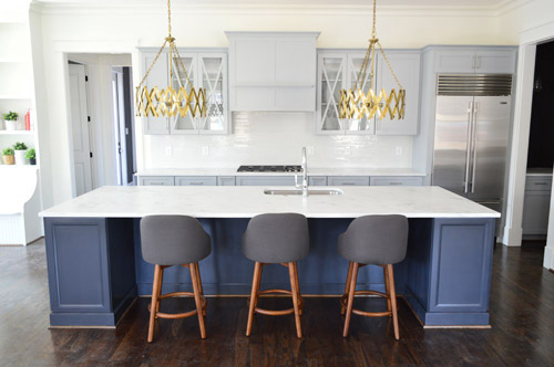
And look, you can see a sliver of styling stuff sitting in the built-ins of the eat-in nook to the left of that picture. Sherry’s probably working on those as you read this.
I don’t think we’ve showed that little corner of cabinetry on the right of the kitchen until now, so there it is. It’s a nice big open space (the island is 11 feet long if that helps put things into perspective) and Sherry can’t wait to get stuff on those counters and in those glass-fronted cabinets to make it feel more homey. Just seeing the stools pulled up to the island made it feel more “like a real kitchen” for us, though.
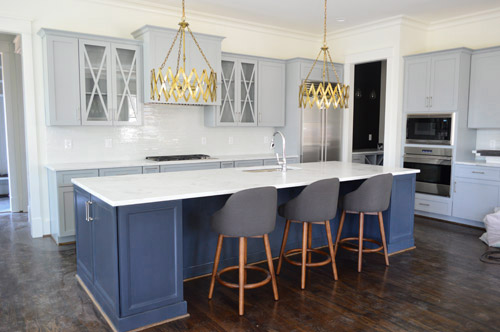
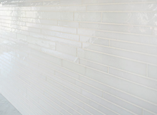
We wanted the backsplash to be fairly subtle, mainly just bringing a little polish and light-reflection to the room. So we chose this white blend waterfall glass tile from a local company called Mosaic. This is another case of “this didn’t need to be the star” since we have things like the gold light fixtures, that big navy island, and those x-fronted glass cabinets – so we just aimed to make it a solid supporting player.
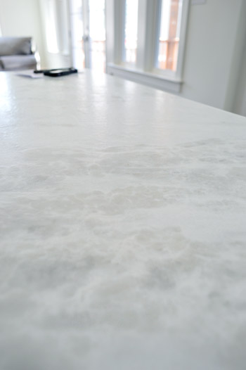
I tried to get a better shot of the counters, but didn’t totally succeed. It’s a leathered marble called White Moura which means that rather than having a smooth, glossy finish it has a slightly pebbled texture to it, along with a more matte finish. It actually feels kind of like leather (hence the name) but obviously is a lot harder/denser. And apparently the way they seal these, along with that added texture, makes them durable and easier to keep clean/maintain.
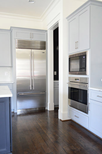
Let’s talk about the fridge. I’m mad jealous of this fridge. Well, actually, I’m mad jealous of Yolanda Foster’s fridge (I do my best to ignore the housewives entirely, but Sherry paused it to show me that fridge and it did something to me). But I’d still feel like a king if a fridge like this ended up in our house someday. We picked all of the appliances at a local contractor place called Cline. We had started by choosing a nice Whirlpool line, but the builder wanted to go big or go home, so he upped the ante and had us select a Sub-Zero and Wolf package.
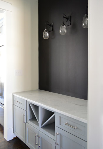
The area through that doorway above is the butler’s pantry which has the same cabinetry and counters as the kitchen. We put in the traditional wine / servingware storage in the bottom, but ditched the usual upper cabinetry in place of some cool industrial teardrop sconces from Shades of Light and a wall full of chalkboard paint. It’s a pretty small transition space so we thought it would be nice to let the upper walls breathe a little – and we have some plans for that chalkboard area soon…
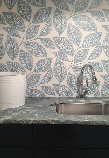
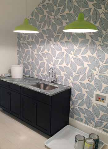
Moving upstairs, the wallpaper we’ve been way too excited about has finally been hung in the laundry room. It’s called Pebble Leaf by MissPrint and was donated by Wallpaper Direct. We waffled a little bit on adding it, but in the end we said “showhouse! take risks! stop waffling!” and went for it. So glad we did.
The counters are soapstone (purchased through a local place called Eternal Stoneworks), the faucet is called Leland (donated by Delta), and the cabinets are a dark wood stain (purchased from Affinity here in Richmond) while the floors are a nice, light and modern tile (called Travertino White Field Sunrock, purchased from Mosaic in Richmond). The lights are from our Shades of Light collection (they’re these in “Extra Lime”), and we bought two of them to hang in a row for fun. We’re still waiting on the washer and dryer (we ordered them in a deep gunmetal color) so that should complete that wall and balance things out.
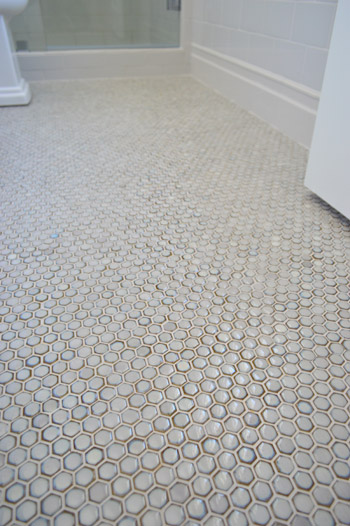
We haven’t shown you the guest bathroom yet, since it’s still missing a few major things like finished tile work and a mirror over the vanity. We wanted sort of a vintage vibe in there so we did a tile wainscot around the whole room, which we can’t wait to show you when it’s finished. In the meantime, here’s a peek at the floor, which was donated by The Tile Shop. It’s the hex version of the penny tile that we put in our last kitchen.
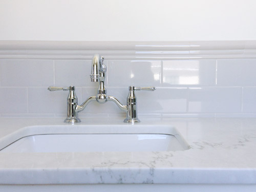
We also had fun with some vintage inspired fixtures, like this this bridge faucet that was donated by Brizo.
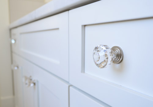
Even little details like having the hardware on the cabinets is making it feel that much closer to complete (these were donated by Liberty).
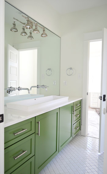
As much as we love the old-school/classic feel of the guest bath, our favorite bathroom in the entire house is the kids bathroom. You had seen a preview of the green vanity and the white lantern tile a few weeks back, but the wall-to-wall mirror finally got installed, along with our wall-mounted faucets, and that fun industrial light fixture (donated from Shades of Light).
The white solid surface top has a double trough sink recessed into it, which the folks at Ferguson helped us find. It’s hard to see how deep it is since it’s half recessed (it doesn’t just sit on the counter, it drops beneath it) but it has over 5″ of depth, 14″ of width, and is nearly 48″ long. Can I just tell you how crazy Clara would go for this set-up? It’d be like the grandest swimming pool ever for her Barbies. We also had fun adding a pair of wall-mount faucets (donated by Delta) that come directly from the mirror.
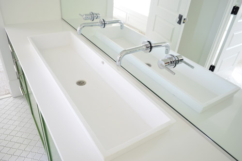
Don’t mind me. Just another shot of the vanity since the lighting was about as perfect as I’m ever gonna get in there.
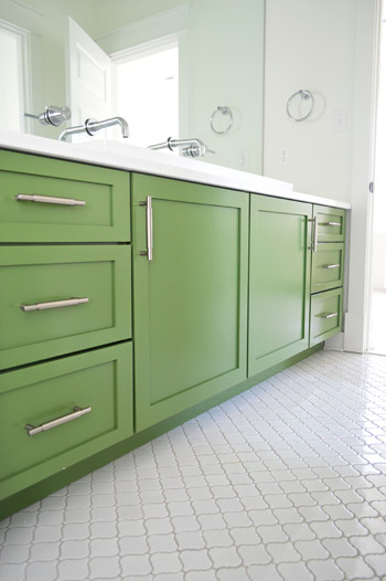
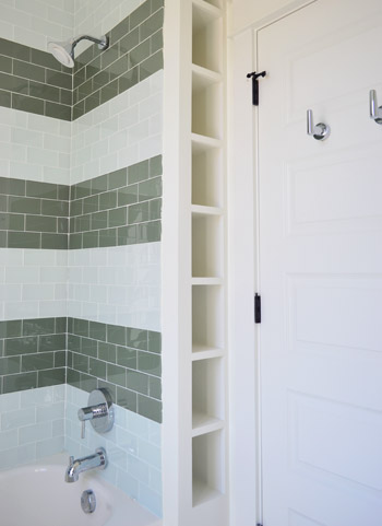
Another fun feature in that bathroom is the attached toilet/shower area, which is sectioned off by a door (so one kid can shower or use the toilet while the other one washes up/gets ready). Inspired by the cubbies in this bathroom, we had the builder squeeze in a set of wall shelves behind the shower that are perfectly sized for rolled up towels, shampoo, and other small bathroom accessories (you can read more about the striped glass tiles we chose for the shower here).
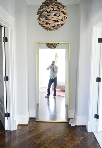
Other little nooks that are starting to come together include the Main Bedroom “Atrium” between the bathroom and closet. We got this brass floor mirror from West Elm so the future owners can look at themselves taking photos (I kid), and of course you guys have seen a peek of that branch chandelier here. Ah to have 10′ ceilings on the first floor and 9′ ceilings on the second floor. Update: these walls are Stonington Gray by Ben Moore.
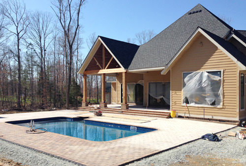
And we can’t forget that there are six other awesome houses going up right around us for the show – each done by a different team. So the other day we took a super quick field trip (the clock was ticking for preschool pick-up) to see some of the other exteriors. How amazing is this backyard? Pools aren’t super common in Richmond so it’s a nice treat to see one going in. We wouldn’t blame you guys if you just hung out back here during most of the show…
Things are going to be really showhouse heavy in real life for us over the next couple of weeks, so forgive us in advance if we’re behind or off schedule. We don’t want to let down our team or Habitat, so we’re hustling to get this baby done… well… before our other baby is done. We’re supposed to have as much finished as possible by April 4th (yes, a week from today) so it can be photographed by the Homearama organizers and then judged shortly thereafter (we’ll continue tweaking things and tying up loose ends for the following week or two). So we’re basically living out there these days. Good thing there are mattresses now.
Psst – Wanna see more showhouse info & photos? Click here for Our Full Showhouse Tour, which includes final pictures of every room, the floor plan, budget info, a video walk-through, and shoppable showhouse furniture & accessories.

Beks says
That house is turning out beautiful (like there was any doubt!). I’m moving soon, and it’s DEFINITELY giving me ideas of how I want to redecorate (moving into a manufactured house with SERIOUSLY 90’s features. Eep!).
Lindsey P says
I’m glad you mentioned the other showhouse homes in this post! I was wondering how you were handling seeing other ones in the neighborhood–did you question any of your decisions when you saw them? I know I would have a hard time not comparing my work to someone else’s. Are you excited to see what other people have done?
YoungHouseLove says
Everyone’s houses are so different, it has been awesome to see! We haven’t been inside all of them (we can’t wait until the show so we can soak up every detail and take photos for you guys), but so many have amaaaaazing showstopping details. It’s nice that they’re so different in style/range since it keeps the show interesting, and I think it helps us feel like “yeah, our house looks like us – and these look like them.” It’s cool to have so many points of view in one cul-de-sac :)
xo
s
Ashley says
I don’t mind the light fixtures in the kitchen, but I think their height is distracting because of the x-front glass cabinets right behind them. Have you considered raising the lights? I love the lights in the butler’s pantry!
YoungHouseLove says
Thanks Ashley! The electrician just hung them at a standard height above the island (he has a bunch of standards, like over an island, over a sink, over a dining table, etc), but we can tweak everything as the rooms come together, so if we think anything’s too low or too high after rooms come together, there’s a walk-through with him to adjust things at the end :)
xo
s
Megan says
Soooooo many aspects to gush over… and now the fun styling part? What a DREAM!!! You guys are doing a fantastic job. Weird thing I noticed though, isn’t the quarter round typically the same finish? For some reason it pops out to me as not blending against some of the trim and kitchen island.
YoungHouseLove says
It’s a regional (Richmond?) thing I think. In all of our past houses the quarter round has been stained to match the hardwoods. It gets installed and stained at the same time as the flooring and matches that which apparently cuts down on scuffs and visible dust like painted quarter-round tends to collect, but sometimes it bugs people so I’ve seen them paint it if it’s not their preference.
xo
s
Sarah C says
I was JUST about to ask the same question but before I did, I did a ‘Ctrl F’ search for ‘quarter’ before I pressed submit and found Megan’s question! :D
Interesting. I know I have seen it both ways and I was wondering if it was a new trend. But I guess I just live in an area (Atlanta) that paints! However, you reasons NOT to paint make sense – the quarter round is DEF the most scuffed part of my trim. Hmmm…
Lea says
I’ve only ever seen quarter round painted/stained to match the trim rather than the floors (in MN) and love that it makes the trim seem that much more substanstial. I think it would drive me nuts to have it match the floors – especially where there are doorways that can’t be trimmed out.
Stacy says
How exactly does the furniture/non-fixed stuff work once the house is sold? I know you’re getting loaned pieces for staging some things, but you’ve also mentioned having a budget for furnishings and then having some stores (like West Elm) donate pieces, too. So will the donated things stay with the house, while the loaned stuff will go back to the store? Basically, when someone buys the house, how much of the furniture/accessories will they get with it?
YoungHouseLove says
Many of the items that are being donated are either being returned (like some of the art and some of the larger furnishings) or they’re being donated to Habitat after the event. But some of the other furnishings that were loaned out from various places, like GreenFront, are available for purchase by the future owners if they’d like to keep them in the house. Some other donated things will be sold with the house and worked right into the purchase price, instead of as an add-on (like light fixtures, tile, faucets, and other “attached” stuff).
xo
s
Caroline says
Hey guys, I am loving the cabinets in the kitchen!! I reread through but didn’t see who makes them. Can you help me out? Good luck with everything!
YoungHouseLove says
Those are by a local company called Affinity. Love their stuff.
xo
s
Betsy says
I am sure that you have already mentioned it and I just missed it, but what are the floors that are in the house? I LOVE them. Great job, the house is looking fabulous!!
YoungHouseLove says
They’re solid oak hardwoods that were stained/sealed on site in Jacobean (that’s the stain color).
xo
s
Sayward says
You guys are doing such an amazing job. (West Elm’s full length mirrors are worth every penny). Being excited about this project has been one of the things that got me through this year’s never ending North East winter. I’m literally clutching my tickets in my hand right now. Road Trip!!!!
YoungHouseLove says
Woooot! Love a good road trip.
xo
s
Ingrid says
What a beautiful house – you’ve done a wonderful job! I’m just wondering about those gold kitchen light fixtures – how do you decide how high to hang those so they aren’t in everyone’s way as they’re visiting around the island? Thanks!
YoungHouseLove says
The electrician just hung them at a standard height above the island (he has a bunch of standards, like over an island, over a sink, over a dining table, etc), but we can tweak everything as the rooms come together, so if we think they’re too low or too high after rooms come together, we are doing a walk-through with him to adjust things at the end :)
xo
s
Misty says
This just blows me away. You guys blow me away. It’s beautiful! You have such fabulous taste!
kelley says
I love everything- especially the kids bathroom! Where can you find a vanity like that?
YoungHouseLove says
Thanks Kelley! That was from a place called Affinity (just one of their stock clean-lined options) and we added the hardware from Liberty (and the fun paint color) just to wake it up a little.
xo
s
Lizzy says
I love that green vanity so much I want to marry it.
Julie says
Love! I’m sure this is completely insane, but I wish that the cubbies in the kids’ bathroom could be lined up with the stripes in the tile. And if THAT is the only thing I would even think about changing, then your designs are a HUGE success. Amazing! Could I move in, please . . . ?
YoungHouseLove says
Haha, thanks Julie! That would have been cool!
xo
s
Alex says
I LOVE the doorway orientation on the kids’ bathroom vanity! Genius! I never would have thought of that, but it’s perfect for the jack & jill doorways. Awesome, awesome, awesome.
YoungHouseLove says
That’s all the builder & the architect. They’re amazing.
xo
s
Jen says
My husband works for subzero/wolf. He’s going to be excited that you put it in the kitchen. He likes to watch tv and point out every time we see one (especially if its a project he’s worked on). Its gotten so bad that I can now identify a subzero or wolf in a second. Sad times when my life involves indentifying both the brand and the “series” of appliance.
YoungHouseLove says
That’s hilarious. Sounds like John. The man is now a fridge snob. Haha!
xo
s
Allison says
I had to comment because my family does the same thing! We own an appliance store (and love selling Wolf & Sub-Zero!), and we are always racing to yell out the model numbers of the appliances we see on TV =)
Angie says
Will you two be at Homearama any of the days for a book signing? :)
YoungHouseLove says
We don’t have any plans for something formal like a signing, but we’re hoping to stop through sometime during the last weekend since I’ll be the most likely to be up and about after a c-section by then. So excited to see how the show turns out!
xo
s
Maggie Overby Studios says
That look like so much fun, and a lot of hard work. I am loving the look of those green cabinets in the bathroom. Great pop of color with the grey striped tiles. Wish I were closer so I could see it all in person!
Emily says
I love the sink in the green bathroom, but it stresses me out to think about cleaning up after kids in there… cleaning the mirror around those faucets and wiping up the toothpste that wont get to the drain out of the sink… I want it in MY bathroom though!
Jessica says
Love. You. Two. You do amazing things. I love seeing how this pushes you out of your comfort zone. You should always live outside of your comfort zone! Apparently amazing things happen there! I always loved your style, but seeing you design this has made me feel like you guys have been holding back on us! Amazing!!!
YoungHouseLove says
Aw thanks Jessica! I think the true lesson is that with helpers and more of a budget (or amazingly kind donors) you can do amazing things – sort of like design shows. Everything comes together so fast and you can find awesome materials and vendors and the sky really feels like the limit. At home when it’s just you guys and your own savings account… well, you inch along :)
xo
s
Sarah W. says
Weird question that came to mind immediately–are you going to put food in the fridge? I’m just imagining people opening it and being disappointed that it’s empty…but that is also maybe not a great reason to buy a fridge-worth of food.
Just curious!
YoungHouseLove says
I think we should do something funny, like fill it with soda for John’s love of Dr Pepper and Coke. Or put weird things in it, like a vase and a cordless phone. I might just be in a weird mood though…
xo
s
Alex says
At least open the fridge for us when you do the final video tour! I need some more “Cribs” in my life!
I think the pantry will be tricky! I’d think people would get a better sense of the size and how much they could store there if there were things in it, but of course outfitting with all the cool pantry/tupperware storage systems could get crazy! Do they make play food boxes that are full size or will Clara have to lend you her bologna and eggs?? ;)
YoungHouseLove says
Someone came up with an awesome pantry idea in the last post that we want to do, which is to encourage folks to bring one canned item to leave there for charity. Wouldn’t it be cool to see the pantry filling up for a good cause?
xo
s
Steph Nelson says
That fill the pantry thing is a VERY good idea. It would be nice if the promoters would make it across the board/all the houses. I know most food pantries struggle this time of year with donations. It would be awesome to see an empty pantry day one and a full one on the last day. BRAVO to whoever gave you that idea!
Tiffany says
I loved the idea someone brought up earlier of using items to stage the house that could be donated to a food bank later!
Jennifer says
I usually don’t commment but I have to say I think this house is my dream home! I LOVE LOVE LOVE everything about it. Especially all the light fixtures and all the custom built in details. I can’t wait to see it. The only thing I’m sad about is not seeing the mustard door in person! I loved the mock-up!
YoungHouseLove says
Aw thanks Jennifer!
xo
s
Tamara @ Provident Home Design says
LOVE, LOVE, LOVE it ALL! Such an awesome job guys!!! And I see Courtyard Green in our kids bathroom’s future! Thanks for all the eye candy and inspiration :-)
Alisha H. says
I LOVE the trough sink on the kids’ bathroom! I immediately thought that would make a great place to bathe an infant. No more breaking your back leaning over the side of the tub. :)
YoungHouseLove says
That’s hilarious because I thought “this would be awesome for Burger baths.” Babies + Burger = kind of the same size. Ha!
xo
s
Randi says
All I can say is WOW. My favorite elements are the green vanity and the kitchen backsplash. Just so perfect.
I would live in that kids bathroom if I could – I would just sleep in the bathtub and stare at the vanity all day long.
You both are so talented! And to be able to have this opportunity while benefitting such a great cause… it doesn’t get any better than that!
YoungHouseLove says
Thank you so much Randi! You’re so sweet.
xo
s
Carla says
Does this mean you guys will be branching out into home design? I would kill to live in a house you designed from the ground up! It’ll be a few years until I’m ready to build something, but keep it in mind ;)
YoungHouseLove says
You’re so sweet Carla! The builder has asked us if we’d like to work with him on future projects, and I think we’re open to it as a side gig eventually, but we’re going to have our hands full with a newborn for a while, so we’re going to take a nice breather after this show from the new-home/building arena :)
xo
s
Lindsay J says
Thank you so much for sharing. I look forward to these updates. They are so inspiring. You really stepped outside your comfort zone and I am LOVING it! I would not have normally picked those chandeliers for the island, but I am LOVING them. (Trying to find how to get them on sale!)
Thank you for sharing where everything comes from and what exactly it is. I love it all so much! Great work. I can’t wait to see more!!
Emily Fridenmaker says
I am over the moon in love with that atrium area! That branched chandelier is gorgeous, and it would be amazing to have that huge mirror. Everything looks great, guys!
Keeley says
It looks fantastic! I love the high-end appliances in the kitchen (and they’re what I’d expect from a custom home in that price range) and I love, love, love the light fixture in the kid’s bathroom. I need to find one like it for our home.
Melissa says
Sorry if you already mentioned, but where did you get the pulls for the cabinets? We’re in the middle of a kitchen remodel and I love the one’s you chose. Thanks
YoungHouseLove says
Those are from Liberty Hardware.
xo
s
Laura says
The teardrop sconces, the hex penny tile (ever since you used those in your last house, I’ve been dying to use them somewhere for myself!), and the trough sink. Dying to see everything finished. I don’t mind if you skip a few posts just to give yourselves time to knock this thing out! So excited to see the final product! Great job guys.
YoungHouseLove says
Thanks Laura! We’re going to do our best to keep on track with schedule/projects, but it might get a little wonky in there if things get tight. Will keep you guys posted!
xo
s
Heather says
There are some nice features in here for sure. I loved that faucet and though “might be nice for one of our bathrooms” and then I promptly pulled a Lucille Ball when I saw the price.
http://25.media.tumblr.com/tumblr_m5n9rqEtY91qbaj4uo1_500.gif
YoungHouseLove says
Oh yeah! Thank goodness for builder discounts and donations!
xo
s
Sarah @ Sarah's Daybook says
Oh, and why no forum foursome today? Just curious!
Sarah
http://www.sarahsdaybook.wordpress.com
YoungHouseLove says
Sorry Sarah! Just didn’t have time to pull one together for you guys this week. We’ve been sort of hit or miss with them lately (maybe every other week is our average?), but we’d love to get back on the wagon. Maybe after the baby comes!
xo
s
RLR says
Forgive me if someone has already asked this – but it looks like the kids’ bathroom cabinets are hinged between the doors and would swing together rather than apart if both doors are opened. Is this to allow each kids to have their own “door and drawers” section without having to share? Are those actually two separate cabinets instead of one large one with two doors?
YoungHouseLove says
We deferred to the experts/vendors in a lot of function-related choices like this, and the cabinet makers said for shared kids’ bathrooms with two faucets, it’s nice to have the doors open towards each side (with a dividing wall between them, so they’re two different cabinets). Just to sort of make an invisible line between each zone for the kids.
xo
s
kelly g says
The teardrop sconces and the gold kitchen pendants are absolutely incredible!! Everything else is too though ;)
Question… what do you do with all of the donated accessories? Like I understand that most of the furniture will be on loan, but things like the donated barstools… do they get sold with the house? And the accessories you guys are picking up from thrift stores, target, etc… do those get sold with the house too??
YoungHouseLove says
Many of the items that are being donated are either being returned (like some of the art and some of the larger furnishings) or they’re being donated to Habitat after the event. But some of the other furnishings that were loaned out from various places, like GreenFront, are available for purchase by the future owners if they’d like to keep them in the house. Some other donated things will be sold with the house and worked right into the purchase price, instead of as an add-on (like light fixtures, tile, faucets, and other “attached” stuff).
xo
s
Katie Fitz-Gerald says
Good Morning!
Do you know how your builder installed the shelves behind the door in the bathroom? We just built our dream home in Denver, and all three bathrooms have built-in shelves behind the doors, but I hate them! The shelves are just pieces of wood resting on ledges. In your photo, it doesn’t look like they are resting on anything. I really want that look!
Thanks,
Katie
YoungHouseLove says
The carpenter’s name is John Longo and he’s the man. He was able to make them all appear to float by making them wider so they all rested on ledges on each side and then framing the front part in to make it flush to the wall (essentially hiding those ledges from view). Hope that description makes sense!
xo
s
Sara says
I need to just delete my whole “dream home” pinterest board and replace it with this post. You guys did SUCH a great job!!
YoungHouseLove says
Thanks so much Sara!
xo
s
Jen says
I really like the kitchen back splash. I think it’s a nice alternative to the white subway tile that I’ve been seeing every where (including the bathroom in this model home!)
Melissa says
Love the wallpaper! That link isn’t bringing it up on wallpapers direct. I can’t find it. Is it only a British website or do they have an American version to order paper through?
YoungHouseLove says
So sorry, I updated that link to the American version of their site, but we noticed last night that the paper wasn’t on there anymore. Maybe it’s out of stock and will be back? We tried to include the name and maker in the post so you could attempt to hunt it down somewhere else if they don’t restock it.
xo
s
Abby Kinch says
Wow. There are really not many other words. The colors and textures and finishes you all have chosen are really stunning. Looks gorgeous and cozy at the same time. Amazing job!
YoungHouseLove says
Thanks so much Abby!
xo
s
hez says
The house looks good, but I believe it works have looked even better if you two had decided to consult a designer with some of your choices. Now I realize that you two like to consider yourselves amateur DIYers, perhaps expanding your education will help your sensibilities reach a more mature level.
By no means am I trying to imply that you’re both one trick ponies, but you’re on your 3rd house and there has been no advancement in your esthetic.
Heather says
I’m so impressed that John or Sherry managed to approve this comment and gracefully refuse to reply.
I think the reason people read and like this blog is that it’s an attainable real-life design, not magazine-house design. Certainly they’ve made course changes along the way and learned from “mistakes” they’ve made, and certainly plenty of their readers have said they’d make different choices in their own homes. For one, less mature folks would probably not worry so much about function over form; cabinets that hold the dishes and however something comes from the thrift store or IKEA is really all that’s important to most people. John and Sherry have always been a lot more stylish than that!
I imagine if they’re getting multiple book deals, featured in magazines, asked to design showhouses and at least two home product lines, that it means they have the aesthetic and “mature” style to be teaching those classes you seem to think they need.
For that matter, I think they could also teach a seminar on how to be super-classy and not rude. Perhaps you should sign up.
alia says
Heather’s response is spot on, so I’m mostly just going to say Yeah to that. With some classy swearing because I swear really classily. …Which is now a word…
But I wanted to add, John and Sherry’s aesthetic? So not mine. I mean, I appreciate it. But I like the opposite spectrum of colors and couldn’t get excited about a light fixture if you paid me (er, small amounts. Large amounts in cash, I am prepared to get excited over….)
I don’t come here for the color schemes. I come here for the helpful spirit and the kindness and the honesty. You can’t teach those in a class.
And I would suggest you google “the failure mode of clever”…
Dona says
I love the kids bathroom with the “Olympic Swimming Pool” sink and the green is wonderful. You have given me new inspiration for my kids/guest bathroom.
Lori says
I love it all. I want to move in. Now.
I especially love that blue leaf wallpaper. Stunning.
Hannah says
Are you going to talk about the wood floors in an upcoming post? I would be curious to know what kind of wood you chose, stain color, and how much it cost per sf. Thx!
YoungHouseLove says
It’s basic oak flooring that has been stained/sealed on site in Jacobean (that’s the stain color name). I don’t know the cost per square foot, but I can try to ask the builder (he’s the man with the budget, haha) but I think since he builds many homes per year he probably gets a nice deal on it, so I’m not sure his price would reflect what a residential homeowner would pay.
xo
s
Lindsay J says
I’d like to know the cost per square foot as we’ll. it is such a beautiful floor.
YoungHouseLove says
I’ll ask the builder about that for you guys!
xo
s
jbhat says
I just cannot even stand how pretty this house is! I’m all for your DIY style, but I’m also absolutely smitten with all of these high-end design and decor choices.
jbhat
YoungHouseLove says
Thanks so much Jbhat!
xo
s
Ashley says
You may have already mentioned this, but what kind of wood floors were used in this house? It’s the perfect color and texture.
My fiance and I have been looking at replacing the carpet in most of his house with wood flooring and this would be perfect!
YoungHouseLove says
They’re basic oak floors that were sanded/stained/sealed after they were laid in Jacobean (that’s the name of the stain color).
xo
s
tara e says
Ahhhhh obsessed with SO MANY THINGS in this house! You guys have really done an amazing job – which we all knew you would :) I can’t wait to see it all put together! Wish Wisconsin was a little closer to Richmond so I could see all the houses in person!
My hubby and I are in the middle of moving into a new house. He’s a builder and it’s a spec house he designed last summer – it wasn’t supposed to be ours but we decided to move in anyway! I’m trying to pick out paint colors and big girl furniture and lights now and I can’t imagine doing an entire house where you are taking risks :) Way to go!
Lynn @ Our Useful Hands says
Just beautiful guys! I love the butlers pantry style and I love the wall mounted faucets in the kids’ bathroom (just to name a smidgen of the things I’m smitten with in this house.) Just wondering, when the water is turned on in the sink is there much splash back onto the mirror? I’d love to do the same thing in our guest bathroom but mama aint got time for all those water spots. ;o) Enjoy your whirlwind of adventures! Stay hydrated!
My best, Lynn
YoungHouseLove says
The plumber is AMAZING for this project, so we told him about our worries of the water splashing or rushing out too quickly or not being contained to the bowl and he made sure to mount them and turn on the water to check the height and the placement so the only place the water goes is the bowl. It was sort of a math equation to make sure they weren’t too high (causes splashing) and too low (can’t get hands under them as easily). There were actually multiple placements to get them right, but I believe the winning height was 5″ above the counter (but the sink is recessed 2″ below that). I think every fixture might have different flow/splashiness though, so you might want to play around with it and not complete the drywall until you get something that works?
xo
s
Nicole says
You guys, the house is looking amazing! Can’t wait to see the finished product.
Looking at the pics made me wonder, if you had the money to buy any furniture and accessories you wanted and hire people (painters, plumbers, etc.) to do all the work for you, do you think you would still DIY?
YoungHouseLove says
I think if we won the lottery we’d still DIY regularly (we truly love doing it – and the satisfaction of doing it ourselves and learning new things) but I’m not going to lie- those annoying thankless jobs like painting blue trim or ceiling beams… let’s just say we might be happy to pay someone else to do those while we do the fun stuff, like making a vanity out of a piece of furniture or reupholstering a headboard.
xo
s
kathyg says
IMO, I really think your readers would like that too! We all know you can paint, get a painter in there before baby boy comes and get that office and dining room painted! We’d rather see you do the fun stuff too! Take a poll…I’m right. ;)
YoungHouseLove says
Haha, thanks KathyG! Only issue is that we didn’t win the lottery, so hiring out things we can do ourselves means it’ll take us longer to have the budget for the fun stuff :)
xo
s
Betsy says
I was so excited to get an email from Biringer yesterday. See you two on April 7th!!!
YoungHouseLove says
Woooot!
xo
s
Luxie says
It looks great! The doors on the kids vanity open towards each other and not away, is there a reason for that? Is there a wall between the two areas? I love it and am using it for an inspiration for our own kid’s bath. Also I am feeling Justified in never matching metals right now.
YoungHouseLove says
We deferred to the experts/vendors in a lot of function-related choices like this, and the cabinet makers said for shared kids’ bathrooms with two faucets, it’s nice to have the doors open towards each side (with a dividing wall between them, so they’re two different cabinets). Just to sort of make an invisible line between each zone for the kids.
xo
s