At first I had typed the original “I like to move it, move it” lyrics but then I realized that I don’t really enjoy the moving process at all, so it was sort of an unpleasant deja vu moment when we started unloading furniture into the Homearama showhouse on Monday. But my glass half-full version of the situation is: we’re finally getting to the furnish the showhouse! Note: for anyone wondering what the heck this showhouse is, and how it benefits Habitat for Humanity, click here and here for more info.

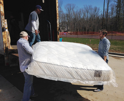
With almost everything done construction-wise in the house, we greeted a truck from Green Front Furniture (the local place loaning pieces to many of the houses in the show). They were delivering a bunch of bigger items like beds, desks, and sofas, so we had an “all hands on deck” day to carry things in and place them. Here I am with Charlie the listing agent hoisting the king-sized mattress out for the main bedroom.
Not everything is coming from Green Front, so more stuff has been trickling in as the week went on. And Sherry and I have spent a few hours every day going to thrift & secondhand places, small local shops, and big box stores to buy all that makes-a-house-a-home stuff to fill blank walls, empty shelves, and other empty feeling nooks and crannies.
There has also been some great progress outside. The wood beams have been stained and sealed, which made their color a bit richer/darker as planned. It still looks somewhat naked without any landscaping, so we can’t wait to see that stuff go in (should be rolling out sod this weekend) but the front door has officially been painted.
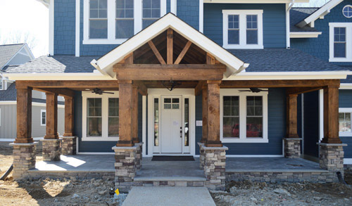
After the rest of the Homearama team weighed in on the door color debate, the write-in vote for white from you guys stuck (we all liked the idea of making the door look more substantial, so keeping it the same color as the white sidelights gave it more visual heft). The real stars of this exterior are the deep siding color and the rustic wood porch anyway, so we were all happy to let the door take a supporting role rather than competing for attention. Especially since we’ll be adding things like landscaping/potted plants/porch furniture to the mix. We even have a hanging porch swing that’s going up soon.
Moving inside, the kitchen is looking much improved now that it’s all put together. The appliances are officially in, the backsplash has been tiled, and we even got our island stools put together, which are these comfy saddle stools donated by West Elm. (For anyone wondering about the island color, it’s Hale Navy, the gray cabinets are just a stock color by the cabinet maker that we picked from a sample, and the gold pendants over the island are from Shades of Light).
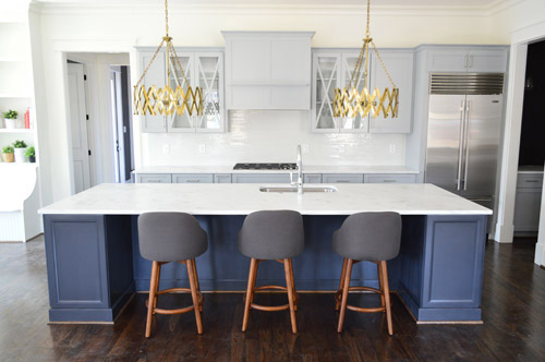
And look, you can see a sliver of styling stuff sitting in the built-ins of the eat-in nook to the left of that picture. Sherry’s probably working on those as you read this.
I don’t think we’ve showed that little corner of cabinetry on the right of the kitchen until now, so there it is. It’s a nice big open space (the island is 11 feet long if that helps put things into perspective) and Sherry can’t wait to get stuff on those counters and in those glass-fronted cabinets to make it feel more homey. Just seeing the stools pulled up to the island made it feel more “like a real kitchen” for us, though.
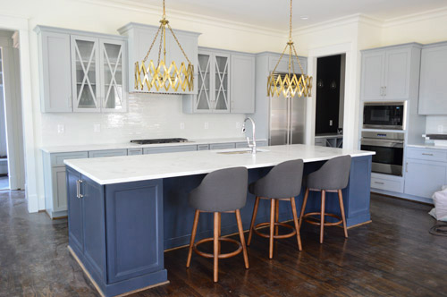
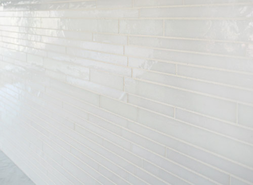
We wanted the backsplash to be fairly subtle, mainly just bringing a little polish and light-reflection to the room. So we chose this white blend waterfall glass tile from a local company called Mosaic. This is another case of “this didn’t need to be the star” since we have things like the gold light fixtures, that big navy island, and those x-fronted glass cabinets – so we just aimed to make it a solid supporting player.
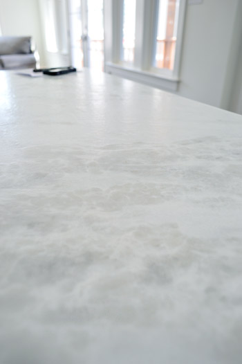
I tried to get a better shot of the counters, but didn’t totally succeed. It’s a leathered marble called White Moura which means that rather than having a smooth, glossy finish it has a slightly pebbled texture to it, along with a more matte finish. It actually feels kind of like leather (hence the name) but obviously is a lot harder/denser. And apparently the way they seal these, along with that added texture, makes them durable and easier to keep clean/maintain.
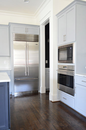
Let’s talk about the fridge. I’m mad jealous of this fridge. Well, actually, I’m mad jealous of Yolanda Foster’s fridge (I do my best to ignore the housewives entirely, but Sherry paused it to show me that fridge and it did something to me). But I’d still feel like a king if a fridge like this ended up in our house someday. We picked all of the appliances at a local contractor place called Cline. We had started by choosing a nice Whirlpool line, but the builder wanted to go big or go home, so he upped the ante and had us select a Sub-Zero and Wolf package.
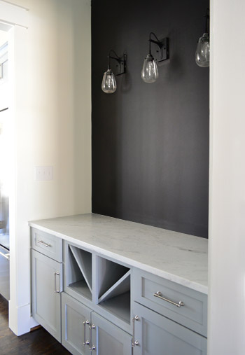
The area through that doorway above is the butler’s pantry which has the same cabinetry and counters as the kitchen. We put in the traditional wine / servingware storage in the bottom, but ditched the usual upper cabinetry in place of some cool industrial teardrop sconces from Shades of Light and a wall full of chalkboard paint. It’s a pretty small transition space so we thought it would be nice to let the upper walls breathe a little – and we have some plans for that chalkboard area soon…
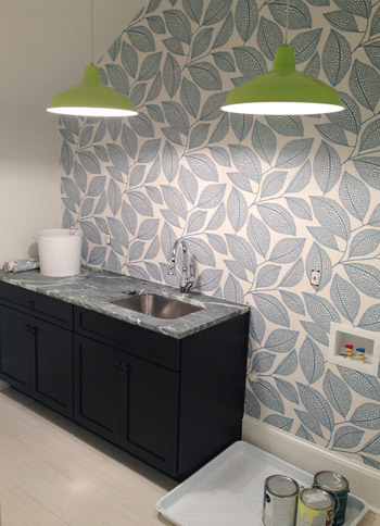
Moving upstairs, the wallpaper we’ve been way too excited about has finally been hung in the laundry room. It’s called Pebble Leaf by MissPrint and was donated by Wallpaper Direct. We waffled a little bit on adding it, but in the end we said “showhouse! take risks! stop waffling!” and went for it. So glad we did.
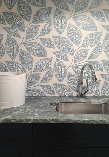
The counters are soapstone (purchased through a local place called Eternal Stoneworks), the faucet is called Leland (donated by Delta), and the cabinets are a dark wood stain (purchased from Affinity here in Richmond) while the floors are a nice, light and modern tile (called Travertino White Field Sunrock, purchased from Mosaic in Richmond). The lights are from our Shades of Light collection (they’re these in “Extra Lime”), and we bought two of them to hang in a row for fun. We’re still waiting on the washer and dryer (we ordered them in a deep gunmetal color) so that should complete that wall and balance things out.
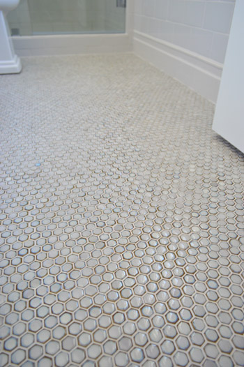
We haven’t shown you the guest bathroom yet, since it’s still missing a few major things like finished tile work and a mirror over the vanity. We wanted sort of a vintage vibe in there so we did a tile wainscot around the whole room, which we can’t wait to show you when it’s finished. In the meantime, here’s a peek at the floor, which was donated by The Tile Shop. It’s the hex version of the penny tile that we put in our last kitchen.
We also had fun with some vintage inspired fixtures, like this this bridge faucet that was donated by Brizo.
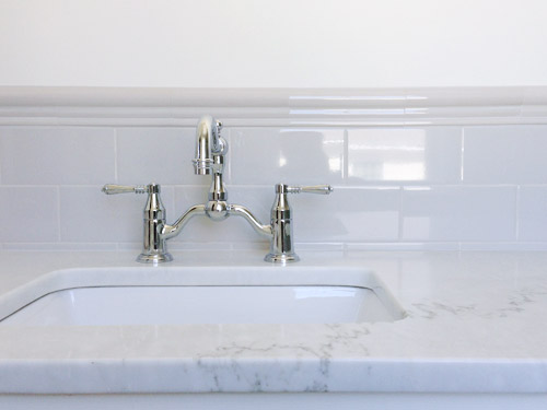
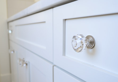
Even little details like having the hardware on the cabinets is making it feel that much closer to complete (these were donated by Liberty).
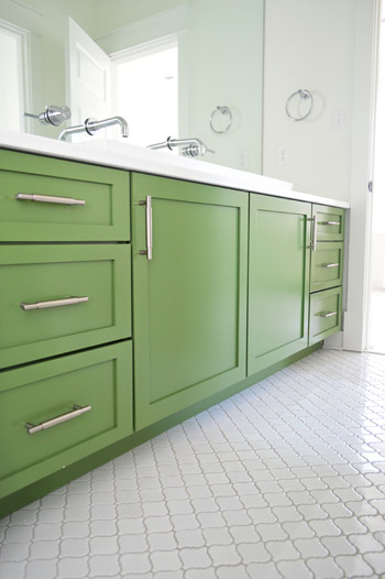
As much as we love the old-school/classic feel of the guest bath, our favorite bathroom in the entire house is the kids bathroom. You had seen a preview of the green vanity and the white lantern tile a few weeks back, but the wall-to-wall mirror finally got installed, along with our wall-mounted faucets, and that fun industrial light fixture (donated from Shades of Light).
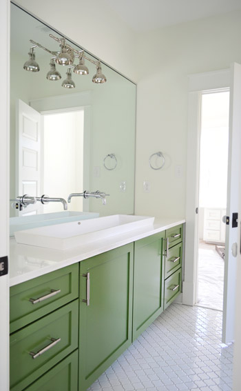
The white solid surface top has a double trough sink recessed into it, which the folks at Ferguson helped us find. It’s hard to see how deep it is since it’s half recessed (it doesn’t just sit on the counter, it drops beneath it) but it has over 5″ of depth, 14″ of width, and is nearly 48″ long. Can I just tell you how crazy Clara would go for this set-up? It’d be like the grandest swimming pool ever for her Barbies. We also had fun adding a pair of wall-mount faucets (donated by Delta) that come directly from the mirror.
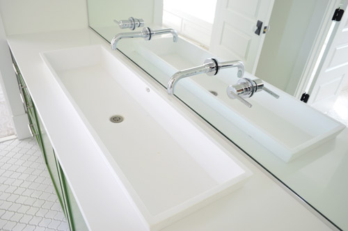
Don’t mind me. Just another shot of the vanity since the lighting was about as perfect as I’m ever gonna get in there.
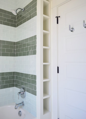
Another fun feature in that bathroom is the attached toilet/shower area, which is sectioned off by a door (so one kid can shower or use the toilet while the other one washes up/gets ready). Inspired by the cubbies in this bathroom, we had the builder squeeze in a set of wall shelves behind the shower that are perfectly sized for rolled up towels, shampoo, and other small bathroom accessories (you can read more about the striped glass tiles we chose for the shower here).
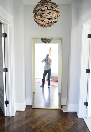
Other little nooks that are starting to come together include the Main Bedroom “Atrium” between the bathroom and closet. We got this brass floor mirror from West Elm so the future owners can look at themselves taking photos (I kid), and of course you guys have seen a peek of that branch chandelier here. Ah to have 10′ ceilings on the first floor and 9′ ceilings on the second floor. Update: these walls are Stonington Gray by Ben Moore.
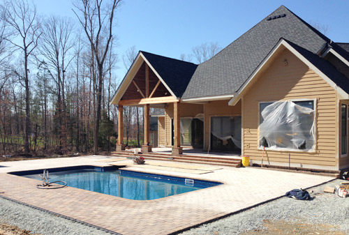
And we can’t forget that there are six other awesome houses going up right around us for the show – each done by a different team. So the other day we took a super quick field trip (the clock was ticking for preschool pick-up) to see some of the other exteriors. How amazing is this backyard? Pools aren’t super common in Richmond so it’s a nice treat to see one going in. We wouldn’t blame you guys if you just hung out back here during most of the show…
Things are going to be really showhouse heavy in real life for us over the next couple of weeks, so forgive us in advance if we’re behind or off schedule. We don’t want to let down our team or Habitat, so we’re hustling to get this baby done… well… before our other baby is done. We’re supposed to have as much finished as possible by April 4th (yes, a week from today) so it can be photographed by the Homearama organizers and then judged shortly thereafter (we’ll continue tweaking things and tying up loose ends for the following week or two). So we’re basically living out there these days. Good thing there are mattresses now.
Psst – Wanna see more showhouse info & photos? Click here for Our Full Showhouse Tour, which includes final pictures of every room, the floor plan, budget info, a video walk-through, and shoppable showhouse furniture & accessories.

Megan says
So beautiful– you guys have the magic touch. Loving the inspiration in these photos and your bold choices! Wish I had a bit more courage in design!
(Written safely from the confines of my very boring white-tiled, white-walled, and white-cabinetry home….)
jessie says
Oh please let me know the paint color for that wonderful green vanity in the bathroom!!! it’s beeeaaauutttiful!!!
YoungHouseLove says
That’s Courtyard Green by Benjamin Moore. Hope it helps!
xo
s
Angel says
Sorry if someone already mentioned this but I tried to follow the “wallpaper direct” link and it took me to an old post of yours about your toilet and trimming your door. Not sure if that was what was supposed to happen LOL!
YoungHouseLove says
Sorry! I tried to link to the US site (it was going to the British one before). Third time’s the charm?
xo
s
Rebecca says
You should get the lady from your most recent house crashing to do some crazy chalkboard art for the nook next to the kitchen! Not to knock your, I’m sure, awesome plans or anything, but she’s local right? If not, I can’t wait to find out what you guys have in store.
YoungHouseLove says
That would be awesome! She was the best!
xo
s
Dana@chocolateandsunshine says
I love everything!!! Wonderful job. My favorites are your lime green light fixtures in front of the gorgeous navy wallpaper. I’m a big fan of using large patterned wallpaper for accent walls. I have one in my kitchen and another in my living room. Always get compliments and I have no regrets. You guys rock!
Kelli says
Nothing better than Friday eye candy! Thank you! It’s such a treat to see all of your choices come together.
Jessica says
Sooo if I could move in tomorrow, I totally would. Every detail of this house is perfect. My favorite is the butler’s pantry. I’m excited to see how you are going to style it!
YoungHouseLove says
Thanks so much Jessica!
xo
s
cali says
ive never wanted to live in a house more than i do right now!
Andrea says
You guys knocked it out of the park on every. single. choice. I la la LOOOOVVVVEEE this house! I can’t wait to see more. I feel like I’m looking through somebody’s windows (which, I often feel compelled to do, so this is a nice way to satisfy that urge and not get arrested for trespassing haha). Good luck in the final stretch!
Carla says
You guys, this house doesn’t look like you took risks. For me risk means going hog wild and buying into trends and doing things that will probably be replaced or updated by the new owners in their first year of living there.But your design choices on this house feel timeless and balanced and sophisticated.
Why aren’t you doing this with your own house? You are stuck in the same old design game of Ikea and floating shelves and white cabinets, and trends like covering laminate counters in cement. This showcase house is very telling. I think it’s what you want for yourself in terms of the design, but you don’t know how to step back and let go and make it happen. I dare you to stop playing it so darn safe and really dig in and make your own house something bold and beautiful.
You’re playing it way too safe and predictable with the arrow wallpaper and cement counters and the other kinds of updates you’ll find on Apartment Therapy and Design Sponge. I love those sites, but much of the featured designs are the same thing over and over again.
YoungHouseLove says
Thanks Carla! We’re loving the process of seeing the showhouse take shape! The budget, the donated items, and the team of pros who are helping us pull things together (electricians, carpenters, tilers) have definitely set it apart from what we can afford to tackle at home as we inch along and do things one small update at a time, but I think it’ll be interesting to see how our showhouse experiences influence our future at-home choices, especially bathroom/kitchen renos down the line, when we’ll be picking materials/cabinetry/tile :)
xo
s
Lo says
I agree with Carla regarding your own house. I’ve never really understand all the “budget” and “saving our pennies” excuses from you guys…if you can afford to drop $30,000+ to buy a new car in cash, you’re very well off. (Don’t forget, many other people have blogs, so it’s not hard to estimate how much you’re pulling in from just ads with your traffic). Of course you’re entitled to save/spend/do whatever you like with your money and if you’d rather put money into your savings account for the future rather than bust it out on new stuff all the time, that’s perfectly reasonable (and smart!). But your “saving our pennies” thing makes it seem like you’re just scraping by when it’s actually obvious you’re doing very well financially. I wish you would just own that and be more transparent instead of acting like you’re just getting by.
YoungHouseLove says
I’m sorry if you got the impression that we are scraping by. That is not what we intend to imply, but we are naturally thrifty and we do like to save, regardless of our income. As you mentioned, we like to keep money in savings (freelance jobs like this have no guarantees) as well as putting it towards college and retirement. We have always believed in living in a home and planning big renos over time instead of gutting kitchens and baths right away. But as Sherry told Carla, this showhouse experience will definitely influence how we spend our money on big renos moving forward. Especially since we’ve been looking forward to choosing long-term materials and appliances since this is a home we plan to stay in for a long time.
-John
Meagan says
I for one appreciate both the showhouse and the updates you do on your own home. I love the showhouse; it’s beautiful. But to me, it’s just that, a show house. I will never afford a home like that (and I don’t want to, I’ve made certain life style choices to guarantee I can spend time in my home with my family rather than work to afford a home like the show house). I appreciate being able to see beautiful design in the show house, but appreciate even more seeing the updates you do in your home, because it shows me my house can be just as beautiful and trendy and affordable. I love learning new DIY and cost saving tricks. Please, for your fans who are budget conscious, don’t change that!
YoungHouseLove says
Thanks Meagan! I think it’s safe to say that there’s always going to be a mix. Even in our first house we loved the high/low thing (we splurged on granite counters and Kraftmaid cabinets, but saved by researching/negotiating a more affordable set of appliances and hunting down a discount faucet/sink).
xo
s
Kati says
Lo, I think it’s interesting that you see “saving pennies” as an opposition to buying a new car. That’s the kind of thing that makes purchasing a car doable. Saving pennies everywhere adds up. If they knew they were going to start planning for a car change four years ago and they began saving $500/month, it’s easy to see how buying a $24,000 car in cash is possible. And UNLIKE most of America with steady jobs, they are saving for retirement and college: long-term goals that make their disposable income “less-than-disposable.” I think it’s very smart, and I really, really, REALLY appreciate seeing the Peterskis share a home on a budget, because it’s a great example for everyone to follow- no matter the income. The idea that only “poor people” need a budget is a myth – being careful, slow and deliberate with purchases, and savings is exactly how people become well-off, not by spending just because they have it. I disagree that they need to be “more transparent” – says who? This is their blog. I LOVE their tips on saving money around home improvement projects! Who wouldn’t, right?!?
And Carla – it is a showhouse. They are going at a SUPER fast clip and they have a budget for this that someone else provided, plus people are donating items. :-) No one is donating to the Petersik house (no swag policy yo!) AND they’ve only been there for a little while. I think it’s a little pre-mature to say “they’re stuck” or they “don’t know how to make it happen.” They blog extensively about Phase 1, 2 and 3, because their time and money are limited, and they don’t have a staff of builders to bounce personal house ideas off of.
Megan – love it! I’m a renter and will be for a while. Even the IKEA updates are bigger than our budget would allow, so we’re going slow and steady to win the race!
Petersiks! You guys are awesome! You got this in the final weeks. I’m enamored with the house. If only my husband loved it all (he’s a dark man-cave kind of man.) :-)
Carla says
I’m having a late lunch and wandered back to this discussion.
I’m in no way criticizing John and Sherry’s thriftiness or questioning their finances versus frugal spending. I love that about them. It’s very inspiring.
My comment is only focused on design choices and letting their hair down a bit and having some fun in their own home.
:o)
Lo says
John, thanks for the reply. Being thrifty is one thing; acting like you have to save for ages to buy anything is another. You guys seem to like to give the impression of the latter. Maybe it’s unintentional. Maybe it’s so a majority of your readers will better identify with you. I am not saying you need to spend more money or stop being thrifty. Just that I think it’s odd and slightly annoying that you give the impression of having difficulty affording things that are actually very easily affordable for you.
Lo says
Hi Kati, I didn’t realize John and Sherry needed commenters on defense duty. You may want to read my initial comment again because I didn’t say they shouldn’t save money or have a budget or that they “need” to be more transparent.
Lo says
P.S. Kati, you may want to dial it back a bit… I’m a little scared.
ErinY says
I think it’s also important to remember that the show house needs to actually appeal to a lot of buyers. I don’t think it’s very common for people to want to buy a brand new house just so they can change everything after they move in.
Barbara says
John and Sherry, you are very wise. I’m 52 years old and have made plenty of financial mistakes over the years. I wish I would have had that wisdom when I was your age.
Ashley says
When I was little, a friend’s mom had a big island like that in her kitchen and she always had a large wooden bowl full of granny smith apples on it. For some reason, when I saw the picture of the kitchen I was thinking “man, an apple bowl would make that kitchen so homey.” So there’s a styling idea (as if you needed any more :) )
YoungHouseLove says
Haha, thanks Ashley!
xo
s
Sarah says
Lookin’ good! My husband and I booked our flights yesterday to visit Richmond and go to the show! So excited!
YoungHouseLove says
That’s amazing Sarah! I hope you guys love it! The other houses are all coming together too – it’s going to be a great show!
xo
s
Jeanna says
I love everything, really do! And all the lights!!! It feels like such a HAPPY house :)
Jim says
The house looks wonderful. I would love to see some pictures of the door casings, baseboards and crown. It looks like a nice modern craftsman look and really stands out well.
Jim
YoungHouseLove says
We’d love to snap some details for you!
xo
s
Tara says
I really love how this project is coming along. I fell in love with the Pebble Leaf wallpaper instantly but when I tried to find it on Wallpaper Direct, I was unable to. Is this a product that is not on the marketplace yet?
YoungHouseLove says
I think it might be out of stock now so maybe check back or search it by name and maker to see if another vendor comes up?
xo
s
Laura says
Loving how the showhouse is coming together! I’ve noticed in the rooms with wood floors that the quarter round is the same color as the floor rather than the baseboard. Is this standard? If not, what was the decision process behind keeping the quarter round the color of the floor? I’m curious because we just painted all of our quarter round to match our baseboard, and now I’m wondering if we should have gone through all of that effort?!
YoungHouseLove says
It’s a regional (Richmond?) thing I think. In all of our past houses the quarter round has been stained to match the hardwoods. It gets installed and stained at the same time as the flooring and matches that which apparently cuts down on scuffs and visible dust like painted quarter-round tends to collect, but sometimes it bugs people so I’ve seen them paint it if it’s not their preference.
xo
s
K(Barking BabyMama) says
I LOVE the gold accordion light fixtures in the kitchen – LOVE!!! And the kids bathroom – well, everything about it is so good. Color, tile, wall-to-wall mirror, sink, wall-mounted faucets – it’s spectacular.
Kelly Belly says
This is all looking so marvelous! I love the exterior and that kitchen especially. And that tile in the kids bathroom. And that wallpaper in the laundry room. And, and, and…. :)
Do you think you’ll have time to do a video tour of the showhouse, like you’ve done in the past with your own houses? I would love to see how the whole house flows together; especially since I’m on the West coast and won’t be able to purchase a ticket!
YoungHouseLove says
Yes, we’d love to share a full video tour for anyone who can’t make it to the show.
xo
s
Jules says
Good job guys. Everything is coming together so nicely. It looks great and there are so many things to love! I like the white door, but I feel like it is getting a little lost in there. Are you planning to put something on it, like a number, or a wreath to make it stand out a little more?
YoungHouseLove says
I love that idea!
xo
s
Lo says
Can you elaborate on how the Homearama thing works with regard to the builder? Is part of the builder’s proceeds going to be donated to Habitat for Humanity? It seems like most of your fixtures in the house (lighting, faucets, etc) have been donated, but those are things that would have otherwise gone under the builder’s cost… I assume the house is to be sold at market value, so who is actually benefiting from the donated fixtures? The builder? How does Habitat for Humanity benefit?
YoungHouseLove says
Yes, we are donating our fee to Habitat, ticket sales go to Habitat, and the builder is sending a huge donation to Habitat as well (essentially the more we hustle to get donated, the more he can give to Habitat).
xo
s
Lo says
Thanks for the info. How much is the builder donating? When you say “he more we hustle to get donated, the more he can give to Habitat” makes it seem like you got $2000 worth of stuff donated, so he’s going to donate $2000 to Habitat – which is essentially zero out of his pocket…
YoungHouseLove says
When the house is finished we will total how much we got donated to offset building costs and he will be donating that amount on top of a personal donation to Habitat. The builder loves the cause, and has also talked about loaning his team out to help them build something, like a porch for a house they’re working on for a family in need.
xo
s
Lo says
Where are the handles on the green bathroom vanity from?
YoungHouseLove says
They’re from Liberty Hardware.
xo
s
Stephanie @ Whole Health Dork says
This looks amazing! I can’t believe how much you have done from the ground up! I can’t imagine having to make all of those decisions (then again, that’s why I’m not in that profession I guess). Will you be able to give us a total run-down of costs at the end? Just curious…
YoungHouseLove says
I think that could be difficult since there are a lot of builder discounts, donations, and borrowed items in the mix, but it would be lots of fun!
xo
s
Kristin says
Will you guys be at the house for some of the days it’s open to the public? I live in Virginia Beach and would TOTALLY drive up to Richmond to see the house and meet you guys!!! :)
YoungHouseLove says
I’ll be recovering from a c-section but we’d love to slide through to see the show for an hour with the baby at home with our parents or something. Maybe during that last weekend so I have the most time to recover? Can’t wait to see the other houses!
xo
s
Maya says
I just put that hex from the tile shop in my kitchen. It makes a great backsplash with their “Morocco black” ceramic tile on the floor.
ErinY says
You may have already touched on this at some point, but when it’s all said and done I think it would be really interesting to hear about how the show house may have influenced or inspired new ideas and choices for your own house, since you’re taking more risks that you normally may not have. Love the show house, keep up the great work!
YoungHouseLove says
Love that idea! Would be a fun post.
xo
s
Jess Jonese says
ALL GOOD THINGS. Amazing, wonderful, but… (sorry to mention) having done it on one house and learning a lesson, in our current one -then second time- we did grey grout instead of white, specifically in bathrooms with white tile… White tile, with charcoal grout. Works -do it. Way to go. White tile with white grout- messy mess, you see EVERY spec of dirt and it’s hard and annoying to clean in a room where spills and water occurs… Just saying… (grey grout over the white could still happen- … just saying.) Otherwise this is my DREAM home! Awesome job!!!
YoungHouseLove says
Thanks Jess! For the guest room and kids room and mudroom and laundry room we did gray grout for just that reason (recommended by the tile dealers). Yay!
xo
s
Jenny B. says
A friend just told me about Epoxy grout. She said her tile guys suggested it for her kitchen backsplash (white subway tile with white grout), and that it has stayed white and is easy to clean.
YoungHouseLove says
Good to know!
xo
s
Lisa says
Awwww it looks amazing!
L x
http://workingmumy.blogspot.com
Kris B says
That quarter round in most of the rooms is really bugging me. If that wood floor is laminate, I can see why it’s needed but if it’s engineered or hardwood, why in tarnation did they not install the flooring, then install the baseboard on top of that so there’s no need for quarter round? Looks horrible. They got it right on the passageway/doorway baseboard trim.
I LOVE that exterior! Absolutely gorgeous!
Katie says
I love the green vanity, where did that come from? We are in the process of re-doing our master bathroom and I want to replace our vanity but all the ones I find are so expensive and too short (we need something around 72 inches). I also love the Hex Moss tile for the half bath, I picked out the same one at the Tile Shop last weekend for an accent around the wall in our shower!
YoungHouseLove says
That’s from a local cabinet maker called Affinity.
xo
s
Lily says
This place is going to be absolutely stunning!! Leathered marble is awesome.
xo Lily
http://whilemyboyfriendsaway.blogspot.com/
Jessica D. says
Planning to move to Richmond once my offer is accepted for this house….But seriously I am already majorly jealous of the to-be homeowner. Great job! You have truly honed your natural design instincts over the years. It’s been so much fun following you three…four…soon-to-be five since house #1.
YoungHouseLove says
Thanks so much Jessica!
xo
s
val says
Gorgeous–very Sarah Richardson, which is the highest compliment! This must be so much fun–but does it make you wish you were building your own home from scratch?
YoungHouseLove says
It’s such a different animal! I think we see the fun and excitement of this, but still love our old house in the woods :)
xo
s
Donald says
Is the Showhouse pushing you to take greater risks in your own home? Or has it just been a nice place to get some crazy out of your system?
YoungHouseLove says
I think it’s definitely stretching us in new ways and influencing how we approach our own home as well!
xo
s
Angela says
Hi Sherry & John.. Great job..for a great cause! Everything looks absolutely lovely and so much inspiration. Love everything but still not digging the lights in the kitchen. Hopefully your expertise will bring it thru to the finishing line.
Jenny B. says
Love Love Love everything! The exterior is AWESOME! Houses just don’t look like that in my area. :( Everything is brick and stone around here. Sigh… That kids bathroom is outstanding!
Sara says
I love the clear Liberty knobs on the white cabinets. Can you provide the name of them or the link to them? There are so many on the Liberty website!
YoungHouseLove says
That one is P23944W. Hope it helps!
xo
s
Jo says
The green vanity is amazing :)
Karla@{TheClassyWoman} says
This home is gorgeous already! Loving that leaf wallpaper and so many more details, especially the tile. :)
Can’t wait to see it all finished. This process reminds me of the HGTV Dream home giveaway homes. What a wonderful project to be a part of.
YoungHouseLove says
Thanks Karla! We are so honored to be involved.
xo
s
Megan B says
I don’t comment often, but I had to take some time to tell you guys that this house is blowing my mind. I love every single room! The kids’ bathroom is pretty amazing, the lights in the butler’s pantry area are now on my must-buy list, the exterior color of the house is my dream color…..you get the picture. Well done! I’m loving the risks you’re taking!
YoungHouseLove says
Thanks so much Megan!
xo
s
Sam F says
I thought, “what were they thinking?” when I first saw a peek at the kitchen light fixtures, but oh man, I’m totally converted. I love how they look now! They’re gorgeous. This has been so much fun to see everything and I can’t wait for the “final” reveal!
YoungHouseLove says
Aw thanks Sam!
xo
s
Lauren P says
I love the refrigerator! Where is it from?
xo Lauren
YoungHouseLove says
It’s a SubZero fridge purchased through Cline here in Richmond.
xo
s
Virginia says
After the showcase house is completed, will you post a budget breakdown? I’ve always purchased already built houses (vs buying land and building on the property). I know you’ve had a lot of items donated for the project (like your amazing light fixtures), but I’m curious to see if the cost is similar to buying/renovating an older home. Thanks!
YoungHouseLove says
I think that could be difficult since there are a lot of builder discounts, donations, and borrowed items in the mix, but it would be lots of fun. We can definitely share the house price/appraised value when it hits the market!
xo
s
Kate S. says
I think I’ll have to go through the comments here and see what others are thinking, but for me, while I think each space is individually beautiful, they do not present a very cohesive image. Each room is a unique presentation (or so it seems here). The bathrooms don’t match, there are a dozen different tile patterns, all the light fixtures are totally different . . . . it seems really odd to me. But then, perhaps that is the nature of a show house. I know the HGTV show houses have a similar design pattern. I can’t wait to see how you finish it and (hopefully) tie all the rooms together a bit more with furnishings.
Cody says
Hey guys, I love the house. Your bold choices are giving it some great personality.
I do have a question…is there a reason the cabinets in the kitchen don’t go to the ceiling? That seems like a choice in keeping with the caliber of the home. Is that typically not done in your area?
YoungHouseLove says
We love cabinetry to the ceiling when the ceilings are standard height or even 9′ tall! These are 10′ ceilings in the kitchen though, so they typically don’t have cabinets to the top since they’re so high (I think of all seven houses, all of the 10′ kitchens have air above the upper cabinets).
xo,
s
Emily @ Life on Food says
I am in love with bridge facets. We are currently hunting for one in the kitchen.
Rachel says
Ok seriously, i want this house. Every detail is beautiful and it just gets better every time i see it! Anyway to move it to Austin? Right on the lake? Yea.. that would be great, thanks.
YoungHouseLove says
We’ll have to talk to the builder but maybe he can get a really big truck…
xo
s
Elisabeth says
This house looks awesome. I wish I could have your help and unlimited donations to furnish a house we’re setting up as a short term rental. Also I hope no one’s water breaks on the new carpet of your show house.
YoungHouseLove says
Oh yeah, THAT WOULD BE BAD.
xo
s
Cora says
So basically what I’m hearing is that when I buy a house and have a lot of money, you guys will be my interior decorators??? That’s great! Thanks! <3
YoungHouseLove says
Haha!
xo
s
Kati says
It just dawned on me: once the Showhouse is bought, what happens to the furniture and other items that are on loan? Do the new owners have to take them back, or do the stores come get the pieces, or is there an option for them to buy?
YoungHouseLove says
Many of the items that are being donated are either being returned (like some of the art and some of the larger furnishings) or they’re being donated to Habitat after the event. But some of the other furnishings that were loaned out from various places, like GreenFront, are available for purchase by the future owners if they’d like to keep them in the house. Some other donated things will be sold with the house and worked right into the purchase price, instead of as an add-on (like light fixtures, tile, faucets, and other “attached” stuff).
xo
s
Rosie S says
Looks so pretty and everything is coming together so beautifully. Good luck with the final crunch! It will be so gorgeous, I just know it!