At first I had typed the original “I like to move it, move it” lyrics but then I realized that I don’t really enjoy the moving process at all, so it was sort of an unpleasant deja vu moment when we started unloading furniture into the Homearama showhouse on Monday. But my glass half-full version of the situation is: we’re finally getting to the furnish the showhouse! Note: for anyone wondering what the heck this showhouse is, and how it benefits Habitat for Humanity, click here and here for more info.

With almost everything done construction-wise in the house, we greeted a truck from Green Front Furniture (the local place loaning pieces to many of the houses in the show). They were delivering a bunch of bigger items like beds, desks, and sofas, so we had an “all hands on deck” day to carry things in and place them. Here I am with Charlie the listing agent hoisting the king-sized mattress out for the main bedroom.
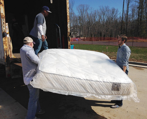
Not everything is coming from Green Front, so more stuff has been trickling in as the week went on. And Sherry and I have spent a few hours every day going to thrift & secondhand places, small local shops, and big box stores to buy all that makes-a-house-a-home stuff to fill blank walls, empty shelves, and other empty feeling nooks and crannies.
There has also been some great progress outside. The wood beams have been stained and sealed, which made their color a bit richer/darker as planned. It still looks somewhat naked without any landscaping, so we can’t wait to see that stuff go in (should be rolling out sod this weekend) but the front door has officially been painted.
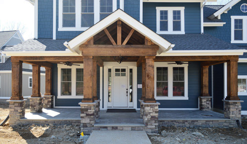
After the rest of the Homearama team weighed in on the door color debate, the write-in vote for white from you guys stuck (we all liked the idea of making the door look more substantial, so keeping it the same color as the white sidelights gave it more visual heft). The real stars of this exterior are the deep siding color and the rustic wood porch anyway, so we were all happy to let the door take a supporting role rather than competing for attention. Especially since we’ll be adding things like landscaping/potted plants/porch furniture to the mix. We even have a hanging porch swing that’s going up soon.
Moving inside, the kitchen is looking much improved now that it’s all put together. The appliances are officially in, the backsplash has been tiled, and we even got our island stools put together, which are these comfy saddle stools donated by West Elm. (For anyone wondering about the island color, it’s Hale Navy, the gray cabinets are just a stock color by the cabinet maker that we picked from a sample, and the gold pendants over the island are from Shades of Light).
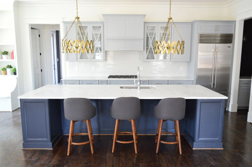
And look, you can see a sliver of styling stuff sitting in the built-ins of the eat-in nook to the left of that picture. Sherry’s probably working on those as you read this.
I don’t think we’ve showed that little corner of cabinetry on the right of the kitchen until now, so there it is. It’s a nice big open space (the island is 11 feet long if that helps put things into perspective) and Sherry can’t wait to get stuff on those counters and in those glass-fronted cabinets to make it feel more homey. Just seeing the stools pulled up to the island made it feel more “like a real kitchen” for us, though.
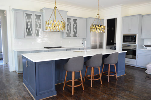
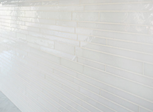
We wanted the backsplash to be fairly subtle, mainly just bringing a little polish and light-reflection to the room. So we chose this white blend waterfall glass tile from a local company called Mosaic. This is another case of “this didn’t need to be the star” since we have things like the gold light fixtures, that big navy island, and those x-fronted glass cabinets – so we just aimed to make it a solid supporting player.
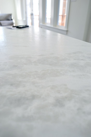
I tried to get a better shot of the counters, but didn’t totally succeed. It’s a leathered marble called White Moura which means that rather than having a smooth, glossy finish it has a slightly pebbled texture to it, along with a more matte finish. It actually feels kind of like leather (hence the name) but obviously is a lot harder/denser. And apparently the way they seal these, along with that added texture, makes them durable and easier to keep clean/maintain.
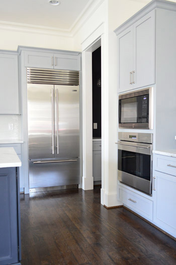
Let’s talk about the fridge. I’m mad jealous of this fridge. Well, actually, I’m mad jealous of Yolanda Foster’s fridge (I do my best to ignore the housewives entirely, but Sherry paused it to show me that fridge and it did something to me). But I’d still feel like a king if a fridge like this ended up in our house someday. We picked all of the appliances at a local contractor place called Cline. We had started by choosing a nice Whirlpool line, but the builder wanted to go big or go home, so he upped the ante and had us select a Sub-Zero and Wolf package.
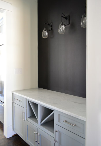
The area through that doorway above is the butler’s pantry which has the same cabinetry and counters as the kitchen. We put in the traditional wine / servingware storage in the bottom, but ditched the usual upper cabinetry in place of some cool industrial teardrop sconces from Shades of Light and a wall full of chalkboard paint. It’s a pretty small transition space so we thought it would be nice to let the upper walls breathe a little – and we have some plans for that chalkboard area soon…
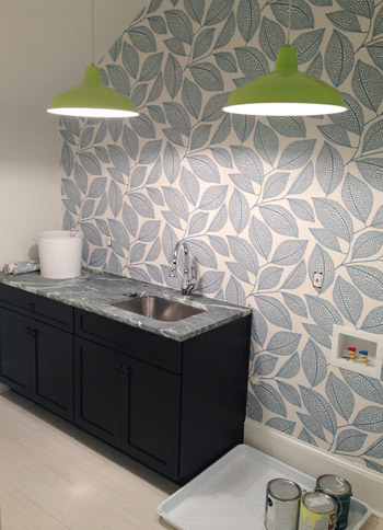
Moving upstairs, the wallpaper we’ve been way too excited about has finally been hung in the laundry room. It’s called Pebble Leaf by MissPrint and was donated by Wallpaper Direct. We waffled a little bit on adding it, but in the end we said “showhouse! take risks! stop waffling!” and went for it. So glad we did.
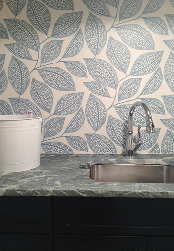
The counters are soapstone (purchased through a local place called Eternal Stoneworks), the faucet is called Leland (donated by Delta), and the cabinets are a dark wood stain (purchased from Affinity here in Richmond) while the floors are a nice, light and modern tile (called Travertino White Field Sunrock, purchased from Mosaic in Richmond). The lights are from our Shades of Light collection (they’re these in “Extra Lime”), and we bought two of them to hang in a row for fun. We’re still waiting on the washer and dryer (we ordered them in a deep gunmetal color) so that should complete that wall and balance things out.
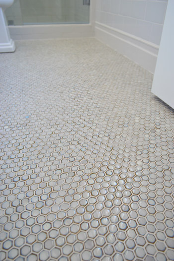
We haven’t shown you the guest bathroom yet, since it’s still missing a few major things like finished tile work and a mirror over the vanity. We wanted sort of a vintage vibe in there so we did a tile wainscot around the whole room, which we can’t wait to show you when it’s finished. In the meantime, here’s a peek at the floor, which was donated by The Tile Shop. It’s the hex version of the penny tile that we put in our last kitchen.
We also had fun with some vintage inspired fixtures, like this this bridge faucet that was donated by Brizo.
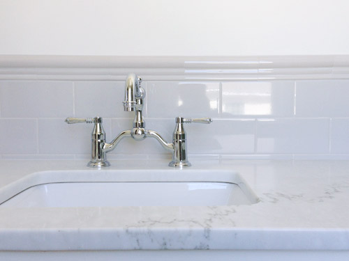
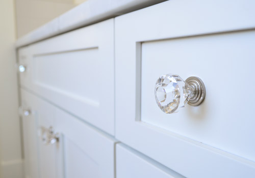
Even little details like having the hardware on the cabinets is making it feel that much closer to complete (these were donated by Liberty).
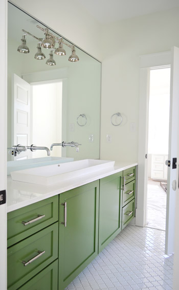
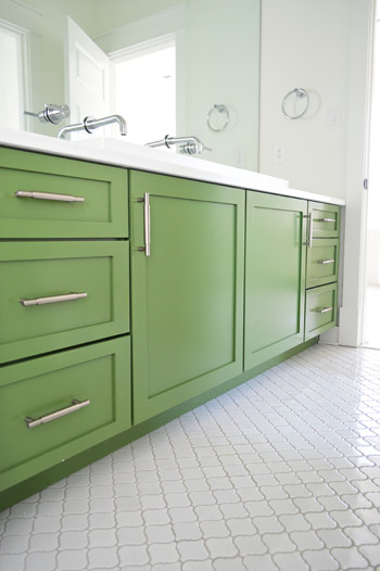
As much as we love the old-school/classic feel of the guest bath, our favorite bathroom in the entire house is the kids bathroom. You had seen a preview of the green vanity and the white lantern tile a few weeks back, but the wall-to-wall mirror finally got installed, along with our wall-mounted faucets, and that fun industrial light fixture (donated from Shades of Light).
The white solid surface top has a double trough sink recessed into it, which the folks at Ferguson helped us find. It’s hard to see how deep it is since it’s half recessed (it doesn’t just sit on the counter, it drops beneath it) but it has over 5″ of depth, 14″ of width, and is nearly 48″ long. Can I just tell you how crazy Clara would go for this set-up? It’d be like the grandest swimming pool ever for her Barbies. We also had fun adding a pair of wall-mount faucets (donated by Delta) that come directly from the mirror.
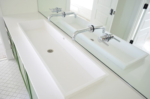
Don’t mind me. Just another shot of the vanity since the lighting was about as perfect as I’m ever gonna get in there.
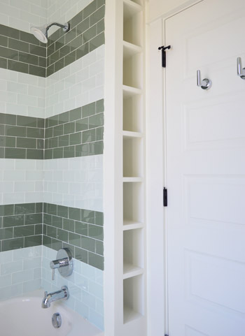
Another fun feature in that bathroom is the attached toilet/shower area, which is sectioned off by a door (so one kid can shower or use the toilet while the other one washes up/gets ready). Inspired by the cubbies in this bathroom, we had the builder squeeze in a set of wall shelves behind the shower that are perfectly sized for rolled up towels, shampoo, and other small bathroom accessories (you can read more about the striped glass tiles we chose for the shower here).
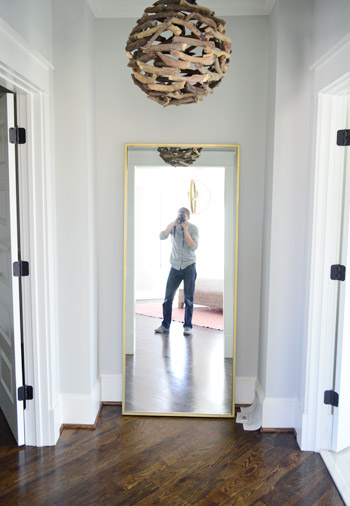
Other little nooks that are starting to come together include the Main Bedroom “Atrium” between the bathroom and closet. We got this brass floor mirror from West Elm so the future owners can look at themselves taking photos (I kid), and of course you guys have seen a peek of that branch chandelier here. Ah to have 10′ ceilings on the first floor and 9′ ceilings on the second floor. Update: these walls are Stonington Gray by Ben Moore.
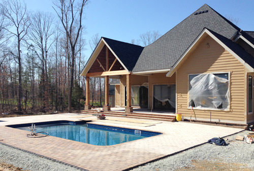
And we can’t forget that there are six other awesome houses going up right around us for the show – each done by a different team. So the other day we took a super quick field trip (the clock was ticking for preschool pick-up) to see some of the other exteriors. How amazing is this backyard? Pools aren’t super common in Richmond so it’s a nice treat to see one going in. We wouldn’t blame you guys if you just hung out back here during most of the show…
Things are going to be really showhouse heavy in real life for us over the next couple of weeks, so forgive us in advance if we’re behind or off schedule. We don’t want to let down our team or Habitat, so we’re hustling to get this baby done… well… before our other baby is done. We’re supposed to have as much finished as possible by April 4th (yes, a week from today) so it can be photographed by the Homearama organizers and then judged shortly thereafter (we’ll continue tweaking things and tying up loose ends for the following week or two). So we’re basically living out there these days. Good thing there are mattresses now.
Psst – Wanna see more showhouse info & photos? Click here for Our Full Showhouse Tour, which includes final pictures of every room, the floor plan, budget info, a video walk-through, and shoppable showhouse furniture & accessories.

Carla says
I just took another look at the photos to see the nice green in the bathroom.
I didn’t realize the mirror is so huge and that the faucets come out of the wall through it. Clever but very impractical. What a mess keeping that looking nice and clean.
And the sink is going to require a lot of water to help toothpaste and soap wash down the drain. Although it looks great, I think the design uses too much counter space and is going to make grime and toothpaste and soap residue really stand out.
But that green is so beautiful.
Steph Nelson says
I’m really loving these showhouse posts! You guys have done a great job and I can’t wait to see the video. I was thinking a few things while reading and thought I’d share…
~Yea for you guys donating your fee and basically doing this for free. Good Karma! :)
~I am so jealous of the people that get to buy this house. I probably will never have the opportunity to even come close to buying a house like this.
~Did you personally make the phone calls to get all this stuff donated? If so, that is amazing and I want to send a THANK YOU to them for that!
~That’s all. (Name the movie)
YoungHouseLove says
Aw thanks Steph! It has mostly been emails to folks we have worked with for giveaways or as sponsors. It has been awesome. Everyone is so generous for a good cause like Habitat.
xo
s
Laura says
LOVE is not a strong enough word for the green vanity. The entire house looks amazing, I wish I lived closer to see it in person during the show.
Kelly says
If you ever get tired of blogging, designing homes can be your new career. This house looks amazing. I wonder who will be the lucky buyer after the show.
Nikki H says
I have a thing for green, and I love the green vanity in the bathroom. But I really, really LOVE those green lights! I want them. Don’t know where I’d put them, but I want them. This house looks great. :)
Anna says
Looks great! I love the green bathroom, especially.
caroline [the diy nurse] says
It’s looking amazing. Can’t wait to go!!
Rachael says
Looks fantastic! I LOVE the blue kitchen. We have been umming and ahhing about going for a blue and white kitchen so, just as a matter of interest, would you go for a coloured kitchen yourselves? I love them but then my head keeps arguing with my heart!!
YoungHouseLove says
Yes! They are so much fun! And a color like navy is a neutral so I don’t think it’s trendy like hot pink or anything. I say go for it!
xo
s
Charlotte Claypole says
Hi John and Sherry,
I wish I lived in Richmond and was able to tour the house and buy a ticket. Love what has been happening with both or your homes. (the nursery is looking so sweet)
Was wondering if Sherry will have one last belly photo before the baby arrives???
AWESOME TEAM WORK TO ALL INVOLVED WITH THE SHOWHOUSE.
Charlotte
London, ON
CANADA
YoungHouseLove says
Aw thanks Charlotte! We like to take a pic together in the nursery when it’s done (or nearly done, haha) so we hope to do that this week.
xo
s
Misty says
okay. so I took a couple hours then came back to look again….and yup… something is bothering me about the laundry room. LOVE the light fixtures and wallpaper – its the vanity! I don’t know why it seems out of place for me! I usually never ever disagree with any of your design choices. I will wait till all is finished for final judgment… ;) #withlove
Rachel @ The Sunny Disposition Home says
I LOVE the kitchen, and cannot wait for the rest of it!!
J. Bagley says
Seriously wishing I could take a trip to Richmond to see Homearama. Looking great!
I spied a house adjacent to your lovely build that has a “greige” siding color. While I love the bold, beautiful blue in your design, we’re looking for a good exterior neutral for our hot, humid climate.
Any chance you could get the scoop on the siding color for that house peeking out from behind pic #3?
P.S. Our daughter is constantly imagineering with toys in our tiny bowl of a bathroom sink and she too would love that Barbie oasis you’ve got going in in the kids’ bathroom. :)
YoungHouseLove says
Aw thanks J! I hope Justin from Homearama drops in with that paint color info!
xo
s
Gretchen says
Have the homerama folks thought of offering “there in spirit” tickets to benefit habitat for humanity? It would be fun for those of us who can’t be there to participate!
YoungHouseLove says
I love that idea! Will have to check with them to see if it’s too late to coordinate that. What an awesome suggestion.
xo
s
Jenn says
Can’t you just buy a ticket online and not use it?
YoungHouseLove says
The whole ticket doesn’t go towards Habitat, though, (it’s a portion since there are staff/expenses of running the show built into tickets as well) so if someone wanted to donate theirs to Habitat directly it would be nice to set that up on the Homearama site.
xo
s
Sarah says
I really love how you respond to criticism. It amazes me. The house looks beautiful all around. Can’t wait to see the finished product. Sooooooo the solid white surface under the trough sink…is that just a piece of marble, or quartz, or something?
YoungHouseLove says
It’s just solid white corian. We had that in our last kitchen and it was really easy to care for.
xo
s
Rosie S says
Sarah, I was just thinking the same thing after reading some of the comments, J and S really teach a master class in handling criticism with class, patience and clarity.
Yvonne King says
This house is SO dreamy! It will definitely make someone VERY happy. I love the island and the light fixtures above!
A.Marie says
I have always imagined a trough sink for any kids I might have! I too played Barbie in the sink and yes, this would have been beyond amazing.
Great job mixing it up and being bold.
Allison says
Oh my goodness! I LOVE Yolanda Foster’s refrigerator! Every time there is an event at their home I am wishing and hoping for a good frig shot! Ahhhh simple pleasures! p.s. The show home is marvelous!
Connie says
An amazing job you two! Love it all except the laundry….either the wallpaper or the counter would be lovely, both is way too busy in my opinion. Also, would have passed on the chalkboard, way overdone and soon to be “yesterday’s” decor. Just my opinion!
VICKI C says
Am I right in thinking that the flooring in the master closet is running on diagonal–
was that mentioned before?
Love the trough sink — would love to do something like that when we remodel our FL house…
but like others–
I am not fan of the grey trend in decorating now and think items like the upholstered bar stools just look like they will be stain/crumb magnets if kids use them–no matter what the material is supposed to be.
YoungHouseLove says
The hardwoods are run in all the same direction (against the beams, which is the way they’re least likely to warp), so it’s just the angled closet layout that means the floor looks angled too. Here’s a floor plan to hopefully help orient you :)
xo
s
VICKI C says
Plus–our FL house has similar fridge with bottom freezer and double doors–
It is just awkward to use–I always open the wrong door when Looking for something and lose things in the freezer–
Truly if there were space I would so prefer having 1 fridge and 1 freezer side by side…or freezer in the pantry and 1 super fridge…
Margaret says
Love all of the mixed metal finishes you have going on. We want to change out all of our shiny brass door knobs for ORB, but don’t know if we should change the hinges or not. Did you guys change all of your hinges when you did your door knobs?
YoungHouseLove says
We did! We found a contractor pack at Home Depot for cheap (a giant bulk set of them) and switched them all out so they tie into the knobs.
xo
s
Elaine says
Just a few questions re the butlers kitchen…Why did you remove the upper cabinets in favor of a chalkboard wall, what advantage does this have?
Butlers kitchens are primarily used for food prep and to provide much needed storage space. As your main kitchen seems to be lacking in storage, the butlers kitchen would have been the perfect place to include more. Placing the microwave in the butlers kitchen would also allow the main kitchen oven to be raised to a more agreeable height. Also, the lighting in your butlers kitchen seems non task specific to food prep. Good overhead lighting is essential in any kitchen. Have you included a sink and/or dishwasher in the butlers kitchen as there only seems to be a single bowl sink in the main kitchen?
YoungHouseLove says
We worked on layout options with the builder, architect, and a group of cabinet pros, so this is just the one we all liked most. The island is 11′ long & packed with cabinetry (sides, front, & back) along with the uppers/lowers around the back & side walls of the kitchen, so we liked forgoing 4 upper cabs in the small pass-through area to the dining room to keep things open. We all thought a large/deep single sink in the island (looking out into the living area and breakfast nook) was the best option, since adding another one would mean staring at the wall (this kitchen is in the middle of the floor plan & there are no windows) and we envisioned the butler’s pantry as a place to store wine/drinks & set up a small bar. There are definitely lots of ways to go though, so if the new owner wants to remove the lights and hang cabinets that should be pretty simple!
xo
s
Stephanie says
I love love love the green cabinets. What is the name/brand of that green? I must have it for my boys bathroom!
YoungHouseLove says
Thanks Stephanie! It’s Courtyard Green by Ben Moore.
xo
s
Grace says
I’m not sure I can read these posts anymore, because the house is just so ridiculously stunning that it actually makes me a little sad. Isn’t that silly? You guys have done an amazing job! Makes me want to move back to Richmond badly:)
YoungHouseLove says
Aw thanks Grace! We were just there last night unloading stuff and hanging art and I was a little sad to go at the end of the night. It’s quickly turning into my baby. But I love thinking about how it’ll be full of life (a real family instead of the pretend one in our head!). Plus I hope we can house crash them. Haha!
xo
s
Kate S. says
Wow, that kids’ bathroom! I never thought I could love green cabinets so dearly. Really loving the lighting choices throughout the house, too.
jenn says
i feel like this house is so you! its exactly your style, fun mixed with neutrals. its calming but has personality. i love love love it. and it’s not even decorated yet! love the green pendants and that wall paper! never be afraid to take a risk especially in your own house! would love to see some of this stuff in your current home. as mrs frizzle always said, take chances! make mistakes! get messy! haha. sorry 90s kid at heart.
Jackie says
Random question – where is the switch for the garbage disposal? Don’t know why I’ve never thought of this before with sinks that are within islands! Also, any reason why you didn’t want the island to have a higher counter on the stool side so as to hide the dry rack that will go next to the sink?
Best,
Jackie
YoungHouseLove says
There’s a small flush-to-the-counter stainless steel button that you push above the sink. Totally feels like I’m James Bond when I use it. Haha! As for the tiered island, we thought it kept things more open without one (and made for more spread-out-able workspace without it being broken up), but some folks love that double height look. I think some of the other showhouses have a two-height island, so we’d love to share those pics when we crash them.
xo
s
Kristen says
Random observation. Why was the outlet in the butlers pantry photoshopped out for the close up? You can see it from the kitchen view
YoungHouseLove says
John took that out of that closer shot for the builder since it’s on his change-list (he hates how it sticks out in white, so he’ll be adding a matching paintable cover).
xo
s
Jess says
The showhouse is looking so nice! That’s amazing progress in just a short amount of time. I especially love the kitchen backsplash and I’m thinking of doing something like that for my own kitchen. I’m hoping my husband and I can make the trip down from Baltimore during the event!
YoungHouseLove says
That would be awesome!
xo
s
Beth says
Thank you – you found the backsplash I’ve been looking for!
Carly says
I think I just fell in love with that laundry room! Great job on the whole house you guys! Can’t wait to see everything once you’ve completely finished.
Heather says
You’ve confused me here guys! Are there outlets in the butlers pantry or not? The kitchen shots show outlets on the black wall, but the close up shots show none. Photoshop?
YoungHouseLove says
John took that out of that closer shot for the builder since it’s on his change-list (he hates how it sticks out in white, so he’ll be adding a matching paintable cover).
xo
s
Mary says
Fun! Lame question…but is there a way to pin specific pictures from this post? I just get the main picture when I try to pin…I must be missing something!
YoungHouseLove says
If you go to Pinterest and get the pin it button for your browser header you can pin specific pics. Sorry it’s so complicated! We are actually trying to make it easier for you guys with a new plug-in soon so I hope it works :)
xo
s
Cassie Dearborn says
I am loving the kids bathroom. The sink is awesome for function and play and those tiled stripes are beautiful. We might be stealing some ideas there.
I not feeling the gold fixtures in the kitchen though. I’ll wait until the end to form my final opinion, since you often surpise me with how well you can pull things together.
Good luck, and hope us distant folks can get a video tour once the shows over :)
YoungHouseLove says
For sure! We’d love to record a full tour after the show for you guys to virtually tour it.
xo
s
Kajsa says
What about house crashing the other showhouses when they are finished? It would be so fun seeing them after having followed you planning yours!
YoungHouseLove says
That’s a definite plan! We covered all the homes last year and had so much fun sharing the details!
xo
s
alexis says
What color is the dark color on the hex penny tile? I liked it on your last kitchen wall but on the floor it just looks dirty. As a homeowner, its good to know that that type of tile might look dirty with light and dark colors like that. I definitely won’t choose that when I redo my bathroom this summer!
YoungHouseLove says
Here’s the link to the penny tile for ya. It’s a rustic irregular clay edge like the one we installed in our kitchen (same colorway, moss). Definitely doesn’t look dirty to us, but to each his own :)
xo
s
Sarah says
Love the previews and can’t wait to see it at Homearama! I love it!!
David Jones says
Wow,well done!Love them and I am using it as an inspiration for our own house.
Gemma says
Hi,
Love your blog, just wish all the products you feature were available here in the uk. I’m using your blog for inspiration all the time.
I am currently renovating my house and have a grey kitchen. Ive been searching for the perfect backsplash tile and love the ones in the showhouse. Could you provide more details as I can’t work out which ones they are on website link you have provided?
Thanks x
YoungHouseLove says
Aw thanks Gemma! For some reason the site won’t let us link to the exact product page, but if you click the “glass” box and then scroll down to “White Blend Waterfall” that’s the one. Here are some stats for it from that page: SKU: 53STAWHI, Series: Glass Mosaics, Color: White Blend, Available Sizes: 12×12 Waterfall, Type: Glass. Hope it helps!
xo
s
Rachelle says
I was curious if there is a garage on the house? Will it be white too? I never know how to match a garage door to a house with white trim/ door.
YoungHouseLove says
Yes, around the side there is a two car garage. The doors are white like the trim, but that’s not always the rule. You could do another color like charcoal if you want them to be dark – or you could keep them light like the trim.
xo
s
Cathy C. says
so I am beyond frustrated in terms of replacing the bath vanity in my home, I had one I loved but now I can’t get it. Where did this vanity come from? I like it too, maybe I will get one and save myself the headache! Thanks!
YoungHouseLove says
It’s from a local cabinet place called Affinity.
xo
s
Michelle says
Hi I had a quick question about your beautiful kitchen . My husband and I are having our house built we installed all white kitchen shaker. With white quartz in hope to have a colored island . I love your island and was curious when I search hale navy bm it shows up so dark in other photos . Is it darker then what is pictured and do you know if its semi gloss ? Thanks so much house is turning out beautiful!!
YoungHouseLove says
It’s a very dark baby color, so the true color is more obvious in pics we share of the fireplace column across the room.
xo
s
Katie O. says
Love how everything is coming along, especially the kids’ bathroom! I do have one question about the dual faucet and long sink — do each of the levers control one faucet? How do they get hot water? Or is one lever hot and the other cold, so when you turn one on, hot or cold water comes out of both faucets? Does that make sense?!?
YoungHouseLove says
They each control that spigot separately like two double sinks. So it’s turned one way for cold and the other way for hot :)
xo
s
Bethany @ Dwellings by DeVore says
I can see why the kid’s bathroom is your favorite, that vanity is amazing! The whole house is really coming together!
Jenni H says
I LOVE the hex tile for the guest bathroom floor. Can you please tell me what color grout you chose? It looks so good!
YoungHouseLove says
I think that was a light gray color like oyster shell or something like that?
xo
s
Tiffany T. says
I was just wondering why Mrs. Foster’s fridge had things in it that didn’t need refrigeration? Is that really the fridge or is there another one that I might be missing? Crazy town.
YoungHouseLove says
Never even thought about that!
xo
s
Bailey says
Love love love! The green paint you guys used in the kids’ bathroom is beautiful, and the mirror-faucets are so cool!
Jan says
I agree that you two have hit it out of the park on this Showhouse. Anyone will be super lucky to actually live in it.
One thing that continues to amaze me is how you’re both able to repeatedly tell us where each little or large item is from, its color (even mixes), whether it was donated, if it comes in various finishes, and on and on.
All this while working on your own home…not to mention parenting a toddler…and baking another little one. The energy and dedication that you Petersiks exude is inspiring.
(And, no, this is not your mother writing this! Just a big fan.)
YoungHouseLove says
Aw thanks Jan!
xo
s
Ashley says
I am obsessed with most everything but especially the kitchen! Oh my gosh what a dream — the navy, grey, white, gold, natural wood… so much goodness that I think goes beautifully together!!
Question: Who is the cabinet maker? Such a pretty color they used!!
Thx! XO
YoungHouseLove says
It’s a local place called Affinity here in Richmond.
xo
s
Abilu says
I am so excited to see your show house…so excited that I decided not to read the posts so that I am completely surprised by its beauty when I see it in person. Then I will go back and read how it was designed, built and decorated. Until then, I am just covering my eyes and scrolling…
YoungHouseLove says
That’s so sweet Abilu!
xo
s