At first I had typed the original “I like to move it, move it” lyrics but then I realized that I don’t really enjoy the moving process at all, so it was sort of an unpleasant deja vu moment when we started unloading furniture into the Homearama showhouse on Monday. But my glass half-full version of the situation is: we’re finally getting to the furnish the showhouse! Note: for anyone wondering what the heck this showhouse is, and how it benefits Habitat for Humanity, click here and here for more info.

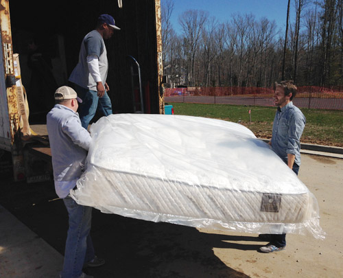
With almost everything done construction-wise in the house, we greeted a truck from Green Front Furniture (the local place loaning pieces to many of the houses in the show). They were delivering a bunch of bigger items like beds, desks, and sofas, so we had an “all hands on deck” day to carry things in and place them. Here I am with Charlie the listing agent hoisting the king-sized mattress out for the main bedroom.
Not everything is coming from Green Front, so more stuff has been trickling in as the week went on. And Sherry and I have spent a few hours every day going to thrift & secondhand places, small local shops, and big box stores to buy all that makes-a-house-a-home stuff to fill blank walls, empty shelves, and other empty feeling nooks and crannies.
There has also been some great progress outside. The wood beams have been stained and sealed, which made their color a bit richer/darker as planned. It still looks somewhat naked without any landscaping, so we can’t wait to see that stuff go in (should be rolling out sod this weekend) but the front door has officially been painted.
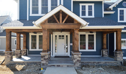
After the rest of the Homearama team weighed in on the door color debate, the write-in vote for white from you guys stuck (we all liked the idea of making the door look more substantial, so keeping it the same color as the white sidelights gave it more visual heft). The real stars of this exterior are the deep siding color and the rustic wood porch anyway, so we were all happy to let the door take a supporting role rather than competing for attention. Especially since we’ll be adding things like landscaping/potted plants/porch furniture to the mix. We even have a hanging porch swing that’s going up soon.
Moving inside, the kitchen is looking much improved now that it’s all put together. The appliances are officially in, the backsplash has been tiled, and we even got our island stools put together, which are these comfy saddle stools donated by West Elm. (For anyone wondering about the island color, it’s Hale Navy, the gray cabinets are just a stock color by the cabinet maker that we picked from a sample, and the gold pendants over the island are from Shades of Light).
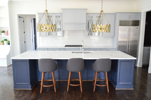
And look, you can see a sliver of styling stuff sitting in the built-ins of the eat-in nook to the left of that picture. Sherry’s probably working on those as you read this.
I don’t think we’ve showed that little corner of cabinetry on the right of the kitchen until now, so there it is. It’s a nice big open space (the island is 11 feet long if that helps put things into perspective) and Sherry can’t wait to get stuff on those counters and in those glass-fronted cabinets to make it feel more homey. Just seeing the stools pulled up to the island made it feel more “like a real kitchen” for us, though.
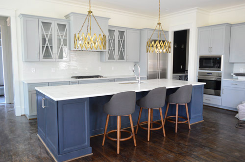
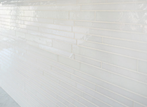
We wanted the backsplash to be fairly subtle, mainly just bringing a little polish and light-reflection to the room. So we chose this white blend waterfall glass tile from a local company called Mosaic. This is another case of “this didn’t need to be the star” since we have things like the gold light fixtures, that big navy island, and those x-fronted glass cabinets – so we just aimed to make it a solid supporting player.
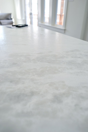
I tried to get a better shot of the counters, but didn’t totally succeed. It’s a leathered marble called White Moura which means that rather than having a smooth, glossy finish it has a slightly pebbled texture to it, along with a more matte finish. It actually feels kind of like leather (hence the name) but obviously is a lot harder/denser. And apparently the way they seal these, along with that added texture, makes them durable and easier to keep clean/maintain.
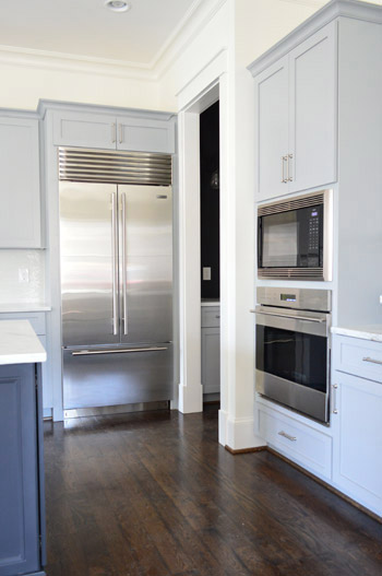
Let’s talk about the fridge. I’m mad jealous of this fridge. Well, actually, I’m mad jealous of Yolanda Foster’s fridge (I do my best to ignore the housewives entirely, but Sherry paused it to show me that fridge and it did something to me). But I’d still feel like a king if a fridge like this ended up in our house someday. We picked all of the appliances at a local contractor place called Cline. We had started by choosing a nice Whirlpool line, but the builder wanted to go big or go home, so he upped the ante and had us select a Sub-Zero and Wolf package.
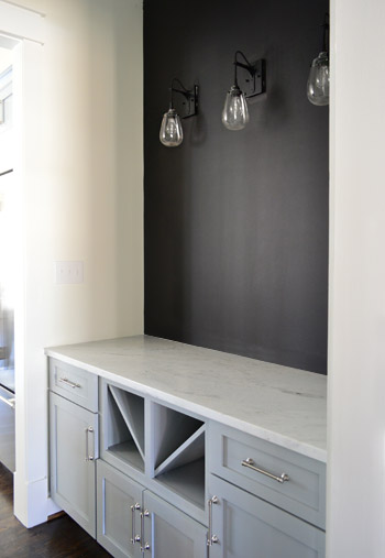
The area through that doorway above is the butler’s pantry which has the same cabinetry and counters as the kitchen. We put in the traditional wine / servingware storage in the bottom, but ditched the usual upper cabinetry in place of some cool industrial teardrop sconces from Shades of Light and a wall full of chalkboard paint. It’s a pretty small transition space so we thought it would be nice to let the upper walls breathe a little – and we have some plans for that chalkboard area soon…
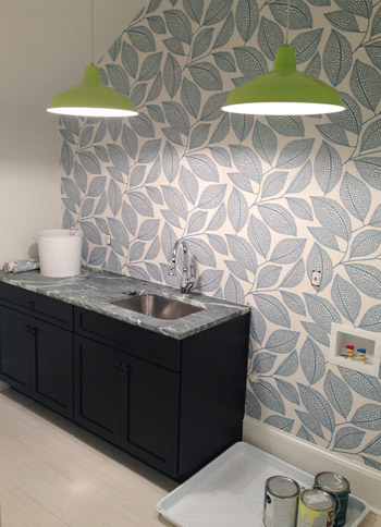
Moving upstairs, the wallpaper we’ve been way too excited about has finally been hung in the laundry room. It’s called Pebble Leaf by MissPrint and was donated by Wallpaper Direct. We waffled a little bit on adding it, but in the end we said “showhouse! take risks! stop waffling!” and went for it. So glad we did.
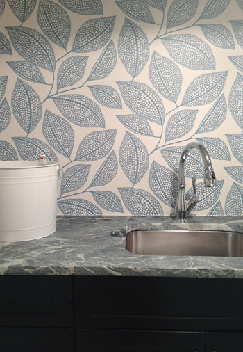
The counters are soapstone (purchased through a local place called Eternal Stoneworks), the faucet is called Leland (donated by Delta), and the cabinets are a dark wood stain (purchased from Affinity here in Richmond) while the floors are a nice, light and modern tile (called Travertino White Field Sunrock, purchased from Mosaic in Richmond). The lights are from our Shades of Light collection (they’re these in “Extra Lime”), and we bought two of them to hang in a row for fun. We’re still waiting on the washer and dryer (we ordered them in a deep gunmetal color) so that should complete that wall and balance things out.
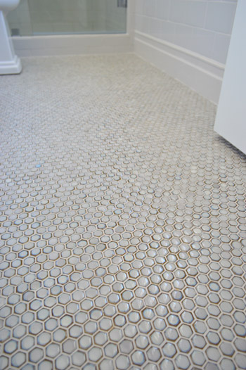
We haven’t shown you the guest bathroom yet, since it’s still missing a few major things like finished tile work and a mirror over the vanity. We wanted sort of a vintage vibe in there so we did a tile wainscot around the whole room, which we can’t wait to show you when it’s finished. In the meantime, here’s a peek at the floor, which was donated by The Tile Shop. It’s the hex version of the penny tile that we put in our last kitchen.
We also had fun with some vintage inspired fixtures, like this this bridge faucet that was donated by Brizo.
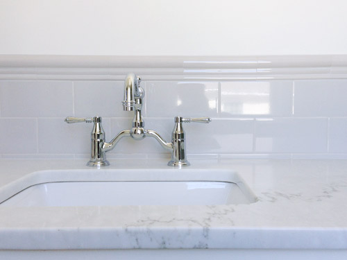
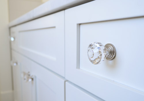
Even little details like having the hardware on the cabinets is making it feel that much closer to complete (these were donated by Liberty).
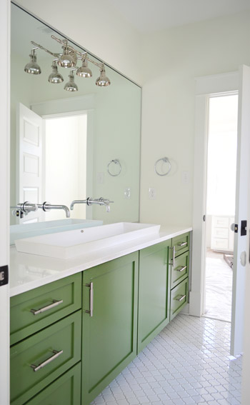
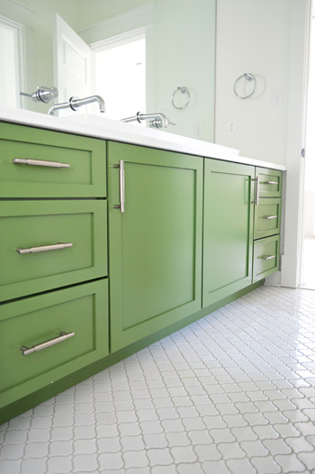
As much as we love the old-school/classic feel of the guest bath, our favorite bathroom in the entire house is the kids bathroom. You had seen a preview of the green vanity and the white lantern tile a few weeks back, but the wall-to-wall mirror finally got installed, along with our wall-mounted faucets, and that fun industrial light fixture (donated from Shades of Light).
The white solid surface top has a double trough sink recessed into it, which the folks at Ferguson helped us find. It’s hard to see how deep it is since it’s half recessed (it doesn’t just sit on the counter, it drops beneath it) but it has over 5″ of depth, 14″ of width, and is nearly 48″ long. Can I just tell you how crazy Clara would go for this set-up? It’d be like the grandest swimming pool ever for her Barbies. We also had fun adding a pair of wall-mount faucets (donated by Delta) that come directly from the mirror.
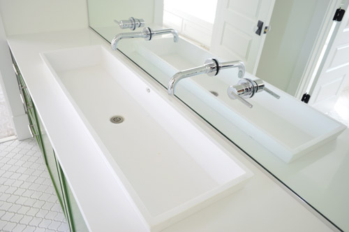
Don’t mind me. Just another shot of the vanity since the lighting was about as perfect as I’m ever gonna get in there.
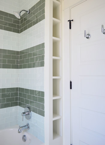
Another fun feature in that bathroom is the attached toilet/shower area, which is sectioned off by a door (so one kid can shower or use the toilet while the other one washes up/gets ready). Inspired by the cubbies in this bathroom, we had the builder squeeze in a set of wall shelves behind the shower that are perfectly sized for rolled up towels, shampoo, and other small bathroom accessories (you can read more about the striped glass tiles we chose for the shower here).
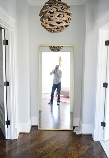
Other little nooks that are starting to come together include the Main Bedroom “Atrium” between the bathroom and closet. We got this brass floor mirror from West Elm so the future owners can look at themselves taking photos (I kid), and of course you guys have seen a peek of that branch chandelier here. Ah to have 10′ ceilings on the first floor and 9′ ceilings on the second floor. Update: these walls are Stonington Gray by Ben Moore.
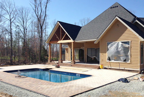
And we can’t forget that there are six other awesome houses going up right around us for the show – each done by a different team. So the other day we took a super quick field trip (the clock was ticking for preschool pick-up) to see some of the other exteriors. How amazing is this backyard? Pools aren’t super common in Richmond so it’s a nice treat to see one going in. We wouldn’t blame you guys if you just hung out back here during most of the show…
Things are going to be really showhouse heavy in real life for us over the next couple of weeks, so forgive us in advance if we’re behind or off schedule. We don’t want to let down our team or Habitat, so we’re hustling to get this baby done… well… before our other baby is done. We’re supposed to have as much finished as possible by April 4th (yes, a week from today) so it can be photographed by the Homearama organizers and then judged shortly thereafter (we’ll continue tweaking things and tying up loose ends for the following week or two). So we’re basically living out there these days. Good thing there are mattresses now.
Psst – Wanna see more showhouse info & photos? Click here for Our Full Showhouse Tour, which includes final pictures of every room, the floor plan, budget info, a video walk-through, and shoppable showhouse furniture & accessories.

Christina says
We are getting ready to build, and this house had given me so much inspiration. Can you tell me what type of wood are the beams on front of house made of?? Thanks and Congrats!
YoungHouseLove says
They’re rough hewn wood boards that our builder found locally. He stained them in “cedar natural” from Sikkens.
xo
s
Kerri K says
Hello,
I’m wondering what wood species and stain color you chose for the showhouse. I couldn’t find that information in any of your posts.
Thanks in advance!
Kerri
YoungHouseLove says
It’s oak and the stain is Jacobean.
xo
s
Penny Smith says
I am not sure why it excites me so much that the tile I picked after being inspired by your penny tile backsplash, is the tile YOU used for the guest bath! (The Moss Hex) LOVE IT! And everyone loves my tile when they come to my house! It looks great-your picture is so much more true to “life” than their website picture for sure! They should use your pic on their website as an example! :)
YoungHouseLove says
Sounds awesome Penny! Good luck!
xo
s