Most guys don’t log time with their sister’s boyfriends by helping them rearrange their bedrooms. But then again, most guys don’t list “furniture placement” among their interests. So when my little sister Carrie recruited us to give her boyfriend Robert a hand with his clunky bedroom layout (after we spruced up her living room last fall) we were totally up for the challenge. And the budget? Zero dollars and zero cents.
For a guy just out of college, Robert has a pretty sweet townhome and a surprisingly grown-up bedroom set. He was just struggling with a way to functionally cram all that serious furniture into such a modestly sized space. Here’s what his room looked like when we arrived (we didn’t really give him fair warning to clean up – but at his age I wasn’t exactly obsessively organized either).
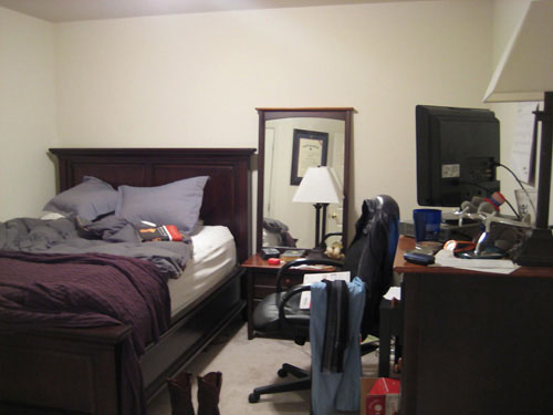
Robert had two main complaints about his room: (1) not enough space to move around and (2) an unused corner that collected junk by default. We noticed that it also felt crowded when you walked in – the biggest piece of furniture (the bed) stared you straight in the face while the tallest object (the dresser) practically bumped right into you as you entered. So in about 45 minutes we cleaned, rearranged and spent absolutely no money to give Robert a more spacious feeling furniture arrangement. Here’s the rearranged result (from the same view):
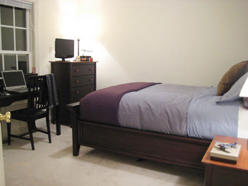
Not bad for a no budget switcheroo, eh? Cleaning certainly helped a lot, but here’s a rough floor plan to show you where furniture arrangement really made the difference (note: Robert’s bedding is in fact a blue and brown combo, but it somehow looks purple in the pictures):
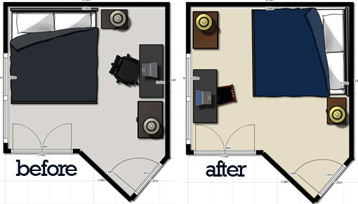
The biggest difference was moving the hulking headboard out of your initial line of sight and exposing more of that big back wall to let your eyes “breathe” a bit when you first enter the room. A few other helpful changes were swapping out the large office chair with a lighter-looking one (borrowed from elsewhere in the house) and positioning the matching table lamps on either side of the space for a more balanced look (and consistent lighting throughout the space). Robert also loved that we centered his desk under the window so he was no longer staring at the wall while he worked.
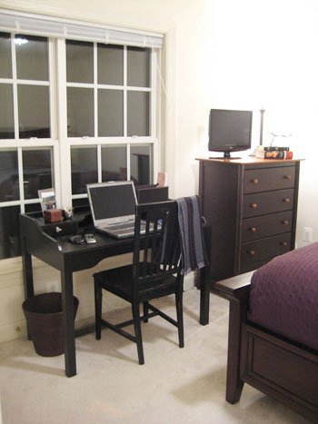
And now, instead of the practically walking into the side of the dresser upon entry, the bedroom door opens to this much lower-profile nightstand. It still gives Robert a place to toss his keys without risking a lamp in the eye.
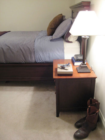
You can still appreciate the classic, masculine look of the headboard from the other side of the room. Heck, from this view you almost forget that this modestly sized space does double duty as a bedroom and office.
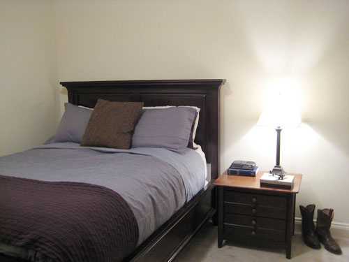
Best of all, Robert’s two pet peeves are no more – he has more walking room and no more wasted corners. He plans to add art, hang that mirror and possibly add a round circle rug from Ikea and some slate blue corduroy curtain panels. But for now we think he should be pretty proud of his “new” room which called for absolutely no money, and just a little moving.
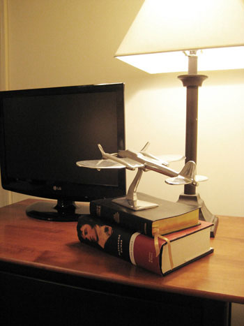
And I have to hand it to Robert for being a good sport about the whole thing. Not many guys would take well to their girlfriend’s older brother dismantling their bedroom. And if the worst thing we uncovered during our rearrangement was a few too many issues of Popular Mechanics (engineering porn?) then I think I’ll let him keep dating my baby sister.
Floor plans created using Floorplanner.com

sarah says
awesome after!furniture placement does wonders for small places. my favorite part is the cowboy boots! hehe!
Molly says
Seriously? Now i’m wondering which rooms in our house need a little switcheroo, too!! Coming to Dallas anytime soon? he!
Linda@LimeintheCoconut says
Nice job, Youngsters!! Plus you cleaned it up. Just a tad.
two Excited nests. says
Holy schmoly!!!!! What an awesome transformation, I’m in awe at the moment! You guys are so inspiring!
Kathleen T says
Clearing out the clutter seems to do wonders as well!
Laura Lynn says
I can’t decide what I enjoy more – the room’s transformation or your writing style. OK, I like them both! You guys are so talented.
Erin says
Looks great! Just goes to show you what $0 can get you! And since you reference John’s old apartment… my hubby and I are headed to Manhattan this weekend. Got any suggestions for great places to go and pick up some unique furniture/accessories if you’re on a budget? Thanks!
Alicia says
Great job John! It looks great and I’m sure both your sis and her bf appreciate your efforts.
I really love his desk/work table–any idea where it’s from? Probably Target, which is bad news for this Canadian.
Keep it up!
YoungHouseLove says
Alicia- Robert’s desk actually hails from Ikea, so that bodes well for finding it in Canada!
Alysia- His bed is from Crate & Barrel and it is indeed very nice. He’ll have it for years.
As for a post about my old apartment, here’s one that spotlights a few of our old NYC abodes, and there’s even a video tour of my Greenwich Village apartment at the bottom. Enjoy!
xo,
Sherry
Alysia says
Nice set-up! Do you know where he got his bed? It is very nice! ps. Did you ever post about Sherry’s old place?
jbhat says
Nice work, and thanks for sharing the befores and afters. He’ll be a brother-in-law soon, I suspect.
heather s. says
It’s amazing what a little furniture moving can do! I love rearranging rooms and used to do my bedroom every couple of months (now in my current house it can only be done one way due to closet doors).
Erin says
This is great! It shows that just the placement of furniture makes a big difference in a room.
Sam & Jacci says
That looks GREAT!!! :) How restful!
Hmm… I’m still thinking about all you said about staring at huge furniture the moment you walk into a room…
We just moved into a smaller home, and we’re still trying to figure out where all of our furniture is going – especially in bedrooms. I know the cost for your mood boards, but do you all do any smaller scale consulting – like in furniture placement, for less $$?? Right now our master bedroom is potentially “too much” for the eyes upon entering.
I love what you all did with Robert’s room. The little touches like moving the airplane onto the stack of books makes it look more decorated, even without the money spent. As always, you guys are rocking it :)
Jacci
YoungHouseLove says
Hey Jacci,
Good news. We heard you loud and clear and devised a whole new service to meet your needs!
https://www.younghouselove.com/house-calls/
xo,
Sherry
Natalie says
Wow, fabulous job!
Nicole H says
What a difference…what did you do with that mirror that he had on/near his bedside table?
YoungHouseLove says
Hey Nicole,
The mirror is going to be hung on the thin strip of diagonal wall that isn’t pictured (directly to the left of the door as you enter) since Robert uses it to get ready but it looked sloppy propped up on his side table. Hope it helps!
xo,
Sherry
Kristy says
THIS proves that you can have a nice home even with no additional money spent. It’s about how you lay things out. I would say this room would do especially well with a bit of wall color as well.
Kristi says
Nice work! What software did you use to create the floorplan diagrams?
Thanks!
-kristi
YoungHouseLove says
Hey Kristi,
We used floorplanner.com to create those diagrams. It’s easy and free! Hope it helps.
xoxo,
Sherry
Livy says
Literally, I “omg’ed” out loud at the after pics. Amazing for not having spent a cent.