Our recent flurry of mirror-related projects means my repertoire of pun-riddled mirror references is growing thin. Our latest victim was the guest bathroom. We figured after swapping out the medicine cabinet in our master bath, that we might as well do the same in the guest bath. Especially since our guests won’t exactly need a medicine cabinet. At least we hope not.
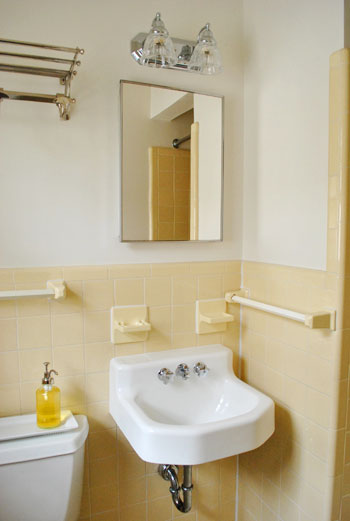
It was still functional, but had definitely seen better days (the interior metal cabinet was starting to rust- we think it was original to the house, which makes it almost 50 years old) and we figured we could do better than the plain silver frame. So two screws later it was off the wall and after another two minutes (ok, maybe I’m exaggerating, let’s say five) we were back in business:
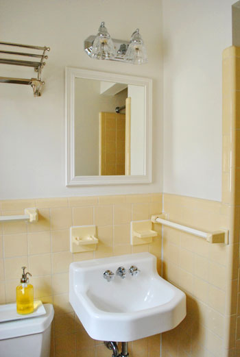
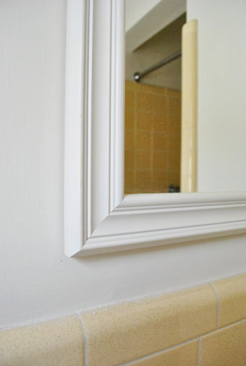
It’s clearly nothing elaborate, but at least it was free (it was an old Target mirror that we’ve had for a couple of years). And we figure once we get some paint on those walls (we’re thinking some sort of muddy gray will hopefully add some sophistication with the yellow tile) the white frame will pop nicely off the wall and go hand in hand with other clean white objects like the trim, sink, toilet, etc.
We also took a moment to remove the large room-encroaching metal shelf & towel bar. You can see it gone in the photo below and scroll back up to see it in action above the john. We figure we’ll add two clean looking hooks to the inside of the bathroom door for guests to hang their towels, and the room might benefit from some crisp art on the wall, just so it feels a bit less utilitarian. Oh and speaking of the inside of the bathroom door, we decided to remove the full length mirror that you see in the pic below. Not just to free up space for those towel hooks that we mentioned…
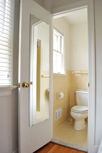
… but also to remedy the uncomfortable placement. See, if our guests went in there to do their business, they’d get a view similar to this one. Minus the jeans. Awkward.

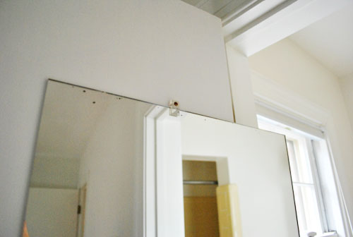
Removing it was a cinch. Since it wasn’t glued to the door, I just had to remove the single clip on the right side, and then carefully slide that baby out (it had two clips on the top and the bottom, and one on each side). Once it was off the door, I removed the rest of the clips. Here’s the best one handed “in progress” shot that I got.
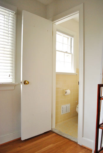
And here’s the door as it stands now. We’ve still gotta putty over the screw holes left by all of the mirror clips and then hang our towel hooks but we feel pretty good that we’ve saved our guests from having to experience their very own “John on john” moment. If they happen to be named John. Otherwise switch the first John out with their name (like how I overexplained that for you?).
Oh, and you probably remember that we’ve got another one of these mirrors on the master bathroom door (on the outside, fortunately). We were thisclose to taking it off moments after finishing this project, but suddenly started second-guessed ourselves. We’re now thinking that instead of removal, we might leave it be and someday upgrade it with a nice frame of molding around it so it looks built-in. We’ll see…

Elizabeth Mackey says
What is it with some people and mirrors! The house we are in right now (we rent) has a bathroom that has so many mirrors in it, I feel like I’m in a fun house most of the time! Never fun in the morning after a shower, to look in all those mirrors,buck naked!
Anna says
I can’t wait to see what else will be in the future for this bath. I have the same yellow tile and I’ve tried to love it, but nothing seems to tone it down.
Oona says
That shot of John on the john is priceless. You should frame it and that can be your bathroom “art”! lol
T @ the peach chablis says
Do you always pose on the john with your hand so elegantly placed on your cheek?!? Made me snicker. and snort. Just a little.
YoungHouseLove says
Oh yeah, I’m coy like that.
-John
Bobbie Brown says
This post totally made me laugh! Love the pix of John sitting on the toilet!!! Hysterical!
kristen f davis says
i really love that yellow tile.
Brittany says
We literally just painted one of our bathrooms that has that exact same color tile this weekend. We ended up using a Behr premium color called “Lunar Shadow”. It’s a very moody color when on the walls and it looks amazing. It updates the tile and makes it look more on purpose than being left over from the 70’s, when our house was built. After a couple of weekends of much painting it is the first color that my husband said that he loved. Depending on the lighting and time of day it has a purple tint, gray tint and at night a blueish look to it. But another color that almost won out was another Behr color called “elephant skin”, it is a muddy gray color that looks great with the yellow tile.
Love the replaced mirror :)
jja says
It looks nice :-)
Annalea says
You guys could do some really great things with the mirror from the guest bath door. Build a frame (like the Barnwood Frame from Knock Off Wood) for it, and hang it sideways somewhere in the house that needs more light, for instance. There’s a website I just learned of called Mirror Mate (Google will tell you where it is) that has some neat frames sized for mirrors, too.
Have fun!
Susanna says
Our old powder room was formerly an entry hall closet. The owner got a little over-inspired by the concept of mirrors making a small space look larger. The ENTIRE bathroom, all probably 4×4 feet of it, was mirrored from the waist down. It was traumatic. When people came over for the first time and used it we would just wait for their comments when they came out. Pregnant friends were the most traumatized, but really no one needs to see themselves pee from all angles!
Shannon says
I think it looks great. I also think the gray on the wall would be the best match for the yellow tile, definately make more sophisticated looking. Oh my gosh, I want your house already! I am working on my house but it was no where near as cute to start with! I’m actually very anxious to begin my daughter’s room because I get to add a whole wall, with a closet behind it, and I am putting built-in shelves w/a lower cupboard on one side and a little nook for her dresser on the other(it’s a small room and I want her to have as much floor space as possible) but unfortunately that will be one of the last rooms…just because of how we have to live here right now.
Anyways, after this post I scrolled down and saw your bedroom post again and now I am in the mood to do my room big time! I think this weekend while the kiddos are visiting Grandma is the perfect time! Which means I have from now until Friday to FINALLY choose a color!!
Kelly says
I laughed so hard at the John on john photo. The last thing you want to see when you’re going potty is yourself!
Taylor says
I am a new follower of your blog (2 weeks) and loving it. Do you think you will ever change the yellow tile or will you keep it for the long haul?
Hilarious picture of John!
YoungHouseLove says
Hey Taylor,
We’re definitely planning to work with it for the time being. Maybe sometime down the line we’ll reno the bathroom to make better sense of the shower shape (it’s kind of small and closed in) but we’re happy to give the current “vintage” look some love for a while.
xo,
s
Lauren says
In our half bath the sink/mirror are directly across from the toilet (same set up as the half bath in your old house) so I can see the top of my head in the mirror. I used to think that was bad, but the John on the john photo is WAY worse….what were they thinking when they decided to put a mirror there?
Lana says
I might be in the minority but I really like the yellow tile! Vintage-y like you said, and it looks like it’s in great shape. My apartment bathroom in Seattle is unfortunately not so lucky. I’m jealous, you guys! :)
Rae says
what makes me laugh is that we did the very same thing. with the very same target mirror. Looks really good in your house, too!
SarahClark says
I totally want that sink.
Leslie says
This bathroom looks very familiar! We ended up painting the walls a beige color. It totally changed the look of the tile from yellow to a nice neutral. The tile just blended in with the wall color. You might want to consider it!
tammy says
wow. nice call on getting rid of that mirror. hilarious!
Ellen says
Help!! my husband and I just bought a brick ranch built in the 60’s (so you can imagine my amazement stumbling upon your blog…and laughing hysterically because we’re having the same experiences!). Our master bath is identical to yours shown here and I can not figure out what color to paint it. Our tile is a little paler (some days I look and see a neon green tinge to it) – hideous to say the least. BM Crystalline is the shade I am considering but I am undecided. Is there a shade you’d recommend that may “compliment” that color tile better? I’ve never thought of a gray…you may be onto something there…
YoungHouseLove says
Hey Ellen,
Your best bet would just be to hold up a bunch of swatches and see what you like! That’ll be our approach when we get to the paint-picking stage!
xo,
s
Katey says
I love the liquid soap dispenser sitting on the back of the toilet, can you tell me where you picked this up at?
YoungHouseLove says
Hey Katey,
Target! Love that thing. Plus it’s recycled glass!
xo,
s
Jamie B says
I can see how it’d be hard to reconcile with the rest of your house as you make modern upgrades, but I too like that charming vintage tile. I also like the marble (?) doorstep, how posh. :)
Lisa says
As much as I LOVE full length mirrors (I must be very vain), my grandparents have always had a behind-the-door-zoom-in-on-the-business mirror and I hated it every time I sat down. Good move on removing the infamous mirror and I cannot wait to see all the improvements you both will be making on the snazzy new/old house!
Carla T says
Hey John, Thanks for the visual ;) lol! That was funny!
katie n says
love the idea of gray paint with the “vintage” yellow tile. love how you’re going to work with the tile already in there!
jane says
lol at the picture of John on the toilet. I totally see why the mirror came down. :) I cant wait to see what you do to that bathroom as far as accessories. We have a bathroom very similar only in blues. The tile is original to the house and looks just like yours but in different blues. The vintageness (not sure if that is even a word) is actually growing on me.
Alecia says
Love your blog! We have tile that looks very similar to the tile on your bathroom wall and when I had our house tested for lead, I was shocked to find out that our tile was filled with lead. You may want to have yours tested if you do decide to remove it.
YoungHouseLove says
Thanks so much Alecia! We took a ton of precautions when we redid our bathroom in the old house, so it’s definitely something to think about if we pull of those toothbrush holders or something.
xo,
s
Mary @ stylefyles says
Vesper on John?
Tara says
Funniest picture ever!! On another note, I cant seem to find the “View All” button for comments…only the numbered pages of comments are showing up. Help!!
YoungHouseLove says
Hey Tara,
So sorry! We had some issues and had to take it down for a bit, but it should be back up now!
xo,
s
Krista Haws says
I love the idea of doing a grey for the walls! I think it would look very sophisticated and you can tie it all together with accessories! Good idea (as usual) :)
christina says
john on the john? classic. no need for mirror puns when you got your husband on a toilet on the blog :) maybe i should try that next time i’m having a blog post brain fart!
xo christina
[www.littlewellies.com]
Kay says
Haven’t read all the comments, so forgive me if this is a repeat. I don’t want to burst anyone’s bubble – or mirror (imagine the bad luck) – but have you checked local codes? I know you like to be code-compliant and your attention to details like that paid off when you sold your last home. In our area, we’re burdened with a requirement that every bathroom MUST have a recessed medicine cabinet located at blahblahblah height within blahblahblah distance of the sink. If you’re lucky, you have a code that is reasonable and modern and let’s home-owning adults decide where to store the Bandaids, but I hated to see you plan the bathrooms without checking first.
YoungHouseLove says
Good to know Kay! That’s so funny that some places actually have codes about that. We don’t know of any such codes in our county, and recently sold our last house without any medicine cabinets (both bathrooms had flat mirrors since we removed two old metal medicine cabinet beasts a few years prior). Hope it helps!
xo,
s
Ashley says
Don’t you love that marble threshold feature of 1950s/60s houses? I didn’t notice that my own house had them until after we closed and moved in, and it was such a fabulous surprise bonus.
shannon R. says
Hey guys! I don’t know if you have recently checked the crate and barrel website but the lamps you had in the mood board you created for your bedroom are $29 right now! Just wanted to let you know since they’re an amazing deal right now :)
YoungHouseLove says
Thanks Shannon! Off to check them out!
xo,
s
Caitlin says
I am SO EXCITED to see this bathroom painted grey!!!!
Also I had a good laugh seeing John on the john… that’s a terrible place for a mirror!
Leslie says
I love the mirror replacement, the new one looks great; same goes for removing the shelves, much better! I have to agree with others that I like this bathroom! The tile on the walls and floor look great together, and seem to be in good shape! Love the sink, too; I have the same one in my (tiny!) master bath!
Courtney says
HAHA! Great choice to get rid of the mirror, we have a similar issue with our half bath. But we had to change the paint first…it’s a small room, and it was HIGHLIGHTER YELLOW. It made me sick to my stomach!
Mich says
oohhh I love the idea of Gray with that tile! Can’t wait to see that!
JC says
If I had been a boy, my father was insisting on naming me James Robert for the sole purpose of nicknaming me Jim Bob. I’m pretty sure I would have changed my name at the first possible opportunity!
Monica F says
I posted on the wrong entry, so I will put it here instead.
You may have posted this somewhere else, but where did you get that soap dispenser in the guest bathroom?
YoungHouseLove says
Hey Monica,
That’s from Target. Love it! And it’s made from recycled glass!
xo,
s
Andrea | HomageStyle.com says
John on john moment? Don’t you mean Lars on john?
Seriously entertaining myself with that one!
Sheralyn says
You guys can turn any room into a magazine worthy masterpiece! I am loving the tiles so so much
imagining them complemented with muddy grey walls :)
Any chance a modern-style sink skirt may make it into the room as well? I’ve heard they’re great for
adding bathroom storage.
YoungHouseLove says
Hey Sheralyn,
We don’t have a sink skirt in the plans for now, but who knows where we’ll end up!
xo,
s
Krista says
We had a yellow bathroom too! Gotta love old houses :) Ours was built in 1965. Thankfully it has since been renovated but seeing your ideas really makes me want to repaint…
Leigh says
I’ve got a 1950’s rancher w/ a yellow tile bathroom and the first project I completed was painting the walls gun metal grey and I LOVE it. I gotta say I liked the silver medicine cabinet better. But you guys clearly know what you are doing, the new white mirror might look awesome once it’s all painted.
Katey says
Love the mirror! Also, the tile floor in the bathroom seems familiar…scrabble, anyone?
Macy says
I laughed aloud when I saw the picture of John on the toilet because, sadly, I can relate. When my parents redid their condo they put a full length mirror on the door of the “guest” bathroom (aka, the bathroom that my sister and I share we’re both living at home for the moment…) My solution has been to hang my giant bath towel over the mirror, so I can only see my ankles, but boy oh boy do I wish one of them had realized how weird it is to have a full length mirror across from the toilet… And it actually is a built-in, so there’s no removing it easily!
Anne says
Your bathroom will be lovely in yellow, gray, and white. Such a classy scheme. Might I suggest you not go too muddy with the gray? Perhaps pick out a mid-tone or lighter from the marble threshold.
Wendy says
I cracked up seeing this! Check out my post about our mustard tiled bathroom… the mirror (and the tile) might just look familiar!
http://beaconbits.blogspot.com/2010/12/baby-steps.html
Lilly says
I love the grey and yellow combo. I think it will look super cute and u save the time and money for a big reno later later down the road. I’m thinking of doing the yellow grey combo for my second baby that I’m currently expecting this May. We are expecting our second little girl aww.
Katie says
Hey guys, this post got me because I thought for a moment you had taken a photo of my bathroom. Oddly enough, where you have a white sink, ours is the banana yellow that covers the rest of the bathroom. We also went with a warm grey, actually called Perfect Greige. (Grey + Beige). We are currently considering the option of having the tile refinished as it is the master bath and we have 2 others to redo. I’m so excited to see how yours ends up! Enjoy!