Many of you have probably heard that Sherry and I started Young House Love to help our family keep up with our kitchen renovation. We came up with the idea while walking Burger one evening last September and even picked the name before finishing our loop around the block.
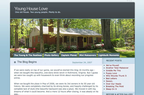
That night I signed up for a free WordPress account, found an existing template I liked, typed up a quick introductory post (read it for yourself here) and thus gave birth to our blog. And it looked a little something like this:

That steely blue template looks so funny to us now, but it was our pride and joy for the first 5 months of our blogging experience. It wasn’t until the dust had settled in our kitchen that we finally considered giving Young House Love a makeover too.
I learned some basic web coding and together we designed a new homepage that felt a little more like home (we spruced up the site with the neutral palette and clean lines that you see throughout our house). On February 16 we launched the new design and haven’t looked back… although we’re always open to suggestions if you’ve got any!
Knowing our ever-evolving tastes, don’t be surprised if you see YHL v3.0 someday. But for now we’re just enjoying our happy little home(page)- and we hope that you guys are too.

Ky says
Did you use online resources to learn your webcoding? If so, any site in particular you would recommend?
Thanks! Love y’alls home design taste! And the fact you do everything on a budget.
YoungHouseLove says
Hi Ky,
Good question. I learned all I needed to know online, usually just Googling my questions until I found an answer that I could understand. I once knew HTML pretty well, but the web is much more sophisticated than that these days so I’m just trying to keep up.
This WordPress.org site is pretty helpful at breaking down all you need to know to get a self-hosted blog started.
For the actual design of our new site I downloaded an existing WordPress template here and then just played around in the files ’til I figured out which code affected which parts of the design. I didn’t stray too much from the original template, just gave everything new colors and graphics. And whenever I ran into something that stumped me I just turned to Google again.
Sorry that’s not a very step-by-step answer, but it was definitely a trial and error experiment. And an experiment through which I’m still learning new stuff everyday!
Feel free to e-mail me directly at [email protected] if you’ve got other questions.
Thanks for reading!
-John
Hima says
Sherry and John, Congrats on the first year celebrations! I got hooked to your site a few months ago and I am a regular reader of the blog. Living in India and with the time difference, I wait for every evening so that I can have a look at your site. I truly enjoy your site and have got a lot of inspiration for my home decorations. Keep up the good work.
Hima.
Chennai, India.
YoungHouseLove says
Whahoo- India! That’s super exciting:) One day we’ll chart all of our global readers so we can see what city/state/country/continent everyone calls home.
xo,
Sherry
Sara says
Totally random post, but it is a slow day at work and I’m looking at your archives and I came across this post. As a regular YHL follower for the past few years, I’m curious about the tabs on your original blog. What did the “Young and the Restless” and “Captain Planet” tabs stand for?
YoungHouseLove says
Haha, those were the days. The Young and The Restless was our about tab (you clicked it and learned about us, the Young & Restless Home Renovators) and Captain Planet was all of our green projects and posts (since we were learning how to compost, making a rain barrel, etc). Ah, the good old days.
xo,
s