This kind of spoils the whole “wait for it… here it comes…” build-up, but I had to lead with an after picture for you guys.
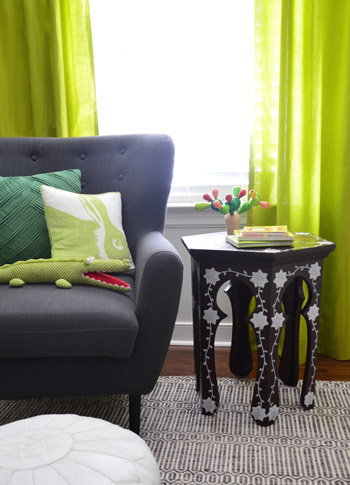
It’s a super affordable, deceivingly simple thrift store table upgrade. Seriously, don’t tell me you can’t do this. You can.
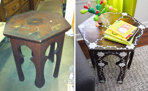
And I’ll give you one of these if you say you can’t.
Do you remember the $25 thrift store Moroccan table that I brought home nearly two years ago?
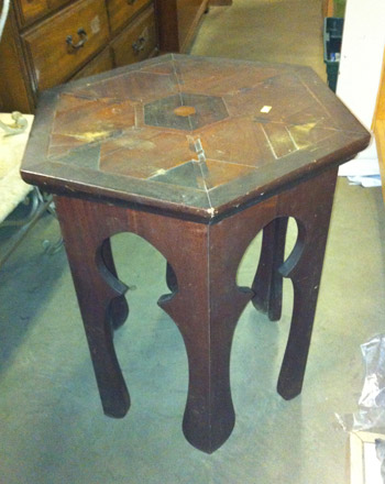
Even after cleaning it up, the top still had a few issues, but I didn’t want to rush into altering it right away (like attempting to putty, sand, prime, and stain/paint it) so I just tossed a few things on the top to hide those cracked and water-stained areas. John and I really liked the wood tone and the cool interlocking shapes on the top anyway, so we thought living with it as-is for a while was the way to go.
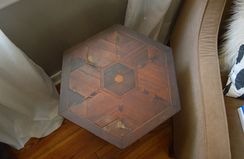
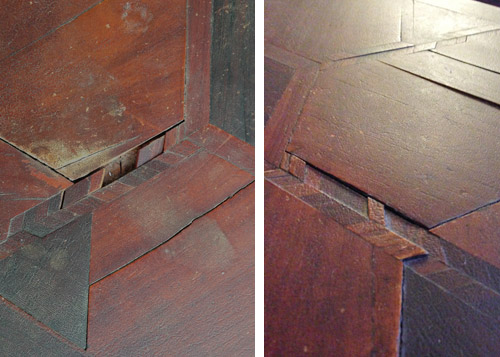
Fast forward nearly two years, and well, we’ve definitely lived with it for a while. No sir, there was no rushing into anything with this guy. But the years haven’t been very kind to the top of the table. And by “the years” I mostly mean Clara, who figured out that she could pull little wood shapes out of it like a puzzle.
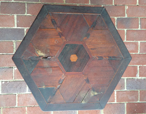
Some areas were a lot looser than we thought, and a few pieces even started to pop out and get lost in the shuffle.
The temptation to paint our bedragged little table definitely came back full-force as it continued to fall deeper into despair. Especially when we started noticing sweet little versions like this and this popping up. Meanwhile, our old thrift store find was giving off that “uh, you don’t really have much to lose at this point” vibe. So we thought “let’s just try refinishing it, and if that backfires we can always paint it as a backup.” The first step was sanding it and adding some wood filler to those cracked, broken, or uneven areas.
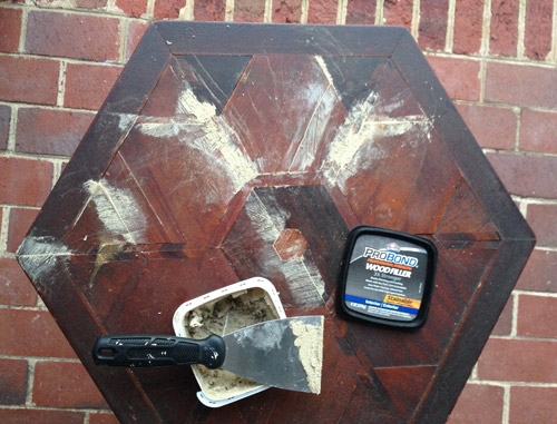
We had luck using this same type (and tone) of wood putty with our dark-stained kitchen cabinets (more on that here), so although we debated running out to buy some darker wood putty for this project, we figured we’d have the same luck with being able to even things out with a little more stain on those puttied areas. That last sentence is foreshadowing. Feel free to read into it.
After everything was dry, we sanded those areas, and then it was stain time.
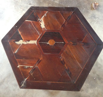
We wanted the same rich reddish-brown tone that it had always had, so we went with Red Mahogany stain by Minwax (we’ve had the same can since using it on Clara’s two-tone dresser four years ago). After two coats – applied with a brush and wiped off, per the instructions – it was clear that those wood puttied areas were being a lot more stubborn than they had been when it came to our kitchen cabinets. Bummerz.
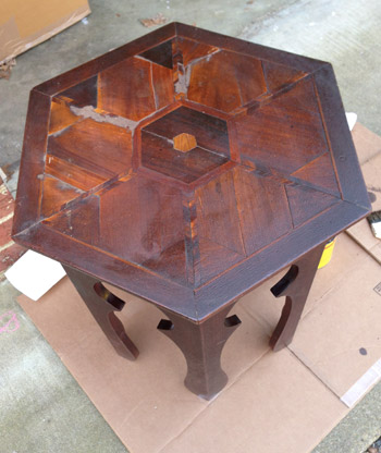
So I did what I usually do whenever a project goes wrong. I stepped away from it for a while and John and I started working on something else and ran to Home Depot for some other materials. In other words I just tried to forget about it for a little while – hoping some solution would come to me. Honestly I expected the solution to be “well, we said painting was a backup plan and it sounds like that’s the best option.”
Then as we pulled into our garage after returning from Home Depot, stain markers popped into my head. I knew we had one in a dark color since I occasionally use it to touch up the dark wood furniture items that we have (like our foyer console table, Clara’s dresser, our sofa table, etc), so I figured I could just give that a go on the wood puttied areas to see if it might darken them up so they blended better.
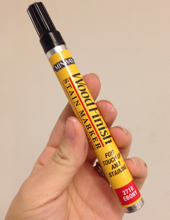
Miracle of all miracles, it worked. I just scribbled it on and gently wiped it with a paper towel to blend it all in.
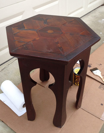
It didn’t completely hide the putty (you still can see those spots when you stare at the top in this picture) but it definitely was a nice leap closer to the not-as-obvious effect that we were going for.
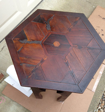
And that’s when I had another idea to completely obscure them. What if I didn’t paint 80% of the table, but I added some interest in a few areas with an inlay inspired detail? I figured that might draw the eye away from those patched spots while adding some fun detailing without completely robbing the table of the wood look like a full-on paint job would. I even found this example in an binder full of magazine tear sheets since I vaguely remembered thinking about that as a “down the line” idea a year or two ago. Turns out I had even written myself a little note so I wouldn’t forget.
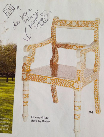
It’s definitely not a tame idea (ok, maybe it falls into the “kinda crazy” category) but I figured we didn’t have much to lose, and John was down with the idea too. So with his blessing it just came down to the “how” of the project. I considered everything from stencils and stamps to attempting to freehand the whole thing, and landed on a combo move: freehanding the leafy vines that connect everything but creating a cardboard template for the star-like shapes that seem to be on a lot of Moroccan designs.
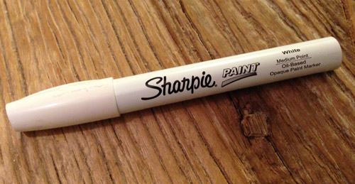
I thought a paint pen would give me more control than a paint brush, so I decided to try that first. Thankfully this Sharpie paint pen worked well, so I’d recommend it – but be sure to use their oil-based version (they also have a water-based one that I love) if you’re using it on a stained piece of furniture to avoid any bleed-through. To avoid fumes, I just opened a bunch of windows and Bane-d things up with my respirator so I wasn’t breathing anything in that I shouldn’t be.
To make my cardboard stencil I found a seven pointed star online, printed it out onto card stock in a bunch of different sizes, picked the size I liked best, and cut that one out. As for how I landed on seven sides for my shape, I noticed some Moroccan designs that had five, six, seven, or eight pointed stars – so because seven is our favorite number I went for that.
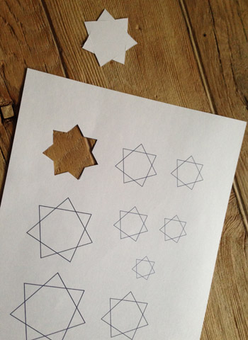
I traced that onto a piece of cardboard and cut it out. Then it was as simple as tracing around that like a template right onto the table, and filling it in (it took a few coats of “filling in” for things to look nice and solid, so pardon the sketchy look of these progress pics). Note: in hindsight I wish my stars were a smidge smaller, so choosing a star printout that’s a little smaller than the one you want will probably yield the perfect size since the traced outline makes it slightly bigger.
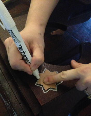
I drew one of them in the middle of the top and one on each of the corners, and then I just made random sort of wavy lines to connect them all.
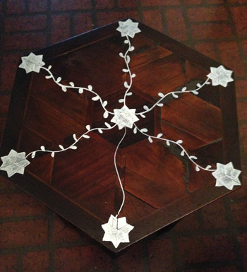
Those were the simplest part, and adding little leaves on alternating sides turned those squiggles into vines. If you tell me you can’t do this I’ll challenge you to a duel with a paint pen, because you can. Anyone can. Just practice with a marker on a piece of paper, and make some wavy lines and add some leaves. It’s crazy easy, I promise.
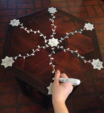
Then I just added more vines to connect the outside edges. This is before I did one more “coat” for the stars, so it’s still a bit sketchy looking in a few places. The cool thing about adding the faux inlay detailing was that it made the puttied parts virtually invisible, thanks to adding a lot more contrast with that white detailing. Can you even tell where the putty is anymore? It’s amazing what a little “look over here” diversion can do for a cute-but-flawed patch-job on an old secondhand table.
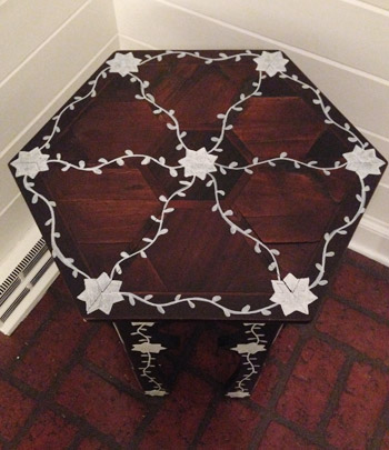
To do each of the six sides of the table, I laid it down on its side and worked on each one at a time – adding a star to the top, middle, and bottom of each leg, and connecting those with a hand-drawn leafy vine.

As I mentioned, the paint pen filled those stars in sort of sketchily, so I went back over all of them with another “coat” to make them look more solid. The vines were fine with one coat though, so it didn’t take too long. I actually might do one more star coloring session to make sure they’re solid looking before I use Safecoat Acrylacq to seal it all in (that’s our favorite non-toxic poly alternative).
Overall this entire refinishing process took a few hours and the inlay inspired stenciling/freehanding probably took two more, so it wasn’t as fast as painting it a solid color, but it was really fun to try something new – especially since this design is so common on Moroccan tables, and we still get to enjoy that pretty wood tone coming through.
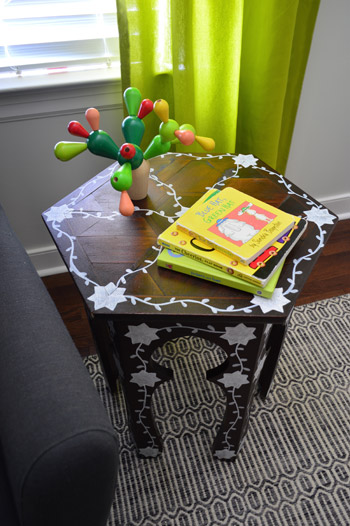
Considering that some of the real-deal mother of pearl inlay tables sell for over $1000 (!!!) I’m cool with this $25 “look for less” result with some paint on our sweet little thrift store find. We had everything that we used in our arsenal already, but even if you had to buy wood putty, stain, a stain pen, and a paint pen, you’d only spend around $25 on materials.
It’s definitely one of those bolder furniture moves, so it’s probably not for everyone, but it was fun to try something different. And the nice thing is that it’s not too much of a commitment, so if we tire of it down the line we can always sand it down and re-stain it, or even paint it a solid color someday.
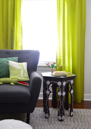
Right now it looks pretty sweet in the nursery since there are other wood elements in there (the built-in dresser tops, the crib drawer, the wood wrapped toy cabinet, the wooden bike frames) but we’re not sure if it’ll stay there for the long haul. You know we’ll keep you posted!
Were any of you making over any furniture this week? Have you ever tried one of those stain pens on wood putty? Or a Sharpie paint pen? I was so relieved that the stain pen helped and the paint pen actually worked (I think my lines would have been a little harder to control with a craft brush). When a project stalls out, how do you deal with it. Do you walk away and work on something else? Google around for ideas? Consult your all-knowing chihuahua?

Christy says
Even though I don’t love the table, I am still happy to see it. Your posts help me to figure out what I like/don’t like and why. By looking at this table, I have figured out that if I do something like this myself (which I might), I would use a less contrasting paint and smaller stars (or other motif).
By seeing something I like but don’t love, I can figure out how to adapt this to get something I love so I won’t be disappointment if I try something.
Your posts help me to be comfortable with taking a risk. Thank you for all you post (now I just need to make time to do something in my own house).
YoungHouseLove says
Thanks Christy – you’re so sweet! Happy to help.
xo
s
Susan Z.F. says
I never would have thought of using a sharpie paint pen. Thank you for the idea! I think that’s what matters most in DIY world…give it a try! It just might be the exact look you’re going for. I think it looks very sweet keeping company with that awesome chair and those cutie-cute pillows.
I have a question on sealers. You mentioned using Safecoat Acrylacq on this piece…how is that product different from the Minwax Polycrylic sealer you also use? And how do I know which of those 2 product to use? Thank you Sherry!
YoungHouseLove says
Thanks Susan! As for the sealers, we prefer Safecoat just because it’s non-toxic and it doesn’t stink or yellow like some other sealers do (although Polycrylic doesn’t tend to yellow, it does have more of an odor but it’s available at Home Depot and you usually have to order Safecoat online). So if you’re going for something that’s non-toxic Safecoat’s the way to go, but if you don’t care and have Polycrylic on hand, that works too.
xo
s
Meredith says
Soo pretty! It looks so high-end. I think it would look even more like your inspiration photo if you add more leaves. But then again I have an edit issue….idk. Either way LOVE IT!
YoungHouseLove says
Haha, thanks Meredith!
xo
s
Mags says
I like where you’re going with this- I think it just looks unfinished- like you need to keep going! Your inspiration pics have a LOT more “inlay” on them– most inlay pieces are almost 50% each color. Take a look at what Jenny at Litte Green Notebook did a few years ago http://littlegreennotebook.blogspot.com/2012/04/diy-inlay-dresser.html – I think if you keep drawing, it could look really pretty!
YoungHouseLove says
I love that project so much Mags! Thanks for the suggestions!
xo
s
Ashley says
Usually I love almost EVERYTHING you guys DIY, but I think the table looked way better with the dark stain (even though you could see the wood filler). It looks like some other commenters have made some good suggestions how to fill those spots so it wouldn’t stand out so much if you were to re-stain it. To each their own though, not everyone has the same taste! I do love all your posts about the projects you’ve done to your home. It is truly inspiring and has given me tons of ideas on what my husband & I can DIY to our own home :)
YoungHouseLove says
Aw thanks Ashley!
xo
s
Jenn says
Hi Sherry and John,
I just wanted to let you know that I don’t believe “inlay” is really the word you want to describe your end result. As a service to your readers, you may want to explain that “inlay” is a “design, pattern, or piece of material inlaid into something.” It is not the same as a pattern drawn on top of something. “Inlay” indicates something has been embedded. I thought it might benefit your readers to know the difference.
Have a lovely day!
YoungHouseLove says
Point taken! I thought using terms like “faux” and “look for less” indicated that it wasn’t a true inlay detail (along with sharing the whole process with photos and an inspiration picture of a chair that’s painted as well) but you’re right that it’s definitely more of a stenciled/freehanded design than a real DIY inlay. I’ve updated the post to make sure I’m not confusing anyone by saying that this is an inlay technique, but an “inlay-inspired design” or “faux inlay look”. Oh and we’d love to see a real DIY inlay project if anyone has done one!
xo
s
Lisa says
As someone who feels like most of your posts look like the result you would get if you hired a professional interior decorator to design a space, this does not. It looks like you used a sharpie on a table. If it makes you happy then go for it, but I would skip it in the show house:)
YoungHouseLove says
Haha, thanks Lisa! Will do!
xo
s
Cassie says
That is amazing!! I LOVE IT!!
I’m repainting my little brother’s REALLY UGLY dresser at the moment for my daughter. I needed it quick, so I haven’t been able to do anything super fun with it, but I painted it a nice green (for whatever reason I grabbed spray paint instead of a brush and canned paint lol, big mistake) and I’m getting new handles for it and painting the inside of the drawers a cute light yellow. The only issues is that my mom used wood putty and did a really lazy job of filling in the old handle holes… so I have to get something that will cover them up, lol.
YoungHouseLove says
Oh man, good luck Cassie! I hope it looks great when you’re done :)
xo
s
Flora says
I don’t love the table, but that’s the beauty in thrifted cheap finds – you don’t have to be fully committed to something that didn’t cost very much! I hope the table’s final destination isn’t the nursery – it just doesn’t fit. The graphic carpet with the illustrated table are jarring.
I usually love what you guys do, but I’m at a loss with the nursery. I’ll be glad to see everything come together! I was also wondering about the staging – the cactus keeps moving! It might be a good idea to invest in practical materials that will actually LIVE in the spaces (expedit, built ins, etc) instead of moving the same stuff around for photos. In a baby’s room, the “stuff” is easy: fill the shelves with things a baby will need. Put the cute stuff out and the ugly stuff in cute bins/baskets.
Just please, stop with the cactus.
YoungHouseLove says
Someone else asked about the traveling cactus too! Last week it was on the changing table but we brought in a small fan for the little guy (like we had in Clara’s room) which stole that spot – so over to the side table it went. I’m sure it’ll end up on the built-ins or in one of the toy bins to be played with when the little guy is here, but as we mentioned in the last few nursery posts, a lot of this stuff is really just “where it landed now” – so once we have the baby things should settle into more fixed positions – although not much is really that fixed in a child’s room anyway. You should see how Clara’s stuff moves around ;)
xo
s
Bethany Ann says
I think it’s a little silly to nitpick things like the cactus being in different places in different photos. Small items like that just naturally get moved around! And even if it is just for staging purposes, who cares?! It’s cute! I’m always moving stuff around based on my mood or just to freshen things up a bit.
It would be a little weird if more “fixed” items (like Karl or something) were popping up in all different rooms of the house though! Haha!
Rachel says
I think the table would look great painted a solid color. The “stenciling” takes away from the detail work on the legs and the cool hexagon shape of the top. Teal, navy, or yellow would be a nice accent color in the nursery.
YoungHouseLove says
That could definitely be fun too!
xo
s
Courtney says
Cute table and it’s a shame the wood couldn’t be saved, but I agree with what others have said about painting it. It would look awesome in the nursery in a bright emerald green.
Anita says
Can you remind me what brand and model that chair is? I remember you got it from One King’s Lane or Gilt or somewhere, so I’m sure it’s not available there anymore, but maybe I could find it through google if it’s still made? I’m so, so tired of the Dutailier rocker in our nursery and now that we’re about to wean my almost one year old, I’d prefer a comfy snuggle and reading chair to the ugly nursing rocker! :)
YoungHouseLove says
I think it could have been by Safaveih? It’s from Joss & Main and sometimes flash sale sites don’t tell you who the maker is since they’re selling them at such a discount that the maker doesn’t want their name on things. Anyone recognize it? It came in an unmarked box too, so that doesn’t help.
xo
s
Karly says
I’m digging the design on the top, but it’s too busy for me on the legs as well…..but to each their own! Happy Monday!
Katie W says
Pretty cool idea, especially to remedy a tricky situation.
I bet it would look cool with other colors too, like a gold.
YoungHouseLove says
That would be pretty too!
xo
s
Jen says
I, too, agree that you handle comments well. But one who blogs as a business should show professionalism. This just isn’t a family blog but a full-time business. The reason for your overwhelming success lies in the fact that you are able to handle comments of “customers” with grace. And the consumers of your blog should be able to give honest feedback. I just notice a lot of comments that stated that others wouldn’t respond so nicely but responding nicely is part of customer satisfaction, the reason why the customer comes back.
YoungHouseLove says
Aw thanks Jen! We certainly love and value all opinions that are constructive and respectful, even if folks aren’t into a certain table update or paint color choice. That definitely happens in design (especially when you share your home with the internet at large) and it would be a pretty crazy world if everything we posted was universally loved by all! So it not only has become part of our jobs, but something that has taught us some nice life lessons I think.
xo
s
Julianne says
So cute! I’m a firm believer in ‘use whatcha got’ and you guys definitely pulled it out on this little charmer. It’s such a cheery pattern and perfect for the nursery! :O)
YoungHouseLove says
Thanks Julianne!
xo
s
Mary says
Hmm. Im not loving it… I feel like it just looks like you colored on it with a sharpie- but in a way like I would color on my stuff in high school. I like the idea of using a stain to tone it down- that could save it, but I really am not sure. Good idea though!
Deco says
What a wonderful idea realy helpful tips thanks for sharing this =)
John says
Would have loved to have seen you restore that tabletop to its former beauty. That would have been mega-blogworthy. Sorry, but this is a two thumbs down.
Pixie Ronn says
Such a great idea!
http://pixieronn.blogspot.co.uk/
Yael says
We built a 12 foot farmhouse table!! But trying to figure out what color stain to use is hard since my chairs are one color, shelves another and nearby console table still another!! Your table is a diff color than the top of your dressers, what’s the rule to mismatch match diff wood tones?
Great job as always-
YoungHouseLove says
Thanks Yael! We don’t mind layering some wood tones in a room (like how a room with dark wood floors might look nice with a blonde table or a mid-toned oak console) so I would just try holding things together to see if they jive (for example, the bike frames looked nice with Clara’s dresser which is the same color as this table, so I guessed it would layer in well with the other items in the same bike-frame tone).
xo
s
Grace says
I love all the green in the room especially since it feels like we’re in an eternal
Winter/Game of Thrones winter. And the table is gorgeous, too.
Tempted to scour Craig’s List tonight just to give it a try.
I just created a little green and springy branch thing.
Let me know what you think!
http://teachlovecraft.com/twigsframe/
YoungHouseLove says
Really cute! I love how that turned out Grace!
xo
s
Shara says
Just when I thought Baby Boy’s nursery couldn’t possibly get any cuter! So creative! I have been wanting to ask this question since you completed Clara’s awesome room: Do you envision (either mentally or like Candace Olson’s detailed sketches which include art, accessories, etc.) the entire room before you begin, or complete one project and then ponder what to do next? For example, did you plan Clara’s tear drop wall from the beginning? Or, after the canopy was up, did you think, “Hmm, maybe that wall needs something else. I wonder what would work.” Just curious. Whatever your method, it WORKS amazingly!
YoungHouseLove says
You’re so sweet Shara! We usually just do one thing at a time and it tends to lead to another choice after that and so on and so on (we like to call it trial and error – haha!). So it’s sort of like walking up a staircase… you take one step up, then another, then another. We tend to just build on things and course correct as we go!
xo
s
Annie says
Usually I think most everything you guys post is pretty much genius…. But this… I’m sorry I really don’t like it. To each their own and I love that you love it. :)
Audrey says
Eh. Not a fan. I vote paint.
Hope says
What a great idea! I wouldn’t have made the initial jump and done something so bold, but I’m SO glad that you did – it is such a perfect touch!
YoungHouseLove says
Thanks Hope!
xo
s
Jessica says
I’ve literally been waiting for this update since I first saw the table on your blog, but I’ve got to be honest, the result just doesn’t look good. It’s such a beautiful piece with such beautiful details and lines that should be celebrated but the Sharpie paint really cheapens it and detracts from its natural beauty. I really would have loved to see it restored to its former beauty, even if that meant dragging it out with several posts. It would have looked much better if you cut new pieces of wood to fill in the empty spaces on the top instead of yet another quick paint fix. Some furniture pieces really are worth the extra time and effort. It’s your table, so obviously it’s up to you what you do with it, but it had so much missed potential.
Sasha says
I completely agree. I was in love with the table as you found it and was hoping for a true tutorial on restoring a piece to beauty. It sounds like several people have chimed in with ways you could have easily done it. It would have been an amazing piece of furniture if you’d taken the time to research how to repair the wood pieces. Instead, you took the easy way out and doodled on it with a Sharpie.
Susan H says
Such an awesome makeover!!
This is random but I saw this pin on Pinterest where this girl added rockers to a standard comfy chair for her nursery. http://interiorsbykenz.com/ikea-hack-strandmon-rocker-diy-wingback-rocking-chair/ Anyway, I saw it and thought of you guys and your awesome nursery chair! You’ve probably seen it but I just thought I’d pass it along just in case. I’m loving all these nursery posts! What a lucky little boy!
YoungHouseLove says
Thanks so much Susan, that’s really cool!
xo
s
Kelly says
This is slightly off subject, but I was going through your book and we decided to try to tackle making over some clearance nightstands from Target similar to what you did with project 72. For one of the nightstands, you spray painted it but I haven’t been able to find any tutorials of yours regarding spray painting the cheapo MDF/particle board glossy type furniture. Any tips or tricks? Thanks and I like what you did with the table, I think it’s a great little piece for a nursery!
YoungHouseLove says
For that I would sand it to rough it up so it’s not super glossy and then use a spray primer and a good quality spray paint. Do nice thin and even coats (3-5 thin ones are better than 1-2 thick and drippy ones). Hope it helps!
xo
s
Karis says
Haha, YESSSSS, Blue Hat Green Hat… my favorite! Oops :)!
Jts says
I see many projects on websites that are simply not my taste. Any brightly colored and glazed furniture or shabby chic-ed wood would never find a place in my home, however I can appreciate the effort that people have put in.
This piece however has shocked me. I must admit I loved this when you first bought it home. It would have fitted so well into my decor, I wished it were mine. This could have been the perfect way for you both to extend your skills. Either of you could have learnt about true woodworking, you could have finished it so beautifully. Your older fans would have appreciated your growth, your younger fans would have seen how they really could find that diamond in the rough and would eventually develop skills to bring it to life.
Sadly this is not a situation where I can say I respect the work someone has put. I hope you are able to rectify it somehow. I find that you guys are coasting a bit these days. I hope you return to form soon
Keri says
I love it!
Paola says
I thought this was a diy blog? Where are the diy projects?? In my opinion, your content now lacks inspiration. I been a long time reader, since your first house, but now I just don’t see it. btw this is my first and only comment.
Emily says
Wow, that is extremely harsh. I find kindness to be lacking in so many of the responses here.
Amber says
Absolutely IN LOVE with what you did to that sweet little table! Everyone has different tastes and that beauty definitely speaks to mine! You guys inspire me soooooo much! Your post are always a highlight of my day!
YoungHouseLove says
Thanks Amber, you’re so sweet!
xo
s
audrey says
I just wanted to ask an obvious question to the other commenters……do they realize it’s not their table? If John and Sherry are happy, I’m happy. Personally I find it really quirky and cute, and even MORE “one of a kind” now. Thank goodness they tried to breathe life into the table again. It looks perfect in its new home and with its new clothes. 100% a fan!
Karen says
Amen!
Stephanie Ayer says
Love it! I’m attempting something similar on a morrocan inspired plant stand using a table by Wisteria as inspiration. Didn’t think of using the sharpie pens which I’ve used before. Thank you! I think you just saved me some heartache. The pen will be much easier than my tiny paintbrush : )
YoungHouseLove says
Good luck Stephanie!
xo
s
Amy K says
Sorry, I am team ‘sad’. Not a fan, the white sharpie looks too cheap and the stars take away from the curves on the legs; they are almost too big maybe. Perhaps a pearl paint that resembles shell could improve the look.
Emily says
Just because I do not love it, it does not mean a thing, or anyone else for that matter. It looked like it was fun to do and you took a piece that had been collecting dust and did something with it. It reminds me of the show Extreme Home Makeover, when the decoration or theme was not what I would pick, but I could tell the people loved it, so what else mattered? That’s my two cents. Oh, and you guys are incredibly kind with your replies. Could I borrow some of that kindness and bottle it up?
Emily says
And just wanted to add, I have been a quite reader that has been following your blog before you had your darling daughter, and I love to read your blog.
Clara L. says
I think I just liked the table better before.
Malina says
Sorry, don’t like what you did with the cute table. Props to John on the changing table, it looks so much better/interesting now.
Cyndi says
Love these updates.
I have been searching your blog to find a trunk/chest refurb. I’m doing my very first refurb and would love some blogs to read in addition to the research I have done. Here is my post and piece I am working on. Any advice would be awesome!
http://decisivedecor.blogspot.com/2014/07/a-little-diy-project.html
THANKS!!!!
YoungHouseLove says
So cool! We haven’t tackled that yet but it sounds awesome. Best of luck! And if anyone else reading this has advice for Cyndi, I hope they’ll share.
xo
s