That’s what Clara said when she woke up and saw our freshly hung real art in the kitchen. It was cute. And we laughed. And then she squealed “She’s swimming! Look, fishies!” which are most definitely not in there, but the girl has quite an imagination. So hooray for imaginary fishies.
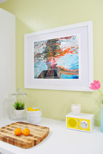
I described this gal as “real art” because it’s actually our first big art purchase ever. It’s a large print of an original oil painting by an amazing Etsy artist that we just couldn’t get out of our mind. And at $195 it was definitely a splurge for folks like us who usually frame free art that we make ourselves or hunt thrift stores and garage sales for cheapo options, but we figure that we’ve done a lot of things to save a really significant amount of money on our kitchen (like reusing our cabinets/sink/faucet, getting pendant lights from an outlet and a range hood on craigslist, reselling things like our old granite and over-the-range microwave on craigslist, building our own fridge surround/hood cover/open shelving, getting on-sale tile and clearanced out cork and installing it ourselves, buying inexpensive lab stools from a school supply shop, etc).

So yeah, it took a bit of rationalizing with ourselves and saying “dude, you have saved money in so many other places, and you love this art and don’t have any real art in the entire house yet- just take the plunge already!” So we did. And it feels good. In the words of Katy Perry: No regrets. Just love.
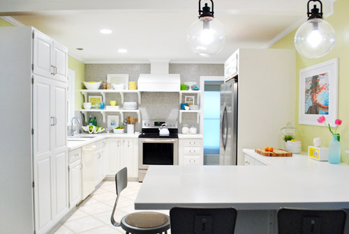
So yes, we’re calling it our V-day gift to each other (and our beloved kitchen). And it was icing on the cake when Clara got excited about it too. Burger has yet to react but we’ll keep you posted.
Doesn’t our lady swimming with imaginary fish look especially cheerful with two pink tulips leftover from book shoots (yup, those are still going on – they wrap this Friday and today we’re actually shooting cover stuff – ahhhhhh). As for framing our lady, I’m sure one day we’ll man up and pay to have her professionally framed (they always seem to have those 50% coupons at Michael’s) but sometimes it’s a better balance for us when we spend in one area and then work a bit harder to save in another. So for now we have framed it really inexpensively ourselves, just by getting a simple black frame for $21 at Target and a $4 sheet of archival-quality mat-board at Michael’s (they sell it in their framing department for anyone else who wants to try DIYing it).
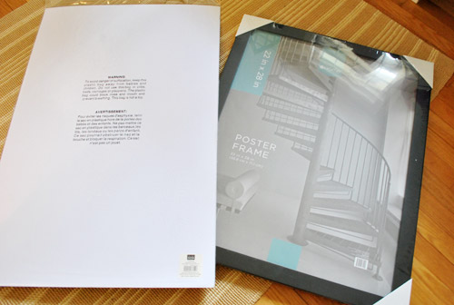
This entire framing job was just $25 (for a 31″ x 25″ finished piece!) thanks to already having some white Rustoleum Universal spray paint (the kind with the built-in primer). Yup, I’m completely predictable. You know I spray painted the heck outta that frame (after removing the pane and the backing and laying it out on a piece of cardboard outside). Then I just cut down the archival mat-board to fit the frame and placed the print centered in front of it.
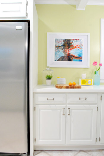
So unlike a pro framing job, this mat isn’t a cut-out window that you look through to view the print – the print just floats right in front of it in the middle, with an equal amount of mat around it to beef it up and fit the frame. The luckiest accident of the whole thing is that the mat-board has subtle gray undertones while the print and the frame are bright-bright-bright white. It actually makes for a nice balance since the soft gray-ish coloring in the mat relates to other softly-gray things in the room (the penny tile, the appliances, etc) and the bright white of the print and the freshly sprayed frame ties into the glossy white molding/trim, our counters, and the dishware on the open shelves.
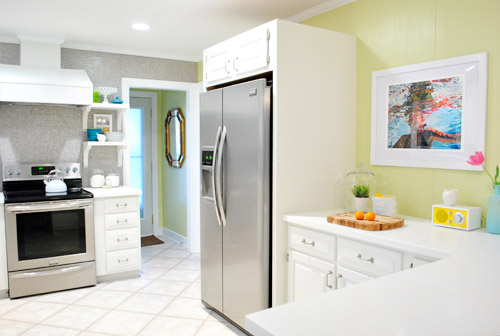
We love that our print (on archival paper with an archival mat, no less) can always be upgraded with a proper frame down the line, but for now it slips right into the room. And it’s refreshing. Like a big ol’ glass of lemonade. Or a dip in the pool. This is actually how we frame a ton of stuff (like all of the things in our hallway of frames, for example) so although it’s not the fancy way, it works for us. Art is definitely one of those highly personal things though, so this method might be heresy for some folks out there! Just do whatever works for you and your house and cover your walls with stuff that makes you smile.
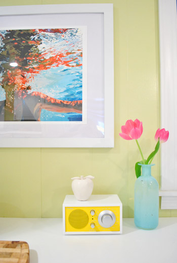
We have to admit that real art is definitely addictive. Our little swimmer lady confirms that sometimes a wall splurge can make you pretty dang giddy. So we’re definitely hoping that the occurrence of saving up for art that we love isn’t just a one time thing! What have you guys been framing lately? Do you have a favorite framing method? Do your children see imaginary fish? Let’s talk.

mary says
I see why Clara saw fish. The orange kind of looks like goldfish at first glance.
Sarah says
There is no other way to describe that area now than happy! That print is so fun and unexpected — if I saw it in a store, I would say it wouldn’t “fit” in your kitchen, but it does and perfectly — the colors, size, everything! I can’t wait to see some more finishing touches!
I’ve made some “real art” of my own at one of those Wine & Design places that has popped up where a group of 20 or so drink wine and paint the same piece. It was so fun and relaxing, and most of our paintings turned out really well!
My only “real art” purchases are two pieces of aboriginal art that I bought on a 2010 trip to Australia (http://i42.tinypic.com/htgys9.jpg and one similar to this: http://www.mbantua.com.au/image.php?id=6735). I got them both from Mbantua Aboriginal Art Gallery and Cultural Museum in Alice Springs, Australia, and can say that these are DEFINITELY the best souvenirs I ever purchased. Art is SO much better when it’s something you love, and it sounds like this print is one of those things for you two!
Wiggs says
I just have to tell you, I have been stalking Samantha French (and that painting in particular) for MONTHS. I’m green (grellow?) with envy. Combine that with the fact that my grandmother’s name is Clara (and hence the name we will give our first daughter) and you guys are basically a future version of me!
I’m so glad to see Samantha’s work getting more love, because she’s incredible. The print looks fantastic in your kitchen! I hope you show her the results!
YoungHouseLove says
Haha, I love it!
xo,
s
Amy says
When I saw the first picture with the post, I saw fish too… and I’m not a toddler… I saw goldfish where it’s supposed to be a reflection. Further into the post, with a more close up view, it was all cleared up for me.
Emily @ NewlyWife says
Great colors and movement! It really brings some nice life to the kitchen – granted, we usually see most of your rooms without people in it. :)
Audrey says
I LOVE that painting! It brings in some much needed color…your kitchen is just flooded in white. And as much as I love white, I have to be honest in admitting I don’t really dig the white cab/counter combo. Wish you had gone with black counters or a really moody gray. That, or that y’all had painted those shelves a fun color! I do like how accessories are the standout however, and it IS your kitchen…something I think we blogofanatics forget. :)
Congrats on your first “real” art purchase, Petersiks!
Michelle says
I’m sure it’s been said already, but I think your girl interpreted those orange reflections in the water as goldfish! They kind of look that way to me.
schmei says
I love it! Though I would worry about it adding prep time to your meals, for I would end up just staring at the painting instead of chopping veggies or whatever… :-)
CA says
I totally see where Clara is coming from. The orange bits definitely look like goldfish to me!!! I think she is brilliant and insightful :)
Bethany says
I love the frame and pic but that is not what I want to talk about today. I have a request. Very small, I am sure you can manage it. ;) I need your book to be able to be purchased on an eReader. I have a NOOK and that’s where I get all my books so please, oh please, make sure that happens for this loyal reader! (and maybe other readers too) Love ya! Muah!
YoungHouseLove says
Our publisher had mentioned making it eReader friendly, though we haven’t heard any specifics yet. That’s probably a down-the-road conversation with them, but we’ll keep you posted!
-John
Jill says
Ha! I love it!
I framed something for my husband and found myself at Ben Franklin buying spray paint for the frame.
Afterwards something seemed weird and I realized your yellow horses must have lodged themselves in my brain and now we have a yellow frame. :-)
Thanks for all the conscious and unconscious inspiration.
p.s. – another great place to buy art is VCU’s juryed undergrad show. We’ve picked up some really cool stuff and supported local, emerging artists. Look for it in the spring.
Sheilah says
I have a framing trick that leans way more toward the cheapo-DIY side of things than the posts I’ve looked at so far (though I haven’t looked at all of them). I have a gallery wall that has mostly 4×6 and 5×7 frames. It has photos and a few random items on it, but also several postcards of fine art. (A common thing for me to do when I go to a museum or a new exhibit is to go to the gift store and buy a postcards of my favourite pieces – it’s a space- and money-saver compared with buying anything bigger.) What often happens is that the postcards aren’t quite 4×6 or 5×7 – they’re often somewhere between. The proportions are sometimes kind of weird, too, depending on the shape of the piece, but I still want to put them on the gallery wall. My solution: You know that piece of glossy paper that comes in store-bought frames that says what size the frames are? I frequently just flip that over, lie the postcard on top of it, and pop them in the frame. It creates a border of whatever colour that piece of paper is around the postcard and, if you’re not inspecting it closely, looks like a mat. Usually the sheets of paper are white on the other side, once in awhile they’re grey, but either way it serves to fill the frame’s space and doesn’t detract from the picture. I haven’t done this with anything bigger than 5×7, and should point out that since they’re on the gallery wall none of them tend to receive a lot of hardcore individual attention, but this trick has worked just fine for my purposes and doesn’t cost a cent more than I’ve already paid for the frame.
YoungHouseLove says
Nice!
xo,
s
ScullyPA says
I want to reiterate Debra Cripps’ comment — I used to work for a framing shop, and if the glass rests directly on the art, you can expect damage at some point. There are all different kinds of glass, too, so you can get special ones with coatings to prevent sun fade, etc. You’ll be fine for a little while, till you are ready to upgrade!! If you like the “floating” look, where ever you can purchase framing supplies, look for “spacers” — at the frame shop, they used what looked like clear plastic strips with one sticky side to keep the glass off the art. The strips attach directly to the glass, forming a little “mini” frame around the inside, and keep the glass off the art. I’m sure there are other methods, that is just the one that I am familiar with.
And if you did not use an acid free method to mount the art on the matt, you can again, expect damage. (rice paper, etc.)
If you are spending the moola for the art, you should definitely make sure that it is protected for the long haul, to protect your investment!
The art makes a great addition to the kitchen.
YoungHouseLove says
Thanks for the tips! We learned that a local framing shop will cut an opening in our mat so it will truly float in front of it and the glass won’t touch our print!
xo,
s
jackie smith says
Santa sent our daughter to NYC and during our trip she got to but her own “Tiggy” picture. Tiggy paints colorful pics of NYC and every time my husband or I go, we grab her one. She didn’t car for the real Monet in the Met, but was so excited to buy her own Tiggy outside…The price w/ a frame? 22 bucks.
YoungHouseLove says
Amazing!
xo,
s
jeannette says
clara is correct to be so excited and while it looks good from all angles, the pic of the enfilade of print, refrigerator, mirror in the foyer, light streaming through foyer door, is especially satisfying. i’m glad you splurged.
Andrea says
90% of the frames in my house are from American Frame – you get the pro-look with a more DIY price and you get to put it together yourself. They even have a “sand-box” where you can upload an image of your artwork and then play with different frames and mats. Insider tip – don’t buy the mounting board, use the cardboard box the frame came in!
tjack says
I am so glad you splurged on the artwork! It was money well spent and is just what your kitchen needed to add some color!
That piece is so beautiful, it makes me want to see (ie touch) the real one, lol. You know like feel the paint strokes that leave little rippled on the canvas?
Now that you have caught the “real art” bug, I am so curious as to what your next purchase will be :)
Andrea says
Opps forgot the website –
http://www.americanframe.com/
YoungHouseLove says
Thanks for the tip!
xo
s
Stacey says
That really is a stunning piece of art. Have you managed to master the art of painting water and clouds? The art I’ve produced has always been realistic but clouds and water I have never succeeded in depicting.
YoungHouseLove says
Amen. Those are hard! And hands. I’m terrible at all of them. Haha. I can do a dark sky at night (with moody streaks of gray and navy), but during the day with clouds it’s harder!
xo,
s
Mel says
RVA TIP: Frame Warehouse at Libbie Place is WAY cheaper than half off at Michael’s or Ben Franklin. We got something mounted and double matted there and it was cheaper than a simple framing at half off from the BF.
YoungHouseLove says
Love it! Thanks Mel!
xo,
s
Elizabeth says
Have you guys ever read “Monkey with a Tool Belt,” by Chris Monroe? This has nothing to do with your print (which is lovely, by the way), but it just occurred to me that Clara, with her fondness for monkeys, might love the book. It’s about a monkey named Chico Bon Bon who has a very impressive tool belt that he takes with him wherever he goes, allowing him to deal with a variety of sticky situations. There are three books in the Chico Bon Bon series so far, and they are all gems. It’s totally incongruous for me to bring this up now, but I thought, you know, you like tools, your daughter likes monkeys…perfect fit, right? Plus, the books are so great!
YoungHouseLove says
It sounds awesome! We need to check it out!
xo,
s
Molly says
Wow! I absolutely love this! I wondered how you would manage to add art to such a bright and happy space without making it look too serious or too childish. It’s so unexpected but totally perfect for that spot. Bravo!
carly says
We thought the prices at Michaels were INSANE even with 50% off, so much that my future husband stormed out of the store with disgust. He ended up making his own from trim picked up at Home Depot:
http://thehousethatbuiltusstory.blogspot.com/2011/07/framing-philly.html
Barbara H. says
Love the art but want to reinforce the idea of having an archival mat over the print as well as under it. You might be okay for a while but you know how time slips by. Ferrotyping is the term you want to research: Blocking is the phenomenon of prints becoming adhered to each other front to back as in a stack, face-to-face as in a photo album or to smooth surfaces in contact with the prints such as glass in frames or plastic sleeves in enclosures. Ferrotyping is similar to blocking, but instead of bonding between prints or to adjacent materials, the softening of the print surface causes the gloss of the print to be degraded.
It has long been known that the gelatin layer used in traditional photographic prints can bond to glass in framing packages and many types of plastic sheeting used in storage enclosures. This happens when the glass transition temperature of the print’s gelatin layer is exceeded.” from http://www.dp3project.org/re_ferrotypehumidity.shtml
YoungHouseLove says
Thanks for the tip! We plan to get our mat cut soon and then it’ll be in front like it should be!
xo,
s
Artsy Forager says
LOVE that you bought a Samantha French print! Her work is wonderful, I’ve been a fan of hers for a long time and she was one of the first artists I featured on my blog ( http://artsyforager.wordpress.com/2011/08/29/going-along-swimmingly/ ). Oh and thanks to my fellow commenters for introducing me to the work of Hannah Richardson & Jeannie Maddox!
I’m so glad fellow commenters have alerted you to the danger of letting the glass rest on your print. I worked in a gallery for 5 years where we did a ton of framing of all kinds of artwork and it is always best to keep any kind of artwork ( even posters! ) from directly touching glass, as others have mentioned, condensation can build up, destroying the artwork. It’s really easy to cut 1/4″ foamcore spacers and place them between the mat & glass, around the perimeter of the frame. They will lift the glass off the artwork and give a nice little shadowbox effect to the frame. Or, as others have mentioned, a local frame shop will cut a mat for you super cheap. You can also ask local shops if they have any scrap matboard they would be willing to sell at a lower cost. Our gallery did a lot of corporate framing work, which usually meant large mats, so we always had lots of scrap.
Local framers will almost always be much more accommodating than a big box store. ;-)
Congrats on your first “real art” purchase!!
KT says
My husband and I eventually asked ourselves, “Why spend money on getting mats cut at Michael’s when we can buy a $25 mat cutter, $20 self-healing mat, and $20 quilting ruler and do it ourselves?” (plus we bought all those things with 50% off coupons). It’s worked out great. We get a professional looking mat and we can either mat to standard sized frames or pay for a custom frame size. I recommend it.
Carla says
Tell Clara I totally saw fishes too. At first glimpse, I thought the red “reflection” above the lady was a huge orange fish hahahaha
Priscilla says
Beautiful picture. I couldn’t exactly tell, but is the photo/print touching the back side of the glass? If it is then the photo could permanently attach itself, like happened to a snapshot I loved. It is not hard to matt a print yourself, all you need is a small matt cutter like the Dexter Matt Cutter and a thick piece of stainless steel straight edge. Practice on some small prints.
If the print is not touching the glass, then no worries.
Allison says
I amreally enjoying see the progress on your kitechen. I love how bright, airy and cheerful it is.
Just want to pass along some tips about some placement of everyday things that may make more sense as far as practical placement. Just some suggestions:
-I find it most convienent to have my cutting board next to my sink. That way I can place freshly washed things right to the cutting board and then wash my hand easily after done chopping. It seems to work best if it is betweent eh sink and stove. This may not be the most eye pleasing, but super functional.
– Also, your flour and sugar may function better if it is near the largest cooking space. Like where your mixer would pug in. Then there is less moving around.
Just some suggestions that I have learned along the way that make cooking in the kitchen way easier and efficent.
Cant wait to see the floors in!Keep up the hard work.
YoungHouseLove says
Thanks Allison! We actually have a cutting board next to the sink too (it’s white, so it’s hard to see) – just having a wood one over there helps since we like to prep in two zones! Love the flour and sugar tip!
xo,
s
cameron says
Hobby Lobby will custom cut a mat for you for you, and I think it costs around $6.00. Plus, they’ll do it while you wait.
Amber says
Artwork looks great! I think that’s probably the hardest part of decorating a house. Plus art is so subjective it’s hard to please everybody (i.e. husband and wife). We picked up a vintage German battery metal sign at a flea market. My husband framed it in an IKEA frame with a canvas drop cloth background. We saved a ton framing it ourselves.
http://www.willscasa.com/2012/01/how-to-frame-a-vintage-sign-on-the-cheap/
YoungHouseLove says
Love it!!
xo,
s
Jen says
You see, this is why I love you. I have so many pieces of my own photography around my home and am on a mission to branch out and find some art. I never would have picked the piece you did, but oh my gosh it is STUNNING in you new kitchen! I love that it is unique and colorful and unexpected.
Maybe you have a post on the subject that I missed, but I would love to know the process you go through when looking for and selecting art. I get so overwhelmed by it all sometimes, if only I could be a fly on the wall and see how the “pros” do it!
xoxo! Jen
YoungHouseLove says
Aw thanks Jen, you’re so sweet! I think the main questions we ask ourselves when we’re looking for art are:
1) is it the right size for the spot (or can I make it the right size by adding a mat)?
2) do we like the colors/subject (aka: would it complement the surroundings instead of looking clashy or off)?
3) do we both agree (this is a biggie – since we both have to “sign off” on every purchase, a lot of times something gets vetoed because we don’t both agree)?
Hope it helps!
xo,
s
Kath says
Catching up on posts and just LOVE that little yellow radio!!! The art too. And the whole kitchen is just fab!!
megan says
Looks beautiful. If you’re concerned about keeping your painting as fresh as a baby’s bottom & don’t want to get it framed professionally then you can insert little spacers to keep it away from the glass… they are just little plastic pieces that you hide under the frame to float the painting and it off of the glass.
From http://www.drloriv.com/advice/framing1.htm:
…You do not want any work of art to be directly touching the glass on a frame. Condensation, dirt, dust, and tiny particles can build up and adhere to the glass in your frame. This could result in damage to the work of art.
For those pieces that just wouldn’t look appropriate with a mat surrounding them, professional framers offer methods to keep the work of art away from the framed piece of glass. These framing components are called, simply, spacers. They do what their name says they do, they give space between the work of art and the glass. These spacers are usually little plastic elements that are placed within the area between the art and the frame (you can’t see them in a completed frame as they are hidden within the frame). They provide space so the work of art doesn’t touch the frame or the glass. The result is that the work on paper or similar 2-D piece looks as if it is floating in the frame. This is often a desired framing method for contemporary works of art.
YoungHouseLove says
Great tip Megan- thanks!
xo,
s
Cathryn says
If I may suggest:
Be careful of not using a mat between the original art and the glass. Heat and light can bond glass to any paper, especially any treated paper, like photos or art mediums.
I have had many of my interior design clients lose old family photos this way. I mention this particularly because your art is in the kitchen and I would hate to see your lovely investment get damaged.
YoungHouseLove says
Thanks for the tip, Cathryn!
-John
Susie says
Nice choice, you guys — it looks great!
Totally unrelated, but have you seen this (scroll down to #4):
http://twistedsifter.com/2012/02/top-10-what-my-friends-think-i-do-vs-what-i-actually-do-posters/
Apparently, you’re the de facto perception of stay-at-home-dadding, John — congrats!
YoungHouseLove says
Hahaha- yes! So funny!
xo,
s
Ashley says
Have to agree with a local frame shop but a cheap trick I have found is to buy a ready made frame like the one you did at Michaels and then take it to the frame shop to have the perfect mat selected and cut for you. Their selections of mats is huge, they offer advice on the best pick, and without the cost of the frame and glass its always been very affordable (around $30 or less). The local frame shop also told me that the bottom of the mat should be slightly thicker to appear right to the eye.
Abby J. says
I love it! Just fyi, if you want the look of a matte that is cut out at an angle, so that you look through it to see the artwork, they do make an angled exacto knife for cutting mattes that you can get at an art store. If you plan to use it enough to make it worth the purchase price, that could save you on professional framing jobs.
Carla says
The artwork is amazing. I really like it. But I have to say, she looks like she’s drowning, and the image feels very cold and uninspiring in your kitchen. Maybe when you add the cork floors, your new kitchen will feel less sterile. But as you always say, and I really appreciate this: It’s a personal choice kind of thing. :o)
Ashlee says
Where.is.Bob? Have I missed it?
YoungHouseLove says
Haven’t heard from him yet!
-John
Larissa says
Ha! I was wondering the same thing. WHAT ABOUT BOB?!
Laurie says
So, I totally feel like I am missing out….who is Bob??
YoungHouseLove says
Bob is a mystery wrapped in an enigma. He tends to have pretty absolute opinions when it comes to what constitutes art.
xo,
s
Melissa says
PLEASE DO THIS: You can go to any DIY framing shop and get invisible spacers for your frame. You buy it in a long 6 foot stick and cut it to size and save the rest for future projects. The spacers will prevent your expensive painting from being ruined by being pressed and bonding to the glass. Paint (but oil paint especially) bonds to glass like glue, ruining any chance of upgrading the frame. I have a feeling that all the heat and steam in the kitchen will keep the oil paint soft and accelerate the bonding process. I use to work in a frame shop! Don’t ruin your nice painting by not preserving it properly!!! I also love your blog!
YoungHouseLove says
We appreciate the tip – we’re looking into getting a mat or spacers for it. But just in case it was confusing in the post, this is a print of an oil painting – so there’s no actual paint at risk here. :)
-John
Andrea says
That art really balances out that side of the kitchen. And the colors blend so well… good pick!
Lauren says
Love the new art! I think it’s refreshing…I would love to see it during these cold winter months, as a reminder of warmer weather!
On a completely different note:
Forgive me if you covered this in the past, but did you ever consider having the cabinets/pantry go all the way up to the ceiling? The only reason I ask is this; our cabinets stop short of the ceiling, and I was thinking about replacing them (eventually….actually it’s just a dream of mine…we have no real plans of tearing out cabinets and buying new because, well…I’m a money Nazi).
But I’m curious to know if you regret not having yours go all the way up.
I think it looks awesome the way it is, but my mind always goes to storage (after of course the money issues).
Just curious :) Great job guys! I’m green with envy.
YoungHouseLove says
We did but we have beams that go across the ceiling so the pantry would run into the beam if it got taller. Since we don’t have many tall cabinets/uppers we figure it’s nice to keep them lower (aka: not create three random skyscrapers in the room when nothing else is that tall) but it can definitely look amazing in other spaces for sure!
xo,
s
Heather says
Took me a while to figure out what I was looking at, so I really appreciate the close-up. Cleared things right up for me! I totally get what Clara meant about fish though. The orange totally reminds me of koi.
So pretty! And I love all the comments about Michael’s. Until now, I figured those coupons were probably pretty decent. I’ll have to find some local shops now (which is really for the better anyway). You’d think after a few years of living here, I’d have it all figured out. :P
Kathy says
The new artwork looks fantastic. I really appreciate the investment pieces (Joss Martin -chair, rug, ottoman, etc) you have been incorporating in your home. They are making a big difference in your home.
I am really curious about one thing. On the top shelf to the left you have a medium/large size picture with a bowl in front of it. What is this picture? I meant to ask this question a few days ago when you did a posting about the open shelves.
YoungHouseLove says
It’s an old map of Richmond actually. You know I love maps…
-John
Chesley says
I can see why she sees little orange fishies in there!! She associates the water with the fishies, it’s perfect. And they do sort of look like fish. Love the piece. Congrats.
Ally says
Gorgeous! I absolutely love it. Great choice.
Lizbeth says
If/when you two want to officially frame it, we’ve had a lot of luck with americanframe.com. They’re HIGHLY customizable, do great work, and it’s really inexpensive.
Leslie says
I think the orange-ish reflection on top of the water could look like fish to a little one. Go Clara!
Meredith says
I’m not trying to be a smart aleck (really, I’m not! I’m assuming there’s an answer)… so, why didn’t you just buy a white frame at Target instead of paint a black one white? Do they not sell that size in white? Or were those frames too off-white? Thanks!
YoungHouseLove says
Yeah, they didn’t sell it in white unfortunately. Definitely would’ve made life easier!
-John