Continuing our showhouse-heavy week of reveals, we’re bringing you a bunch of after photos from three more spaces – the main bedroom’s en-suite bathroom, its attached closet, and cool little atrium space. We showed you the main bedroom on Tuesday (along with the office and the butler’s pantry) so it only felt natural to continue our virtual tour where we left off.
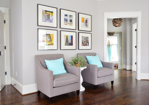
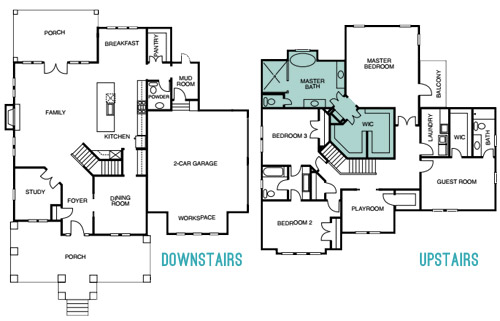
The attached bath and closet sit off a corner of the main bedroom and are separated by a space that we’ve been lovingly calling the “atrium” (it’s really more of a vestibule) which you can see above on the right side.
Here’s the floor plan for a clearer map of how that area is situated:
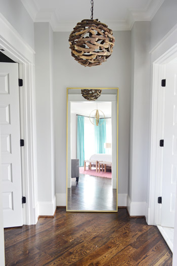
The atrium features a brass floor mirror donated by West Elm, a driftwood light from Shades of Light, and walls that are painted Stonington Gray by Benjamin Moore just like the bedroom. At one point we wanted to do a “living wall” back there with a bunch of built-in planter boxes filled with greenery, but due to the architecture of the roofline, we couldn’t put a skylight there. So because it felt unwise to cram a sunlight-less area with live plants, we scrapped the idea. It’s still a nice spot between the bathroom and the closet for a floor length mirror, and the driftwood light is one of our favorites in the house.
When you turn to your right, through the double doors you’ll see the space that we most want to pick up, stuff in a suitcase, and put in our own house.
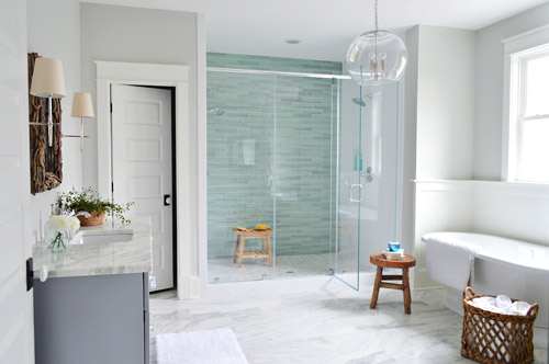
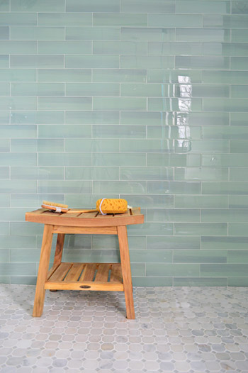
It felt fitting to aim for that spa-like effect in such an airy space (the house’s floor plan meant we knew that this room would be spacious with a big window over the tub). So pretty early on we decided we wanted a light color scheme with a wash of color on the back wall of the shower. We actually considered a more intense cobalt blue tile at one point, but it was out of stock. We love the calming aqua glass tile that we ended up with, (it’s the 3 x 12″ New Haven tile from The Tile Shop) so it was just one of those “happy accidents” throughout the room’s evolution.
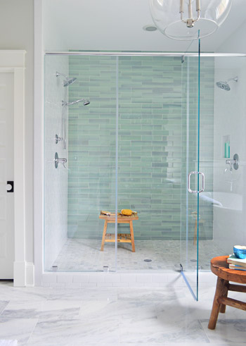
The sides of the shower are basic 3 x 6″ white subway tiles, also donated by The Tile Shop, which we picked because they were the same height as the bolder back-wall tiles (so the rows would line up), as well as feeling nice and simple – to keep the attention on that green glass tile. It’s considered a double shower since it has Baliza showerheads on both side walls, which were donated by Brizo. At the suggestion of our local Ferguson rep, whom we worked through to select plumbing fixtures, we included a handshower on one side (we learned that new builds frequently include them, just to give people options like spraying off their feet or a pet).
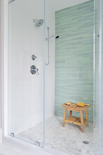
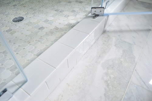
The floor tile in the shower pan is the Tile Shop’s Evanston series in Frost Snow, which featured some small aqua glass accents between the marble squares which help tie the big accent wall together with the marble floor (that’s 12 x 24″ Tempesta Neve marble) throughout the rest of the room. You can check out a detailed photo of our tile pics (and more clearly see those little green glass squares in the floor) here. We also really like how the tile installer wrapped the white subway around the shower threshold.
I’ll be honest that as the glass tile was being installed I was certain we had made a big mistake (three different tile choices for the shower walls and floor felt like they didn’t really “mesh” yet) but as soon as it was all grouted with the same white grout throughout, it tied everything together. And now it’s my favorite thing.
But let’s step out of the shower for a second and talk about the vanities (you don’t get to say that everyday), which came from the same local cabinet company (Affinity) that did the kitchen. They’re also painted in their stock gray color, which we’ve discovered is close to Benjamin Moore’s Timberwolf Gray. The walls are Moonshine.
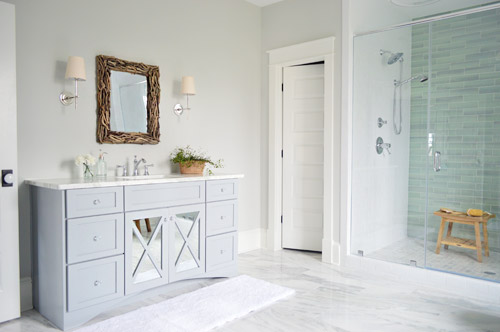
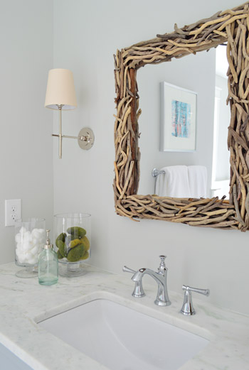
The driftwood mirrors and Soho sconces were donated by Shades of Light, the faucet is Brizo Baliza just like the shower fixtures, and the subtly green-veined counters are Lady Onyx which were purchased through a local company called Eternal Stoneworks.
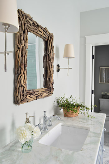
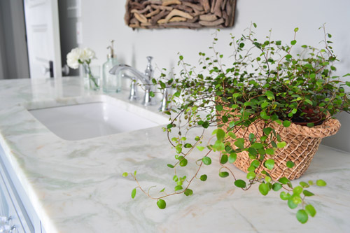
The onyx counters have a hint of the same seaglass color that’s in the shower tile, so we thought they’d be a nice counterpart to the more traditional marble on the floor. The little woven baskets are from HomeGoods.
We added a little more interest to the vanities by selecting mirrors with a soft patina effect that we placed behind the x-frame doors (similar to the clear glass ones that we chose for the kitchen). We also went with arched trim along the base of each vanity to give the built-in cabinet a bit more of a furniture feel (you can see that better two shots up). The giant bathmats are from Target.
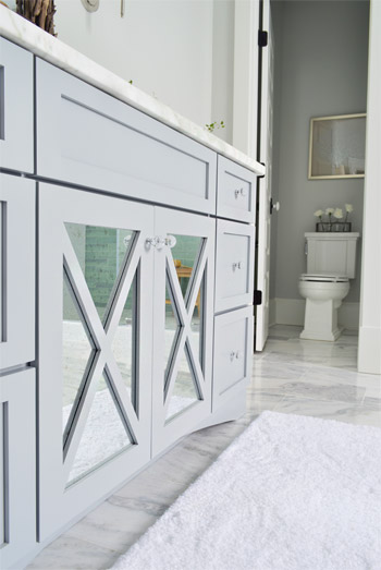
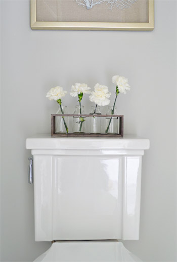
And now, let’s get weird for a second. I have to take a moment to talk about this toilet. I’ve never given toilets much thought, but when our builder urged us to pick something more stylish than a basic model we both fell in love with this one (the Tresham, donated by Kohler). And now I have this crazy case of toilet envy. So I guess that’s a thing. The little vases on the top are from World Market and the framed seafan art is from HomeGoods.
Speaking of envy, Sherry (in all her pregnant glory) has had a few moments of longing in front of this tub. Ever since one of our book tour hotels had a big soaker tub, she has been jonesing for one. It’s the York from Victoria + Albert, and the cool thing is that lots of people paint the outside an accent color. We considered it, but decided that we wanted to leave the shower as the main accent in the room – but we thought we’d toss that tip out because it could be a fun idea for your space.
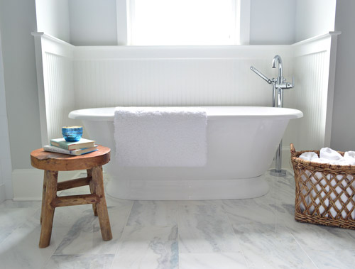
The stool and basket are both from HomeGoods, and the floor mount tub filler is the Trinsic, donated by Delta. You can see that we also had the carpenter add some beadboard wainscoting around the tub area as an accent, and to provide some extra protection from splashing, bubbles, and whatever else your particular tub fantasy entails. Mine includes nachos. Just sayin’.
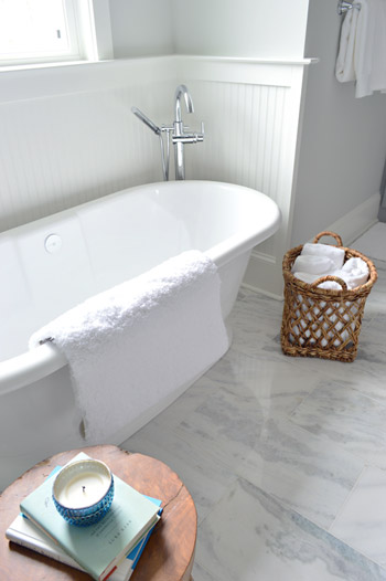
This is the view looking back on the room from the shower. Yes, I was literally in the shower when I snapped this. And yes, I did consider taking it for a test drive.
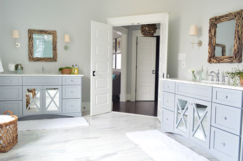
The mirrors were actually an 11th hour decision (as in, we were hanging them a few days ago) because the original chrome-y mirrors that we picked were blending too much with the other gleaming/polished items in the room and felt a little too invisible. So we decided that we needed something with more contrast and texture, and it hit us that rough driftwood frames would be an awesome reference to our lighting choice in the nearby atrium.
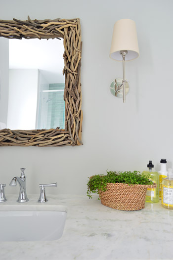
As soon as we hung the new mirrors we got more excited than we should have. Maybe we were just delusional at that point, but they’re one of our favorite last minute changes.
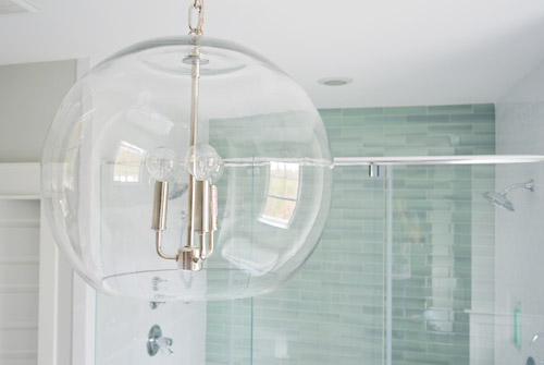
The main light fixture in here is the Clear Glass Chandelier from Shades of Light. It doesn’t pop in pictures very much, but in person it’s pretty amazing. So much so that we bought another one for the living room, but had them wire it in a gold finish to tie into some other fixtures down there.
The en-suite bedroom closet is equally envy-inducing in size and sports two sections (which make it convenient for a couple) thanks to a little partition in the middle to carve out two sides. We can’t claim much credit for how this turned out, since we mostly just nodded along as the builder and his carpenter told us their plans, but we’re happy to show off their handiwork and our meager styling of it (closets typically get a few outfits, bags, and shoes for these shows, so you get the idea but don’t have to see them stuffed with an entire wardrobe).
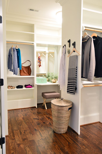
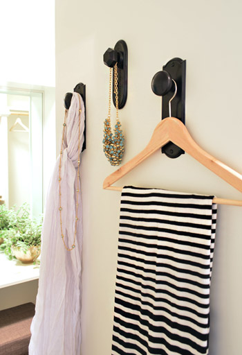
As we mentioned yesterday, we did hang a trio of our new doorknob hooks (two large ones and one small one) to create a little display space on the partition that separates the two sides of the closet. That flat wall was originally going to have a full length mirror on it, but it started to feel excessive after putting the floor mirror in the atrium – especially because we added a table-height mirror in that vanity area right behind it.
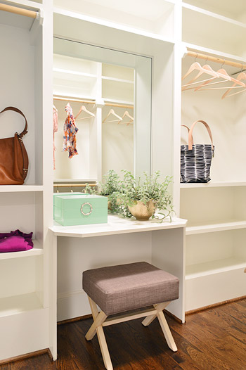
Speaking of that little vanity space, the stool is from Target, the green lacquered box is from HomeGoods, and the gold bowl with the plant in it is from World Market. The bags and clothes are mostly ours, along with some thrift store items and few scarves from Target.
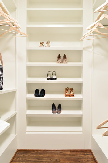
The vanity sits in the back half of the closet, which in addition to bars and cubbies, also sports this wall of angled shelves for shoes. I tell ya, Carpenter John (yes, yet another John who worked on this project) knows whats up.
The front side is mostly bars and shelves, as you can see in this shot of that area…
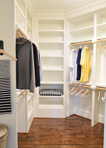
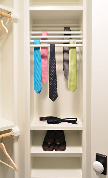
…but it does feature a built-in tie rack and a couple of shoe shelves. We bought some thrift store ties to fill it, only to get them into better lighting in this closet to discover they were all stained. Luckily some other folks working on the house had some (cleaner) spares to loan us, and my dad donated a few to the cause as well.
So now you’ve officially seen all of the main bedroom area of the house, bathroom and closet included. There’s still lots more house to show – and we’re madly trying to photograph it all before the baby comes (along with recording a video tour) but since we’ve probably overloaded you enough with photos for the week, we’re going to spend Friday at our house in a final-hour attempt to paint the office (ceiling and walls). So we won’t be posting tomorrow, but we’ll hopefully be back on Monday with a freshly painted office, which means we’ll finally be able to clear more chaos off of other surfaces – like the kitchen & dining room tables – before this baby arrives.
Psst – Wanna see more showhouse info & photos? Click here for Our Full Showhouse Tour, which includes final pictures of every room, the floor plan, budget info, a video walk-through, and shoppable showhouse furniture & accessories.

Leslie @ Oh, the Fun of It says
The last-minute mirror change up in the bathrooms… I think they made the entire room! Really great choice, YHL! Those and the tile on the shower… dreamy :) The whole bathroom ties together so well when you take a minute to really look at all of the detailing. You’ve done a beautiful job.
Andrea says
Loud applause! whistling! stomping of feet! and oh, that tub…seriously, Sherry, how did you find the moral fortitude to not come over with a big fluffy towel and lavender bubble bath? Close the door, claim the bathroom needs “lots of styling…”
Agreeing with all the rest here: thank you for all your hard work, and hoping you’re taking a moment or twelve to be kind to yourselves. Lots of dark chocolate and bourbon (well, not for Sherry. Yet.).
YoungHouseLove says
Hahah, thanks Andrea! I definitely have thought about taking a soak in that tub. And oddly enough John wants to test out the shower. Purely for quality control reasons. You know, to be sure the buyers are getting something in perfect working order ;)
xo
s
Kristen says
LOVE the closet. Hello dreamy.
Functional questions now!
I see outlets for one vanity.. Are there outlets at both the bathroom vanities as well as the closet vanity so someone could use a hair dryer or straightener in the closet too?
Also, I didn’t see any towel rings or hooks near the shower. Are there any?
YoungHouseLove says
Yup, both bathroom vanities have outlets, but the make-up desk in the closet doesn’t have one (the builder could pop one in there if someone requested it since the attic is right above it). There are towel hooks on the back of the bathroom doors, but we have extra ones that were donated sitting under the sink that the future buyers can hang closer to the shower if they’d like. We wanted to let them choose if they wanted them there or liked the open look without them.
Update: Just realized I forgot about the towel bar to the right of the tub. You can see part of it in this shot, as well as in the reflection of the mirror in this picture.
xo
s
Kristen says
Also, I only see one very small space to put items IN the shower. If I had that shower, I would have to put my stuff on the floor, which seems silly…
YoungHouseLove says
The bench holds stuff too, along with that niche (I’d be tempted to add a drum stool too if I needed more surface area). The Tile Shop also sells pretty marble or glass ledges that I’m sure the builder would be happy to add if the buyer so desires them :)
xo
s
Miranda says
I LOVE the bathroom!! I can’t imagine having a bathroom that big and bright and lux.
Tina W says
please tell me more about the bud vases in the wooden holder over the sink, they’re totally what i’m looking for as wedding table decor.
YoungHouseLove says
Aren’t those cute? They’re from World Market.
xo
s
Tina W says
i don’t see them on the site. bummer!
YoungHouseLove says
Maybe they’re just in stores? Hope you can hunt them down!
xo
s
Carla says
Oh my god I swooned so hard over that bathroom! I love the mirrors and the heavy wood stools. I would never think to do something that dark in a room that airy, but it’s perfect!
Good luck with all the last minute stuff, and do take care of yourselves before the Barnacle shows up!
Jessica Leonard says
I’m loving everything in this house so far! The mirror switch in the bathroom was a great idea.
One suggestion: The closet still seems too sparse. I think some storage boxes or pretty shoe/hat boxes on the upper shelves would help. And maybe a few more clothing/shoe items here and there.
Looking great guys!
YoungHouseLove says
Oh yeah it’s really empty in all of the closets throughout the show (usually a few hangers with clothes and shoes are that go into them since people get the idea). The lady who runs the show supposedly has ten million clothes and shoes though, so I keep winking at her and joking that she could store some of her extra stuff in here if she’d like!
xo
s
Amber @ Wills Casa says
I adore everything you did in the bathroom and closet. Seriously that closet has an incredible layout! Can you come style mine (bathroom and closet I mean might as well do both if you’re here)? It has good bones I promise! ;)
http://www.willscasa.com/2014/03/completed-ish-master-bathroom/
YoungHouseLove says
You need absolutely no help with your house Amber. I am following along with bated breath. I’m in LOVE with all of your choices so far. Your blog is a daily read for me :)
xo
s
Eilene says
I just love how you pull everything together. The colors and textures are just beautiful! It just reads light and happiness. I’ve been wanting to go more gray with my color choices, and what I discovered is that my rustic pine floors (yellowish) it just isn’t working as well as I wanted it to. :-( Wish I had the floors from this house! Congratulations!
Joyce says
I love the whole house. The master bath is a particular favorite. I like to change out the shower heads for a hand held. It makes for cleaning the shower much easier.
Cathy says
Gosh, four different tiles in one bathroom? Kind of a sensory overload. Additionally, the clear glass doors on the shower will be constantly filled with water spots unless they’re polished daily. The mirrored doors on the vanity, the twig mirrors, and the clear glass light fixture are nothing but dust and steam catchers. This room contains a lot of the trendy finishes that are currently popular, but maintaining a clean, spot free room is impossible in the long term. The closet is nice, but I would have made the shoe shelves out of some type of polished plastic because the white painted surfaces are going to get filthy from the bottom of the shoes.
Mary-Carolyn says
A daily squeegee will keep the doors relatively spot-free. They will probably need an occasional polishing with one part vinegar, one part water, but a squeegee is a pretty quick and efficient way to deal with the water on a daily basis. My glass shower doors are probably much smaller, but I would guess it still wouldn’t take that long. My parents have a similar sized shower (no glass) and have a very large squeegee they use to clean off all the tile. They spend very little time cleaning grout!
Emily says
I have a shower like this and it’s not a problem keeping it clean.
Megan says
I’m thinking the person that buys this house can afford a maid LOL!
Jennie says
Maybe it’s just me, but I always wipe or clean the bottoms of my shoes before I put them away in the closet, so I don’t see it as a problem! :)
Sara T says
Just curious… Do I have to buy tickets in advance? Can I just show up and “pay at the door?”
YoungHouseLove says
I think you can buy them at the door. Maybe Justin will drop in to double check me on that?
xo
s
Justin says
Hi Sara – You can buy your tickets at the door also. The online ticket is available at a discounted price of $8 and it may save a little bit of time.
YoungHouseLove says
Thanks Justin!
xo
s
Lea says
Where is the blanket from that’s folded on the ‘his’ side of the closet?
YoungHouseLove says
That’s ours from Ikea a few years back (we stole so many things from our own house to use for the show, haha!).
xo
s
Sarah @ Sarah's Daybook says
I want to live there soooooo badly! It’s so funny to think that it is only in the 500’s. As much as it is a lot of money, I live in D.C. were that kind of house would sell for 2 million.
When I saw the bathroom I was like, umm… there’s only one sink? What were they thinking?! So relieved when I saw the second vanity! Ha. And that closet… I would be in heaven if I could even fill that! :)
6 DAYS UNTIL THE BARNACLE!! Crazytown! Has Clara given any other funny name suggestions? She is way too cute.
Also, do you guys have a baby book like you did with Clara? Any future career guesses? I am going to say an actor. Totally random.
Ah. So many questions.
Sarah
http://www.sarahsdaybook.wordpress.com
YoungHouseLove says
You’re so sweet! I have no idea what my guess for the bun’s future profession is, but I need to get on that baby book! Maybe he’ll be a home builder. Haha! As for the house price, it’s actually up in the 600s now (it seems to evolve based on the ever-changing prices of neighboring showhouses and appraisals, etc).
xo
s
LeAnn B says
Do you have a “like this” photo of the “living wall” you wanted to do? BTW the house looks great! When can I move in?
YoungHouseLove says
When we were on the Nate Berkus show a while back he had a living wall, which is where we first fell in love with it! I just searched for one on Pinterest and this came up though, which could have been awesome if the skylight was possible: http://www.pinterest.com/pin/7599893091718824/
xo
s
Brenda says
The driftwood mirrors are like the sprinkles on top. I love the beachy vibe it gives the space! So relaxing.
paige @ LPD says
Love the vanity in the closet!
Suzanne @Sprinkled Nest says
It is absolutely Gorgeous!!! I love how you mixed the tile in the shower, and the tub is amazing!! The color pallet is amazing…and one I want to achieve in my home! But, I really wish I had that walk-in-closet!! Cheers!
YoungHouseLove says
Thanks so much Suzanne!
xo
s
Lily says
Oh my lord that bathroom is EVERYTHING. Just the kind of huge, relaxing space I imagine for someday in my future…
x Lily
http://whilemyboyfriendsaway.blogspot.com/
K. Stoker says
Everything looks AMAZING! Question: Did ya’ll do anything for the balcony that’s connected to the master? We always leave ours awkwardly blank…
YoungHouseLove says
We have two chairs with a small table between them, but it’s such a small space it was impossible to shoot. Hope to include it in the video tour though!
xo
s
Leiann says
Wow, this is the sweetest bathroom I’ve ever seen–and I was just on our area’s “Parade of Homes” tour a couple weeks ago, so I saw some real gems. This one takes the cake. That wall of tile and those mirrors had me at hello. I love the mirrors so much, I don’t even care that they may be a tad harder-than-your-average-mirror to dust! :) I’m not one to linger in the bathroom but if I had this space, I would set up camp for sure!
Seriously, you guys did an amazing job on this house!
Out of curiosity, are you guys going to do a cost rundown/estimate at all on what was spent on major things and what the house may be listed for? It would be interesting to compare with houses similar around the country.
YoungHouseLove says
That would be really interesting! The house price is in the 600s (it keeps evolving based on nearby showhouse prices and appraisals). As for room by room breakdowns, all of the donations mixed with builder discounts (he doesn’t pay retail since he uses the same vendors for dozens of houses a year, etc) make it hard to pin down the “real” cost of things like this, but someone else asked me to roughly estimate how much this room would cost without anything being donated and here’s that guess.
xo
s
Shelly says
Everything looks so great! It’s fun to see the near-final product!
When you mentioned that some of the clothes/bags in the master closet are your own, it got me thinking about a problem that I have (unfortunately) seen before. My company hosts a big exhibit every year in a large showroom, and we have it all styled and propped – and believe it or not, people always walk off with the props! I’m not sure if this has ever been the case at Homearama, and I hate to even mention it, so hopefully you have no trouble!
YoungHouseLove says
From what we hear these houses are watched really well – so here’s hoping!
xo
s
Chase says
Seriously. That closet! I’d actually want to do laundry for that closet.
Nat says
In love with everything! So inspirational for the master bath update I’ll get to do someday.
One thing that is bothering me though.. Isn’t that door in the bathroom, that I’m assuming goes to the fancy loo, opening the wrong way?!
YoungHouseLove says
There are two big double doors, so each one swings out from the center of the doorway like french doors. Very grand ;)
xo
s
Chasity says
Thanks for telling us that you won’t be posting tomorrow! You guys definitely deserve a break but I can’t help but worry when you’re unexpectedly silent! So excited for this little bun to make his arrival! :)
Marie says
I wish I could come and paint your office and ceiling for you so you guys could put your feet up and rest before the barnacle arrives!!
Libby says
Love the house. How on earth did John also find time to model for Louis Vuitton with everything else you guys have going on? :)
http://stupiddope.com/wp-content/uploads/2014/01/louis-vuitton-mens-spring-2014-campaign-3-960×640.jpg
YoungHouseLove says
Haha!
xo
s
Annelies says
That’s our Belgian actor Matthias Schoenaerts !
Barcy says
I have bathroom/closet envy so bad right now!
Sara says
Oh wow, this bathroom is literally bigger than the room in my apartment we use as a living/dining/my parents bedroom.
It looks awesome :)
Elaine - Visual Meringue says
Stunning! And I agree, those driftwood mirrors really MAKE it! Gorgeous. Awesome work guys :) And as always, thank you so much for sharing. I look forward to your blog every morning and never miss a post. xo
Allie ~ This Yellow House says
Wow so gorgeous! I could live in that bathroom! I love all the touches you guys added and I can’t wait to see the video tour!!!!
And I’m so happy next week you will have your baby boy! Big congrats to both of you on your son, the house and your target line! Exciting times!!!
(Yes I realize I used too many exclamation points in this comment but I couldn’t help it, too excited lol)
YoungHouseLove says
You’re so sweet Allie! And never apologize for exclamation points. They pour out of me just as freely. Haha!
xo
s
Danielle Purtle says
I gasped out loud when I scrolled down to the bathroom! I mean it is fantastic! Wow wow wow.
Diane Taylor says
Holy cow – I could die a happy girl in the bathroom…or that closet. Sigh :) The shoe area of the closet reminds me of the scene in the first Sex in the City movie, when Carrie turns on the light in that drool-worthy closet that Mr Big has built for her.
What an amazing/crazy experience – and oh yeah, I keep forgetting about THE BABY!! gaah!
YoungHouseLove says
Doesn’t she say the best line in that closet? Like “hello lover” or something. I love that part.
xo
s
ETB says
I know you said you added the mirrors to the vanities, but I was wondering if that was an option from the manufacturer or if you DIYed it. If you did it yourself, can you direct to the tutorial you used? Everything looks beautiful; job well done!
YoungHouseLove says
We added those through the cabinetry folks, so we just selected finishes (the paint finish, the curved bottom, the patina mirrors and x-details) and they assembled and installed them.
xo
s
Sarah says
I was getting so excited looking at the bathroom pictures when I started wishing I could see the house in person… Then I realized that I get to, I purchased tickets weeks ago. It think it is so fun that you guys did a project that some of us lucky people actually get to visit and enjoy instead of just seeing the pictures on the blog.
YoungHouseLove says
Aw I love that! Everyone who came to the builder party on Monday night said it was so much fun to see in person (a few folks said they had no idea the kitchen was so huge since our pics made it look smaller) so I wish everyone had a chance to walk through it! So glad you get to :)
xo
s
Sarah says
Absolutely heavenly, every bit of it!!
Natalie says
Hey, just so you know, the term atrium is actually a light and/or air filled vertical element. the space you’re calling an “atrium” should be called a vestibule or an antechamber… just needed to get architecturally-correct on you!! :) Overall, looking beautiful!
YoungHouseLove says
Thanks Natalie! Just added an update to the post :)
xo
s
Carolyn H. says
One of the containers on the sink kind of looked like it was full of pickles. I’m sure that it’s not — that it just photographed that way, and it’s really full of something normal like sponges or something. But I smiled imagining pickles. No explanation. Everything else completely normal. Just a bowl full of pickles on the bathroom sink. And you’re like, “What? Doesn’t everyone have one of those?”
YoungHouseLove says
For the pregnant lady, of course! Haha! Just kidding, they’re little moss rocks. I was laughing because Clara was obsessed with them. Like if we got her moss rocks for her birthday she would be thrilled.
xo
s
Bethany says
Hahahaha! It would be so funny to stage super random items like this and see if anyone noticed.
Annie says
The bathroom looks awesome, the shower is killer! What’s with the unimaginative lights next to the driftwood mirrors though? Not my favorite.
However, nachos in the soaker tub!? My life has a new purpose!
YoungHouseLove says
Haha, bathtub nachos need to be a thing. As for the sconces, I think for some things we wanted to go classic/understated so other accents could be the star (like the wall of glass tile, the green veined marble tops, the x-shaped vanity bases, etc), so we opted to go basic with them.
xo
s
Allison says
WOW. That bathroom. Is. Amazing. Great job you guys! Everything is looking great – I’m excited to see the rest!
Out of curiosity, how come you chose to lean the mirror in the atrium instead of hanging it on the wall?
YoungHouseLove says
I think we liked it feeling casual (we have a leaning mirror in our own bedroom) but there’s hanging hardware on the back, so if someone wanted to hang it they could definitely do that!
xo
s
Martin says
OBSESSED with the bathroom. This is my favorite room you’ve ever done. We’re currently planning on redoing ours at the end of the month, and this post has us reconsidering all the choices we’ve made!
Amazing jobs, guys. Show house indeed!
YoungHouseLove says
Thanks so much Martin!
xo
s
Nicole S. says
You guys are doing a great job wih this show house! Any idea what the plant on the bathroom vanity is? It’s so sparely Nsmith201 the almost round leaves are so charming. Thanks!
YoungHouseLove says
Isn’t it cool?! I don’t remember the name but the leaves feel velvety. Anyone recognize it?
xo
s
Ashley says
The materials are beautiful! I love that gorgeous tub! I am curious about two things: 1. Lighting above the vanities–do you have any can lights above them to add more lighting to an area where people usually get ready? 2. Why did you use the beige shades for the sconces? I love the fixture, but it seems like a white shade would complement the space whereas this color looks like a mismatch in the sea of beautiful grays, greens, and whites.
YoungHouseLove says
There aren’t extra can lights in the ceiling other than one in the shower, but the room has 11 light bulbs total (there are two sconces on either side of each vanity, for a total of four, along with the center fixture which has three bulbs, the shower can, and a light fixture in the powder room with three bulbs) so the space has a lot of light. Those were just the stock shades that came with the sconces, but there are tones of that creamy/tan color in the floor, the woven baskets, the driftwood, etc – so in person they don’t really bother us. We can always get white shades if the buyer would prefer those though!
xo
s
Susan m says
Wow. That is an amazing area. I love all of it. I thought I loved the bathroom the most until I saw the closet and the atrium is great too. I love the hooks in the closet. You could use it to lay out a special outfit or just the next days outfit. Amazing
Teresa says
wow! love the tile, door knobs, and the hamper basket. In the post, you indicated that the little baskets are from Home Goods. Is the Hamper also from Home Goods?
YoungHouseLove says
That one in the closet is from IKea!
xo
s
Melissa says
I love the white pedestal table in the first pix between the two chairs. Where is it from?
YoungHouseLove says
That’s from Target!
xo
s
Kaesey says
Wow. It huge. It’s beautiful, too. I think my favorite part is the soaker tub, although from a practical standpoint I should be coveting the shower. =)
Question about the driftwood mirrors: are they sealed at all? I’m wondering about steam and moisture with unfinished wood. Granted, that’s a big bathroom so perhaps the increased space means it’s not as much of an issue? I’ve been thinking about hanging a found-wood frame in my bathroom and don’t want to seal it, but also don’t want it to warp.
Ok, off topic but I wanted to share a craft project with Sherri that might be good fun for Clara as Easter (and new baby) approaches: Easter scribble tees. I spent a Saturday afternoon doing a handful of these with my four-year-old and it kept her quite happy. I’m guessing the technique (super easy) would work on a baby onesie as well…. http://kaesey.wordpress.com/2014/04/07/tutorial-easter-scribble-tees/
YoungHouseLove says
Those look like fun! Thanks for the link! As for the mirrors, they’re made for bathrooms/vanities so I think they’re good with moisture/steam.
xo
s
Kaesey says
P.S. Typo! Sorry, Sherry. I spelled your name wrong. =(
YoungHouseLove says
No worries, I don’t even notice that! My name is spelled so many ways I’m immune to it :)
xo
s
Beth says
I’m probably the 5 millionth person to suggest this, but I think that driftwood light fixture would look fantastic in the barnacle’s nursery! The wood tones would match so well with the bike print frames and the other wood elements in there.
And the showhouse looks INCREDIBLE! And I want to also send all my best wishes for a safe delivery soon! :)
YoungHouseLove says
Aw thanks Beth!
xo
s
Renee says
That’s it, I am packing my bags and moving to Richmond just so I can have that bath/closet! This place is brilliant and keeps getting better with every post!
I almost was over it when I saw it was a single sink, thinking okay, there is the the thing wrong, and then you have TWO vanities? Sigh….love it you guys!
Oh, and Sherry, you rock doing all this less than a week out from your due date…I think you earned that tub in your bathroom updgrade ;)
Erica says
You guys did such an amazing job designing this home! All of these spaces are so beautiful and inspiring! This bathroom is a dream!! I have a recent obsession with houseplants, and I was curious if you knew the name of the plant on the vanity?
YoungHouseLove says
I forget the name but it feels velvety. Anyone recognize it?
xo
s