Continuing our showhouse-heavy week of reveals, we’re bringing you a bunch of after photos from three more spaces – the main bedroom’s en-suite bathroom, its attached closet, and cool little atrium space. We showed you the main bedroom on Tuesday (along with the office and the butler’s pantry) so it only felt natural to continue our virtual tour where we left off.
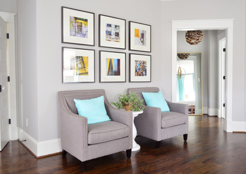
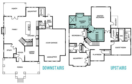
The attached bath and closet sit off a corner of the main bedroom and are separated by a space that we’ve been lovingly calling the “atrium” (it’s really more of a vestibule) which you can see above on the right side.
Here’s the floor plan for a clearer map of how that area is situated:
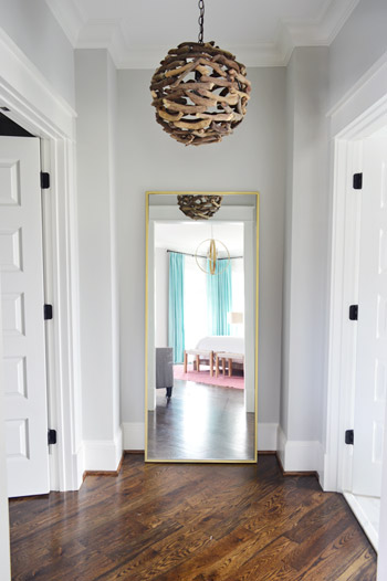
The atrium features a brass floor mirror donated by West Elm, a driftwood light from Shades of Light, and walls that are painted Stonington Gray by Benjamin Moore just like the bedroom. At one point we wanted to do a “living wall” back there with a bunch of built-in planter boxes filled with greenery, but due to the architecture of the roofline, we couldn’t put a skylight there. So because it felt unwise to cram a sunlight-less area with live plants, we scrapped the idea. It’s still a nice spot between the bathroom and the closet for a floor length mirror, and the driftwood light is one of our favorites in the house.
When you turn to your right, through the double doors you’ll see the space that we most want to pick up, stuff in a suitcase, and put in our own house.
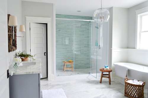
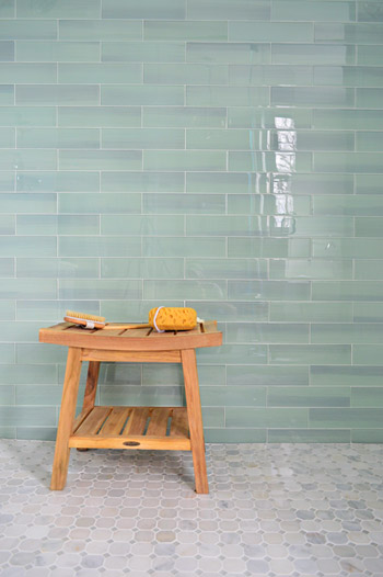
It felt fitting to aim for that spa-like effect in such an airy space (the house’s floor plan meant we knew that this room would be spacious with a big window over the tub). So pretty early on we decided we wanted a light color scheme with a wash of color on the back wall of the shower. We actually considered a more intense cobalt blue tile at one point, but it was out of stock. We love the calming aqua glass tile that we ended up with, (it’s the 3 x 12″ New Haven tile from The Tile Shop) so it was just one of those “happy accidents” throughout the room’s evolution.
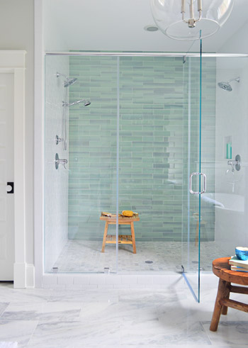
The sides of the shower are basic 3 x 6″ white subway tiles, also donated by The Tile Shop, which we picked because they were the same height as the bolder back-wall tiles (so the rows would line up), as well as feeling nice and simple – to keep the attention on that green glass tile. It’s considered a double shower since it has Baliza showerheads on both side walls, which were donated by Brizo. At the suggestion of our local Ferguson rep, whom we worked through to select plumbing fixtures, we included a handshower on one side (we learned that new builds frequently include them, just to give people options like spraying off their feet or a pet).
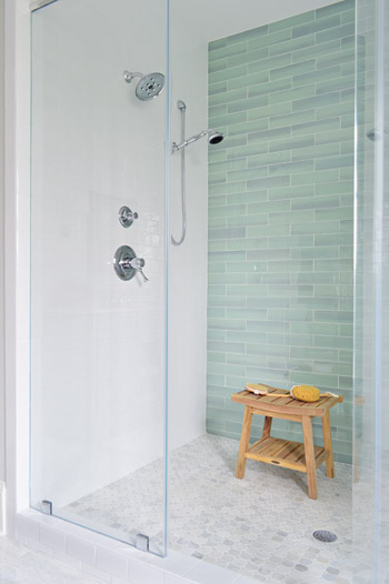
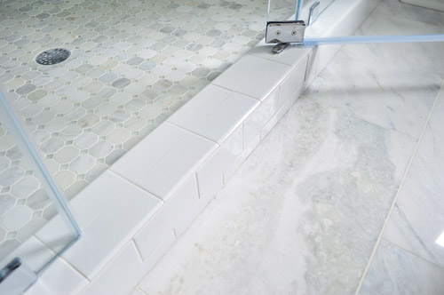
The floor tile in the shower pan is the Tile Shop’s Evanston series in Frost Snow, which featured some small aqua glass accents between the marble squares which help tie the big accent wall together with the marble floor (that’s 12 x 24″ Tempesta Neve marble) throughout the rest of the room. You can check out a detailed photo of our tile pics (and more clearly see those little green glass squares in the floor) here. We also really like how the tile installer wrapped the white subway around the shower threshold.
I’ll be honest that as the glass tile was being installed I was certain we had made a big mistake (three different tile choices for the shower walls and floor felt like they didn’t really “mesh” yet) but as soon as it was all grouted with the same white grout throughout, it tied everything together. And now it’s my favorite thing.
But let’s step out of the shower for a second and talk about the vanities (you don’t get to say that everyday), which came from the same local cabinet company (Affinity) that did the kitchen. They’re also painted in their stock gray color, which we’ve discovered is close to Benjamin Moore’s Timberwolf Gray. The walls are Moonshine.
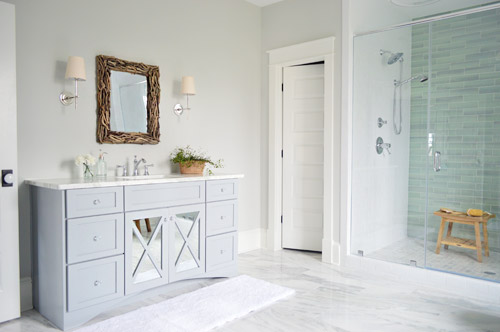
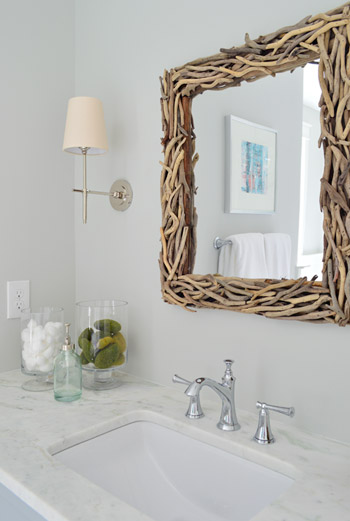
The driftwood mirrors and Soho sconces were donated by Shades of Light, the faucet is Brizo Baliza just like the shower fixtures, and the subtly green-veined counters are Lady Onyx which were purchased through a local company called Eternal Stoneworks.
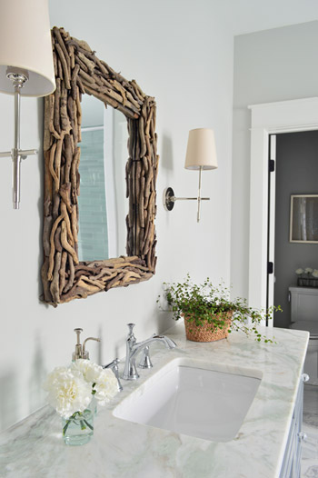
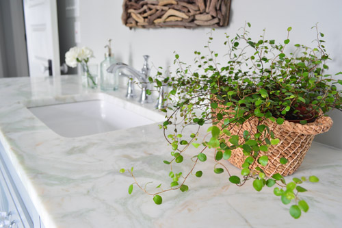
The onyx counters have a hint of the same seaglass color that’s in the shower tile, so we thought they’d be a nice counterpart to the more traditional marble on the floor. The little woven baskets are from HomeGoods.
We added a little more interest to the vanities by selecting mirrors with a soft patina effect that we placed behind the x-frame doors (similar to the clear glass ones that we chose for the kitchen). We also went with arched trim along the base of each vanity to give the built-in cabinet a bit more of a furniture feel (you can see that better two shots up). The giant bathmats are from Target.
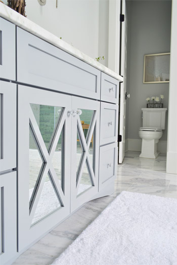
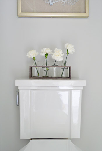
And now, let’s get weird for a second. I have to take a moment to talk about this toilet. I’ve never given toilets much thought, but when our builder urged us to pick something more stylish than a basic model we both fell in love with this one (the Tresham, donated by Kohler). And now I have this crazy case of toilet envy. So I guess that’s a thing. The little vases on the top are from World Market and the framed seafan art is from HomeGoods.
Speaking of envy, Sherry (in all her pregnant glory) has had a few moments of longing in front of this tub. Ever since one of our book tour hotels had a big soaker tub, she has been jonesing for one. It’s the York from Victoria + Albert, and the cool thing is that lots of people paint the outside an accent color. We considered it, but decided that we wanted to leave the shower as the main accent in the room – but we thought we’d toss that tip out because it could be a fun idea for your space.
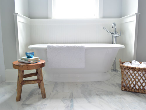
The stool and basket are both from HomeGoods, and the floor mount tub filler is the Trinsic, donated by Delta. You can see that we also had the carpenter add some beadboard wainscoting around the tub area as an accent, and to provide some extra protection from splashing, bubbles, and whatever else your particular tub fantasy entails. Mine includes nachos. Just sayin’.
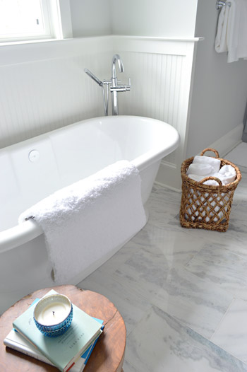
This is the view looking back on the room from the shower. Yes, I was literally in the shower when I snapped this. And yes, I did consider taking it for a test drive.
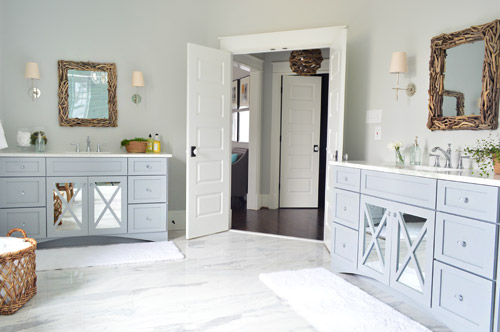
The mirrors were actually an 11th hour decision (as in, we were hanging them a few days ago) because the original chrome-y mirrors that we picked were blending too much with the other gleaming/polished items in the room and felt a little too invisible. So we decided that we needed something with more contrast and texture, and it hit us that rough driftwood frames would be an awesome reference to our lighting choice in the nearby atrium.
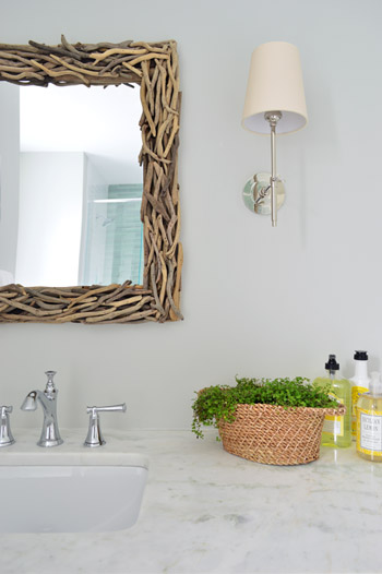
As soon as we hung the new mirrors we got more excited than we should have. Maybe we were just delusional at that point, but they’re one of our favorite last minute changes.
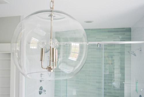
The main light fixture in here is the Clear Glass Chandelier from Shades of Light. It doesn’t pop in pictures very much, but in person it’s pretty amazing. So much so that we bought another one for the living room, but had them wire it in a gold finish to tie into some other fixtures down there.
The en-suite bedroom closet is equally envy-inducing in size and sports two sections (which make it convenient for a couple) thanks to a little partition in the middle to carve out two sides. We can’t claim much credit for how this turned out, since we mostly just nodded along as the builder and his carpenter told us their plans, but we’re happy to show off their handiwork and our meager styling of it (closets typically get a few outfits, bags, and shoes for these shows, so you get the idea but don’t have to see them stuffed with an entire wardrobe).
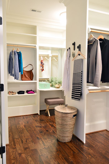
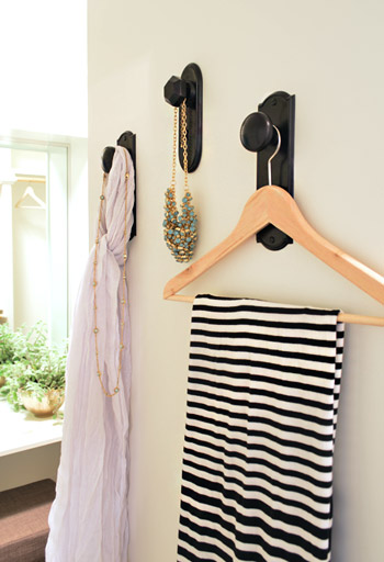
As we mentioned yesterday, we did hang a trio of our new doorknob hooks (two large ones and one small one) to create a little display space on the partition that separates the two sides of the closet. That flat wall was originally going to have a full length mirror on it, but it started to feel excessive after putting the floor mirror in the atrium – especially because we added a table-height mirror in that vanity area right behind it.
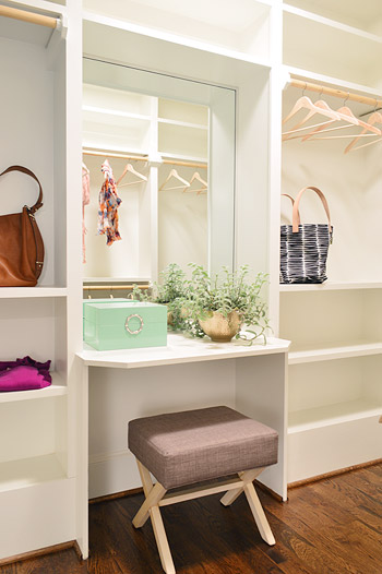
Speaking of that little vanity space, the stool is from Target, the green lacquered box is from HomeGoods, and the gold bowl with the plant in it is from World Market. The bags and clothes are mostly ours, along with some thrift store items and few scarves from Target.
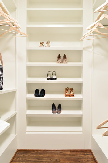
The vanity sits in the back half of the closet, which in addition to bars and cubbies, also sports this wall of angled shelves for shoes. I tell ya, Carpenter John (yes, yet another John who worked on this project) knows whats up.
The front side is mostly bars and shelves, as you can see in this shot of that area…
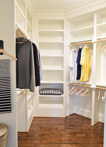
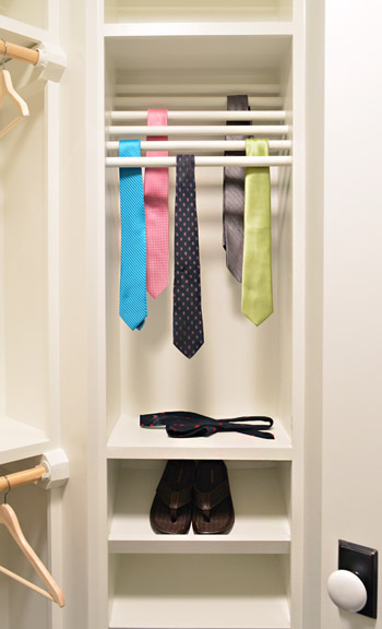
…but it does feature a built-in tie rack and a couple of shoe shelves. We bought some thrift store ties to fill it, only to get them into better lighting in this closet to discover they were all stained. Luckily some other folks working on the house had some (cleaner) spares to loan us, and my dad donated a few to the cause as well.
So now you’ve officially seen all of the main bedroom area of the house, bathroom and closet included. There’s still lots more house to show – and we’re madly trying to photograph it all before the baby comes (along with recording a video tour) but since we’ve probably overloaded you enough with photos for the week, we’re going to spend Friday at our house in a final-hour attempt to paint the office (ceiling and walls). So we won’t be posting tomorrow, but we’ll hopefully be back on Monday with a freshly painted office, which means we’ll finally be able to clear more chaos off of other surfaces – like the kitchen & dining room tables – before this baby arrives.
Psst – Wanna see more showhouse info & photos? Click here for Our Full Showhouse Tour, which includes final pictures of every room, the floor plan, budget info, a video walk-through, and shoppable showhouse furniture & accessories.

Meg says
My goodness, that closet. Wow. WOW. I… I just can’t. Suffice it say that y’all hit a home run on this one! The bathroom is absolutely gorgeous, but the closet is a real jaw-dropper.
Emily F says
Oh. My. GOSH!!! I want to move in to that closet and bathroom!!! It’s perfect!!!!!!! You two did a great job! I love everything! And I think the floor plan of your show house is perfect. Can’t wait to see more! :)
YoungHouseLove says
Thanks so much Emily!
xo
s
Andrea says
This place is awesome. But I keep thinking, “Who in real life actually has a house like this?” It’s just too perfect and too unattainable. Is this actually going to be someone’s home in the habitat for humanity program?
YoungHouseLove says
The Homearama show benefits Habitat (we are donating our fee, the builder is donating a chunk of change, and the show itself is donating as well) but the house is for any buyer in the area who wants to purchase it, along with the other six houses in the show.
xo
s
Jessica says
What kind of light fixture do you have above the toilet?
YoungHouseLove says
It’s a simple shade. Will have to try to find a link for you!
xo
s
Missy says
As a whole I generally love this bathroom even if there are a couple of things that I would’ve done differently – different shower floor tiles and different vanity counters. However, the one thing I feel that let’s down the room is the vanity mirrors. I feel like they’re a little to small/narrow for the room and get swallowed up. The room feels a little bottom heavy to me and I think mirrors that have a bit more presence would’ve balanced things up.
Other than that I love it! :)
cheryl says
you hit the nail on the head
Nicole Y. says
OMG I am in LOVE with this house! If I could I would buy the whole house with all the furnishings and then never ever leave it ever again!!!
Camellia says
WOW! Both great spaces. If only you could just buy the place yourselves, lol!
Brett says
Has building this show home made you feel like in the future you’d like to build your own “dream home” instead of buying a fixer-upper?
YoungHouseLove says
I think we would love to do other new build projects for other people but we are hopelessly in love with our old house in the woods, so we have no plans to build for ourselves.
xo
s
Lindsay says
Are all the plants real or fake? Where did you get them? They add so much to the space!!!
YoungHouseLove says
They’re real, from a local nursery called Great Big Greenhouse.
xo
s
Callie says
Gorgeous color choices in the bathroom, I love the light green shower wall and white beadboarding around the soaker tub!! Are there any shelves or hooks for towels by the tub/shower? I didn’t see any and can’t imagine always wanting to store towels on the floor in a basket where they’ll get wet/dripped on getting in and out of the tub. One of my top priorities in a bathroom is being able to reach for my towel from the tub/shower :) The other one is having a large mirror for doing hair/makeup/etc, so as much as I love those driftwood mirrors I think I’d have to change them out :| I do love the texture they bring to the room, though!
YoungHouseLove says
There are towel hooks on the back of the double bathroom doors, but we have extra ones that were donated sitting under the sink that the future buyers can hang closer to the shower if they’d like. We wanted to let them choose if they wanted them there or liked the open look without them.
xo
s
Lo says
I just asked the same question and see now you’ve already answered it. But where would you put your towel while you’re IN the shower? Get out of the shower and walk across the bathroom to the doors to get it? It doesn’t look like there’s much space on either side of the shower to even put any hooks.
YoungHouseLove says
I’d either fold a fresh towel over the tub edge, put it on the wood stool right outside the shower, or hang a hook nearby if I felt like a closer one made sense (a hook could fit above the tub on that wall next to the shower or even on the door to the powder room on the other side).
xo
s
Katie says
I don’t want this comment to make your head spin but do you think the painting of the office will be the last pre-baby item you check off your list? (honestly, no one would blame you if you just veg out all day tomorrow and bring baby home to an unpainted office). Just wondering about your kitchen counters? Not because I’m dying for a post on sealing them but my anxiety is kicking in for you and I can’t imagine having non functioning counters with baby home. Hopefully you can still utilize them even if they aren’t sealed for awhile. All my best for a safe uneventful delivery and healthy little boy!!
YoungHouseLove says
Sealed counters and a painted office = the goal!
xo
s
Andrea says
I love the show house inside and out. If only it was in Seattle! I’d buy it in a heartbeat. I’ve been pinning lots of your pictures to use as inspiration in our upcoming house build. I especially love the tub. There’s something so elegant about a freestanding tub if such a thing can be said.
I also love your line at Target; though my local store (very sadly!) doesn’t carry it, I’m planning to order a few Burger hooks online. And maybe some octopus hooks, and heck I love the doorknob ones as well!
YoungHouseLove says
Thanks so much Andrea!
xo
s
Bonnie @ The Pin Junkie says
Gorgeous! I love the serene, calming colors you chose for the bathroom. And I could live in that big spacious closet! Well done!
Leslie says
I’ve had apartments smaller than that bathroom! Looks beautiful!
Danielle says
Just wow, the show house turned out so amazing! Big high five to you two! I’m sure I just missed it somewhere, but where were those amazing drift wood frames from?? I think I’m in love.
YoungHouseLove says
The driftwood mirrors are from Shades Of Light.
xo
s
Sara says
I’m not sure I would ever leave that bathroom. I’m not even a bath girl.. but that tub makes me want to be one. The whole room is relaxing!
Betsy says
Will you all be adding the show house to the “house tour” page when it’s all said and done. You’ve done such a great job I know I’m going to want to go back and ogle at it for years to come!
YoungHouseLove says
Yes we’d love to do that!
xo
s
Sarah says
Do you have all the showhouse posts categorized somewhere on the site? My mom is currently building a house and I’d love for her to read about your process and see all your great tips!
YoungHouseLove says
Yes if you go to the sidebar and click the “category” tab you can scroll down and click “showhouse” to see them all.
xo
s
Sarah says
Thank you so much! She’s so excited to read through all your posts – I can only hope her home turns out this gorgeous! I would move in here in a second.
theresa says
OH MY GOD I wish I could pick that house up and drop it right here in WA state. I think you should do this for a living. I mean- quit your blogging job (no, don’t really) and just start designing houses for people. AMAZING!
Only think- I think it would be super super hard to clean behind that tub. I would hate it for that. But it looks soooo lovely. All of it. Congrats.
Lauren Nicole says
THANK YOU for not posting on Fridays lately. It gives those of us who don’t have time to read every day a chance to catch up! I strongly suggest you continue this trend once the Barnacle arrives for the sake of your sanity. :)
Carrie K says
LOVE that you put your own clothes in the closet! That’s awesome.
Beth says
i’ll admit, i liked the house before today. today, i am WOWED and in LOVE! beautiful work, congratulations!
YoungHouseLove says
Thanks so much Beth!
xo
s
Briel K. says
Wow, the closet and bathroom are to die for! They are so HUGE. And I love the area between them with the mirror too. Ugh, so jealous. haha
I’m sure there is someone who keeps track of all the items in the house and what belongs to who but is everything labeled somehow too? It must get confusing remembering what’s been donated and what needs to be returned and such.
YoungHouseLove says
We have spreadsheets, photos, and emails for reference.
xo
s
Mary-Carolyn says
Just curious if a.) the bathroom mirrors are the same as the white one in the entry, just different colors and b.) if y’all considered other last-minute mirror options.
These seem a little small in scale for the bathroom, particularly in the height department. Did you consider an oval mirror? I think the curves might have brought a little softness to the space, and they would have given you more height without being too wide for the space between the sconces, which I’m sure was a constraint in finding new mirrors.
YoungHouseLove says
The funny thing is that we found the white one in the entryway from HomeGoods while the bathroom ones are from Shades of Light! We really like how they pulled texture into the space and tied into the atrium light but an oval would be pretty too!
xo
s
Lou Anne says
Love the show house! It is apparent how much work went into it. I know you guys must be exhausted.
I bought 2 of your hooks today!! So excited to see them in my Target!! I got the burger one and the key one, both in white. Can’t wait to get them hung!
I also wanted to let you know how much I think of you guys. Like many of your readers, I feel like I know you personally. You are both such hard workers, and seem to be such sweet genuine people. I couldn’t be happier for your current success and I wish you nothing but the best! I know you are probably feeling some nerves and anxiousness with Baby Barnacle coming very soon. I will be praying for a smooth, healthy delivery and baby boy, as well as for your peace. I love your sweet family and will totally understand your taking some well deserved time off. I will certainly be here when you return!!
Lou Anne
YoungHouseLove says
Thanks so much Lou Anne!
xo
s
Brittany says
If I could live in that closet and bathroom, I would be a happy girl. Well…. I guess I would also need the kitchen so I could cook, eat and blog. BUT seriously those two rooms on their own would make me want to buy this house. Amazing!!
Erica says
I am obsessed with this bathroom. We are about to re-do our (much smaller) master bath, and this is exactly the color palette I am going for. I can’t stop pinning marble hexagon tile! It’s so helpful to see that beautiful tile in the shower – I was hesitating about doing a shower accent wall, but now I think I have to go for it! Thanks so much for your super detailed and thorough source list, and for all these fabulous pictures I can use for inspiration!
And that closet with the shoe wall…excuse me, I just drooled on my keyboard.
YoungHouseLove says
So glad! Good luck with yours!
xo
s
Cindy says
Beautiful! I agree with you about the driftwood mirrors; they totally balance the space.
I have a question about lighting in the bathroom. I saw a can light above the shower, two sconces flanking each mirror, and a chandelier in the middle of it all. Is there any other lighting in that room, or is that enough?
YoungHouseLove says
There are eleven bulbs in the bathroom so it’s super bright! Four sconces, a three light fixture in the middle, a can light in the shower, and a light in the powder that has 3 bulbs.
xo
s
Amanda {NoDak Nest} says
Those vanities! Oh my gracious, be still my heart! I need those in my life.
Marta says
Woooooow, count me in on the Envy Club… Amazing job guys, as usual.
(I also joined the “Longing at the Soaker Tub” Club, and am pretty sure I would just wanna camp in there if I saw it in real life instead of in a picture.)
I am also painting a room, now that I can finally open the windows, (after a way too long Chicago winter, it feels great)
Get some rest!
Jen says
This bathroom is beyond gorgeous. I think I would lock myself in there for the whole day!
On another topic, I wanted to let you know that you guys inspired my husband and I to put an offer on an amazing house. The only trouble is that it’s all original 1960’s inside… pink tile bathroom included! We know it’s going to be a huge project, but with all we’ve learned from you, we know we’ll be fine. Fingers crossed the offer goes through!! Thank you!
YoungHouseLove says
Good luck with everything!
xo
s
Jaime says
Maybe I am not seeing it, but where am I supposed to hang my towel for when I get out of the shower?? Do I have to hang it over the edge of the tub and walk across the massive floor dripping everywhere to dry off?? I love the materials and colors you guys picked but the room just seems so lacking in practical things that make a bathroom function like shower accessible towel racks and storage. Yes, the bathroom is huge, and I love that, but it seems that it was “furnished” for one half its size; everything, while nice, is just way too small…
YoungHouseLove says
There are towel hooks on the back of the bathroom doors, but we have extra ones that were donated sitting under the sink that the future buyers can hang closer to the shower if they’d like. We wanted to let them choose if they wanted them there or liked the open look without them.
Update: Just realized I forgot about the towel bar to the right of the tub. You can see part of it in this shot, as well as in the reflection of the mirror in this picture.
xo
s
Candice S says
LOVE IT! The colors are perfect and probably worked out better than the cobalt blue. Very spa-like.
FYI – I wanted to check out the bathroom sink faucet, but the link took me to Shades of Light. Oops.
YoungHouseLove says
Sorry about that! Will fix that as soon as we can.
xo
s
Rebekah says
That bathroom is to die for! What a beautiful space! You have put so much of yourselves into this house. It would be hard for me to let it go! :-) Take care of yourselves in the next few days! Can’t wait for the arrival of the little one!
Scotti says
This is so beautiful! We added a hand-held to our shower too and we love it. No pets to wash, but it’s also perfect for the kids. They enjoy having control of the water when they shower and it lets them be independent. My four year old will point the warm water right at his belly for long periods of time :)
We also have a ceiling mounted rain shower head that my husband loves, but I don’t like so it gives us options.
Camille says
Best bathroom ever! I want to live in that bathroom, it looks so peaceful! :)
YoungHouseLove says
Thanks Camille! There’s room for a bed in there so you can move right in ;)
xo
s
Amy says
We’re looking to install a tub like that for our master suite project. They are incredible! A friend of ours has one and that inspired us to do so after she let us take it for a test drive. It will be totally worth all of the meals of ramen noodles I will have to eat to save up for it!
Kerry says
This post is probably one of my favorites. The driftwood light…the shower. Sigh. The tub is nice, but give me that shower any day. (I think I just get bored in baths) I have a duo shower nozzle thing, and the handheld is so nice for a sore neck or for washing pets. Have you ever tried bathing a cat? A standalone shower with a handheld sprayer makes it easier (not easy. Easier. :P). And that toilet is really nice! Love the look of it.
The closet is great! I would use the doorknob hooks to hang tomorrow’s clothes (I get up at 4:00 a.m., so I like to have my clothes picked out the night before).
Great job, guys. Truly. This is fantastic.
cheryl says
For me the bathroom just looks disjointed .. too much going on ..
Mandy says
Beautiful! Forget the bedroom … I’d sleep in that tub. :)
Heather says
It hurts a little to read His and Hers all through the design planning. There’s never going to be a His for me, we’ll be two Hers and a gaggle of little ones. I have complete faith that no insult was meant by those choices. I also wanted to share my experience with you guys since I respect you so much. Keep up the brave work, you two. It’s beautiful.
YoungHouseLove says
Heather you’re so right, we weren’t thinking. Will take it out asap.
xo
s
Samantha @ Fabulous Fabris says
My goodness do I want that bathroom and closet.
I love how calming the bathroom is. I could just lie in the tub all day sighing at the room.
Stacey C says
Please just pack that entire bathroom up and send it my way! We’re looking to renovate our bathroom and I might have to copy your ideas! If only I had the room and lighting…
Thanks for sharing!
Constance says
The only thing I have to say about the pictures in this post is PUUUUUUURRRRRRRRR!
YoungHouseLove says
Haha!
xo
s
Leigh Anne says
I know it’s impossible to go over every detail of the showhouse, but as someone who’s in a “needs some love house” like you guys, I’m curious – is there a fan in the bathroom for steam removal, or is there something fancy that newer homes have now? We’re doing a Phase 1 guest bathroom update, so the bisque-colored fan has got to go! Thanks for the help!
YoungHouseLove says
From working with the guy who installs glass shower doors, it sounds like a lot of new constructions keep those a few feet from the ceiling so there’s ventilation room to reduce any steam and there’s also a vent in the powder room area of the bathroom to vent things.
xo
s
Johanna says
There are two scenarios in which you use the similar tones of slightly different colors (I’m pro- the vanity and bathroom walls and the built-in’s and walls of Barnacles nursery. Or at least they read in the pictures as being very close in tone. Is there more of a contrast in person or were looking for them to be a little more blendy?
YoungHouseLove says
We were going for the tone on tone thing so they didn’t all match and felt a little more dimensional since there were layered shades, but they were sort of in the same family if that makes sense.
xo
s
Johanna says
I meant to say- probably describing it wrong…! But still, I’m curious about the method ;)
Barbra says
That floor in the Atrium is gorgeous!! Is there a name, style, something about that so I can look into it?
YoungHouseLove says
It’s solid oak hardwood flooring that was sanded and stained in place after being installed. The stain color is Jacobean.
xo
s
Katie says
It’s fabulous! Congrats on an amazing end result after all your hard work!
Now to sit back and watch everyone freak out when you don’t post tomorrow…;)
Lynne Wesenberg says
I am IN LOVE with this bathroom and closet!!! You guys did an awesome job :)
One question: where did you get the stool in shower? Is is really water-ready so that it can live in there? I could really use one in my shower, is why I’m asking. Thanks! You guys rock!
YoungHouseLove says
It’s by Broyhill from HomeGoods and I believe it’s teak (which is wood that works well in a shower). Others have said they have teak ones that hold up well if that helps!
xo
s