Continuing our showhouse-heavy week of reveals, we’re bringing you a bunch of after photos from three more spaces – the main bedroom’s en-suite bathroom, its attached closet, and cool little atrium space. We showed you the main bedroom on Tuesday (along with the office and the butler’s pantry) so it only felt natural to continue our virtual tour where we left off.
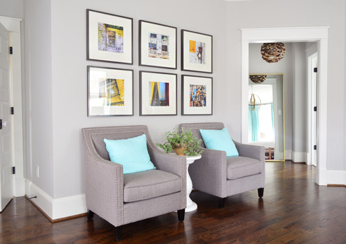
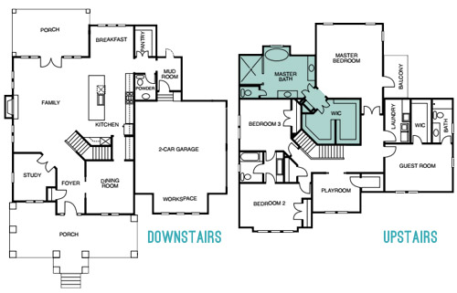
The attached bath and closet sit off a corner of the main bedroom and are separated by a space that we’ve been lovingly calling the “atrium” (it’s really more of a vestibule) which you can see above on the right side.
Here’s the floor plan for a clearer map of how that area is situated:
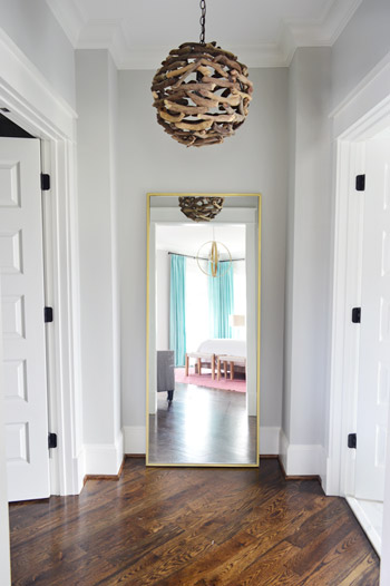
The atrium features a brass floor mirror donated by West Elm, a driftwood light from Shades of Light, and walls that are painted Stonington Gray by Benjamin Moore just like the bedroom. At one point we wanted to do a “living wall” back there with a bunch of built-in planter boxes filled with greenery, but due to the architecture of the roofline, we couldn’t put a skylight there. So because it felt unwise to cram a sunlight-less area with live plants, we scrapped the idea. It’s still a nice spot between the bathroom and the closet for a floor length mirror, and the driftwood light is one of our favorites in the house.
When you turn to your right, through the double doors you’ll see the space that we most want to pick up, stuff in a suitcase, and put in our own house.
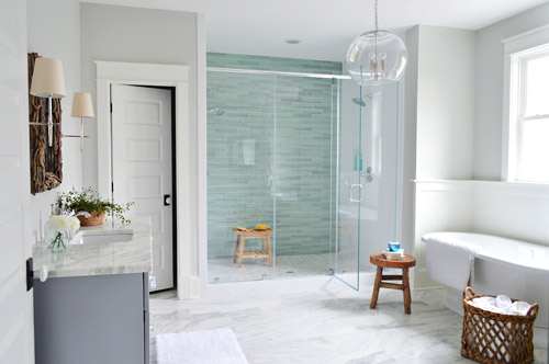
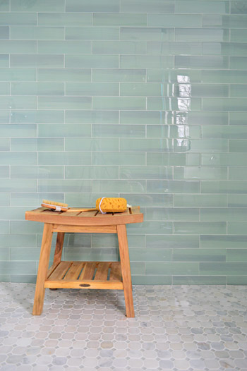
It felt fitting to aim for that spa-like effect in such an airy space (the house’s floor plan meant we knew that this room would be spacious with a big window over the tub). So pretty early on we decided we wanted a light color scheme with a wash of color on the back wall of the shower. We actually considered a more intense cobalt blue tile at one point, but it was out of stock. We love the calming aqua glass tile that we ended up with, (it’s the 3 x 12″ New Haven tile from The Tile Shop) so it was just one of those “happy accidents” throughout the room’s evolution.
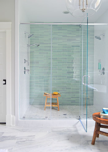
The sides of the shower are basic 3 x 6″ white subway tiles, also donated by The Tile Shop, which we picked because they were the same height as the bolder back-wall tiles (so the rows would line up), as well as feeling nice and simple – to keep the attention on that green glass tile. It’s considered a double shower since it has Baliza showerheads on both side walls, which were donated by Brizo. At the suggestion of our local Ferguson rep, whom we worked through to select plumbing fixtures, we included a handshower on one side (we learned that new builds frequently include them, just to give people options like spraying off their feet or a pet).
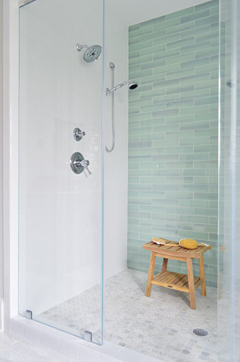
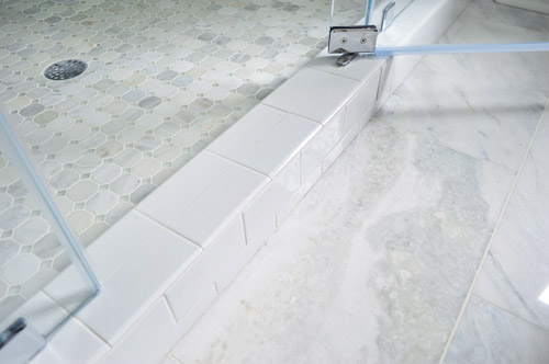
The floor tile in the shower pan is the Tile Shop’s Evanston series in Frost Snow, which featured some small aqua glass accents between the marble squares which help tie the big accent wall together with the marble floor (that’s 12 x 24″ Tempesta Neve marble) throughout the rest of the room. You can check out a detailed photo of our tile pics (and more clearly see those little green glass squares in the floor) here. We also really like how the tile installer wrapped the white subway around the shower threshold.
I’ll be honest that as the glass tile was being installed I was certain we had made a big mistake (three different tile choices for the shower walls and floor felt like they didn’t really “mesh” yet) but as soon as it was all grouted with the same white grout throughout, it tied everything together. And now it’s my favorite thing.
But let’s step out of the shower for a second and talk about the vanities (you don’t get to say that everyday), which came from the same local cabinet company (Affinity) that did the kitchen. They’re also painted in their stock gray color, which we’ve discovered is close to Benjamin Moore’s Timberwolf Gray. The walls are Moonshine.
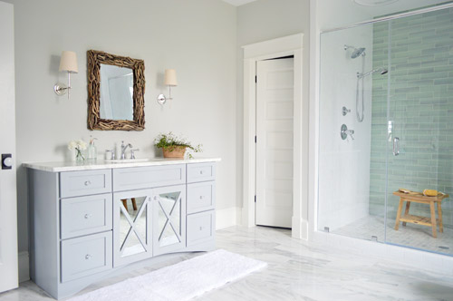
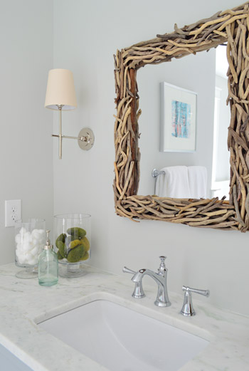
The driftwood mirrors and Soho sconces were donated by Shades of Light, the faucet is Brizo Baliza just like the shower fixtures, and the subtly green-veined counters are Lady Onyx which were purchased through a local company called Eternal Stoneworks.
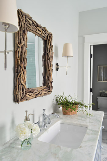
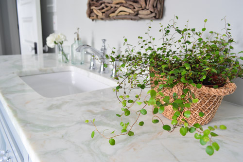
The onyx counters have a hint of the same seaglass color that’s in the shower tile, so we thought they’d be a nice counterpart to the more traditional marble on the floor. The little woven baskets are from HomeGoods.
We added a little more interest to the vanities by selecting mirrors with a soft patina effect that we placed behind the x-frame doors (similar to the clear glass ones that we chose for the kitchen). We also went with arched trim along the base of each vanity to give the built-in cabinet a bit more of a furniture feel (you can see that better two shots up). The giant bathmats are from Target.
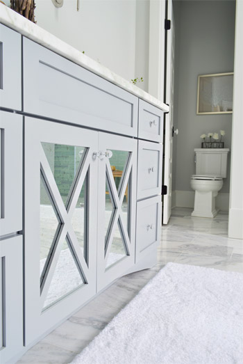
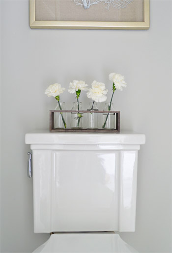
And now, let’s get weird for a second. I have to take a moment to talk about this toilet. I’ve never given toilets much thought, but when our builder urged us to pick something more stylish than a basic model we both fell in love with this one (the Tresham, donated by Kohler). And now I have this crazy case of toilet envy. So I guess that’s a thing. The little vases on the top are from World Market and the framed seafan art is from HomeGoods.
Speaking of envy, Sherry (in all her pregnant glory) has had a few moments of longing in front of this tub. Ever since one of our book tour hotels had a big soaker tub, she has been jonesing for one. It’s the York from Victoria + Albert, and the cool thing is that lots of people paint the outside an accent color. We considered it, but decided that we wanted to leave the shower as the main accent in the room – but we thought we’d toss that tip out because it could be a fun idea for your space.
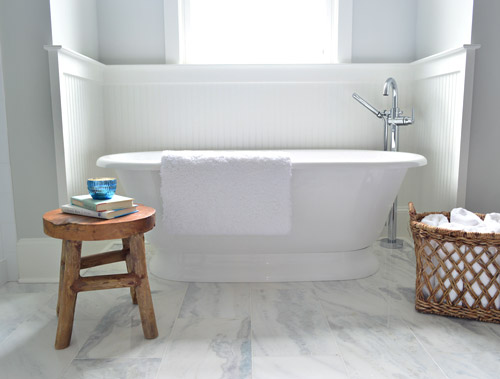
The stool and basket are both from HomeGoods, and the floor mount tub filler is the Trinsic, donated by Delta. You can see that we also had the carpenter add some beadboard wainscoting around the tub area as an accent, and to provide some extra protection from splashing, bubbles, and whatever else your particular tub fantasy entails. Mine includes nachos. Just sayin’.
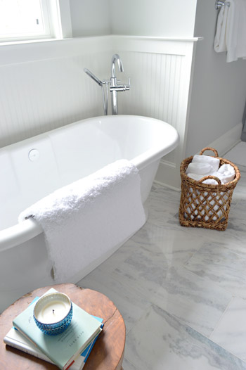
This is the view looking back on the room from the shower. Yes, I was literally in the shower when I snapped this. And yes, I did consider taking it for a test drive.
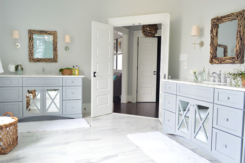
The mirrors were actually an 11th hour decision (as in, we were hanging them a few days ago) because the original chrome-y mirrors that we picked were blending too much with the other gleaming/polished items in the room and felt a little too invisible. So we decided that we needed something with more contrast and texture, and it hit us that rough driftwood frames would be an awesome reference to our lighting choice in the nearby atrium.
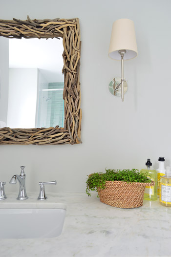
As soon as we hung the new mirrors we got more excited than we should have. Maybe we were just delusional at that point, but they’re one of our favorite last minute changes.
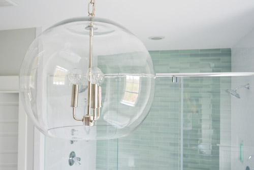
The main light fixture in here is the Clear Glass Chandelier from Shades of Light. It doesn’t pop in pictures very much, but in person it’s pretty amazing. So much so that we bought another one for the living room, but had them wire it in a gold finish to tie into some other fixtures down there.
The en-suite bedroom closet is equally envy-inducing in size and sports two sections (which make it convenient for a couple) thanks to a little partition in the middle to carve out two sides. We can’t claim much credit for how this turned out, since we mostly just nodded along as the builder and his carpenter told us their plans, but we’re happy to show off their handiwork and our meager styling of it (closets typically get a few outfits, bags, and shoes for these shows, so you get the idea but don’t have to see them stuffed with an entire wardrobe).
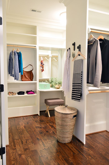
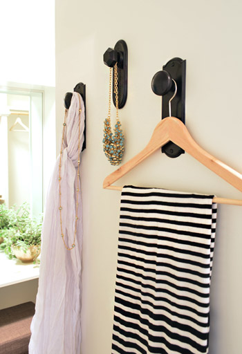
As we mentioned yesterday, we did hang a trio of our new doorknob hooks (two large ones and one small one) to create a little display space on the partition that separates the two sides of the closet. That flat wall was originally going to have a full length mirror on it, but it started to feel excessive after putting the floor mirror in the atrium – especially because we added a table-height mirror in that vanity area right behind it.
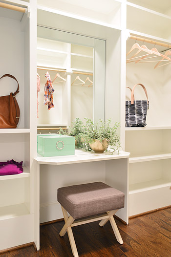
Speaking of that little vanity space, the stool is from Target, the green lacquered box is from HomeGoods, and the gold bowl with the plant in it is from World Market. The bags and clothes are mostly ours, along with some thrift store items and few scarves from Target.
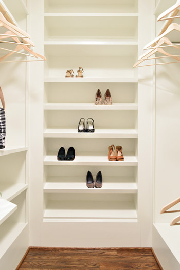
The vanity sits in the back half of the closet, which in addition to bars and cubbies, also sports this wall of angled shelves for shoes. I tell ya, Carpenter John (yes, yet another John who worked on this project) knows whats up.
The front side is mostly bars and shelves, as you can see in this shot of that area…
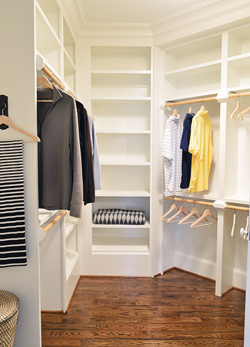
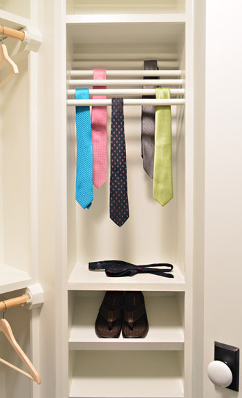
…but it does feature a built-in tie rack and a couple of shoe shelves. We bought some thrift store ties to fill it, only to get them into better lighting in this closet to discover they were all stained. Luckily some other folks working on the house had some (cleaner) spares to loan us, and my dad donated a few to the cause as well.
So now you’ve officially seen all of the main bedroom area of the house, bathroom and closet included. There’s still lots more house to show – and we’re madly trying to photograph it all before the baby comes (along with recording a video tour) but since we’ve probably overloaded you enough with photos for the week, we’re going to spend Friday at our house in a final-hour attempt to paint the office (ceiling and walls). So we won’t be posting tomorrow, but we’ll hopefully be back on Monday with a freshly painted office, which means we’ll finally be able to clear more chaos off of other surfaces – like the kitchen & dining room tables – before this baby arrives.
Psst – Wanna see more showhouse info & photos? Click here for Our Full Showhouse Tour, which includes final pictures of every room, the floor plan, budget info, a video walk-through, and shoppable showhouse furniture & accessories.

jessica says
how many sf is the house? I’m sure you’ve said before but couldn’t find the info. Thanks!
YoungHouseLove says
It’s around 3500 square feet.
xo
s
Albiedesigns says
It’s just gorgeous!!!You guys did an amazing job! We are doing our master remodel as well, and I have been eying the “YORK” as well. Love it!
Anna // Gone Banannas says
I hope you two have given yourselves a sufficient amount of pats on the back for this house because it is re-darn-diculous how awesome it is!
YoungHouseLove says
You’re so sweet Anna!
xo
s
Michelle says
I could move in! Great job you guys!
Brooke Mowry says
OMG that house is perfection!! You guys have done an amazing job–congrats :) Loving everything about it so far! And that bathroom…who WOULDN’T love that oasis!??!
Just a question…who makes that shower door? I’ve in the midst of a master bath reno and that’s the last on my to-buy list and I love that one! Thanks :)
YoungHouseLove says
Those are stock glass doors our builder installs in most of his homes by a local company called Interiors 2K.
xo
s
Brittney Everett says
I LOVE the wall with the 3 hooks in the closet. As someone who picks out my outfits the night before, and sometimes for a big event, multiples days before, I love that there is a space to display my choices, play with accessories etc! Great Choice… those future owners have enough places to look at themselves in mirror’s, they don’t need any more!
Alice says
I could live in that bathroom it is just so gorgeous!!!
Dumb question, but if this were your bathroom, which vanity would be John’s and which would be Sherry’s?
YoungHouseLove says
Good question! In my head I just claimed one (without telling John which one I wanted) and asked him his favorite and he picked the other one! So funny! I randomly chose the one across from the tub and he said he liked the one across from the shower.
xo
s
Alice says
The reason you claimed the one across from the tub is because you can probably see alcove & tub in the mirror behind you and John had unknowingly picked the other one because he could see that droolworthy shower in that vanity’s mirror reflected from behind him!
YoungHouseLove says
So funny! That makes sense!
xo
s
AmyL says
Ok, super weird, tangential question here. In your next to last photo of the closet, there is an IKEA Henny blanket on the lower shelf (black and grey wool). It may just be your own personal property — in which case, I assume you’d just take it home — but on the off off off chance that it’s thrifted AND you have some plans to sell unused items after Homearama ends, I would move mountains to buy it! (been kicking myself for several years for only buying one before IKEA discontinued it (seemingly one week after it hit the shelves))
YoungHouseLove says
You’re so sweet! That’s ours from a few years back (we brought a few things from our house like pillows and candles and blankets to fill things out) but if we don’t have a spot for it in our house down the line I’ll let you know!
xo
s
Lo says
I like the shower and closet. I especially love the little stool near the tub. So cute. Where is the stool in the shower from?
As well, I don’t see any hooks or towel bars anywhere – where would you hang your towels?
YoungHouseLove says
The shower stool is by Broyhill from HomeGoods. There are towel hooks on the back of the bathroom doors, but we have extra ones that were donated sitting under the sink that the future buyers can hang closer to the shower if they’d like. We wanted to let them choose if they wanted them there or liked the open look without them.
Update: Just realized I forgot about the towel bar to the right of the tub. You can see part of it in this shot, as well as in the reflection of the mirror in this picture.
xo
s
Amy says
Those giant bath mats… I want them! what brand at target? Threshold? Nate? Fieldcrest? Love!
YoungHouseLove says
I think they were Fieldcrest. They’re on the very bottom shelf in our store.
xo
s
BeccaK says
I love the shower tile. I want to stroke it – will you stroke it for me? Pretty please?
I also love the driftwood mirrors and how they echo the cool lighting fixture, although I definitely prefer the look of the one hung horizontally more than the one hung vertically, since it looks larger that way and provides more viewing area for the person using the sink. (They don’t need a longer view in the bathroom itself, since you have that great standing mirror in the atrium!)
MonW says
I am loving the tile choices in the master bath! Not in your face, I don’t think it will look dated in 10-20 years. Perhaps a twist on the timeless look?
Ingenious tie storage solution! I’ve been gathering ideas after counting the stash of ties the hubby has. 24 ties, so far.
I have learned it is very bad for knitted ties to hang them..
Also bad for all ties to leave in loose knots….
stacy says
As someone who currently shares a tiny little closet with her husband and the bed linens I have to comment that the closet is TO DIE FOR. I would give my right arm for something like that. Absolutely beautiful.
Summer says
LOVE the driftwood mirror and light fixture!
buhdoop says
Those spaces look wonderful. Just out of curiosity, did any of the other designers blog about their design choices on their particular homes for the event?
YoungHouseLove says
I think we’re the only bloggers in the group. Many of the other designers/decorators do this full time as their profession, so they might have a design website but I don’t think any of them have a blog. We’re hoping to crash all of their homes and share the awesome details with you guys though, so that should be fun! They’re all making really bold choices so the show is turning out to be really exciting and diverse!
xo
s
Kirstin says
I apologize if this was already asked and I missed it, but what kind of plant is that on the vanity? I really like the look of it!
YoungHouseLove says
Thanks Kirstin! The vanities came from the same local cabinet company (Affinity) that did the kitchen and they’re also painted in their stock gray color, which we’ve discovered is close to Benjamin Moore’s Timberwolf Gray.
xo
s
Rebekah says
I believe she was asking the plant name, not the paint color of the vanity…
Leah says
I think she was asking about the plant, as in the green, growing thing there. It is really lovely!
Looking for the plant also made me notice the awesome natural light. I love rooms where you don’t have to turn on an electric light to see.
YoungHouseLove says
Sorry, I clearly have pregnancy brain going on! I think it’s some kind of fern? Not an asparagus fern though. I forget. Anyone recognize it?
xo
s
Rosie S says
It looks like a Wire Vine, I have also heard it called button or angel vine. LOVE this plant and actually just bought one at Junk Bonanza (great show BTW!). It likes light, not too much heat, and likes water and if it dries out completely, kiss it goodbye…at least that is my experience with it. It also is a wonderful plant to shape onto a topiary form.
Nicole S. says
That’s it! Thanks, Rosie S!
Sandra says
The master bathroom is incredible! I will be referencing it if I ever get around to updating my own. I love that wall of tile.
One thing…the water closet door is mounted backwards. It should open out for safety.
-Sandra
YoungHouseLove says
Thanks Sandra! Never heard that, but will definitely run it by the builder to be sure everything is up to safety standards! I do know we passed all of our inspections, so maybe it’s a regional thing?
xo
s
Rebekah says
In the house floor plan, the door opens outward. Was a door opening inward a change you requested?
YoungHouseLove says
Nope, we have nothing to do with doors being hung and that stuff :)
xo
s
Bethany says
Don’t most doors open inwards? I don’t know anything about code/safety, but I thought they were like that so you don’t whack someone with the door when you’re opening it from the inside.
Amy says
On your floor plan, the door is mounted correctly (the graphic in this post shows the door opening out). If you & the builder don’t decide to change it, will you update us to explain why it was mounted that way? (Also I can’t imagine there’s a lot of room in there with the door opening to the inside.) Thanks!
YoungHouseLove says
Will to!
xo
s
Sandra says
Wow, this got bit of attention! My understanding of the door swing issue is should someone collapse inside, their body would block the door and make it difficult to access them for emergency care. It may not be a code requirement nationwide.
You guys have plenty on your plate now, but thank you for the forum for discussion.
Sandra
Jill says
I cannot BELIEVE you furnished this whole house in 2 weeks!! It would’ve taken me months!! Bravo.
Melodee Vandenbosch says
Absolutely beautiful. I would steal space from my guest room for the shower. Just saying.
Melissa says
I would sell my soul for that closet… I promise you I need every inch!
Nsark says
I LOVE that bath and closet. I would move right in.
This is an extremely random question, but do you know what the name of the plant is on the vanity in the bathroom? I had one that died (black thumb problems) and i have never found a replacement for it since!!
YoungHouseLove says
I think it’s some kind of fern? Not an asparagus fern though. I forget. Anyone recognize it?
xo
s
Kary Glawe says
I read “Sherry has had a few moments of longing” as “lounging” and wondered if she snuck over there to use the tub!
YoungHouseLove says
Haha! I wish!
xo
s
Stephanie @ Whole Health Dork says
That bathroom is incredible! I love the calming, spa-like atmosphere going on. Serious bathroom envy! Amazing job as always!
Ansleigh says
Love, love, love!
We are in the very early stages of starting to build our next house. Basically, my husband and I are too picky to find a house already build, so we’ve decided to build what we want. Finding plans we both like has been difficult…like I said, we’re picky. We do love this house though (and it’s obviously a bonus to see pictures of the real thing and not just drawings). Is it possible to purchase these plans for a builder to use?
YoungHouseLove says
Yes, the plan is called The Clover and it’s available for purchase on the builder’s site (with a portion of proceeds going to Habitat). His site is biringerbuilders.com
xo
s
Megan says
Hence the Clover Cafe on the chalkboard drawing! So clever! :-)
Lesley K says
When I scrolled down and saw that bathroom…. absolutely breath taking. Stunning. Im still smh at its beauty. Again, you guys go above and beyond!
YoungHouseLove says
Thanks so much Lesley!
xo
s
Ashlee says
I’d forgo my house to live in that bedroom/bathroom/closet, which I’m sure is double or triple the size of my entire house. I’d have dinner parties in that bathroom because it’s so beautiful.
Lori says
The house is so amazing, but with all the love and heart you put into it makes it more than that. You two are such good people; it comes through with each post. My daughter also follows you, and she is close behind Sherry in having her second child. We are praying for a good labor and delivery for you, and want you to know that you are loved by many who follow your blog. Thank you for the good example you are to all the young marrieds with small children. It’s not easy but your effort to make things work gives encouragement to others. A good marriage has to be void of selfishness. You’ve been a perfect example of that!
YoungHouseLove says
You’re so sweet Lori, thanks for the kind words!
xo
s
Jamie Smith says
Watching this show house come together has been so fun. I’ve never built a house before, so it is fun to vicariously enjoy the process. This home is really beautiful and amazing and full of thoughtful details. One day, when you guys are bored and have nothing to do (ha ha), it would be cool if it could join your other houses on the house tour page. (But no pressure now! :). I hope you get all the rest you deserve before your new little one comes next week.
YoungHouseLove says
We’d love to make a page dedicated to it among the other house tours we have :)
xo
s
Bonnie says
Wow…Sherry & John, you two (and your team) have done a phenomenal job!! It’s such a fun, breathtaking (but still real) way to decorate and pull together an entire house. Fantastic job!! Like someone else said in the comments…I wouldn’t change a thing…
YoungHouseLove says
Thanks Bonnie!
xo
s
Amanda says
I was in Target last night and just had to have the little teal hex picture hanger from your collection. I loved the door knobs but couldn’t think of a single place to use them. This morning while getting ready for work, I thought how nice it would be to have hooks to plan out my clothing options the night before. And NOW you have solved both problems – I can buy the doorknobs I love and know exactly where I can put them in my closet. Going back to Target tonight :)
Sarah says
Can you tell me more about the beautiful Clear Glass Chandelier? I saw it in one of your preview pics, found it on the Shades of Light website, but was bummed that it didn’t come in a gold or brass finish. So when you mentioned you had another one for the living room in gold, I got excited. Did you paint it?
YoungHouseLove says
We got their outlet (they build and re-wire lights a lot) to help us with that! Any electrician or lighting shop could probably help you rewire it I would think – you might even be able to call Shades of Light to see if they could do it internally for you?
xo
s
Caity says
Everything about this house is perfect. You guys are such an inspiration!!
Praying for a smooth, safe deliver with no complications. I hope you enjoy your time transitioning to a family of 4 (well, 5. I count the furbabies!)
Caity says
*delivery
Courtney says
No towel racks??
YoungHouseLove says
There are towel hooks on the back of the bathroom doors, but we have extra ones that were donated sitting under the sink that the future buyers can hang closer to the shower if they’d like. We wanted to let them choose if they wanted them there or liked the open look without them.
Update: Just realized I forgot about the towel bar to the right of the tub. You can see part of it in this shot, as well as in the reflection of the mirror in this picture.
xo
s
Kellie says
G’day guys
LOVE your bathroom – currently working on design of my new house and considering a freestanding bath – just wondering if cleaning floor tiles etc on wall side seems practical? How far is it away from the wall to get in there and give her a clean?
Thanks for sharing – everything.
YoungHouseLove says
That’s a good question. The next time we’re over there we’ll have to measure. I would imagine if you can set it far enough away to get in there with a mop you’d be ok (wouldn’t need for it to be so far from the wall you could crawl through or anything).
xo
s
Mary says
Is there a place where one could buy the floorplans for this house? It might be ideal for when we want to build our dream house (nixing the dining room in favor of a media room, though)
YoungHouseLove says
Yes, the plan is called The Clover and it’s available for purchase on the builder’s site (with a portion of proceeds going to Habitat). His site is biringerbuilders.com
xo
Michelle says
Ummmm I am totally in love! We are building right now and this is similar to what we are doing in our master bath (color wise anyways). I would love to know the height of the ceilings…In love with the mirrors but not sure if they would fill the space enough for us. Again, beautiful work!
Bailey says
Flabbergastingly stunning. I love the driftwood features, the tiles in the shower, and that gorgeous clear light fixture. I didn’t even realize that there were two countertops in the bathroom until you showed the picture taken from inside the shower!
YoungHouseLove says
Thanks so much Bailey!
xo
s
Alina says
Auuugh I love this whole space SO much. Strange as it sounds, my favourite feature is actually that little display wall in the closet! I (and I’m willing to bet a LOT of other ladies) love picking out my clothes the night before, but I hate getting another surface cluttered up with my choices! I have a feeling I’ll be DIY hacking this idea very soon in my (much less) awesome closet. Thanks for the inspiration guys!
Keisha G says
I now have some serious closet envy!
Kristin says
Will you be at the show house during any of the hours/days it is open? My husband and I were thinking of driving up from virginia beach to see it and hopefully you guys! :)
YoungHouseLove says
We’ll have a newborn and I’ll be in c-section recovery mode but we’d love to slide through. Maybe during the last weekend of the show?
xo
s
Lisa says
Looks great. Love the colour if the wall in the shower
L x
http://workingmumy.blogspot.com
Beth says
I’m curious as to why you gave the house (at least what you’ve shown us so far) such a feminine feel. Even down to the ties hanging in the closet.
YoungHouseLove says
Those were just the ties people happened to loan us after the original thrift store ones were dirty, but I think we just wanted to keep things happy and bright in some spaces to balance other choices that felt more masculine (navy exterior with rough wood beams, navy kitchen island, stone outdoor fireplace, navy interior fireplace accent wall, rich hardwood floors, gray tweed-like sofa, driftwood mirrors and light fixtures, etc).
xo
s
KoCa says
Hi, I asked about the skylight in the “atrium” the other day. When I first heard you reference the atrium I thought for sure it would have one. I have to be honest, without a skylight or any other large window it feels funny reading that it’s an “atrium.”
YoungHouseLove says
We were bummed when we couldn’t get that skylight in but I think the name just stuck. Someone commented to say that “vestibule” is the architectural term for that space so we added that to the post :)
xo
s
Larissa says
“I’m trapped in an ATM vestibule with Jill Goodacre”
Emily says
Showhouse looks absolutely incredible!
Tricia says
Not to worry you, but I think I just died while reading this post. SO. GORGEOUS. I’d be the cleanest gal in town with that bath. And then I’d take my clean self and lie down in the closet and gaze up at my shoes….
Nice job!!!!
Shannon says
BEAUTIFUL!!! There are too many beautiful things to pick a favorite! Thanks for sharing this experience with all of us.
YoungHouseLove says
Of course! It has been our pleasure! It’s such an amazing team to work with, and we are so excited to hand over a big check to Habitat.
xo
s
Diana says
You know in Harry Potter how they had a tent that looked tiny on the outside but then was giant on the inside? I need that magic to happen to fit this whole bathroom into our tiny space. And a magic $20k to pay for it wouldn’t hurt either. =)
LOVE it all. Seriously. Major inspiration for our hopeful upcoming bathroom remodel.
Carrie says
Dude. I LOVE that shower. I might have to copy in my own home…
Rebecca says
Oh my goodness!!! I am in love with the bathroom. The floors. The tile. The fixtures. The details. Everything! Absolutely gorgeous!
Erin says
Hi!
I have absolutely loved watching this house be created from nothing! – you guys have done the most wonderful job!
I don’t know if you guys are allowed to share, but I am so curious how the finances for homearama works. It would be so interesting to see how much money is raised for charity after expenses (based on what you think the house could go for?), are any of the decor items returned after the show, how much was spent per room on decor, who is responsible for requesting donations from stores like west elm… I just can’t believe how much time energy resources and dollars it must cost to furnish a house from scratch! … Especially to where it looks more decorated than my apartment of 1.5 years!
Can’t wait to see the rest of the house!
Erin
YoungHouseLove says
That would be fun! We can’t wait to hear the total tally going to Habitat, we can share the list price of the house once it has been set, and John and I have personally been tracking down all of the donations through our contacts (people we’ve worked with for giveaways, etc). Beyond the donations, our decorating budget from the builder for each space breaks down to around $500, which could easily be blown on one bed or one rug, so it has been awesome to hustle for those donations. As for returns after the show, some vendors who loaned/donated things would like us to ship them back, others will be donated to the Habitat ReStore, and others that were purchased from the builder’s budget might be reused in future models of his. There are lots of moving parts, but we’re trying to keep it all straight!
xo
s