Continuing our showhouse-heavy week of reveals, we’re bringing you a bunch of after photos from three more spaces – the main bedroom’s en-suite bathroom, its attached closet, and cool little atrium space. We showed you the main bedroom on Tuesday (along with the office and the butler’s pantry) so it only felt natural to continue our virtual tour where we left off.
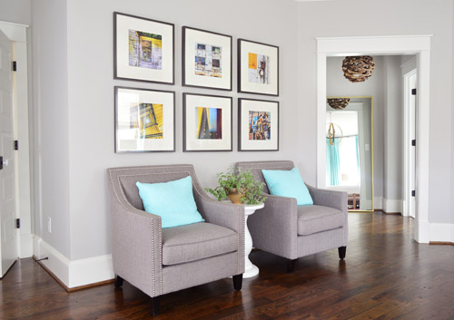
The attached bath and closet sit off a corner of the main bedroom and are separated by a space that we’ve been lovingly calling the “atrium” (it’s really more of a vestibule) which you can see above on the right side.
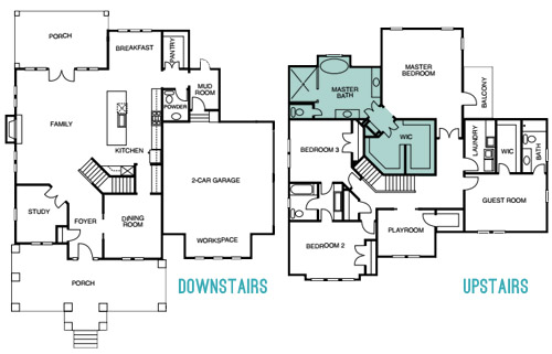
Here’s the floor plan for a clearer map of how that area is situated:
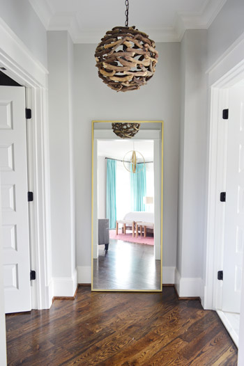
The atrium features a brass floor mirror donated by West Elm, a driftwood light from Shades of Light, and walls that are painted Stonington Gray by Benjamin Moore just like the bedroom. At one point we wanted to do a “living wall” back there with a bunch of built-in planter boxes filled with greenery, but due to the architecture of the roofline, we couldn’t put a skylight there. So because it felt unwise to cram a sunlight-less area with live plants, we scrapped the idea. It’s still a nice spot between the bathroom and the closet for a floor length mirror, and the driftwood light is one of our favorites in the house.
When you turn to your right, through the double doors you’ll see the space that we most want to pick up, stuff in a suitcase, and put in our own house.
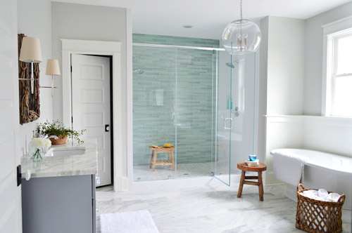
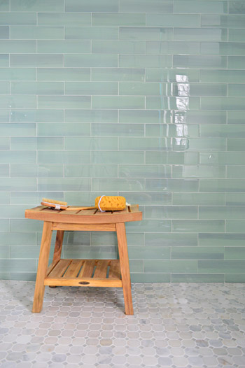
It felt fitting to aim for that spa-like effect in such an airy space (the house’s floor plan meant we knew that this room would be spacious with a big window over the tub). So pretty early on we decided we wanted a light color scheme with a wash of color on the back wall of the shower. We actually considered a more intense cobalt blue tile at one point, but it was out of stock. We love the calming aqua glass tile that we ended up with, (it’s the 3 x 12″ New Haven tile from The Tile Shop) so it was just one of those “happy accidents” throughout the room’s evolution.
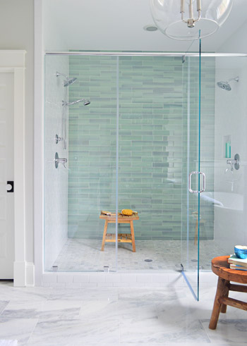
The sides of the shower are basic 3 x 6″ white subway tiles, also donated by The Tile Shop, which we picked because they were the same height as the bolder back-wall tiles (so the rows would line up), as well as feeling nice and simple – to keep the attention on that green glass tile. It’s considered a double shower since it has Baliza showerheads on both side walls, which were donated by Brizo. At the suggestion of our local Ferguson rep, whom we worked through to select plumbing fixtures, we included a handshower on one side (we learned that new builds frequently include them, just to give people options like spraying off their feet or a pet).
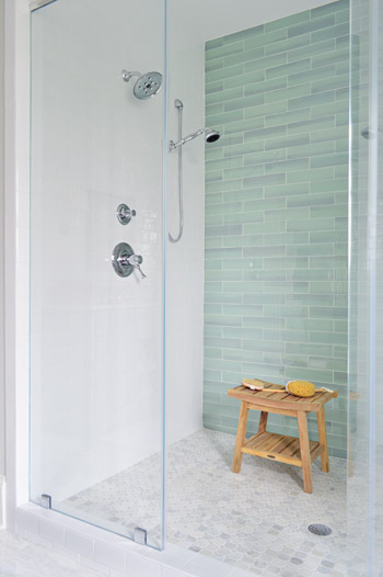
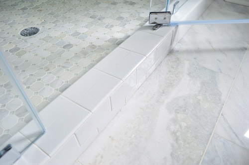
The floor tile in the shower pan is the Tile Shop’s Evanston series in Frost Snow, which featured some small aqua glass accents between the marble squares which help tie the big accent wall together with the marble floor (that’s 12 x 24″ Tempesta Neve marble) throughout the rest of the room. You can check out a detailed photo of our tile pics (and more clearly see those little green glass squares in the floor) here. We also really like how the tile installer wrapped the white subway around the shower threshold.
I’ll be honest that as the glass tile was being installed I was certain we had made a big mistake (three different tile choices for the shower walls and floor felt like they didn’t really “mesh” yet) but as soon as it was all grouted with the same white grout throughout, it tied everything together. And now it’s my favorite thing.
But let’s step out of the shower for a second and talk about the vanities (you don’t get to say that everyday), which came from the same local cabinet company (Affinity) that did the kitchen. They’re also painted in their stock gray color, which we’ve discovered is close to Benjamin Moore’s Timberwolf Gray. The walls are Moonshine.
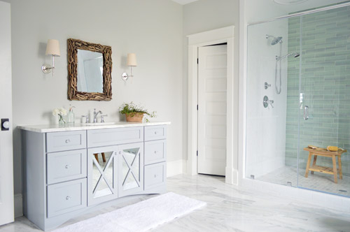
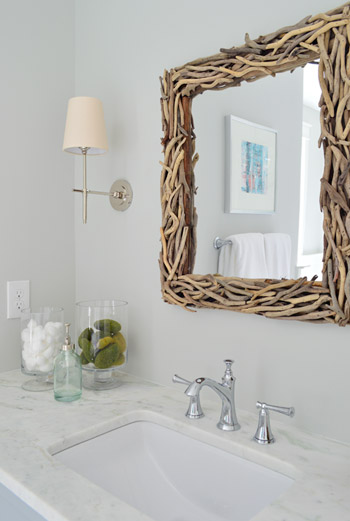
The driftwood mirrors and Soho sconces were donated by Shades of Light, the faucet is Brizo Baliza just like the shower fixtures, and the subtly green-veined counters are Lady Onyx which were purchased through a local company called Eternal Stoneworks.
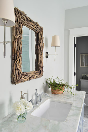
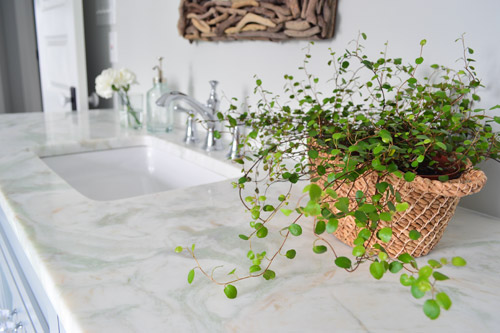
The onyx counters have a hint of the same seaglass color that’s in the shower tile, so we thought they’d be a nice counterpart to the more traditional marble on the floor. The little woven baskets are from HomeGoods.
We added a little more interest to the vanities by selecting mirrors with a soft patina effect that we placed behind the x-frame doors (similar to the clear glass ones that we chose for the kitchen). We also went with arched trim along the base of each vanity to give the built-in cabinet a bit more of a furniture feel (you can see that better two shots up). The giant bathmats are from Target.
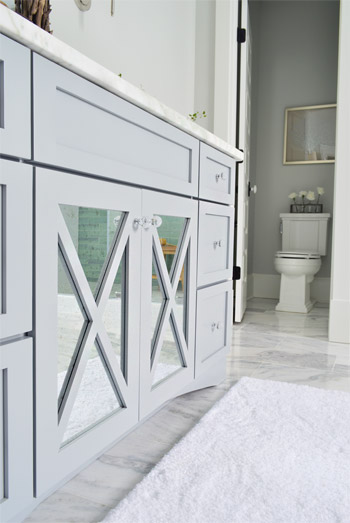
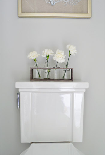
And now, let’s get weird for a second. I have to take a moment to talk about this toilet. I’ve never given toilets much thought, but when our builder urged us to pick something more stylish than a basic model we both fell in love with this one (the Tresham, donated by Kohler). And now I have this crazy case of toilet envy. So I guess that’s a thing. The little vases on the top are from World Market and the framed seafan art is from HomeGoods.
Speaking of envy, Sherry (in all her pregnant glory) has had a few moments of longing in front of this tub. Ever since one of our book tour hotels had a big soaker tub, she has been jonesing for one. It’s the York from Victoria + Albert, and the cool thing is that lots of people paint the outside an accent color. We considered it, but decided that we wanted to leave the shower as the main accent in the room – but we thought we’d toss that tip out because it could be a fun idea for your space.
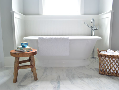
The stool and basket are both from HomeGoods, and the floor mount tub filler is the Trinsic, donated by Delta. You can see that we also had the carpenter add some beadboard wainscoting around the tub area as an accent, and to provide some extra protection from splashing, bubbles, and whatever else your particular tub fantasy entails. Mine includes nachos. Just sayin’.
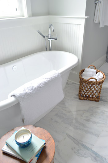
This is the view looking back on the room from the shower. Yes, I was literally in the shower when I snapped this. And yes, I did consider taking it for a test drive.
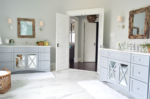
The mirrors were actually an 11th hour decision (as in, we were hanging them a few days ago) because the original chrome-y mirrors that we picked were blending too much with the other gleaming/polished items in the room and felt a little too invisible. So we decided that we needed something with more contrast and texture, and it hit us that rough driftwood frames would be an awesome reference to our lighting choice in the nearby atrium.
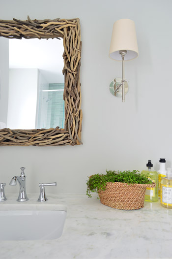
As soon as we hung the new mirrors we got more excited than we should have. Maybe we were just delusional at that point, but they’re one of our favorite last minute changes.
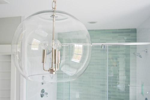
The main light fixture in here is the Clear Glass Chandelier from Shades of Light. It doesn’t pop in pictures very much, but in person it’s pretty amazing. So much so that we bought another one for the living room, but had them wire it in a gold finish to tie into some other fixtures down there.
The en-suite bedroom closet is equally envy-inducing in size and sports two sections (which make it convenient for a couple) thanks to a little partition in the middle to carve out two sides. We can’t claim much credit for how this turned out, since we mostly just nodded along as the builder and his carpenter told us their plans, but we’re happy to show off their handiwork and our meager styling of it (closets typically get a few outfits, bags, and shoes for these shows, so you get the idea but don’t have to see them stuffed with an entire wardrobe).
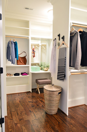
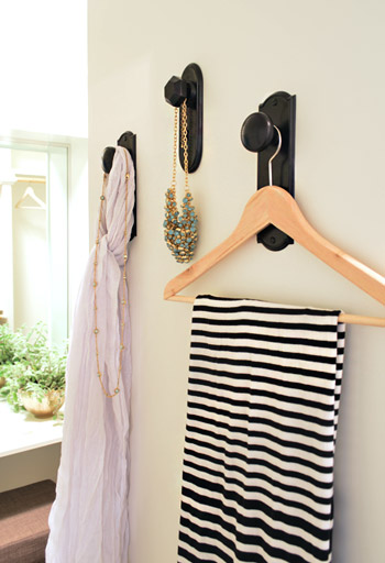
As we mentioned yesterday, we did hang a trio of our new doorknob hooks (two large ones and one small one) to create a little display space on the partition that separates the two sides of the closet. That flat wall was originally going to have a full length mirror on it, but it started to feel excessive after putting the floor mirror in the atrium – especially because we added a table-height mirror in that vanity area right behind it.
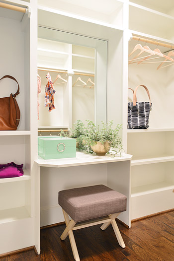
Speaking of that little vanity space, the stool is from Target, the green lacquered box is from HomeGoods, and the gold bowl with the plant in it is from World Market. The bags and clothes are mostly ours, along with some thrift store items and few scarves from Target.
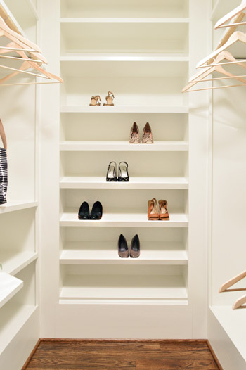
The vanity sits in the back half of the closet, which in addition to bars and cubbies, also sports this wall of angled shelves for shoes. I tell ya, Carpenter John (yes, yet another John who worked on this project) knows whats up.
The front side is mostly bars and shelves, as you can see in this shot of that area…
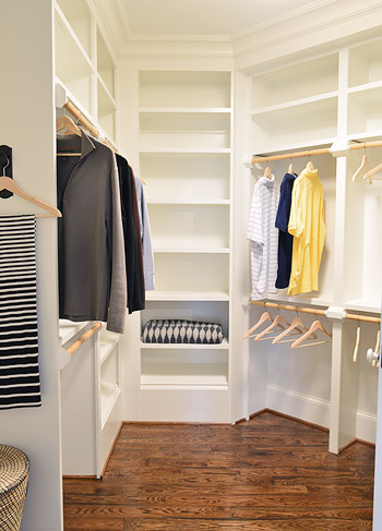
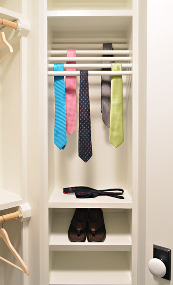
…but it does feature a built-in tie rack and a couple of shoe shelves. We bought some thrift store ties to fill it, only to get them into better lighting in this closet to discover they were all stained. Luckily some other folks working on the house had some (cleaner) spares to loan us, and my dad donated a few to the cause as well.
So now you’ve officially seen all of the main bedroom area of the house, bathroom and closet included. There’s still lots more house to show – and we’re madly trying to photograph it all before the baby comes (along with recording a video tour) but since we’ve probably overloaded you enough with photos for the week, we’re going to spend Friday at our house in a final-hour attempt to paint the office (ceiling and walls). So we won’t be posting tomorrow, but we’ll hopefully be back on Monday with a freshly painted office, which means we’ll finally be able to clear more chaos off of other surfaces – like the kitchen & dining room tables – before this baby arrives.
Psst – Wanna see more showhouse info & photos? Click here for Our Full Showhouse Tour, which includes final pictures of every room, the floor plan, budget info, a video walk-through, and shoppable showhouse furniture & accessories.

Kate says
Everything looks great!
On a side note, if you do ever get to have your dreamy spa bathroom and it includes a massive shower, the handheld shower head is a necessity for another reason…cleaning the shower! You can scrub down the shower then stand by the door and spray all the cleaner down the drain. So make sure to put the handle and shower head within arms reach of the door.
Wishing you sleep! We have a four month old and do a victory dance every morning he sleeps past 630. But the morning happy smiles are worth it :)
YoungHouseLove says
Love that cleaning tip!
xo
s
Karen L. says
Hey, just thought of something—-the showhouse could be called your “surragate” baby, which you’ll “birth” for someone else. Then you go home to your own “baby”. :) Thanks for all the pictures of the gorgeous house, which you’ve designed so beautifully. Have “fun” painting the office and getting some true “hometime” before the little guy comes. Prayers for all to go very well for y’all.
YoungHouseLove says
Haha, it’s true! It’s like we’re having twins. Fraternal though…. because one looks like a house…
xo
s
Angie K says
That walk in closet is probably two of my bedrooms in size! Ok, maybe not quite! Absolutely stunning retreat!
Katie says
Beautiful!!!! I’m jelalous! Where is the hamper in the closet from-I didn’t see a reference to that (or I missed It!) thanks!!
YoungHouseLove says
That’s from Ikea!
xo
s
Jennifer says
I can’t even take how ga-ga-gorgeous that bathroom is! I want to move in NOW.
Kaija says
Ok, so you just made me change my Pinterest Dream House board to contain only this house’s images.
It is so wonderful. Thinking of painting my kitchen’s ceiling blue now…
catherine says
wow, john you must be exhausted after writing ALL of the posts this week. hats off to you.
xoxo,
cat
YoungHouseLove says
No need to worry about me Catherine! I seriously doubt I’m half as exhausted as anyone in their 39th week of pregnancy. My lady-wife has been running around doing showhouse and book stuff along with carrying my baby and manning 95% of comment duty as usual. Writing a few extra posts in the last week of her pregnancy is the least I can do.
-John
Aimee says
I LOLd that the toilet was trendy. That’s an Art Deco sort of thing going on there. I’ve actually seen toilets like that, still working, in that period’s homes – not since I was a kid, but they were built like trucks back in the day.
Katharina says
This house is oh so very, very, VERY beautiful!
LOL about the stained ties !!!
All the best to you in the next couple of days. We’ll be praying for you that all runs smoothely with the new addition to your wonderful family.
JoAnne says
First let me say that this is a stunning bathroom! Second, (if someone has already asked this question, forgive me for repeating it)several years ago, I read an article compiling home safety tips from police officers and fire fighters. They urged people to make sure that doors on water closets (toilet rooms)open out instead of in. Apparently, losing consciousness while on the toilet (sorry for that factoid)is more common than we know. Emergency workers can’t get to the patient if they are unconscious on the floor and wedged against the door. My daughter recently had a home built and made sure her builder hung the door with that safety tip in mind. It seems architects and builders don’t even consider this. I’m wondering if there was any discussion about this subject between you and your builder.
YoungHouseLove says
Thanks for the tip JoAnne! Those decisions are made between the architect and the builder (we’ve never discussed which way this door should swing with them), but I’ll be sure to mention that to them! Maybe after the show but before the new owner takes possession they can switch that for them :)
xo
s
Bethany says
Other people mentioned the door was hung wrong for safety reasons but didn’t explain why. This makes so much sense! Thanks for the info JoAnne!
Julie Q says
Amazing house. Far far out of any budget I could ever dream of unless the lottery comes my way . I love the bathroom and the shower is amazing. The only thing is where do you put your shampoo/conditioner and soap when you shower? Some sort of shelving would make it perfect!
YoungHouseLove says
There’s a little niche in the shower (you can see it in this shot on the right) and that bench would work for resting stuff too.
xo
s
claire says
the master bath is lovely but those mirrors are reminding me way too much of true detective. carcosa…
Maggie says
Ha THAT’S what they remind me of! Same thing for the white one downstairs.
I’m also thinking that it might be frustrating to have to reach AROUND the door to turn on the lights in the bathroom- and that without specific task lighting it may be a really dark space to put on makeup etc– I know the sconces are there, but they seem more decorative than functional. Did anyone see in HouseTweaking when they had the lighting professional look at the hallway to assess where to put lights for most function, instead of straight in the middle of everything? I think back to that post often!
Joanna Banana says
OMG….I’m dying for that closet!
Julianne says
WOW!!!! This post actually took my breath away!! I absolutely LOVE what you did for the bathroom and that closet is to die for. Totally enamoured by your bathroom choices…..you outdid yourselves. GREAT work!!!! :O)
YoungHouseLove says
Thanks so much Julianne!
xo
s
Jen says
How did you hang the driftwood mirrors? I notice on Shade of Light site the hooks are visible but are not in your photos. What hooks/attachments did you decide to use?
Everything looks great!
YoungHouseLove says
That’s a really good question! The two mirrors we got had hanging hardware that was set lower, so they hang from two screws & anchors, but they’re not visible. Not sure why it’s different on the website photo.
xo
s
Melissa says
I love everything you guys do! When you get done with your show house posts, would you consider posting a master list of all the paint colors you used!? I am loving the colors of the office ceiling and the master bath, and I am sure I will love more colors you reveal….It would be nice to have a list of them all in one place!!! Happy office painting!
YoungHouseLove says
Yes, we’d love to make a showhouse page for our House Tour section full of that info for ya!
xo
s
Natalie Royall says
Hi Sherri! I’m loving the showhouse!! Such a cool new way for you guys to show off your AMAZING talents!! Also, good luck next week!! I’ll be sending positive vibes your way all day Wednesday!! :) ALSO…. is it weird that I can completely see you hosting a girls night at the show house with all your lady readers :) I picture it just being 10 even though I know you have a million + out there :) hahaha! Just a happy little thought. Manis, pedis and movies with Sherri and Clara :)
YoungHouseLove says
That’s so funny! We were saying how funny it would be to just host a pizza party there.
xo
s
Vicki C says
Did you guys add any electrical outlets to the master closet?
We have a great closet in the house we live in now–lots of hanging space and shoe racks, and two buildt=in 5 drawer chests so we don’t need lot of furniture in the master bedroom which is smaller than house we moved from ironically…
BUT I really wish the people who built the house had added a couple of outlets by the chests to use for phone charging or maybe dustbuster…
And is there any outlet for cable/television in the master bath–
that seems to be popular in new homes in high $$ construction in my area…
YoungHouseLove says
Such a good idea! Someone else mentioned dropping one in by the vanity area, and since the attic is right over that it should be really simple. Thanks Vicki!
xo
s
Marisa J. says
I apologize in advance if you already got this comment. I love that on your blog you have the house tour section and you can click on each house that you guys have worked on, do you think you will put the Showhouse in there as well? I would love that so that if I ever want to go back and look at some of the sources it would all be in one place. You have so many posts of the showhouse so it might be hard to find them if they aren’t organized all in one spot. I absolutely love everything about all of your houses including the showhouse. xoxo
YoungHouseLove says
Yes, we’d love to do that!
xo
s
Krystal says
Gorgeous! What I want to know is what voodoo you did to not be in the picture of the mirror in the atrium! lol
YoungHouseLove says
So funny! A few other folks asked that so the answer is on the first page of comments for ya :)
xo
s
Lori Reed says
no post today….is anyone att he hospital having a baby?????????????
YoungHouseLove says
We’re tying to bust out some last minute projects before this bun comes, so we included a bold note about not posting today at the bottom of our most recent post :)
xo
s
ivette says
I love everything about the show house, definitely one of my new dream houses! BTW is the Barnacle on the way, or you guys busy with other projects today?
YoungHouseLove says
We’re tying to bust out some last minute projects before this bun comes, so we included a bold note about not posting today at the bottom of our most recent post :)
xo
s
Katy @ The Non-Consumer Advocate says
Perfection from top to bottom. Amazing! I would absolutely come see it in person (and show some love to Habitat) if I lived in Richmond.
Now, go put your feet up and watch some TV with your only child. Life is about to change for the better.
Rhiannon says
And with that, I have now finished going through all of your archives! Yup, I have read every single post since you started this blog in 2007. And I’ve loved it. You guys are awesome. I have a feeling that I’m about to have a lot more free time though now that I’m not going to be reading weeks worth of posts at a time…
YoungHouseLove says
You’re so sweet Rhiannon! You reserve a bumper sticker or something for making it all the way through!
xo
s
Shana says
Hmm, late post…. Baby?
YoungHouseLove says
We’re tying to bust out some last minute projects before this bun comes, so we included a bold note about not posting today at the bottom of our most recent post :)
xo
s
JenB says
ctrl v — ctrl c
over and over:)
JenB says
Oops…I meant ctrl c, ctrl v. I got it backwards. It’s late & it’s Friday. Have a great weekend!
Stephanie Turner says
LOVE the driftwood lights and mirror. We just built our home and moved in last year… this gives me so many ideas.
Elaine Schmidt says
I am IN LOVE with that bathroom. I want to move in and live there. Such inviting touches–that dreamy aqua tile and whimsical stool and those pristine vanities and unique driftwood mirrors. I could go on and on. Congratulations!!!
Joseph says
I saw the cover on the most recent addition of This Old House magazine and for a minute I thought it was a picture of this bathroom (which I thought particularly funny given the history you have with them). Then I realized it was pretty different, but it has a bunch of similar elements in it.
Nicole McIlhargie says
I love the glass subway tiles! And the color is just stunning.I have to admit that I have been kindof obsessed with them and would love to add some to our bathroom and possibly the kitchen. Are there specific things you guys look for when selecting the tiles?
YoungHouseLove says
I think we just look for tile we both like. Haha! Sometimes we don’t agree, so when we find something we both like we usually have a lot more confidence to go for it.
xo
s
mcgrimus says
I love the color of those vanities. Do you happen to know what it is?
YoungHouseLove says
They’re a stock color offered by the cabinet maker, but when we held up swatches it was close to Ben Moore’s Timber Wolf Gray. Hope it helps!
xo
s
Cori says
It’s April 11th and I don’t see a new post. Are you guys having a baby today!!???
YoungHouseLove says
We’re tying to bust out some last minute projects before this bun comes, so we included a bold note about not posting today at the bottom of our most recent post :)
xo
s
Annie Craven says
I love what you’ve done! It’s so simple yet comfy. I love the colors used and how you brought the outdoors in. Thanks for sharing, lots of really good ideas here.
Susan says
Random thought! Have you guys considered contacting a local clothing boutique to see if they have clothes that could be lent for the show for use in the closet? It would be a great form of advertising for a local business! They could have business cards available for interested people..
YoungHouseLove says
That’s such a fun idea!
xo
s
Jess says
No Friday post… anyone else thinking Sherry is in labor? Good luck if that’s the case! Can’t wait to ‘meet’ your little man!
Jess says
Whoops. Always helps to read the post all the way to the end and not just gawk at the beautiful photos! Save my ‘good luck’ for the big day, mmmkay? ;)
Babs says
Such a peaceful relaxing space…Question I noticed that you didn’t install a backsplash around the sinks or did you and I can’t see it? If (when) I copy you I want to make sure I do it right. :)
YoungHouseLove says
We’ve had luck without backsplashes by just using clear waterproof caulk along the back wall (where the counter meets the wall) and good quality paint for bathrooms (it’s water resistant, scrubbable, and seems to hold up well).
xo
s
Christina says
Okay, woke up thinking of you and decided to pray. I believe in guardian angels and that when someone is on your mind, they need a prayer or two. Have come to the site twice today and noticed you hadn’t posted, which makes this “Morbid Pollyanna,” as I call myself, think that maybe your little one has decided to come on his own terms! Praying that all are well and that nothing major is wrong. God bless!
YoungHouseLove says
Aw thanks Christina! We’re tying to bust out some last minute projects before this bun comes, so we included a bold note about not posting today at the bottom of our most recent post :)
xo
s
erin says
are you suuuuuuure you’re painting the office? or is that code word for BABY?!!! either way hoping all the best for you- you make beautiful babies and homes!
YoungHouseLove says
Yup, no baby yet – but our scheduled delivery date is the 16th (Wed) so we’re getting there :)
xo
s
Sally says
Wow guys – it is looking phenomenal and I can’t wait to see the rest! Hopefully your weekend isn’t all painting and you take some time to relax before the new baby arrives:)
Michelle says
I hope you guys are able to get some rest this weekend! The house is absolutely beautiful! If you ever get a chance, will you consider putting a tour of this place under your house tours link? I just love looking at it all together! Be well!
YoungHouseLove says
Yes, we’d love to do that – along with a video tour :)
xo
s
Kristin says
Love everything about everything in that entire space, so beautiful! It’s a rare occasion, but I now have two things already at my home that I’ve seen in your posts after the fact…a Nest and now the bathroom stool from Home Goods-haha! Now if only I could transform my house in the ways that the two of you work, I’d be in heaven!
Sarah @ Sarah's Daybook says
WOAH! The new look!!!!!!!!!!!!!
YoungHouseLove says
Haha, don’t mind us. Just playing around this weekend. It’ll keep changing over the next few days ;)
xo
s
Sarah @ Sarah's Daybook says
No more hearts? I loved them! But I would understand if you thought it was too busy.
YoungHouseLove says
Aw thanks Sarah! I think we both get antsy after a few years of the same thing so we’re just playing around.
xo
s
Alison says
Cool, but HATE the animated ad banner at the top!!! Sorry to say it gives your page a cheap and unclassy feel… And definitely takes away from the clean look you seem to be going for
YoungHouseLove says
Thanks Alison! In an attempt to clean up our sidebar we removed 30+ ads over the last six months (we also used to write sponsor shout outs in posts each months, which we no longer do). For the redesign we decided to put one ad at the top of the page, because we figure as soon as you scroll down to read the content it’ll be invisible (so our previous 30+ sidebar ads seemed a lot more distracting and busy to us since they compete with the content area while you read). Hope that makes sense! We don’t write sponsored posts or accept freebies, so we hope five ads on our site aren’t deal-breakers :)
xo
s
Ashley says
Cutey McCuterson new blog header. Digging the colors and simplicity!
YoungHouseLove says
Thanks Ashley!
xo
s
Kat says
Love it all!
And I see you have a new blog header!! Cool!
YoungHouseLove says
Thanks Kat! We’re just playing around this weekend, so things will probably keep changing through tomorrow night :)
xo
s
Kaely says
I have serious shower envy and good call by the builder on the hand-held shower head. Every time we’ve moved, putting in hand-held shower heads was on the top of the “before we move in” list.
Casey says
Hey guys, just chill and go have that baby! My C/S is scheduled for April 20th (Easter Sunday… weird that the hospital gave us that date), and I cannot imagine doing what you are doing right now.
Best of luck to you, Petersiks!
Sophie Stanton says
No Friday post?
Could that mean…someone has arrived?
YoungHouseLove says
We’re tying to bust out some last minute projects before this bun comes, so we included a bold note about not posting on Friday at the bottom of our most recent post :)
xo
s
Kayla says
The more I see of this house the more I want to move to the US! Absolutely stunning – and it’s totally spurred me on to feel okay about my decision to paint our house in greys. What a fantastic achievement. :)
Nat says
The vanity in the bathroom and the toilet are so cool! Massive bathroom and you did well in choosing the tiles.
Jamie N says
Like the new blog design!
YoungHouseLove says
Thanks! Still tweaking things this weekend :)
xo
s
kimb says
You have a new header/ Banner on the web site looks good