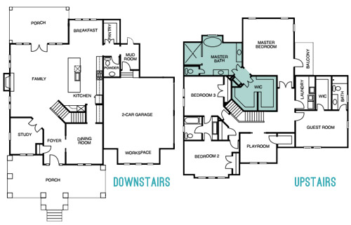
Continuing our showhouse-heavy week of reveals, we’re bringing you a bunch of after photos from three more spaces – the main bedroom’s en-suite bathroom, its attached closet, and cool little atrium space. We showed you the main bedroom on Tuesday (along with the office and the butler’s pantry) so it only felt natural to continue our virtual tour where we left off.
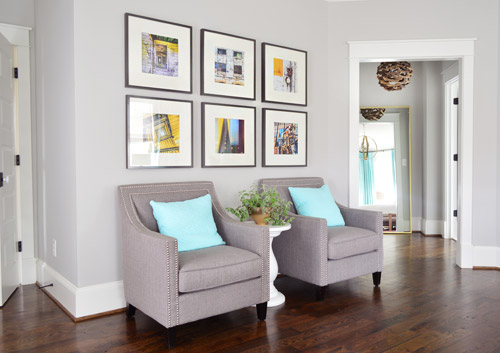
The attached bath and closet sit off a corner of the main bedroom and are separated by a space that we’ve been lovingly calling the “atrium” (it’s really more of a vestibule) which you can see above on the right side.
Here’s the floor plan for a clearer map of how that area is situated:
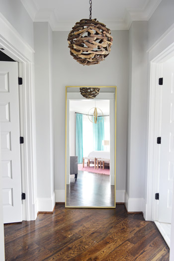
The atrium features a brass floor mirror donated by West Elm, a driftwood light from Shades of Light, and walls that are painted Stonington Gray by Benjamin Moore just like the bedroom. At one point we wanted to do a “living wall” back there with a bunch of built-in planter boxes filled with greenery, but due to the architecture of the roofline, we couldn’t put a skylight there. So because it felt unwise to cram a sunlight-less area with live plants, we scrapped the idea. It’s still a nice spot between the bathroom and the closet for a floor length mirror, and the driftwood light is one of our favorites in the house.
When you turn to your right, through the double doors you’ll see the space that we most want to pick up, stuff in a suitcase, and put in our own house.
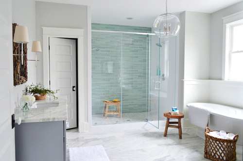
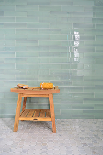
It felt fitting to aim for that spa-like effect in such an airy space (the house’s floor plan meant we knew that this room would be spacious with a big window over the tub). So pretty early on we decided we wanted a light color scheme with a wash of color on the back wall of the shower. We actually considered a more intense cobalt blue tile at one point, but it was out of stock. We love the calming aqua glass tile that we ended up with, (it’s the 3 x 12″ New Haven tile from The Tile Shop) so it was just one of those “happy accidents” throughout the room’s evolution.
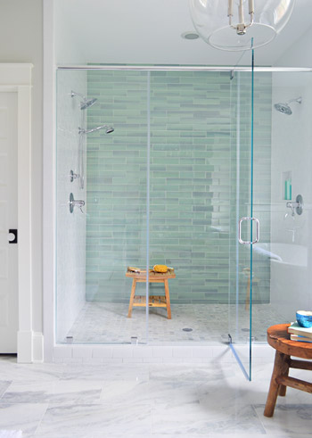
The sides of the shower are basic 3 x 6″ white subway tiles, also donated by The Tile Shop, which we picked because they were the same height as the bolder back-wall tiles (so the rows would line up), as well as feeling nice and simple – to keep the attention on that green glass tile. It’s considered a double shower since it has Baliza showerheads on both side walls, which were donated by Brizo. At the suggestion of our local Ferguson rep, whom we worked through to select plumbing fixtures, we included a handshower on one side (we learned that new builds frequently include them, just to give people options like spraying off their feet or a pet).
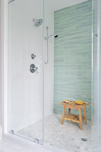
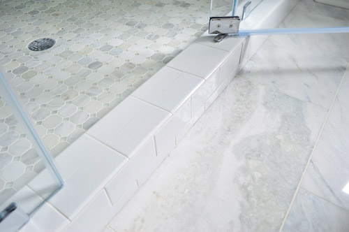
The floor tile in the shower pan is the Tile Shop’s Evanston series in Frost Snow, which featured some small aqua glass accents between the marble squares which help tie the big accent wall together with the marble floor (that’s 12 x 24″ Tempesta Neve marble) throughout the rest of the room. You can check out a detailed photo of our tile pics (and more clearly see those little green glass squares in the floor) here. We also really like how the tile installer wrapped the white subway around the shower threshold.
I’ll be honest that as the glass tile was being installed I was certain we had made a big mistake (three different tile choices for the shower walls and floor felt like they didn’t really “mesh” yet) but as soon as it was all grouted with the same white grout throughout, it tied everything together. And now it’s my favorite thing.
But let’s step out of the shower for a second and talk about the vanities (you don’t get to say that everyday), which came from the same local cabinet company (Affinity) that did the kitchen. They’re also painted in their stock gray color, which we’ve discovered is close to Benjamin Moore’s Timberwolf Gray. The walls are Moonshine.
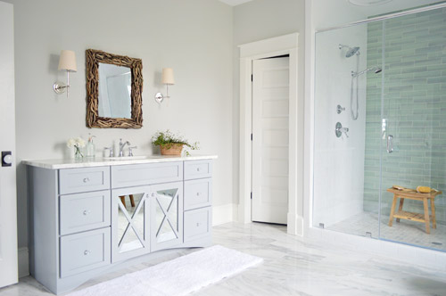
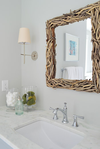
The driftwood mirrors and Soho sconces were donated by Shades of Light, the faucet is Brizo Baliza just like the shower fixtures, and the subtly green-veined counters are Lady Onyx which were purchased through a local company called Eternal Stoneworks.
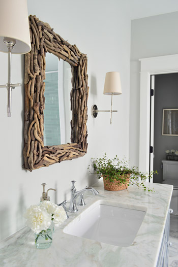
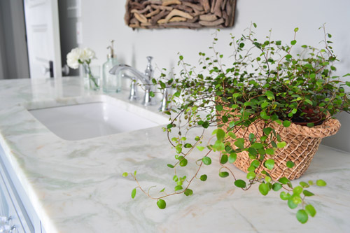
The onyx counters have a hint of the same seaglass color that’s in the shower tile, so we thought they’d be a nice counterpart to the more traditional marble on the floor. The little woven baskets are from HomeGoods.
We added a little more interest to the vanities by selecting mirrors with a soft patina effect that we placed behind the x-frame doors (similar to the clear glass ones that we chose for the kitchen). We also went with arched trim along the base of each vanity to give the built-in cabinet a bit more of a furniture feel (you can see that better two shots up). The giant bathmats are from Target.
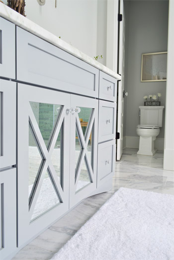
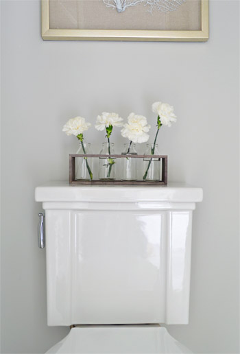
And now, let’s get weird for a second. I have to take a moment to talk about this toilet. I’ve never given toilets much thought, but when our builder urged us to pick something more stylish than a basic model we both fell in love with this one (the Tresham, donated by Kohler). And now I have this crazy case of toilet envy. So I guess that’s a thing. The little vases on the top are from World Market and the framed seafan art is from HomeGoods.
Speaking of envy, Sherry (in all her pregnant glory) has had a few moments of longing in front of this tub. Ever since one of our book tour hotels had a big soaker tub, she has been jonesing for one. It’s the York from Victoria + Albert, and the cool thing is that lots of people paint the outside an accent color. We considered it, but decided that we wanted to leave the shower as the main accent in the room – but we thought we’d toss that tip out because it could be a fun idea for your space.
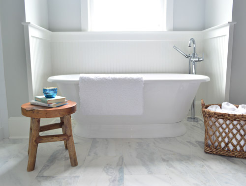
The stool and basket are both from HomeGoods, and the floor mount tub filler is the Trinsic, donated by Delta. You can see that we also had the carpenter add some beadboard wainscoting around the tub area as an accent, and to provide some extra protection from splashing, bubbles, and whatever else your particular tub fantasy entails. Mine includes nachos. Just sayin’.
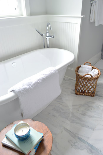
This is the view looking back on the room from the shower. Yes, I was literally in the shower when I snapped this. And yes, I did consider taking it for a test drive.
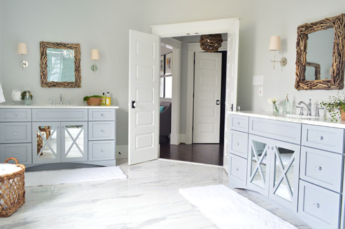
The mirrors were actually an 11th hour decision (as in, we were hanging them a few days ago) because the original chrome-y mirrors that we picked were blending too much with the other gleaming/polished items in the room and felt a little too invisible. So we decided that we needed something with more contrast and texture, and it hit us that rough driftwood frames would be an awesome reference to our lighting choice in the nearby atrium.
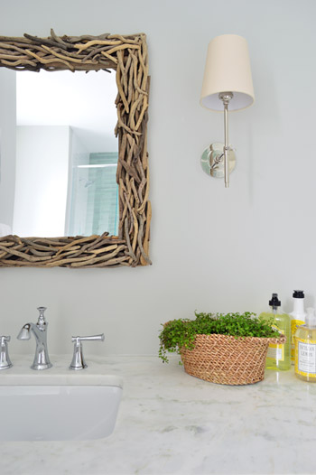
As soon as we hung the new mirrors we got more excited than we should have. Maybe we were just delusional at that point, but they’re one of our favorite last minute changes.
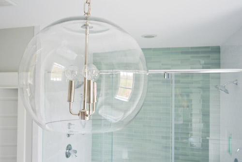
The main light fixture in here is the Clear Glass Chandelier from Shades of Light. It doesn’t pop in pictures very much, but in person it’s pretty amazing. So much so that we bought another one for the living room, but had them wire it in a gold finish to tie into some other fixtures down there.
The en-suite bedroom closet is equally envy-inducing in size and sports two sections (which make it convenient for a couple) thanks to a little partition in the middle to carve out two sides. We can’t claim much credit for how this turned out, since we mostly just nodded along as the builder and his carpenter told us their plans, but we’re happy to show off their handiwork and our meager styling of it (closets typically get a few outfits, bags, and shoes for these shows, so you get the idea but don’t have to see them stuffed with an entire wardrobe).
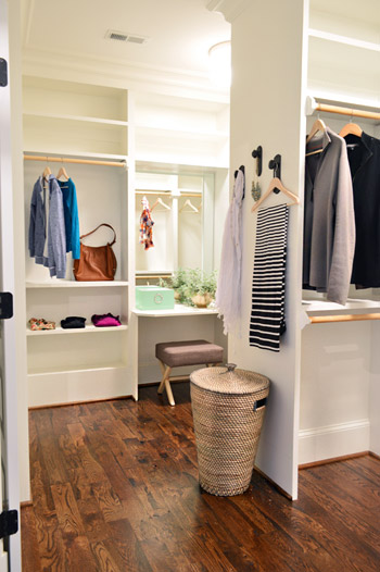
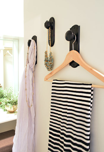
As we mentioned yesterday, we did hang a trio of our new doorknob hooks (two large ones and one small one) to create a little display space on the partition that separates the two sides of the closet. That flat wall was originally going to have a full length mirror on it, but it started to feel excessive after putting the floor mirror in the atrium – especially because we added a table-height mirror in that vanity area right behind it.
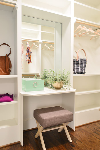
Speaking of that little vanity space, the stool is from Target, the green lacquered box is from HomeGoods, and the gold bowl with the plant in it is from World Market. The bags and clothes are mostly ours, along with some thrift store items and few scarves from Target.
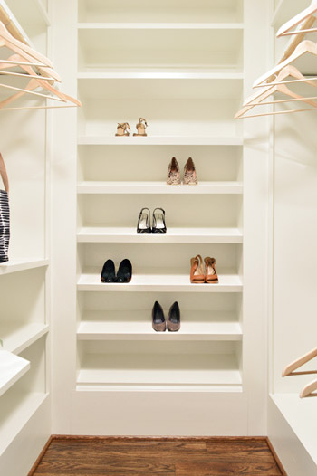
The vanity sits in the back half of the closet, which in addition to bars and cubbies, also sports this wall of angled shelves for shoes. I tell ya, Carpenter John (yes, yet another John who worked on this project) knows whats up.
The front side is mostly bars and shelves, as you can see in this shot of that area…
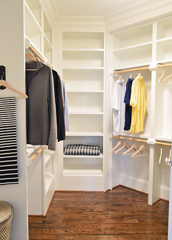
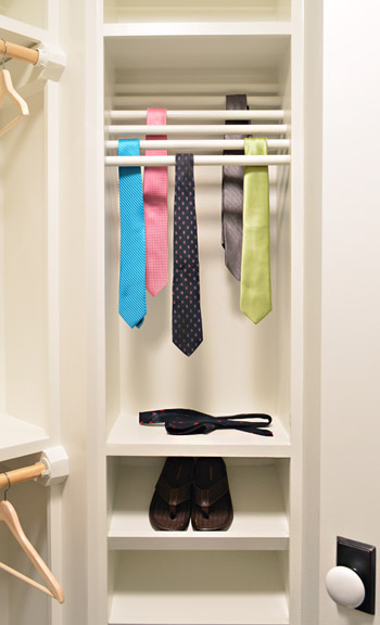
…but it does feature a built-in tie rack and a couple of shoe shelves. We bought some thrift store ties to fill it, only to get them into better lighting in this closet to discover they were all stained. Luckily some other folks working on the house had some (cleaner) spares to loan us, and my dad donated a few to the cause as well.
So now you’ve officially seen all of the main bedroom area of the house, bathroom and closet included. There’s still lots more house to show – and we’re madly trying to photograph it all before the baby comes (along with recording a video tour) but since we’ve probably overloaded you enough with photos for the week, we’re going to spend Friday at our house in a final-hour attempt to paint the office (ceiling and walls). So we won’t be posting tomorrow, but we’ll hopefully be back on Monday with a freshly painted office, which means we’ll finally be able to clear more chaos off of other surfaces – like the kitchen & dining room tables – before this baby arrives.
Psst – Wanna see more showhouse info & photos? Click here for Our Full Showhouse Tour, which includes final pictures of every room, the floor plan, budget info, a video walk-through, and shoppable showhouse furniture & accessories.

Nicole says
Hey, I love the new blog design! (Naturally the showhouse looks amazing as so many people have all ready said.)
Wishing you all the very best this week :)
YoungHouseLove says
Thanks so much Nicole!
xo
s
Jess says
LOVE LOVE LOVE the new design.
It is amazing.
Good luck this week!
xo
YoungHouseLove says
Thanks so much Jess!
xo
s
shaly says
hi guys,
why there’s no update here? is Sherry ok? Hope that everything is ok there..
<3
YoungHouseLove says
We’re tying to bust out some last minute projects before this bun comes, so we included a bold note about not posting on Friday at the bottom of our most recent post :)
xo
s
Anne says
This is so gorgeous! Where are the chairs in the first picture from? Love them!
YoungHouseLove says
Those are from HomeGoods!
xo
s
South Barrington Hardwood Flooring says
I love the dark, matte finish hardwood you have upstairs. Very elegant.
Jade says
I am sure you all have covered this somewhere else but I am curious to know the square footage of the house. It is such a great floor plan! Keep up the great work…. we have so enjoyed seeing your success through the years. I saw your line at Target yesterday and gave out a screech!
YoungHouseLove says
Thanks so much Jade! It’s around 3500 square feet (big to us, but the smallest one in the show!).
xo
s
Mel says
Aren’t you worried about people stealing things out of the show house for all the things you’ve borrowed or your own items you put in it? I used to work for a home builder and that kind of thing used to happen all the time in their model homes unfortunately.
YoungHouseLove says
Thankfully we hear the houses are watched really well and things tend to be ok for the most part, so we’ll have to see, but we’re feeling good about it!
xo
s
Rebecca says
Where are the driftwood mirrors and paneled doors purchased from?
YoungHouseLove says
The driftwood mirrors are from Shades of Light (we linked to them in the post if that helps) and the paneled doors are from a local distributor here in Richmond, but if you search “horizontal paneled doors” and your city you can hopefully find someone in your area that sells them.
xo
s
Andrea says
This bathroom is seriously amazing. The mirror on the vanities – get out. So gorgeous. We’re renovating our master and this is amazing inspiration.
PS. Wishing you an easy delivery and a happy, healthy baby and mama!
shana says
I like the new cleaner look but I’ve cleared my cache/history etc and refreshed several times yesterday and today and still the whole right side is cut off – it’s fine on my big monitor at work (yeah I totally read you at work!) but on my 13″ macbook the whole right sidebar cuts off – your about area and everything below it. :S
YoungHouseLove says
So sorry Shana! We braced ourselves for all sorts of loading problems yesterday and were surprised when it seemed to be such a simple transition for everyone (you’re the first person telling us something is getting cut off). Maybe try opening our site in another browser (for example, if you’re using Firefox, try Safari). That way if it works in one browser you can come back and tell us which browser it’s not working in and we can try to fix it. For example, super old versions of Internet Explorer are notorious for messing up sites, but if you update your IE (or use another browser) it’ll all look normal again.
xo
s
Sarah says
Hey John and Sherry!
Are you going to (in the future) add the show house as one of your house tours? I loveeee what I’ve seen so far and think it would be a great way for everyone to see pictures of the house all in one place (and also to check out where you got everything). Love love love how it’s coming along! Good luck tomorrow having the baby!!!
YoungHouseLove says
Yes, we’d love to do that (along with a video tour).
xo
s
Nichole says
I always think I’m not a “gray person” when it comes to colors, but then I see this master bed/bath and I’m ready to move in! We’re in the process of moving right now and I kind of wish we were bazillionaires so that I could just copy this floor plan and build. I’m in love!
Khadija says
Can you tell me where you got the shower bench? I really need one for my bathroom. Thanks in advance
YoungHouseLove says
That’s by Broyhill purchased at HomeGoods.
xo
s
Jennifer says
Everything in this house is so beautiful. Do you guys have an original post that explains how you guys got involved. really amazing job!
YoungHouseLove says
If you search “our other new house” in our sidebar I think it’ll come up :)
xo
s
Mila says
Driftwood mirror & driftwood lamp – these are insanely awesome! Everything in those rooms just FITS-so cozy and beautiful!
xx
Mila
All things nice... says
Wow, your home is amazing! Wish I had that bathroom, love the tiles in the shower too.
All things nice…
Krissy Grant says
Super excited to see the flower holder on the back of the toilet! I’m using the same thing as a toothbrush holder in my almost – finished master.
Also the shower is amazing. All of it is. Love the vanity color.
Laura says
Congratulations on your little guy – he is precious!
I don’t mean to bother you during such a busy time, but I have a question about the paint colors from your post “It’s Bath Time.” I went to a hardware store that sells Benjamin Moore paint, but they didn’t have Stonington Gray or Moonshine in their paint chips or in their book of colors that had the formulas.
The bathroom and hallway are gorgeous!! Love every part of it! Hope to be able to use these colors in my own home. Thanks for any help you can give.
YoungHouseLove says
So strange! They’re pretty well known colors of theirs (in multiple decks, on their website, etc). Maybe call another vendor in your area and have them look them up in the computer to be sure they have the formula?
xo
s
Anne says
Where did you all get the rain chain??? Love it.
YoungHouseLove says
That was something John the Builder sourced through the landscaper I think. Will have to try to remember to ask him and report back to you!
xo
s
Keren says
If you’ve already answered this I apologize but there are some many comments loving this house. Can you tell me what color trim was used in the rooms painted stonington gray? Thanks!
YoungHouseLove says
That’s Ben Moore’s Simply White on the trim and doors throughout the house.
xo
s
Nancy Lunsford says
Of all the homes in the show, yours by far was the only one that felt like a home I could imagine living in. So many had bizarre layouts with rooms that didn’t make sense. Your home flowed so beautifully. One of my favorite spots is that space with the gold mirror and wooden light. Looking up at the ceiling, it was just gorgeous the way that little space came together. You guys did such an amazing job.
Mary Ellen says
Beautiful bathroom! I ordered the exact same sconces for my bathroom. I was struggling to find a hanging light for over the tub, so I ordered the glass bowl since I can see they already work so well together! I plan on mounting my scones above a double sink vanity. I think the mirror will be almost the full space and I’m wonder how high you hung these from the floor? Also, any advice on how far they should be hung from the edge of the sink so they don’t block your reflection?
YoungHouseLove says
I would just hold them up to see where they look best (we no longer live in that house so I can’t measure for you). Have someone hold them in different spots and examine your options and hopefully some placement option will be the clear winner.
xo
s