True to form, we’re all over the place over here. After switching up the ol’ blog design (and figuring out why the header was MIA for 20% of you – here’s hoping it’s back) we’ve also been plugging away at our $6 cabinet makeover but aren’t quite done with the painting/building-up process (here’s hoping we’ll have photos and lots o’ words to share early next week). But crazily enough, in the meantime we’ve also been doing some yard work, a random bedroom project, and have even started brainstorming the next phase of the kitchen. Hence this brain dump.
We’re still saving our pennies for things like new appliances to begin the next step of our slow & steady kitchen overhaul (remember when we upgraded the fireplace and wood paneling a little while back?). So as we wait for the bank account to say “sure, go buy a new wall oven that’s not bisque, and a new microwave that’s not black”, we thought meeting up with an old friend of ours to get a few kitchen ideas might be nice. Who is this mysterious old friend that we speak of? Why it’s Nancy Kulik, the lady who helped us plan our first kitchen makeover through Home Depot (they offer up Certified Kitchen Designers to help for free if you buy cabinets or counters through them, of which we got both).
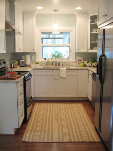
We knew that we wanted white cabinets and light marble-esque counters (they were actually granite) during the planning stages of that makeover back in 2007 – so we didn’t look to Nancy for much “style advice” during our 113 day kitchen reno. But she was truly invaluable when it came to space planning. She just knows how people use kitchens and where appliances should be placed to maximize function, and we fully believe that our first kitchen would have been half as useful if we didn’t have her free-with-the-purchase-of-cabinets advice when it came to where to squeeze in a dishwasher, relocate the fridge, and build in the microwave. Lesson learned: sometimes the pros know best. So take their advice whenever it’s free (and even when it’s not if you need it). You know, so you don’t DIY a kitchen all alone that’s semi-functional when you can DIY something twice as useful with some pro advice and a smidge of well-spent cash (assuming you can’t track down free services like those from HD or Lowe’s).
But back to our buddy Nancy. We actually kept in touch with her over the last three years since our big kitchen makeover in 07′ (she and Clara are practically BFFs). So she was sweet enough to offer to glance at a floor plan and a few photos of our current house’s kitchen to give us a little here’s-what-I-would-do advice. Second lesson learned: there are definite perks to staying in touch with any kitchen geniuses that you may encounter.
But first a little refresher. You’ll remember that the eat-in part of our kitchen currently looks like this:
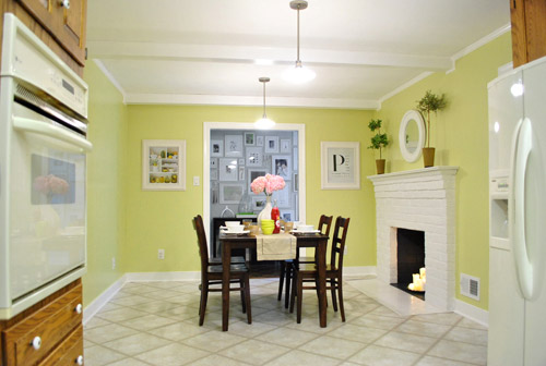
We’ve always planned to add a built-in island in place of the too-small dining table, just because when we knock out a huge doorway in the wall across from the fireplace to connect it to the dining room we thought two tables lined up through that opening would look odd (a big round one in the dining room and another one so nearby in the kitchen = crazytown).
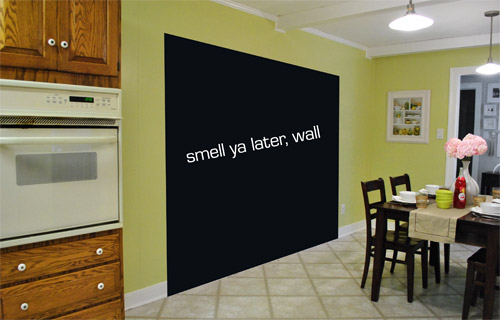
So we thought a big round table in the dining room and a smaller built-in island by the fireplace would make sense and be less “hello table, meet my friend, table.”
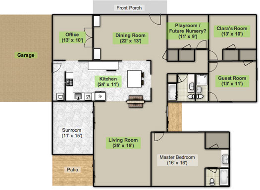
Here’s an old floor plan that we shared last November before we even moved, just to give you an idea of what we thought might work when it came to the island (with the new wide doorway to the dining room that we plan to add worked in there too):
Oh while we’re on the topic of someday dreams, we’d love to paint our cabinets white and craigslist our white, bisque, and black appliances and upgrade to stainless steel. When it comes to our counters, we plan to work with the granite that we have, but completely redo the backsplash for a crisper, lighter look. And those florescent tube lights and big brown fan? They gots to go.
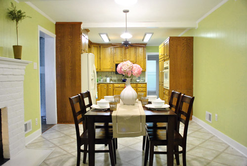
While we’re rattling off things on the list, of course we’d love to redo the floors but aren’t sure if there’s hardwood running all the way under the entire kitchen that we can refinish (we know it runs under part of it, but haven’t confirmed all of it) or if we’ll have to just redo them with something new entirely. The challenge of that is that we’ve learned that our floor joists aren’t built strongly enough to hold the weight of stone or ceramic tile (I thought slate would be awesome in there, so yeah… le bummer). We’ve toyed with everything from lightweight cork to some sort of linoleum (Candice Olsen has done some surprisingly awesome kitchens with that on the floor) but we’re nowhere near a decision. We’ll keep you posted though.
But I digress (who’s surprised?). Back to our talk with Nancy Kulik and the big kitchen idea she came up with (pretty much on the spot because she’s cool like that). Are you ready? She looked at the new to-scale floor plan that we brought with us (and a few photos) and realized that something was wrong, wrong, wrong on our little whole-house floor plan (seen three photos back, which we did months ago in November). That something? The fireplace is almost in the corner of the room in real life. So the placement of the fireplace in that old floor plan is totally off.
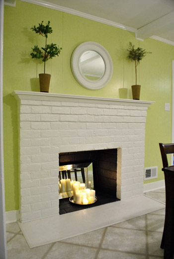
Thankfully it was drawn in the actual correct location in the newer kitchen-only floor plan that we brought with us to our Nancy meeting, but since it’s not actually centered on the wall (and practically kisses the door that leads to the hall), no island could be centered on it without nearly touching slash completely blocking that doorway (which we definitely want to keep open). So Nancy suggested something that we never would have thought of ourselves. And I mean never. Brace yourself. She proposed a floating L-shaped banquette that faces the fireplace and the frame wall.
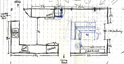
Note: don’t mind that vertical line that follows the back of the banquette to the door to the living room, she just dropped that in to tell us that we should line those things up- but the banquette wouldn’t be attached to anything, it would just float in the middle of the room to keep things open- just like an island would, but since it would face the fireplace in a way that an island wouldn’t it could make a lot more sense.
I’m not going to lie. Both of our first impressions were “thanks, but no thanks.” But as she further explained her vision we slowly started to come around. See, I’ve always adored the cozy-factor that is an L-shaped banquette. And if you search “banquette” some pretty cute images come up on google and Pinterest. A breakfast nook-ish type space like that might not be everyone’s cup of tea (there are definitely some die-hard island-lovers out there), but we actually thought it could be even cozier than our previously considered idea of an island. Especially because it would make sense of the off-centered fireplace in a way that an island never could (since it couldn’t ever be centered on it or lined up in any real way). So we took Nancy’s little scrap paper sketch home and taped out her floating L-shaped banquette idea on the floor:
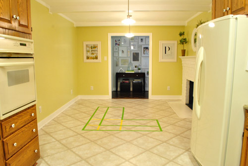
To explain what you’re looking at, the smaller L that’s being spooned by the bigger L would be the actual bench seating that faces the fireplace & the frame wall (which would make sense of the layout a bit more than a big floating rectangle that doesn’t line up with the fireplace at all). And the bigger L would be built-in cabinetry that wraps around the back of the bench seating to create a nice nestled nook that looks as good from the back and the side as the front (and provides a nice amount of concealed storage that’s accessible from the back, just like an island would have done).
As for the height, we thought keeping the tops of the cabinetry and the banquette seating the same height as the lower cabinets in the rest of the kitchen would make things feel cohesive and open (many of our inspiration images above have banquettes that are the same height as the base cabinets). And of course knocking out a huge 6 foot wide doorway to the dining room behind the banquette (which will have pretty cabinetry that faces the doorway so it looks good from behind) should keep the flow nice and airy – so nothing feels too boxed in.
I know it’s pretty much impossible to picture, so here’s John sitting at the fake banquette (although the table would be a smaller pedestal based thing, possibly square, oval, or even round – and possibly white or even a color, but probably not dark brown).
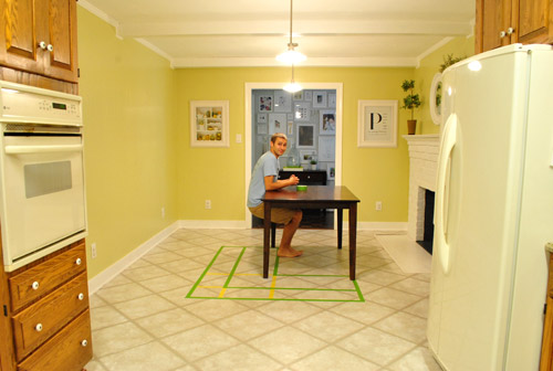
Note: we’ll have to move the lighting on this side of the room regardless of an island or banquette creation since it’s placed too far apart to make sense either way – and in the case of the banquette we’d center it over the table, not the seating (like many of the inspiration images).
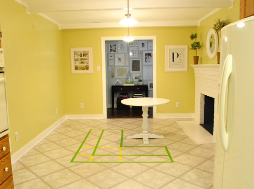
It’s admittedly still impossible to picture (and I would bet $20 that nearly everyone reading this is completely not sold on this idea), but here’s a round pedestal table tossed in there in case that helps the picture come together for a few of you (since our banquette table will definitely have a pedestal base to make maximum room for legs).
And here’s a lower square table (of course too low for a banquette, but this sized top might be right) to possibly help the vision come together a little more. As of now we’re both actually bigger fans of a rounded top – like the one above – but who knows where we’ll end up.
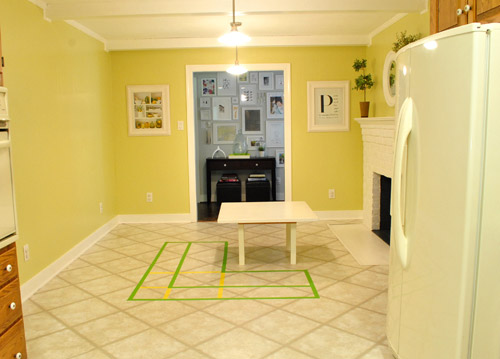
Who am I kidding. This probably doesn’t help anyone. And you all think we’re crazy to consider this. I know it. And we might be. But we’re excited enough about it to at least keep this idea on the table for now. Har-har.
See how the fireplace in the corner almost makes sense in that location with the cozy banquette facing it (which will be lined up with the doorway to the living room, so that doesn’t feel random either)? Nope. You still don’t see it. Haha. Well in person it actually has a lot of balance and makes considerably more sense than any island shape / placement that we’ve taped out on the floor over the last eight months (of which there have been many). We might just have to build our cabinet-backed banquette with cardboard or something to try to envision it further. Or use some serious photoshop magic to help picture it (the challenge is finding photos of the backs of banquettes since so many shots are looking into the L-shaped seating nook as opposed to looking over its shoulder from this angle).
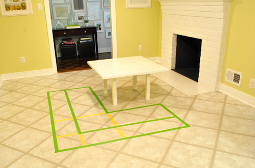
Oh and ignore the crazy white fireplace surround on the floor, since it seems to encroach and crowd the table waaaaay too much. When we redo the flooring in the room that’ll be remedied since we have plans to double side the fireplace down the road so you can peer into the living room through it (but will either make it gas or keep it completely inoperable so kiddo(s?) can crawl through the hole like it’s a secret passageway – so there won’t be a huge tile rectangle on the floor anymore).
I’ll leave you with this picture again, because it’s the one that makes my brain hurt the least when I try to picture things:

So all of this is to say that we taped off a crazy shape on the kitchen floor and we’re seriously considering some sort of cozy banquette-ish breakfast nook as opposed to a centered island with an off-centered fireplace nearby. It should be interesting. And the odds are that we’ll end up making some semblance of a decision someday. And we promise to keep you posted. Off to dip back into the aforementioned bedroom project and the office cabinet makeover. Ah DIY, you fickle friend. Maybe next week we’ll be less scattered. Who are we kidding? Probably not.

Sarah @ Redhead in Ruffled Flats says
I really can’t picture how that would open up the kitchen (since the back of the banquette would seem to function kind of as a wall – in my mind), but I know you guys are awesome and whatever you choose will blow me away and make me pretend I never doubted you! I’m sure Nancy knows what she is talking about since she helped you with the previous kitchen which you and everyone reading loved, so I’m sure her advice is good.
Can’t wait to see what it all looks like in the end, regardless of what you choose!
Emily says
I love the idea of a banquet. If I could manage that in my kitchen I would definitely try. Have you guys thought about using your $1 cabinets as stand ins? They’re probably not quite the right size, but once they’re painted white, they might give you a different idea of what it might look like from the dining room.
YoungHouseLove says
I’ve been meaning to do that! Might not be enough, but they could definitely give us an idea…
xo,
s
Sam Cross says
I really like the idea!! More than just a breakfast nook, it will make for a really nice family-chill space, no doubt about it. I can totally see burger relaxing on the pillows that I am sure Sherry will toss in, and Clara loving a hot cup of cocoa in the winter!! Good stuff you too!! Your house is def on its way to the fun, cozy and unique home anyone would want.
Side note, there is a tiny smiley face at the bottom of your blog, a little towards the right of it. Is that intentional? hehehe it sure made me smile!
YoungHouseLove says
Haha, we love that thing. It actually was put there by traffic tracking software that we use. But we love that he’s friendly. Haha.
xo,
s
Kim says
Love the idea of the banquette seating!
I wonder..if it feels too block-y looking at it from the kitchen side…what if the wrap-around cabinets for that little section of the banquette were swapped for a short counter top ledge with a couple stools under it (instead of cabinets there)?? Might break the blockiness up a bit and give a bit of a transition between kitchen and fireplace side of banquette.
YoungHouseLove says
That’s definitely another possibility!!
xo,
s
Ashley @ DesignBuildLove.co says
totally in LOVE with the banquette idea! I know it’s not everyone’s thing, and it can sometimes seem a bit “country,” but I’ve always felt that they were super warm and inviting! In fact, I have a few of the same pictures pinned on my Pinterest too: http://pinterest.com/designbuildlove/
Lovin’ the kitchen plans and having a banquette would really allow you guys to sit and enjoy the fireplace in the kitchen and would serve wonderfully for small, intimate meals.
Sheila says
I love the ‘idea’ of it, the challenge will be as said not to let it slide too far into a country style, although I do see some of that in your style anyway. Any ideas to make it feel more modern – maybe keeping it sleek, low, not busy?
YoungHouseLove says
Yup, low, sleek and not busy sounds good! And using modern pops of color with pillows and a glossy pedestal table (as opposed to a chippy old one). Should be interesting…
xo,
s
Ashley @ DesignBuildLove.co says
I’m totally in agreement with Sherry- keeping it low and having pops of bright colors will be perfect for maintaining a modern vibe! Also… maybe you can feed your pillow “love” by having fun, bold pillow on the banquette! :) You are officially reinvigorating my desire to develop plans to restructure our kitchen and built in some sort of banquette… hmm…
ktmade says
I actually love the idea of a banquette. I’ve always wanted one, and I think it would be perfect there – better, in fact, than an island, which could look kind of lonely. Ha!
Jen A says
I’m slowly wrapping (initially typed as “warpping” which also works) my head around your new plan. I like it.
What are you planning for the side of the L that faces the kitchen? I picture it as counter with a couple of low stools around it for people to gather there.
What abou the side facing the dining room? Anything visual there? Shelving for cookbooks / display items? A low dart board for Clara and her cousins?
fun fun fun.
YoungHouseLove says
Love those ideas! We definitely like the idea of making them feel like furniture and not like cabinets- so shelving or other ways to make it functional and fun (like a chalkboard for Clara) could be really fun!
xo,
s
Tina says
We basically have a banquette also, but it doesn’t float. We have a really low corner window & were baffled as to furnishing it. That is until we came across a square table with two ‘love seats’ benches & a corner seat. It fits perfectly! And it saved my husband loads of time not having to build one. Now my kids fight over the corner!
I think it will be great for you & very interesting!
Morgan says
I see that others have mentioned that the pictures aren’t showing up in IE7, but I thought I’d also mention that they aren’t showing up in the google reader either. I am at work, so firewall/virus software can’t be the issue, because we have a massive IT team to deal with that and use different professional software. And even when sites are blocked, I can still see them in the google reader.
YoungHouseLove says
See, if you can’t see them in google reader or on our site (but we can, and others can) it means something on your computer doesn’t like showing them because of where they’re being hosted. But they’re still being hosted in exactly the same spot that they’ve been for the last 3 years (amazon.cloud). Meaning we didn’t make a single change on our end, so it stands to reason that either amazon.cloud is just being glitchy for a few people or it means that something on your computer has decided to block those images for some reason – both here on our site and on google (along with a few others folks as well). That’s why we think it’s probably anti-virus software (perhaps you all have some pro version of Norton running at work, and it has decided our pics are not “safe” along with everyone else who has updated pro Norton on their work computer). This is why they wouldn’t show up in reader or on our site (the anti-virus software won’t show them anywhere for you, since it has flagged and blocked them). This has happened to small groups of other readers over the past few years and some went into their virus software and manually listed our photos as safe and they popped back up, while others waited it out and a few days later they came back. We wish it was something we could do on our end to fix it right this second though! So sorry for the trouble!
xo,
s
ONE THING I WANT TO KNOW IS says
I’m on IE8 and can’t see any of your photos.
YoungHouseLove says
So sorry! We didn’t change anything with our photos (they’re on amazon.cloud, where they’ve been hosted for the past 3 years) so maybe it’s your anti-virus software blocking them? Sometimes it does that but you can put in YHL as a safe or approved site and they should pop back up. Wish it was something we could do on our site!
xo,
s
Ellen says
In reference to the header on the website – sometimes when I’m working in a design program, if a project is saved in CMYK Color, it will only show up in Mozilla Firefox and not Internet Explorer. RGB color projects usually work with both! Hope that helps!
YoungHouseLove says
Thanks so much for the tip- we’ll have to check that out.
xo,
s
Melinda George says
I love this idea! Much nicer than the island. I’d put it closer to the wall and away from a fireplace a bit more perhaps…once you open the wall it will seem close to the fireplace it seems. At least from the photos… Once the wall goes you will have a few more feet to play with, that you can’t get the feel for now. It’s a really fun idea, I’ve not seen it done in the middle of a room before, exciting.
Amber Anderson says
I’m usually good at visualizing, but I was having a hard time with this one so I pulled out my Photoshop skills and did a mock-up of how I think it would look. Love it! I posted my image on flickr if you want to check it out. http://flic.kr/p/aimBhE
YoungHouseLove says
YOU ARE A GENIUS! Can we borrow that image and credit you?! It might help a lot of other people visualize it!!!
xo,
s
Amber Anderson says
Absolutely!
YoungHouseLove says
Wahoo! I’ll have to include that in our next kitchen progress report so folks who are picturing something taller that somehow blocks people seeing one another can picture it more. I love that it won’t be any taller than a table, so just like we can see each other sitting at the table, we can see each other at the banquette. Thanks so much for helping me (and everyone else) visualize it!!!!
xo,
s
Amber Anderson says
I hated that you could still see the green tape on the floor so I reworked the image. I also didn’t like how yellow it was so I color-corrected that AND removed the 2nd light. http://flic.kr/p/ainops
YoungHouseLove says
OH MAN, YOU RULE. Thanks a million!
xo,
s
Meghann says
I really love the idea of the banquette, but i feel like its too… sharp. Meaning when the wall is open and its square and then the square fireplace and then the L shaped banquette.. to me feels very closed off. I know you read sooo many opinions, but what if the seating area was more rounded… ie: the one with the white pedestal table with the glass top. I think my heart stopped when I saw that. That way you could turn the banquette slightly to open it more up into the room, rather then it feeling closed off from the kitchen. With the back parallel to the dining room/opening, and then open angled more to the fireplace wall… like 3 angles… im hoping Im making sense… then you could add a bench (like they have in the picture) when needed for when you have a party and need more butt space. I think visually it would be sooooo gorgeous… again my opinion of many. LOL
YoungHouseLove says
Since the big table in the adjoined dining room is giant and round we worried it would be too round, round, round. But you never know where we’ll end up!
xo,
s
JennP says
I have to admit, when I saw your original plans I couldn’t help but wonder where you were going to eat your casual family meals. I love a big, gorgeous island as much as the next, but they aren’t the best solution for family dinners (especially with babies and toddlers). I think the banquette is an awesome solution for the space and an even better solution for a young family!
Laura says
OMG! LOVE IT! we totally need to commit to something like this in our kitchen! thanks for the inspiration!
Stephanie says
I’m in Safari, on a Mac, and still having the same issues about not seeing the photos. What seems to be happening is an issue of where you are linking your photos from. One photo in the whole site was working from me, and the URL said it was a direct file in your WordPress uploads folder. The rest are linked from your Amazon cloud file.
My work blocks Amazon cloud, so that’s why I’m not seeing any of your images. If you’d like everything on the site to be compatible for everyone, that would be the fix. Though I know changing everything would be a hassle, I won’t be able to read your awesome blog at work anymore. And that makes me so sad as I don’t have internet at home :(
Still love everything you do!
YoungHouseLove says
We have stored our photos on amazon.cloud for the last three years! So sorry your office now blocks them, but hopefully they’ll come back (some others have said that blocked pics came back miraculously after a few days or weeks). A few years back we picked amazon.cloud because most people could see their photos (some other places were blocked more often and we got complaints, so even though we pay a pretty penny to use amazon.cloud it’s worth it for the majority of our readers to be able to see the pics). Moving over 100,000 images to another place would be nearly impossible (all the relinking would have to be done by hand) but I’m so sorry you’re having an issue and hope they come back soon!
xo,
s
Stephanie says
Everything is back! That is so WEIRD! But awesome :)
YoungHouseLove says
Glad it cleared up! So strange!
xo,
s
Anne Lee says
Lots to think about with this very clever, out-of-the box idea. Some things that have crossed my mind:
1. Solid cabinets, seating, plus table could make for a fairly massive chunk there. I wonder if it will feel too “solid”.
2. From the feng shui point of view, some people don’t like to sit with their backs to an opening, especially a large one so they would only be comfortable sitting on the short side. The longer side facing the fireplace would make them feel trapped without a view to the beyond.
3. The island idea allowed for multiple uses both personal and for entertaining – storage, serving buffet, seating, mingling, and access all around the perimeter. The banquette idea is really only sitting and storage for personal use. Not sure how it would work in a mingling situation.
Yozka says
Love this idea! The back of the built-in will look very clean when viewed through the knocked-out wall. You could add wainscot or something for visual interest.
& yes to an oval table! Now I do not like sitting in booths, so could a couple of chairs/highchair when needed be pulled around the other side? I wonder what seating capacity could be?
I agree that it would be good to see the little ones from the kitchen, nuti don’t think you can flip the thing around… How about some well- placed mirrors for keeping an eye, if needed?
sara says
fun idea! have you tried google sketchup? you can design interior and exteriors and use their “warehouse” to search for furnishings to place in your space too. might a way to help visualize with exact measurements.
YoungHouseLove says
We’d love to try that!
xo,
s
Christina says
The nook looks way better than the island. I know – easier said once you post a second idea, but since I don’t know you, I felt my opinion best kept to myself at the time. Now that you are thinking along other lines, that island seemed as though it was out in no-mans land with no real purpose. Glad to see you kept up the friendship! Good luck with it and I enjoy your posts and ideas…even when I think you are smoking something!
Lauren says
Ooh my Grandma seriously has almost that exact kind of set up in her house (a cozy banquette facing a fireplace). It’s where I remember spending all my time growing up when I was at her house (we were lucky that my grandparents only lived 5 minutes away so she was my designated babysitter). My memories of that spot are of drinking hot chocolate or eating stove-top popcorn while reading books with granny. :)
Very cute, could totally picture you guys loving it.
Wom-mom Ethne says
I might’ve missed it in the above comments since I didn’t read thru them, but do you intend to do a countertop on top of the cabinetry on the banquette so you have workspace there? It looked like one of the free-standing banquette images you put up had that.
YoungHouseLove says
Yup! There would be a counter along the top of all the cabinetry that spoons the banquette.
xo,
s
Anne G. says
I love the banquet idea. It would work so well with the fireplace. So much cozier than an island! I think it will be amazing! Can’t wait to see what you end up doing!
Kristi says
I love the banquette, too. Am just concerned that it seems to be crowding the fireplace (and not just the tile surround) from what I can tell.
YoungHouseLove says
We definitely plan to build everything with cardboard to visualize it and then shift things backwards or forward once we do that! We’re just getting started…
xo,
s
Sam(antha) says
I love, love, love the banquette! In fact, you have inspired me to draw up a kitchen renovation for our home revolving around the banquette idea! Our little cottage home was built in 1951, and a banquette screams the 1950’s…thanks for such a great idea! Can’t wait to see how yours turns out. By the way, I’m new to your blog, and I’ll be honest, it’s my new obsession!! I’ve been reading you everyday for the last week and I love everything about it! My family lives in Richmond and my aunt told me about you guys, I am so happy to be a follower now :o) P.S. We share the same anniversary, 7-7-07 rocks, and also the same lemon & lime wedding napkins and scheme, awesome! ~Sam
YoungHouseLove says
No way?! Lemon and limes and 7/7/07. Love it!
xo,
s
Lisa says
Take that last picture and put in the area where the wall will be removed (your black rectangle)…that should help to visualize where it all goes in the space.
Lisa P. says
Lovin’ the new bloggy look. And great ideas on the kitchen. Can’t wait to see it unfold!
Jessicah says
I for one am a fan of the banquette! My grandparents had one in their house when I was growing up, and I have lots of fond memories of being squashed in amidst all my cousins– eating snacks, or drinking hot chocolate. :)
YoungHouseLove says
Thanks everyone for the suggestions! We’re having trouble keeping up with over 690 comments so we just want to thank everyone for the ideas and promise to keep you posted every step of the way!!!!
xo,
s
Marni says
I love your website! So many great ideas but . . . do you guys work?! How do you have the time to do all that you do?!
YoungHouseLove says
Well, along with raising a one year old, this blog is actually our full time job. And no one is more surprised about that than we are! It definitely wasn’t something that happened overnight (four years and 2,000 posts later…), but it’s pretty darn amazing to us. How on earth did we get here? And we owe all of you guys (our lovely fantastic readers) so much love and appreciation for stopping in to see what we’re up to. Look out, I’m a hugger…
xo,
s
Vonda says
I like the idea. I pictured it with some really nice glass cabinets surrounding it with lights (like curio type cabinets) where you put really pretty dishes, vases, etc. and that would be seen from the dining room large entry when you knock it out. Like a friend’s awesome kitchen featured in Richmond magazine (or maybe R Home) several years ago. And I almost know what you’re thinking and their 2 kids are growing up in that house and they never got into trouble with the glass cabinets.
Michelle says
I’ve had that same happy and bright kitchen photo on my desktop as inspiration for my kitchen, too! So pretty!
Elizabeth says
I love the idea of the L shaped island or banquette. I think making that opening in the one wall will really brighten things up, as well as changing out the current lighting situation!
Kelly says
You kept saying that people probably aren’t feeling it, but when I first saw what she suggested my heart sunk in JEALOUSLY! I was like a 3 year old… no you can’t have one of those, I want one! lol Sadly my kitchen isn’t large enough or shaped right for that.
But that spot will be perfect for a little l-shaped banquette! You can cozy up to the fireplace with coffe and a bagel… I’m so jealous.
Erin says
Nope totally follow, and that’s a great idea! When I first saw the sketch, I was imagining the counter behind the banquette being counter height behind the seating with barstools pulled up to it – either on one or both of the legs of the “L.” Maybe you could do shallow, counter-height cabinets (12″), with a deeper countertop for overhang that you could tuck stools under. It would provide “stadium seating” (for lack of a better explanation) facing the fireplace, with a lot of versatility for entertaining. Having it counterheight would provide a great serving space adjacent to the dining room as well. Just a thought!
YoungHouseLove says
Love that idea too! So many possibilities guys! Thanks for all the suggestions!
xo,
s
Aimee says
Love this (now that I can see the photos) I’ve been trying to find a place to do something like this in our great room. So far cant find one that makes sense. On another note – dont moarn the loss of the slate floor too much. My parents have one and my mom says it was the biggest mistake ever. After 20 years of wear and tear she can make it shine its so clean but it still looks dirty, and there is nothing worse than a dirty looking kitchen floor.
YoungHouseLove says
So glad the pics are back for you! Wahoo! And thanks for consoling me about the slate floor.
xo,
s
Jody says
Wow, at first the drawing made me go, what you two are crazy!
But seeing the banquet picture that HAD the island made me realize that is a perfect solution. Since you are blowing out the doorways I would really try to see if you can incorporate a bit of a real island, at least to the side closest to the rest of your kitchen. That would be amazing for an extra prep area when Clara is older.
I dream of building a banquet in our kitchen since we have a half wall separating the living room kitchen and it has no purpose.
Courtney says
I absolutely love kitchen nooks! They’re so cozy and family friendly IMO.
How did you survive without pinterest Sherry? It seems like everything you reference is from there! lol
YoungHouseLove says
I know, right? I was alone in the dark ages before Pinterest!
xo,
s
harmony says
I think this is an excellent idea and will work wonderfully in your space! We are actually putting a banquet nook into our tiny dining area as well, and I couldn’t be more excited!
Emily F. says
I love the idea of a banquette there! Sounds cozy, and like a great place for Clara to do homework in the future! My in-laws have a banquette space in their kitchen and it’s the most popular place in their house.
Oh, and I’d keep an eye on Craigslist for appliances…you never know! We found a wall oven on CL for $350 ($1100 new! yikes!). It was only 1 year old, black, the right size, and still had a year of warranty left! On top of that, the owners were about two miles away from our house and they delivered it for free :). It couldn’t have been more perfect timing either. The oven from 1980 in our kitchen was cooking only the bottom of anything you put in there. Quite the predicament…
YoungHouseLove says
Thanks so much for the tip! We’ll have to start checking more often for them!
xo,
s
KatyB says
I like your new header, but sadly I can no longer see the pics at work. For me, this was your number one attribute. Suprisingly, I am not into seeing how other people arrange their junk drawers, or pics of their adorable children. However, junk drawers and other people’s cute children while I am supposed to be working…totally awesome.
YoungHouseLove says
So sorry! We have heard some offices have started to block photos from amazon.cloud (where we store all 100,000+ pics, and have for the last 3 years) so we hope that’s not the case and it’s just a glitch. We didn’t change anything on our end, but here’s hoping they pop back up soon for ya!
xo,
s
Joy says
The L-shaped banquet is brilliant. What a clever solution. I think it will look beautiful and add a high-end “custom” look to the space. Go for it!
joyjoy says
LOL. Brain dump indeed! I love, love, love banquettes. I’ve never seen one that was completely floating, so I’m very interested to see how yours turns out. I’m intrigued. :-) Actually, the banquette idea made a lot more sense than an island to me from the instant you mentioned it. In my mind, islands are meant to increase counter space and work flow area, and from your floor plans it didn’t seem like the island would be close enough to the rest of the appliances to do that (I don’t have an island, so really, it’s all in my mind :-P). The banquette, though, I’m super excited about…and it’s not even my kitchen!
Katie @ Shared Bites says
I like this thinking outside the box! But I would be concerned about how much it cuts the banquette-sitters off from those in the kitchen or the dining room (should that wall come down). Like if your daughter was coloring at the table and you were cooking, could you even see her?
YoungHouseLove says
Yup, it would be the same as if she were sitting at a table (the banquette back and counter will be the same height at the lower kitchen cabinets and the current table in the room). It’s so hard to picture though!
xo,
s
Paulina J! says
Just wanted to say taht I can see all pics and teh header. Gorg!!!
The banquette idea is GENIUS! Props to Nancy. It’s way more functional than the island. To me, it always seemed like the island was too far away from the actual prep areas in the kitchen and was blocking the function and view of the fireplace. I can’t wait!!
Elaine K says
I love the banquette and think you will find it easier to use than an island for making cookies with Clara. My kitchen designer was helpful too. He suggested a peninsula rather than an island and making it look like the alarm system was built into it rather than just hanging on the wall by itself.
debbie c says
I like how in the third inspiration picture, there is a countertop on top of the storage behind the seating area of the banquette. It sort of marries the island with the banquette idea! Have you thought of doing something similar?
YoungHouseLove says
Yes, that’s how it would look, but on a smaller scale since we don’t have that much space!
xo,
s
Tammy says
I think the island is a better use of the space. I can see you and Clara making cookies or laying out a school project on a nice island, but not so much on a banquette. An island is also a great way to lay out a formal or informal buffet. (maybe I just wish my kitchen were large enough for one?)
Heather says
I actually really like the idea! Can’t wait to see how it turns out!