True to form, we’re all over the place over here. After switching up the ol’ blog design (and figuring out why the header was MIA for 20% of you – here’s hoping it’s back) we’ve also been plugging away at our $6 cabinet makeover but aren’t quite done with the painting/building-up process (here’s hoping we’ll have photos and lots o’ words to share early next week). But crazily enough, in the meantime we’ve also been doing some yard work, a random bedroom project, and have even started brainstorming the next phase of the kitchen. Hence this brain dump.
We’re still saving our pennies for things like new appliances to begin the next step of our slow & steady kitchen overhaul (remember when we upgraded the fireplace and wood paneling a little while back?). So as we wait for the bank account to say “sure, go buy a new wall oven that’s not bisque, and a new microwave that’s not black”, we thought meeting up with an old friend of ours to get a few kitchen ideas might be nice. Who is this mysterious old friend that we speak of? Why it’s Nancy Kulik, the lady who helped us plan our first kitchen makeover through Home Depot (they offer up Certified Kitchen Designers to help for free if you buy cabinets or counters through them, of which we got both).
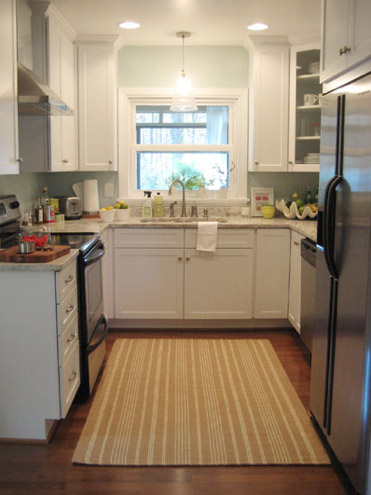
We knew that we wanted white cabinets and light marble-esque counters (they were actually granite) during the planning stages of that makeover back in 2007 – so we didn’t look to Nancy for much “style advice” during our 113 day kitchen reno. But she was truly invaluable when it came to space planning. She just knows how people use kitchens and where appliances should be placed to maximize function, and we fully believe that our first kitchen would have been half as useful if we didn’t have her free-with-the-purchase-of-cabinets advice when it came to where to squeeze in a dishwasher, relocate the fridge, and build in the microwave. Lesson learned: sometimes the pros know best. So take their advice whenever it’s free (and even when it’s not if you need it). You know, so you don’t DIY a kitchen all alone that’s semi-functional when you can DIY something twice as useful with some pro advice and a smidge of well-spent cash (assuming you can’t track down free services like those from HD or Lowe’s).
But back to our buddy Nancy. We actually kept in touch with her over the last three years since our big kitchen makeover in 07′ (she and Clara are practically BFFs). So she was sweet enough to offer to glance at a floor plan and a few photos of our current house’s kitchen to give us a little here’s-what-I-would-do advice. Second lesson learned: there are definite perks to staying in touch with any kitchen geniuses that you may encounter.
But first a little refresher. You’ll remember that the eat-in part of our kitchen currently looks like this:
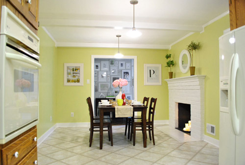
We’ve always planned to add a built-in island in place of the too-small dining table, just because when we knock out a huge doorway in the wall across from the fireplace to connect it to the dining room we thought two tables lined up through that opening would look odd (a big round one in the dining room and another one so nearby in the kitchen = crazytown).
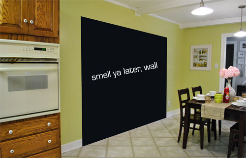
So we thought a big round table in the dining room and a smaller built-in island by the fireplace would make sense and be less “hello table, meet my friend, table.”
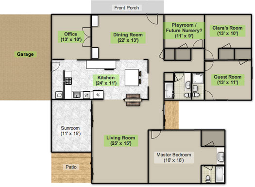
Here’s an old floor plan that we shared last November before we even moved, just to give you an idea of what we thought might work when it came to the island (with the new wide doorway to the dining room that we plan to add worked in there too):
Oh while we’re on the topic of someday dreams, we’d love to paint our cabinets white and craigslist our white, bisque, and black appliances and upgrade to stainless steel. When it comes to our counters, we plan to work with the granite that we have, but completely redo the backsplash for a crisper, lighter look. And those florescent tube lights and big brown fan? They gots to go.
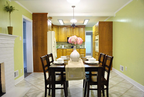
While we’re rattling off things on the list, of course we’d love to redo the floors but aren’t sure if there’s hardwood running all the way under the entire kitchen that we can refinish (we know it runs under part of it, but haven’t confirmed all of it) or if we’ll have to just redo them with something new entirely. The challenge of that is that we’ve learned that our floor joists aren’t built strongly enough to hold the weight of stone or ceramic tile (I thought slate would be awesome in there, so yeah… le bummer). We’ve toyed with everything from lightweight cork to some sort of linoleum (Candice Olsen has done some surprisingly awesome kitchens with that on the floor) but we’re nowhere near a decision. We’ll keep you posted though.
But I digress (who’s surprised?). Back to our talk with Nancy Kulik and the big kitchen idea she came up with (pretty much on the spot because she’s cool like that). Are you ready? She looked at the new to-scale floor plan that we brought with us (and a few photos) and realized that something was wrong, wrong, wrong on our little whole-house floor plan (seen three photos back, which we did months ago in November). That something? The fireplace is almost in the corner of the room in real life. So the placement of the fireplace in that old floor plan is totally off.
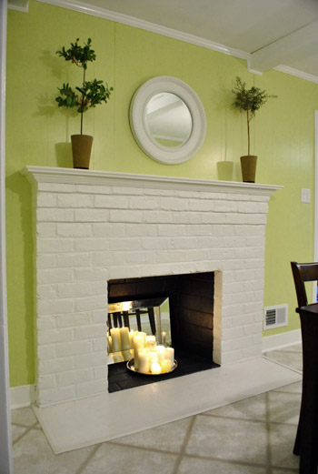
Thankfully it was drawn in the actual correct location in the newer kitchen-only floor plan that we brought with us to our Nancy meeting, but since it’s not actually centered on the wall (and practically kisses the door that leads to the hall), no island could be centered on it without nearly touching slash completely blocking that doorway (which we definitely want to keep open). So Nancy suggested something that we never would have thought of ourselves. And I mean never. Brace yourself. She proposed a floating L-shaped banquette that faces the fireplace and the frame wall.
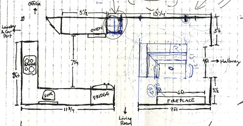
Note: don’t mind that vertical line that follows the back of the banquette to the door to the living room, she just dropped that in to tell us that we should line those things up- but the banquette wouldn’t be attached to anything, it would just float in the middle of the room to keep things open- just like an island would, but since it would face the fireplace in a way that an island wouldn’t it could make a lot more sense.
I’m not going to lie. Both of our first impressions were “thanks, but no thanks.” But as she further explained her vision we slowly started to come around. See, I’ve always adored the cozy-factor that is an L-shaped banquette. And if you search “banquette” some pretty cute images come up on google and Pinterest. A breakfast nook-ish type space like that might not be everyone’s cup of tea (there are definitely some die-hard island-lovers out there), but we actually thought it could be even cozier than our previously considered idea of an island. Especially because it would make sense of the off-centered fireplace in a way that an island never could (since it couldn’t ever be centered on it or lined up in any real way). So we took Nancy’s little scrap paper sketch home and taped out her floating L-shaped banquette idea on the floor:
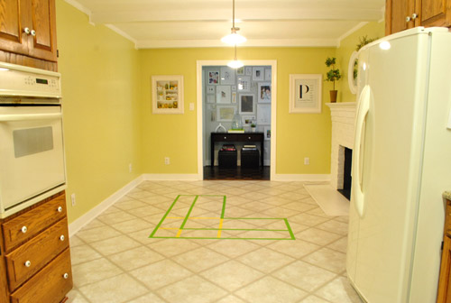
To explain what you’re looking at, the smaller L that’s being spooned by the bigger L would be the actual bench seating that faces the fireplace & the frame wall (which would make sense of the layout a bit more than a big floating rectangle that doesn’t line up with the fireplace at all). And the bigger L would be built-in cabinetry that wraps around the back of the bench seating to create a nice nestled nook that looks as good from the back and the side as the front (and provides a nice amount of concealed storage that’s accessible from the back, just like an island would have done).
As for the height, we thought keeping the tops of the cabinetry and the banquette seating the same height as the lower cabinets in the rest of the kitchen would make things feel cohesive and open (many of our inspiration images above have banquettes that are the same height as the base cabinets). And of course knocking out a huge 6 foot wide doorway to the dining room behind the banquette (which will have pretty cabinetry that faces the doorway so it looks good from behind) should keep the flow nice and airy – so nothing feels too boxed in.
I know it’s pretty much impossible to picture, so here’s John sitting at the fake banquette (although the table would be a smaller pedestal based thing, possibly square, oval, or even round – and possibly white or even a color, but probably not dark brown).
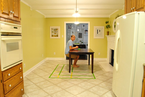
Note: we’ll have to move the lighting on this side of the room regardless of an island or banquette creation since it’s placed too far apart to make sense either way – and in the case of the banquette we’d center it over the table, not the seating (like many of the inspiration images).
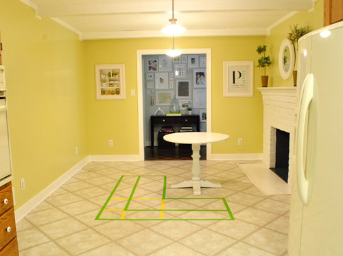
It’s admittedly still impossible to picture (and I would bet $20 that nearly everyone reading this is completely not sold on this idea), but here’s a round pedestal table tossed in there in case that helps the picture come together for a few of you (since our banquette table will definitely have a pedestal base to make maximum room for legs).
And here’s a lower square table (of course too low for a banquette, but this sized top might be right) to possibly help the vision come together a little more. As of now we’re both actually bigger fans of a rounded top – like the one above – but who knows where we’ll end up.
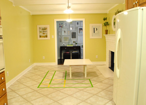
Who am I kidding. This probably doesn’t help anyone. And you all think we’re crazy to consider this. I know it. And we might be. But we’re excited enough about it to at least keep this idea on the table for now. Har-har.
See how the fireplace in the corner almost makes sense in that location with the cozy banquette facing it (which will be lined up with the doorway to the living room, so that doesn’t feel random either)? Nope. You still don’t see it. Haha. Well in person it actually has a lot of balance and makes considerably more sense than any island shape / placement that we’ve taped out on the floor over the last eight months (of which there have been many). We might just have to build our cabinet-backed banquette with cardboard or something to try to envision it further. Or use some serious photoshop magic to help picture it (the challenge is finding photos of the backs of banquettes since so many shots are looking into the L-shaped seating nook as opposed to looking over its shoulder from this angle).
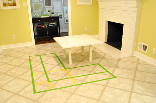
Oh and ignore the crazy white fireplace surround on the floor, since it seems to encroach and crowd the table waaaaay too much. When we redo the flooring in the room that’ll be remedied since we have plans to double side the fireplace down the road so you can peer into the living room through it (but will either make it gas or keep it completely inoperable so kiddo(s?) can crawl through the hole like it’s a secret passageway – so there won’t be a huge tile rectangle on the floor anymore).
I’ll leave you with this picture again, because it’s the one that makes my brain hurt the least when I try to picture things:

So all of this is to say that we taped off a crazy shape on the kitchen floor and we’re seriously considering some sort of cozy banquette-ish breakfast nook as opposed to a centered island with an off-centered fireplace nearby. It should be interesting. And the odds are that we’ll end up making some semblance of a decision someday. And we promise to keep you posted. Off to dip back into the aforementioned bedroom project and the office cabinet makeover. Ah DIY, you fickle friend. Maybe next week we’ll be less scattered. Who are we kidding? Probably not.

LibraDesignEye says
Banquette idea is smashing – wonderful and something that fits right into your aesthetic. I like the functionality when you have a big holiday meal too – the two groups can be together without it feeling like two tables in a row.
For the future, though, I’ve got a couple of space planning thoughts for ya – right now the folks who live here – Two adults plus a little one who still sleeps a lot. Look ahead 5 years with their friends over, plus two parents who work at / in their home and consider that the openness you are about to build into the house, may benefit from the ability to close an adult space off from a kids space.
When they are little, you can stand ninety rounds of The Wiggles, but when four or five or eight of them are all playing loud games in the living room, you may want a pocket door between kitchen and family space while you make dinner and chat with John. Or so kids go to living space while grownups have another glass of wine in the dining room after an extended family meal and be able to listen to jazz from the office sound system while they chat instead of hearing boom boom room next door.
I also realize that in the future french doors to the dining room and a solid door to kitchen (another pocket opportunity when you redo?) could make the office an away space, but you don’t want to have to go to the office or your bedroom to escape (12 years later) teen noise (a gathering, their television, and so on). Even at a family dinner, there will be a time where kids and grownups separate after . . and the smallest door can make a difference in how much fun everyone can have.
I also lurrve opening this space to the new dining room, but it will change your traffic patterns a lot. Now to go to the dining room – you exit through office or through frame gallery hall. Once the direct route to the front door from the sink is straight through, you’ll have less use for the hallway doorway from the kitchen. You’ll still use that hall a lot – from living room to front door, to your bedroom from kids wing (love how I upgraded that area to a whole “wing” of your abode?)
With your (much noisier) future in mind, you might consider that when you open the fireplace area to the living room, that you could lose the connection to the hall. That wall could be the back of a longer banquette to solve the placement of the fireplace issue. Or the current hall doorway could shift to the left behind the banquette and still preserve the lineup of front window and new wide doorway to family kitchen space.
Now if you have a pocket or swinging door with magnetic hold between kitchen and living, you can hear kids down the hallway, and the new double fireplace but have a lively adult conversation at the table without being pummeled with the next generations version of techno hip hop or the powerful roar of teen action jackson flicks. (now i’m oversharing!) Tho i love the view to your wall as well, remember that you can relocate some above the banquette.
That would give you a little more space at the kitchen end to add the coveted island. Perhaps get your cake and eat it too?!?!
YoungHouseLove says
Wow- thanks for all the thoughts! We’re definitely planning to try to consider every last thing that we can before making any major decisions!
xo,
s
Paola says
I was totally sold immediately! Especially because I had this same idea two weeks ago (after seeing some images on Pinterest, of course!). I just built a wall between the kitchen and dinning room to make a third bedroom. So now I have the perfect space where the wall is to build a banquette.
I love them, they are so cozy and cute and more comfortable than high stools… my father-in-law is gonna help me build the bench with some storage inside! I’m so excited!
Erica says
Banquette idea is brilliant! You could use the top of the cabinet space for a buffet. Great to focus on the sweet fireplace. Can’t wait to see what you decide!
Blair says
I don’t like the idea at all, especially after seeing pictures. I feel like the fact that it’s floating is too awkward for me to get past. That said, if I thought anyone could make it work it would be you two so I’m excited to see how it turns out!
Nancy says
Wow! I like banquettes and think it could be great. I’ve not read through all your comments, so I’m likely not the first to ask this, but the only thing that bothers me is that it seems that the L shape faces toward the hall door rather than the kitchen. For me, that would be result in lots of bruises bumping into it every time I put food on the table for our family. Of course, having the cabinetry accessible to the kitchen would be good, too. This is, of course, your house and you have to be satisfied with how it works. Sometimes, it just takes awhile to readjust your patterns. But, I think I would prefer to have the table open to the kitchen for ease of food transfer.
Also, I don’t think the blog banner is right on my computer. There is a big space between the banner and the blog – a solid two inches. And then, barely visible, just above the white box of the newest entry, I can just make out the word “life.” And I’m not going to mention the overlapping ad. Doh, I just did. Maybe it’s just my firefox or macbook pro? It’s doesn’t really bother me, but I thought you’d want to know.
YoungHouseLove says
So sorry about that header issue you’re having! It seems like our blog looks great in most common browsers, but sometimes it’s wonky in really old ones (or uncommon ones like Opera for some reason). Wish we could get to the bottom of it!
xo,
s
Tara says
I love the banquette. I mean really love it!!! I love islands too, but I think I love this idea better.
Megan says
LOVE the banquette! If I wasn’t an apartment dweller I would definitely have one.
Sandy says
I love the idea of a banquette much better than an island. And facing it toward the fireplace is perfect! I would love a cozy place to sit and have a meal and watch the fire in the fireplace, or just sit and relax with a book and cup of tea or hot cocoa. There is just something about a fireplace that adds instant ambiance with or without a fire and this idea will definitely take full advantage of that space. Kudos to your kitchen friend!
emily says
my initial reaction was ‘absolutely not’, but i’m warming up to the idea. seems to fall in line nicely with your nontraditional use of space (dining room as office, living room as dining room, etc).
have you guys considered downloading google sketchup and modeling your home in 3D? it’s soooo very simple, and could be very valuable for things like this!
YoungHouseLove says
We’d love to play around with that soon!
xo,
s
shannon says
it is hard to picture and it is a tough situation since that fireplace is so janky.
good luck though! can’t wait to see it all take shape :)
Kimberly says
Could John pretend to sit at the white pedestal table? As if you don’t have enough to do already. Love the built-in banquet idea and the cabinet people at Home Depot.
YoungHouseLove says
We have a rendering this afternoon that might help! Stay tuned…
xo,
s
Shannon says
Love the idea! It’s the kind of thing I never would have come up with myself, but it works great with your space! Love the inspiration pics, too!
Kim says
I love the banquet idea! I wasn’t so sure about the idea of the island – as they are normally higher and it seemed to me it would kinda just be a big rectangle in the middle of the room. But it’s your house and you usually make things work when we can’t see it – so i figured you’d make it work :) But I think the idea of the banquet seating is so cozy in there – esp. with the fireplace – you are so lucky!
Ali says
I love the banquette idea! To visualize it you could try the homestyler website–you can make up a floor plan and add cabinetry, furniture, wall colors etc., and it lets you see a 3D version too. I used it a ton while waiting to get into my current house–kind of addictive!
http://www.homestyler.com/designer
YoungHouseLove says
Thanks for the tip! Off to check it out!
xo,
s
Julia Fain says
we have/are considering modern banquette seating. definitely go for a tulip-base style table. We just got one and it saves SO much space–with chairs, sliding stuff around easily. And much better with kids.
YoungHouseLove says
Love the tulip base idea!
xo,
s
jeannette says
i had good luck resurfacing a 48* CL tulip base table for $250 instead of $2500 or whatever they’re asking for new ones.
YoungHouseLove says
Woah- that’s awesome! Such a classic.
xo,
s
Ranelle says
I can picture it! Especially with a combination of closed and open storage on the back side!
LMN says
someone may have already said this, but i think it would be super cozy in the winter by the fireplace. what are the plans for the back of the seats that faces the opening into the dining room? in my mind you’ll just see a big back of a seat when you walk in the front door? hubs and i are drawing a kitchen too!
YoungHouseLove says
We’ll share a rendering this afternoon that will hopefully make a lot more sense of things!
xo,
s
Alecia says
I love the idea of a banquette. Here’s something, though: I know you guys love your view of the gallery wall from the kitchen (and it is great) but have you ever considered closing off that doorway altogether? You’re still planning on opening the wall to the dining room so there would be good flow there, but closing off that wall would allow a couple of things:
– A LARGER banquette that hugged the back wall and then faced the fireplace and kitchen (still L-shaped so that you wouldn’t immediately see another table from the dining room). Solves the problem of a floating banquette and since it could be bigger, you could seat more people.
– Another large wall to decorate! Yes, you love your hallway gallery wall, but what about creating a similar or even completely different one on the new giant wall behind the banquette? I know you guys could totally do something great with accessorizing it.
Just an idea.
YoungHouseLove says
Yes, we have debated closing that hallway but then the hallway side would feel a lot more closed in and we love the view of all those frames! It also leads directly to the bathroom and three bedrooms so it’s often used (and guests would have to circle around to go to the bathroom if we moved it. Who knows where we’ll end up though!
xo,
s
Valerie says
Haven’t read all the comments (b/c there’s usually a lot of them :)), but I love this idea! We have a breakfast nook in our kitchen with one 1/2 wall that backs to the sink, I wasn’t sure how to make it work until I saw one of your inspiration photos…LOVE IT!
An idea: maybe make the bench seat ones that open from the top so that they too can be used for storage!
Also, call me senorita safety, but the idea of kids crawling through the fireplace scares me!…they might think all fireplaces are secret passages and get hurt somewhere where the fireplace is, well, a fireplace. :/ just thinking out loud here.
YoungHouseLove says
Love the bench storage idea! And never thought about that with the fireplace! We’ll have to teach them that we have a magic fireplace and all others are off limits!
xo,
s
twelvedaysold says
I love the idea of having the nook there. As I was looking at it, I think that I would rather the table at the banquette facing the kitchen (so if someone is cooking, anyone sitting at the table can easily interact with the person in the kitchen). And then I realized that that totally offsets the whole “centered with the fireplace” gig. I may not be 100% sold, but that’s only because I know I’d want to be able to comfortably face anyone that was in the kitchen, but you’ll also know what works best for you and your family. And thinking of sitting in front of the fireplace in an adorable banquette is a great idea. Can’t wait to see what comes of this idea!
Samantha Frank says
I’d never thought a ‘breakfast nook’ could exist anywhere but in a corner – this is such a neat idea! Have you thought about how you’d utilize the tops of the cabinets? More counter space I suppose, right?
YoungHouseLove says
I think we’d love to use some sort of countertop (like the third inspiration picture).
xo
s
Kellee says
First, can I just say that you guys rock? Thanks for helping me get over my DIY fears.
Anyway, now that I got that out of the way, I wanted to tell you to not be too sad over the slate-in-the-kitchen thing. I had it and replaced it because, although it was beautiful, it was a complete nightmare to clean. Think bumpy vacuuming and shredded mops. And if I ever spilled something like flour on it? Forget it. It was going to live there forever. My type A personality just could not handle it.
Can’t wait to see what you decide on!
YoungHouseLove says
Thanks so much! You’re the second person to say that and it definitely makes me feel better!
xo,
s
AlexandraRS says
Why not use your 6 new desk cabinets as place holders to build a banquette? They’re probably around the same height as kitchen cabinetry (maybe a little tall) but you can use a few to build a mock-up.
YoungHouseLove says
We actually just saw a rendering that helped us picture it so well. Check out this afternoon’s post (just up) to see it!
xo,
s
Sara says
I actually have always thought the island idea was a bit wacky because Islands tend to be centered, anchors of the kitchen. I like the banquette idea way better. I’d suggest some open shelving along part of it.
Stephanie says
If you make the fireplace inoperable there isn’t a point in keeping it there to determine the placement of everything else in the room! Somebody might have already said this but that was my first thought. A banquette would be also cute facing the rest of the kitchen, but that’s if there’s NO fireplace, and the storage would be facing the opposite way. That’s my 2 cents! Love the idea anyway
YoungHouseLove says
We want to make it double sided so kids can crawl through it! So it might just end up being the favorite thing in the whole house. Haha.
xo,
s
Nikki says
What about a bank of cabinets on one side but a peninsula style bench on the side that is perpendicular to the fireplace? Then you could face either way from that portion of the bench. Love love love the idea…I had already pinned one of those pics!
YoungHouseLove says
That’s definitely another idea! Not sure if we want the storage and counter space from the L-shaped thing though. Still definitely have some thinking to do!
xo,
s
Susan says
Haven’t read through all 800 comments, but have you thought about closing the door to the hallway, and doing a more u shaped banquet that touches/ grounded to that wall?
YoungHouseLove says
We thought about that but just liked this banquette idea better. Who knows where we’ll end up though!
xo,
s
Sarah says
What an amazing idea! I agree, it will be very cozy and definitely fits your personalities. I hope you decide to go with it! I’m looking forward to seeing the transformation.
Cindy says
A table that faces a fireplace? Yes, yes, yes! Envision hot chocolate and cozy fires on cold winter days. Come to think of it, maybe you should make this decision in the winter when a fireplace makes more sense in the first place.
Carolyn says
I love the idea — better than an island. I’ve always wanted something like that myself, and having the fireplace there will be just so cozy. And once you open the fireplace up to the other side … perfect. This will let the fireplace be more the show of the room too instead of hiding kind of behind the island. Invite me over to hang out on it when it’s done! Kidding … ; )
Hannah says
So call me crazy, but what about flipping the orientation of the banquette to face the kitchen and fireplace? I’m guessing most of your traffic will flow from your living room? This way the backs would face the hallway and dining room but leave the table open to the living room doorway and kitchen to allow for conversation. What do you think?
YoungHouseLove says
Check out this afternoon’s post (just put that up!) for why that won’t work as well for us. Hope it helps!
xo,
s
Kelly says
I love the idea! I can see you drinking coffee, reading the paper in front of the fire on a winter day (do you even drink coffee and read the paper? – maybe another place to work on your laptop, or a homework station for Clara someday)…it totally makes sense of the oddly placed fireplace in the kitchen. I would have never thought of that. You’d probably get much more use out of it than an island and seems to me it would fit your style better, too.
fyreflie says
I love the idea of the banquet. At first I thought it was crazy but then I started picturing it and now I love it. I think it would change the feel of your entire house. It would really make the kitchen the heart of the home which it should be, and doesn´t feel like it is at the moment.
I was reading through the comments and lots of people feel that it should face the other way. I think, the reaction is natural, but I obviously understand the point with the fireplace/balance thing. So I thought about it and decided that it really wasn´t so tragic. I grew up with a banquet in our kitchen and my parents always made me sit in the bench section. However I remember always thinking that sitting on the seats on the open side of the table would be more comfortable… more easily accessible. I figure that there will be seating on all four sides of the table, not just the L-shaped bench but also chairs of some sort. If this is the case, then Clara and any future kids, or any guests that want to hang out in the kitchen while you work, can simply sit on the chairs, on the seats on the far side or on the fireplace side of the table if they so choose. You would just have to get comfortable chairs… like the type of chairs that Katie Bower put in her eat-in kitchen. Those look really comfy… Of course nothing beats sitting in that little corner on a chilly winter morning with a cup of peppermint hot chocolate, a blanket, pillows, and a real fire in the fireplace…. how incredible the idea.
Anyway… my point is that there will be more seating in addition to the bench so ther is no need to worry about not facing the kitchen…
love it!
Lindsay says
I like the banquette idea because of its coziness and it is useful too. I don’t think you’ll want to drag breakfast cereal and lunch with kiddos into the front dining room – that’s a little formal for really casual eating. But in the kitchen gathered around a real table vs an island counter seems so normal, and fun. And I love fireplaces near where you eat – it’s been that way for centuries because it works!
Kelley says
Hmm. Everything y’all do ends up looking fabulous, so I’m sure it will be a winner. But I don’t know if it’s my favorite idea. Here’s why:
-the L shape (as it is planned now) causes some who are sitting in the L to have their backs to the kitchen, not the best for hanging out/prepping food, etc.
–the back of the main part of the L faces the front of the house, so it sort of blocks you from the kitchen rather than inviting you in (pure opinion)
I do LOVE the idea of maximizing the fireplace coziness factor, that might win out over the drawbacks.
If it were me, I’d remove the wall (as you plan to do) but also remove the bank of floor to ceiling cabinets right there as well. I’d get a slide-in range rather than a built in oven/cooktop (which may nix the plan right there b/c you’d have to get some granite modifications). With that bank of cabinets gone, put in an island w/seating–but closer to the fridge (not jutting out into the breakfast area or blocking the flow of traffic into the living room). Then I’d put some awesome loveseats by the fireplace to have some hang-out/cozy kitchen space. (Oh, and with the bank of cabinets gone you’d have a whole huge wall to fill with kid artwork, etc!)
The great thing of course is that our homes are our territory to do what suits us as individuals! So if you choose the built-in seating, I’m sure you’ll be happy with it and it will work very well!
(ps–my opinions aren’t totally random. I design kitchens for a contractor locally, so I’m not just pulling ideas completely out of the sky.)
Good luck!
YoungHouseLove says
Check out this afternoon’s post which might clear up some of those concerns! We’re definitely still mulling over a ton of options, so we don’t know where we’ll end up but we’ll keep you posted!
xo,
s
Erin says
I’m totally digging the banquette idea… LOVE it!
Sarah says
I kinda love the idea of a banquette. Very few rooms can really support that kind of arrangement, but it always looks so cozy to me! Almost like you have a mini-restaurant inside your kitchen. I guess I’m probably just wishing I could have one of my own… I am questioning the planned direction a bit. I’m wondering what a 90 degree rotation might look like. Cabinet sides visible from the doorways, fireplace still on one side. I know you guys will try out every possible option before going with anything. And I’m looking forward to it!
To change topics over to flooring choices, I fully support cork. What could be better for a lightweight kitchen material? And there are so. many. gorgeous options to choose from. Love.
YoungHouseLove says
We love the cork idea too! Just not sure if the rest of the house (which has wood flooring) might be too – woody. Haha. We have parquet in the living room and hall, and regular hardwoods everywhere else, so we thought more brown wood-ish flooring might be too much? But maybe it would layer in and look nice! We’ll have to see what we find.
xo,
s
Donna says
I have a suggestion that kind of combines all the ideas:
(I haven’t read all the comments so I don’t know if someone has suggested this already, but I know you two will read this to make sure it’s “drama-free”.)
What if you make an L-shaped ISLAND instead? With stools that could be moved around the island so anyone could face any which way they wanted?
You would still have the “makes more sense” shape and the storage, plus a work surface and more flexibility for direction of seating.
Maybe it would be the same height as your lower kitchen cabinets, same colour as the cabinets, and have a cohesive counter to your current counter. Then you could do something fun with the seating, maybe a bench on one side and stools on the inner part of the L or something.
Just another suggestion for you to consider. I love how you taped everything out for better visualization.
YoungHouseLove says
Check out the post this afternoon! It sort of merges that idea!
xo,
s
Pamela says
Oh, Sherry, my first instinct was that the banquette idea was absolutely fabulous! It’d be a shame for your fireplace to sort of get lost in the mix (seems to happen in living rooms where the seating location doesn’t emphasize a fireplace), and it may happen with an island placement. Islands (in my humble opinion) are not as unique an item as a cozy banquette & individualized banquettes make such a personal design statement for a family. Islands seem to be everywhere in homes, but adorable banquettes…not as much. Don’t you have a pillow obsession??! Bring on a banquette, girl…don’t let that obsession go to waste!! Ha. I can relate – pillows are one of my design obsessions, too (especially knowing they’re easily changed out/added/updated).
Have fun…can’t wait to see the outcome! Sooo exciting.
Jill says
I think it’s a great idea, sounds really cool & functional, especially for kiddo breakfasts! you could pull up a high chair to one of the open sides, older kids can sit on the bench, sounds fantastic! i’d say the only downside (compared to an island) would be counter space, but that may or may not be a want/need for you. I can picture a beautiful light fixture there already! sounds cozy and inviting! especially compared to an island!
Misty says
Hmmm…I usually love all your ideas, but I’m not sold on this one. I am fairly open to new ideas, just seems odd placement for this and very “specific”. When you sell your home down the road, I don’t know if this will be a great resale idea. Also, I see plenty of amazing Pintrest pics with islands with chairs that can be used for homework, etc. I’m still Team Island!!! :-)
Misty says
P.S. Jake still misses Burger’s Blog :-(
YoungHouseLove says
Well tell him there will be lots o’ videos and pics of Burger over on Young House Life. Didja see the one of him doing his little “leave it” trick? Such a good boy!
xo,
s
Allison says
I love, love, love the banquette idea! I am assuming with this many comments there are many naysayers…but ignore them! I honestly thought the idea of an island in that spot was sort of crazy. It seemed out of place to me and like it would block the fireplace, but I just wasn’t sure what else you could do with that space because you are both right–two tables side by side would be crazypants. The banquette solves EVERYTHING. Also, it seems incredibly cozy and out of the ordinary. Who wants a kitchen that looks like 99% of everyone else’s kitchens anyway?
Julie says
I admittedly did not read all of the comments so if this is a repeat question I apologize, but I was wondering if you plan to build the banquette yourself or purchase one? I LOVE this idea and would love to get some tips on how to build one if you go that route! Thanks!
YoungHouseLove says
We’d definitely love to DIY it! We’ll keep you posted!
xo,
s
Debbie says
We have a fireplace in our dining room and NEVER use it. So anything to make that cozier so that you actually use it would be a plus in my book. :-0
MC says
Have you thought about getting rid of the fireplace altogether and just starting from scratch, rather than working around the fireplace?
Seems like you have a lot of space for more work area in the kitchen and more cabinets.
YoungHouseLove says
Our kitchen is 25 feet long- almost too big in our minds. So we’re happy with all the function on the other half of the kitchen (although the eyeball knobs kill us, haha) so we don’t really want to add anything else in place of the fireplace. We like that one side feels like a cozy living area and one side feels like a cooking zone. Our last house had two fireplaces, so apparently we can’t get enough of them!
xo,
s
jeannette says
i’m anti-island. i hate them. they’re grossly non-see-throughable, they’re huge, they look like rhinoes in a kitchen, and the bar stool configuration that they demand is antisocial at best (i’m thinking edward hopper, nighthawks — no eye contact).
banquettes are sociable and cozy and chic. especially round ones. it does make sense of the fireplace, and makes a snuggly chic place for baby to do homework, for games of scrabble while papa cooks, etc.
Melissa says
I love the idea, I just feel like you will need to pay careful attention to the flow of it all.. the transitions may be very uncomfortable/unwelcoming otherwise…
BUT-It could be a REALLY big hit if executed properly!! Thats how it is when you’re risky(=most admired design)…
<3 from Nashville!!
AmandaonMaui says
I actually really like the banquet idea. I think since you have a cozy fireplace in the kitchen you should have a cozy seating arrangement that the whole family can enjoy. Banquets are such a great way for families to be together. :)
Carrie says
Love this idea! Hope you can incorporate storage in the banquette – in the bench or even sliding doors on the side facing the rest of the kitchen. I’m sure you two will do something awesome either way :)
YoungHouseLove says
Oh yes, we definitely plan to do some concealed and some open storage! You know we love to squeeze that stuff in. Haha.
xo,
s