True to form, we’re all over the place over here. After switching up the ol’ blog design (and figuring out why the header was MIA for 20% of you – here’s hoping it’s back) we’ve also been plugging away at our $6 cabinet makeover but aren’t quite done with the painting/building-up process (here’s hoping we’ll have photos and lots o’ words to share early next week). But crazily enough, in the meantime we’ve also been doing some yard work, a random bedroom project, and have even started brainstorming the next phase of the kitchen. Hence this brain dump.
We’re still saving our pennies for things like new appliances to begin the next step of our slow & steady kitchen overhaul (remember when we upgraded the fireplace and wood paneling a little while back?). So as we wait for the bank account to say “sure, go buy a new wall oven that’s not bisque, and a new microwave that’s not black”, we thought meeting up with an old friend of ours to get a few kitchen ideas might be nice. Who is this mysterious old friend that we speak of? Why it’s Nancy Kulik, the lady who helped us plan our first kitchen makeover through Home Depot (they offer up Certified Kitchen Designers to help for free if you buy cabinets or counters through them, of which we got both).
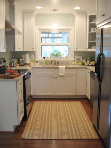
We knew that we wanted white cabinets and light marble-esque counters (they were actually granite) during the planning stages of that makeover back in 2007 – so we didn’t look to Nancy for much “style advice” during our 113 day kitchen reno. But she was truly invaluable when it came to space planning. She just knows how people use kitchens and where appliances should be placed to maximize function, and we fully believe that our first kitchen would have been half as useful if we didn’t have her free-with-the-purchase-of-cabinets advice when it came to where to squeeze in a dishwasher, relocate the fridge, and build in the microwave. Lesson learned: sometimes the pros know best. So take their advice whenever it’s free (and even when it’s not if you need it). You know, so you don’t DIY a kitchen all alone that’s semi-functional when you can DIY something twice as useful with some pro advice and a smidge of well-spent cash (assuming you can’t track down free services like those from HD or Lowe’s).
But back to our buddy Nancy. We actually kept in touch with her over the last three years since our big kitchen makeover in 07′ (she and Clara are practically BFFs). So she was sweet enough to offer to glance at a floor plan and a few photos of our current house’s kitchen to give us a little here’s-what-I-would-do advice. Second lesson learned: there are definite perks to staying in touch with any kitchen geniuses that you may encounter.
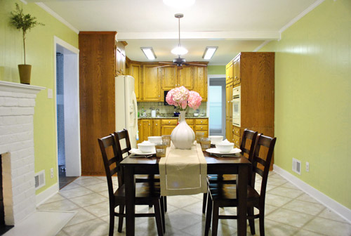
But first a little refresher. You’ll remember that the eat-in part of our kitchen currently looks like this:
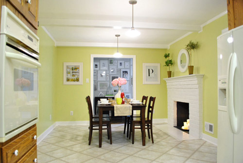
We’ve always planned to add a built-in island in place of the too-small dining table, just because when we knock out a huge doorway in the wall across from the fireplace to connect it to the dining room we thought two tables lined up through that opening would look odd (a big round one in the dining room and another one so nearby in the kitchen = crazytown).
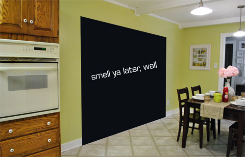
So we thought a big round table in the dining room and a smaller built-in island by the fireplace would make sense and be less “hello table, meet my friend, table.”
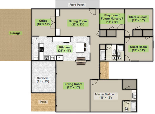
Here’s an old floor plan that we shared last November before we even moved, just to give you an idea of what we thought might work when it came to the island (with the new wide doorway to the dining room that we plan to add worked in there too):
Oh while we’re on the topic of someday dreams, we’d love to paint our cabinets white and craigslist our white, bisque, and black appliances and upgrade to stainless steel. When it comes to our counters, we plan to work with the granite that we have, but completely redo the backsplash for a crisper, lighter look. And those florescent tube lights and big brown fan? They gots to go.
While we’re rattling off things on the list, of course we’d love to redo the floors but aren’t sure if there’s hardwood running all the way under the entire kitchen that we can refinish (we know it runs under part of it, but haven’t confirmed all of it) or if we’ll have to just redo them with something new entirely. The challenge of that is that we’ve learned that our floor joists aren’t built strongly enough to hold the weight of stone or ceramic tile (I thought slate would be awesome in there, so yeah… le bummer). We’ve toyed with everything from lightweight cork to some sort of linoleum (Candice Olsen has done some surprisingly awesome kitchens with that on the floor) but we’re nowhere near a decision. We’ll keep you posted though.
But I digress (who’s surprised?). Back to our talk with Nancy Kulik and the big kitchen idea she came up with (pretty much on the spot because she’s cool like that). Are you ready? She looked at the new to-scale floor plan that we brought with us (and a few photos) and realized that something was wrong, wrong, wrong on our little whole-house floor plan (seen three photos back, which we did months ago in November). That something? The fireplace is almost in the corner of the room in real life. So the placement of the fireplace in that old floor plan is totally off.
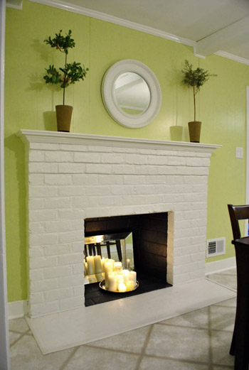
Thankfully it was drawn in the actual correct location in the newer kitchen-only floor plan that we brought with us to our Nancy meeting, but since it’s not actually centered on the wall (and practically kisses the door that leads to the hall), no island could be centered on it without nearly touching slash completely blocking that doorway (which we definitely want to keep open). So Nancy suggested something that we never would have thought of ourselves. And I mean never. Brace yourself. She proposed a floating L-shaped banquette that faces the fireplace and the frame wall.
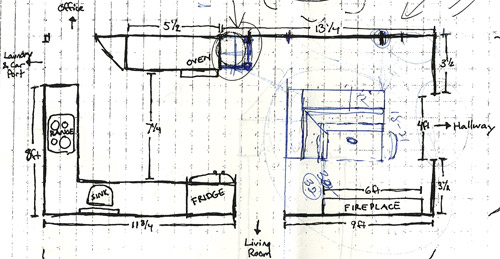
Note: don’t mind that vertical line that follows the back of the banquette to the door to the living room, she just dropped that in to tell us that we should line those things up- but the banquette wouldn’t be attached to anything, it would just float in the middle of the room to keep things open- just like an island would, but since it would face the fireplace in a way that an island wouldn’t it could make a lot more sense.
I’m not going to lie. Both of our first impressions were “thanks, but no thanks.” But as she further explained her vision we slowly started to come around. See, I’ve always adored the cozy-factor that is an L-shaped banquette. And if you search “banquette” some pretty cute images come up on google and Pinterest. A breakfast nook-ish type space like that might not be everyone’s cup of tea (there are definitely some die-hard island-lovers out there), but we actually thought it could be even cozier than our previously considered idea of an island. Especially because it would make sense of the off-centered fireplace in a way that an island never could (since it couldn’t ever be centered on it or lined up in any real way). So we took Nancy’s little scrap paper sketch home and taped out her floating L-shaped banquette idea on the floor:
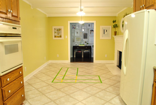
To explain what you’re looking at, the smaller L that’s being spooned by the bigger L would be the actual bench seating that faces the fireplace & the frame wall (which would make sense of the layout a bit more than a big floating rectangle that doesn’t line up with the fireplace at all). And the bigger L would be built-in cabinetry that wraps around the back of the bench seating to create a nice nestled nook that looks as good from the back and the side as the front (and provides a nice amount of concealed storage that’s accessible from the back, just like an island would have done).
As for the height, we thought keeping the tops of the cabinetry and the banquette seating the same height as the lower cabinets in the rest of the kitchen would make things feel cohesive and open (many of our inspiration images above have banquettes that are the same height as the base cabinets). And of course knocking out a huge 6 foot wide doorway to the dining room behind the banquette (which will have pretty cabinetry that faces the doorway so it looks good from behind) should keep the flow nice and airy – so nothing feels too boxed in.
I know it’s pretty much impossible to picture, so here’s John sitting at the fake banquette (although the table would be a smaller pedestal based thing, possibly square, oval, or even round – and possibly white or even a color, but probably not dark brown).
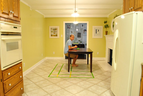
Note: we’ll have to move the lighting on this side of the room regardless of an island or banquette creation since it’s placed too far apart to make sense either way – and in the case of the banquette we’d center it over the table, not the seating (like many of the inspiration images).
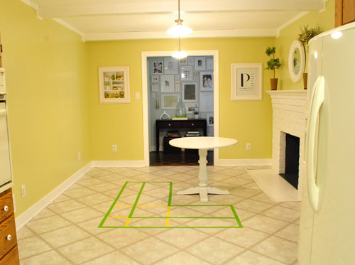
It’s admittedly still impossible to picture (and I would bet $20 that nearly everyone reading this is completely not sold on this idea), but here’s a round pedestal table tossed in there in case that helps the picture come together for a few of you (since our banquette table will definitely have a pedestal base to make maximum room for legs).
And here’s a lower square table (of course too low for a banquette, but this sized top might be right) to possibly help the vision come together a little more. As of now we’re both actually bigger fans of a rounded top – like the one above – but who knows where we’ll end up.
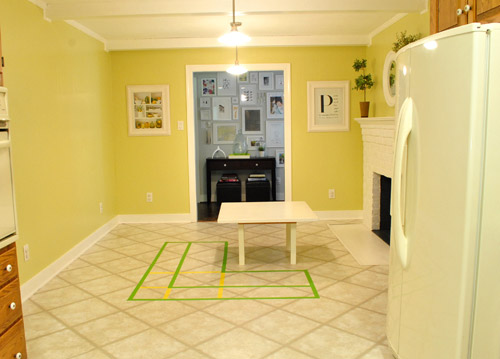
Who am I kidding. This probably doesn’t help anyone. And you all think we’re crazy to consider this. I know it. And we might be. But we’re excited enough about it to at least keep this idea on the table for now. Har-har.
See how the fireplace in the corner almost makes sense in that location with the cozy banquette facing it (which will be lined up with the doorway to the living room, so that doesn’t feel random either)? Nope. You still don’t see it. Haha. Well in person it actually has a lot of balance and makes considerably more sense than any island shape / placement that we’ve taped out on the floor over the last eight months (of which there have been many). We might just have to build our cabinet-backed banquette with cardboard or something to try to envision it further. Or use some serious photoshop magic to help picture it (the challenge is finding photos of the backs of banquettes since so many shots are looking into the L-shaped seating nook as opposed to looking over its shoulder from this angle).
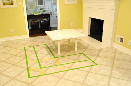
Oh and ignore the crazy white fireplace surround on the floor, since it seems to encroach and crowd the table waaaaay too much. When we redo the flooring in the room that’ll be remedied since we have plans to double side the fireplace down the road so you can peer into the living room through it (but will either make it gas or keep it completely inoperable so kiddo(s?) can crawl through the hole like it’s a secret passageway – so there won’t be a huge tile rectangle on the floor anymore).
I’ll leave you with this picture again, because it’s the one that makes my brain hurt the least when I try to picture things:

So all of this is to say that we taped off a crazy shape on the kitchen floor and we’re seriously considering some sort of cozy banquette-ish breakfast nook as opposed to a centered island with an off-centered fireplace nearby. It should be interesting. And the odds are that we’ll end up making some semblance of a decision someday. And we promise to keep you posted. Off to dip back into the aforementioned bedroom project and the office cabinet makeover. Ah DIY, you fickle friend. Maybe next week we’ll be less scattered. Who are we kidding? Probably not.

Katie @ Domestiphobia.net says
Yikes, this is like the 900th comment so not sure you’ll read it, but I just have to say that I LOVE the idea. I was sooo not a fan of the island you had in the first drawing (but didn’t want to say anything way back when you proposed it because I didn’t want to be *that* reader, you know?).
I think islands are hugely overrated. Many people told us to get an island instead of a peninsula, but it would’ve had to be suuuuper tiny and we now have so much more counter and storage space with the peninsula! You have to have a HUGE space for an island to make sense, and a cozy breakfast nook with a banquette in front of your fireplace would fit your space so much better than a crazy island away from everything. If you wanted to, you could even put a raised counter behind your banquette for stools instead of cabinets, but I think the cabinets would look nicer and would you really need seating *behind* seating? Probably not.
Nice choice! I’m totally sold.
Aubrey says
I am absolutely in love with this idea, especially after reading the follow up post. Cozy is the perfect word to describe a little family nestled in the nook on a cold day with a fire going, hot chocolate, and a board game. (Is it winter, yet?)! Please go through with this!! I can’t wait to see what happens! :)
Julie Anne says
LOOOOOOVE the banquette idea. It’s perfect.
I was never 100% sold on the island idea, but this – well, this had me at hello.
This is exactly what the room needs to make the future “wall hole” er, pass-through, work along with the fireplace, which I love and cannot get enough of. Plus you will still have a casual kitchen meal and craft table location, which will be super-important as the beanette grows and is joined by a sibling perhaps in the future.
And the new layout is lovely. No problems from a Windows 7, Explorer 9 user.
toni from says
Wow. I can’t believe you guys are considering a banquet. I never would have thought of that either, but now I am sold. It makes way more sense than an island (other than losing work space,) but let’s face it most people use islands to display stuff and to put a bunch of crap on….at least this way if you throw stuff on the table the back of the bench might hide it. LOL.
I would suggest researching fabric and durability of a banquet with kids. I somehow envision yogurt covered goldfish crackers stuck to the backs of beautiful pillows, what just my kids? Somehow that image doesn’t jive with laying back and relaxing with your coffee in the morning on your beautiful cushy banquet. LOL Congrats on stepping outside of the box and being open to a new idea. I know it will be great and you will figure out a way to make it durable for kids and beautiful at the same time…I am picturing a white oval table with turquoise and grellow pillows… with a variety of patterns, hmmmm. sounds lovely doesn’t it?
YoungHouseLove says
Haha- we’re definitely thinking about what sorts of fabrics we can use that will stand up to goldfish! Nancy actually said that a wooden banquette might be easier to slip in and out of (and we can add pillows with washable covers for softness) so that’s another option too!
xo,
s
Laura S. says
I like the pic of John at the banquette. I’d suggest glass fronted doors with shelves inside in the same finish as your kitchen cabinets with the same knobs. Cookbooks can be stored there, vintage kitchen utensils, etc.
I’d also suggest that the counter on the banquette match your kitchen counters.
Crystal says
I love the idea, but unfortunately don’t have the spatial skills to picture it. Can’t wait to see it come together though!
I have read before that you have no outside windows attached to your kitchen, do you get much in the way of natural light? Are you planning for a skylight or happy to live with the current lighting situation?
Just curious.
YoungHouseLove says
Once we open the doorway to the dining room (which has a huuge picture window) we hope the room will get a lot more light! If that doesn’t make much of a difference like we’re hoping, we’re definitely open to adding a skylight or two down the line!
xo,
s
LauraC says
Love the idea and the inspiration pictures. I’ve been trying to figure out a way to get one ourselves.
Malissa says
Do you all ever use Google Sketch up? It’s free and really pretty easy to use. When you download the software they direct you to free tutorials. Anyway, you might enjoy drawing you kitchen (or whole house) in it and drawing in the banquet to get an idea of how it could look.
They offer special drop ins and finishes so you can add your own wall color, paint your cabinets white and play with different types of flooring. They even have appliances.
PS I don’t work for Google, i am just an interior designer that doesn’t want to drop a couple grand on AutoCAD :)
YoungHouseLove says
Sounds like lots of fun! We’ll have to check it out.
xo,
s
Kate @ Savour Fare says
I have a banquette in my kitchen. I think it takes up too much space, but then (a) I’m a cook and you guys aren’t and b) your kitchen is bigger than mine. I do like sitting on it for casual kitchen dinners — we use it all the time.
You can see pictures here:
http://savour-fare.com/2011/05/16/kitchen-mini-reno-part-2-lighting-cushions/
YoungHouseLove says
Cute! I love hearing from folks who have them and use them all the time!
xo,
s
CLDesigns says
I love a cozy banquet – great for kids’ art projects and homework while mom/dad cook dinner – but I really don’t see the point of floating it in the room. Why not push it back against the wall opposite the fire place? The circulation path thru the kitchen won’t be hindered by the banquet, and you’ll still have a great view of the fireplace. You could then extend the cabinet run on the oven wall to the banquet. btw, how awesome is a fireplace in the kitchen? Just think about all your babies doing their homework together at that table with the fire going.
YoungHouseLove says
We just taped it out back there and it looked crazy in person. Like a person sitting on a sofa 15 feet across the room from a TV – just too separated and the whole space felt like all the “furniture” was against the wall. So we liked the idea of floating something. Still not sure where we’ll end up, but this is the idea we like most so far. We’ll keep you all posted!
xo,
s
buen says
I think closing the hallway entrance might balance the space. I know you guys like the frame wall´s view from the kitchen, but I think once you open the big entryway from the dining room, two entrances to the kitchen might be kind of too much, maybe? you could use the resulting wall to the left of the fireplace for installing some cabinetry, for example. It´s kind of late here in Spain so I don´t know if I am capable of getting my point across when I am about to pass out. I hope you guys got what I mean, I could throw in a sketch so you could see what I am talking about, hehe.
YoungHouseLove says
We thought a lot about closing that off and have decided for the time being we love it more than a 4′ closer wall that makes that hallway dark and closes in the kitchen more. But who knows what we’ll think when we blow out the doorway to the dining room…
xo,
s
kickymarcia says
Have you thought of demo’ing the fireplace?
Its placement is not ideal and really cuts off the traffic flow. Be careful to not create another hallway in your house. I have a back living room that is awkward because its really just 10′ wide, large hallway.
Then you could install a fireplace in the living room as a focal point on the backwall.
YoungHouseLove says
No way! We’re cuckoo for fireplaces. Haha. Our last house had two and we already miss the other one, so we have loved the idea of double-siding this on since day one. It’s nice architecture for a long (25′!) kitchen, and so cozy and looks great from the living room side of the house too.
xo,
s
Elaine says
I had to save photo #3. Love that!!! I see a kitchen redo in my (very distant) future….
tracy a says
you’ll be glad, no matter what you decide, that you can’t have tile flooring. my entire rental suite (which is lovely, in its own right) has tile floor…i have a 3 yr old and a learning-to-walk 9 month old. let’s just say a lot of dishes have been broken (a LOT) and a little bodies falling on such a hard surface get hurt! all that to say, buffet, island, whatever you decide, the tile won’t be missed! (or at least i wouldn’t miss it)
Audrey Walter says
I recently started a pin board titled “I’ve always wanted a banquette”!!! Love it!
YoungHouseLove says
Haha- I need one of those too! Maybe I’ll call mine “Batty for Banquettes.”
xo,
s
Sarah says
What if you left the side of the banquette facing the kitchen open without a cabinet on the backside of it? Then it would sort of be like a chaise lounge on that side of the banquette that people could sit on either way – facing the table/fireplace or the kitchen. A little bit like the end of this one – http://pinterest.com/pin/107207167/
YoungHouseLove says
That’s definitely another option! Not sure if we’ll be sad to lose the counter and storage along that side though. We’ll have to see where we end up!
xo,
s
Meg says
Totally can see it and I totally Love it!! Banquettes are my fav. Plus in front of a cozy fire? As Rachel Zoe would say, “it’s so mah-jor!”
Holly Austin says
Okay, I’m totally and completely on board with this idea! I only dream of banquette seating, and if there were any place for it in my house I’d have it. Love love love!!
eileen marie says
Love the new (blog)look! Can’t believe you didn’t think a controversial topic like this would cause a stir…and a crash! I personally love the idea-much more balanced! (It looks like it belongs, & I love banquettes!) For further functionality, would you consider putting a counter surface on the top of the cabinets like pic #3? Or would it look odd, so far removed from the rest of the kitchen, & lose functionality for that same reason? I just love that glass-topped table in pic #4 -definitely have my eye out for a 42″ glass top for our lil’ round pedestal now!
YoungHouseLove says
Oh yeah- we’d totally add a counter like the third inspiration room. Check out this afternoon’s post to see a little rendering which definitely helps us begin to picture it!
xo,
s
Kaitlin says
I totally think you should do it! It sounds like such a cozy and romantic little corner and really does make the corner fireplace make more sense. I’m a sucker for all that extra storage too! But seriously, can’t you see Clara chasing her friends round and round that little island nook? My siblings and I used to LOVE doing that as kids :)
YoungHouseLove says
Haha, one thing is for sure: Clara will be in love with it if we do it. I love picturing her standing on the banquette and facing the other way to “help us” at the counter behind it. So cute.
xo,
s
Miranda says
We just built banquette seating in our house using Ikea cabinets and we LOVE it!!!!
MaryBe says
I don’t have hours to read the comments, but I’m sure someone already said this – I love the idea, but did you want to be able to see the fireplace from the dining room? Or just the backs of the ‘you-already-said-they’d-be-pretty’ banquette benches?
YoungHouseLove says
You’ll see the fireplace mantel, but not the firebox (we’d have to keep that entire side of the room completely clear of anything for that to be seen from the dining room since it’s basically on the floor).
xo,
s
April says
Just wanted to drop in and say I can totally picture it, and I think it’ll be awesome. Go for it!
Maria says
I don’t know who thinks it’s crazy–I think it’s a great idea! A banquette seems like a sweet fit for the inviting and comfortable way you’ve decorated the rest of your home–and Sherry, can you IMAGINE how much fun you’d have with throw pillows?! Good luck whatever you decide.
Jennifer says
I’m not going to read through all of the comments but just wanted to say that I’m completely sold. LOVE the idea. I see cozy french toast mornings in the future.
Barbara says
OK Guys I guess we’ll just have to trust you on this one! I just can’t help thinking that the banquette makes more sense up against the wall you want to remove though. Did you give that possibility any thought?
YoungHouseLove says
Yup, but that wall has to come down! We can’t wait to be able to access the dining room from the kitchen, and making that huge opening to line up with the window in there will be so pretty from the moment you step in the door!
xo,
s
Christie says
I do like those banquet seating ideas you’ve shown, and I plan on having one someday!
Though, why not install an island that starts at the corner of that doorway and extends to the middle of the fireplace … just like the dimensions you’ve shown of the banquet. It sounds like the asymmetry of the fireplace and doorways is what is throwing your island plans off, and I think just go with it and make it an intentional part of your kitchen design. I guess what I’m saying is, if your first choice is an island but worry about asyemmetry, I think you can make that the most interesting detail of your kitchen.
Once I saw the most darling little craftsman bungalow with an asymmetrical porch. The actual gable was symmetrical, but the details were not. The entrance to the porch was from one side, not the front and the two porch roof support brackets differed. One was curved and one was not. I wish I had a photo to show you. Anyway, it showed me that something that limited the obvious actually made the design more successful.
But then again, I love the banquet, and your limitations with the off-centered fireplace may just be feeding into the new, creative, successful banquet idea!
Have fun deciding!
YoungHouseLove says
See, our first choice was an island but now we love the banquette idea so much more! So cozy and different and soft and all the things that we worried an island wouldn’t be (especially since the seating will be regular height and counter-height seating isn’t always great for wee ones until they get much bigger- so we think this works for the fam much more).
xo
s
Marty says
I also love the L-shaped banquette (and I’m crazy for the one on the cover of the Sept MS Living), but I’m not sure about the floating concept. Instead of a huge opening between the kitchen and dining rooms, have you thought about going with a smaller opening and lacing an L-shaped banquette on the long wall and the wall to the left of the existing doorway? (I haven’t read all the comments, and apologize if someone else already suggested this.) As a bonus, you could also put a nice reading chair by the fireplace….
YoungHouseLove says
Yup, we tried taping that off but it felt like everything in the room was pressed to the sides of the space and it was so far from the fireplace it felt like when you’re sitting in a big room too far from the TV. It’s hard to see online I think, but in person the room is really big (25 feet long!) and that big opening to the dining room will mimic a giant picture window in there (we want it to line up exactly) so it’s a gorgeous sight when you walk through the front door!
xo,
s
DEB says
IT REMINDS ME OF A COZY PUB .
YOU WILL LOVE IT…………AND SO WILL WE.
Leslie Ann says
“and I would bet $20 that nearly everyone reading this is completely not sold on this idea”
You lose $20, because I’m completely sold on it! It’s such an innovative way to deal with an odd, unsymmetrical space. I am a symmetry-lover, so any plan that results in good symmetry is usually a winner in my book! Plus it seems cozy :D
Tracy Mahmoud says
Round pedestal table all. the. way! I can totally feel the cozyness…so exciting!
Ali says
A banquette – why not? :) I have confidence that you would make it look nice. We are considering a banquette for our kitchen (likely down the line), but we’re going to wait until the kids get a little bigger so they don’t try to climb it all the time. :)
Jaime says
Unless I am reading this wrong, it seems that you plan a counter top height overhang off of the back. I think that is the perfect solution to wanting more counter space, especially with a little girl who is soon to be a big helper. It allows for the whole family to prep and prepare (thinking Christmas, Thanksgiving, birthdays etc) while not sacrificing the need for places to sit and eat, whether it be informal quick breakfast or overflow from the dining area. A pedestal table should make it feel less crowded. I think banquettes look nice, but in practice are kind of a pain with the person in the interior always asking to be let out- or at my grandparents house, sliding onto the floor and crawling under the table to get out. I think you are on the right track.
EngineerMom says
Have two small children, no time to read 900+ comments, so if this has already been mentioned, sorry!
I love the banquette idea, especially facing that fireplace.
My thought on seeing all the pictures and plans (and being an engineer, I had no problems visualizing!) – have you considered also widening the doorway that leads into the kitchen from the hallway? Not to the width of the wall, but just an extra-wide doorway? I think it would help with traffic flow around the banquette and also help that end of the room not feel closed-off.
YoungHouseLove says
Hmm, never thought about that, but it’s not a load bearing wall so it’s possible! Some folks are telling us to close that off (we so don’t walk a long dark hallway though) but you know we’re always down with knocking things down. Haha.
xo,
s
Ginny C. says
I came across your blog a few months ago and I’ve been stalking it daily ever since! Love it! I’m a kitchen/ bath designer and I had to chime in on your banquette idea. I love the idea of making it a cozy space next to the fireplace, but I would consider clipping the back corner on an angle or curving it to soften the back corner that faces the oven. That will be the high traffic side and will make the transition smoother. Keep up the great blogs! They are an entertaining way I start my day! :)
YoungHouseLove says
That’s definitely a possibility! Thanks for the ideas (you know we love kitchen and bath designers- haha).
xo,
s
Brandan WH says
Lord! You got some comments. Have nothing much to add except that I’m sure it will be great. Have fun!
Joanne F says
Love love love the idea! I wasn’t a fan of your island idea – I thought it wasn’t close enough to the business end of the kitchen to serve as counter space. It didn’t make sense to me. This really does. Maybe adding chairs or a bench to the layout would help see it (maybe with sheets draped over the back to give you some idea of the mass). And if L shaped soesn’t work maybe just facing the fireplace. Cool ideas!
Aleah says
I’ve been dying to have a banquet in our living/dining room (house is only 828 sq feet so everything has to be uber functional). I was thinking ikea kitchen cabinets after seeing someone blog about making a bench and custom making a cushion for the top. That seemed like too much commitment though, and after seeing your post yesterday somehow had an epiphany to use PB’s Bailey cubes (I’ve eyed them on Craigslist for over 6 months but didn’t know what I’d do with them). So last night I drove 3 hours in LA traffic to get 4 of them and will go get another from another seller today. It’s amazing! So cozy and inviting, and it will cost me about $200 total for 5 cubes. I can still move them for Christmas time (our tree goes in that corner) and I have added storage too! Thanks for the inspiration to go get something done!! I hope you enjoy your banquet once you figure it all out :)
Brittnee says
I absolutely LOVE the idea. I can picture the setup exactly so if you have doubts about its look just ask me later! lol. I think after you take off the wall and move the fireplace tiles in the front you will be good to go with the banquette idea because it will be (and feel) less crowded. Good luck with whatever your guys plans are! By the way, hows the neighborhood turning out?
YoungHouseLove says
The neighborhood is still looking pretty rough. Lots of trees still on roads and homes but some have been removed. Slowly but surely! We’re just all very thankful to have power again. Some other areas still don’t and they’re saying it might be another week.
xo,
s
Jamie says
Well, I might be crazy too but I really like the banquet idea. To me the fireplace alwasy seemed out of place since its in the kitchen/dining room. Fireplaces just scream comfort, hot chocolate, and book to me so sticking a comfy L shaped banquet in there seems perfect to me. It would feel very cozy and help to break up the long room. You could put cabinets/storage in the back side for extra room too. I love the idea. I hope y’all go with it.
Audrey says
I too love banquettes in kitchens, so much so that we included one when we renovated our kitchen 2 years ago. Our sort of “formal” dining room (in an old farm house nothing is really formal) is connected to our kitchen, but we use the banquette for most meals, coloring & projects for our two girls (ages 1 & 3). A contractor tried to talk me into an island with bar stools, but so glad we went this direction. We have storage in the benches and the table base is also a cabinet where we keep craft supplies!
Just a couple things you might want to think about… the inspiration pictures are beautiful, but some of them don’t seem really practical (the last one with the round bench, there’s no room for your legs). I had wanted to do an upholstered bench, but someone (our cabinet guy, I think) recommended starting with just a wood bench, easier to slide on and easier to clean. And after 2 years, with all the spills, crumbs, ect, so glad we didn’t pad it. My final tip, the space between the table bench; it sounds like your table will be movable, so I’m sure you’ll be fine, but we shift ours around quite a bit. Kids on one side, move the table closer to them; adults on the other side, move table farther away. So the overhang of the table, or lack there of… just something to think about.
I’m not a banquette expert, but hope that helps you or someone! I could probably dig up a picture of our kitchen if you like.
YoungHouseLove says
Thanks for the tips! I’d love to see pics of your banquette too! We’ll definitely leave the table movable Bd go with a pedestal so there’s nice leg room!
xo,
s
Margie says
Are you planning on doing a tiled backsplash this time around? I notice there is one in your inspiration picture. We are in the process of deciding on our backsplash right now to go with our painted white cabinets, black honed granite countertop and stainless appliances. I’m sold on white subway tile with gray grout, but my husband doesn’t love it. We are even thinking of including a stipe of black granite that matches our countertop so that it doesn’t look too white. Curious to hear if you guys have any ideas or suggestions that we should consider as you start to dream/plan for your kitchen.
YoungHouseLove says
We definitely hope to DIY a tile backsplash but have no idea what we’ll pick. Subway tile is up there on the list though!
xo,
s
Veronica says
I love the idea. I am not very good at envisioning things like this but it will probably look awesome. It will be so cozy. If you do go with a gas fireplace can u imagine winter nights sitting drinking hot chocolate infront of the fire. I am jealous :) can’t wait to see the completed kitchen.
SJ says
Love the blog redesign! And am 75% on board with the banquette idea. Can you repost the very last picture with the ‘See Ya Later wall’ labelled? That might help the doubters imagine the centered-ness of the banquette against 1)the doorway to the picture wall 2)the eventual kitchen to dining room passageway and 3)the off center fireplace.
SJ says
Nevermind! Just scrolled up on the page :)
jenn says
LOVE it. I think she is dead on in that it would make sense of the fireplace and give you a more casual but still beautiful eating space. Plus, what a great home for future homework-doing down the road. Fantastic. Can’t wait to see what you guys come up with.
Mrs. Plank says
Okay, I’m super late to this party, but that is the story of my life lately.
So, I just had to comment on this. I LOVE banquette’s, I really do. But I just can’t love this one(which really doesn’t matter, right:). My thought is that the limited traffic flow around such a large piece is going to drive you nuts, as well as all those corners.
So here’s my two cents: Do a built-in around the larger doorway (when you actually open it up) that mirrors the one in the dining room, i.e. tying the two rooms together. That solves the storage and can add extra counterspace. Then just go with a pedestal table and maybe softer seating around it.
The reality is you will do your most prep work close to your sink and stove. It’s very un-ergonomic to travel that distance to prep something when you could take one step left or right. Also, I know with kids and dogs the more open space the better and it is always a huge hassel when there’s a major object to manuever around. Like I said I DO love banquette’s, but they are not for everyone or every space.
Hope I don’t come off jerky, I just thought I’d add to the thought process :)
Best of luck on your choices, I know ya’ll will make the right one, you always do.
Laura Lea says
In my opinion, banquettes only work against windows and walls. I would really think long and hard (that what she said….he, he) before taking up so much space in your kitchen. Just looking at the size of the pictures/rendering from Amber, it looks like the banquette would only sit 3 people. I’m just thinking down the road when the Petersiks are 4 or 5 or 6 people…….. (I’m not trying to be snarky, I’m just trying to be constructive.)
BTW, love the new look!
YoungHouseLove says
We figure if we’re 5 or 6 folks we’ll sit as a family in the dining room (where there’s seating for 8) since there’s probably no way to comfortably sit 5-6 people in the kitchen (even with an island or table) without feeling super cramped. Thank goodness when we open the wall the big dining table will only be five steps away.
xo,
s
Joanna says
Just saw this and thought of your kitchen!
http://pinterest.com/pin/161279039/
Love reading your blog!
YoungHouseLove says
Obsessed! I love it!!
xo,
s
Stacy says
I love this idea! Absolutely brilliant. I too was concerned about the “hello table, meet my friend, table” issue when I saw your original plans. =) This is such a great solution to that problem. Add to that, the extra storage and coziness factor, I think this arrangement is a real winner. On my way to Home Depot to befriend a kitchen planner, putting on my 100 kw smile and taking a box of Dunkin’ Donuts with me. Lol!!
Lindsey says
I love banquettes!!!!! It’s a winner winner chicken dinner (or brunch) for me!
I also find it hilarious how involved we all get in your biznaz. Haha!