True to form, we’re all over the place over here. After switching up the ol’ blog design (and figuring out why the header was MIA for 20% of you – here’s hoping it’s back) we’ve also been plugging away at our $6 cabinet makeover but aren’t quite done with the painting/building-up process (here’s hoping we’ll have photos and lots o’ words to share early next week). But crazily enough, in the meantime we’ve also been doing some yard work, a random bedroom project, and have even started brainstorming the next phase of the kitchen. Hence this brain dump.
We’re still saving our pennies for things like new appliances to begin the next step of our slow & steady kitchen overhaul (remember when we upgraded the fireplace and wood paneling a little while back?). So as we wait for the bank account to say “sure, go buy a new wall oven that’s not bisque, and a new microwave that’s not black”, we thought meeting up with an old friend of ours to get a few kitchen ideas might be nice. Who is this mysterious old friend that we speak of? Why it’s Nancy Kulik, the lady who helped us plan our first kitchen makeover through Home Depot (they offer up Certified Kitchen Designers to help for free if you buy cabinets or counters through them, of which we got both).
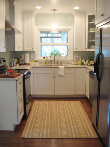
We knew that we wanted white cabinets and light marble-esque counters (they were actually granite) during the planning stages of that makeover back in 2007 – so we didn’t look to Nancy for much “style advice” during our 113 day kitchen reno. But she was truly invaluable when it came to space planning. She just knows how people use kitchens and where appliances should be placed to maximize function, and we fully believe that our first kitchen would have been half as useful if we didn’t have her free-with-the-purchase-of-cabinets advice when it came to where to squeeze in a dishwasher, relocate the fridge, and build in the microwave. Lesson learned: sometimes the pros know best. So take their advice whenever it’s free (and even when it’s not if you need it). You know, so you don’t DIY a kitchen all alone that’s semi-functional when you can DIY something twice as useful with some pro advice and a smidge of well-spent cash (assuming you can’t track down free services like those from HD or Lowe’s).
But back to our buddy Nancy. We actually kept in touch with her over the last three years since our big kitchen makeover in 07′ (she and Clara are practically BFFs). So she was sweet enough to offer to glance at a floor plan and a few photos of our current house’s kitchen to give us a little here’s-what-I-would-do advice. Second lesson learned: there are definite perks to staying in touch with any kitchen geniuses that you may encounter.
But first a little refresher. You’ll remember that the eat-in part of our kitchen currently looks like this:
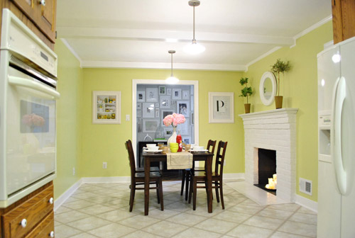
We’ve always planned to add a built-in island in place of the too-small dining table, just because when we knock out a huge doorway in the wall across from the fireplace to connect it to the dining room we thought two tables lined up through that opening would look odd (a big round one in the dining room and another one so nearby in the kitchen = crazytown).
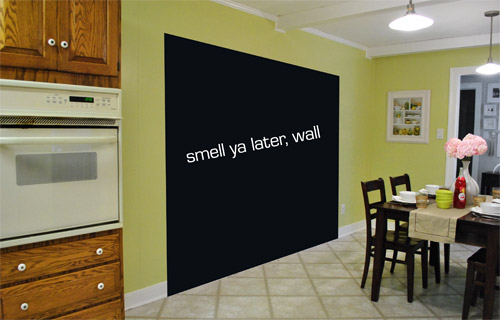
So we thought a big round table in the dining room and a smaller built-in island by the fireplace would make sense and be less “hello table, meet my friend, table.”
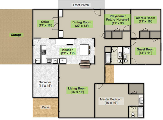
Here’s an old floor plan that we shared last November before we even moved, just to give you an idea of what we thought might work when it came to the island (with the new wide doorway to the dining room that we plan to add worked in there too):
Oh while we’re on the topic of someday dreams, we’d love to paint our cabinets white and craigslist our white, bisque, and black appliances and upgrade to stainless steel. When it comes to our counters, we plan to work with the granite that we have, but completely redo the backsplash for a crisper, lighter look. And those florescent tube lights and big brown fan? They gots to go.
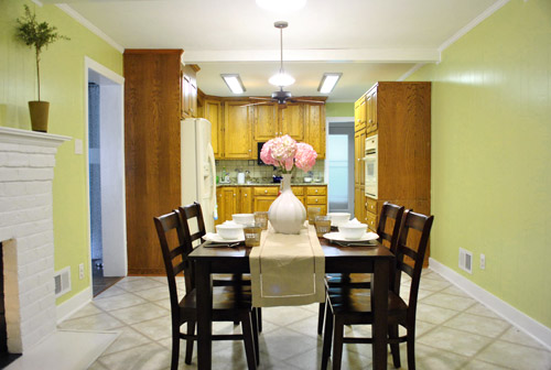
While we’re rattling off things on the list, of course we’d love to redo the floors but aren’t sure if there’s hardwood running all the way under the entire kitchen that we can refinish (we know it runs under part of it, but haven’t confirmed all of it) or if we’ll have to just redo them with something new entirely. The challenge of that is that we’ve learned that our floor joists aren’t built strongly enough to hold the weight of stone or ceramic tile (I thought slate would be awesome in there, so yeah… le bummer). We’ve toyed with everything from lightweight cork to some sort of linoleum (Candice Olsen has done some surprisingly awesome kitchens with that on the floor) but we’re nowhere near a decision. We’ll keep you posted though.
But I digress (who’s surprised?). Back to our talk with Nancy Kulik and the big kitchen idea she came up with (pretty much on the spot because she’s cool like that). Are you ready? She looked at the new to-scale floor plan that we brought with us (and a few photos) and realized that something was wrong, wrong, wrong on our little whole-house floor plan (seen three photos back, which we did months ago in November). That something? The fireplace is almost in the corner of the room in real life. So the placement of the fireplace in that old floor plan is totally off.
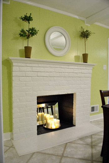
Thankfully it was drawn in the actual correct location in the newer kitchen-only floor plan that we brought with us to our Nancy meeting, but since it’s not actually centered on the wall (and practically kisses the door that leads to the hall), no island could be centered on it without nearly touching slash completely blocking that doorway (which we definitely want to keep open). So Nancy suggested something that we never would have thought of ourselves. And I mean never. Brace yourself. She proposed a floating L-shaped banquette that faces the fireplace and the frame wall.
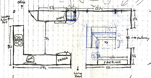
Note: don’t mind that vertical line that follows the back of the banquette to the door to the living room, she just dropped that in to tell us that we should line those things up- but the banquette wouldn’t be attached to anything, it would just float in the middle of the room to keep things open- just like an island would, but since it would face the fireplace in a way that an island wouldn’t it could make a lot more sense.
I’m not going to lie. Both of our first impressions were “thanks, but no thanks.” But as she further explained her vision we slowly started to come around. See, I’ve always adored the cozy-factor that is an L-shaped banquette. And if you search “banquette” some pretty cute images come up on google and Pinterest. A breakfast nook-ish type space like that might not be everyone’s cup of tea (there are definitely some die-hard island-lovers out there), but we actually thought it could be even cozier than our previously considered idea of an island. Especially because it would make sense of the off-centered fireplace in a way that an island never could (since it couldn’t ever be centered on it or lined up in any real way). So we took Nancy’s little scrap paper sketch home and taped out her floating L-shaped banquette idea on the floor:
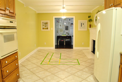
To explain what you’re looking at, the smaller L that’s being spooned by the bigger L would be the actual bench seating that faces the fireplace & the frame wall (which would make sense of the layout a bit more than a big floating rectangle that doesn’t line up with the fireplace at all). And the bigger L would be built-in cabinetry that wraps around the back of the bench seating to create a nice nestled nook that looks as good from the back and the side as the front (and provides a nice amount of concealed storage that’s accessible from the back, just like an island would have done).
As for the height, we thought keeping the tops of the cabinetry and the banquette seating the same height as the lower cabinets in the rest of the kitchen would make things feel cohesive and open (many of our inspiration images above have banquettes that are the same height as the base cabinets). And of course knocking out a huge 6 foot wide doorway to the dining room behind the banquette (which will have pretty cabinetry that faces the doorway so it looks good from behind) should keep the flow nice and airy – so nothing feels too boxed in.
I know it’s pretty much impossible to picture, so here’s John sitting at the fake banquette (although the table would be a smaller pedestal based thing, possibly square, oval, or even round – and possibly white or even a color, but probably not dark brown).
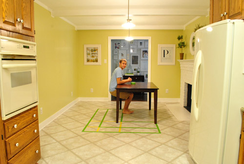
Note: we’ll have to move the lighting on this side of the room regardless of an island or banquette creation since it’s placed too far apart to make sense either way – and in the case of the banquette we’d center it over the table, not the seating (like many of the inspiration images).
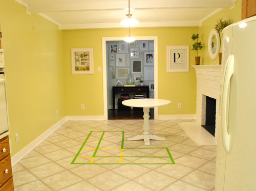
It’s admittedly still impossible to picture (and I would bet $20 that nearly everyone reading this is completely not sold on this idea), but here’s a round pedestal table tossed in there in case that helps the picture come together for a few of you (since our banquette table will definitely have a pedestal base to make maximum room for legs).
And here’s a lower square table (of course too low for a banquette, but this sized top might be right) to possibly help the vision come together a little more. As of now we’re both actually bigger fans of a rounded top – like the one above – but who knows where we’ll end up.
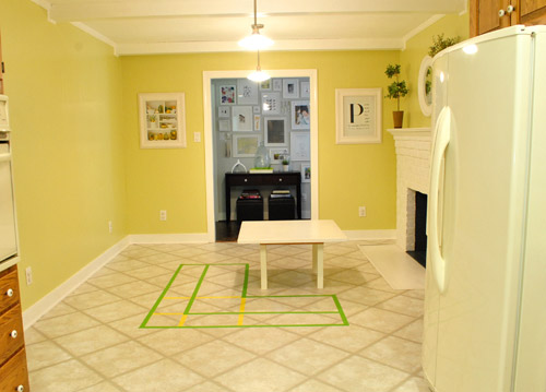
Who am I kidding. This probably doesn’t help anyone. And you all think we’re crazy to consider this. I know it. And we might be. But we’re excited enough about it to at least keep this idea on the table for now. Har-har.
See how the fireplace in the corner almost makes sense in that location with the cozy banquette facing it (which will be lined up with the doorway to the living room, so that doesn’t feel random either)? Nope. You still don’t see it. Haha. Well in person it actually has a lot of balance and makes considerably more sense than any island shape / placement that we’ve taped out on the floor over the last eight months (of which there have been many). We might just have to build our cabinet-backed banquette with cardboard or something to try to envision it further. Or use some serious photoshop magic to help picture it (the challenge is finding photos of the backs of banquettes since so many shots are looking into the L-shaped seating nook as opposed to looking over its shoulder from this angle).
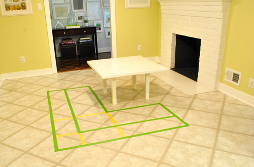
Oh and ignore the crazy white fireplace surround on the floor, since it seems to encroach and crowd the table waaaaay too much. When we redo the flooring in the room that’ll be remedied since we have plans to double side the fireplace down the road so you can peer into the living room through it (but will either make it gas or keep it completely inoperable so kiddo(s?) can crawl through the hole like it’s a secret passageway – so there won’t be a huge tile rectangle on the floor anymore).
I’ll leave you with this picture again, because it’s the one that makes my brain hurt the least when I try to picture things:

So all of this is to say that we taped off a crazy shape on the kitchen floor and we’re seriously considering some sort of cozy banquette-ish breakfast nook as opposed to a centered island with an off-centered fireplace nearby. It should be interesting. And the odds are that we’ll end up making some semblance of a decision someday. And we promise to keep you posted. Off to dip back into the aforementioned bedroom project and the office cabinet makeover. Ah DIY, you fickle friend. Maybe next week we’ll be less scattered. Who are we kidding? Probably not.

SingleMama says
I think it would look so cute! I love the breakfast nooks and wish I had enough room for one!!
bridget b. says
i like your taping method to get an idea of the size of furniture in a room. i have to remember to try that next time i’m placing furniture.
i think the banquette is a neat idea, but even though the footprint fits the space, i wonder whether it might seem bulky and take up too much visual space in the middle of a room (if that makes sense). is there a way to simulate the height of the finished product.
pretty much everything you guys try turns out golden, so i’m sure that it will end up looking great and i’ll love the final product!
Kristen says
Love the banquette idea. Definitely a multi-tasking use of the space! You snagged some gorgeous inspiration photos to get you started, too. The new blog design looks great, too!
Kristen @ Popcorn on the Stove says
I’m not entirely sold on the banquet. I think it may break up some of the movement in the kitchen (if your family is like mine in that they all hang out in the kitchen when they visit). Maybe you could rearrange the way the kitchen is set up and make an L counter into the area where the dining area is? Basically mirror the range to where the fridge is. Does that make any sense?
PS – for some reason, I don’t see your post when they actually go up. It’s like it’s delayed. Even on my Google Reader.
YoungHouseLove says
There are definitely some other options out there, so this is just our first brain dump. Who knows where we’ll end up!
xo,
s
Cali says
I see the new header! Love it! as for the bench, I don’t know how I feel about that…
Pamela says
I totally “see” the banquette. The only thing I dislike about them is sliding my butt into the corner. Can the back be wide enough to be used for buffet service?
YoungHouseLove says
Yup, I think we’d use upper cabinets so it might be 12′ wide. Which would work for small plates and cups, etc. Anything deeper would crowd the room according to Nancy- and she knows everything! Haha.
xo,
s
sarah says
I love the idea!!! I really love that third inspiration photo with the counter top on the back…it would give you a spot to place things during a dinner party!
Meghan says
The banquette would be SUPER cozy!! Love love love!
Also, really digging the blog update! It’s so fresh and fun, without being too overwhelming. Well done, youngsters! xo
Heather says
I think that this is a great Option especially if you go with the same style as your cabinetry-I didn’t look at the floor plan but you may be able to even build an island on the back facing the kitchen like your banquet inspiration picture #3 shows… Just an idea. Sometimes I am so ready for your house to be done, but then I realize how long your last one took. It really helps me with my own new house redo to remind me that “Rome wasn’t built in a day”!
Katie says
I do like the banquet idea. But, like poster John above, I wish you could make it work so that the people sitting on it could face the kitchen area and not the hallway. That way, when y’all are cooking, they can see you, or when Clara is sitting there working on a puzzle or picture or homework one day, she can see y’all in the kitchen while you are multitasking away. Is there a way to make it work?
YoungHouseLove says
We’re definitely going to do our best to consider every last option before making a decision! I guess right now the way we sit at the table we don’t face the kitchen (Clara faces the hallway and we face each other next to her) so it’s not so bad if we end up that way for us, but we can see how other people might prefer a different layout! We’ll have to see where we end up.
xo,
s
bridget b. says
p.s. what does the yellow tape in the pictures represent?
YoungHouseLove says
That just represents that we started taping with yellow and realized you couldn’t see it so we switched to green and only went over the areas that were most important (the two spooning Ls). Haha.
xo,
s
Madeline says
I love the idea of the banquette! Actually, to be honest I did not even know that was called a “banquette”. Sounds cozy and something you would see in a “very expensive, who lives in these amazing homes” picture in a magazine. Love your blog, I look forward to your post each morning and love to see what you guys are doing. On another random note, did you donate your hair, Sherry, when you got it cut? Loved your ponytail but your new haircut is really cute!
YoungHouseLove says
I wish! I was a few inches shy. I donated it a few years back though (right after the wedding when I chopped off even more).
xo,
s
Michele says
Also, the post shows 41 comments, but when I click on “41,” it changes to 17.
YoungHouseLove says
It’s just a computer chache-ing thing. In layman’s terms, it just takes some time for the comments to “catch up.” I’m working as hard as I can to get through the pending ones too (there are currently over 160 waiting to be approved). Lots of questions today!
xo,
s
Katie Carroll says
First off…love the banquette idea!
Second…I’m using the most up to date Firefox (just updated today) on a PC and have no problems at all with the blog. I can see the header and all the pictures.
Kelly says
I love the look of the blog! So light and airy just like your house…it’s great. And, by the way, I totally love the idea of the banquette. It’s so cozy and makes me wish for just a minute that I could live in a cold place just so that I could make use of a fireplace like that. It just wouldn’t be as practical here in Phoenix :)
Bboss says
Banquettes also make great homework spaces. Don’t think for a minute that your child will do their homework sitting at a desk in their room by themselves.
YoungHouseLove says
Amen! That’s what I was hoping.
xo,
s
Jason says
I like the banquette idea very much – I think it would even be cool if the countertop on top of your cabinetry that is the back of the banquette was extended out far enough to put a few bar stools under. Even if you did 2 bar stools on just the side facing the kitchen that could be cool. That side could even have a different height counter if necessary. You can call it an Islandette lol!
YoungHouseLove says
Haha, an islandette. Always another possibility!
xo,
s
t.d. says
Totally genius- Islandette, I sort of had a similar thought process. If this is considered, one may want to question the storage under the ‘table’ extension (as you may duck under the ‘table’ to reach the storage).
Banquettes can be quite cozy especially by a fireplace, so charming in the few restaurants I’ve witnessed!
Vanessa says
Interesting idea. My thought would be that when you do take down that wall, if you are sitting at the banquet your backs will be to the other room. When I heard your idea of an island I saw it as a conversation area with stools so people could sit and chat while you chop organic tomatoes. Very you.
Personally I am not a fan of banquets because it feels like everyone is on top of one another and bumping elbows when you eat. It’s like always sitting in a booth when you go to a resturant.
I am sure whatever you guys do will be fantastic. We all know that Burger and Clara make the final call anyway.
Allyn says
I kinda love that you’re doing something so untraditional. WHy not make it a cozy fun space?
ALso? I love that Clara has friends at Home Depot and Lowe’s. I grew up with parents who were ALWAYS dragging us to the hardware/home improvement stores to fix up our old 1915 house. I actually grew to almost hate those stores for a while just because I knew that going in=not coming out for what felt like days.
Now, of course, the hubs and I are there all the time. Sigh. Full circle. I’m officially becoming like my parents.
Brianne says
LOVE the banquette idea so much more than the typical island that isn’t in the center of the kitchen. This makes so much more sense in the space.
Sarah says
This is a great idea! To be honest, I always kind of scratched my head at the idea of an island sitting off by itself (usually they’re in some way tied in spacially to the cooking area). Didn’t want to be a rude debbie downer since it’s your house, and it has to work for you, not me :-). A bench in front of the fire like this would be so cosy – much more so than I’d imagine sitting on a stool looking over a countertop at it would be. Also, it seems like kids looove built in benches, vs. worrying about small folk tipping off a high bar stool while you try to eat breakfast together. I’m curious to see what things look like if you go with it!
Meredith says
I can totally picture it! I love the idea :-) Would you continue the same countertops from your kitchen onto the counters behind the seating?
YoungHouseLove says
Not sure yet!
xo,
s
SALLY says
Hi Guys-
Just wanted to know how you guys found out that your kitchen floor wasn’t strong enough to hold the dreamy slate! :o)
Thanks!!
YoungHouseLove says
The previous owner told us. So glad for the intel! Apparently they had it structurally checked out a while back.
xo,
s
t.d. says
Would the structural issues cause issues with a -presumably- heavy banquette?
YoungHouseLove says
Great question. Tthe part that’s apparently not as reinforced is the area where the room used to be two rooms (which is the space between the fridge and the wall oven). Whew.
xo,
s
mary says
What an interesting idea… I am a little concerned about the squish factor with a family of four in that space. There isn’t much clearance in front of the fireplace. I also think banquettes look best against a window/cabinet/tall wall. But you guys always know best. I love the new blog look. Wonderful.
Leila says
I think this idea is brilliant. When I saw the sketch, I was like, OF COURSE! I thought the original island idea was a little funny (since it would be disconnected from the actual kitchen prep area), so I’m on board with this idea. The banquette might be a little petite but will add a lot of good cozy seating!
Jenn(ifer) @ heim-elich says
I love that idea!
Maybee you can try visualizing it with the ikea kitchen planner…
I also love your new Background!
Megan says
I love, love, love it! Cozy seating in front of a fireplace should be a given! Please do it!
Lisa says
I love it! Nancy is a genius. It just totally makes complete sense and I think it will function well and add that cozy, homey-vibe. Get on with it already! (just kidding. you guys are amazing!)
Stephanie says
I love the banquette idea. You would still keep the round dining table right? I’d be all for more seating for guests and like you said, a table for Clara to hang out at and do homework in a few years!
YoungHouseLove says
Of course! We love that thing.
xo,
s
Meg @ La Vie En Rose Events says
Love this idea. Plus, banquette = another place for your throw pillows to live!! Pillows on an island = notsomuch.
Jamie M says
Ive never seen a floating banquette before, so im nervous about how that would look! But I trust you guys to make it beautiful!
Alli R says
Hey YHL!! Love the new idea! What are you going to use the counter space for on your new L shape banquette?
YoungHouseLove says
Not sure yet! We’ll keep you posted though!
xo,
s
Colleen says
What a great idea! While the banquette will probably give you a nice cozy feel on a daily basis, I wonder if it will help you achieve your ultimate goal. As the members of the family that often host the large gatherings, I would suggest that you revisit your initial idea about some sort of island configuration. We have an island that over the years has earned it weight in gold — serving as buffet during mealtime and the landing spot for dirty dishes after the meal. Given the fact that you are also planning to tear down that wall, your set-up makes me a bit jealous! Clara is just a peanut now, but as the mom to two teenagers, I would also counsel you to think ahead to homework, large school projects, craft projects, and cooking/baking with her as she grows. Some of our fondest day-to-day memories have been made around our island. Happy planning!
YoungHouseLove says
Thanks for the tips Coleen! We’re definitely also considering things like where we can set out food as a buffet (we’re planning to add a big buffet next to the door in the entryway that is in the dining room) and where we can seat people (the island probably would have had the same amount of seating as the banquette). Nothing is certain yet though- who knows where we’ll end up!
xo,
s
malibou says
I love banquettes and am constantly trying to tweak things to make one fit. Maybe I need to come see Nancy.
Oh, and FYI, I can’t see the header either.
Dana Y says
Absolutely fabulous. I’m admittedly biased…as I am a long-time member of team banquette. I do hope you go with it. It will be soooo cozy and its going to make that space seem so purposeful and cohesive! haha i’m entirely too excited about your home. I need to focus less attention on yours and more on mine. Everything is looking great, btw. On a side note, I watched the “Clara’s first year” video, and I got choked up. I’m sure some of that had to do with our new little baby, but It’s super duper well-done. Oh, and she’s beyond adorable. Cheers!
Kathi says
Love the banquette idea. I wonder how it would look with the L flipped the other direction so it faces the kitchen? That way diners don’t have their backs to the kitchen.
YoungHouseLove says
If we flipped the L it wouldn’t nestle the fireplace and make sense of the layout, so we’re weary to do that. We might try a few renderings or cardboard arrangements to be sure though!
xo,
s
gk says
it’s wary, not weary. wary = cautious; weary = tired.
i’m sorry. i’ve seen a bunch of people make this mistake in the past few days and am finally caving into my grammar police tendencies.
really like the banquette idea! but it helps that i was never sold on the island :) i think the banquette will serve the same purpose but be cozier w/ the fireplace. i also like the idea of leaving the side facing the kitchen cabinet-free, more like a chaise lounge. would help the kitchen-to-table flow.
alg says
YES! YES! YES! YES! YESYESYES!!!!!!
That is fan-freaking-tastic!!! You should kiss Nancy square on the mouth!!!
The view of the banquette/fireplace through the new dining-room doorway? Will. Be. Stunning.
And even moreso when you make that fireplace two-sided… Ah… envisioning it with ease and joy :) :) I say do it!!!
YoungHouseLove says
Aw, your description of that view just made me giddy. Can’t wait to see where we end up!
xo,
s
ellis says
Actually……. I never ever ever EVER could picture an island in there- it seemed to me like it’d feel really far removed from the kitchen, mainly because islands are normally right in the midst of it. I lovvvvvvve this idea! It still gives you storage and more counter space while serving a more individual purpose as well and embracing the fireplace. So- not sure how it’ll shake out in the comments, but no “y’all totally might not get this vision” hedging needed for me. I. Love. This. Idea.
And by the way- how awesome to be Nancy Kulik! Did she know she’d be showing up today? I have a feeling her phone will be ringing off the hook.
YoungHouseLove says
Haha- it’ll be a surprise!
xo,
s
Jane @ The Borrowed Abode says
Viewing in Firefox, and I can see the fab new header . . . but none of the photos are loading. It’s been about 5 min and the little circle is still spinning that indicates that the page is still loading. . . not sure what’s slowing it down. Anyway, just wanted to let you know. Not complaining! :)
YoungHouseLove says
So sorry! We didn’t change anything about how our photos are hosted (they’re over on amazon.cloud, where they’ve been for the past three years) so maybe they’re just having a glitch or your anti-virus software is blocking them (sometimes that happens out of the blue). Wish we could help!
xo,
s
pam says
i LOOOOVE the idea of a banquette! so cozy! i have plans for one….one day ;)
mandyk says
i LOVE the idea of the L-shaped banquet in front of your fireplace… it makes so much sense! and i love the coziness factor of it, too. totally go for it.
Brenda says
I love it too! It will be a great view from the dining room. I see as a cozy spot in the winter to hang out in (I love fireplaces so I would totally make it functional) and play games. The table should definitely be big enough to spread out a game board or a puzzle even.
Ellen says
I keep picturing something like this instead of a banquet.
http://img2.timeinc.net/toh/i/g/0108_space_savers/gertrude_settee.jpg
It could center on the fireplace, be upholstered in some fun fabric, and provide you with a ton of other options. But lately, I have been obsessed with incorporating comfy seating in the kitchen, since that’s where we all end up anyway.
This post has my pea brain churning!
YoungHouseLove says
Totally another possibility!!
xo,
s
ROK says
Technically, blog looks good here at work IE.
Love the banquette. Not sure about keeping the fireplace functional, but otherwise seems good. I have kids, and counter-height eating isn’t so good for them so I think the banquette will serve you better for informal eating.
But don’t be afraid to lose the fireplace…esp if its cramping your style.
Mandy says
I actually love the idea of the banquette. I’ve always loved to sit in the back corner of those! :) I agree that it would make more sense and be more cozy than a floating island.
Sarah says
I think that could be so sweet and cozy. Not to mention – unique! I’m team banquette :)
Sarah says
Oh…and you can put more pillows somewhere!!
Amanda says
You are right about not being sold on the banquette. Those inspiration pictures are great, but wouldn’t you just love a big open area of counter space that only an island can provide for prepping food?
YoungHouseLove says
My chef (John) claims that he has more than enough counterspace in the kitchen part of the room and wouldn’t bother walking to the other side of the space to chop stuff. Haha.
xo
s
Devon @ Green House, Good Life says
Wait…so it’s just going to be the banquette? Without any counter space above? I was reading the double-L’s as the banquette (smaller L) hugged by the cabinets with a counter on top for that extra work space you want (and maybe even a bar-type ledge). No?
Devon @ Green House, Good Life says
…kind of like the third inspiration pic (but probably not full-depth cabinets).
YoungHouseLove says
Yes, it’ll be a banquette with a table in front of it and cabinetry that spoons it from behind (the bigger L) – so that will have a countertop and create a work space/ ledge!
xo,
s
Amanda says
I LOVE THAT IDEA!!! I’ve wanted to do some banquette seating in my kitchen/dining room for a while now, just haven’t came up with a plan we’re happy with yet.
Charles says
Banquettes look cool, and I have absolutely no doubt that the end-result chosen will be unbelievably spectacular (very few things I read on this blog are NOT spectacular!).
Though Sherry hit the nail, spot-on: “might not be everyone’s cup of tea”.
My parents have a banquette and we fight to this day (when we visit) about who HAS to (not ‘gets to’) sit in the corner of the banquette. Inevitably whomever has to sit there will have to go to the restroom or leave early or whatever, and everyone else has do the bunny hop to move out from the table without knocking the table senseless & spilling drinks, etc. There’s more argument over who ‘gets to’ sit at the normal chairs on the opposite side of the banquette (so we can eat in peace!)
Burger will love the banquette (long bench, table height…what’s not love?)!! Guaranteed Kid giggles & funny pictures!!!
Again, whatever the outcome of the design you choose – it’ll undoubtedly be magazine-cover picture perfect!!!!!