True to form, we’re all over the place over here. After switching up the ol’ blog design (and figuring out why the header was MIA for 20% of you – here’s hoping it’s back) we’ve also been plugging away at our $6 cabinet makeover but aren’t quite done with the painting/building-up process (here’s hoping we’ll have photos and lots o’ words to share early next week). But crazily enough, in the meantime we’ve also been doing some yard work, a random bedroom project, and have even started brainstorming the next phase of the kitchen. Hence this brain dump.
We’re still saving our pennies for things like new appliances to begin the next step of our slow & steady kitchen overhaul (remember when we upgraded the fireplace and wood paneling a little while back?). So as we wait for the bank account to say “sure, go buy a new wall oven that’s not bisque, and a new microwave that’s not black”, we thought meeting up with an old friend of ours to get a few kitchen ideas might be nice. Who is this mysterious old friend that we speak of? Why it’s Nancy Kulik, the lady who helped us plan our first kitchen makeover through Home Depot (they offer up Certified Kitchen Designers to help for free if you buy cabinets or counters through them, of which we got both).
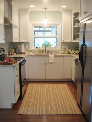
We knew that we wanted white cabinets and light marble-esque counters (they were actually granite) during the planning stages of that makeover back in 2007 – so we didn’t look to Nancy for much “style advice” during our 113 day kitchen reno. But she was truly invaluable when it came to space planning. She just knows how people use kitchens and where appliances should be placed to maximize function, and we fully believe that our first kitchen would have been half as useful if we didn’t have her free-with-the-purchase-of-cabinets advice when it came to where to squeeze in a dishwasher, relocate the fridge, and build in the microwave. Lesson learned: sometimes the pros know best. So take their advice whenever it’s free (and even when it’s not if you need it). You know, so you don’t DIY a kitchen all alone that’s semi-functional when you can DIY something twice as useful with some pro advice and a smidge of well-spent cash (assuming you can’t track down free services like those from HD or Lowe’s).
But back to our buddy Nancy. We actually kept in touch with her over the last three years since our big kitchen makeover in 07′ (she and Clara are practically BFFs). So she was sweet enough to offer to glance at a floor plan and a few photos of our current house’s kitchen to give us a little here’s-what-I-would-do advice. Second lesson learned: there are definite perks to staying in touch with any kitchen geniuses that you may encounter.
But first a little refresher. You’ll remember that the eat-in part of our kitchen currently looks like this:
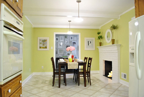
We’ve always planned to add a built-in island in place of the too-small dining table, just because when we knock out a huge doorway in the wall across from the fireplace to connect it to the dining room we thought two tables lined up through that opening would look odd (a big round one in the dining room and another one so nearby in the kitchen = crazytown).
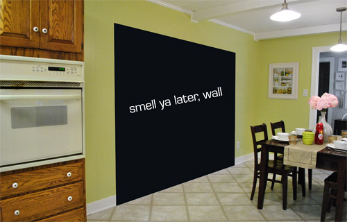
So we thought a big round table in the dining room and a smaller built-in island by the fireplace would make sense and be less “hello table, meet my friend, table.”
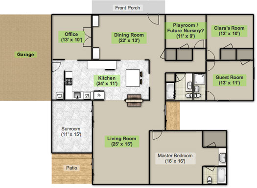
Here’s an old floor plan that we shared last November before we even moved, just to give you an idea of what we thought might work when it came to the island (with the new wide doorway to the dining room that we plan to add worked in there too):
Oh while we’re on the topic of someday dreams, we’d love to paint our cabinets white and craigslist our white, bisque, and black appliances and upgrade to stainless steel. When it comes to our counters, we plan to work with the granite that we have, but completely redo the backsplash for a crisper, lighter look. And those florescent tube lights and big brown fan? They gots to go.
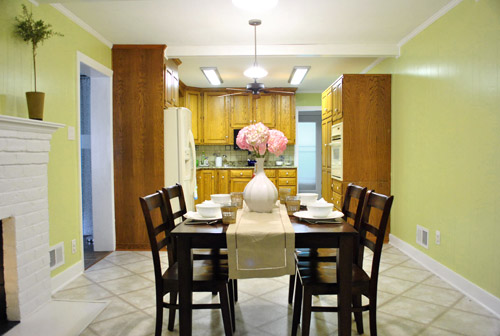
While we’re rattling off things on the list, of course we’d love to redo the floors but aren’t sure if there’s hardwood running all the way under the entire kitchen that we can refinish (we know it runs under part of it, but haven’t confirmed all of it) or if we’ll have to just redo them with something new entirely. The challenge of that is that we’ve learned that our floor joists aren’t built strongly enough to hold the weight of stone or ceramic tile (I thought slate would be awesome in there, so yeah… le bummer). We’ve toyed with everything from lightweight cork to some sort of linoleum (Candice Olsen has done some surprisingly awesome kitchens with that on the floor) but we’re nowhere near a decision. We’ll keep you posted though.
But I digress (who’s surprised?). Back to our talk with Nancy Kulik and the big kitchen idea she came up with (pretty much on the spot because she’s cool like that). Are you ready? She looked at the new to-scale floor plan that we brought with us (and a few photos) and realized that something was wrong, wrong, wrong on our little whole-house floor plan (seen three photos back, which we did months ago in November). That something? The fireplace is almost in the corner of the room in real life. So the placement of the fireplace in that old floor plan is totally off.
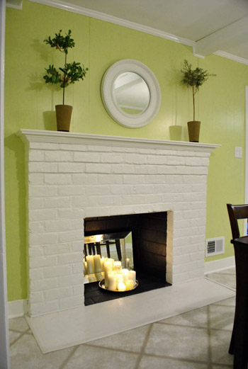
Thankfully it was drawn in the actual correct location in the newer kitchen-only floor plan that we brought with us to our Nancy meeting, but since it’s not actually centered on the wall (and practically kisses the door that leads to the hall), no island could be centered on it without nearly touching slash completely blocking that doorway (which we definitely want to keep open). So Nancy suggested something that we never would have thought of ourselves. And I mean never. Brace yourself. She proposed a floating L-shaped banquette that faces the fireplace and the frame wall.
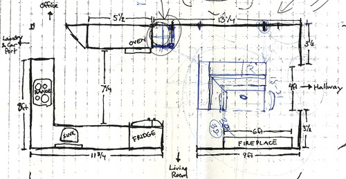
Note: don’t mind that vertical line that follows the back of the banquette to the door to the living room, she just dropped that in to tell us that we should line those things up- but the banquette wouldn’t be attached to anything, it would just float in the middle of the room to keep things open- just like an island would, but since it would face the fireplace in a way that an island wouldn’t it could make a lot more sense.
I’m not going to lie. Both of our first impressions were “thanks, but no thanks.” But as she further explained her vision we slowly started to come around. See, I’ve always adored the cozy-factor that is an L-shaped banquette. And if you search “banquette” some pretty cute images come up on google and Pinterest. A breakfast nook-ish type space like that might not be everyone’s cup of tea (there are definitely some die-hard island-lovers out there), but we actually thought it could be even cozier than our previously considered idea of an island. Especially because it would make sense of the off-centered fireplace in a way that an island never could (since it couldn’t ever be centered on it or lined up in any real way). So we took Nancy’s little scrap paper sketch home and taped out her floating L-shaped banquette idea on the floor:
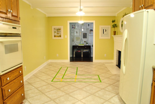
To explain what you’re looking at, the smaller L that’s being spooned by the bigger L would be the actual bench seating that faces the fireplace & the frame wall (which would make sense of the layout a bit more than a big floating rectangle that doesn’t line up with the fireplace at all). And the bigger L would be built-in cabinetry that wraps around the back of the bench seating to create a nice nestled nook that looks as good from the back and the side as the front (and provides a nice amount of concealed storage that’s accessible from the back, just like an island would have done).
As for the height, we thought keeping the tops of the cabinetry and the banquette seating the same height as the lower cabinets in the rest of the kitchen would make things feel cohesive and open (many of our inspiration images above have banquettes that are the same height as the base cabinets). And of course knocking out a huge 6 foot wide doorway to the dining room behind the banquette (which will have pretty cabinetry that faces the doorway so it looks good from behind) should keep the flow nice and airy – so nothing feels too boxed in.
I know it’s pretty much impossible to picture, so here’s John sitting at the fake banquette (although the table would be a smaller pedestal based thing, possibly square, oval, or even round – and possibly white or even a color, but probably not dark brown).
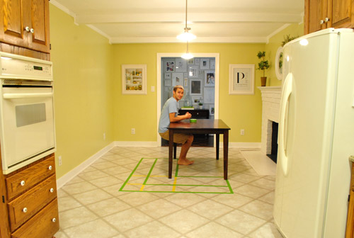
Note: we’ll have to move the lighting on this side of the room regardless of an island or banquette creation since it’s placed too far apart to make sense either way – and in the case of the banquette we’d center it over the table, not the seating (like many of the inspiration images).
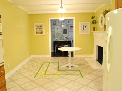
It’s admittedly still impossible to picture (and I would bet $20 that nearly everyone reading this is completely not sold on this idea), but here’s a round pedestal table tossed in there in case that helps the picture come together for a few of you (since our banquette table will definitely have a pedestal base to make maximum room for legs).
And here’s a lower square table (of course too low for a banquette, but this sized top might be right) to possibly help the vision come together a little more. As of now we’re both actually bigger fans of a rounded top – like the one above – but who knows where we’ll end up.
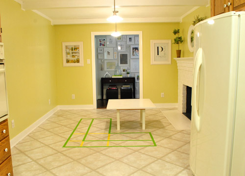
Who am I kidding. This probably doesn’t help anyone. And you all think we’re crazy to consider this. I know it. And we might be. But we’re excited enough about it to at least keep this idea on the table for now. Har-har.
See how the fireplace in the corner almost makes sense in that location with the cozy banquette facing it (which will be lined up with the doorway to the living room, so that doesn’t feel random either)? Nope. You still don’t see it. Haha. Well in person it actually has a lot of balance and makes considerably more sense than any island shape / placement that we’ve taped out on the floor over the last eight months (of which there have been many). We might just have to build our cabinet-backed banquette with cardboard or something to try to envision it further. Or use some serious photoshop magic to help picture it (the challenge is finding photos of the backs of banquettes since so many shots are looking into the L-shaped seating nook as opposed to looking over its shoulder from this angle).
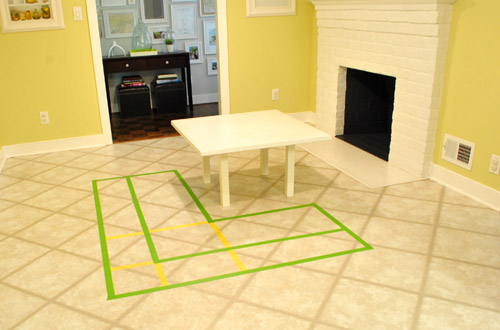
Oh and ignore the crazy white fireplace surround on the floor, since it seems to encroach and crowd the table waaaaay too much. When we redo the flooring in the room that’ll be remedied since we have plans to double side the fireplace down the road so you can peer into the living room through it (but will either make it gas or keep it completely inoperable so kiddo(s?) can crawl through the hole like it’s a secret passageway – so there won’t be a huge tile rectangle on the floor anymore).
I’ll leave you with this picture again, because it’s the one that makes my brain hurt the least when I try to picture things:

So all of this is to say that we taped off a crazy shape on the kitchen floor and we’re seriously considering some sort of cozy banquette-ish breakfast nook as opposed to a centered island with an off-centered fireplace nearby. It should be interesting. And the odds are that we’ll end up making some semblance of a decision someday. And we promise to keep you posted. Off to dip back into the aforementioned bedroom project and the office cabinet makeover. Ah DIY, you fickle friend. Maybe next week we’ll be less scattered. Who are we kidding? Probably not.

Rachel K. says
The banquette idea is perfect. It really makes the fireplace work well in the space and I can imagine your family having a cup of coffee or late night dessert all cozied up together next to the fire. What a special place to have!
liz says
I love this idea! I love the cozy table near the fireplace… I really think this will be a great space – better than a tired old island and table combo. :)
Kat@Withywindle says
I am having trouble visualizing, but I love the idea!! Hopefully you can get some benches/cabinets/cardboard boxes in there as a mock-up and see how it looks!!
PS. I’m using Firefox and everything looks as it should. (and it looks great! love the update!)
Kristin says
So you said you are planning on cabinetry for the back of the banquet. Are you also planning on having a sort of counter so that you don’t lose to much counter space from not having a traditional island? Like the one in the 3rd inspiration picture? I am having a hard time picturing what you mean by just cabinetry, unless I misread. I think this sounds like a wonderful and unique idea for such a long rectangular kitchen!
YoungHouseLove says
Oh yes, we’d have a counter just like the 3rd pic.
xo,
s
Megan says
So, I’m not sure if it’s me or my work or what-not, but none of the pictures are showing up for me. Oddly, the only one I can see if the kitchen-drawers-for-tool-st.jpg in your Cabinet Painting Prep post. Have you change something related to your pictures at all? Or is it my work that’s decided to start blocking images?
YoungHouseLove says
We haven’t changed anything but it might be your office or your anti virus software or even the place that we store our pics (amazon.cloud) having a glitch that affects a small precentage of our readers. Here’s hoping they pop up soon!
xo,
s
Meredith says
I actually think this could be a great idea! Having cozy seating in front of the fire place (I can definitely picture great pillows and cushions), along with storage and use of space. I’m interested to see how this progresses :)
Jill says
Sherry,
Couple of thoughts… as opposed to having actual cabinets what about open shelves that sorta mimic the build-ins in the dining room.
Also, big slide out drawers under the banquet would be perfect for backpack storage. In about four years… Clara K. could come home from school, start her homework by the cozy fireplace and store her backpack underneath for easy access in the a.m.
YoungHouseLove says
We’re definitely down with the shelving idea (anything to make it look more like furniture and less like boring cabinets on the floor). Should be fun to see what balance we strike!
xo,
s
Rachel says
The banquette idea seems so cozy with the fireplace, but it is indeed very hard to picture. Squint really hard and use your imagination!
Ann says
I have to say I’m not sold on the banquette in that space. Stuff to consider: will you have to go around the seating area to put food on the table and is the “path” big enough to accomodate more than one person if someone is putting food on the table and another person is walking from the hallway to the living room or vice versa?
Anyway, I always love what you eventually come up with and I can see the header and I’m using IE. :)
YoungHouseLove says
Thanks for the input Ann! We’re just getting started on this so there are still lots of things to consider! Who knows where we’ll end up!
xo,
s
AarthiD says
For what it’s worth, I actually think the L-shape *does* give the space the balance it needs. The island’s off-centered appearance relative to the fireplace would have driven y’all crazy, especially when the wall got KO’d. Plus, breakfast nooks make amazing reading corners, which are kind of my long-time Holy Grail of DIY….things. This comment derailed quite fast.
PS: I saw you guys’ contribution to the #SecretProject and d’aww, you two are too cute. (John sitting at the imaginary breakfast banquet: also too cute! My coworker threatened to call the Cute Police. ;D)
Kandace says
Love this idea!! I hope you guys do it..i’d love to see it.
Joanne says
Wow, banquette is a WHOLE new word in my home-related vocabulary! :) Can’t wait to see it all come together!
heidi says
I think it sounds perfect!
Amber says
Have you considered making the larger L into a bar of some type instead of solid cabinets? It might look a little funny, but it could have more seating and still function as a serving area. I totally stink at trying to picture things like this.
Love the new blog look! Gray is my favorite color, so you know I love the background- no problems here!
YoungHouseLove says
Always a possibility! Should be fun to see where we end up!
xo,
s
Jess says
Love love LOVE this idea! Go for it! :)
Kylie says
I love the idea of an L-shaped banquette near the fireplace…and the shelving/storage on the back sounds perfect! And I agree with the table situation…the oval/round table looks nicer.
Oh, and I’m on IE9 and could see your header just fine :)
Caitlin says
How cozy would that be to have the family around the table in front of a fire with board games and hot cocoa on a snowy day?! I love the idea!
Shannon says
Totally go for it! You can make this work and take once again take the DIY scene by storm. Banquettes are like couches that people think need to be pushed against walls. Teaching folks how to float this seemingly awkward type of furniture would be awesome.
p.s. your images aren’t showing up in google reader for this post today.
YoungHouseLove says
So strange! They’re showing up in ours (John and I just checked on two computers). Maybe it’s an amazon.cloud glitch (that’s where we host all of our pics, and have for the last three years). We didn’t change anything on our end so we’re stumped!
xo,
s
Jana says
I don’t think its crazy, I really like it, and if it were me I would consider building an baquette “L” that had built in book shelves at the back so that I had a neat place for storage…knick knacks, bins for crayons and coloring books perhaps, or a place to showcase pretty mixing bowls and cookbooks…just a thought. Good luck!
YoungHouseLove says
That could be really fun!
xo,
s
Brettany says
Don’t know if you’ve ever worked with this program before but I immediately thought of using google sketchup to play with building your breakfast nook/seeing it in three dimensional space – it’s super easy to use and the basic version is free to download. Good luck! Love the idea!
YoungHouseLove says
We’ll have to check that out for sure!
xo,
s
Cindy says
Okay, you are totally off base on this post… BECAUSE I LOVE IT. Love. I have wanted a banquette so badly, but the layout of my eat-in kitchen just doesn’t work. I always choose a booth when I got to a restaurant. And how cozy and homey would it be next to a fireplace?! My vote is full speed ahead! (I think I like the round table best, if it works, since so many things in the space are already angular.)
Can’t wait to see what you do! xo
Susan says
This seems like a pretty good idea. And, depending on what order you plan to do projects, it seems like this could be a one-step-at-a-time thing. Open up the wall first which will have a huge impact on how that space feels and then see if you still like the banquette idea. I’m guessing you’ll love it then.
Marah says
Love the idea but still a bit confused. Some of the pictures have counter space on the back of the banquette and some do not. Would you be adding a small counter space that could be a great solution to getting both an island type work space and the banquette seating area.
YoungHouseLove says
It would have a sliver of counter space along the back like picture three since we would be adding cabinetry around the back (as represented by the big L taped on the floor).
xo,
s
Kaysie says
I’m totally sold and have been mulling this over for our new home. I love the idea of a banquet, especially for a family with little ones around. It can serve as an eating area, a coloring spot, bookreading around the fire on cold days, and eventually a place to pull out the homework. You could try to maximize space by using one side of the banquet to add a built in spot for cookbooks, too. Divine!
Laura says
First of all, the header still doesn’t load for me, at least not at work. Haven’t checked from home yet. I’m on IE 7.0.blah blah blah here.
Now on to the banquette. Hmmm…. Very interesting idea. I am not completely sold either, but I am able to somewhat picture it and it doesn’t look bad in my mind! The longer I sit with it (5 minutes so far) it is actually growing on me!
Hannah says
I honestly couldn’t see how the L-banquet would work over an island, but the third banquet picture (the one with the sink on the banquet) makes me super excited to see how it ends up!
Stacy says
Good news! I can see the header today and couldn’t yesterday even though I am still on my more secure work PC.
I love the idea! I was thinking a cozy sitting area would be great but the banquette idea is a great compromise to keep the storage and a more soft peice of furniture near the fireplace.
I noticed that someone mentioned flipping the “L” but that you didn’t find that to be a great solution considering the placement of the fireplace. To be honest, I don’t know if this is even possible or if it can look good but have you thought of making one section of the cabinet/frame work (which faces the kitchen) to be a lower height or even exposed (kind of a like a chaise lounge)? This would seem to help the flow from the stove to the table :).
Either way looks like a fun project and can’t wait to see the transformation!
YoungHouseLove says
Definitely another possibility!
xo,
s
Erin says
sold!!!! you just had to show me the sketch that nancy made and i was so sold. it makes complete sense. it’s balanced correctly. it looks cozy. it will look great through the future big doorway from dining room to fireplace room. sold sold sold. your taped off banquette made complete sense too. good job!
Melissa S. says
Not digging it. My problem with that layout is that the people sitting at the bench would have their backs to the kitchen. One the best things about having an island in that space would be that the peeps sitting at the island would be facing the kitchen — nice for chatting with the cooks and hanging out while cooking. And with older kids – it’s a GREAT space for kiddos to be doing their homework while mom/dad is cooking.
This banquette idea (though charming in other layouts, I agree) will really isolate the eating/sitting space from the workspace.
Have you considered an odd-shaped island? I had always envisioned a triangular one in your kitchen for some reason.
YoungHouseLove says
Yup, we’ve considered a ton of other island shapes. Right now with the table we have people with their backs to pretty much every zone (the hallway frame wall, the work area of the kitchen, the doorway to the living room, etc) so I guess we’re not too upset at the idea of keeping one side of the kitchen as the casual cozy nook and the other side of the kitchen as the work space (bonus: we won’t have to stare at dirty dishes while sitting in the nook) but who knows where we’ll actually end up!
xo,
s
Risa says
yay for banquettes! :) good luck, can’t wait to se how it turns out!
Holly says
That would be a perfect solution for your offset fireplace! I LOVE the idea. Who needs to think about it? You should totally do it!! :)
Chris H says
I really like the banquette idea – I’ve been thinking of one for our kitchen, when we ever get around to it. I would consider flipping it – as someone else said- so the open end faces into the kitchen. I can see why the other orientation would work as well because of the hallway at the end of the kitchen, but I think it would make it more part of the kitchen if it was flipped. Can’t wait to see your progress.
kimb says
I like the 2nd and 3rd pictures that you post as inspiration. I also think the octagonal might work better than the L shape. This makes way more sense and keeps the fireplace as a feature and not a side thought. Also with a 3 sided bench with cabinet behind you could have cabinets on 2 sides and a breakfast bar in the middle with 2 stools. It could be interesting, and definitely use a round table with a dark natural wood top and painted white base.
YoungHouseLove says
Always a possibility!
xo,
s
julie says
I also was thinking one side/back of the L could have cabinets and the other side could be a bar that you could slip stools under. Love all the ideas!
Haley says
I think the banquette idea is awesome! I can totally see Clara sitting by the fire, eating a snack and doing her homework while you cook supper. Fireplaces in a kitchen/eating space are my favorite!
Katie says
I think the banquette is a good option… I had a window seat with a desk (sort of banquette-ish) in my last kitchen and loved it. When I’d have company everyone gravitated towards that spot. That said, I keep thinking it’d make sense to switch the kitchen and eating areas in that space… might be cost-prohibitive but might be worth at least considering. Then, it’d be the actual kitchen that’s visible from the fireplace and you’d have an eating/homework/gathering area tucked more out of sight where the kitchen is now…
Jill says
It is hard to picture, but I really think it could work! Plus, from a selfish perspective, I’d be soooo excited for you guys to build a banquette, since we’re considering building one in our kitchen too :) So far I’ve found a few tutorials online, but I’d love to see how you guys tackle it!
Beau says
I like the idea…do you think you have enough room to pull it off? Why not just have an island that isnt centered?
What software do you use to make those room layouts…I’d love to make something like that for when I head to home depot or try and get layout advice elsewhere!
YoungHouseLove says
We use floorplanner.com to make up those little floorplans. Or just sketches them on graph paper to scale (like the one Nancy drew on- haha Nancy drew). As for the room to pull it off, we trust Nancy about all that stuff and she thinks it’ll fit. As for an island that’s not centered, we just think looking through the doorway from the dining room and seeing a big island with a fireplace randomly stuck in the corner might just not feel balanced and intentional- like a bad mistake/afterthought. Who knows where we’ll end up though!
xo,
s
DeNacho says
can i offer up some suggestions?
1) i couldn’t agree more with your banquette idea. we are nearing the final stages of our kitch/dine redo that’s been 10 years in the planning & i always knew i wanted to do a banquette for many reasons. it’s just better use of seating, but it also affords storage that a traditional table & chairs would not give. here’s what our custom build looked like right after it was installed. http://blondemafia.blogspot.com/2011/06/banking-on-it.html i still have to sew cushions for the seat & pillows for the back, but we LOVE it. and in our 900sq/ft house, we need all the storage we can get. oh & nice to see soooo many people even know what a banquette is. i cannot tell you how many times i’ve had to explain this to people as “you know, a greasy spoon booth?” now it is actually the envy of a couple of friends eat-in dining!
2) if you can, plan electrical to run up through the back of the banquette somewhere. that way, if you wanted to mount a couple of lamps on the side that faces your dining room, it would have more of a furniture look to it & could be low-level lighting when the ceiling lights are not in use. we left the electrical that was on the wall where the banquette got installed but have little removable panels on the top so we can reach down in there if needed to plug something in. when in place, the panels just have a slit just large enough for the cord to come through so everything is hidden below. i’m so glad we were able to add it after the fact because it just adds to the ambiance!
3) for your flooring, i was actually “floored” (haha) to hear you mention Candice Olsen because she was the inspiration behind my new floor – http://blondemafia.blogspot.com/search/label/marmoleum i saw this same Henna color on her show about 6 years ago & said I MUST TO HAVE! i tried to find something/anything else because here in central illinois (1) i simply could not find anyone that sold/installed it and (2) it was horribly expensive at the time. well, it still is a little pricey but how often can you say the floor is the centerpiece of a room? mine certainly is. it was worth the wait, money, etc. and the semi-final look of just the kitchen floor with ikea cabinets installed: http://blondemafia.blogspot.com/2011/05/its-coming.html
can’t wait to see what you come up with!
YoungHouseLove says
Thanks for all the tips and all the links! Fun!
xo,
s
Laura says
What if you did an island in the same “L” footprint and had the stools facing the fireplace? Having that open island would be great for entertaining. I just worry that a banquette will sort of isolate the kitchen part of the room from the eating area, and an island could keep it more open and flow-y. Of course, I’m just brainstorming!
YoungHouseLove says
There are definitely a ton of other possibilities! Just getting started with some thoughts- but who knows where we’ll end up!
xo,
s
Laura says
Wait wait! I take it back! I refreshed four times – no idea why but I did – and NOW the header is refreshing and appearing no problem. Very odd, but whatever, it’s working now!
YoungHouseLove says
Whew. So glad!
xo,
s
Monica C. says
I check your blog every-single-morning as part of my morning routine and although I can see the header, I can’t see any of the pics :(
YoungHouseLove says
So sorry about the missing pics for some folks! Every once in a while anti-virus software on your own computer might block them (nothing changed on our end) but adding YHL to your safe list should help you instantly see them again!
xo,
s
Laura says
When I saw the “L” shape taped out on the floor, the thought that immediately crossed my mind was: bar. An entertainment space. With it being open directly into the dining area, it would make the perfect space for a snazzy cocktail area. Then again, I’m single with no children, so maybe that’s a natural area to go in my mind, and might not be practical for a sweet young family. It just reminded me of the really cozy, jazz-esque styled bars with nice fireplaces incorporated in them. I can’t wait to see what you guys will do though!
Heidi says
I think the banquette facing the fireplace will feel like a cozy little ski lodge…totally homey! :) Thinking about doing some built-in banquette something or other in my new kitchen. I’ve got a private blog, but will shoot you an invite if you wanna see my photoshops. :) (it would only be fair, as i read about your home every day..)
Gavin S. says
Cool (and cozy) idea! I’m totally on board. Speaking of boards…have you thought about doing the banquette in beadboard? We used it for the cabinets and raised counter/bar seating/storage area in our beach house and really love it. It’s so happy! My only other question is if there’s enough space at the far end of the table to place an extra chair as your family continues to grow. It looks like there is in the picture, but just wanted to check. Yay! So excited!
YoungHouseLove says
That could definitely be cute!
xo,
s
holly says
that’s the best design solution i’ve heard in a long time. i think when it’s done it will give off the impression that it belonged there all along. brilliant!
were you planning on all cabinets or a few open shelves, too, to display some of your favorite things? that could be a nice thing to see in the distance when you walk through the front door.
YoungHouseLove says
We definitely love the idea of something that feels furniture-ish- so some open shelves could be nice!
xo,
s
Megan says
Hi Sherrie!
I try to refrain from being negative. You’d be hard-pressed to find things y’all do that I’m not totally down with. But I did want to caution the banquette idea from a practicality standpoint.
Trust me when I say they are a PAIN to clean, both on the seating bench and underneath. Also, it’s often difficult to get in and out of them without the back being operable to move in and out. I think they LOOK beautiful, but as someone who spent the better part of her youth babysitting families with these in the kitchen, I spent way more time than I care to admit on the floor trying to clean up bits of food that had wedged into crevasses.
Sorry to be Debbie Downer – but just wanted to point out the negatives too!
Megan
YoungHouseLove says
Haha, thanks for the tips! We’ll definitely consider that stuff! It’s funny because I complain about all the dust that collects at the bottom four legs of our table and 24 legs of our six chairs – so I thought a built in bench and a pedestal table would mean less spindly legs to grab dust and hair!
xo,
s
fd says
I love the idea in principle (and yay for kitchen expert friends), but I feel like people sitting with their back to the opening that will soon be knocked out of the wall will be creeped out with their back to such an open space. Is that weird of me?
YoungHouseLove says
Haha, I guess since we’re used to having a table there (where our backs are to lots of doorways like the frame hallway) so we didn’t think about that. We’ll have to see how it feels as we go. We’ll probably open the wall before or at the same time, so we’ll get to see how we like it before committing.
xo,
s
Bethie says
I’m totally sold! I hope you go for it!!
jules says
What a great idea! I hear ya about the view from the dining room – but heck that can be tweaked. I’d consider varying the counter/cabinet height of the “big L” on the side that would be viewed from the fireplace. Could be taller with places for display. Choose another color from Sue the napkin and buy more white animals. Might be a chance to create a conversation with the bookshelf wall on the other side of the dining room. Oooh! (just had another thought) give the dining room side a nice countertop and you’d have a built in buffet/serving area for big gatherings or brunches.
Good Luck!
P.S. Have been following your blog for years – am a fellow Richmonder and designer -but have never commented. Ths idea got me excited!
Shauna says
I love both these ideas!
Robin @ Our Semi Organic Life says
I’m going to refer to that in my mind as the nook. Not “your nook”… a little inappropriate but the YHL kitchen nook. I have always dreamed of a kitchen nook. I love the round table with it. Think of the pillows you could shop for!!
Megan K says
“think of the pillows you could show for” – favorite comment so far :)