True to form, we’re all over the place over here. After switching up the ol’ blog design (and figuring out why the header was MIA for 20% of you – here’s hoping it’s back) we’ve also been plugging away at our $6 cabinet makeover but aren’t quite done with the painting/building-up process (here’s hoping we’ll have photos and lots o’ words to share early next week). But crazily enough, in the meantime we’ve also been doing some yard work, a random bedroom project, and have even started brainstorming the next phase of the kitchen. Hence this brain dump.
We’re still saving our pennies for things like new appliances to begin the next step of our slow & steady kitchen overhaul (remember when we upgraded the fireplace and wood paneling a little while back?). So as we wait for the bank account to say “sure, go buy a new wall oven that’s not bisque, and a new microwave that’s not black”, we thought meeting up with an old friend of ours to get a few kitchen ideas might be nice. Who is this mysterious old friend that we speak of? Why it’s Nancy Kulik, the lady who helped us plan our first kitchen makeover through Home Depot (they offer up Certified Kitchen Designers to help for free if you buy cabinets or counters through them, of which we got both).
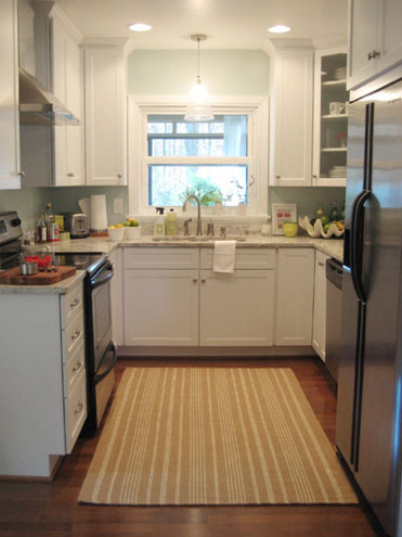
We knew that we wanted white cabinets and light marble-esque counters (they were actually granite) during the planning stages of that makeover back in 2007 – so we didn’t look to Nancy for much “style advice” during our 113 day kitchen reno. But she was truly invaluable when it came to space planning. She just knows how people use kitchens and where appliances should be placed to maximize function, and we fully believe that our first kitchen would have been half as useful if we didn’t have her free-with-the-purchase-of-cabinets advice when it came to where to squeeze in a dishwasher, relocate the fridge, and build in the microwave. Lesson learned: sometimes the pros know best. So take their advice whenever it’s free (and even when it’s not if you need it). You know, so you don’t DIY a kitchen all alone that’s semi-functional when you can DIY something twice as useful with some pro advice and a smidge of well-spent cash (assuming you can’t track down free services like those from HD or Lowe’s).
But back to our buddy Nancy. We actually kept in touch with her over the last three years since our big kitchen makeover in 07′ (she and Clara are practically BFFs). So she was sweet enough to offer to glance at a floor plan and a few photos of our current house’s kitchen to give us a little here’s-what-I-would-do advice. Second lesson learned: there are definite perks to staying in touch with any kitchen geniuses that you may encounter.
But first a little refresher. You’ll remember that the eat-in part of our kitchen currently looks like this:
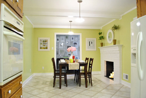
We’ve always planned to add a built-in island in place of the too-small dining table, just because when we knock out a huge doorway in the wall across from the fireplace to connect it to the dining room we thought two tables lined up through that opening would look odd (a big round one in the dining room and another one so nearby in the kitchen = crazytown).
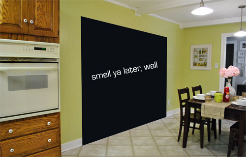
So we thought a big round table in the dining room and a smaller built-in island by the fireplace would make sense and be less “hello table, meet my friend, table.”
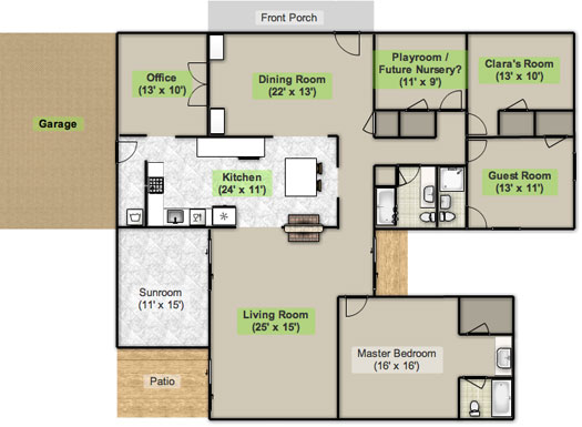
Here’s an old floor plan that we shared last November before we even moved, just to give you an idea of what we thought might work when it came to the island (with the new wide doorway to the dining room that we plan to add worked in there too):
Oh while we’re on the topic of someday dreams, we’d love to paint our cabinets white and craigslist our white, bisque, and black appliances and upgrade to stainless steel. When it comes to our counters, we plan to work with the granite that we have, but completely redo the backsplash for a crisper, lighter look. And those florescent tube lights and big brown fan? They gots to go.
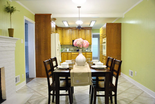
While we’re rattling off things on the list, of course we’d love to redo the floors but aren’t sure if there’s hardwood running all the way under the entire kitchen that we can refinish (we know it runs under part of it, but haven’t confirmed all of it) or if we’ll have to just redo them with something new entirely. The challenge of that is that we’ve learned that our floor joists aren’t built strongly enough to hold the weight of stone or ceramic tile (I thought slate would be awesome in there, so yeah… le bummer). We’ve toyed with everything from lightweight cork to some sort of linoleum (Candice Olsen has done some surprisingly awesome kitchens with that on the floor) but we’re nowhere near a decision. We’ll keep you posted though.
But I digress (who’s surprised?). Back to our talk with Nancy Kulik and the big kitchen idea she came up with (pretty much on the spot because she’s cool like that). Are you ready? She looked at the new to-scale floor plan that we brought with us (and a few photos) and realized that something was wrong, wrong, wrong on our little whole-house floor plan (seen three photos back, which we did months ago in November). That something? The fireplace is almost in the corner of the room in real life. So the placement of the fireplace in that old floor plan is totally off.
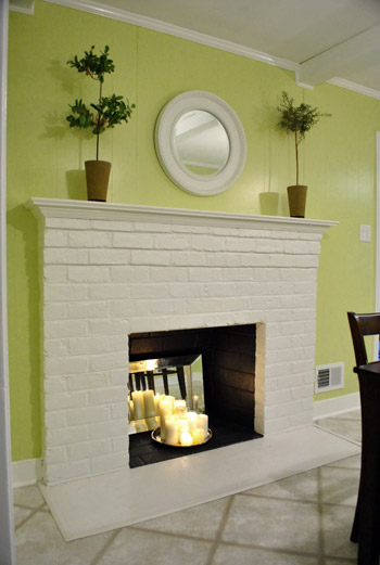
Thankfully it was drawn in the actual correct location in the newer kitchen-only floor plan that we brought with us to our Nancy meeting, but since it’s not actually centered on the wall (and practically kisses the door that leads to the hall), no island could be centered on it without nearly touching slash completely blocking that doorway (which we definitely want to keep open). So Nancy suggested something that we never would have thought of ourselves. And I mean never. Brace yourself. She proposed a floating L-shaped banquette that faces the fireplace and the frame wall.
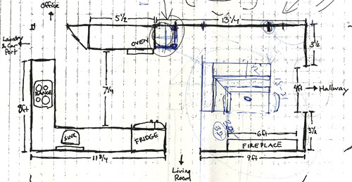
Note: don’t mind that vertical line that follows the back of the banquette to the door to the living room, she just dropped that in to tell us that we should line those things up- but the banquette wouldn’t be attached to anything, it would just float in the middle of the room to keep things open- just like an island would, but since it would face the fireplace in a way that an island wouldn’t it could make a lot more sense.
I’m not going to lie. Both of our first impressions were “thanks, but no thanks.” But as she further explained her vision we slowly started to come around. See, I’ve always adored the cozy-factor that is an L-shaped banquette. And if you search “banquette” some pretty cute images come up on google and Pinterest. A breakfast nook-ish type space like that might not be everyone’s cup of tea (there are definitely some die-hard island-lovers out there), but we actually thought it could be even cozier than our previously considered idea of an island. Especially because it would make sense of the off-centered fireplace in a way that an island never could (since it couldn’t ever be centered on it or lined up in any real way). So we took Nancy’s little scrap paper sketch home and taped out her floating L-shaped banquette idea on the floor:
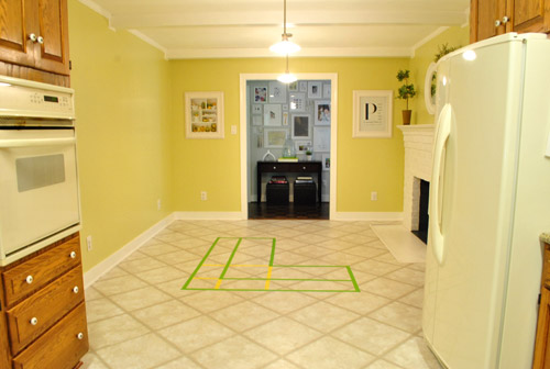
To explain what you’re looking at, the smaller L that’s being spooned by the bigger L would be the actual bench seating that faces the fireplace & the frame wall (which would make sense of the layout a bit more than a big floating rectangle that doesn’t line up with the fireplace at all). And the bigger L would be built-in cabinetry that wraps around the back of the bench seating to create a nice nestled nook that looks as good from the back and the side as the front (and provides a nice amount of concealed storage that’s accessible from the back, just like an island would have done).
As for the height, we thought keeping the tops of the cabinetry and the banquette seating the same height as the lower cabinets in the rest of the kitchen would make things feel cohesive and open (many of our inspiration images above have banquettes that are the same height as the base cabinets). And of course knocking out a huge 6 foot wide doorway to the dining room behind the banquette (which will have pretty cabinetry that faces the doorway so it looks good from behind) should keep the flow nice and airy – so nothing feels too boxed in.
I know it’s pretty much impossible to picture, so here’s John sitting at the fake banquette (although the table would be a smaller pedestal based thing, possibly square, oval, or even round – and possibly white or even a color, but probably not dark brown).
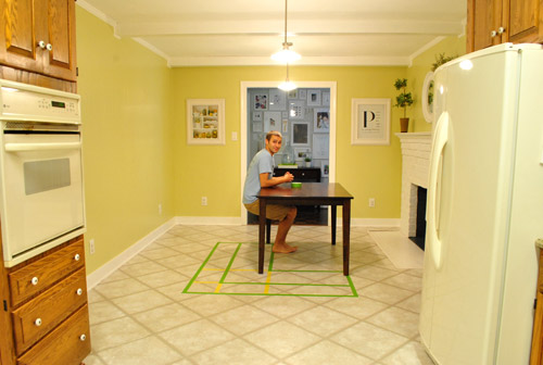
Note: we’ll have to move the lighting on this side of the room regardless of an island or banquette creation since it’s placed too far apart to make sense either way – and in the case of the banquette we’d center it over the table, not the seating (like many of the inspiration images).
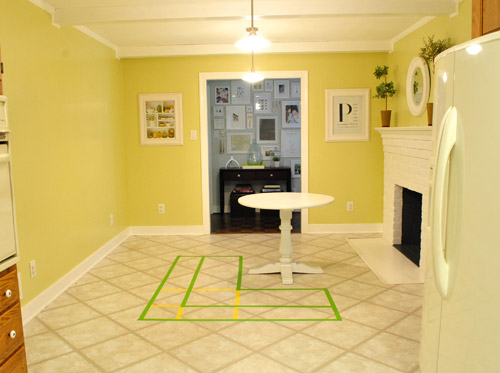
It’s admittedly still impossible to picture (and I would bet $20 that nearly everyone reading this is completely not sold on this idea), but here’s a round pedestal table tossed in there in case that helps the picture come together for a few of you (since our banquette table will definitely have a pedestal base to make maximum room for legs).
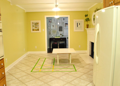
And here’s a lower square table (of course too low for a banquette, but this sized top might be right) to possibly help the vision come together a little more. As of now we’re both actually bigger fans of a rounded top – like the one above – but who knows where we’ll end up.
Who am I kidding. This probably doesn’t help anyone. And you all think we’re crazy to consider this. I know it. And we might be. But we’re excited enough about it to at least keep this idea on the table for now. Har-har.
See how the fireplace in the corner almost makes sense in that location with the cozy banquette facing it (which will be lined up with the doorway to the living room, so that doesn’t feel random either)? Nope. You still don’t see it. Haha. Well in person it actually has a lot of balance and makes considerably more sense than any island shape / placement that we’ve taped out on the floor over the last eight months (of which there have been many). We might just have to build our cabinet-backed banquette with cardboard or something to try to envision it further. Or use some serious photoshop magic to help picture it (the challenge is finding photos of the backs of banquettes since so many shots are looking into the L-shaped seating nook as opposed to looking over its shoulder from this angle).
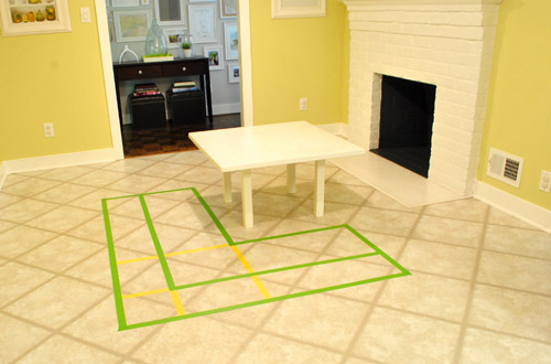
Oh and ignore the crazy white fireplace surround on the floor, since it seems to encroach and crowd the table waaaaay too much. When we redo the flooring in the room that’ll be remedied since we have plans to double side the fireplace down the road so you can peer into the living room through it (but will either make it gas or keep it completely inoperable so kiddo(s?) can crawl through the hole like it’s a secret passageway – so there won’t be a huge tile rectangle on the floor anymore).
I’ll leave you with this picture again, because it’s the one that makes my brain hurt the least when I try to picture things:

So all of this is to say that we taped off a crazy shape on the kitchen floor and we’re seriously considering some sort of cozy banquette-ish breakfast nook as opposed to a centered island with an off-centered fireplace nearby. It should be interesting. And the odds are that we’ll end up making some semblance of a decision someday. And we promise to keep you posted. Off to dip back into the aforementioned bedroom project and the office cabinet makeover. Ah DIY, you fickle friend. Maybe next week we’ll be less scattered. Who are we kidding? Probably not.

George says
I think it’s a great idea. I think what’s throwing me off is the diagonal tiles. If I try to picture it on a floor that is on-axis it makes a lot more sense. my wife turned me on to your site. We really love the stuff you guys do. Anyone can make something look great with a bottomless budget but you make things look great with your ideas and imagination.
Amy says
not an expert on these types of things, but did live in a home with one and found it really annoying to climb in and out of the corner seats!
YoungHouseLove says
Thanks Amy! We hope to play around with things (assuming we go this route) to make sure it’s comfy/functional or we’ll bag it!
xo,
s
Mandi says
I actually love the idea! But I kind of agree with an earlier commenter who suggested flipping the L, so that the long part of it still faces the fireplace, but the seat and table open to the kitchen instead. As it’s drawn on the floor, you will walk into the kitchen and see the seat and table. And from the kitchen, you would see the back part–the cabinets. I think, personally, that it would be better to flip those two views–to enter the kitchen and see a smooth and pretty line of drawers and cabinets, and to stand at the stove and see the table and seat.
It would also add function; as it’s laid out on the floor, you will have to walk *around* the cabinets/storage to put food on the table. If you flip it, you will have easy access to the table from the kitchen area, as well as a clear view for when Clara is older and potentially drawing all over the table with a sharpie.
In short, I’m suggesting that the longer part of the seat still *face* the fireplace, but that the storage end of the L be flipped so that you see the cabinets when you enter the room from the hallway and the table and upholstery from the kitchen. Does that make any sense? I’m not sure I’m explaining myself well. If necessary, I will break out photoshop!
YoungHouseLove says
We’re just confused because then the L wouldn’t face the off-center fireplace so all the balance would be ruined. You’d have this fireplace in the corner with an L shaped banquette squished in the corner too. Having the L on the other side added balance and made you feel like the banquette faced the fireplace- maybe it’s one of those things that makes more sense in person!
xo,
s
Sue says
Hmm, I’m intrigued. Like many others I can see the heading but no pics (first time without pics). Will have to try it from a different computer and see what’s up. This is the computer I normally view it on though without issue.
YoungHouseLove says
So sorry Sue! We can’t figure it out at all since we didn’t change anything on our end with regard to pics, but we hope it clears up! It could be that your virus software had an update and is inexplicably blocking our pics (that has happened to some folks in the past so they go into the software settings and make us “safe” or “approved” and they come back. Hope it helps!
xo,
s
Rebecca says
Hi! I’m a new commenter, long time reader and fellow Richmonder! I like the idea, but I think my concern would be having enough space for seating? The pedestal table you have placed there doesn’t seem very big, and the larger table where John is sitting looks like it would be too cramped…how would you keep it from feeling claustraphobic (not sure if thats a word) back there?
YoungHouseLove says
Nancy is the best designer we know, and if she says it’ll fit and be functional we believe her! We just plan to cobble it together slowly and see how it feels and make adjustments with table size and placement and all that as we go. We want it to be cozy and comfy and functional or we’ll totally bag it and start over with something else!
xo,
s
Niki says
I didn’t read through all of the responses so I’m sorry if someone suggested this; but, maybe to get a feel of the “real” size/feel you could use stacked boxes to build a replica. It might give you a better idea of the flow of the room and the sizing….
YoungHouseLove says
Love it!
xo,
s
priscilla says
I love this idea. It would be nice to incorporate some shallow shelving on the long part of the banquette facing the future opening. It can be painted to compliment the dining room built ins and used to store platters and pretty stuff.
Emily kidd says
Could you do a smaller scale of inspiration picture 3 and have the best of both worlds. And just have storage under the countertop
YoungHouseLove says
Yup, that’s the plan actually. All cabinetry along the back with counters on top.
xo,
s
Anne says
I love it! I was never sold on the island idea either. This embraces both the fireplace and fucuality!
Have you thought about maybe a little bar sink with filtered water I’m it? Then if you are sitting there and Clara wants some tasty water you dont have to get up, just reach over and fill it up.
The only thing I’m having a hard time picturing is the dimensions, it seems like the “countertops” are pretty narrow. I love the other readers suggestions to picture even further with existing stuff as a stand in. Can’t wait to see what you come up with!
P.S. I’m in safari and everything on the blog looks great today! Checked it on chrome yesterday and looked great then too!
YoungHouseLove says
Not sure if a sink bar would be in the budget but it’s always a possibility! As for the counter thickness, it was recommended by Nancy as the best fit for our space, but once we use cardboard to map it out we’ll hopefully get a better idea!
xo,
s
Erin says
Oh my goodness. You are never going to believe this but my mother-in-law, who is a fabulous interior designer, proposed the same idea to my husband and I a month ago. We had the exact same reaction but as the weeks have passed, it has been growing on us. We have not started the renovation but it is for sure something we are considering. In fact, I pinterest picture #3 as my inspiration but I am loving picture #4. What kind of cabinets are you picturing to go behind the bench seating? Or will it just be bench seating?
YoungHouseLove says
That’s so funny! It’ll have some sort of cabinetry behind it like picture 3 but we’re not sure what kind. Maybe some open shelving and some closed cabinetry. We’d love it to look built in and furniture-ish. We’ll keep you posted!
xo,
s
Jennifer Ahnquist says
Have you heard of or ever used Google Sketch Up? I have used it a teeny tiny bit but its supposed to be really user friendly and easy. But basically, you could make a 3D model of your kitchen in there and then see what different banquet arrangements/heights/etc would work. Just a thought. You can download it for free if you just Google it (obviously). Good luck with the project! It’s going to look great no matter what I am sure.
Jennifer Ahnquist says
Oops… banquette. ha!
YoungHouseLove says
Thanks for the tip! We’ll have to check it out!
xo,
s
Keri Beth says
I think an L-shaped banquette would be great there! Do it do it do it! (I’ll live vicariously through you–no room for one in my little galley kitchen.)
Jennifer in VA says
HI!…never commented before but had to after this post. Love the banquet idea, so much that I actually turned around from my kitchen desk to look at our kitchen table and the rail that separates our large kitchen from the (2 steps down) family room. I hate that rail and am thinking that a low banquet with cabinet backs facing into the family room (game storage/open shelving) would be awesome!
BUT… our basement is still unfinished and while our 4 kids were little it was great as the unfinished/rug remnant covered/bike riding in the winter/basketball hoop shooting/ loud playroom area that it is, however…. our little kids are now almost 14, 11, 9 and almost 7. We are ready to finish this space so that we can be the house that they and their friends WANT to hang out at. So a banquet is a few years down the road.
Jennifer in VA says
BTW, I have Firefox 6 and can see all the pics.
Caity says
Will the banquette have seating like those photos? Because that would be OH so cozy facing the fireplace! Picture yourselves curled up with Burger, a cup of cocoa, and a laptop pinning things. Just sayin’.
This idea may be hard to picture, but I think it’s fantastic and a great solution to the table on table conundrum.
YoungHouseLove says
But of course- at least that’s the goal. Haha.
xo,
s
Jess @ Little House. Big Heart. says
Could you build in additional storage into the banquette? Maybe for those awkward things that don’t fit in kitchen cabinets but you want to keep handy(I’m looking at you, breadmaker)? That might sell me a little more on the idea. I’m all about the storage.
YoungHouseLove says
Oh yes, the whole back of the banquette will have storage in it from the back (cabinetry with a counter)- sort of like the third inspiration pic!
xo,
s
Lisa says
A banquet is a brillant idea and makes total sense to me! Love it!
Zoe Feast says
I actually have a banquette or booth as I like to call it in my kitchen and it really is a very cozy place to sit and eat. The only down side to it is if letting the “inner” sitters in and out, especially if, like my daughter, they are up and down during a meal…more water…you forgot the ketchup…that sort of thing.
Also are you planning on having removable cushions? That is what I have and I even sewed covers for them last year ( it is the most horrendously hard sewing project I have done to date)
Glad to hear the new template is getting over it’s initial browser hiccups…if you ever need any help you know where to find me!
YoungHouseLove says
Not sure about cushions yet but they’ll definitely be removable or the bench will be wood (for easier sliding) and then we’ll add plush pillows for softness.
xo,
s
Tricia says
I absolutely love this idea!! and looking at some of the inspiration pics you posted sealed the deal!! i personally like the round table with the banquette seating. and i think it will help soften all of the harsh lines from the cabinetry. can’t wait to see the finished product!! have fun with it!!
Erin says
I’ve never posted a comment before, but have to say that I totally get it and LOVE the idea! How cozy it will feel to eat together as a family in front of the fireplace, especially with snow on the ground (and possibly the fire going if you keep it a working fireplace). Exciting progress! Good luck making a final decision.
Katie Vlietstra says
Awesome idea, Nancy! I think it is a great way to do something fun, funky, and create more storage space. Can’t wait to see it come together. (Labor Day sales are approaching…can anyone say, appliance sale? Maybe a bit early, but if there is a good deal to have I am sure you two will find it!)
Shauna says
i think it’s going to be awesome!
Tonya says
A comfy banquette nestled close to the fireplace with a view of your awesome gallery wall sounds so warm and cozy, much more than an island with seating facing the kitchen. Some pretty fabric cushions and pillows would bring softness to the room, especially since you don’t have a window to add curtains. You might even consider leaving some of the cabinets backing it as open shelves for cookbooks, pretty mixing bowls, baskets, etc. If you are morning news watchers you could discreetly conceal a tv above the fireplace (also good for kid’s shows). Can’t you just see Clara eating her breakfast there before school in a few years?
YoungHouseLove says
Yeah, that’s kind of what we were thinking! The view of the frame wall and the fireplace are the best views in that room, so looking at the prep space isn’t necessarily a goal of ours. Maybe just because I love avoiding dirty dishes! Hah. As for the open shelving in the back, that could be really nice!
xo,
s
Stefanie says
That is an AWESOME idea for that space. What really helped me visualize it was the third ‘inspiration’ pic you posted- the one with the kitchen sink as part of the banquette. That would really tie the whole space together, and give you the island functionality that you were originally looking for.
Can’t wait to see the after photos on this one!
Sheri says
I think it’s a great idea, too. It’ll be awesome!
Val says
I really like the idea! I agree, I never ever would have thought of it. So weird that you posted this because we’re actually having the island vs banquette debate right now as well.
Elizabeth says
I love the idea of a banquet! When I try to visualise it though I imagine the door to the hallway blocked off to make it go all the way to the wall and a lower bench-only side (no cabinets) on the “kitchen” side. Of course I’m just going from photos and have no idea if that would work in your space. Isn’t it funny how different people can imagine a space so differently? Can’t wait to see how it actually turns out!
Joelle says
I actually really like the idea! and i think the part i like most about it? that it’s different from other kitchens, and that’s why i love what you guys do. if you do an island, it’s like 99.9% of the other kitchens out there, not very original. But this banquette seating would have some wow factor AND be cozy to sit around the fireplace.
Love it, and I think if you had the white cabinets with dark hardwoods for it, it’d be gorgeous!
Trish says
Love the idea! Don’t let this kitchen planner go. Not only is it unique, but I agree – much cozier than the big floating island. Plus the wrap around cabinet/narrower counter will be perfect for gatherings … you’ll gain counter space for things like cups/beverages.
Go for it!
April says
I love the idea of a banquette!! It sounds super cozy and functional at the same time!
Melissa says
Love this!!! One of your pinterest pictures listed has been on my Pinterest inspiration board for months. So obsessed! I’m jealous you guys will get to it before I will :)
JB says
It is actually a decent idea. Though I think something to similar to the brown banquet picture would make the banquet seem a little less floating in the room. You could just do countertop on 1-side (side facing dining room) & it would make a wonderful “buffet” for dinner parties in the dining room.
We put an L-shapped banquette in our kitchen, but it is against the walls. We made it counter height & it has an island on wheels in front that we use for countertop & eating. The banquette opens for storage of dish towels, table clothes, napkins, stuff you don’t need to get to everyday). When we have parties – everyone is camped out the banquette.
Amy says
While I think the banquette idea is certainly cozy (I have fond memories of decorating Christmas cookies on the banquette table I grew up with) I would be concerned about losing all the additional counter space and island would provide. THe way my family works, I would prefer to have lots of counterspace that could be used as seating/bar instead of a banquette area that is primarily seating. But it depends on how you will really use the space!
Julie says
I love the idea, but I would switch the L shape so the short end is towards the hallway door. This way, it is a more social arrangement for entertaining. If somebody is cooking your guests could sit there and still talk to the host etc. With the arrangement the way it is drawn it feels like the people sitting on the short side would be excluded because they can not see into the kitchen.
LizO says
I love the banquette idea – we just switched to one from a big table and chairs in our dining room / nook and I just love it. Our bench seats provide storage for napkins and linens and such, and it’s super cozy. We got ours on Craig’s List (plus table and chairs for the other side) for $100 – keep yours eyes out :)
Just a question though, why would you want to face an inoperable fireplace? The coziest-sounding part to me is a fall or winter dinner facing a lovely fire!
YoungHouseLove says
Now that the banquette is on the table, we’re thinking about making putting an electric insert or something in the fireplace. We’ll see – our minds haven’t really crossed that bridge yet.
-John
Janette@The2Seasons says
I love a good kitchen design. We have one to prove it. But, I gotta tell you. One word comes to mind – claustrophobia. Won’t the banquet get overheated when the fireplace is on?
YoungHouseLove says
The fireplace will either be just decorative or an electric insert, so we’ll probably have a fair amount of control over how hot it gets there (and it’ll be easy to turn off if we start to overheat).
-John
Rachel Tatem says
Looks great! I love the idea
Katie says
I think it’s a great idea! Plus, you can have storage underneath the bench seats for things you don’t use very often…much more than an island can give you. I also like that it’s facing away from the kitchen. It makes it more like a separate space, and then the items in the cabinets are more accessible to you when working in the kitchen. Love it!
Lilly says
I think the debate of island vs banquet boils down to one thing: extra counter space or seating. You get storage with both and I’d bet most of the pro-island folks are thinking more about the “lost” counter space. I’d picture an island being used with kids to roll out cookie dough and have flour fights around the holidays for example.
But the banquet is definitely an interesting idea. I think you’d be fine either way, it’s a matter or personal preference and what your individual needs are.
Amy D says
I didn’t read through all the responses to see if this was already suggested…so ignore if it was already suggested.
Since the back will look like cabinets (if I understood correctly), can’t you photoshop in some cabinets to get an idea of what it would look like if you were standing in your kitchen looking towards the hall/fireplace end? I’m not sure it would work, but it might be worth a shot before building it out of cardboard (by the way, I think this is an awesome option too, Clara would have a ball playing with it)
I love this idea, I want to have a banquette area in my kitchen, I just have 3 windows that I am contending with.
YoungHouseLove says
We tried doing some Photoshoping already and it was hard to make it look realistic enough to judge. But we may give it another shot or turn to some 3D software like Google Sketchup.
-John
Amy D says
I thought you had probably tried it. I still think the cardboard option would be so much fun for Clara and practical for you guys to see the banquette in full scale. Most parents make old cardboard boxes make into spaceships & race cars, etc…however, Clara, being the child of you two, it would only be fitting she would have a cardboard banquette to play with.
BTW- Love the thing Amber did for the idea…its just like what I had in my head.
YoungHouseLove says
We definitely love the idea of playing around with some 3D cardboard objects in there too! Could be lots of fun for Clara. And us too. Haha.
xo,
s
Christina says
Sherry,
I am on IE 8 and can see it fine. It also was working fine for me at home on Chrome.
I LOVE the new design but I have to admit, I miss the old header! :( Going to get some getting used to! :)
Kristen: Turning a House into a Home says
Wow – that’s something I never would have thought of on my own! I love banquettes and have been pinning over them on pinterest…but it did take me more than a minute to picture it in your kitchen. I think it’s a great way to get storage and counter space while also incorporating the future wall opening and off-center fireplace. I must tell you – your imaginations are stronger than mine!
Kristen
Julie W says
I like the banquette better than the island. But is it going to be awkward walking food from the kitchen all the way around to the table and possibly standing on the hearth while you set food down? I would flip the L and make it a backwards 7 that way you could go directly to the table without all that walking and standing on the hearth, especially if you decide to get the fireplace working again. I would also keep a low back on it so it won’t be visually blocking.
Kate says
I really like the idea. I think it will really cozy up the room. One question though – I think I remember you saying that one of the reasons you wanted an island there was for extra seating when you had a lot of people over. Are you concerned that people sitting on the banquette will feel isolated from people sitting in the dining room once you open the wall up?
YoungHouseLove says
Actually when we thought of it we realize it makes a perfect “adult table” in the dining room and “kids’ table” in the kitchen, so we kinda liked the separation. Reminds me of how we did big family dinner growing up.
-John
Stephanie says
It’s def. an interesting idea! I was having a hard time with the previous layout myself and this seems like a nice solution. I do think the key is to keep it low. My only issue is that while your firplace is “cozy” wouldn’t you want your focus back toward the kitchen? so lets say if you have kids eating there they were facing you while you make them they’re super yummy grilled cheese? What if you flipped the l so the leg was to the hall wall? ok sorry I’m rambling…I’m sure whatever you do will be fabulous!
tracy says
I actually really like this idea. I never was sold on the island because I consider an island to be “prep space” and I thought it would seem way too far away from the rest of the kitchen to serve that function. When you first said floating banquette, I was all like “uh….ok…” because I was picturing like restaurant booth seats…yikes. But when I saw the inspiration pics that showed counter top elevated behind it, I totally got it. This is going to be great, I just know it.
Even with the ideas you’ve had that I wasn’t sold on in the beginning, you guys always turn it into something amazing, like the scrapbook paper in frames, clothespin light, etc etc. There’s a reason that you guys are in this business – you really are designers that can give life to a vision that others couldn’t see. It’s pretty cool to watch you work your magic. :)
Susannah says
I never knew about the free (with purchase) kitchen design consult at HD. So great to know! There’s nothing like a little outside (and expert) feedback.
The banquette idea is growing on me, but I agree with an above commenter that maybe I’d like it better with the L open to the kitchen rather than the hall of frames, if only for practicality of serving and clearing breakfast dishes. ?? Can’t wait to see your cardboard model. I’m sure John could whip one right up!
Meg says
I LURVE the idea of the banquette. This may be in part because I have been obsessing over the BHG photo with the glossy black floors for weeks now. Growing up we had a (far less posh) banquette and it worked really well for the three kids: homework, trapping us for a lecture, anything really!
Dusty says
The header is finally showing, but not any of the pictures.
YoungHouseLove says
Sorry Dusty. Something funny is going on with our image host (Amazon) which is probably why they’re not showing up. You could try clearing your cache, but in the past it’s just taken some time for it to fix itself. Sorry!
-John
marianne says
I think it is pure genius! I totally get it and love it! Now get to work on it! lol
Emily says
I can totally picture it. In the back of my head, I kind of always thought that exact layout would work and look better in your kitchen. Imagine if you were standing at your front window looking back at the fireplace…that would be a ton of chair/stool legs, which could look cluttery. Plus, I bet the lower bench is more kid-friendly than a tall island. And you could create little cubbies under the benches for storage.