True to form, we’re all over the place over here. After switching up the ol’ blog design (and figuring out why the header was MIA for 20% of you – here’s hoping it’s back) we’ve also been plugging away at our $6 cabinet makeover but aren’t quite done with the painting/building-up process (here’s hoping we’ll have photos and lots o’ words to share early next week). But crazily enough, in the meantime we’ve also been doing some yard work, a random bedroom project, and have even started brainstorming the next phase of the kitchen. Hence this brain dump.
We’re still saving our pennies for things like new appliances to begin the next step of our slow & steady kitchen overhaul (remember when we upgraded the fireplace and wood paneling a little while back?). So as we wait for the bank account to say “sure, go buy a new wall oven that’s not bisque, and a new microwave that’s not black”, we thought meeting up with an old friend of ours to get a few kitchen ideas might be nice. Who is this mysterious old friend that we speak of? Why it’s Nancy Kulik, the lady who helped us plan our first kitchen makeover through Home Depot (they offer up Certified Kitchen Designers to help for free if you buy cabinets or counters through them, of which we got both).
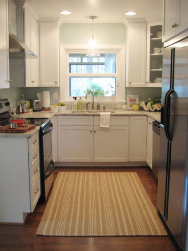
We knew that we wanted white cabinets and light marble-esque counters (they were actually granite) during the planning stages of that makeover back in 2007 – so we didn’t look to Nancy for much “style advice” during our 113 day kitchen reno. But she was truly invaluable when it came to space planning. She just knows how people use kitchens and where appliances should be placed to maximize function, and we fully believe that our first kitchen would have been half as useful if we didn’t have her free-with-the-purchase-of-cabinets advice when it came to where to squeeze in a dishwasher, relocate the fridge, and build in the microwave. Lesson learned: sometimes the pros know best. So take their advice whenever it’s free (and even when it’s not if you need it). You know, so you don’t DIY a kitchen all alone that’s semi-functional when you can DIY something twice as useful with some pro advice and a smidge of well-spent cash (assuming you can’t track down free services like those from HD or Lowe’s).
But back to our buddy Nancy. We actually kept in touch with her over the last three years since our big kitchen makeover in 07′ (she and Clara are practically BFFs). So she was sweet enough to offer to glance at a floor plan and a few photos of our current house’s kitchen to give us a little here’s-what-I-would-do advice. Second lesson learned: there are definite perks to staying in touch with any kitchen geniuses that you may encounter.
But first a little refresher. You’ll remember that the eat-in part of our kitchen currently looks like this:
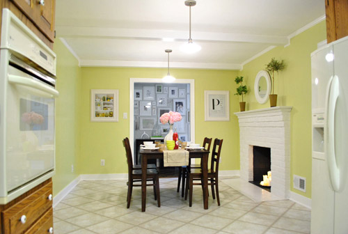
We’ve always planned to add a built-in island in place of the too-small dining table, just because when we knock out a huge doorway in the wall across from the fireplace to connect it to the dining room we thought two tables lined up through that opening would look odd (a big round one in the dining room and another one so nearby in the kitchen = crazytown).
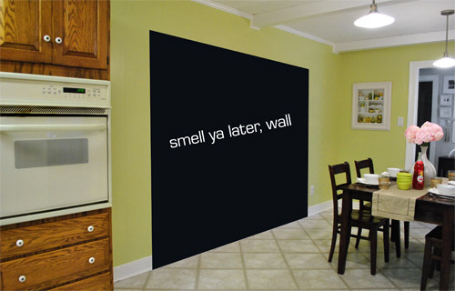
So we thought a big round table in the dining room and a smaller built-in island by the fireplace would make sense and be less “hello table, meet my friend, table.”
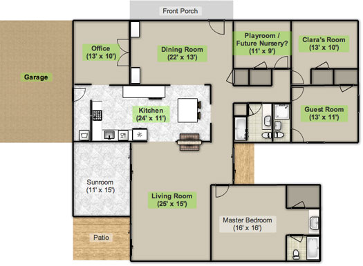
Here’s an old floor plan that we shared last November before we even moved, just to give you an idea of what we thought might work when it came to the island (with the new wide doorway to the dining room that we plan to add worked in there too):
Oh while we’re on the topic of someday dreams, we’d love to paint our cabinets white and craigslist our white, bisque, and black appliances and upgrade to stainless steel. When it comes to our counters, we plan to work with the granite that we have, but completely redo the backsplash for a crisper, lighter look. And those florescent tube lights and big brown fan? They gots to go.
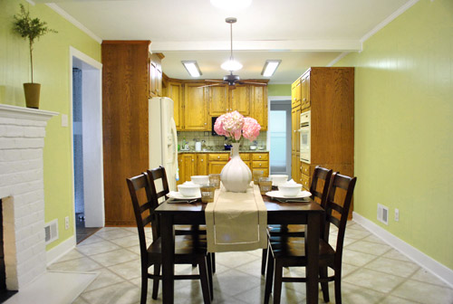
While we’re rattling off things on the list, of course we’d love to redo the floors but aren’t sure if there’s hardwood running all the way under the entire kitchen that we can refinish (we know it runs under part of it, but haven’t confirmed all of it) or if we’ll have to just redo them with something new entirely. The challenge of that is that we’ve learned that our floor joists aren’t built strongly enough to hold the weight of stone or ceramic tile (I thought slate would be awesome in there, so yeah… le bummer). We’ve toyed with everything from lightweight cork to some sort of linoleum (Candice Olsen has done some surprisingly awesome kitchens with that on the floor) but we’re nowhere near a decision. We’ll keep you posted though.
But I digress (who’s surprised?). Back to our talk with Nancy Kulik and the big kitchen idea she came up with (pretty much on the spot because she’s cool like that). Are you ready? She looked at the new to-scale floor plan that we brought with us (and a few photos) and realized that something was wrong, wrong, wrong on our little whole-house floor plan (seen three photos back, which we did months ago in November). That something? The fireplace is almost in the corner of the room in real life. So the placement of the fireplace in that old floor plan is totally off.
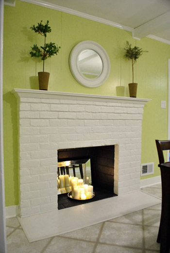
Thankfully it was drawn in the actual correct location in the newer kitchen-only floor plan that we brought with us to our Nancy meeting, but since it’s not actually centered on the wall (and practically kisses the door that leads to the hall), no island could be centered on it without nearly touching slash completely blocking that doorway (which we definitely want to keep open). So Nancy suggested something that we never would have thought of ourselves. And I mean never. Brace yourself. She proposed a floating L-shaped banquette that faces the fireplace and the frame wall.
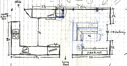
Note: don’t mind that vertical line that follows the back of the banquette to the door to the living room, she just dropped that in to tell us that we should line those things up- but the banquette wouldn’t be attached to anything, it would just float in the middle of the room to keep things open- just like an island would, but since it would face the fireplace in a way that an island wouldn’t it could make a lot more sense.
I’m not going to lie. Both of our first impressions were “thanks, but no thanks.” But as she further explained her vision we slowly started to come around. See, I’ve always adored the cozy-factor that is an L-shaped banquette. And if you search “banquette” some pretty cute images come up on google and Pinterest. A breakfast nook-ish type space like that might not be everyone’s cup of tea (there are definitely some die-hard island-lovers out there), but we actually thought it could be even cozier than our previously considered idea of an island. Especially because it would make sense of the off-centered fireplace in a way that an island never could (since it couldn’t ever be centered on it or lined up in any real way). So we took Nancy’s little scrap paper sketch home and taped out her floating L-shaped banquette idea on the floor:
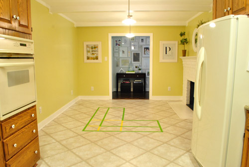
To explain what you’re looking at, the smaller L that’s being spooned by the bigger L would be the actual bench seating that faces the fireplace & the frame wall (which would make sense of the layout a bit more than a big floating rectangle that doesn’t line up with the fireplace at all). And the bigger L would be built-in cabinetry that wraps around the back of the bench seating to create a nice nestled nook that looks as good from the back and the side as the front (and provides a nice amount of concealed storage that’s accessible from the back, just like an island would have done).
As for the height, we thought keeping the tops of the cabinetry and the banquette seating the same height as the lower cabinets in the rest of the kitchen would make things feel cohesive and open (many of our inspiration images above have banquettes that are the same height as the base cabinets). And of course knocking out a huge 6 foot wide doorway to the dining room behind the banquette (which will have pretty cabinetry that faces the doorway so it looks good from behind) should keep the flow nice and airy – so nothing feels too boxed in.
I know it’s pretty much impossible to picture, so here’s John sitting at the fake banquette (although the table would be a smaller pedestal based thing, possibly square, oval, or even round – and possibly white or even a color, but probably not dark brown).
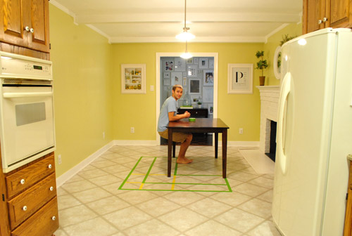
Note: we’ll have to move the lighting on this side of the room regardless of an island or banquette creation since it’s placed too far apart to make sense either way – and in the case of the banquette we’d center it over the table, not the seating (like many of the inspiration images).
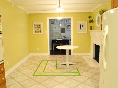
It’s admittedly still impossible to picture (and I would bet $20 that nearly everyone reading this is completely not sold on this idea), but here’s a round pedestal table tossed in there in case that helps the picture come together for a few of you (since our banquette table will definitely have a pedestal base to make maximum room for legs).
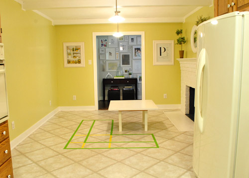
And here’s a lower square table (of course too low for a banquette, but this sized top might be right) to possibly help the vision come together a little more. As of now we’re both actually bigger fans of a rounded top – like the one above – but who knows where we’ll end up.
Who am I kidding. This probably doesn’t help anyone. And you all think we’re crazy to consider this. I know it. And we might be. But we’re excited enough about it to at least keep this idea on the table for now. Har-har.
See how the fireplace in the corner almost makes sense in that location with the cozy banquette facing it (which will be lined up with the doorway to the living room, so that doesn’t feel random either)? Nope. You still don’t see it. Haha. Well in person it actually has a lot of balance and makes considerably more sense than any island shape / placement that we’ve taped out on the floor over the last eight months (of which there have been many). We might just have to build our cabinet-backed banquette with cardboard or something to try to envision it further. Or use some serious photoshop magic to help picture it (the challenge is finding photos of the backs of banquettes since so many shots are looking into the L-shaped seating nook as opposed to looking over its shoulder from this angle).
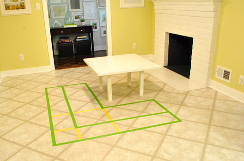
Oh and ignore the crazy white fireplace surround on the floor, since it seems to encroach and crowd the table waaaaay too much. When we redo the flooring in the room that’ll be remedied since we have plans to double side the fireplace down the road so you can peer into the living room through it (but will either make it gas or keep it completely inoperable so kiddo(s?) can crawl through the hole like it’s a secret passageway – so there won’t be a huge tile rectangle on the floor anymore).
I’ll leave you with this picture again, because it’s the one that makes my brain hurt the least when I try to picture things:

So all of this is to say that we taped off a crazy shape on the kitchen floor and we’re seriously considering some sort of cozy banquette-ish breakfast nook as opposed to a centered island with an off-centered fireplace nearby. It should be interesting. And the odds are that we’ll end up making some semblance of a decision someday. And we promise to keep you posted. Off to dip back into the aforementioned bedroom project and the office cabinet makeover. Ah DIY, you fickle friend. Maybe next week we’ll be less scattered. Who are we kidding? Probably not.

catie says
I love the idea of a banquette!! It’s hard to get your ideas across in photos, but I think you did a great job explaining it all.
Just throwing this one out there for you guys…have you guys heard about SketchUp? It’s a free software from Google that does 3D drawings. It’s really easy to learn, if you know Photoshop, you’ll get SketchUp in a flash. We use it at work (I’m a designer at an architectural firm) and it’s fabulous! It would be a really easy way for you to visualize it all!
YoungHouseLove says
We’ve heard of it, but not really tried yet – so maybe this is our opportunity to give it a go. Thanks for the suggestion!
-John
Kristin says
This idea is absolutely perfect for the space. I love, love, love banquettes. And it makes a lot of sense together with that fireplace. Can’t wait to see the kitchen come together!
Angela says
I love banquettes but feel like this doesn’t make sense. Seems like people would want to face the kitchen(where all of the action is)rather than the off center fireplace. I know when we entertain every one gathers right in our kitchen even though there are much comfier spots just feet away.
Ben says
Do you or John have any experience with Google SketchUp? It’s a free rendering program that is quick to learn and easy to use. That might be an easier way to help envision the space. Additionally, you can screen shot it with perspective or parallel projection to provide readers with images or plans of your ideas! Give it a try. You won’t regret it and will probably become obsessed with the program! It’s perfect for the first timer and DIYer!
http://sketchup.google.com/
YoungHouseLove says
I’ve only tried it once, but didn’t give it a fair shot. I may give it another go this time around, or use Floorplanner.com or the Ikea Kitchen Design software too. So many options, fortunately!
-John
Cat@BudgeBlonde.com says
Youngsters, I love this idea even more than the island idea!! I think it will be so cute and cozy to have little Petersiks doing homework there or for casual meals! Can’t wait!
xoxo
Cat Alford
S says
Lovely and large kitchen with so much potential – that I know you guys will take full advantage of – can’t wait to see this evolve.
BTW – when I first loaded the page the header was missing, but I reloaded and it appeared. I’m on a Mac using Google Chrome… just FYI.
maria says
I think it sounds like a good idea and I like where she is going with it. But do you think you would really want to look at the fireplace all the time. When I think of eating in a kitchen, I love to see who is cooking, interact with them and overall see the space in a whole.
I think if you close it off, you not only cut up the space, but you close off the interaction with your guests. Crazy idea- instead of blowing out that wall, why dont you do a crazy big oversized L-shaped banquet,that way although the fireplace is not centered it will eventually be with the oversized banquet. So that now your guests can see eveything that is going on in the kitchen and get the full beautiful view of it. I am pretty sure that the walls that lead into the hallway are load bearing but I was thinking maybe of taking those out and have the big opening there. To make the room more spacious.
Not sure. Totally know it’s a crazy idea. but anything you guys do, I love. Just wanted to give some imput:)
Reba @ WhereLoveisHome says
I really like this idea, especially if you can build storage into the bench. Have you thought about a color for it yet? I’m digging the first two pictures you put up from Pinterest, with the white table/white bench. At least that way, you can add color with the cushions/pillows and change them out over time. (I think if you go with a colored banquette, like the third pic down, you might get tired of it over time and it’s much harder to change!) All in all, I think it’s a really fun and creative idea and totally outside the box.
YoungHouseLove says
We’re mostly thinking white (since that’s usually where our brains go) but we haven’t made a final decision yet.
-John
Lori says
I absolutely love that idea. I think banquettes are unique “finds” in a home. Still giving you an eat in kitchen option…with style. Heck…who doesnt like sitting in a cozy nook next to a fireplace (especially when it is snowing outside?) In fact…makes me mad that i didnt think of this idea for my kitchen….hmmm….sounds like i have a new project now!
Karen says
I can totally see it and I think it’s a brilliant idea.
To be honest… whenever I looked at the plans for what you wanted to do to the kitchen, it always seemed like the island was kinda floating out there in no man’s land. But this seems like the perfect solution.
I love a banquette. I can see it with beautiful cabinetry facing the dining room… kind of like a console… and a banquette filled with bright pillows that will make a cozy spot for casual meals, crafts or doing homework.
Can’t wait til you start the kitchen reno!
Karen says
Oh… two more thoughts!
I like the round table the best… and will you build the banquette with the same white cabinetry you use in the kitchen…. or go for something that contrasts like a painted finish or wood tone?
YoungHouseLove says
Not sure! I think it’s all too soon! Still taking things one day at a time to avoid getting overwhelmed, but we’ll keep you posted!
xo
s
gia says
I am totally sold on this new idea! I think it will be amazing. I was actually wondering how the island would look and wasn’t entirely sure that I liked that idea- it just seemed too far away from the kitchen workspace. We blew out a wall in our kitchen that opens to the dining room and I currently have a dining table close to the kitchen nook table and have been considering options on how to work on this issue. I suggested some built in seating to my husband, but he isn’t completely sold. I’ll have to show him your pinterest pics!!
Carrie Del Cima says
I love this idea…but what about having the L with the long part, parallel to the hallway, and the short part parallel to the new opening to dining room? You would then have more interaction with the kitchen. Another thought, the back of the banquet be a bookshelf for cookbooks and odds and ends.
Sarah says
You had me at hello!I love the idea and i think it would look pretty!
Micha says
Hmm … not quite sold on it yet but it’s one of those “Hm ..never thought of that …let me think about it” kind of ideas. It just might work, and given how you have an eye for style you’ll just make it work :o)
Our contractor wanted to sell us on a penninsula but we want a banquette in our kitchen’s corner too so I’m definitely with you on the cozy kitchen nook with banquette train!
Rhonda says
I love the idea of the L banquette and your inspiration photos. I agree with meagans comment above that having the L face the kitchen area seems more user friendly (I.e. Walking over with cereal bowl slide into banquette versus walk around toward fireplace to enter). I’m sure it will be great when you get there. On another note, I wish I had more of your patience in planning and waiting for the deals you find…might be why your list moves along a little (LOT) faster than mine:)
Michelle N says
I think it’s a great idea! I like the round pedestal table. One question though. Would your banquette be with a counter top like in example three or just seating?
Oh and by the way I’m using Firefox and I am not having any issues viewing your site.
YoungHouseLove says
It’s have some sort of countertop on the back, though probably not as deep as what’s show in picture #3.
-John
Heather says
I love the idea of the banquette. There’s nothing like a cozy nook by a fire. My only question is, will it become annoying to have to walk around it every time you come in from the hallway? We have a terribly-placed island in my kitchen that actually hinders almost everything you might hope to accomplish.
Also, I only see your very cute background of hearts at the veeery bottom of the page…. in your screenshots it looked like they had more of a presence than that. Just letting you know! :)
YoungHouseLove says
We’re thinking doing a cardboard mock-up will help us decide if it really messes up the flow too much. Though living with it the last few days we’ve realized that we’ve been walking around the table with no problem for the last few months and it’s a very similar footprint.
-John
Nora says
I love this idea. So much cozier than an island. I’m thinking of doing a banquette in my own house. I like the idea of bringing in cabinetry because I think it will give the space more balance and cohesion. You know, like now when you look from the perspective of the doorway (to the hall, as in the 5th photo down), it is like cabinets cabinets cabinets at the far end of the kitchen, then they just STOP and you have this open space.
Jaime says
I think this would work! Maybe add some doors/storage on the back side of the banquette, (that would be visible to the diningroom), and expand the top so you have a little buffet/ console.
TD says
I use mozilla, your header looks fine in it.
I am really liking the banquet idea for the space in front of fireplace. To me it seems to make that area more user friendly. Perhaps it’s a matter of how each person uses the kitchen. Personally, I know I will never use the top of the island unless it is near the kitchen cooking triangle area. So it makes sense to use that space for storage and comfy seating instead of only storage and a surface not often used for cooking. BTW, I really liked your detailed discussions on how and why of this process…its like taking a peak into your minds! :)
Angela says
I actually *love* the idea, and it’s similar to the banquette I hope to build in my kitchen area someday! Kudos to Nancy for seeing the possibility and to you guys for considering it!
Candice says
I’m actually a fan of the built-in banquette, and can absolutely picture the cabinetry front the back side, and how accessible it would be. I’m already picturing with solid, crisp white cabinets in some areas, with some glass-front cabinets mixed in to break up the lines, make it feel less heavy, and give some display space to bring in some color. And hidden storage in the benches! Of course, with this potential plan, I would totally want to pull a Candice Olsen and raise the fireplace level up to eye-level when seated. How cozy would that be when drinking your morning coffee, or sipping hot chocolate in the winter? But, I can’t remember what is on the other side of the fireplace, so that might not make sense. But I would love it from a design perspective, and a protecting the kiddos perspective!
Vanessa says
I think its a great idea, that I would have never thought of. I think its different- but I am sure it will come out great. I realize the whole reason for putting the back towards the kitchen, you can could add a “counter-top” at the backs of the seating, that can be used for more space or cooking space for the kitchen. I think it a nice table and nice lighting and cozy cushion and pillows for the seating this would look so great. I can imagine, sitting there and enjoying the fire place. Plus opening the doorway to the living room will open things up even more. I think it has lots of potential! Good luck and cannot wait to see this!!!!!!!
Erin says
Sherry,
Check out the breakfast nook that Caitlyn Creer just finished out in Utah! If you guys can inexpensive build the bench, then you could maybe splurge on gorgeous pillows like these. I heart this space, and I know you will too.
http://www.caitlincreer.com/2011/08/dining-nook.html
Best,
Erin (Wahoo-wa! ’07)
YoungHouseLove says
GORGEOUS! I LOVE IT!
xo,
s
kim says
to people who can’t see the header… maybe try emptying your browser’s cache? i’m so not tech savvy, but i do know that one tidbit sometimes helps.
as for the banquette… LOVIN’ IT! an island is so… expected. the banquette idea is fresh and unique! think of all the fun fabrics you could bring in! i love the idea of incorporating storage. would you add a countertop?
ps. goodbye baby mullet!
YoungHouseLove says
Not sure about adding a countertop- we’ll have to see as we go. Will keep ya posted!
xo,
s
Laura says
If you actually make a banquette look hip and modern and NOT country bumpkinish, I will buy you and John a cup of coffee. Please note this cup of coffee might have to be a drawing of a cup of coffee as I live in Philly :).
YoungHouseLove says
Haha, we’ll take it!
xo,
s
Erika says
Nancy knows what she’s talking about! That is a great idea that I never would have thought of.
ps. I am LOVING that dream kitchen found on Pinterest.
pam says
I love this idea and think it will look spectacular – esp with your talent! I am looking for another house and you have inspired me to look at things differently in that search so thank you very much!
Can’t wait to see it in real life.
I love your blog – keep it coming!!
Pam Cartwright
GretchenF says
I love the banquette idea, I think it’s genious. Just think of cozy breakfasts and a cup of tea after Clara goes to bed. You’ve probably already seen it, but the newest Martha Stewart has a leather banquette in a kitchen and it is gorgeous.
Also, I couldn’t see your header yesterday and I can today. I’m on IE.
Brittany says
I did cork floors in a kitchen and absolutely LOVED them. It was in a 100+ year old home that had been converted into condos and the floor was a little (and sometimes a lot) wonky. To level it enough for tile would have been heavy (on the second floor) and expensive. The cork had just enough give to bend over the wonky spots and it was BEAUTIFUL. I love the slight cushiness, the color and richness of the cork and the fact that it was super durable and easy to clean. I HIGHLY recommend it if you can swing it. I think you’ll love it.
bridget says
I am in love with the idea of doing the banquet and the sqaure table would look amazing, so would the round though.. I agree it makes the fireplace make sense and then if you want a romantic dinner you can light the fireplace and it will all be perfect! GOOD LUCK cant wait to see pictures
sally says
Actually I thought the original plan looked completely unbalanced and unworkable. It stretched out the actual kitchen area way too much. The island was just too far removed from the working end of the kitchen. The banquette makes more sense and will probably provide more storage.
If it were me I’d make the fireplace disappear on kitchen side altogether. No matter how many fires you have I’m not sure what you really get from being able to see through it. And I would be reluctant to accept the limitations it puts on the kitchen area. And there could be safety issues with having a fire in two rooms if one of you isn’t supervising each room. Clara is just going to get more mobile and keeping up with her become more difficult.
Samantha says
I LOVE banquettes!!! Totally down with the redo… have you considered making one side of the L shape open for stools to make it still island-ish? Maybe having the back side facing the kitchen open with two stools underneath, with cabinets facing the dining room? That way you have the convenience of island seating, the cosiness of banquette seating, and the storage of cabinets! Everybody wins!
YoungHouseLove says
Certainly things we’ve considered / are still thinking about. We’ll keep you posted on what we come up with (obviously). :)
-John
Jen says
I totally just had an Oprah “ah! ha!” moment while reading this post. I love the little nook area. I think it will be perfect. I can just picture your little family huddled in there having pancakes or kiddos doing homework or playing with crayons there! Enjoy :-)
adrienne says
I love the idea of a banquette!
Asher says
i love banquettes. i love how this balances your space, but the architect in me wonders how often will people actually want to sit and look at a fireplace in your kitchen? it seems like it would be awkward to sit there and visit with the cook if your seating is oriented in a different direction. also, that’s a tight squeeze if you need to sit on the fireplace side. you’ve mentioned making your fireplace open to the living space as well. have you considered removing it from the kitchen side and opening it up on the living side? then your kitchen planning could go in many directions. just some thoughts. :) excited to see what you choose.
YoungHouseLove says
Definitely some ideas in there we’ve considered and are still tossing around. Lots of options to sort through at this point!
-John
Jennifer says
Love it! I was so concerned about the island previously, and this really seems to make a lot more sense! I commented before about my concerns, and even considered drawing up a floor plan to send you myself (this is my job), but thought that might be a little crazy! So, I’m glad to see you’ve considered other options! Can’t wait to see how it turns out!!
Jane says
Nancy is a genius, seriously knows her stuff and I love this idea.
MJB says
I guess there’s only one solution – move the fireplace! Bwha hahahahaha (evil laugh). I kid. I admire that you guys don’t let things like an off-center fireplace throw you for a loop. I need to be more solution-oriented like you.
How would the banquette look from the front door? Or wouldn’t it be visible?
YoungHouseLove says
We think you’d see just a sliver of the fireplace and the little seating nook from the door (and all of it when you move over to the dining area).
xo,
s
Angela says
I love it!! It definitely makes the random fireplace seem more purposeful. Can’t wait to see what you end up with!
Ben says
Have you thought about using vinyl plank flooring at all? We used the Traffic Master Allure Ultra in our bathroom in the new house and it is awesome. Super easy to clean, waterproof since it’s vinyl, looks surprisingly like wood (even next to our real wood floors) and even feels kind of cushy underfoot. The Ultra is a click and lock system that is wide plank, the non-ultra (Nultra?) is an adhesive based with skinnier planks. It’s worth a look.
The brand also has vinyl tile that you can grout around to make it look like a real (faux slate maybe?) floor.
YoungHouseLove says
Thanks for the tip! Never thought about it!
xo,
s
Lindsay L says
I love it! Seriously. Great idea to Nancy (of course she reads your blog right?) and props to you two for being daring enough to change your vision and going with something new. I love watching your thought process start, grow, change and then change some more. That’s what makes your blog so unique because you don’t just share the projects but all of the idea processes and how to details behind them so we really relate! I get so stuck in waiting for it to be perfect or not being daring enough that I never just do it so thanks for all the inspiration!
East End Girl says
It took me awhile but I li— love the idea! I do have a thought because I, like some other readers, have a thing about the seated person’s back being to the kitchen. Guests love to be in the kitchen whilst the hosts are entertaining. And people tend to sit on the “short” side of a banquette unless they are making room for others. Is it feasible to reverse the “L” so that the short side is along the doorway to the hallway? That way anyone sitting on the short side faces the kitchen and has a gorgeous kitchen view, and the long side still faces the fireplace. It defines the hallway as “traffic zone” and opens the kitchen up more because from the center of the kitchen you’ll be looking at the “open” side of the banquettes. Could be more “friendly” feeling!
YoungHouseLove says
We figure to keep the fireplace looking balanced the L has to face that way (and the view of the fireplace and the frame wall are the best two views in the kitchen! Haha). Otherwise if we move the L to the other side, the room just looks bottom-heavy with a fireplace too close to that wall and an L shaped sectional that’s heavy down there too. We loved the idea of the banquette balancing things out by facing the off-center fireplace to make sense of it. And I don’t mind not being able to see dirty dishes when I’m in my nook. Haha. Hope that makes sense!
xo,
s
Nora Rose says
Huge fan of the l-shaped banquet. I thought an island might crowd it off and not be as functional. This will definitely be cute!
Momlady says
Interesting twist on the kitchen dining/seating/storage problem! Gotta echo a few concerns..John@Our Home pointed out the facing away from the kitchen issue. As a mom (of a now grown child..but I can still remember!) I gotta ask you to consider whether you will be comfortable with not having the kiddo(s) in sight. I suppose it will depend in part on how high the back of the seating/storage will be…but keep in mind kiddos love to hide! Quiana had some trouble visualizing the opening..me too..maybe you could photoshop a taped off opening so it would be similar to the actual taped out banquette layout…??? Pip brought up the other thing I wondered about..how the shape of the table may have some impact on seating..how many people are you looking to seat comfortably in that space?
YoungHouseLove says
We’re definitely keeping all of these things in consideration! We’re just in the very early stages of planning so who knows where we’ll end up!
xo,
s
Jane says
Hi Sherry
Love that you guys are opening up this space – looks like you will have a pretty killer kitchen in the end!
I do, however, have a totally crazy idea. Prepare yourself. Why not knock out the wall that surround the fireplace (the one with the mirror on it) as well as the wall that enters the kitchen from the side (with the “P” print on it). Based on the layout pic, you will basically be able to walk from you living room into your kitchen, and then with the door knocked out, into the dining room OR go through the hall which is rendered almost useless by creating that new 6 ft. door. This way the living room, kitchen and dinning room would be one big, air space, with a super awesome double sided fireplace – perfect for hosting large family gatherings like Thanksgiving. Just a thought :)
Jane
YoungHouseLove says
We have actually thought about that but it’s a thick brick wall (it used the be the exterior of the house before the addition was put on) so it might have structural issues. We also wonder how much open is too much open, if you know what I mean. Haha. We just wonder if we’ll hear kids screaming and the dog barking through the whole house if we open things up too much – especially since we love the big doorway we’ll be adding in the dining room. Who knows where we’ll end up though!
xo,
s
Megan says
Excellent Idea! Love it!! You should show the last picture with the mock up of what the wall will look like once it is gone.
Bethany says
LOVE. THIS. IDEA!!!! super excited to see how this plays out you guys! whoot!
Melissa Breau says
Hmmm. I’m having trouble getting my mind around the sizing–is that bench really wide enough for storage behind it? Or are you talking about keeping the cabinets in the banquette low enough that they’d actually be under the seats? Just trying to picture things!
And any considerations for a not-square shape? A curve or something organic might be nice too (esp with a rounded table) though that would make the cabinets harder to do….
And I can totally imagine the space being super functional – just having trouble seeing what it’ll look like still :-)
YoungHouseLove says
Nancy the genius did the measurements and swears they’ll work and we believe her like crazy! The little L is the bench and the big L is the cabinetry (which is standard depth for upper cabinets, which are 12″ deep). As for adding a curve, using a round table with a banquette on a right angle seems to be appealing to us since we have a round table in the dining room which will be visible once we open the doorway- so a curvy cabinet setup might be too much curve next to that round table. Who really knows where we’ll end up though! These are all first thoughts!
xo,
s
melissa wellington says
Could you use your $6 cabinets to build a fake L shape just to get a better visual? Just an idea… I thought it may help you get a better feel for it :) I love that you guys are open to new ideas that may not seem right at first but have great potential!