True to form, we’re all over the place over here. After switching up the ol’ blog design (and figuring out why the header was MIA for 20% of you – here’s hoping it’s back) we’ve also been plugging away at our $6 cabinet makeover but aren’t quite done with the painting/building-up process (here’s hoping we’ll have photos and lots o’ words to share early next week). But crazily enough, in the meantime we’ve also been doing some yard work, a random bedroom project, and have even started brainstorming the next phase of the kitchen. Hence this brain dump.
We’re still saving our pennies for things like new appliances to begin the next step of our slow & steady kitchen overhaul (remember when we upgraded the fireplace and wood paneling a little while back?). So as we wait for the bank account to say “sure, go buy a new wall oven that’s not bisque, and a new microwave that’s not black”, we thought meeting up with an old friend of ours to get a few kitchen ideas might be nice. Who is this mysterious old friend that we speak of? Why it’s Nancy Kulik, the lady who helped us plan our first kitchen makeover through Home Depot (they offer up Certified Kitchen Designers to help for free if you buy cabinets or counters through them, of which we got both).
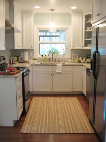
We knew that we wanted white cabinets and light marble-esque counters (they were actually granite) during the planning stages of that makeover back in 2007 – so we didn’t look to Nancy for much “style advice” during our 113 day kitchen reno. But she was truly invaluable when it came to space planning. She just knows how people use kitchens and where appliances should be placed to maximize function, and we fully believe that our first kitchen would have been half as useful if we didn’t have her free-with-the-purchase-of-cabinets advice when it came to where to squeeze in a dishwasher, relocate the fridge, and build in the microwave. Lesson learned: sometimes the pros know best. So take their advice whenever it’s free (and even when it’s not if you need it). You know, so you don’t DIY a kitchen all alone that’s semi-functional when you can DIY something twice as useful with some pro advice and a smidge of well-spent cash (assuming you can’t track down free services like those from HD or Lowe’s).
But back to our buddy Nancy. We actually kept in touch with her over the last three years since our big kitchen makeover in 07′ (she and Clara are practically BFFs). So she was sweet enough to offer to glance at a floor plan and a few photos of our current house’s kitchen to give us a little here’s-what-I-would-do advice. Second lesson learned: there are definite perks to staying in touch with any kitchen geniuses that you may encounter.
But first a little refresher. You’ll remember that the eat-in part of our kitchen currently looks like this:
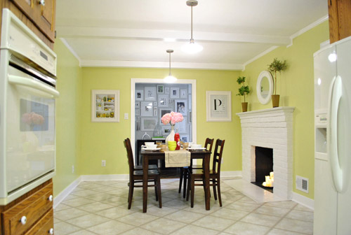
We’ve always planned to add a built-in island in place of the too-small dining table, just because when we knock out a huge doorway in the wall across from the fireplace to connect it to the dining room we thought two tables lined up through that opening would look odd (a big round one in the dining room and another one so nearby in the kitchen = crazytown).
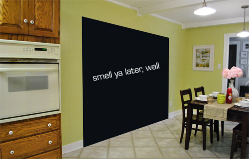
So we thought a big round table in the dining room and a smaller built-in island by the fireplace would make sense and be less “hello table, meet my friend, table.”
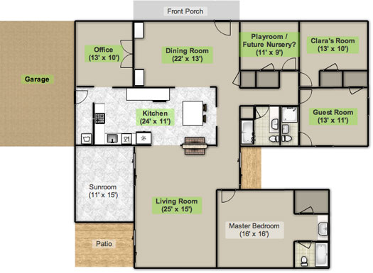
Here’s an old floor plan that we shared last November before we even moved, just to give you an idea of what we thought might work when it came to the island (with the new wide doorway to the dining room that we plan to add worked in there too):
Oh while we’re on the topic of someday dreams, we’d love to paint our cabinets white and craigslist our white, bisque, and black appliances and upgrade to stainless steel. When it comes to our counters, we plan to work with the granite that we have, but completely redo the backsplash for a crisper, lighter look. And those florescent tube lights and big brown fan? They gots to go.
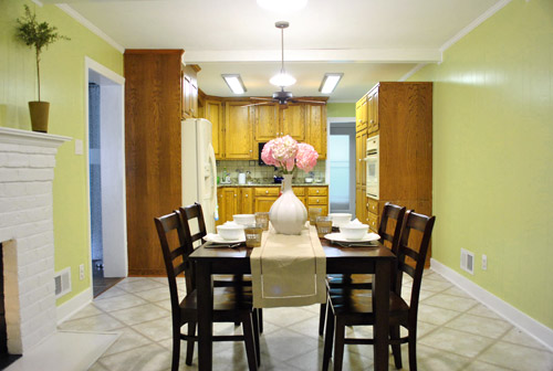
While we’re rattling off things on the list, of course we’d love to redo the floors but aren’t sure if there’s hardwood running all the way under the entire kitchen that we can refinish (we know it runs under part of it, but haven’t confirmed all of it) or if we’ll have to just redo them with something new entirely. The challenge of that is that we’ve learned that our floor joists aren’t built strongly enough to hold the weight of stone or ceramic tile (I thought slate would be awesome in there, so yeah… le bummer). We’ve toyed with everything from lightweight cork to some sort of linoleum (Candice Olsen has done some surprisingly awesome kitchens with that on the floor) but we’re nowhere near a decision. We’ll keep you posted though.
But I digress (who’s surprised?). Back to our talk with Nancy Kulik and the big kitchen idea she came up with (pretty much on the spot because she’s cool like that). Are you ready? She looked at the new to-scale floor plan that we brought with us (and a few photos) and realized that something was wrong, wrong, wrong on our little whole-house floor plan (seen three photos back, which we did months ago in November). That something? The fireplace is almost in the corner of the room in real life. So the placement of the fireplace in that old floor plan is totally off.
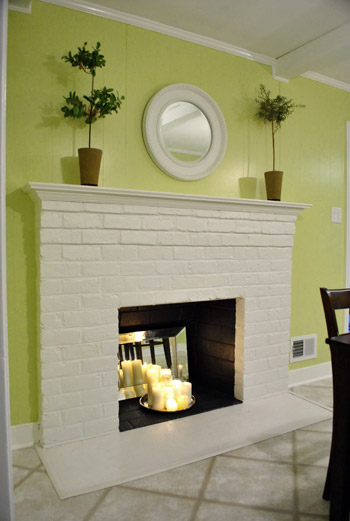
Thankfully it was drawn in the actual correct location in the newer kitchen-only floor plan that we brought with us to our Nancy meeting, but since it’s not actually centered on the wall (and practically kisses the door that leads to the hall), no island could be centered on it without nearly touching slash completely blocking that doorway (which we definitely want to keep open). So Nancy suggested something that we never would have thought of ourselves. And I mean never. Brace yourself. She proposed a floating L-shaped banquette that faces the fireplace and the frame wall.
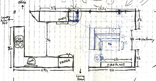
Note: don’t mind that vertical line that follows the back of the banquette to the door to the living room, she just dropped that in to tell us that we should line those things up- but the banquette wouldn’t be attached to anything, it would just float in the middle of the room to keep things open- just like an island would, but since it would face the fireplace in a way that an island wouldn’t it could make a lot more sense.
I’m not going to lie. Both of our first impressions were “thanks, but no thanks.” But as she further explained her vision we slowly started to come around. See, I’ve always adored the cozy-factor that is an L-shaped banquette. And if you search “banquette” some pretty cute images come up on google and Pinterest. A breakfast nook-ish type space like that might not be everyone’s cup of tea (there are definitely some die-hard island-lovers out there), but we actually thought it could be even cozier than our previously considered idea of an island. Especially because it would make sense of the off-centered fireplace in a way that an island never could (since it couldn’t ever be centered on it or lined up in any real way). So we took Nancy’s little scrap paper sketch home and taped out her floating L-shaped banquette idea on the floor:
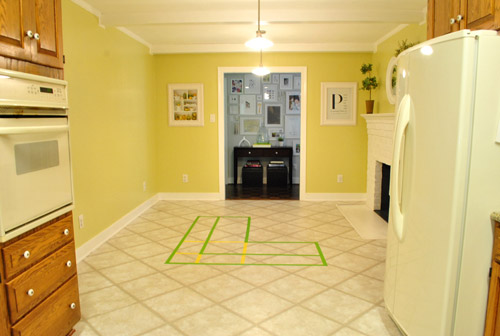
To explain what you’re looking at, the smaller L that’s being spooned by the bigger L would be the actual bench seating that faces the fireplace & the frame wall (which would make sense of the layout a bit more than a big floating rectangle that doesn’t line up with the fireplace at all). And the bigger L would be built-in cabinetry that wraps around the back of the bench seating to create a nice nestled nook that looks as good from the back and the side as the front (and provides a nice amount of concealed storage that’s accessible from the back, just like an island would have done).
As for the height, we thought keeping the tops of the cabinetry and the banquette seating the same height as the lower cabinets in the rest of the kitchen would make things feel cohesive and open (many of our inspiration images above have banquettes that are the same height as the base cabinets). And of course knocking out a huge 6 foot wide doorway to the dining room behind the banquette (which will have pretty cabinetry that faces the doorway so it looks good from behind) should keep the flow nice and airy – so nothing feels too boxed in.
I know it’s pretty much impossible to picture, so here’s John sitting at the fake banquette (although the table would be a smaller pedestal based thing, possibly square, oval, or even round – and possibly white or even a color, but probably not dark brown).
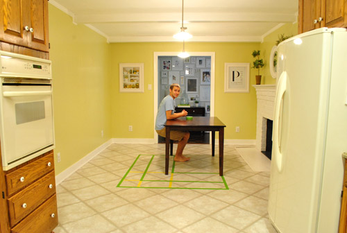
Note: we’ll have to move the lighting on this side of the room regardless of an island or banquette creation since it’s placed too far apart to make sense either way – and in the case of the banquette we’d center it over the table, not the seating (like many of the inspiration images).
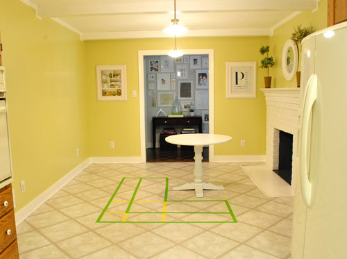
It’s admittedly still impossible to picture (and I would bet $20 that nearly everyone reading this is completely not sold on this idea), but here’s a round pedestal table tossed in there in case that helps the picture come together for a few of you (since our banquette table will definitely have a pedestal base to make maximum room for legs).
And here’s a lower square table (of course too low for a banquette, but this sized top might be right) to possibly help the vision come together a little more. As of now we’re both actually bigger fans of a rounded top – like the one above – but who knows where we’ll end up.
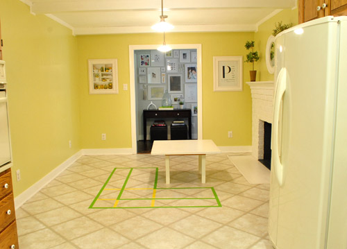
Who am I kidding. This probably doesn’t help anyone. And you all think we’re crazy to consider this. I know it. And we might be. But we’re excited enough about it to at least keep this idea on the table for now. Har-har.
See how the fireplace in the corner almost makes sense in that location with the cozy banquette facing it (which will be lined up with the doorway to the living room, so that doesn’t feel random either)? Nope. You still don’t see it. Haha. Well in person it actually has a lot of balance and makes considerably more sense than any island shape / placement that we’ve taped out on the floor over the last eight months (of which there have been many). We might just have to build our cabinet-backed banquette with cardboard or something to try to envision it further. Or use some serious photoshop magic to help picture it (the challenge is finding photos of the backs of banquettes since so many shots are looking into the L-shaped seating nook as opposed to looking over its shoulder from this angle).
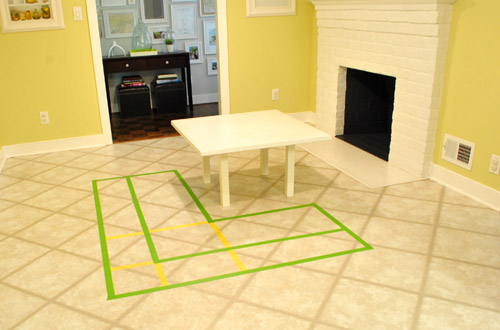
Oh and ignore the crazy white fireplace surround on the floor, since it seems to encroach and crowd the table waaaaay too much. When we redo the flooring in the room that’ll be remedied since we have plans to double side the fireplace down the road so you can peer into the living room through it (but will either make it gas or keep it completely inoperable so kiddo(s?) can crawl through the hole like it’s a secret passageway – so there won’t be a huge tile rectangle on the floor anymore).
I’ll leave you with this picture again, because it’s the one that makes my brain hurt the least when I try to picture things:

So all of this is to say that we taped off a crazy shape on the kitchen floor and we’re seriously considering some sort of cozy banquette-ish breakfast nook as opposed to a centered island with an off-centered fireplace nearby. It should be interesting. And the odds are that we’ll end up making some semblance of a decision someday. And we promise to keep you posted. Off to dip back into the aforementioned bedroom project and the office cabinet makeover. Ah DIY, you fickle friend. Maybe next week we’ll be less scattered. Who are we kidding? Probably not.

Jennifer says
What a wonderful way to cozy up to the fireplace AND get kitchen storage
AND prep space AND a breakfast nook. Brilliant! Plus, how much nicer to have seating on “fireplace level” rather than peering at the flames over the top of a counter or off to the side? But I’m Minnesotan; I like to get close to my fireplace in the winter!!
Meagan says
I can see why people are thrown by having the L ‘cut off’ the kitchen, but with the fireplace location, I think it would give the necessary balance.. one idea would be to have the side of the banquette that is closest to the kitchen be backless – almost like a chaise? It could still be on the same base as the rest of the banquette so it was nice and seamless (and would provide storage underneath) but this way it would feel more ‘open’ and would also allow people to be able to sit facing the actual kitchen area as well? Just a random thought – I’m sure it will look great no matter what and will be a nice seating-but-not-table-next-to-the-dining-table too!
Shauna says
I LOVE it!!! Those built in nooks are one of my dreams in a future kitchen!! Can’t wait to see if/when it plays out!
Rachel P. says
I am so glad Nancy suggested this over the island idea. I really didn’t think it would work and the banquette makes much more sense. I’m curious about any plans you may have for the back. Maybe some details to the wood or a pop of color?
YoungHouseLove says
We haven’t thought that far ahead to backs yet, but either of those sound like good options!
-John
Laura says
I love it! My husband DIY’ed our banquette last fall along with a farmhouse table and we love it! We also live in an old rancher like you. Our kitchen was set up in a way that a banquette made the best use of the floorspace b/c you can shove it in the corner. Ours is built in, not floating, b/c we have double windows on each wall of the L-shape, so it was practically begging for one. I’ll give you a big time saver—the seating for our banquette was actually made from “above-refrigerator” cabinets. We bought those, which have great storage, then added depth/height to them by framing them out. I’m not a blogger, or I’d show you a picture. Maybe I can email it? We even have step by step pics that we took showing how it was framed out. And Sherry…best part? You can change out your pillows SEASONALLY! Whoop!
YoungHouseLove says
Love the idea of the “above-refrigerator” cabinets as the seats. And we’d love to see pictures too. You can find our contact info on the sidebar next to our picture, or just post them on our Facebook page for everyone to see.
-John
Ann L says
LOVE the idea of the banquette, and from the looks of it, the round pedastal table looks like it would make the most sense. So excited to see what you guys end up doing in here. A kitchen makeover is next on our list and I’m sure I’ll end up drawing a lot of inspiration/know-how from yours.
Ana says
LOVE LOVE LOVE this idea! Space planning is an art! She did a fabulous job! Functional, great looking, I don’t think there is a better solution to this island issue! So excited to see what you do with this!!
Melissa S says
I think its awesome!! I love cozy places in the kitchen like this! I think my favorite picture that you posted for “inspiration” was the one where the sink was on the back. That could be really useful almost like a “wet bar” area for the dining room. I think its really cool. Good idea! One thing to consider is the angle at which the back of the seats is at. You don’t want it to feel like you are sitting too upright and you can’t relax. You know what I mean, when you get to a booth at a restaurant and it feels like they put you in an electric chair. You have to sit all stiff and uncomfortable while you eat your meal. Otherwise – go for it!!!
Rachel says
I love the look of slate tiles with white cabinetry, too. We actually have vinyl flooring tiles in our kitchen that look almost exactly like slate. In fact, everyone that comes over is absolutely floored (pun!) that the floors are vinyl and not slate.
Here are some not-so-good photos to give you an idea:http://littleredridinghouse.blogspot.com/2010/09/phase-two-kitchen-reno.html.
I have really loved the vinyl tiles because they are easy on my back when I’m standing up cooking in the kitchen and they clean up really well…not to mention they’re super easy to replace one-by-one if anything ever happened.
YoungHouseLove says
Oh yes- those look really convincing!
xo
s
Laura says
Also- on a side note, didn’t you guys mention you have no plans on even using the fireplace? Would removing it completely to get the island centered be out of the question? I don’t know how much that would cost, we’re redoing some of the walls in our house (stripping to studs) and it didn’t seem like a hugely costly endeavor.
YoungHouseLove says
While definitely an option, I think we like the feature of the fireplace and removing it probably would be quite some trouble since it’s a huge structural feature that goes all the way from our crawlspace up through the room. So for now we’re gonna try to work with it. If only we could nudge it to the side a little bit. :)
-John
Lori says
I can TOTALLY see it – and I totally LOVE it! Do it! Do it! (Decorating peer pressure. :)
Ryan says
I’m excited to see what you guys decide on. I’ve never really seen a banquette that’s floating (they’ve always been anchored by a wall or island). But if anyone can pull it off, you two can! :)
Sarah CC says
LOVE IT! What a great idea!
MJB says
Maybe you’ve already considered this idea but how about a peninsula with seating from the old desk side? (The seats would face the work space) Then put some cozy seating around the fireplace, with a low table for snacks, etc.
YoungHouseLove says
We’ve definitely considered some other ideas and won’t do a thing until we’re certain about what we love best!
xo,
s
Jennifer says
I read your posts daily and never comment (except to try to win something!!! I’m one of “those” kind of lurkers!) But I had to post to say that the banquette idea is AWESOME and so much better than your island idea (sorry!). I never really understood your island idea since it was going to be a great big glob of cabinets right in front of/blocking the now lovely fireplace focal point. The banquette is the perfect solution for your unusual kitchen layout. And I love the round chunky table from one of your inspiration photos. And the cushions/pillows on the banquette will give you the option of changing it up whenever you want like you tend to like to do. And if you do an upcycle table, you can even change that out whenever you find something else that strikes you. And the cabinets on the back of the bench will be so much more accessible and useful than ones underneath a big island (they can be a pain to reach into unless you get all the fancy pullout options). Can you tell I really like the idea!!
Megan K says
I LOVE it! In fact, when I saw the third picture of your “inspiration nooks”, I thought of your white round top pedestal table and when I scrolled down, of course you had used it for one of your own “example” snap shots :)
Initially, I wasn’t sure how a “floating nook” would work, but now I really hope you choose that option – it looks great. You could still put stools on the side that faces hallway if you wanted the “bar esque” working area.
Good luck! And thanks for the updates on your thought process!
Cheryl says
Ok, I must admit when I first read your idea, I had to raise an incredulous eyebrow. However, when I pictured your little family (Burger too!) seated at a cozy banquette with a fire in the fireplace during chilly winter months, I was sold. I think it’s a great idea. Your buddy Nancy is a genius!
PS – Am I a crazy person for picturing you guys that way? Maybe? Sherry, you were totally in a cream colored sweater and you were all surrounded by pillows. NOW I’m a crazy person.
YoungHouseLove says
Haha- I’d be in black. But close.
xo,
s
Bree says
I LOVE this idea!! I think you guys are the perfect ones to take on something less conventional like this and make it totally work. Maybe I’m more visual than others, but I could see it as soon as you taped it out on the floor. In my head, it is awesome!
Tracey says
I gotta say I’m a huge fan, but I think it needs some tweaking. My only concern is proximity to the fireplace. Are you planning on using the fireplace? Won’t that table get extra toasty? I think maybe I’m with the other peeps who are interested in seeing the L flipped the other way facing into the kitchen. (Get on that would ya? j/k :P) And not like you asked, but I think the round table looked best! ;D
YoungHouseLove says
Wait but I don’t understand the flipped banquette idea. All of our concerns with the fireplace looking off centered would be realized. The whole reason for the banquette facing that way is because it would sort of hug the off centered fireplace (creating an L around it that faces it to make sense of the layout). Maybe you have to be in the room to see what I’m talking about. You could be totally right about the proximity to the fireplace though – we plan to build everything without fixing it to the floor until we’re 100% sold on placement, so we’d still be able to shimmy things around!
xo,
s
Kristen says
I really like the idea of banquette! I definitely wouldn’t have thought to do that but now it seems like the perfect idea. So cozy!
Lauren says
How deep will the storage in the banquet be? In my old kitchen I had some narrow cabinets and they were pretty worthless except as use as a pantry. In fact, it functioned well as a pantry since I never had old expired stuff hiding deep in the back.
YoungHouseLove says
Nancy thought we could fit upper cabinets that are standard depth in all kitchens (12″ deep) so we could store anything that we’d up in upper cabinets.
xo,
s
Theresa says
I like the idea. Casters on the table might be a way to make cleaning in the area easier. Don’t forget to make the bench have storage too.
YoungHouseLove says
That could be fun!
xo,
s
gabby says
uh yes– i LOVE this. i think i’ve pinned every banquette on pinterest, so i truly envy and love this plan. xoxo.
ashley says
I LOVE this idea!! To me, it’s nice to have a place that’s in the kitchen, but does not face the sink, appliances, etc. It will give it a nice, cozy “coffee house” or cafe-feel with that fireplace right there. Ah, now I’m imagining a nice, cool, autumn or winter day sitting in front of the fire on a cushy banquette seat with a cup of coffee or tea…
Okay, now all my mind wants to do is think of how to incorporate a banquette into our kitchen eating area : ) Can’t wait to see what you decide!
Lauren says
The back part of the banquet that is made of storage, will that have a counter on top?
YoungHouseLove says
Yes, it’ll have some sort of surface on the tops of the cabinetry. Not sure what!
xo
s
Laura A. says
Sherry, I’m *shocked* to hear you sounding like such a negative Nancy — no one will like it, everyone’s confused. Uhh, I’m totally right there with you, and I LOVE the idea! Can’t wait to see how everything plays out over time! :)
YoungHouseLove says
Haha- we just looked at our photos with all the wrong tables and the green tape lines on the floor and thought “no one can picture it – haha, we can hardly picture it!”
xo,
s
Karli says
I seriously think this is genious! Such a great cozy idea. I prefer the white round table top over the other two. I can’t wait to see the actual finished product!
Kristen @ Old House New Folks says
I love it! We’re planning our first major kitchen overall (maybe next year), and I’m trying to get my husband on board with a banquette as well. Ours will be more traditional in a corner, but I think your free-standing banquette will be perfect by the fireplace.
There seems to be some debate about which way it should face–toward the kitchen or the fireplace. Both seem good, but I like your plan toward the fireplace best. This allows a mini divide between kitchen and eating area. Possibly a nice location for a small shelf for cookbooks or a low table. Can’t wait to see what you decide!
Mary@TheGoodLife says
OMG I LOOOOVE IT. When you mentioned the island idea, I was screaming “no!” inside my head. Not because I thought you could hear me, but because I thought having a work surface over there would be hard to maneuver because it would be just BARELY out of the flow of the kitchen. Plus, the two table thing, which I never would have thought of and now makes total sense. I wanted to suggest a cornered banquette but with the huge wall-hole, that never would have worked… floating? GENIUS. Especially with the finished look of the cabinetry around the backs. Exploding with excitement. Aren’t you guys just itching to get started? Knowing how awesome its going to be must just be killing you guys!
bex says
I think that looks amazing! Such a brilliant idea. I never would have thought of that either – I always marvel at the genius of others. :) We’ve got a couch in our kitchen though (in the eat-in space instead of a table), so I’m all over the unusual furniture in the busiest room in the house.
Melissa Mitchell says
I am an island gal. My brother-in-law teases me that I would be totally happy in a shack as long as it had an island in it. But I think there is a definite way to do something similar to pinterest example #3 (it’s on my board too!) and get the functionality of an island behind the seating by creating an extended workspace behind the benches with cabinets underneath for storage- especially on the back side of the bench that faces the main work area. My only question- it looks like the end product would end up feeling much bigger than the tape lines on the floor do in the space- especially if you added cabinets off the back or anything- hopefully that will be relieved when you cut the hole in the wall for more flow? i know how you guys like your flow. (ha)
YoungHouseLove says
The tape lines reflect the back cabinetry! The little L is the bench seating and the big L is the cabinetry that will hug the back of it. Hope it helps!
xo,
s
Carrie f says
Hola! Carrie and Finn here, I love the new blog design, looks great! I also love the banquette idea because I think they are cozy and practical but I have a few ideas for ya: first, I think it might be nicer if it faced the kitchen (1/2 of the L towards the fireplace, 1/2 towards the kitchen). It would look nicer from the kitchen that way which is where you will mostly be viewing it from. It would also be nicer for conversations and hanging out. I don’t know how many cookbooks you have but I would also strongly consider doing open storage on one or both sides of it so it will look more like a nice furniture piece than cabinetry. Also, if you need more counter space you could knock out the current oven wall cabinets and do an upper/ lower cab combo over there too to gain quite a bit of counter space. Then since you are not going to relaxed your current countertops you could do your new upper/lower cabinet combo countertops and the countertop piece on top of the banquette in the same material so it would all tie together, make sense? You could do butcher block, stainless (I have stainless and my house is not modern and I love it!), ceasarstone, etc. I also love the cork or linoleum idea, you can interesting floor designs with either and they are so much easier on your back than tile. Good luck! As always can’t wait to see what you do!!! Ps, a move to Richmond is looking likely (:
YoungHouseLove says
Thanks for all the ideas! Who know where we’ll end up. Haha. Good luck with your (likely) Richmond move! Wahoo!
xo,
s
Victoria says
I love banquettes. This set up makes me think of the ingleknook’s used by Frank Lloyd Wright. As the mom of four, you will enjoy having Clara a little closer to you as you are in the kitchen and she is coloring. Just those few extra feet away in the dining room will seem like a million when you have to keep going ’round the corner to see why she is so quiet! Plus, the ingleknook could be the coffee/work space, leaving the dining table always ready to, well, dine!
Alexandra says
I think that the banquette idea is great! We had one in my childhood home and I always loved it. So cozy. Nice website update as well; much more representative of the direction(s) your site has taken over the years!
Michelle says
I love the banquette idea, it is going to be very cute and way cooler than an island next to the fireplace!
Also, I just have to tell you that I am newly obsessed with your site and am reading back through all the posts. I am redoing my whole house too and many of your projects are giving me a lot of direction, so thank you, thank you!!!!!
E.Lefebvre says
Like many other commenters… it took me about half the post to like the idea. At first I thought it was nuts. Now I think it’s genius! I can just imagine a nice floor, warm banquet, cozy fire, and well-styled shelves on the back. So fun! And it still gives you a kitchen table/seating, without being a “copy” of the dining room.
And actually… I never thought the island made sense there. I like to use them for big prep things (like baking), but it’s so far from everything else in your kitchen that it would be less functional than it would be otherwise. You couldn’t turn and rinse something or quickly grab a spice without completely leaving your work station.
So there’s my two cents. Looking forward to seeing your progress!
Abby says
I really like the banquette idea, and I can definitely envision it–I’m an Architect and Interior Designer, so that probably helps :). I also really like the idea of using the cabinet countertop around the back of the banquette as a buffet for your dining room–I guess you would have some sort of granite or stone top–or you could use something warmer like butcher block to mix it up–just an idea, but I think it’s critical to have usable countertop space around the banquette to make it functional and transitional–so it doesn’t seem to completely isolate the banquette space from kitchen and (soon to be open) dining room. Can’t wait to see it!!
Margaret says
The banquette sounds like a great idea! I think it would look very spendy and custom in that space.
Michelle says
i love the idea!!! the 3rd example is my absolute Fav and i cannot wait to do this in my house someday… i would have never thought of this idea!
Kelly says
I love the idea! When you were talking island, my thought was, “but I don’t think I could give up my breakfast table in our kitchen”.. but this combines both ideas into one! I’m excited to see what you guys end up doing :)
KAYCEE says
Did you darken the background? It looks different. And wow, i just spied that little smiley face at the bottom of the page, lol!
On another note, write a short blog post explaining why people call internet explorer, internet EXPLODER. Just tell everyone to download Chrome, or Firefox & your problem will be fixed because they most likely will, lol.
As for your kitchen, it is hard to picture the banquet. But, i’m sure with some careful planing & your tastes, you’ll pull it off!
Kaycee
YoungHouseLove says
Yep, we did darken it a bit last night to give the site a bit more contrast. Probably will still be making tweaks over the next few days too. The fun never ends! :)
-John
partyofsix says
I definitely like the idea, especially since I’m a huge fan of kitchen nooks. Alhough definitely deal with your wall first, then “live with” a boxed out version of the cabinets for a little while to see what you think. It will help with sight lines and dimensions–and most importantly if you still like the concept when you can visualize better. I wouldn’t do the island before the wall in other words. Found this on the web http://magahern.zanneth.com/The_Nook_Look.html (have a look at the second photo). Poor image, but it’s similar to what you’re describing?
No doubt you’ll make one really cool table to fit the space!
Loren says
I was totally ‘Not sold on the idea’. Until I finally scrolled down to the third banquette photo. (The one where the sink is actually in the banquette counter.) Then it was like everything clicked into place in my head. A little counter height breakfast nook would look totally cute in there. And perfect for lining up food and drinks during family get togethers.
Nicole S. says
Have you guys tried using Google Sketchup? It’s free, and pretty intuitive to use, and I think it could really help with projects like these. You could model your whole house and insert in little projects like these when you need more than just 2-dimensional tape on the floor. I’m an architect, and we use it all the time. [or you can send it to me and I’ll block it out for ya :)]
I think the floating banquette is a great idea, though. Much better use of existing elements.
YoungHouseLove says
Thanks for the suggestion! We haven’t used it much, but may give it a try for this project. We’ll let everyone know what we come up with!
-John
Kristal says
I love the banquette idea! I can’t wait to see what you decide! :)
Sierra says
I think it’s a GREAT idea! I can totally see it with all your examples.
Love the new blog look! Change is hard/scary but what’s life without a little change eh? lol
Keep up the amazing work! :)
Amanda M. says
Love the idea with the round pedistal table! Can’t wait until the kitchen dump gets started!
Sharon in NYC says
any idea why i can’t see any of your photos today? it has always worked fine before
YoungHouseLove says
So sorry! Nothing on our end changed. Maybe it’s an anti-virus software update? We hear when those happen certain people can be blocked, but if you go into your anti-virus software and make YHL a safe or approved place, they’ll hopefully pop back up!
xo,
s
Brianne Franklin says
Okay, I said I wouldn’t comment as much when I heard HOW much time you spent replying, but I just had to in this case.
I LOVE this idea. I was never sold on the island for you guys because it was way too far away from the ACTION ALLEY (like that term?…yeah, I so made that up) of the kitchen. I could see that you wouldn’t actually use the island.
This is a MUCH more usable idea. So many ways you could go with this.
Also, don’t close your mind to the direction of the banquet. YOu might want it to open INTO the kitchen.
Gosh, I love this blog. Seriously.
Amanda- Hip House Girl says
We had a banquette with a round table growing up and I loved it. There were six of us and it was our only dining space, so things were very… cozy!
I’m kinda with Sara and I don’t really see why the island would need to be centered with the fireplace either, but I trust your judgment that it might be awkwaaaaard. (I just love islands so much, too.) But I love banquettes too and I don’t know how much cozier you can get than a banquette facing a fireplace.
Picturing sweet Clara doing homework at it while you and John whip up dinner is making my heart slightly melt, too.