True to form, we’re all over the place over here. After switching up the ol’ blog design (and figuring out why the header was MIA for 20% of you – here’s hoping it’s back) we’ve also been plugging away at our $6 cabinet makeover but aren’t quite done with the painting/building-up process (here’s hoping we’ll have photos and lots o’ words to share early next week). But crazily enough, in the meantime we’ve also been doing some yard work, a random bedroom project, and have even started brainstorming the next phase of the kitchen. Hence this brain dump.
We’re still saving our pennies for things like new appliances to begin the next step of our slow & steady kitchen overhaul (remember when we upgraded the fireplace and wood paneling a little while back?). So as we wait for the bank account to say “sure, go buy a new wall oven that’s not bisque, and a new microwave that’s not black”, we thought meeting up with an old friend of ours to get a few kitchen ideas might be nice. Who is this mysterious old friend that we speak of? Why it’s Nancy Kulik, the lady who helped us plan our first kitchen makeover through Home Depot (they offer up Certified Kitchen Designers to help for free if you buy cabinets or counters through them, of which we got both).
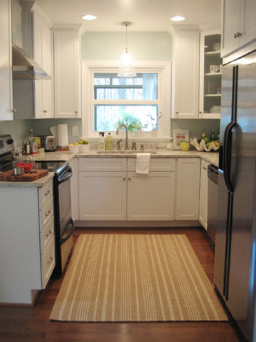
We knew that we wanted white cabinets and light marble-esque counters (they were actually granite) during the planning stages of that makeover back in 2007 – so we didn’t look to Nancy for much “style advice” during our 113 day kitchen reno. But she was truly invaluable when it came to space planning. She just knows how people use kitchens and where appliances should be placed to maximize function, and we fully believe that our first kitchen would have been half as useful if we didn’t have her free-with-the-purchase-of-cabinets advice when it came to where to squeeze in a dishwasher, relocate the fridge, and build in the microwave. Lesson learned: sometimes the pros know best. So take their advice whenever it’s free (and even when it’s not if you need it). You know, so you don’t DIY a kitchen all alone that’s semi-functional when you can DIY something twice as useful with some pro advice and a smidge of well-spent cash (assuming you can’t track down free services like those from HD or Lowe’s).
But back to our buddy Nancy. We actually kept in touch with her over the last three years since our big kitchen makeover in 07′ (she and Clara are practically BFFs). So she was sweet enough to offer to glance at a floor plan and a few photos of our current house’s kitchen to give us a little here’s-what-I-would-do advice. Second lesson learned: there are definite perks to staying in touch with any kitchen geniuses that you may encounter.
But first a little refresher. You’ll remember that the eat-in part of our kitchen currently looks like this:
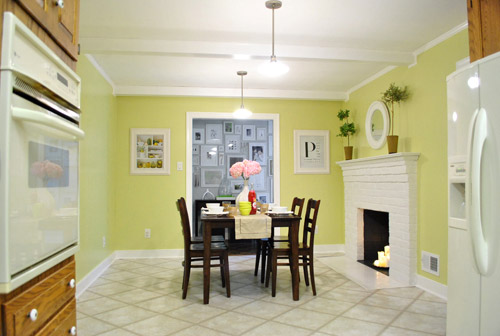
We’ve always planned to add a built-in island in place of the too-small dining table, just because when we knock out a huge doorway in the wall across from the fireplace to connect it to the dining room we thought two tables lined up through that opening would look odd (a big round one in the dining room and another one so nearby in the kitchen = crazytown).
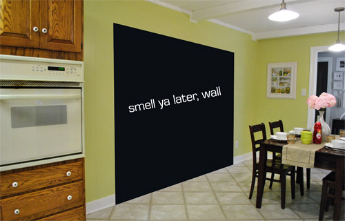
So we thought a big round table in the dining room and a smaller built-in island by the fireplace would make sense and be less “hello table, meet my friend, table.”
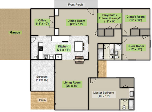
Here’s an old floor plan that we shared last November before we even moved, just to give you an idea of what we thought might work when it came to the island (with the new wide doorway to the dining room that we plan to add worked in there too):
Oh while we’re on the topic of someday dreams, we’d love to paint our cabinets white and craigslist our white, bisque, and black appliances and upgrade to stainless steel. When it comes to our counters, we plan to work with the granite that we have, but completely redo the backsplash for a crisper, lighter look. And those florescent tube lights and big brown fan? They gots to go.
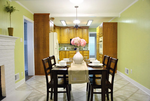
While we’re rattling off things on the list, of course we’d love to redo the floors but aren’t sure if there’s hardwood running all the way under the entire kitchen that we can refinish (we know it runs under part of it, but haven’t confirmed all of it) or if we’ll have to just redo them with something new entirely. The challenge of that is that we’ve learned that our floor joists aren’t built strongly enough to hold the weight of stone or ceramic tile (I thought slate would be awesome in there, so yeah… le bummer). We’ve toyed with everything from lightweight cork to some sort of linoleum (Candice Olsen has done some surprisingly awesome kitchens with that on the floor) but we’re nowhere near a decision. We’ll keep you posted though.
But I digress (who’s surprised?). Back to our talk with Nancy Kulik and the big kitchen idea she came up with (pretty much on the spot because she’s cool like that). Are you ready? She looked at the new to-scale floor plan that we brought with us (and a few photos) and realized that something was wrong, wrong, wrong on our little whole-house floor plan (seen three photos back, which we did months ago in November). That something? The fireplace is almost in the corner of the room in real life. So the placement of the fireplace in that old floor plan is totally off.
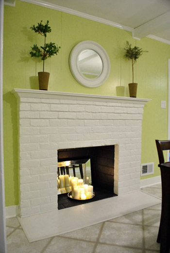
Thankfully it was drawn in the actual correct location in the newer kitchen-only floor plan that we brought with us to our Nancy meeting, but since it’s not actually centered on the wall (and practically kisses the door that leads to the hall), no island could be centered on it without nearly touching slash completely blocking that doorway (which we definitely want to keep open). So Nancy suggested something that we never would have thought of ourselves. And I mean never. Brace yourself. She proposed a floating L-shaped banquette that faces the fireplace and the frame wall.
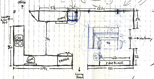
Note: don’t mind that vertical line that follows the back of the banquette to the door to the living room, she just dropped that in to tell us that we should line those things up- but the banquette wouldn’t be attached to anything, it would just float in the middle of the room to keep things open- just like an island would, but since it would face the fireplace in a way that an island wouldn’t it could make a lot more sense.
I’m not going to lie. Both of our first impressions were “thanks, but no thanks.” But as she further explained her vision we slowly started to come around. See, I’ve always adored the cozy-factor that is an L-shaped banquette. And if you search “banquette” some pretty cute images come up on google and Pinterest. A breakfast nook-ish type space like that might not be everyone’s cup of tea (there are definitely some die-hard island-lovers out there), but we actually thought it could be even cozier than our previously considered idea of an island. Especially because it would make sense of the off-centered fireplace in a way that an island never could (since it couldn’t ever be centered on it or lined up in any real way). So we took Nancy’s little scrap paper sketch home and taped out her floating L-shaped banquette idea on the floor:
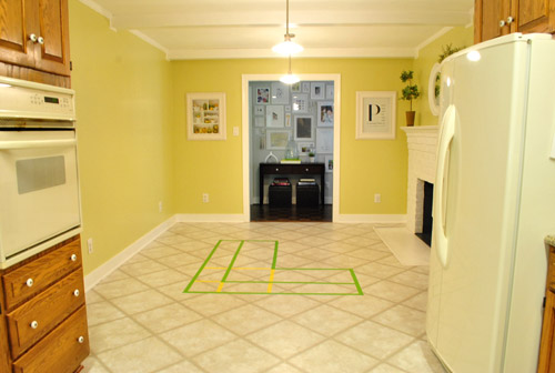
To explain what you’re looking at, the smaller L that’s being spooned by the bigger L would be the actual bench seating that faces the fireplace & the frame wall (which would make sense of the layout a bit more than a big floating rectangle that doesn’t line up with the fireplace at all). And the bigger L would be built-in cabinetry that wraps around the back of the bench seating to create a nice nestled nook that looks as good from the back and the side as the front (and provides a nice amount of concealed storage that’s accessible from the back, just like an island would have done).
As for the height, we thought keeping the tops of the cabinetry and the banquette seating the same height as the lower cabinets in the rest of the kitchen would make things feel cohesive and open (many of our inspiration images above have banquettes that are the same height as the base cabinets). And of course knocking out a huge 6 foot wide doorway to the dining room behind the banquette (which will have pretty cabinetry that faces the doorway so it looks good from behind) should keep the flow nice and airy – so nothing feels too boxed in.
I know it’s pretty much impossible to picture, so here’s John sitting at the fake banquette (although the table would be a smaller pedestal based thing, possibly square, oval, or even round – and possibly white or even a color, but probably not dark brown).
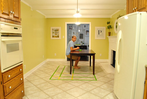
Note: we’ll have to move the lighting on this side of the room regardless of an island or banquette creation since it’s placed too far apart to make sense either way – and in the case of the banquette we’d center it over the table, not the seating (like many of the inspiration images).
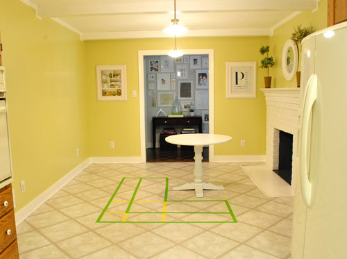
It’s admittedly still impossible to picture (and I would bet $20 that nearly everyone reading this is completely not sold on this idea), but here’s a round pedestal table tossed in there in case that helps the picture come together for a few of you (since our banquette table will definitely have a pedestal base to make maximum room for legs).
And here’s a lower square table (of course too low for a banquette, but this sized top might be right) to possibly help the vision come together a little more. As of now we’re both actually bigger fans of a rounded top – like the one above – but who knows where we’ll end up.
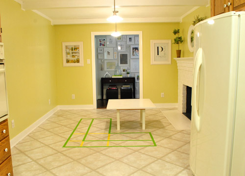
Who am I kidding. This probably doesn’t help anyone. And you all think we’re crazy to consider this. I know it. And we might be. But we’re excited enough about it to at least keep this idea on the table for now. Har-har.
See how the fireplace in the corner almost makes sense in that location with the cozy banquette facing it (which will be lined up with the doorway to the living room, so that doesn’t feel random either)? Nope. You still don’t see it. Haha. Well in person it actually has a lot of balance and makes considerably more sense than any island shape / placement that we’ve taped out on the floor over the last eight months (of which there have been many). We might just have to build our cabinet-backed banquette with cardboard or something to try to envision it further. Or use some serious photoshop magic to help picture it (the challenge is finding photos of the backs of banquettes since so many shots are looking into the L-shaped seating nook as opposed to looking over its shoulder from this angle).
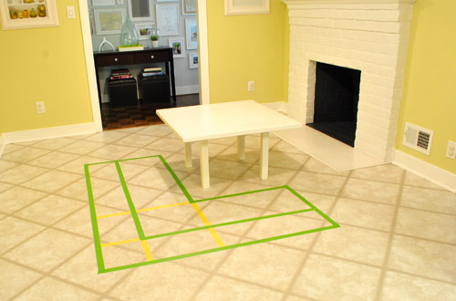
Oh and ignore the crazy white fireplace surround on the floor, since it seems to encroach and crowd the table waaaaay too much. When we redo the flooring in the room that’ll be remedied since we have plans to double side the fireplace down the road so you can peer into the living room through it (but will either make it gas or keep it completely inoperable so kiddo(s?) can crawl through the hole like it’s a secret passageway – so there won’t be a huge tile rectangle on the floor anymore).
I’ll leave you with this picture again, because it’s the one that makes my brain hurt the least when I try to picture things:

So all of this is to say that we taped off a crazy shape on the kitchen floor and we’re seriously considering some sort of cozy banquette-ish breakfast nook as opposed to a centered island with an off-centered fireplace nearby. It should be interesting. And the odds are that we’ll end up making some semblance of a decision someday. And we promise to keep you posted. Off to dip back into the aforementioned bedroom project and the office cabinet makeover. Ah DIY, you fickle friend. Maybe next week we’ll be less scattered. Who are we kidding? Probably not.

MaNell Hembree says
I la-ha-huv the banquette idea. All the cool kids are doing it!! LOL
This is the best idea, and it will feel like the coziest little family nook! All of Clara’s little friends will think it is the coolest spot for hanging out. Yay for this idea! I have wanted to do the same thing in our dining nook, but it is too wide to do seating for our square dining table. The wheels are turning again though, so thanks for the inspiration!! KUDOS for the ingenuity and enjoy the planning and dreaming part… it might be the most fun!
Emily says
Love Love Love the idea. You see islands in just about every kitchen these days! What you don’t always see are fireplaces and banquets! Love!
Jen says
I so want a banquette in my kitchen… love the idea of a cozy little breakfast nook. With the fireplace there, I think it will be perfect in your kitchen.
heather says
First of all, that is totally my cup of tea – because we’re building a similar L-shaped seating area in our Maison. It won’t be floating like yours, it will be against a wall with windows facing our hayfield with a table in front and then a couple seats on the other side (sort of breakfast nookish), but it will be l’shaped (or that’s the plan now, a year or two out).
I really love the snuggly little nook it will create with the fireplace, especially when it’s double sided. You can have the dining room table for big family things, and a cute little homey nook for just the three of you or a couple close friends.
I’m lovin it. Have I said that yet?
Heather says
I love the new blog look … I’m using Safari and I see it just fine :)
And I also agree that the banquet idea is a good one. Your blog is so inspiring! Thanks for sharing everything!
samantha says
I’ve never commented before, but have to jump in to say that I LOVE the banquet idea. So much better than the island and perfect for that space with the fireplace.
Kelly H says
Sounds cozy. I’m all for it. If it were my house, I’d probably build it out of cardboard first like you suggested. And I’m sure Sherry is happy about the opportunity for MORE PILLOWS! Just think- on the back you could have shelving for cookbooks, set up a play kitchen area for Clara… Oh the possibilities!
Angela Hall says
I think it would look amazing. You just gave me some major inspiration for my own kitchen. Our house has a DIY list a mile long, this new idea is totally making the list.
Andrew says
I’m sold. I love the idea of the bookshelves being built into. I picture cook books, photos and other foofy items in there. I also like the idea of keeping a place where you, John and Clara can sit and eat dinner without using the formal dining area. It will be a great place to sit and eat a bowl of cereal or sitting during the winter with the fire and chatting.
Marci says
I think the idea of a breakfast nook is fabulous. As wonderful and practical as kitchen islands can be, its really nice to have a place in the kitchen for the family to sit comfortably and just chill out. Although I don’t have a nook, we opted for a kitchen table instead of an island and with young kids, its the best thing ever and makes for much more comfortable family dinners and not having to worry about the kids with the bar stools or feeling the need to strap them in for safety. I can hardly wait to see how your kitchen nook turns out…. I will live my kitchen dream vicariously through you guys since we just don’t have the money at the moment to make it work for us.
Sarah Fogler says
I think it is a FABULOUS idea and can totally picture it… maybe the back of the banquet can house bookshelves for cookbooks, Clara’s (or #2’s someday) toys, etc….
johanna says
A breakfast nook is a great idea! It’ll make the space feel so much more balanced than if you had an island, and it’ll be a great place to make happy family memories (a cozy little place to have meals together as a family). My aunt has something similar in her kitchen. My cousins (my aunt’s other niece and nephews, she doesn’t have children) and I have fond memories of snuggling together on the bench seats while she fixed dinner.
Have you thought about somehow building shelving into the back of the banquette? It might be an interesting place to keep cook books and kid-friendly pots and pans.
YoungHouseLove says
Yep, we’re definitely thinking of putting shelving on the bank of the banquette. You know we love some extra storage!
-John
Kelly says
It seems like, although your floating banquette would be cozy, it totally blocks the view of the fireplace from anywhere other than the banquette, and it also blocks the flow of traffic from both the dining room and the hall. The space in the corner that will remain after the dining room wall is opened up will be totally wasted. It will essentially be a secondary hallway that exists only to get you around the banquette. Additionally in the existing plan, there is no visual connection with the dining room, which might put a damper on those parties where you need to seat 12 people at once.
What if you guys did this instead?
http://www.flickr.com/photos/36505525@N00/6102822105/
Here are the pros for the new plan:
1. Less flooring to repair/replace when you remove part of the wall.
2. Creates more open space in the kitchen, which helps maintain the flow needed since it connects to every other main room of your house.
3. Seats more people. Depending on how much of the wall you choose keep as a half-wall, you could seat six people at your kitchen table.
4. Maintains views of the fireplace from the kitchen and the dining room.
What do you think? :)
YoungHouseLove says
It’s hard to picture, but the banquette/cabinetry would be about the height of the lower cabinets and around the same height as the current table- so it won’t block any more of the fireplace than is currently blocked by that table, you know? I love your sketch though! But we really want that extra wide doorway which will line up with the window in the dining room – plus this way we’ll get to use more of the inside of the room so everything doesn’t hug the wall. But I love the ideas! Thanks so much!
xo,
s
shannon says
Love that idea kelly! nice sketch!
Abby says
You totally blew my mind with this. I started off with “WHAT???” and ended with “Whoa.” I like it.
abby says
I LOVE this idea. I never would have thought to do a floating banquette but I think it will look amazing! And thanks for the tip about the free Kitcken consultation at Home Depot! We could use one of those when we get ready to do our kitchen!
Jillian says
Love it!
Christine says
That photo of John hanging onto the table is classic! I love how you guys are considering totally different ideas for your place. A banquette is a great idea. I think the only thing that an island has over a banquette is counter space. Is there any way the banquette could be designed to somehow offer counterspace on the back side of it?
Erika says
Just wondering how you know that your floor joists aren’t built strongly enough to hold the weight of stone or ceramic tile. I’m thinking about redoing the kitchen floors in my 1950s ranch in NoVA but didn’t know I needed to consider those sorts of structural concerns.
YoungHouseLove says
The previous owners told us that (they had them looked at a while back).
xo,
s
Jen @ The Decor Scene says
I completely get your idea….well Nancy’s idea. Love it! I really think it will look great. I can totally picture it in your kitchen. And the idea of maybe a colored table with the Breakfast Nook…gorgeous!
I absolutely love the 3rd inspiration picture. I have seen that one on Pinterest. Wouldn’t it be great if you guys could do your kitchen that way. Gorgeous!!! But no matter which inspiration picture, they are all gorgeous and I think will look great. Can’t wait until you get to this part of your project. ;)
Skye @ Neathering Our Fest says
I would have never ever thought of that either but I think it is a TOTALLY amazing idea! I can see a lot of cozy dinners in front of a fireplace happening there! :)
Megan says
Ooh, I love this direction of possibilities! Have you considered (and someone may have mentioned this, I’m a little too late to read through ALL the comments ..)
1. Switching the little leg of the L to the other side (so the back is to the existing doorway to the frame wall?) That way people sitting at the banquette can very easily be part of the kitchen vibe, chat with the cook, etc and not so isolated.
2. Instead of just doing cabinetry across the whole back of the L, maybe doing cabinetry on one side and counter height, well counter on the other? With stools, etc. I think that would really increase the functionality of the little nook, help it feel even more cozy within the L and create a transition from the working kitchen to the casual L seating. by being slightly more casual than the ‘formal’ L seating area. While the table would be a great place to spread out homework and work the counter would be great for quickly checking emails on a laptop or chatting with the cook, etc.
Just some ideas that popped into my head as I scrolled through the post. I’m sure you guys will come up with something awesome and I can’t wait to follow along!
YoungHouseLove says
Thanks for the ideas. They’re definitely some things we’re contemplating. Right now there are tons of options so it’s just a matter of narrowing it down to what really works best.
-John
Sarah R. says
Um, yes, yes, and a big fat YES. Do it! I love that you guys have vision (I have none). I absolutely cannot wait to see these plans come to fruition. You’ve tempted me with your plans and ideas (just like Ana White and her momplex building) and now I am impatiently dying to see the end results. So, what kind of time frame are you thinking of?
YoungHouseLove says
Oh man, the time frame question. We really don’t know at this point because there’s lots to figure out. But we’re definitely going to move as quickly as time and budget allows!
-John
Gracie says
I have to say that when you first mentioned it, I thought it souded like a bad idea, but after seeing the pics of other banquets and seeing the floor taped off with the little pedestal table (I like the round top the best too), I think it will work really well. Everyone will be fighting for a spot at that table fo sure! I know I would be! I love sitting next to fireplaces at restuarants. So cozy!
Layla says
OHMYGOD I cannot tell you enough how excited I am by this! I absolutely love banquettes and for some reason always thought they have to be attached to something, and centered on something, and preferably have a centered window behind it. Which makes it pretty much impossible to ever install one, unless the house is built with one in mind. Now, this setup still wouldn’t work in our house, but it’s super exciting to see some out-of-the-box thinking on this. Love it!
Also, how perfect is this gonna be for romantic candlelight dinners by the fireplace? =D
ktgraham614 says
Love the idea of a passageway in the inoperable fireplace, perfect for kiddos & Burger!
Jessika says
I think the nook would be nice for the day-to-day, but frustrating when you have people over or when you’re trying to talk to the person sitting at the nook since they face away from the kitchen action (and the nook side that faces away from the kitchen has no place to look at the kitchen and lean against something).
Is there any way to build a nook bar? like a long bench seat instead of individual bar stools? Or a curved (or even diamond-shaped) bar on an island but where the people will be seated facing into the kitchen? I only really suggest that because my European mama knows a lot of folks with nooks, so growing up, we were at a lot of people’s houses. People sat in them if they faced and were near the kitchen action. If not? They loitered in the kitchen. My parents have both a nook and a bar and people only sat at the nook if the bar was full. Sitting at the nook felt too low and too much like people were waiting on you. We have a bar now (but no nook) and it is so nice since everyone LOVES to sit at it/stand next to it in the kitchen.
Whoa, long comment. But I know there’s a lot to consider. Just thought I’d throw the height thing in there. The higher you go, the less formal it feels. So… if you go with the nook maybe see if you can bump up the height and/or redirect the direction? Plus, if you bump up the height, you can have underseat storage….
Oh, one more thing: you have to easily be able to move the table around! Nooks attract dirt underneath in hard-to-reach places.
YoungHouseLove says
We’ve contemplated making part of it bar height, but visually haven’t been sold on it in our space. Though we may flip the “L” so that everything faces the kitchen or fireplace. At this point, there’s a lot up in the air still!
-John
Misty says
hey guys, just thought I would leave my 2 cents on which flooring worked for us when we re-did our kitchen. It is at Home Depot, costs like 2 bucks a square foot, and is SUPER easy to install. we have had it for awhile and still love it! I am tempted to put it in one of our bathroooms too. We have the “cork” look stuff, but it comes in many styles. here is a link:
http://www.homedepot.com/h_d1/N-5yc1v/R-202075778/h_d2/ProductDisplay?langId=-1&storeId=10051&catalogId=10053
YoungHouseLove says
Thanks for the suggestion! Definitely gonna check it out.
-John
julie s says
I really like the idea. What about “building” a 3D mock-up of the banquette out of cardboard boxes to see what might work? I mean, it would be a lot of work, but it might help you (and, you know, us) visualize it!
YoungHouseLove says
That’s what we’re actually thinking of doing. Just gotta track down enough cardboard first. :)
-John
julie s says
Sorry, reading comprehension fail.
Kimberly Bernhardt says
So what is Nancy’s number and will she travel to CA? Only kidding I am in a rental. I love the idea of a banquette! I could even see glass doors to display fun things like ceramic animals on the back. I would use a round table, it is less formal than the square. I think banquettes are great for little ones, they cant push it around the room like a chair. My two year old will push her chair as far away from the table as she can just to test the limits before she falls out of her chair.
April says
I bet going ahead and opening up the wall (since you already know where you want that to go) would be the best first step and make everything more easy to visualize!
Renae says
I can’t read through all the posts to see if someone mentioned this already but I think it might be a good idea to rig some cardboard boxes up into the footprint and walk around them for a week or so to see if you can then visualize how it will function for you. That’s our plan when we redo our kitchen. That way instead of the abstract idea of the banquette, you can see how it will be in your space. You might even just build the back wall with boxes to said height and folding chairs or other where the seating would be and eat a meal or two there with one of your little tables. Put up a fake hole in the wall with some newspaper (a la your photo walls) and you might imagine how it will be in the end. Have fun and keep us posted!
YoungHouseLove says
We’re definitely considering going the cardboard mock-up route too. Just gotta wrangle some boxes first!
-John
Erin says
Oooh, you’re showing one of my favorite kitchens! The last inspiration pic you show with the antlers was designed by William Waldraun and was shown in Southern Accents. (And can we all just take a moment to again grieve the demise of that wonderful magazine?) I love everything about that kitchen — well, except the antlers, unless you’re into playing ring toss while something’s boiling on the stove. But the rest of that room is fabu — the ceiling, the brick behind the stove, the curved white banquet, the beautiful table, the wood floors, the to-die-for tall gray double doors.
I agree with you. Love the round table in front of your future banquet. What a great idea! I can see why an L banquette might be more practical for you guys for storage, but I love the look of a curved one like the one Waldraun used — and it could mimic your round dining room table. Can’t wait to see what you decide!
Erin says
Correction: The photo of the antler kitchen was shot by William WALDRON (not Waldraun) for Southern Accents. The designer of the room remains unknown. Wasn’t even mentioned on the Southern Accents site. But I see that kitchen on many sites. Would love to know who designed the space.
And, as I said on a post below, I meant “banquette” not “banquet.” The brain’s not in sync with the fingers…
YoungHouseLove says
Haha, thanks for the correction. My fingers go crazy when I’m typing too!
xo,
s
Tera says
As others have posted, I also wasn’t sold on the island. It just didn’t seem like it would be a functional prep area on the opposite side of the kitchen. Of course I had no other solution, so awesome props to Nancy for suggesting this cozy idea.
Bklyn Amy says
I like the idea of a banquette, but not sold on the L shape. Practically speaking, as a Mom of two boys (aged 4 and 6) I feel that the arm of the L facing the main workspace would annoy me.
It would block my sight-line (I am short) and hinder the ease of getting to the kids to help with homework or lay out snacks, etc. Imagine having to stretch over the storage cabinet every time you wanted to put something on the table, or walk around every time you needed to clean up a spill. I might sound lazy, but an economy of movement is often a mother’s best friend, i.e. when you can get to a spilled cup of orange juice before it reaches the floor.
I think one rectangular banquette and then a couple extra chairs in the room (one next to the fireplace and one in the opposite corner of the room perhaps) that you could pull up to the table for more seating would be awesome though.
YoungHouseLove says
The height of the entire floating banquette would be as tall as base cabinets, so there wouldn’t be any line of sight issues unless you’re crouched down on the ground I think! Not sure where we’ll end up though! This is all just beginning thoughts so we have a lot to flesh out.
xo,
s
Jen says
Just thought you should know I see ALL the photos and the header. (Maybe you just need to know some of use can still see it??)
I can not WAIT to see what the breakfast nook turns out looking like…I’m sure it’ll be stunning!
Lindsay says
This idea is amazing – that woman is brilliant! And the white pedestal table looks perfect there, I could picture it easily! Good luck and I hope you guys go through with this!
partyofsix says
found a better picture of it, http://www.juztimage.com/kitchen-islands-photos/
Oh, and here are several more on Decor Dreams–LOVE the storage drawer on the backsides of pictures #3 & #4, especially the detailing on #4.
YoungHouseLove says
Yep, that’s similar to what we’re thinking – though our counters probably won’t be deep enough for a sink.
-John
Georgia Rowe says
Love the banquet idea! think it will be totally quirky and cozy! woo you could even make little blackboard paint panels on the back for clara and future offspring to do some chalky art work on!
Renae says
Crap! I just realized I missed the part in your post where you said you might do that. Doh!
Erin says
Oops! Meant “banquette” not banquet, but I guess you will be having a banquet at the banquette…
Courtney says
At first I was wondering if the banquette would block the flow of the kitchen but an island would essentially do the same thing so that’s a moot point. I came across this photo { http://pinterest.com/pin/154828835/ } which is a different layout than your kitchen would be but, strangely, helped me to visualize it more.
Plus, everyone loves a kitchen party so having more seating space is never a bad thing. And if you added a gas insert when you upgrade your fireplace, it will be such a wonderful place to hang out in the winter. (On the other hand, I would have killed for a “secret passageway” as a kid!)
PS. Love the new header and background!
Krystle @ ColorTransformedFamily says
I would have never thought of doing that eigher but I love the inspiration photos. I also think that you will appreciate some type of table in the kitchen area as Clara gets older. I used to love sitting in the kitchen while my mom cooked. We had great conversations that way.
cheep3r5 says
I need to mull it over. From a use of space and what you have in it standpoint, it makes sense to make the fireplace a focal point with a banquette setup.
No matter what you go with think about drawers front, back, sides and/or ends for extra storage (toys or otherwise).
When are you going to take the wall out? Are you sure about the size or waiting on how the cabinets will be layed out? Go for as much counter space as you can. Two sinks would be lovely and allow two cooks to work at the same time. Take your time.
YoungHouseLove says
We haven’t decided what order we’ll do things. We know it’ll be easier to visualize the banquette with the wall down, but we hate to later realize the wall opening should’ve been wider/narrower/shifted. So we might start with a cardboard mock-up of the banquette and then go from there.
-John
Eva says
I think the idea of a banquette is great. I think if the back of the banquette has spot for placing items would make it very functional and keep it light and airy. It would be a great place to display items if there was shelving underneath.
You could also make the seats of the banquette lift-able so you could use it for extra storage.
L says
Great idea, that banquette. I can totally picture it. And, as someone who put a 2-stool “breakfast bar” in her dinky kitchen (and it works for this one-sometimes-two-adult house) I think you will be thrilled with the ability to park little fannies at the table for meals, crafts, and homework — and still keep an eye on them while you’re in the kitchen. Just be sure to use easy-clean upholstery.
jenny poe says
Everything looks great from this end! I’ve got IE
Summer says
I love banquettes! How do you feel though, about when you knock out that wall, you’ll be walking into another wall?
YoungHouseLove says
We’re thinking it won’t really feel like a wall since it won’t be super tall. It’ll look more like a piece of furniture, so we’ll still get the benefits of letting in extra visual space and extra light from the front windows
-John
Jamie says
Absolutely LOVE the idea, with the round pedestal table, especially. It would look amazing!!
Amelia R. says
It looks like it could work, but wouldn’t moving the lights make them not centered on the doorframe/room, and throw off your symmetry? I think I’m against that move. In general, though, I love the inspiration photos!
(I use Safari as my browser, and everything is showing up fine over here.)
Jennifer says
Wow! That sounds like a great idea, definitely not what I was expecting to read. Love it!
I’ve got a kitchen question for you. I am hoping to convince my DH to let me redo our kitchen cabinets (using your painting instructions) to change them from tacky yellow-ish oak to crisp white. My question is if you have any advise on how to accomplish this task with a toddler!?!
Specifically, how can you allow the base cabinets to dry hopefully 3-5 days without getting messed up by a crazy toddler or just daily living. My guy is only 7 mths now, but probably about Clara’s age by the time I’ll be able to tackle this project. Any advise? How will you do it when it’s time to tackle your kitchen?
Thanks, love the blog!
Jennifer says
Sorry, advice.
YoungHouseLove says
It’s gonna be a challenge, since Clara does like to play in the kitchen and open up the cabinets. We’ll probably just have to block off the entire room or put something in front of the drying cabinets so she can’t access them. We’ll let you know how it goes!
-John