- The 12 Best White Paint Colors
- Benjamin Moore Edgecomb Gray
- Benjamin Moore Simply White
- Sherwin-Williams Pure White
- Sherwin-Williams Extra White
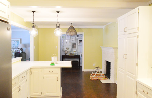
As for more about the kitchen color change, although you guys know we love grellow with a passion, it has been notoriously impossible to photograph (remember a hundred different phases of the kitchen project with “ahh, this color looks so much more subtle in person but is reading as lime green/bright yellow/neon slime for some reason”). And although that’s sort of definitely a dumb reason to repaint a room, I can’t tell you how annoying it is to not be able to share what you see in front of your eyes when you’re a home blogger.
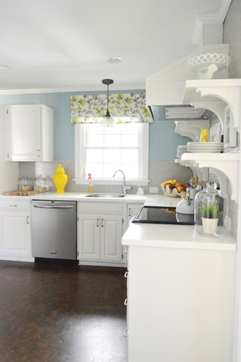
But the main reason for the change wasn’t that the color was hard to photograph, it was that over time we realized that the grellow didn’t let the other things in the room shine as much as they might have with a different choice. Take the white cabinets and counters for example. They looked little yellowed thanks to the wall color reflecting on them – and even the cork looked a little orangey-yellow (especially at night) instead of rich and mocha.
So here’s how we reasoned our way to a new color pick in five bullets or less:
- we worried that other tones of yellow and green would have the same yellowing-ish issue (say that three times fast) since they’d reflect on the counters, cabinets, and cork – even if they were deeper or lighter, so we nixed those options
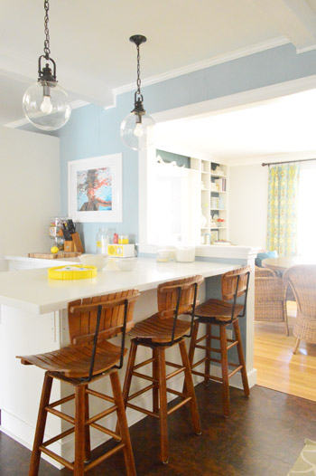
- we wanted something deep enough in tone to provide a little more contrast, so the counters and cabinets would pop more (but nothing too dark since the room is windowless)
- we have gray backsplash tile and a few adjoining rooms are gray, so we didn’t want to go with more gray on the walls (dark, light, or schmedium) for fear of grayverload
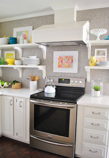
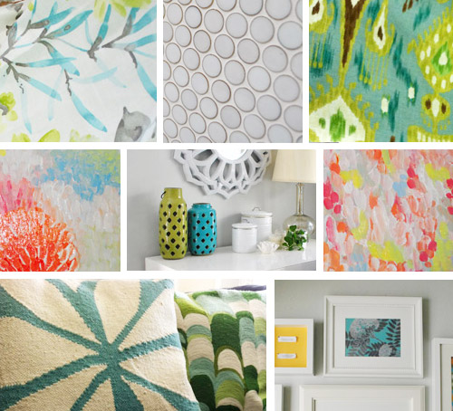
- we wanted an actual color on the walls (since we chose such safe things everywhere else like: brown floors, white cabinets, stainless appliances, white counters, and gray backsplash tile)
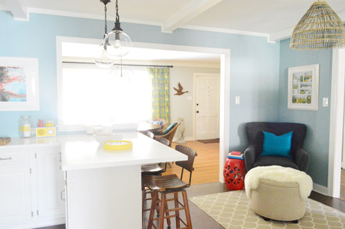
- we wanted a color that would tie the kitchen into the four spaces (yes, four!) that the kitchen opens up to – without getting too matchy-matchy (when a room adjoins so many other rooms, the wall color should work with those rooms since you’ll see them together all the time – it’s sort of like very carefully picking a hallway color that works with all of the rooms off of it)
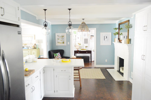
We definitely loved having a soft blue kitchen in our first house, and we actually don’t have any blue on the walls in this house except for the deep teal in the guest room and on the back of the dining room built-ins, so it’s nice to bring in a mid-tone blue that’s sort of in the middle of the guest room and our first house’s kitchen.
The funniest thing about this whole repainting escapade, which we realized while applying the second coat (we’re always loopy by then) was that in our first house we repainted every single room except for our kitchen and our master bedroom. And in this house we’ve only repainted two rooms: the kitchen and our master bedroom. Hilarious.
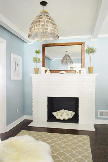
And if you count the time that we painted the fireplace area a different color for book photoshoots (only to repaint it back to normal a few days later) some parts of this room have seen four different paint jobs.
- it’s definitely an actual color (there’s nothing neutral about it)
- it still feels sophisticated (even though it’s not gray or navy or chocolate or taupe)
- it allows the white cabinets and counters to really pop (without yellowing them)
- it’s a great balance to the warm tones in the room (like the cork floors, the wood stools, the rustic cutting boards on the counter, etc).
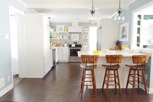
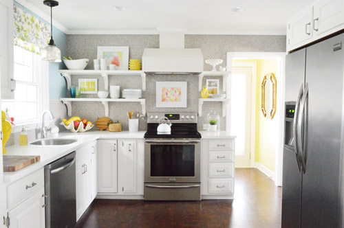
Not gonna lie though, the star of this room is still that wall full of penny tile. Picture me having an as-soon-as-the-show-ends bachelor breakup with the wall paint to run back to the penny tile with open arms. And it’s not that I don’t love the wall color – I just love the penny tile more than a person should love any inanimate object.

Shanna Gilbert says
Love the color you chose! I just painted my dining room and it was a disaster! The color looked completely different. It was supposed to be aqua but turned out to be a neon aqua. It was so bright it actually glowed when you turned out the lights! So after three coats of that and the two coats of a new color (and a very unhappy husband who painted it)it still isn’t quite right but at least it doesn’t glow anymore. I would like to try once more to get it right, but the hubby says no way. Trying to paint with three dogs, a cat and a teenager with lots of friends in the house is too hard! Great job guys!
Marie K says
NO WAY! I just painted my kitchen this same color the end of last week/weekend. Yours looks great!
YoungHouseLove says
Twinsies!
xo
s
emmy A says
I have a blue kitchen with white cabinets too. It’s a great combo. I started with the wrong shade of blue and had to repaint with a turquoise that had more green undertones. Now it’s perfect! Now I just need some new flooring and countertops and maybe a new sink……..
karen says
i gasped when i saw the first pic! once again…my husband rolled his eyes at me.
Kate says
Yes, guys! Really great choice!
Mary | lemongroveblog says
LOVE it! What a complete 180!
Nicki says
I love that color! And I liked it before, but n ow I love it!
tracy says
Wow, this is beautiful! I really liked the grellow, but this color takes the kitchen to a whole new level of awesome. I find myself gravitating toward blue paint this year as well.
Kristin Lynn Connor says
I totally <3 it!
Mandie says
Love it! Really makes the cabinets and backsplash pop and not look yellow! :)
Sarah in Sydney says
Oh Thank God!!!! I’ve not left a note for aaaages… but still read occasionally. I have never ever been a fan of the grellow. I think I love you guys again ;) Looks so so so much better. Good choice.
p.s. we have a paint brand in NZ/Australia called Resene… my interiors are painted 1/4 tea.
Nicole says
LOVE it! I loved the gyellow but I love this so much more! It has a more peaceful feel to it. Great choice!
Cheri says
So funny thing. I spent a good deal of time looking at your site at paint colors last night. I’m repainting a “grellow” bedroom that we are about to put hardwood floors in. I’m thinking a grayish whiteish color … so I can easily change out bedding and accessories. Boring. I know. I have the blue you painted your kitchen in my master bath. Love. it.
YoungHouseLove says
So funny!
xo
s
Becky Horst says
Thank you for doing this!! I loved the previous grellow “concept” but I just wasn’t feeling it! As if you care! But this just makes the kitchen!! Well done busy bees you 2 are & I love the inspiration.
Jara says
Was never a fan of you white on white cabinet countertop. But with the blue? Love Love Love
Athena Warner says
I love these posts that show when you’ve changed your minds. I always worry about if I do something that isn’t going to work out how I can back out of my “brilliant” idea gracefully. You guys just inspire me to say, Well…I just changed my mind! No big! =D Let’s embrace the new!
Christina says
Mocha Choca-lata yaa yaaa… it’s totally stuck in my head now. : )
Also, $herdog, if you haven’t checked out Kendrick Lamar’s new album, you should!
YoungHouseLove says
Ooh sounds awesome!
xo
s
Jerri C says
You two are my “go to” style experts and the grellow never did anything for that beautiful kitchen on screen any way…….BUT this is a 3 Pointer. Love it!!!!
katalina says
I love it both ways and would to have your kitchen either grellow or blue.
I must not be good at guessing because when I saw the tease squares i actually thought– maybe blue-green or the color in your guest room!
But then the difference between you and me if that you have painted your kitchen TWICE while I mull over the perfect green sage color!
Mandy S says
LOVE this color, great choice!!!
Cara D says
I really liked the grellow but the blue looks so much better and the grellow in the laundry room pops as an accent now. I just repainted my kitchen from dark red to a dark turquoise and I LOVE it! Paint makes such a big difference.
Kathleen says
Love how the kitchen looks with the new color!
I’m debating repaint my living room and dining room. They are currently turquoise and leaf green. I found a couple new chairs for the living room and its prompting a change. I think I’m going white. I’ve got lots of color but want to tone things down some.
Easily Distracted By Shiny Things
Kiki says
I totally agree with you about letting the counters and accent colors pop–the blue really does just that! And I love how you’re always open to changes and changing your minds (and openly saying that on your blog!). It puts the indecisive girl like me at ease a little.
Looks good! But then again, all of your projects do! :)
kathy says
Can’t go wrong with a calming light blue. I liked the grellow, but this is beautiful with the natural textured browns in the room. Nice choice!
BTW, do you have plans for the blank side of the large kitchen pantry cabinet? I am visualizing some nice molding or beadboard or something there someday. :)
YoungHouseLove says
Yes, we’d love some sort of message board or something (but chalk or dry erase markers might rub on our clothes when we walk through the door, so we’re still brainstorming….)
xo
s
Kristy D says
I liked the kitchen before. Now I LOVE the kitchen.
Good decision.
Michelle says
I LOVED the grellow. I was shocked to see the change, but it’s growing on me, and I can see why you changed it now. I’m sure I’ll come to love it too, and I’m really glad you kept the laundry nook grellow. Thanks for continuing to show me that change is good!!
Kim says
As a matter of fact, I just repainted a room upstairs that the color just never felt right in. I picked Lotus Leaf by Behr, over the already painted Teal Zeal. I loved the teal by day, but by night it looked like a dark and scary lagoon. In other news, I used a chair I found at Target.com as my color inspiration. I felt like it was just right–and something I had seen before. See, the chair is upholstered in what looks to be the same fabric as your faux window shade in the kitchen, which I just realized… http://www.target.com/p/avington-upholstered-armless-accent-slipper-chair-gazebo-cloud-floral/-/A-13916598#?lnk=sc_qi_detaillink
YoungHouseLove says
NO way, I love it!
xo
s
Johanna says
Wow, your kitchen has really come a long way!! I really liked the grellow, but I LOVE the blue!! :)
Cindy @Made2Style says
I’m sooooo excited about this change!! I am just not a fan of yellow but I love you guys so much I would never say lol I love the blue, it looks amazing!! Kudos!
xo Cindy
Courtney says
I love love love it! I literally scrolled up and down 3 times, yelled for le hubs to come take a gander, and then scrolled up and down 3 more times. That looks beautiful! It is for sure not neutral, but something about it allows everything else to pop so much more. Your counters and cabinets look much more white and crisp as well. Brava!
Carolyn says
This is my first time commenting even though I read your blog pretty much every day so that is saying a lot about how much I like your choice :). The blue is perfect! I did like the grellow but like you said, it just didn’t make all of your other great choices for finishes come together for their full potential! Definitely worth the effort to repaint! :)
Katie says
LOVE IT!
Abby says
We had to reprint our yellow (almost grellow) kitchen, too. Something about it just felt off. We finally figured out that they yellow was making us feel…strange..almost anxious compared to how we felt in the other rooms in our house. So we painted it an off-white color. Now it looks awesome and fresh and our accessories stand out a lot more and it just FEELS better. It’s amazing what a paint color can do.
Lara says
Love the blue! My entire house is heading in the blue/gray direction, one room at a time!
Sarah G. says
Yes! 800 times better! I have to tell you, i never really liked the floor with that yellow. But I kept it to myself because it was my opinion and why would you care. But this is really great! The floor and the cabinets really compliment $herdawg blu ivy (yeah, I went there ;D). Great job, dudes!
Erin says
The blue plays so nicely with everything! The wood, the yellows and everything else! Loving it!
Jules says
Looks great. I was never offended by the grellow but this actually makes your floors stand out more. I read every day and I’ve never stared and admired the cork floors like I did with this new blue color. Nice change.
Lauren says
We are redoing our kitchen and just put in white cabinets and painted the walls a similar blue-gray color. Thanks for stealing my idea….haha! ;-) I love the way the cabinets pop off the new color!
Samantha says
OMG. I loved the grellow you guys had going, but this looks amazing! Im actually kind of obsessed. No, i’m definitely obsessed. The blue walls and the brown floor together makes me want to cry (in a good way). Not to mention the white cabinets and how they pop. I also LOVE the way the laundry room color shines into the room the way it does, good call on not changing it! Great choice, you guys have such a good eye! I’ll def. let you come paint my room if you want! Hah!
Isobelle says
OMG You guys did a great job it looks like a BAJILLION times better and i loved the Grellow! I may borrow/steal this idea.
Peace.
Kelli says
It’s beautiful! I painted two rooms Colorado Gray a couple of years back…love me some Benjamin Moore paint!
Alyce {Blossom Heart Quilts} says
Oh so calm and serene! I’m a tad biased being a blue-lover, but yes, blue and white and grey… be still my beating heart! PS – have you considered adding a Pin It button when you hover over a photo?? Not that you need any help getting on Pinterest, lol.
YoungHouseLove says
We actually added those for a day and about 4 people complained within the hour that we added them, so we took them down :)
xo
s
MG says
My new favorite line…. “I actually like a good freestyle cutting in sesh”
Charlotte says
The kitchen looks awesome.
I/we (my husband did help) just repainted our bedroom. I love it and so glad my husband comprimised with me on painting. It’s painted a grey colour called Silver spoon. And it gives me a calm feeling when I enter. He even said he likes it!
Em says
I like the change! But I do have a question…lately all your pictures are so blown out. It almost looks like the air outside all the windows are glowing white! Are you guys upping the brightness in photoshop or something? If so, please don’t :) It makes a lot of the details harder to see. These pics are so blown out, you can’t even see the paneling on the walls. I don’t mean any of this in a negative way, just a loyal reader giving a perspective!
YoungHouseLove says
Nope, we don’t up the brightness or exposure or anything – we just find that when you shoot with natural light (without putting lights on in a room, which is the way the pros do it) many of the windows are blown out. The way to avoid that is to take two photos (one very underexposed) and photoshop those less bright windows into the shot, but it takes a lot of time (and can look unnatural unless you’re really good at it) so it’s something we might do on special occasions, but not for every one of our 50+ photos a week. Hope that explains it. Oh and you can take down the brightness on your monitor, which might help. That might be why you think it looks different recently (your own monitor brightness might have been increased) :)
xo
s
Meredith K A says
I LOVE it. Love. This might be the biggest “Oh so THAT’S .how perfect looks! Moment so far, and I’ve been reading for probably 3+ years now. Seriously, you nailed it, that color is perfect.
Laura says
I love this!! All of your accent colors (art, dishes, etc.) pop even more. And the fireplace and hanging basket light look gorgeous in the blue… not to mention how much I love the gallery wall frames in the hallway with the new color as a backdrop.
Virginie says
A-ha !
Now I realize I never really liked the grellow and absolutely LOVE this blue ! With the wood accents it almost looks like a beach house, something very calming about it.
But I am wondering, you must have had to remove the open shelves to paint ? You never cease to amaze me with how fast and easily you paint (took over repainting the smallest bathroom in our home, and the million little nooks that were a nightmare to get to drove me nuts). One day, maybe…
YoungHouseLove says
We actually just taped off the edge of them and it was all good!
xo
s
Krista says
Looks fabulous! I painted my living room coffee table and my front door Aegean Teal and have been looking at Colorado Gray as a potential kitchen colour for months now… I’m thrilled to see how great it looks in your house!
Tiffany T. says
It somehow just feeeels better! At least it does to me a million miles away haha!Great job guys-